✧ Onboarding for Sofia Health's Practitioner's Web and App
A Healthcare Platform✨ The Problem ✨What does our practitioner need?🔍 Community ObservationPractitioners are:Combine with Previous User Interviews and Usability Test DataDefine Our User NeedsCompetitive Analysis🔧 The OnboardingUser Flow🔑 Key FeaturesDashboardLofi Wireframe in Mobile🩵 Thank you for your interest!
A Healthcare Platform
SH is a healthcare provider website that provides alternative healthcare to its customers.
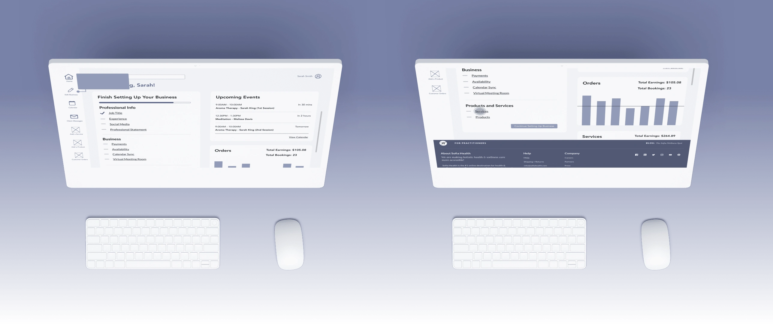
Hero Image of SH's practitioner's dashboard design on web
My Role
UX Design intern + Sole UX Researcher
Contribution
As an intern, I was responsible for discovering and leveraging provider's needs to improve the onboarding process
I conducted competitive analysis, and user interviews and create UX Design from feedback collected.
Timeline
December 2021 - August 2022
✨ The Problem ✨
Prior our UX team joins, our founder has to schedule 1 on 1 meeting with every new practitioner who is interested in listing their services on our platform as both inquiries and help set up their profile.
As a result, it takes too much time to reschedule meetings and is not efficient enough when the interested providers' demand increases.
We need an efficient way and automated process to allow practitioners to sign up and set up their services by themselves before they come to me for assistatnce! -- Founder of SH
What does our practitioner need?
I started with community observation, competitive analysis, and user interviews to help identify our users' needs
🔍 Community Observation
Upon researching online, I discovered discussion boards for practitioners from different fields to share opinions about listing services online and some of their business struggles on platforms like Facebook, Reddit, GitHub,etc.
I disguised myself as one of the fellow practitioners to join these forums as we found the sense of helping peers is the most direct way for practitioners to share their struggles and their solutions. I have then invited some for user interviews.
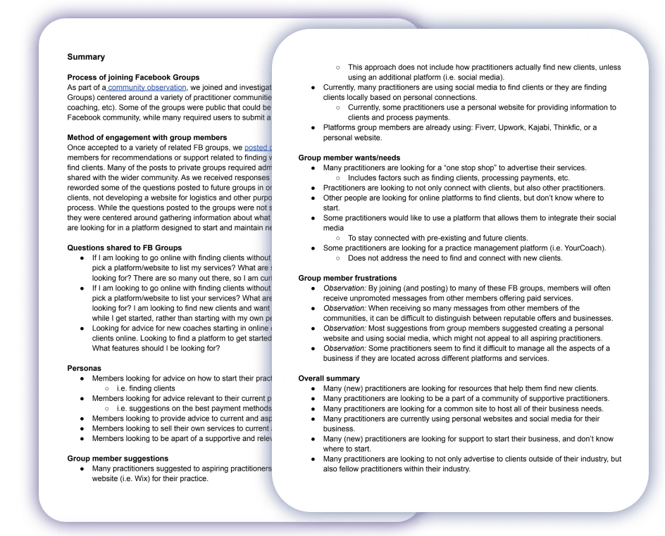
Summary of Community Observation and user interviews
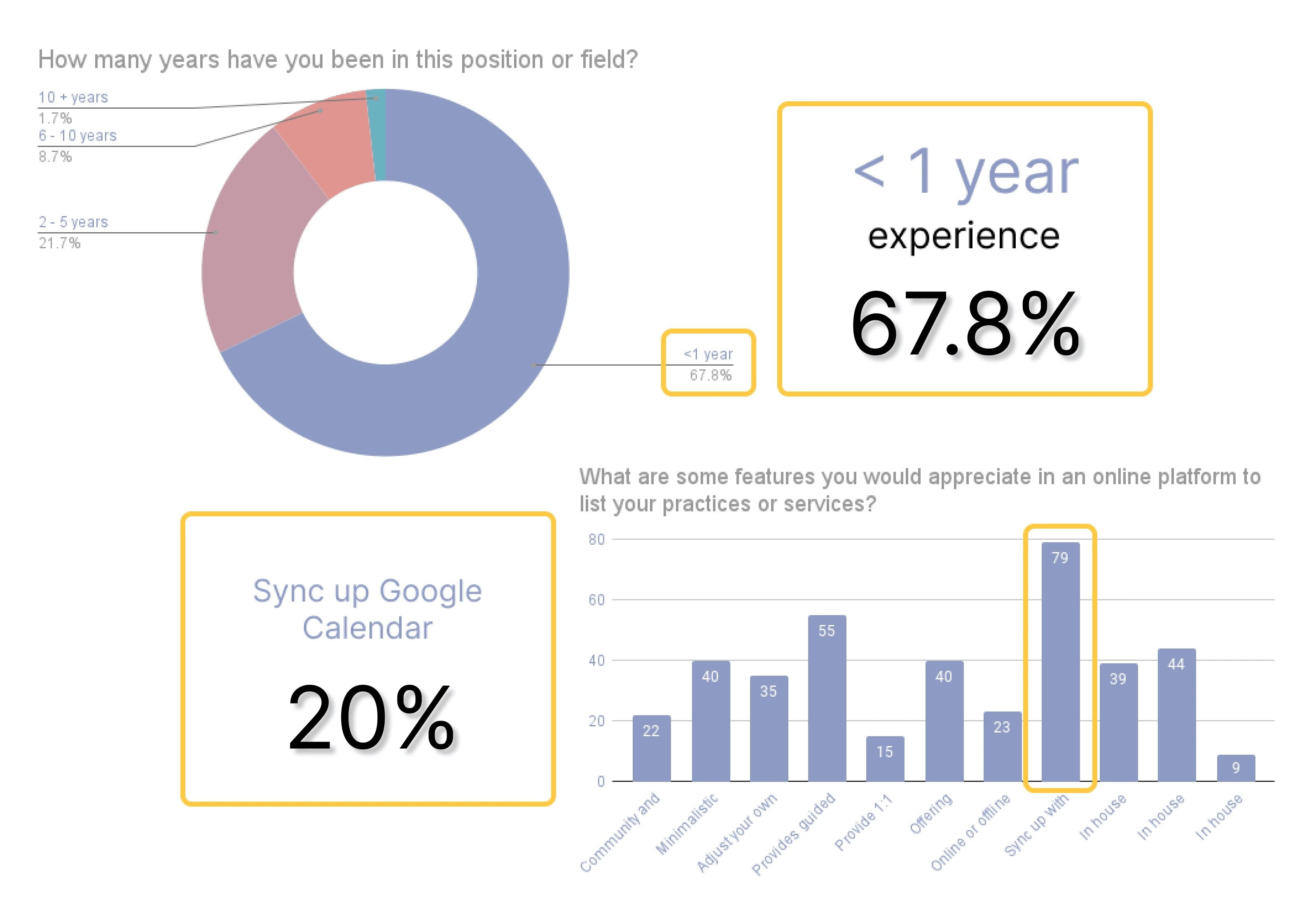
Statistics Breakdown of Responses collected
Practitioners are:
Unsure about resources that can support their online business
Looking for a community of support and affirmations
Unsure where to host their business online
Combine with Previous User Interviews and Usability Test Data
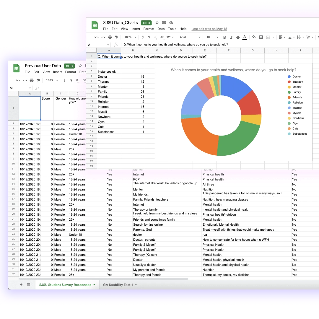
Previous User Data and Usability Test Data Google Sheets.
Define Our User Needs
Through community observations via surveys and user interviews and our previous usability testing and survey, our users expressed their needs:
One-stop shop to advertise their products and services
Sense of community with fellow practitioners
Education on running a business
Guidance in understanding metrics like payment systems, conversion rate, etc.
Matching or Connecting them to customers
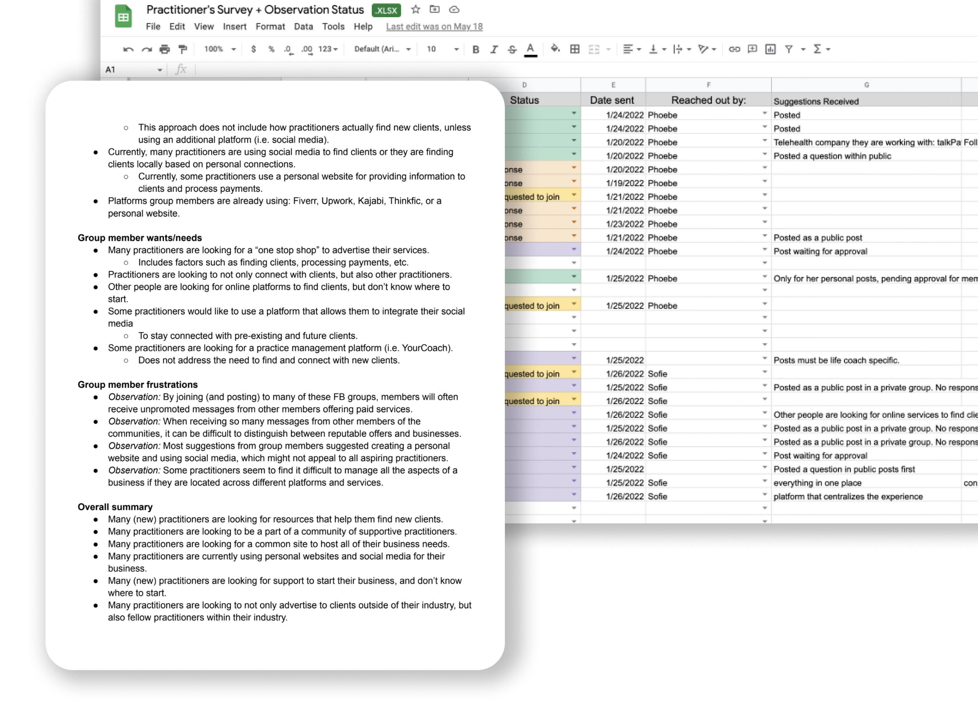
User Research Summary (combined with survey responses)
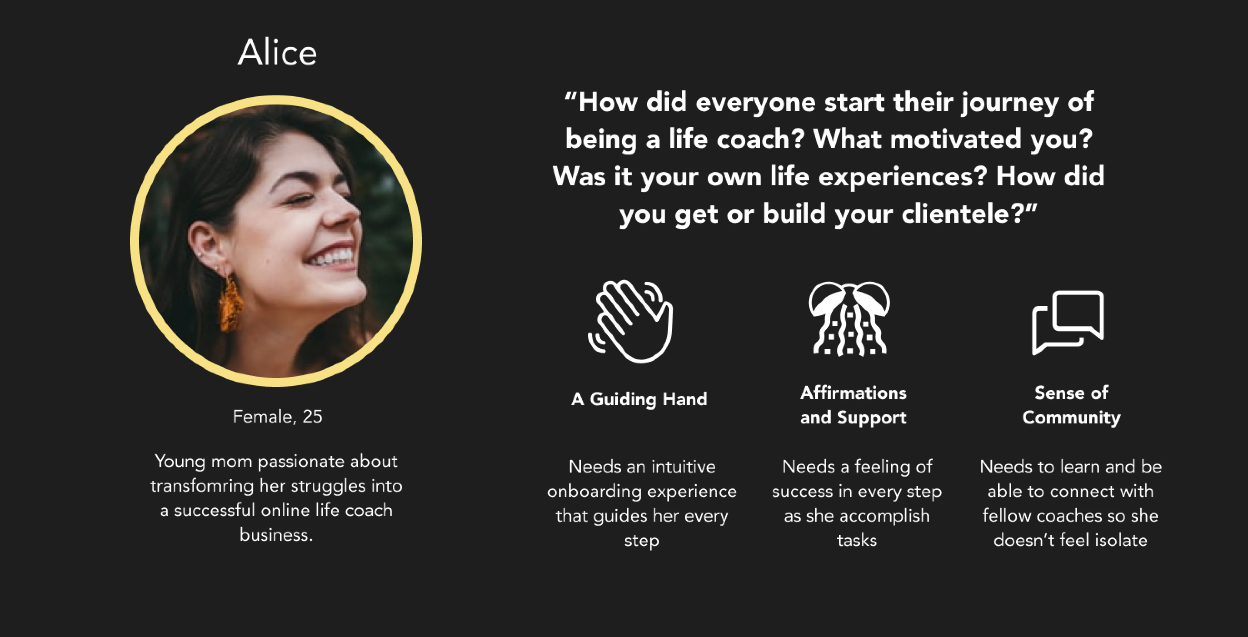
User Persona of Alice
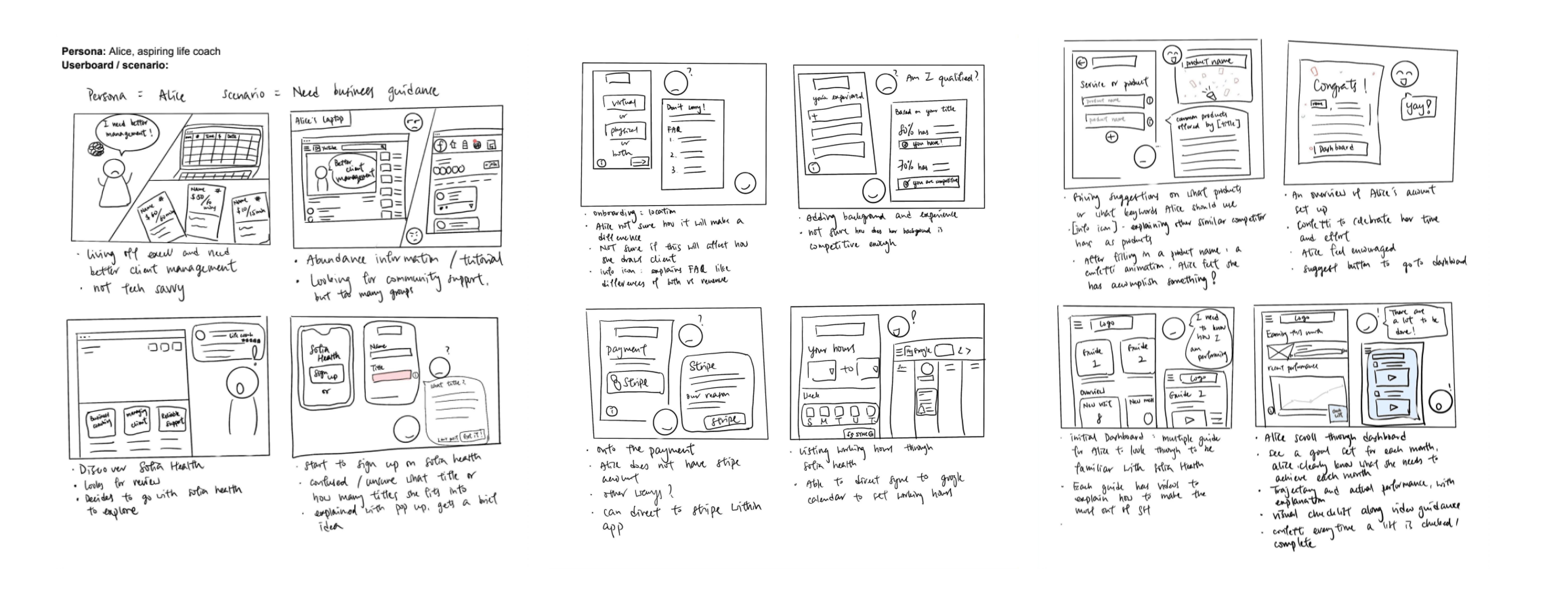
User Storyboards
Competitive Analysis
To understand how our other competitors approach their practitioner's onboarding, I conducted a competitive analysis to find features that may or may not be helpful to our practitioners and find gaps within the market that can differentiate us.
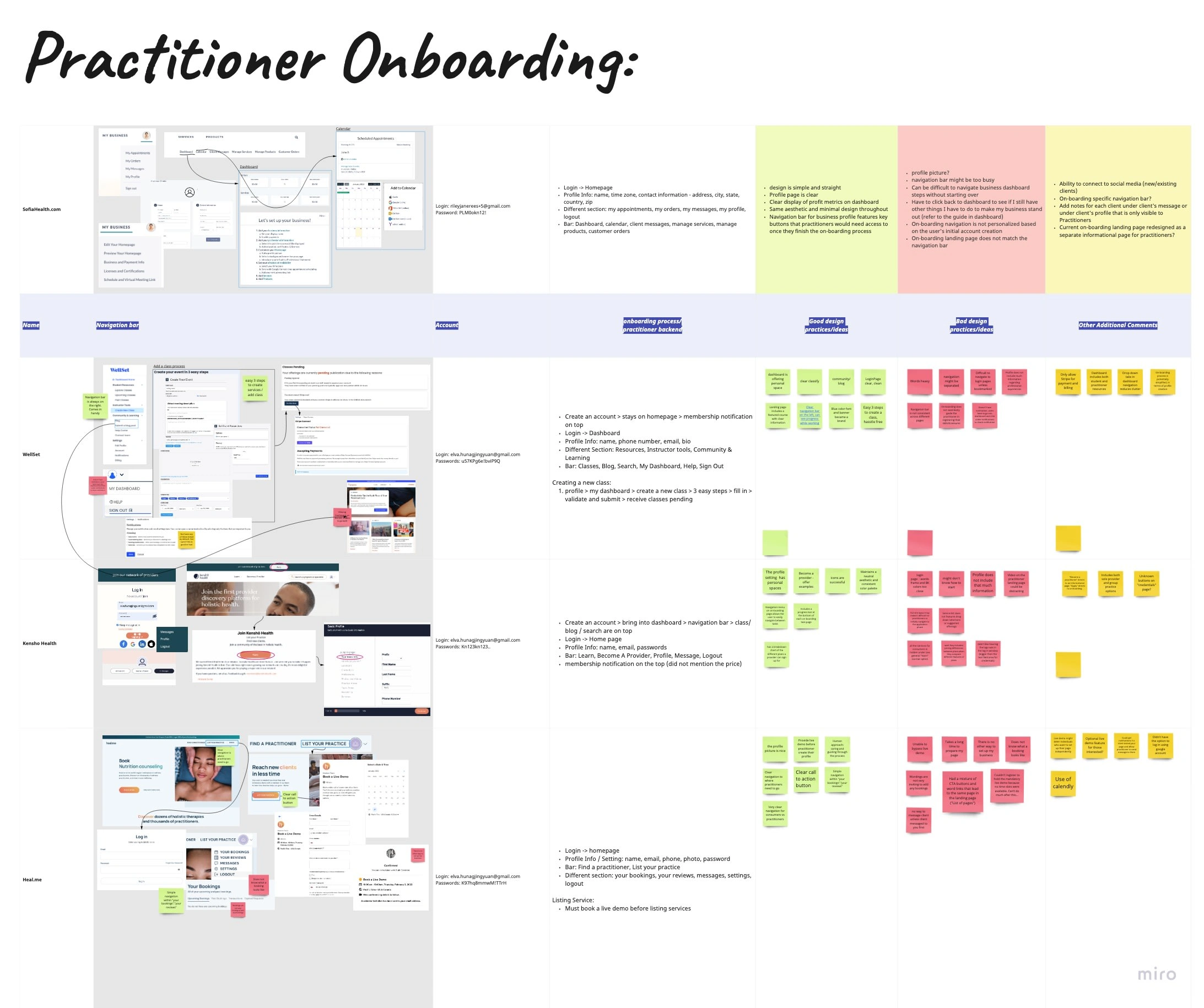
Competitive Analysis done on Miro
Good Design that suits our user's needs:
Progress Bar while working
Provide an Example as the user edits
Navigation menu in onboarding so user can go. back and forth in between tasks
Clear CTA button
🔧 The Onboarding
Interested practitioners will go through the onboarding flow of signing up and creating their own profile, and business profile and listing their service or product. They will be greeted by a dashboard to have an overview and guidance at any time of their business sales.
I participated in all design processes and specialize in creating features that help guide users throughout the process.
User Flow
Login or Sign Up Flow
User Profile
Business Profile
Add a Service or Product
Dashboard
🔑 Key Features
Dashboard
From user interviews and community observation, many users express having a one stop platform can teach them about metrics, allow them to manage their services, and connect with fellow coaches are needed.
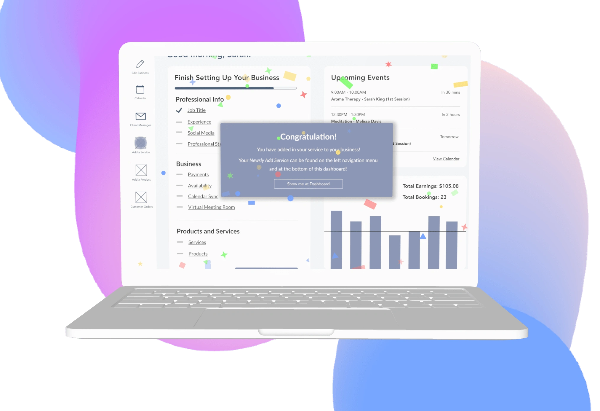
A picture of dashboard on a mac
As a team, we collectively decide to include a dashboard at the end of the onboarding process and as the initial screen after the practitioner has logged back in.
Dashboard includes:
A progress bar and tick mark
The navigational menu on the side
Upcoming events
Quick view on metrics
Lofi Wireframe in Mobile
During this internship, I was able to create a lo-fi wireframe for our mobile version for our practitioner's dashboard. It has the same key features as mention above in the web version.
🩵 Thank you for your interest!
I appreciate how interested you are in the specific details, problem, UX Research, solution, and wireframes but additional details are under NDA. I'd be happy to chat more about my research process and elaborate on the key insights I've learned during this time!
Like this project
Posted May 1, 2023
Designed onboarding for web-based and mobile-based product by performing UX Research and UX Design with Figma, Miro and Google Suite.
Likes
0
Views
99

