✧ Solace : Makes Mars Your Home
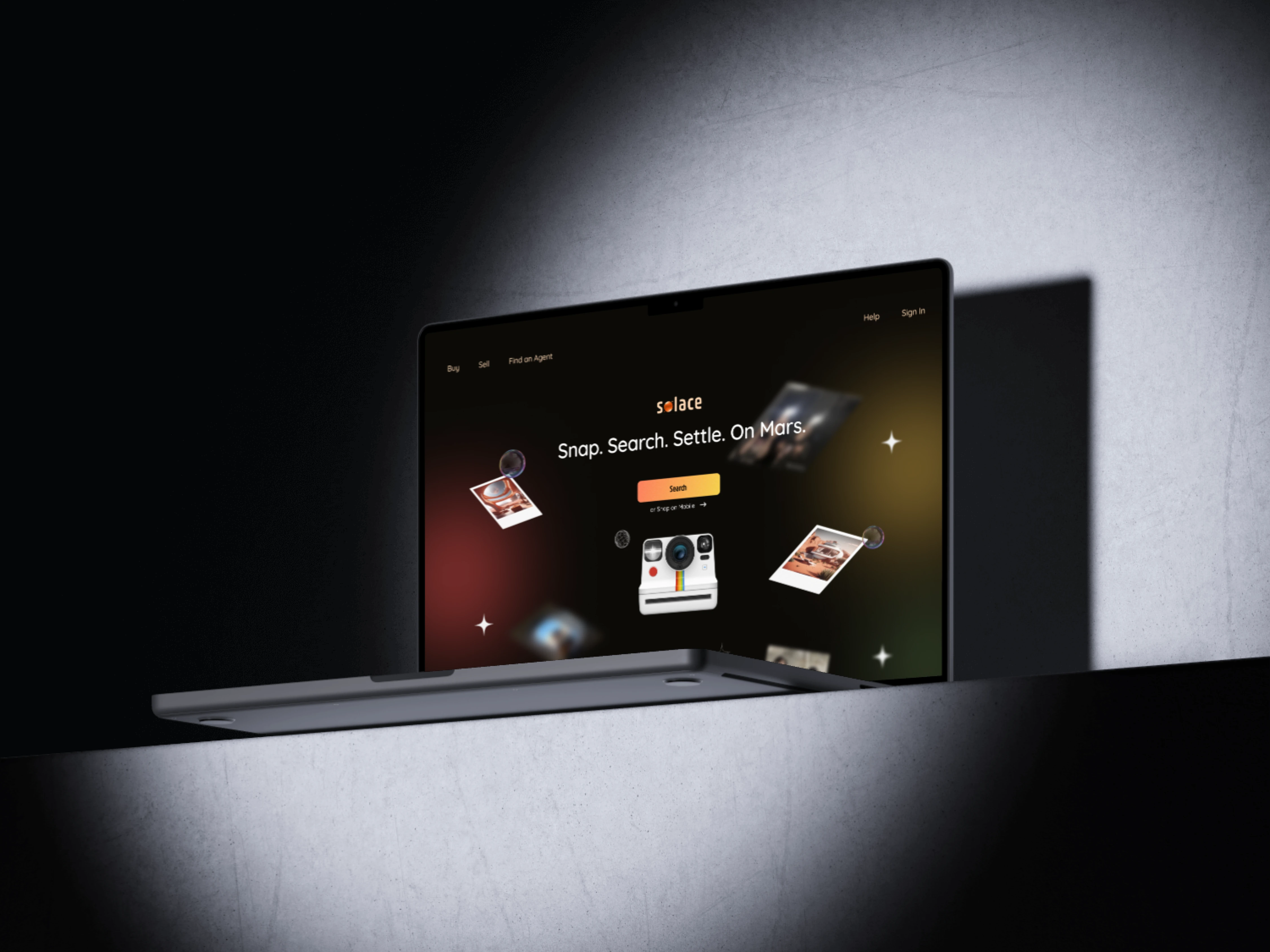
Web - Solace
Solace
A real-estate platform in 2089 that aims to make searching and owning real-estate easier on Mars for professional young women.
Overview
This unique project is done by request as I was interviewing for a travel sector startup in Vancouver as a take-home design challenge. I had a lot of fun while doing this project and would love to share my process and results here :)
Background of the project
Time: Year 2089
Context: Humanity has successfully colonized Mars and is experiencing a real-estate boom.
Goal: To create a concept for new web and mobile application that easily lets people to buy real estate on Mars.
My Role
Sole Product Designer - Product Design, Product Strategy, Interaction Design, Competitive Analysis, High-fidelity wireframe and prototype, Design Assets including prototype components, Presentation Deck
Timeline & Status
5 days, from initial notified of the design challenge to submission.
Proceed to the final round of interviews immediately after submission.
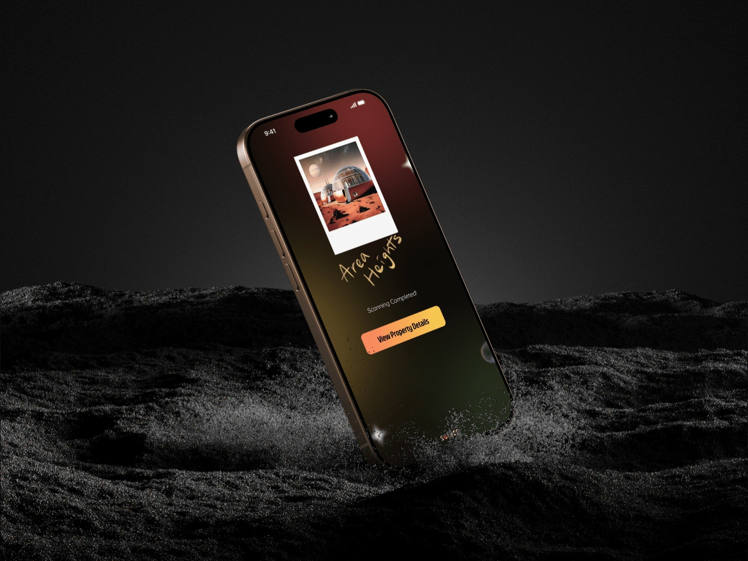
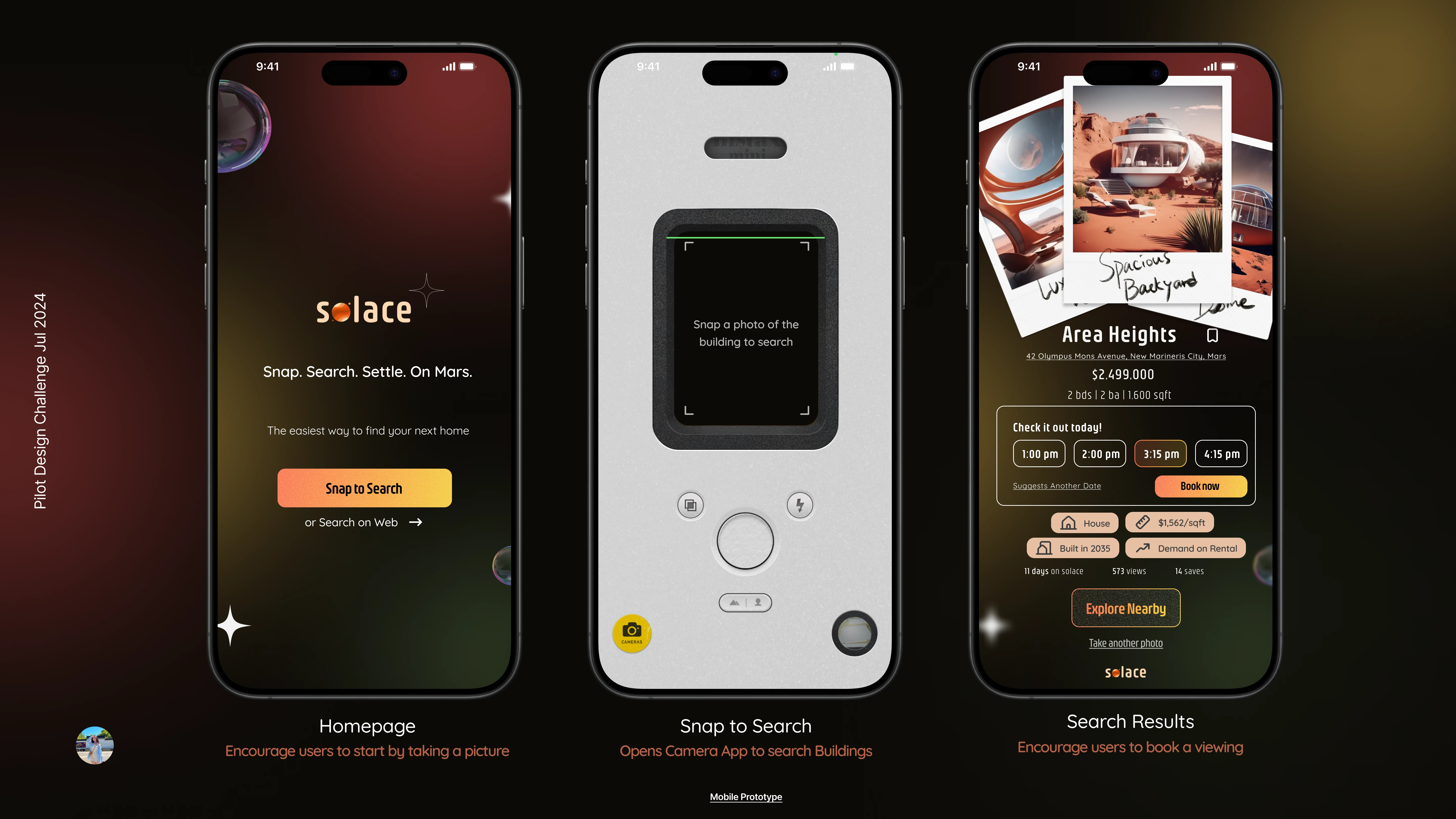
Mobile - Solace Search Results
Due to the nature of this design challenge, my user persona group is given as part of the instructions for the challenge.
Who is affected?
Professional women aged 23 - 36
Travel Enthusiast who loves to travel to different cities.
Enjoying living in the moment
Nostalgic for simpler times that aren't online intensive
Why does this problem arise?
Young professional women are looking for an easier way to search while they are traveling on Mars as infrastructures are built and are in a stable economy. However, most RE/MARS platforms or apps are tedious and do not offer web and mobile access without much research being done.
Final Experience
Designed a one-stop web and mobile app that aims to make searching for real estate in a new city easy and intuitive emphasizing flexibility and mobility while traveling.
Simple easy steps as Snap > Search > Book a Viewing for the entire flow is this project goal.
✧ Highlights ✧
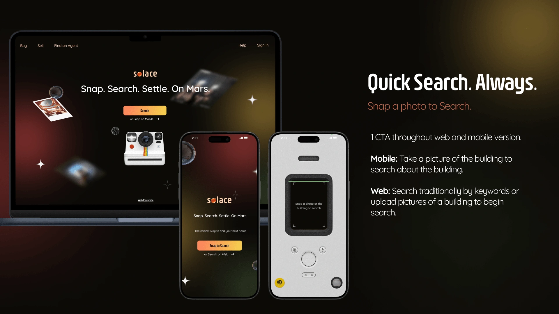
The main goal of this project: Quick Search, Quick Results, Quick Start of Owning
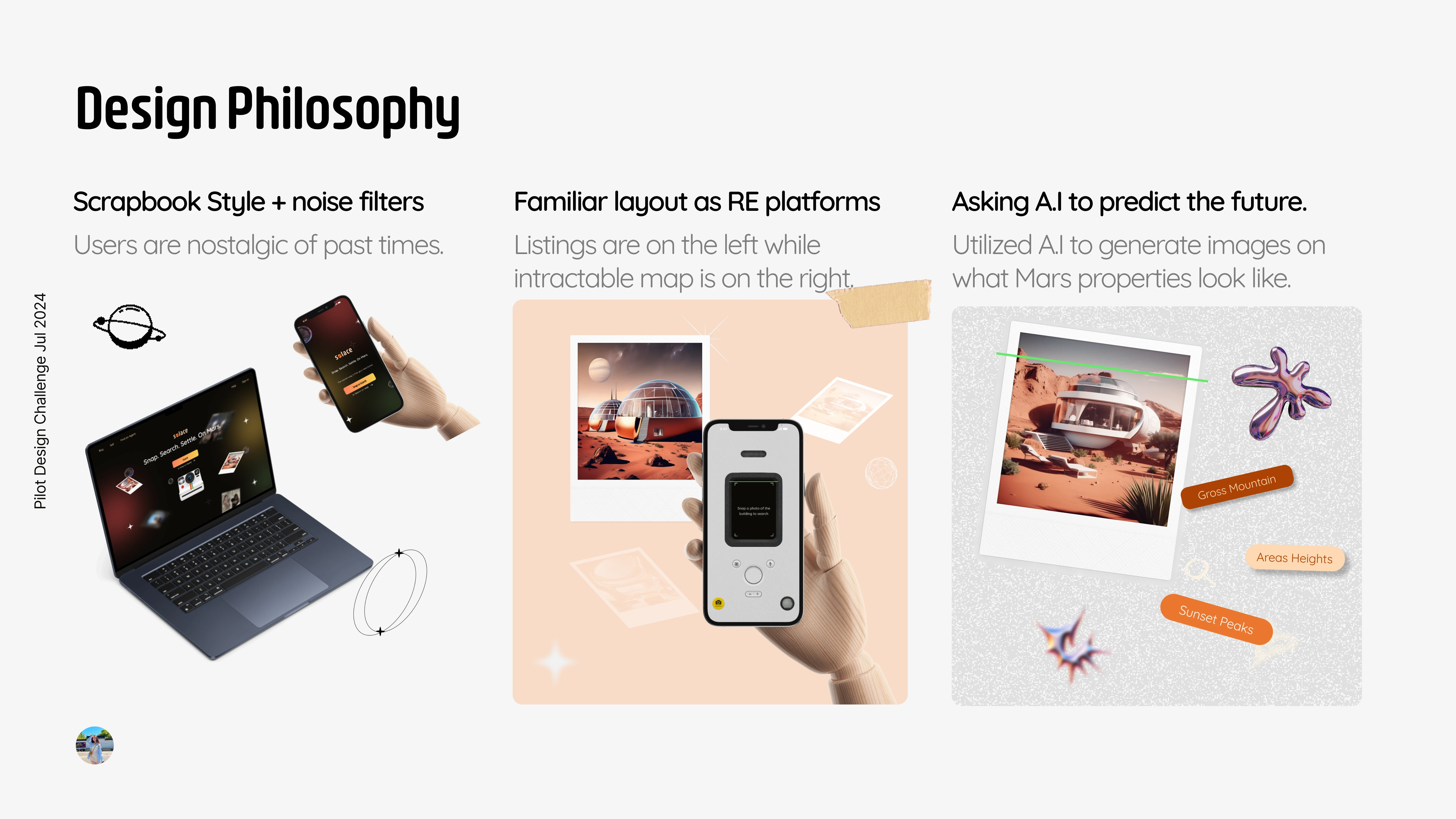
Design Philosophy of this project
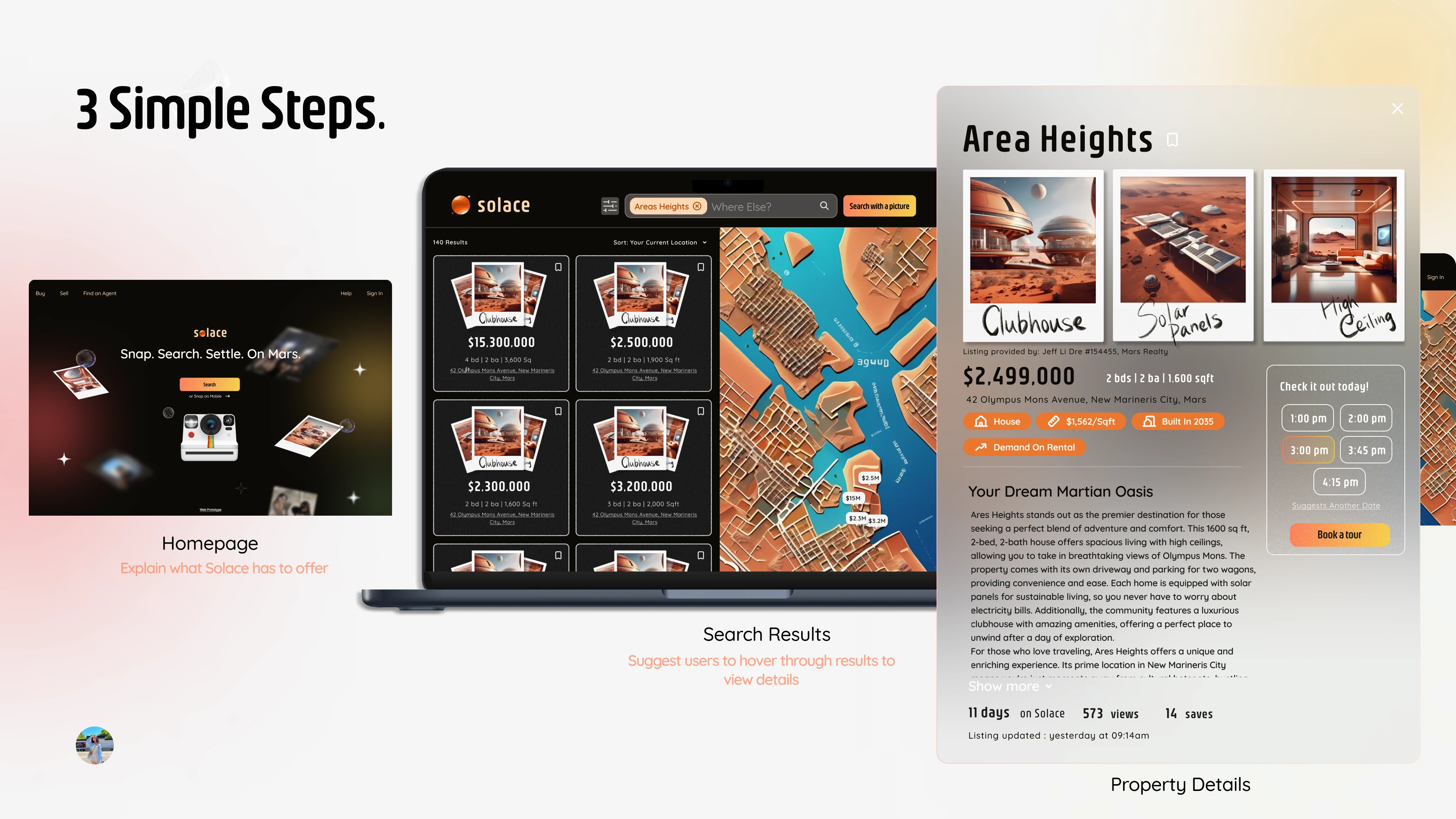
Website Flow: 3 Simple Steps
Exploration Stage
Finding the right vibe
Since users needs and user persona group are given, I wanted to dive into vibes and brand explorations as it was mentioned that our user persona group are:
Nostalgic
In love with the offline experience when things are simplier --> minimize steps and intuitive designs.
Love love Scrapbook styles and Polaroids
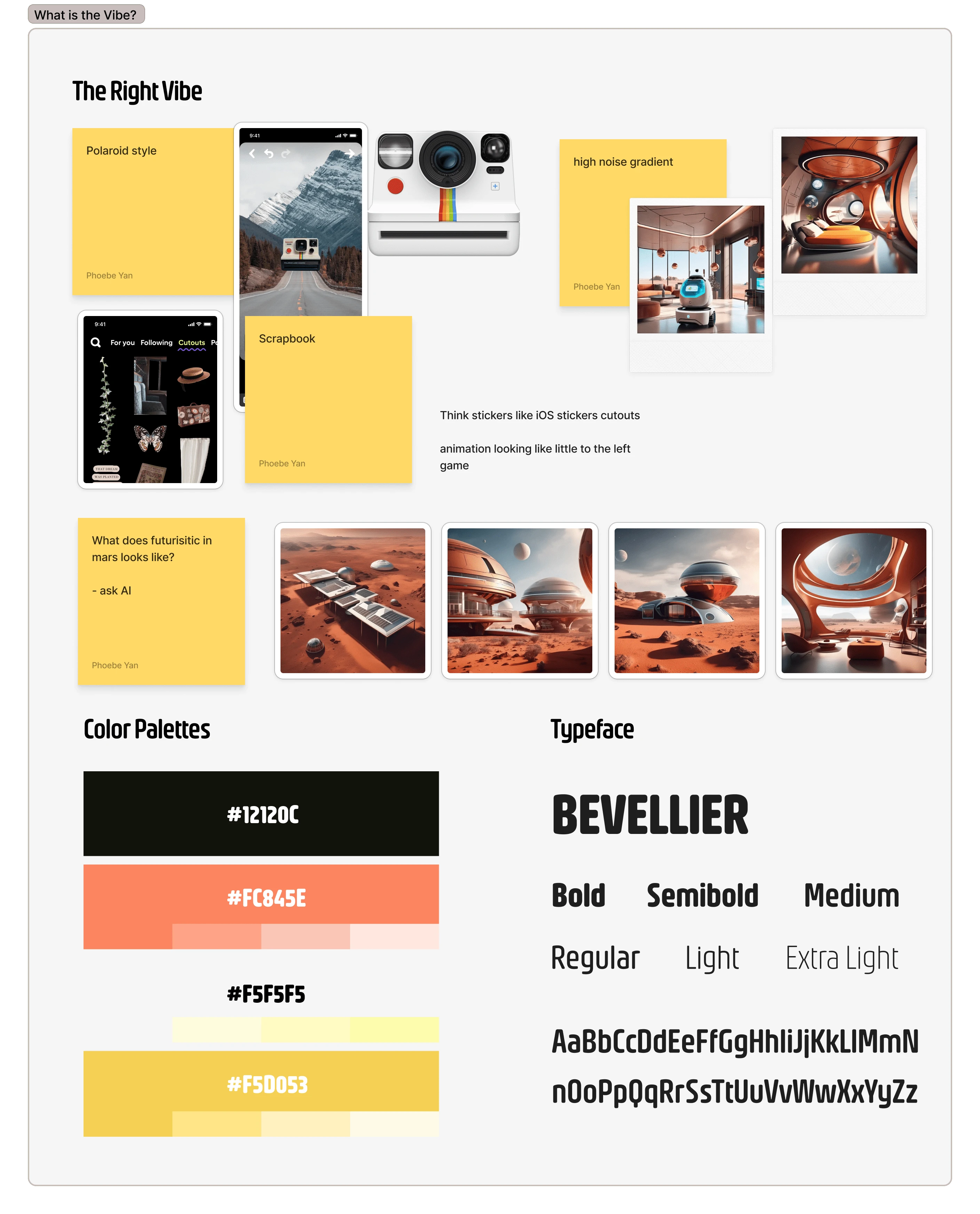
Vibe Research --> Color Palette + Typeface
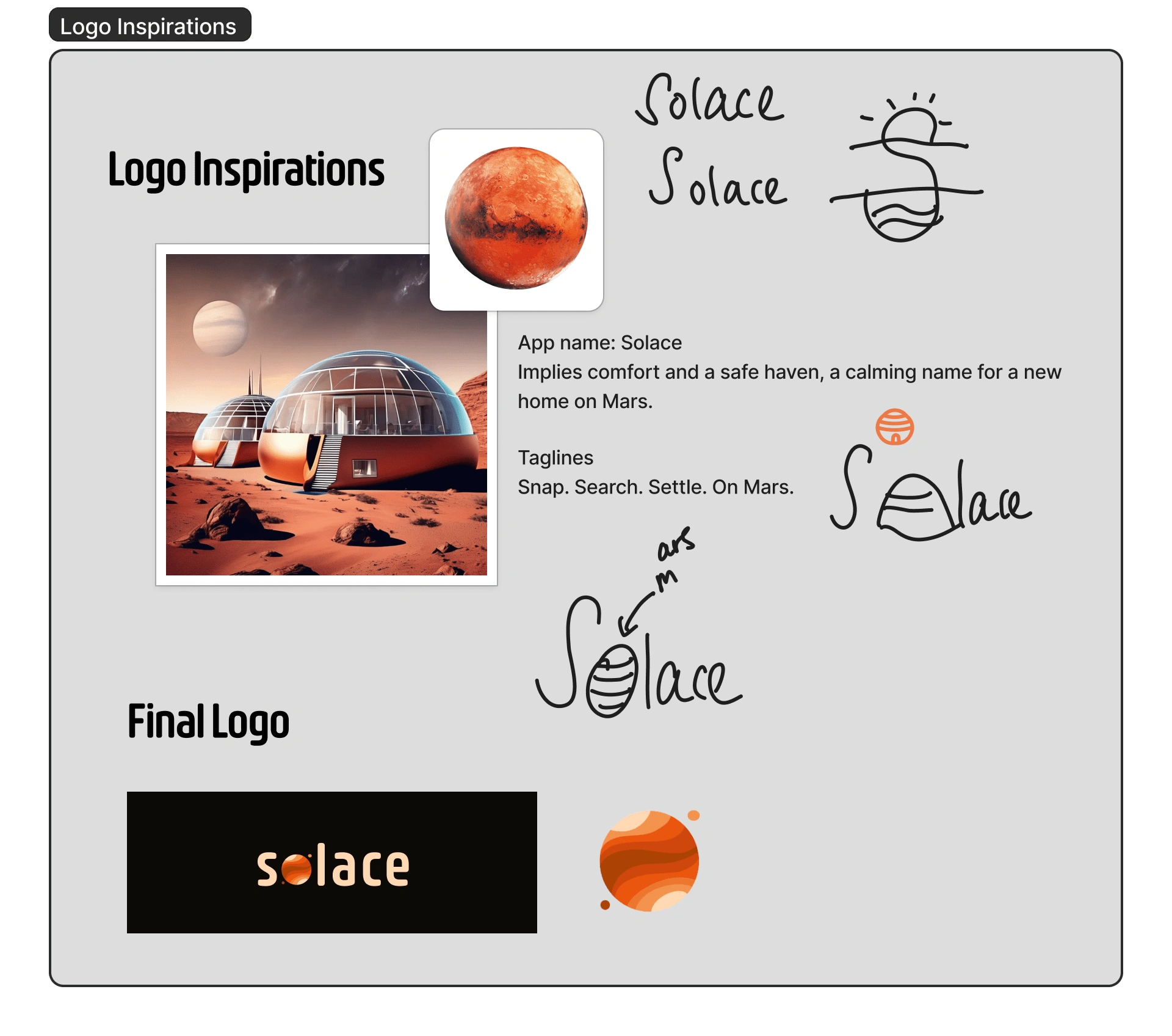
Logo Inspirations --> Final logo
What are other RE platforms doing that is a must have?
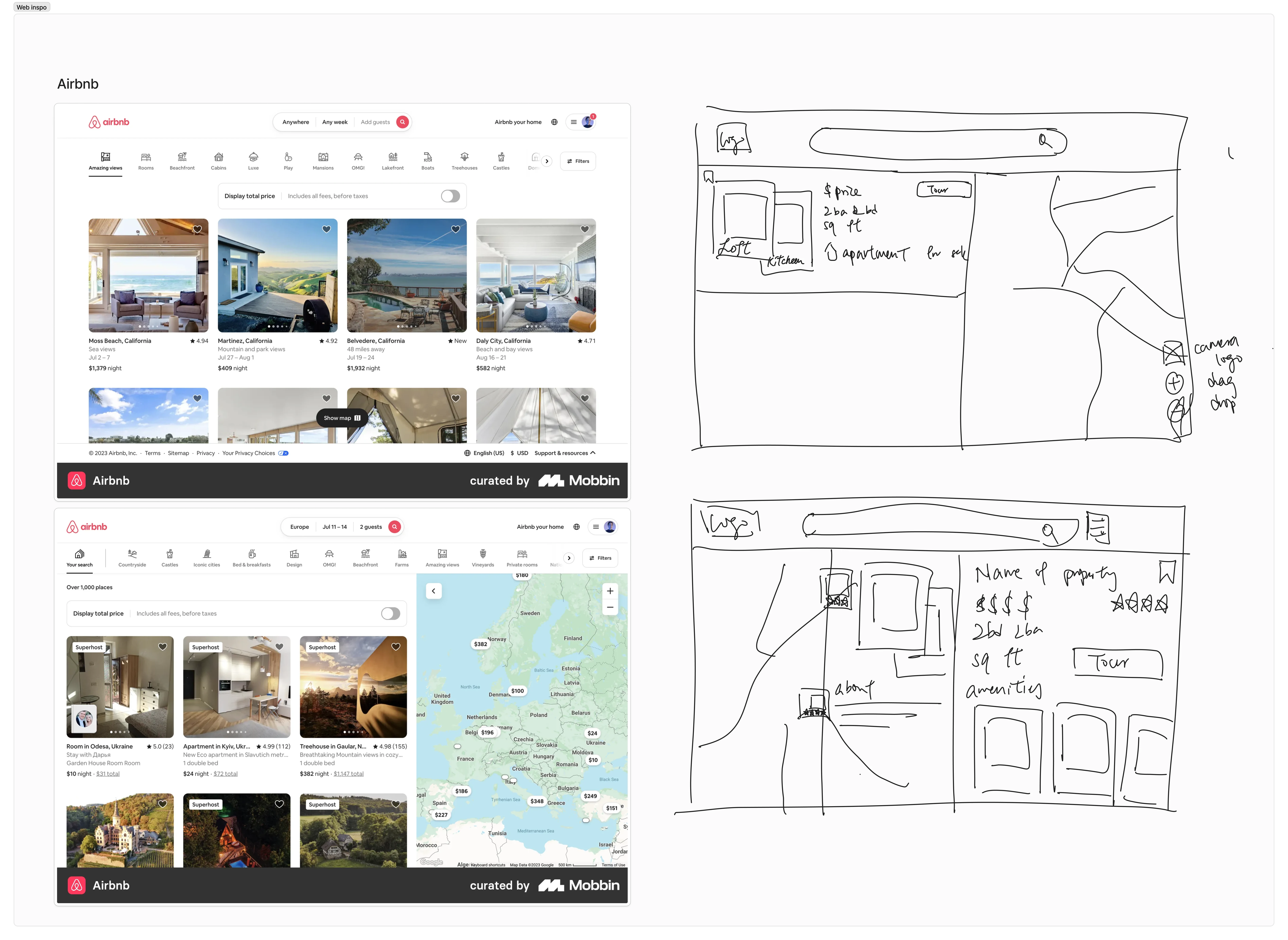
Competitive Analysis + Sketches
Due to the time constraints, I focus only in the necessities of what a Real-estate search results and property details should include that are essential informations to users:
Pictures as a preview of the property
Name of property
Price
Specs : number of bedrooms, bathrooms and total sq ft
Address or view in map option
Save or like feature for organization
Problem Statement
How might we simplify the process of searching, and owning real estate while users are traveling in a new city without disrupting their flow of traveling?
Design Process
WIth the vibes, typeface, colors schemes nailed down. It is only fair to drop down some assumptions for this project due to its unique context setting place in the future on another planet.
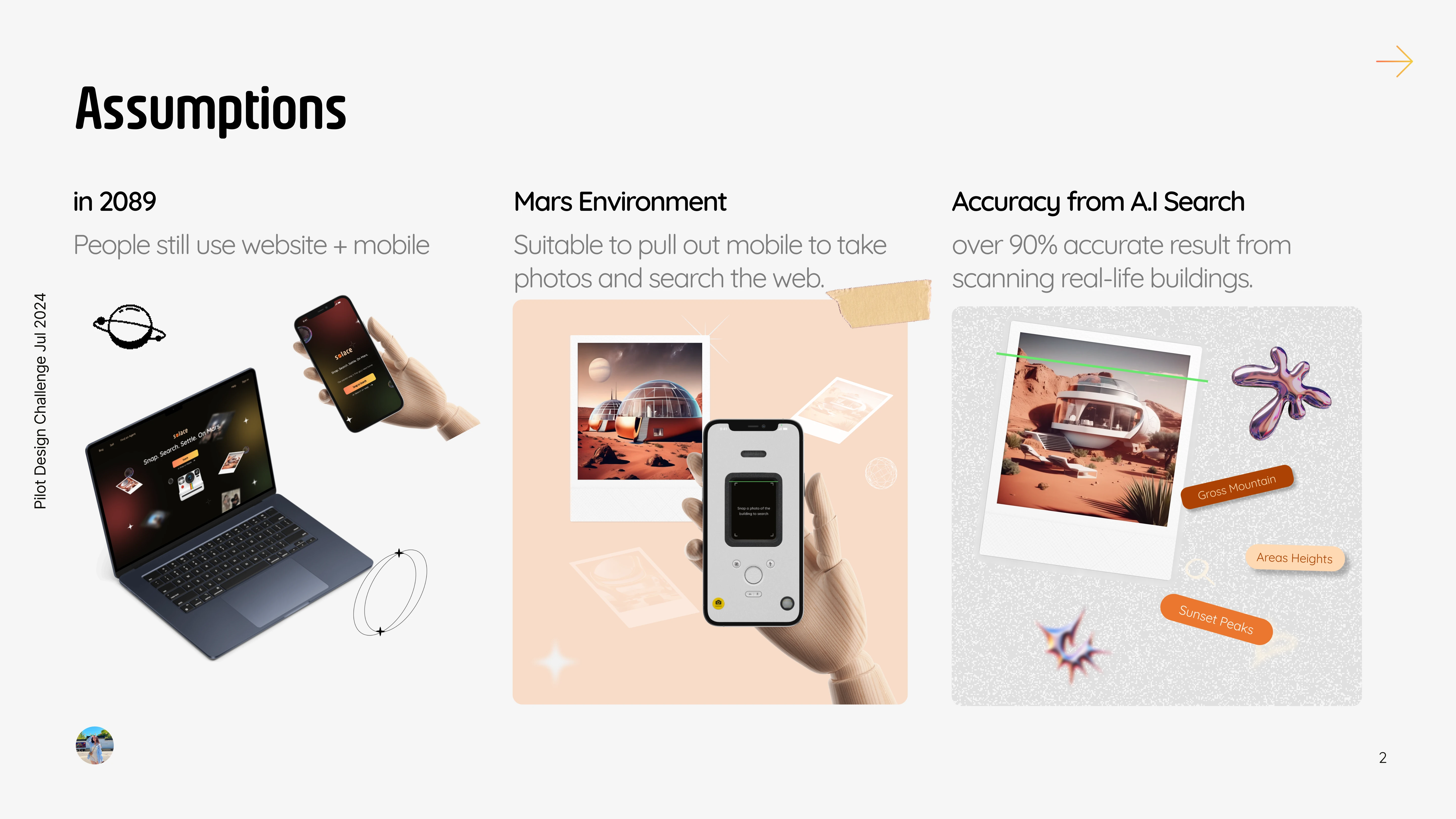
Assumptions for this project
How do we stand out?
Assuming not only us realize the real estate booming on Mars, we need something special to attract users to prioritize us over other platforms.
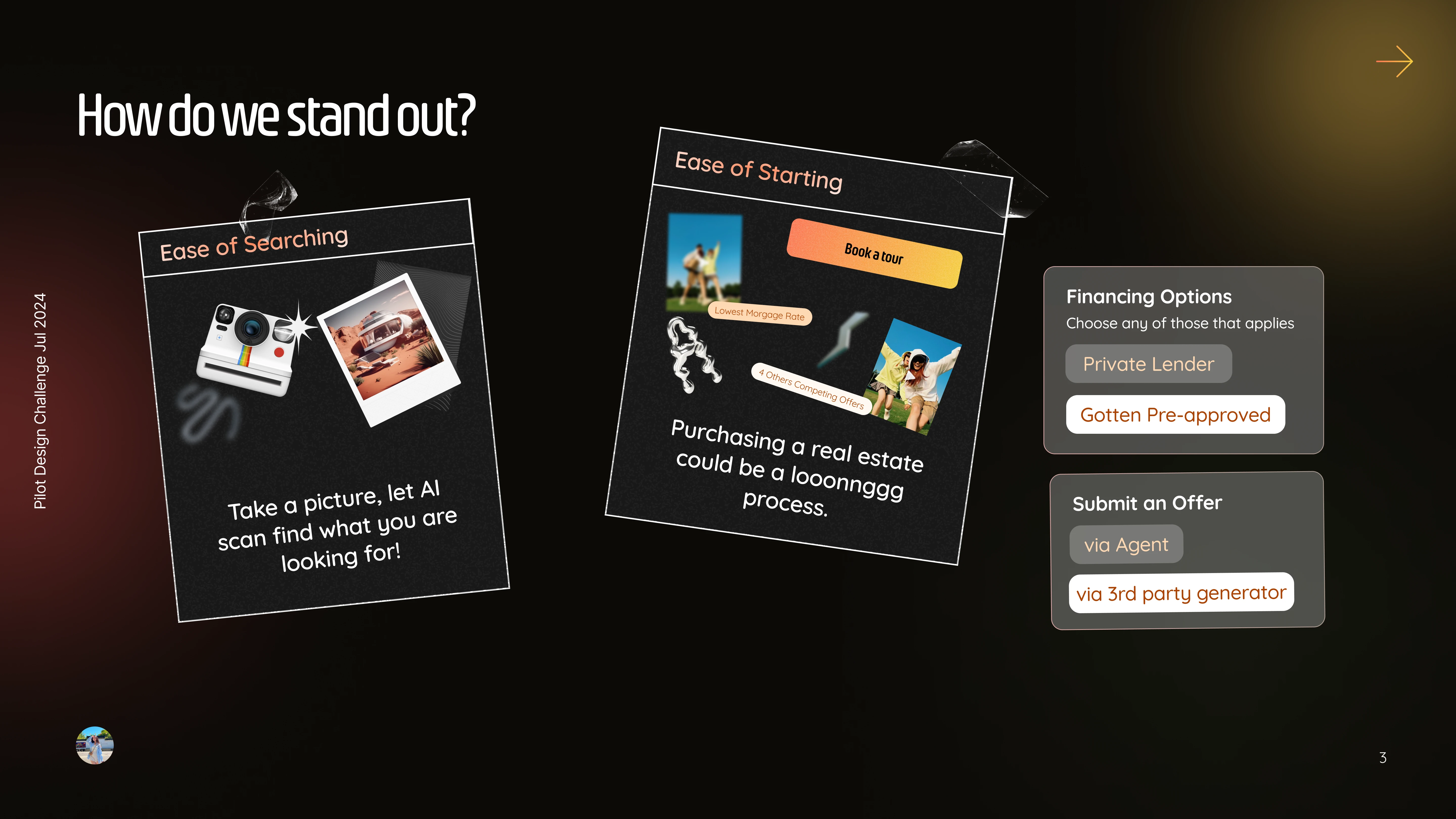
Unique Value Proposition
Product Strategy
For both mobile and web, Solace should be accessible, intuitive, and non-disruptive to our users busy yet fulfilling traveling schedule.
An Ease of Searching
Professional young women are exploring the city and enjoying their time absorbing new cultures, we offer an easy snap search of any buildings they see and pull up information about that real-estate real-time. Then and There.
An Ease of Starting
Owning a real-estate could be daunting and a long process, Solace offers the first step in booking a tour to see it and love it. We will worry about the rest.
Eventually, An Ease of Owning
As we continue to advance and make it easier for our users to own real-estate, the next step will be allowing users to put in an offer and collaborate with local banks or credit unions to make Solace a ONE-STOP platfrom from the Search to Owning real estate on Mars easiest and reliable platform.
User Flows
As Solace aims to provide an ease of searching and an ease of starting, there are different goals in diesigning for web and mobile.

Website User Flow
Web
Easy glimpse on what real-estate is out there and with only essential information needed to prompt users to booking a viewing.
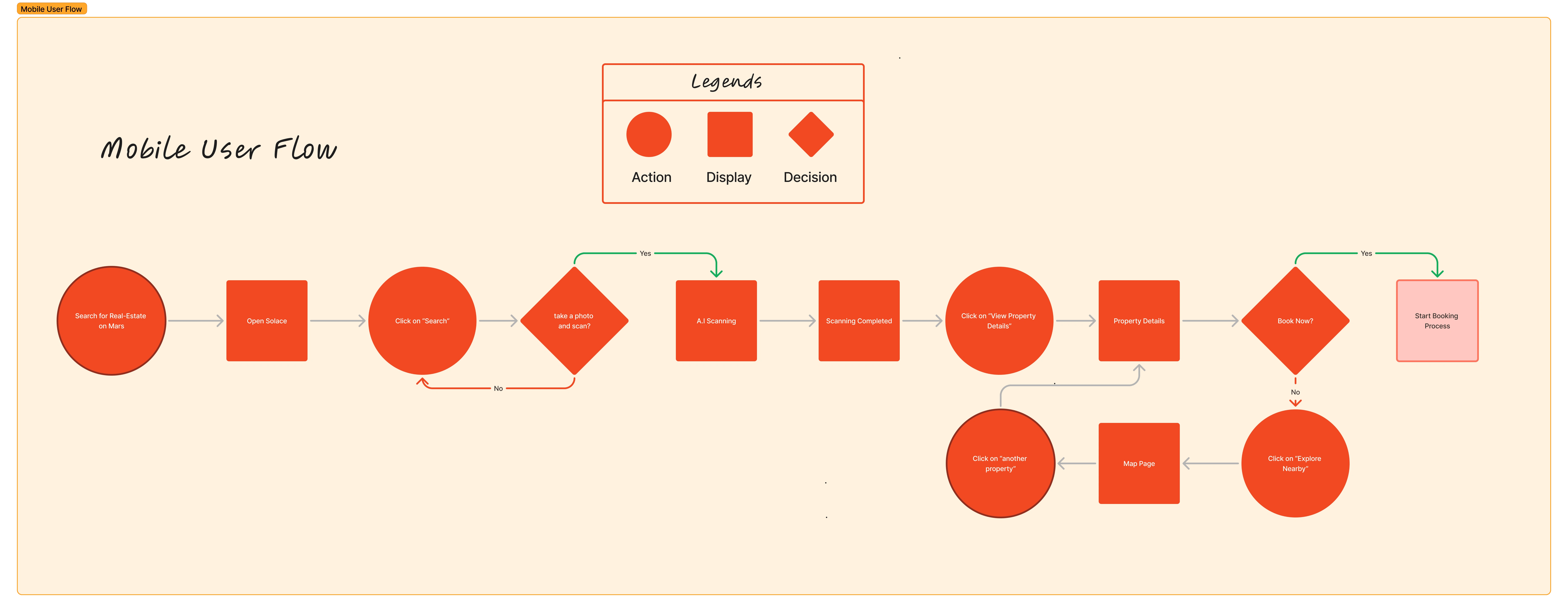
Mobile User Flow
Mobile
Quick snap photo of an interested real-estate and have our A.I search through and pull up the information and prompt users to booking a viewing.
Final Design
Website Design - Searching and Booking a Tour Flow
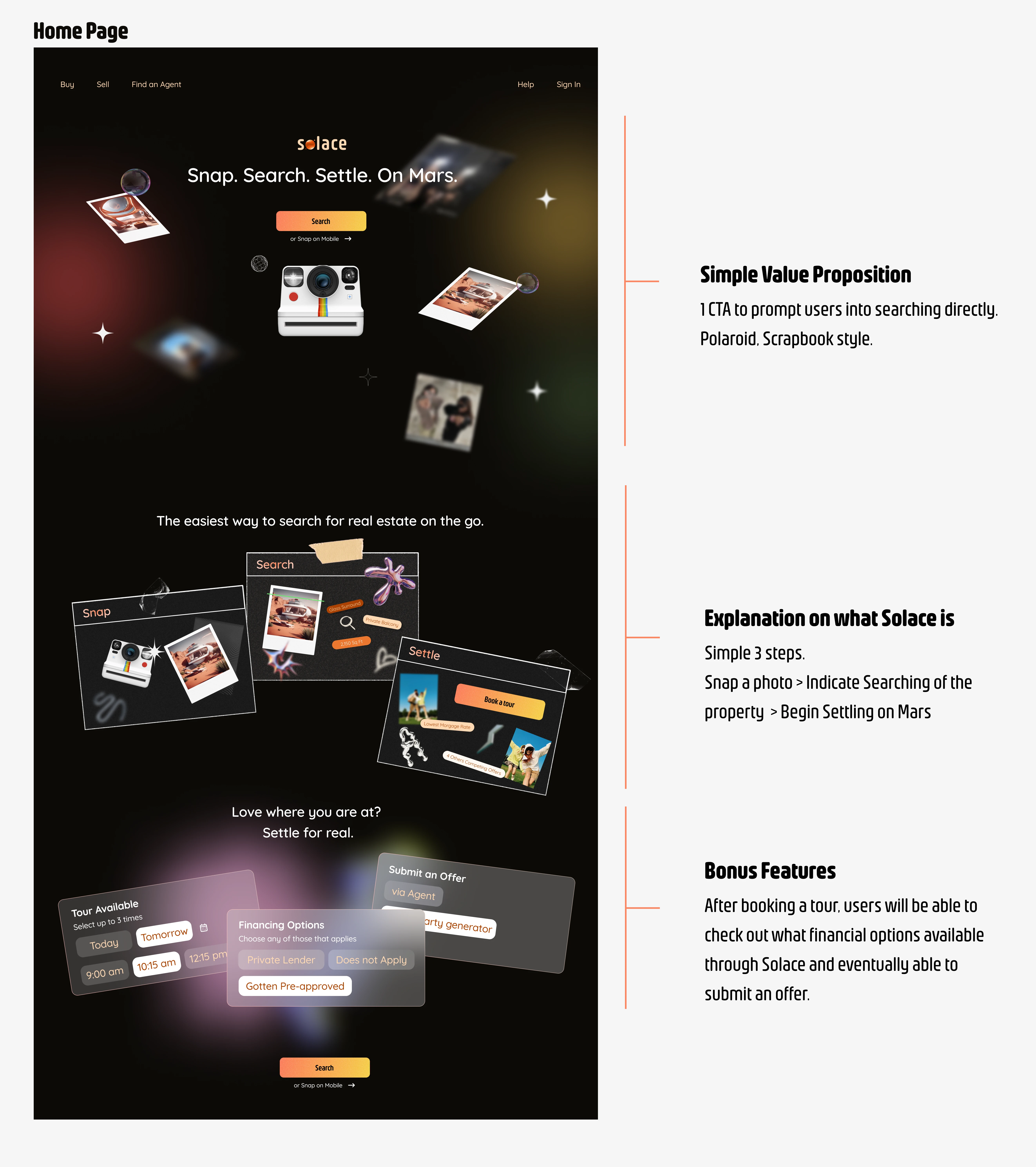
Home Page Full Design
Mobile Design - Searching and Booking a Tour Flow
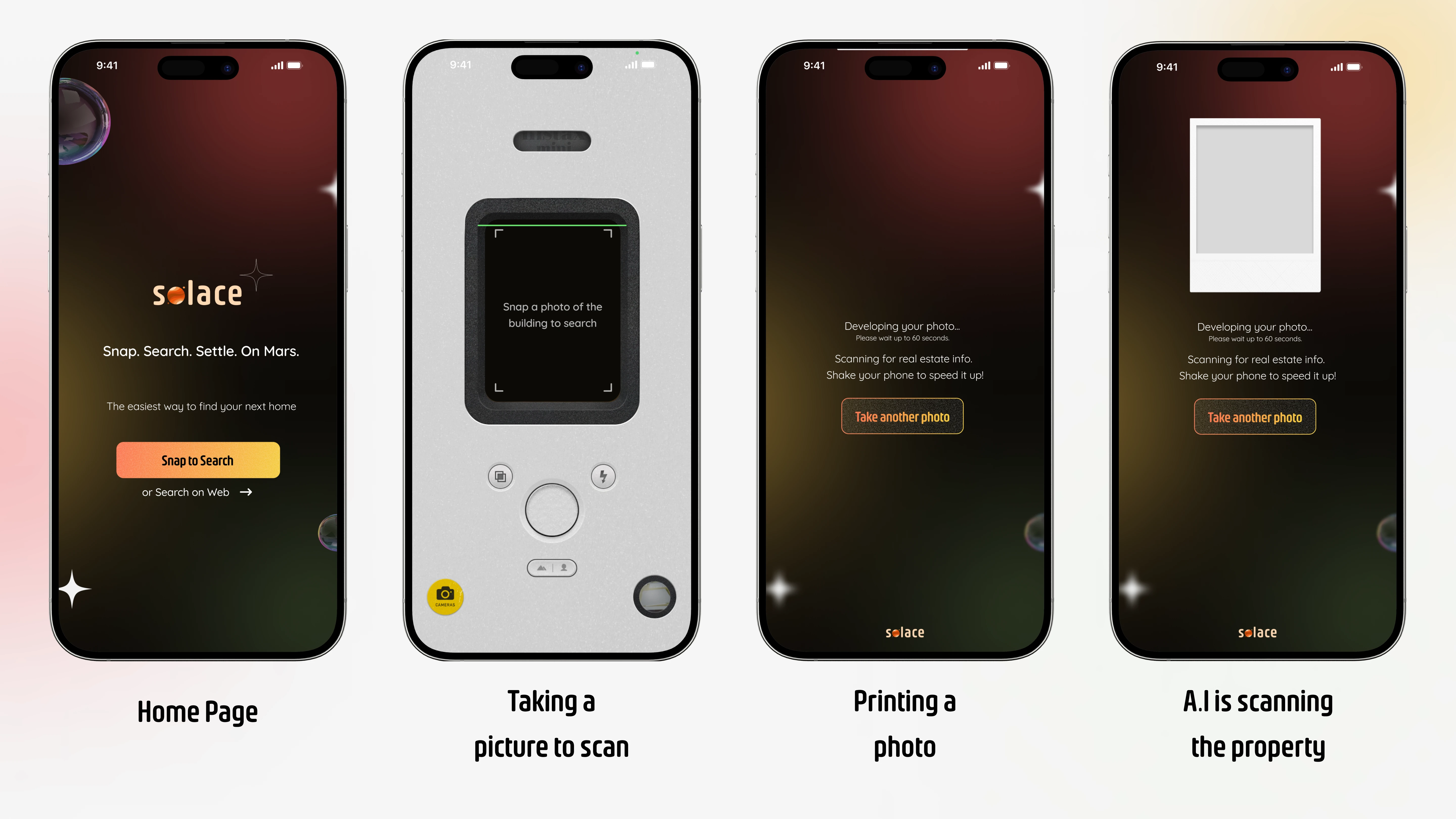
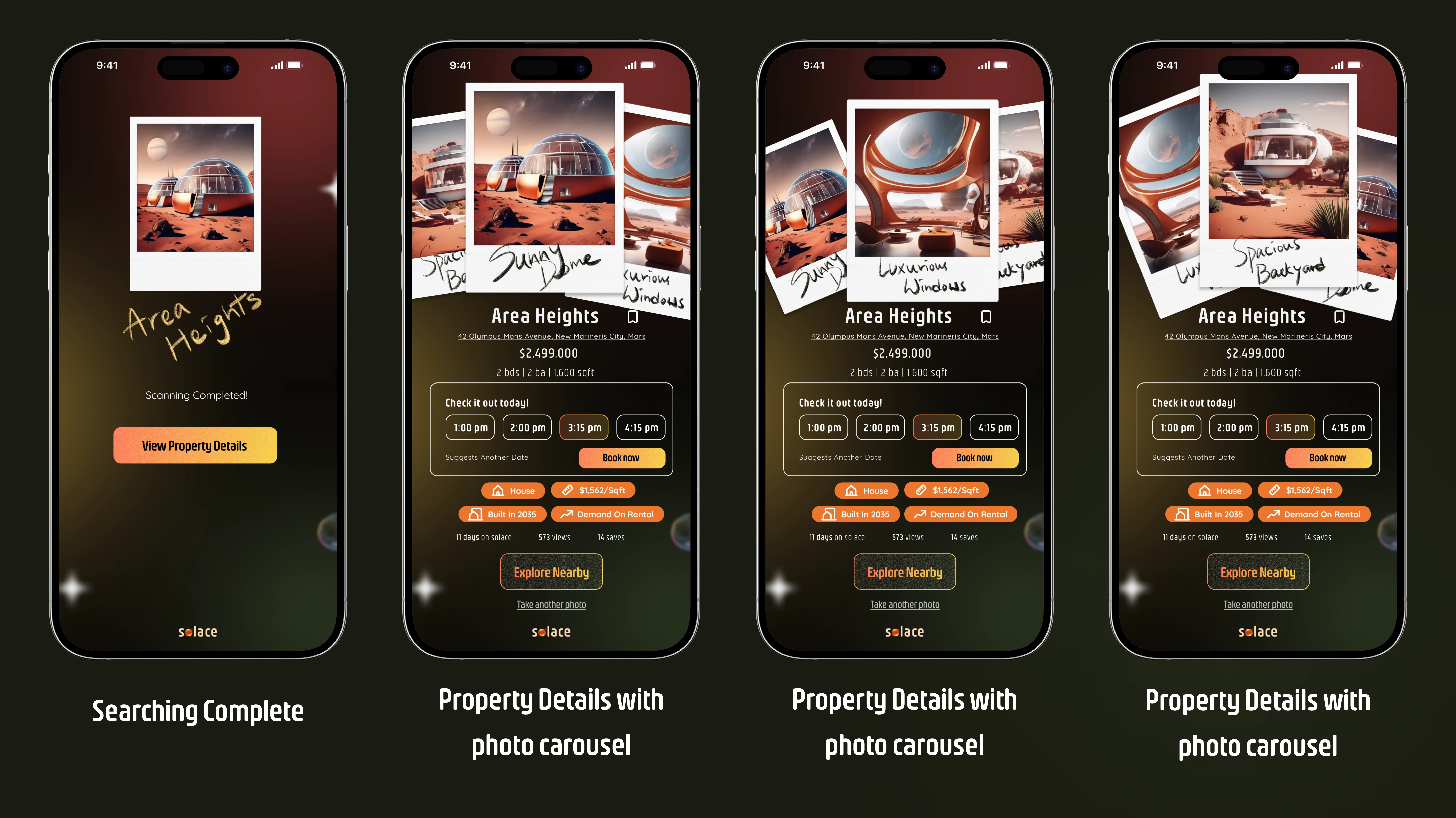
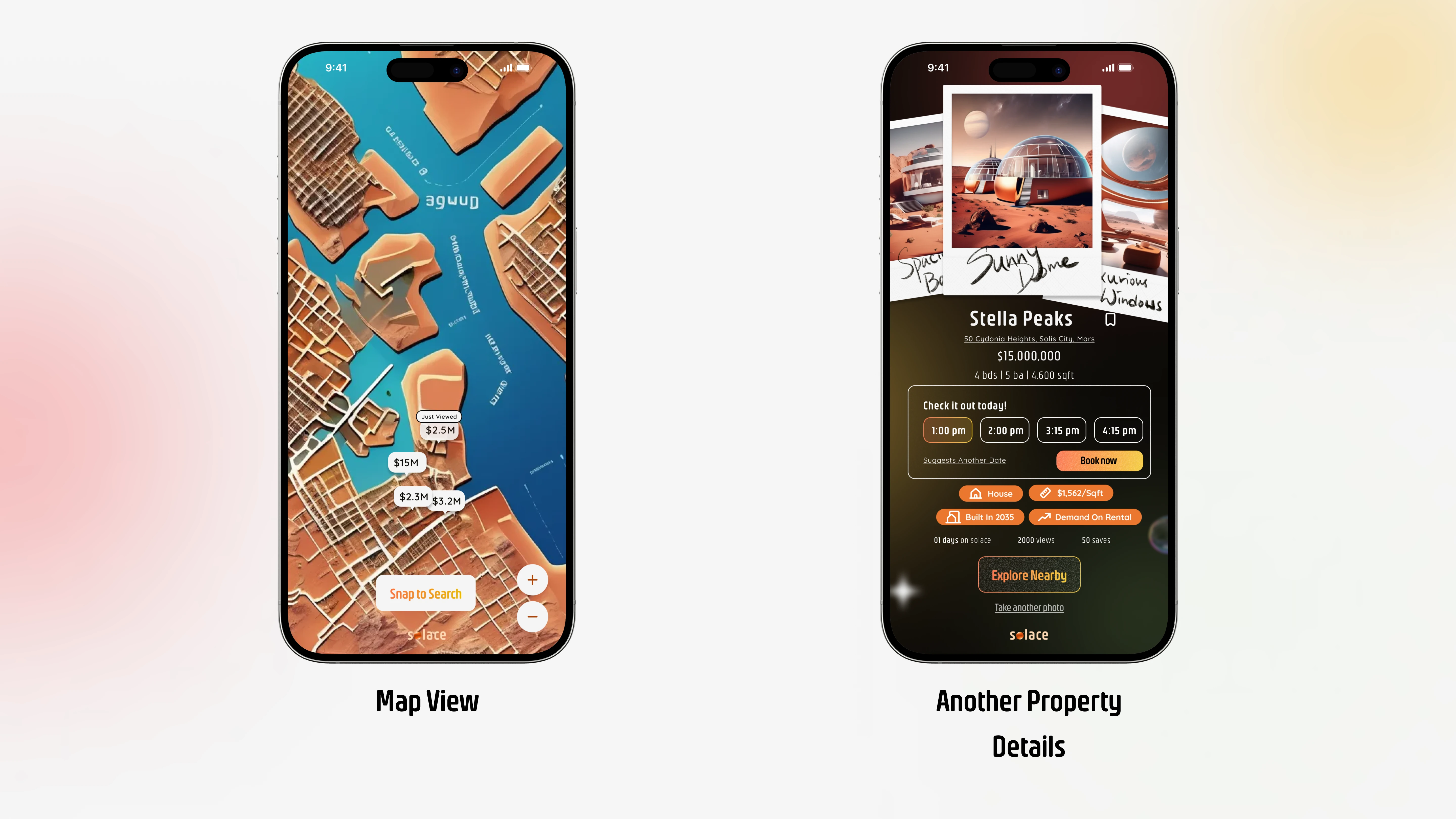
Mobile Prototype Walkthrough
Design Assets
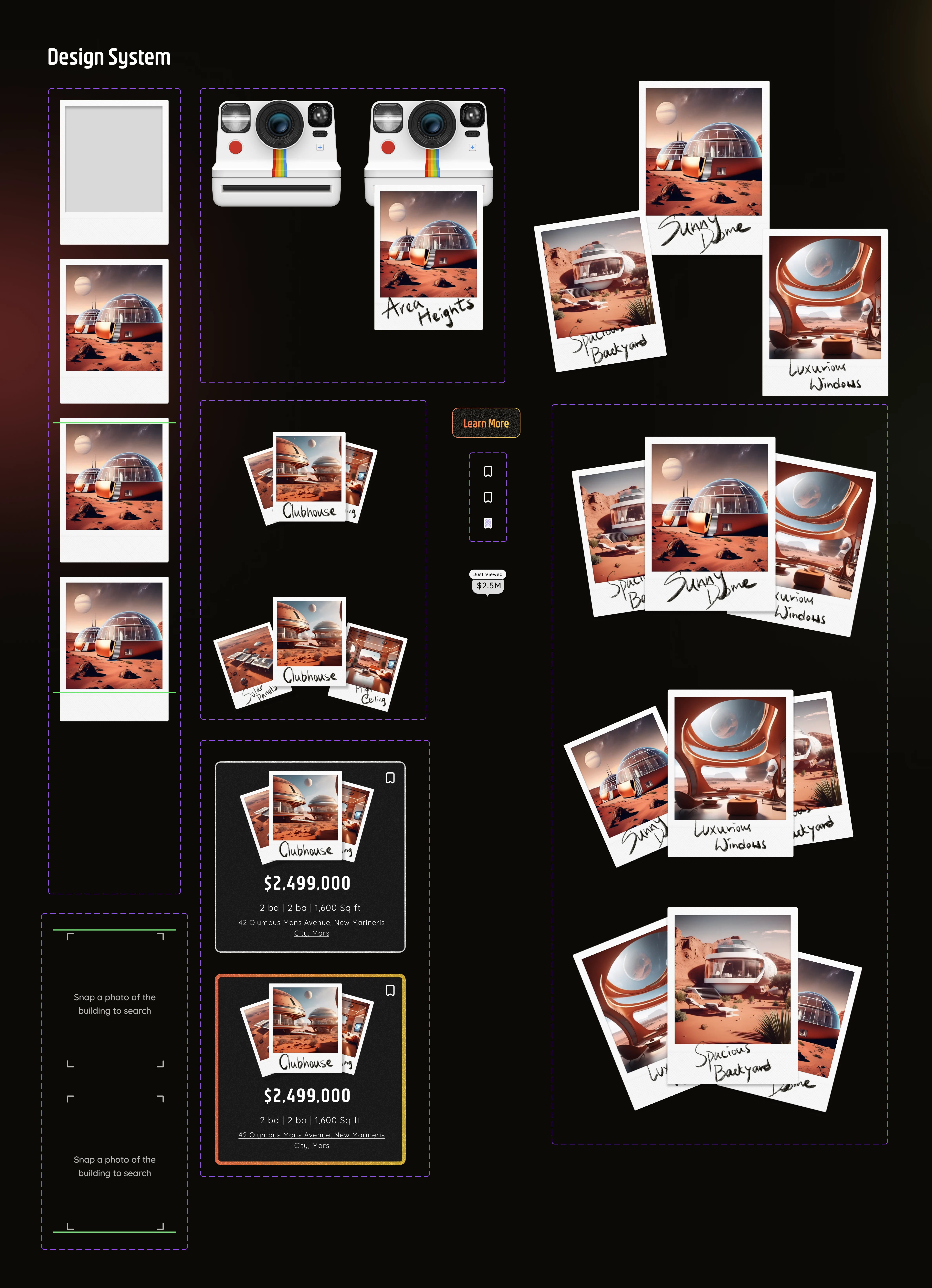
Design Components for Interaction Design Prototypes
Takeaway
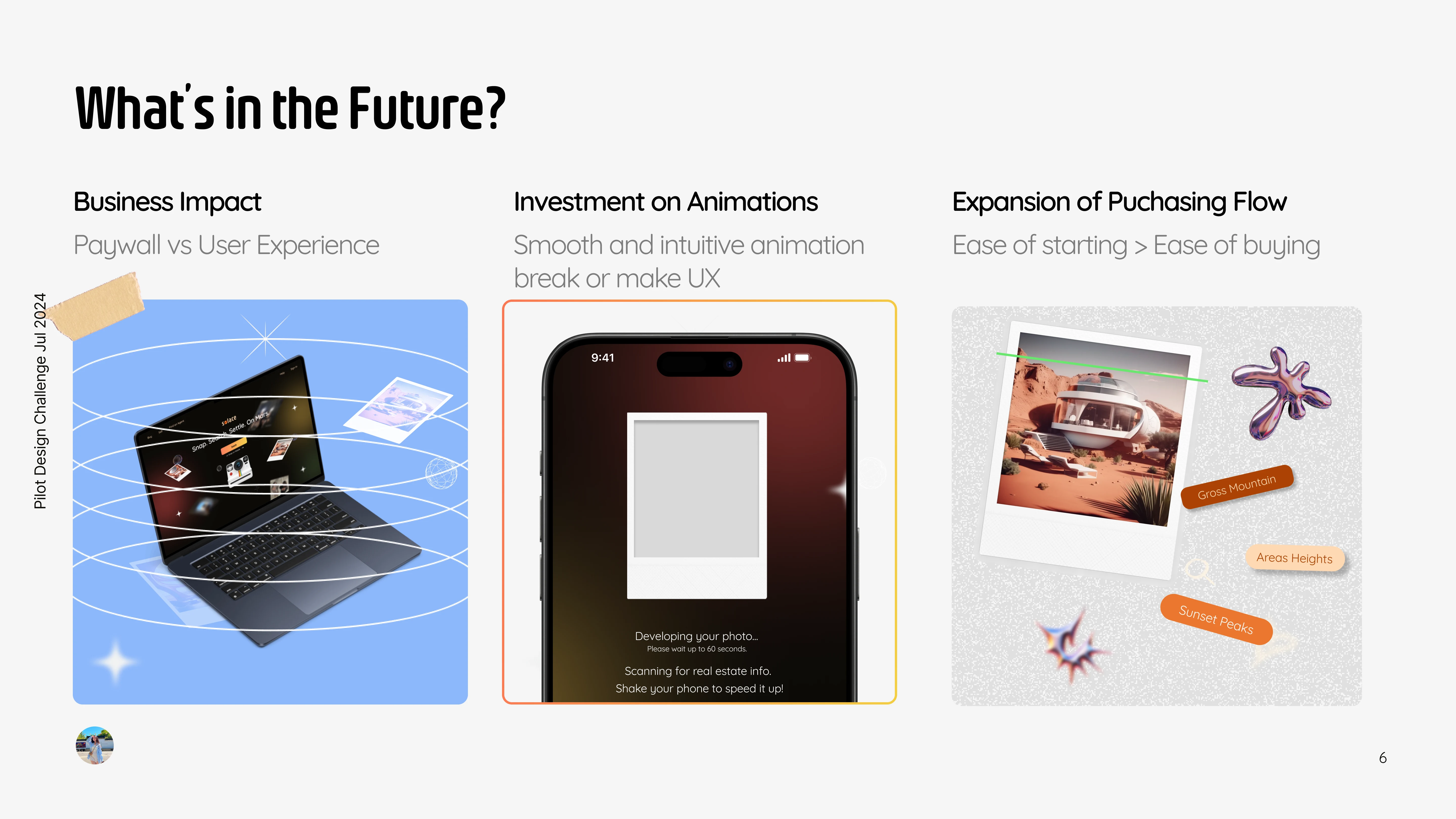
Business Impact
How do we balance the impact of our business if users are to scan or visit an area that is not in our database?
As this product continues to build our users will visit places where we don’t have partners with. We will need to strike a balance on our expansion of partnership without jeopardizing our users experience in searching and booking
We CAN:
rely on third party platforms that have most of these informations e.g Google Search.
Expansion of Purchase Flow
Ease of Starting is the focus for this project but as this product grows, we should focus on Ease of buying.
From searching, booking, negotiating, to signing the lease or buying agreement all through us in a guided manner.
Investment on Animations / Interaction Design
I think micro animations and interaction design makes or breaks any product and will be the bedrock of the future digital designs as younger generations are used to it since young playing in games.
In this project, I added a few interaction designs like the scanning animation to signal to users their actions of taking a picture is resulting to our A.I scanning. These kind of design is much more informational than writing out in text and fewer cognitive loads for users.
A challenge, and an unique one with creative emphasis.
This is a very unique project that allows me to really dive in the possibilities in our future years in 2089. <3
I hope you enjoy what you see as I pull out my heart and soul to this short project for an interview <3
Snippet of a walkthrough demo:
Like this project
Posted Sep 24, 2024
Solace is a RE platform on Mars that iset place in the future, year 2089. In this project, I dive into the product strategy, UX Design for both mobile and web.
Likes
3
Views
106
