Gen-Zifying Nando's
The Brief:
Create a social spec ad for Nando’s directed towards Gen-Z while still adhering to Nando's signature tone of voice.
Insight:
Nandos is an established company that knows what it's doing, as evidenced by its longevity and countless branches. People trust Nando’s decisions. So if Nando’s does something that initially looks weird, people will continue to support them. This references the slang “Let him cook” which means to let someone continue what may look/sound weird and unpopular as they’re onto something. Nando’s is also known for having a warm and friendly appearance, whilst maintaining a refined look. It links to the slang term “serve looks” which means looking good.
Execution/Strategy:
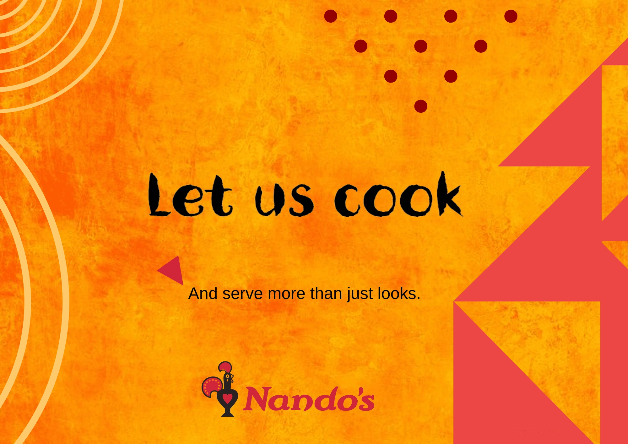
I created a poster that captured the likeness of Nando's poster adverts. Nando’s keeps its origins prevalent through its use of South African print on every advert and its iconic font. I made sure to adopt Nando’s cheeky and witty tone.
Proposition:
Let us cook. And serve more than just looks.
The Result:

A Nando's spec ad with the words: Let us cook, and serve more than just looks.
Like this project
Posted Mar 29, 2024
I crafted a Gen-Z-focused spec ad for Nando's.
Likes
0
Views
12


