EdTech Mobile App — UX/UI Design for an LMS Product

Mark Barliet


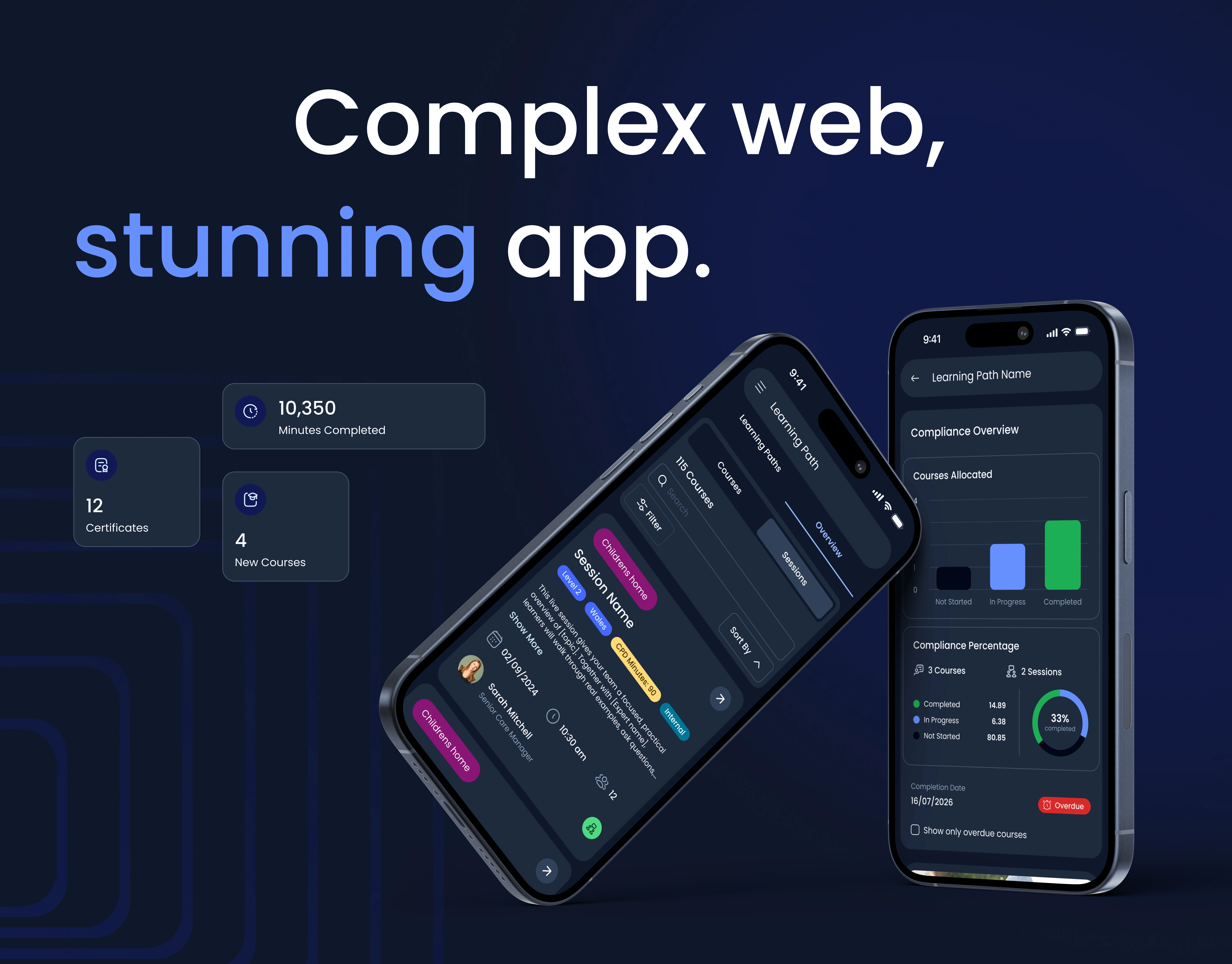
Every great web platform deserves an equally great mobile experience. This case shows exactly how we make that happen.
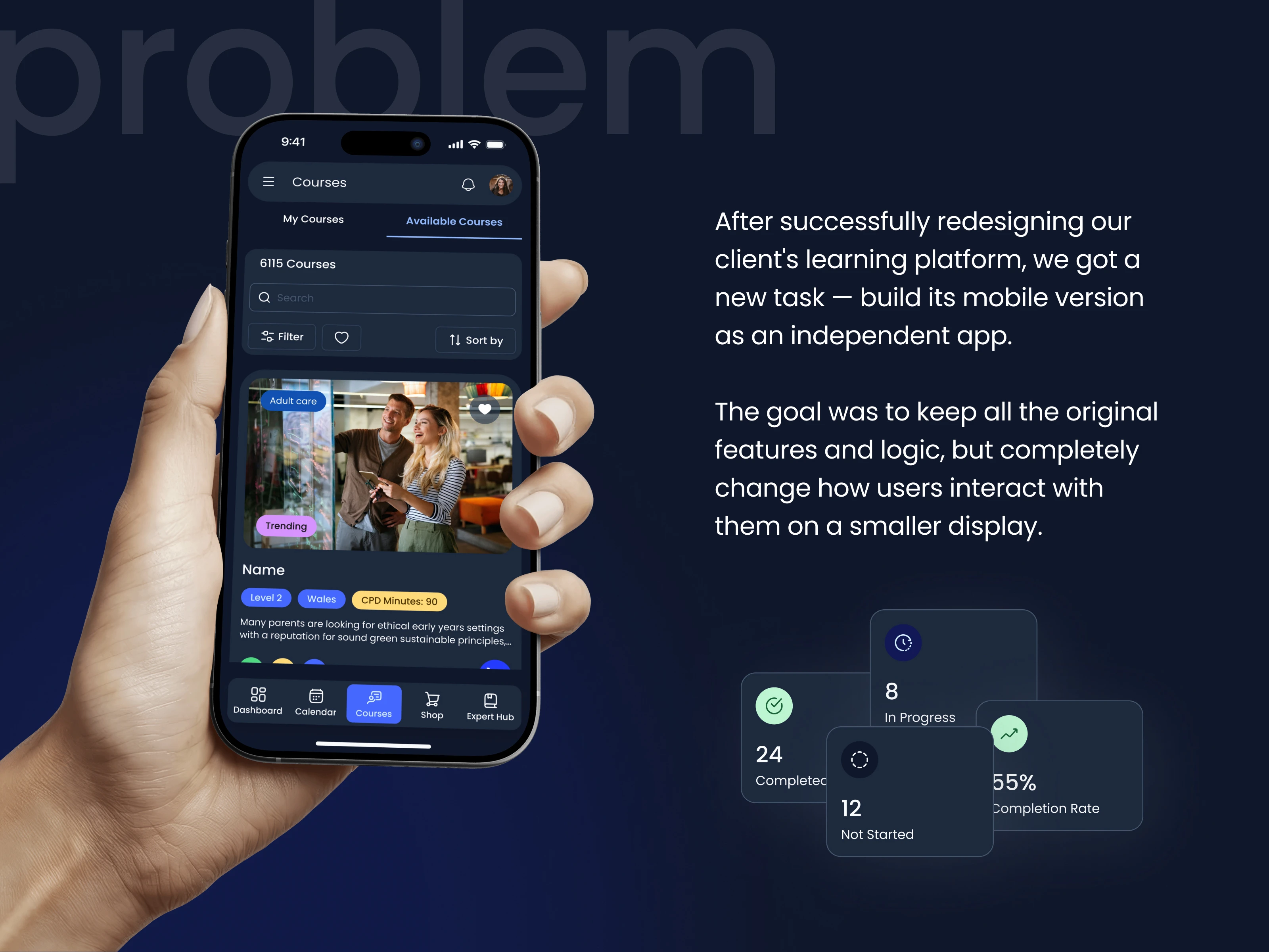
Taking on a project like this requires more than design skills. It takes a deep understanding of how people use products on the go. Full context from the web redesign gave us a big head start.
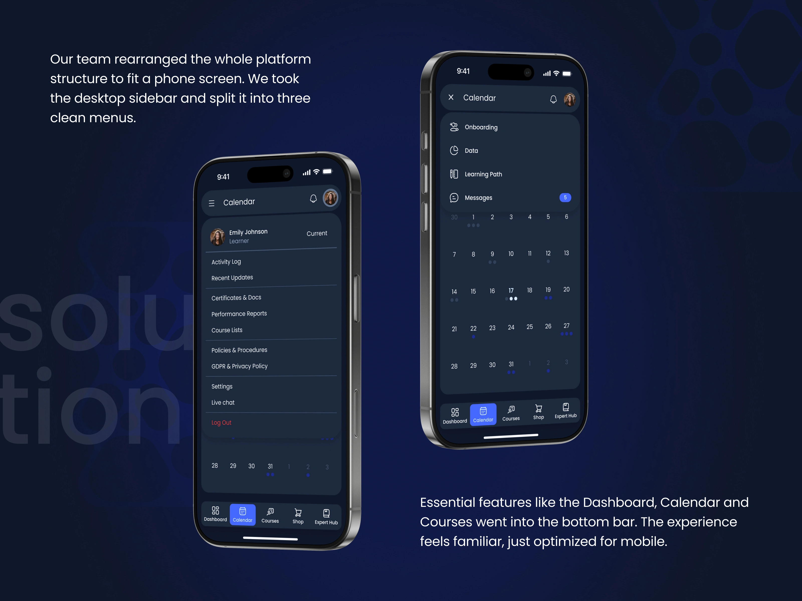
Navigation choices define how a product feels. We looked at what users reach for most and built the structure based on those habits. This helped us group elements logically and make sure every action is easy to complete.
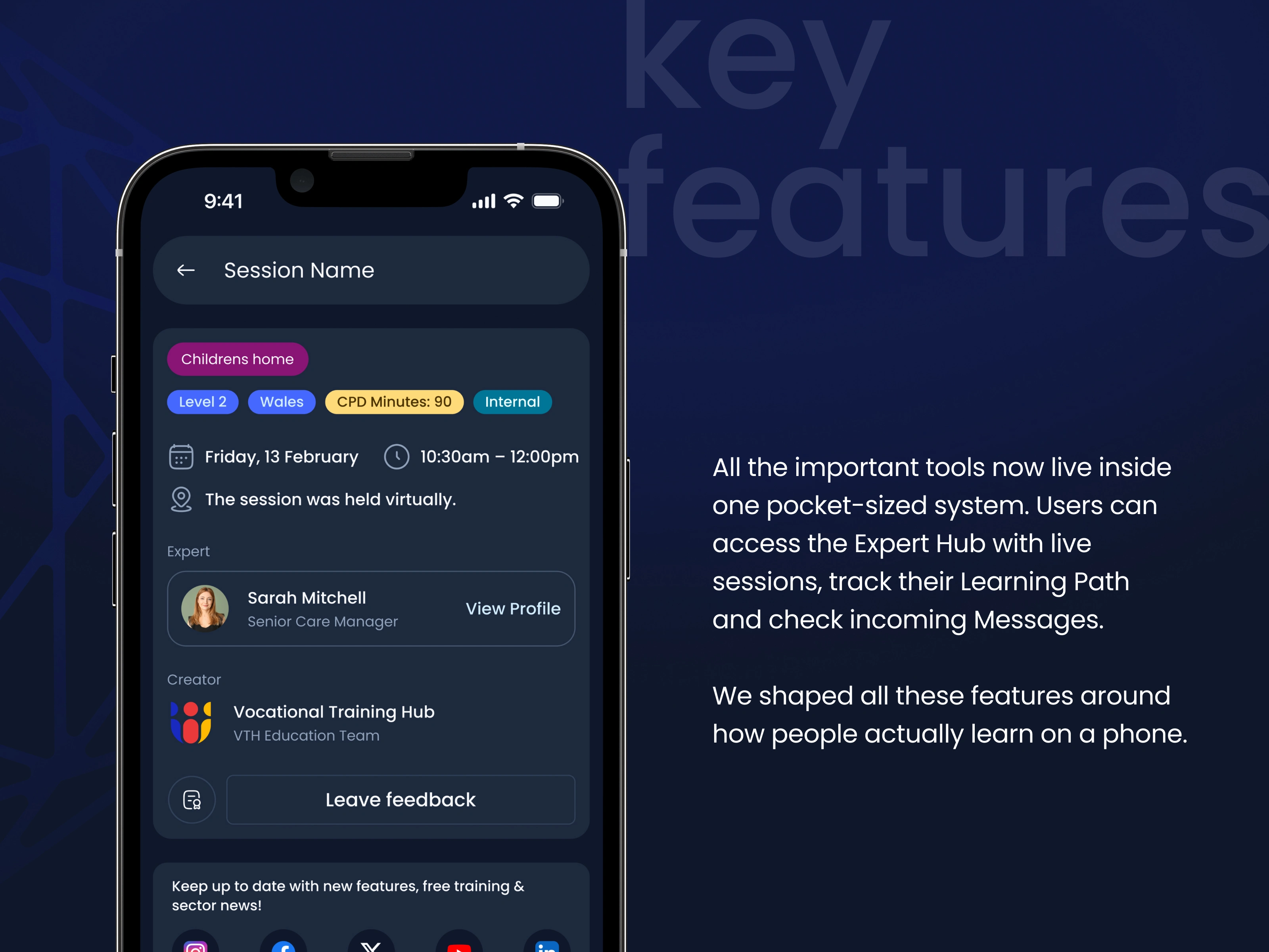
Designing for mobile is about prioritization. We did not just resize the web layout but adapted each screen to support quick interaction. The goal was to make sure the most complex tasks take only a few taps.
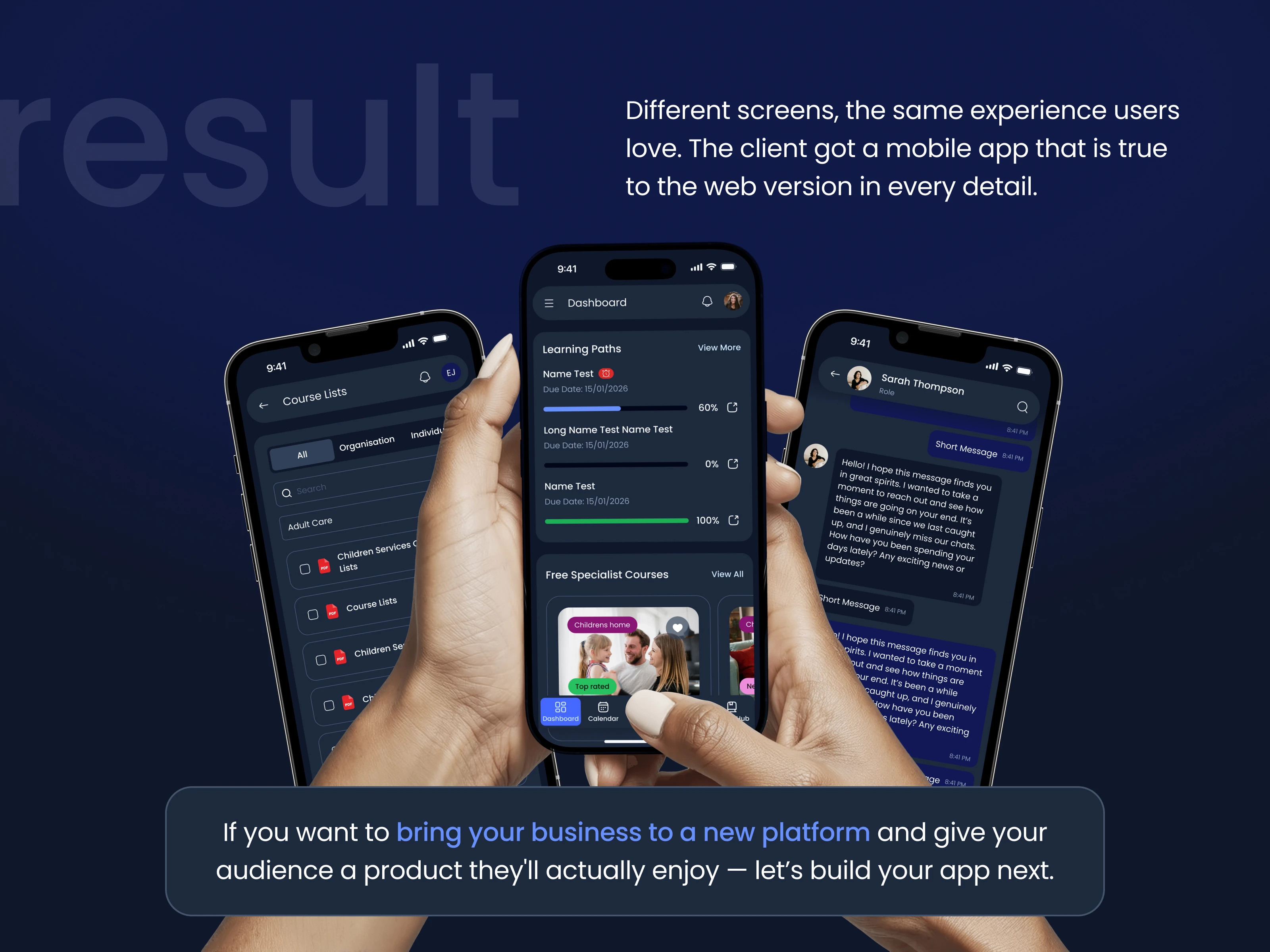
Consistency across platforms is one of the hardest things to get right in this field. Here, the web and mobile versions feel like one product because they were designed by us that way from the start.
If your platform needs the same treatment — send us a message.
We will review your project and arrange a quick сall to see how we can help!
Like this project
Posted Sep 25, 2026
Every great web platform deserves an equally great mobile experience. This case shows exactly how we make that happen.
Likes
0
Views
1
Tags