
Marketing Collateral for NZ Concepts — Architecture, Marketing & Digital Services Agency
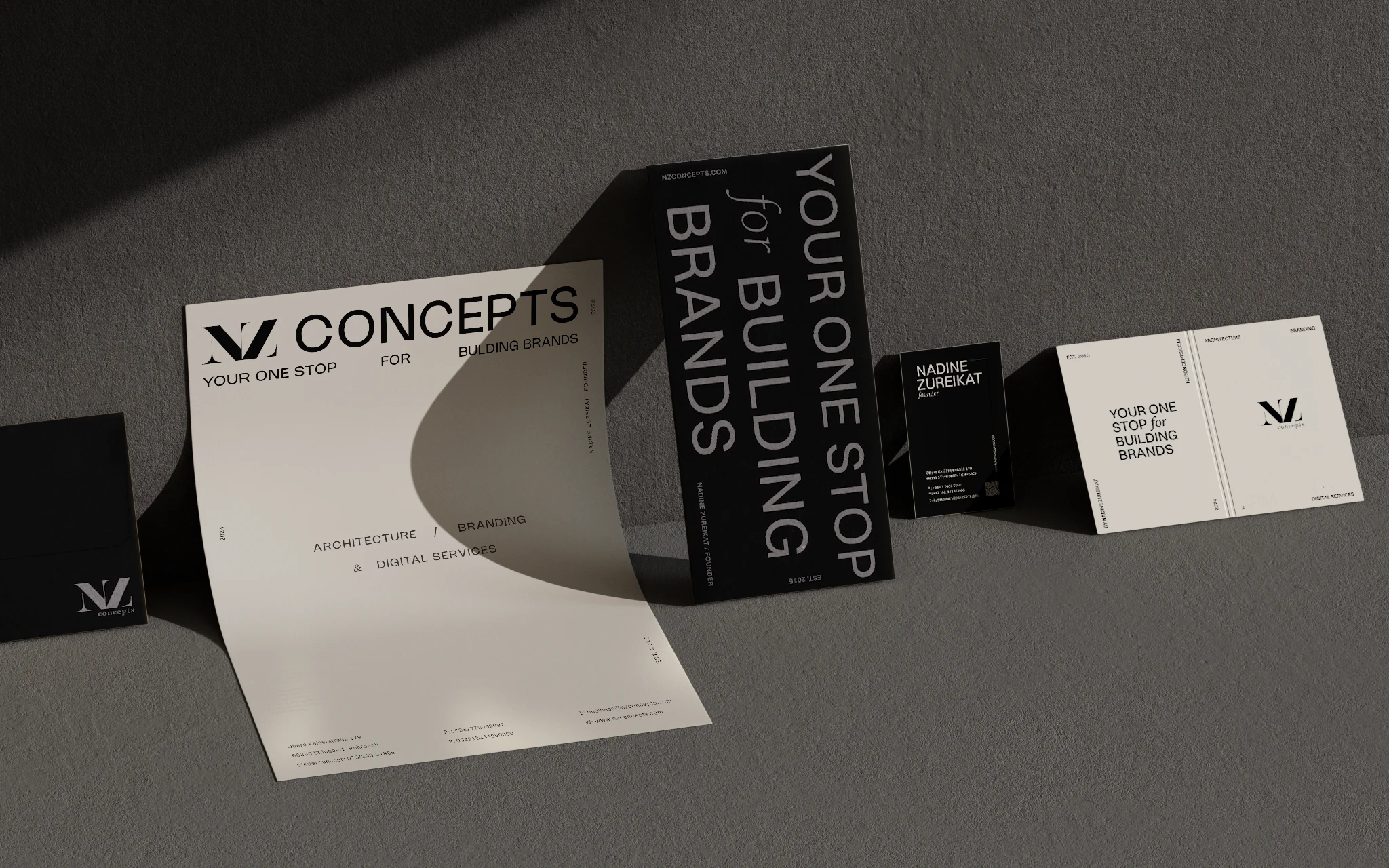
Stationary Design concept
Below you'll see a set of stationary concepts that I created for NZ Concepts marketing agency. The aim purpose of the project was to highlight the agency's branding (who are focused on architecture, branding and digital services) - through a modern, bold and elegant approach (taking inspiration from Swiss-style designs), using of a modern and geometric typography contrasting with an elegant serif-font as main elements of the branding, together with neutral colors such as white, beige and black.
The brand already had their logo and where in the need to redesign their print and promotional presence, with elements that bring the architectural, clean and bold vibes that the brand was aiming for.
The first design concepts were not chosen by the client in the end, however, I loved the overall look of them and decided to share as a concept work I really enjoyed working with.
The approved concepts can be viewed below, together with the final Brand Guidelines book.
First Concepts ↓
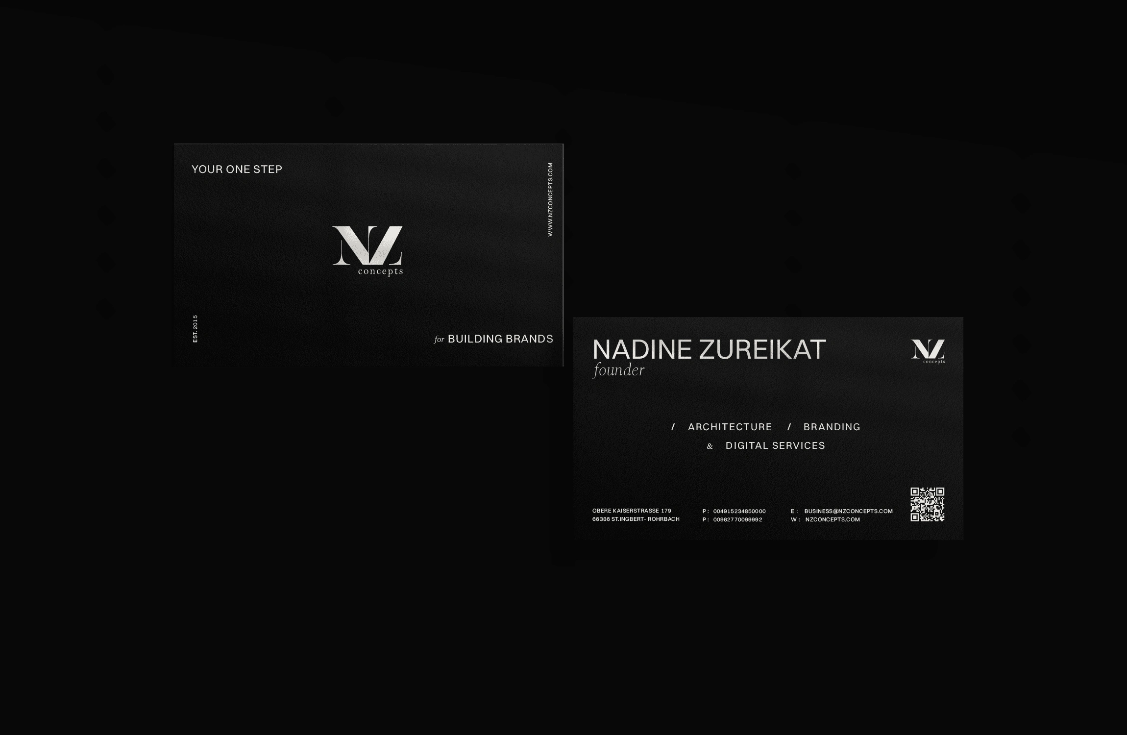
Business Card Design concept
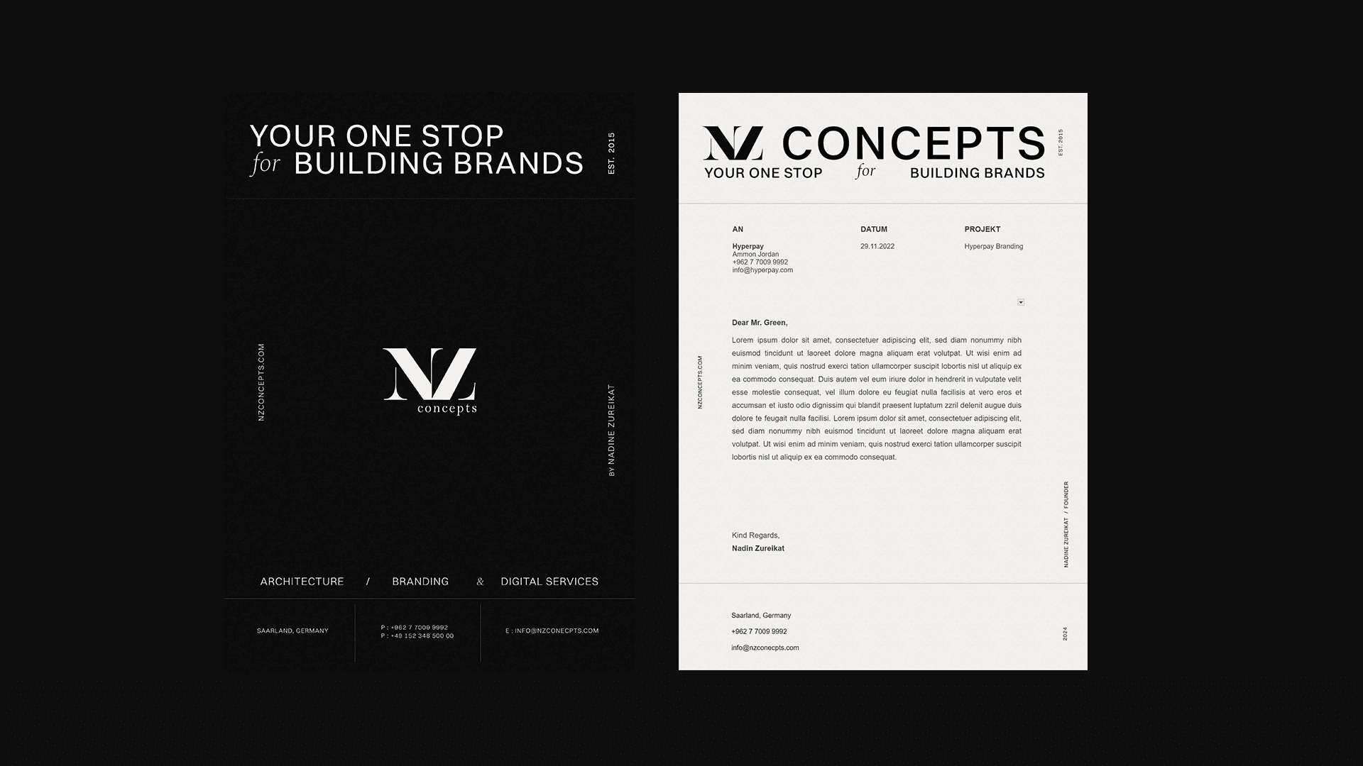
Letterhead Design concept (Cover and Cover Letter)
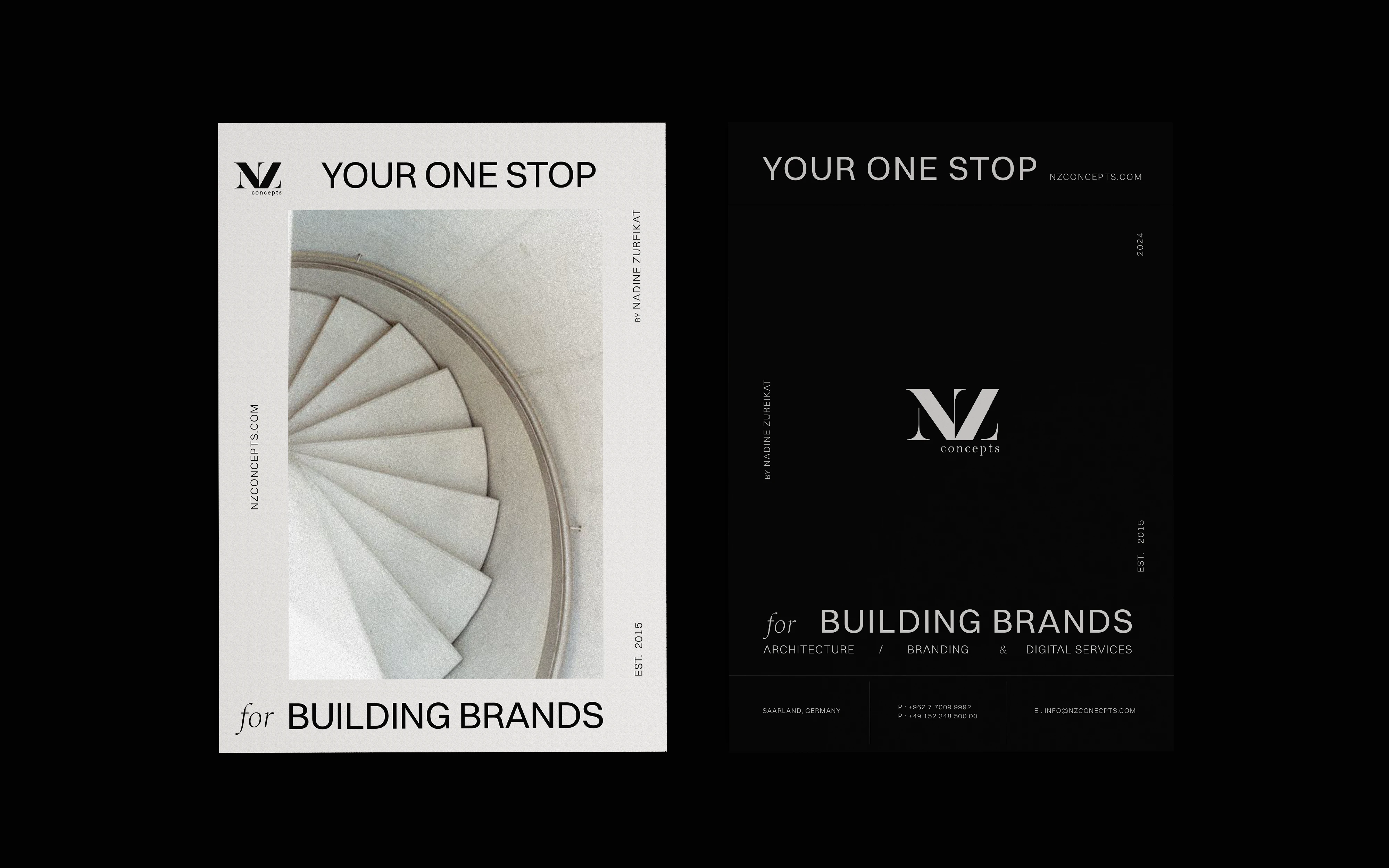
Letterhead Cover Design concepts
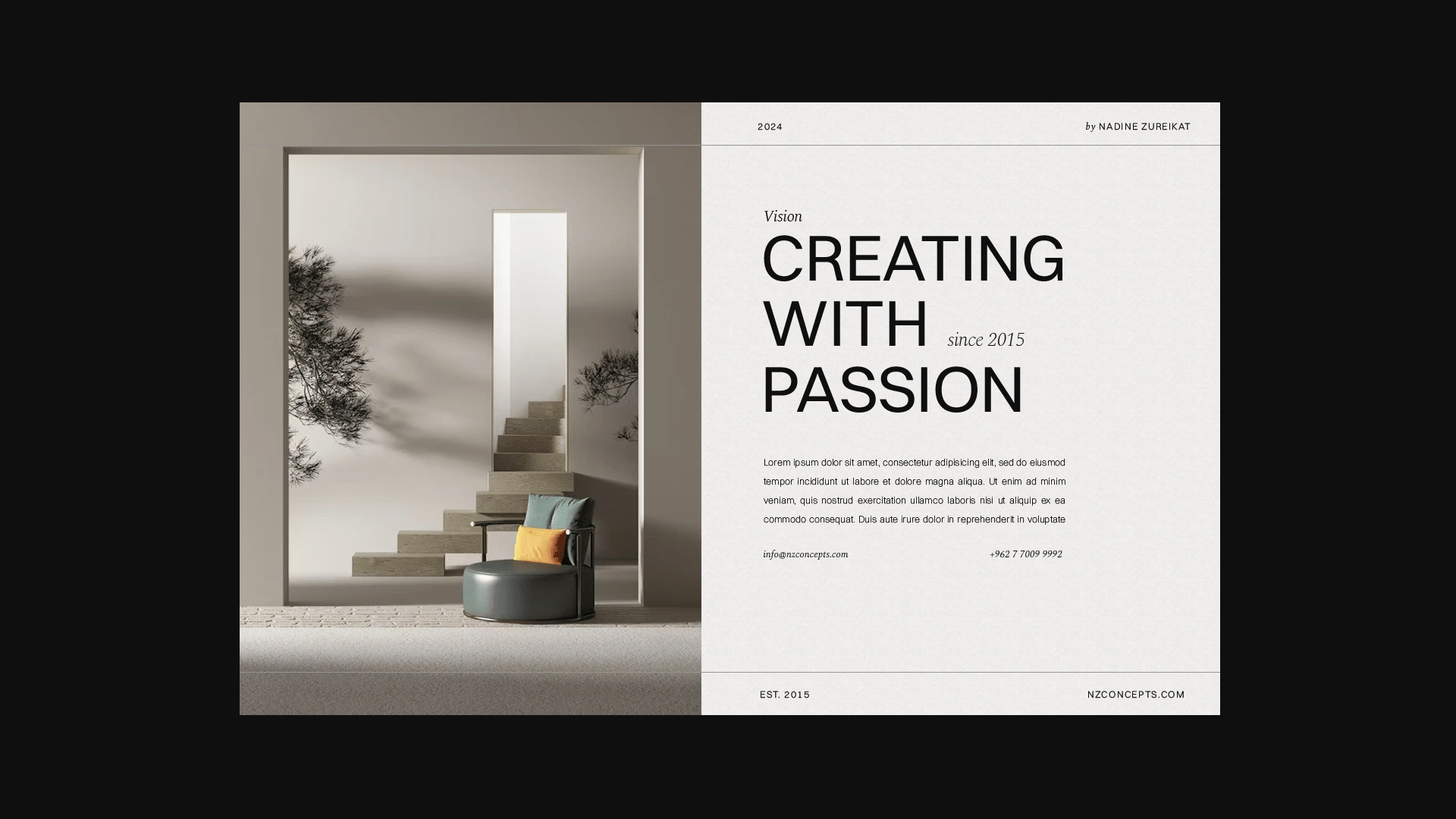
Web Design concept
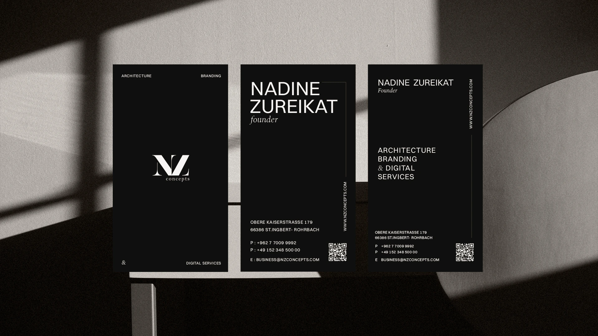
Vertical Business Cards design concept
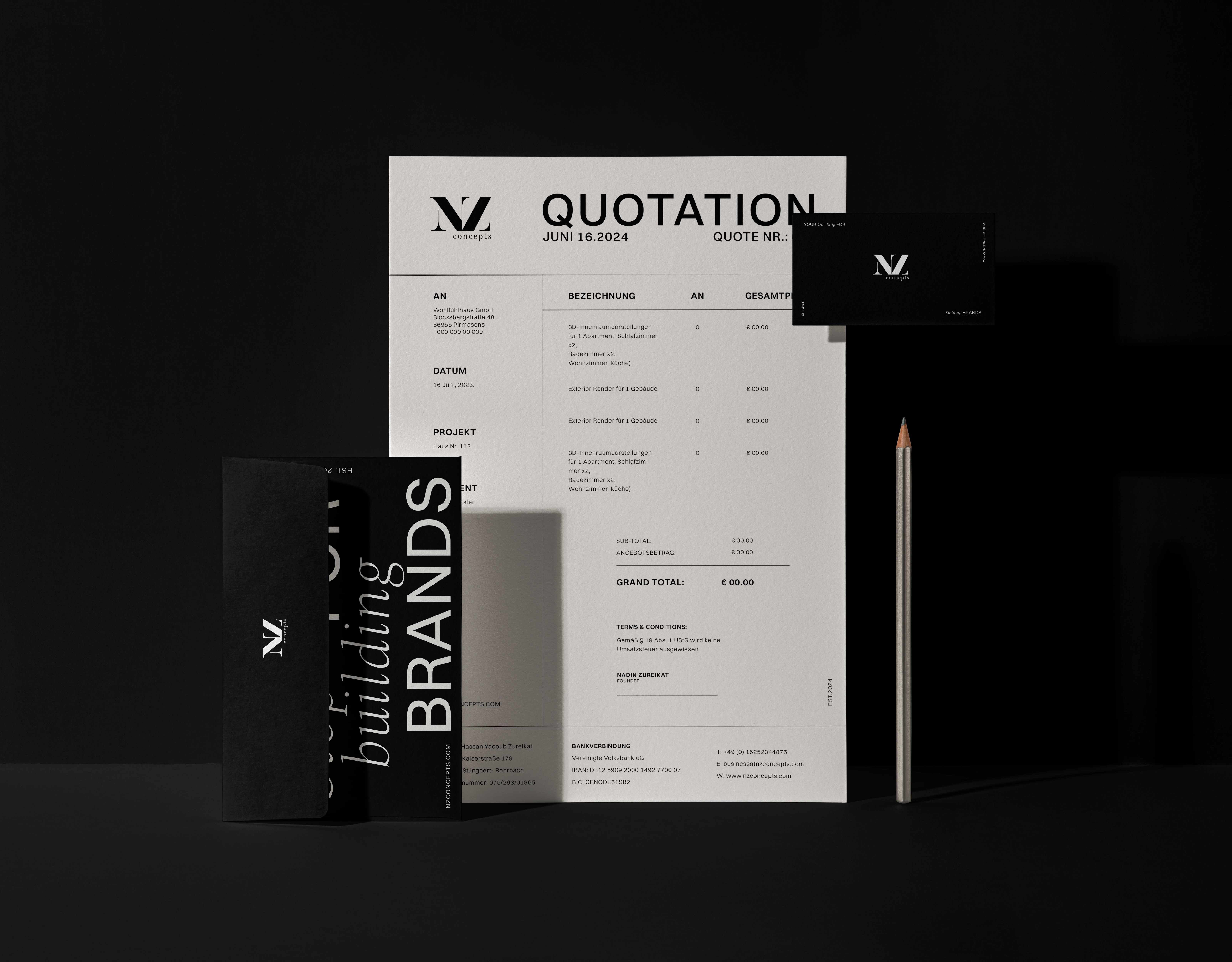
Envelope + Invoice Design concept
Approved Concepts ↓
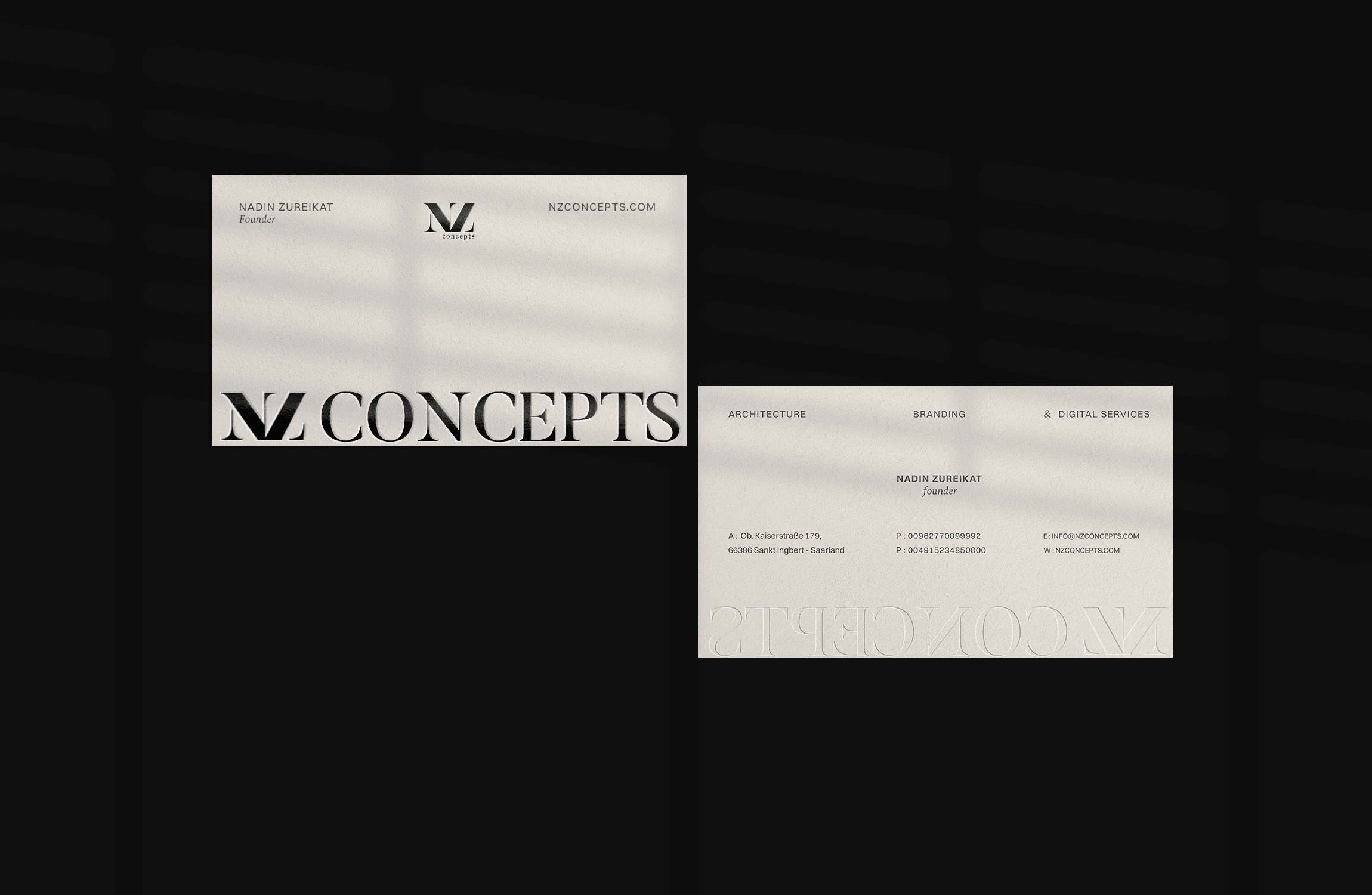
Approved Business Cards
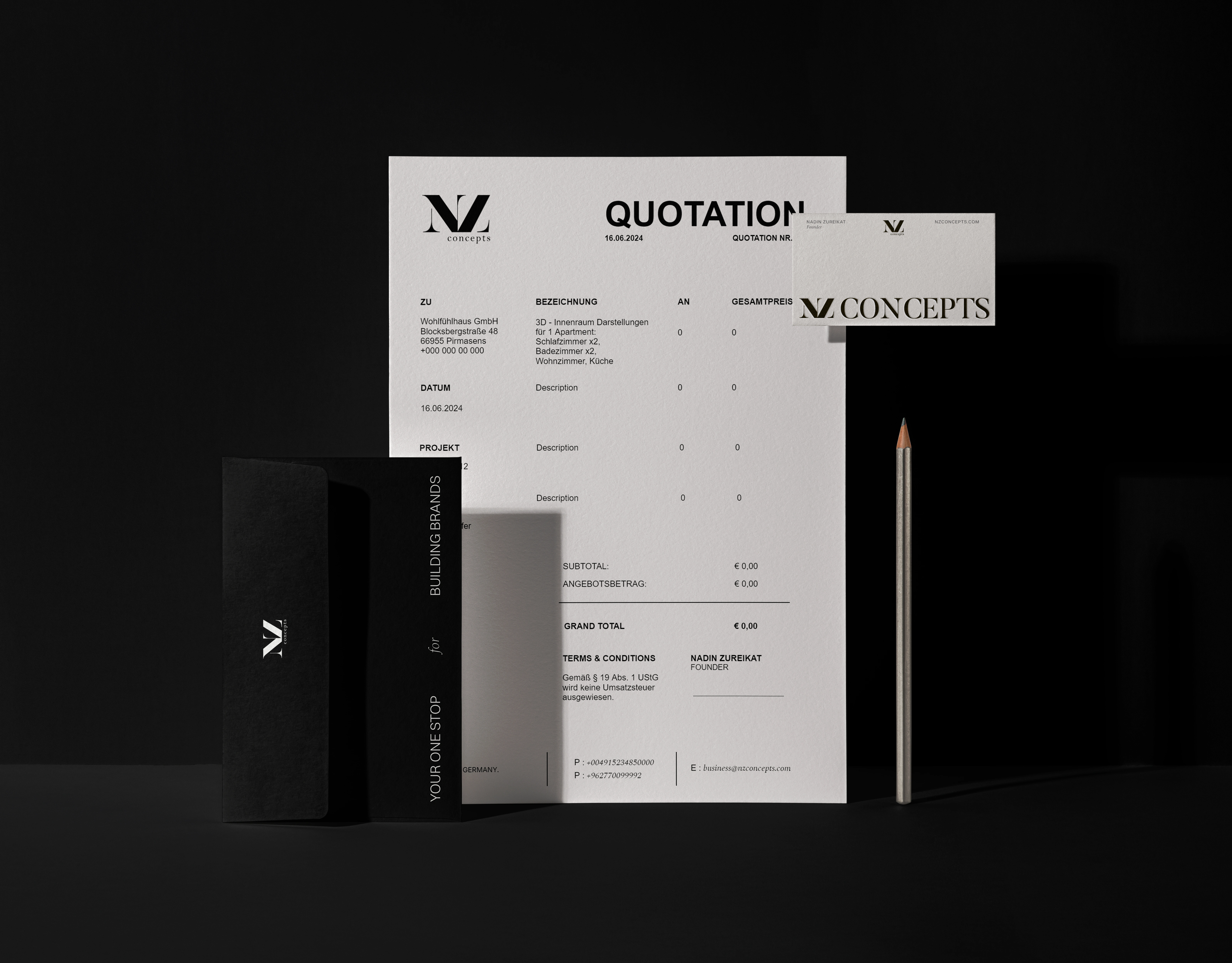
Approved Stationary
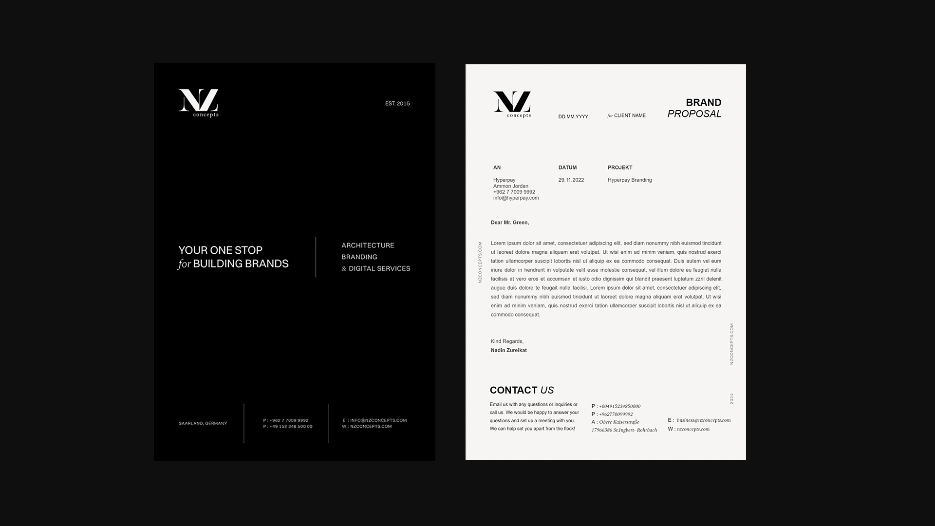
Approved G-Docs & Microsoft Word Cover & Letterhead Design
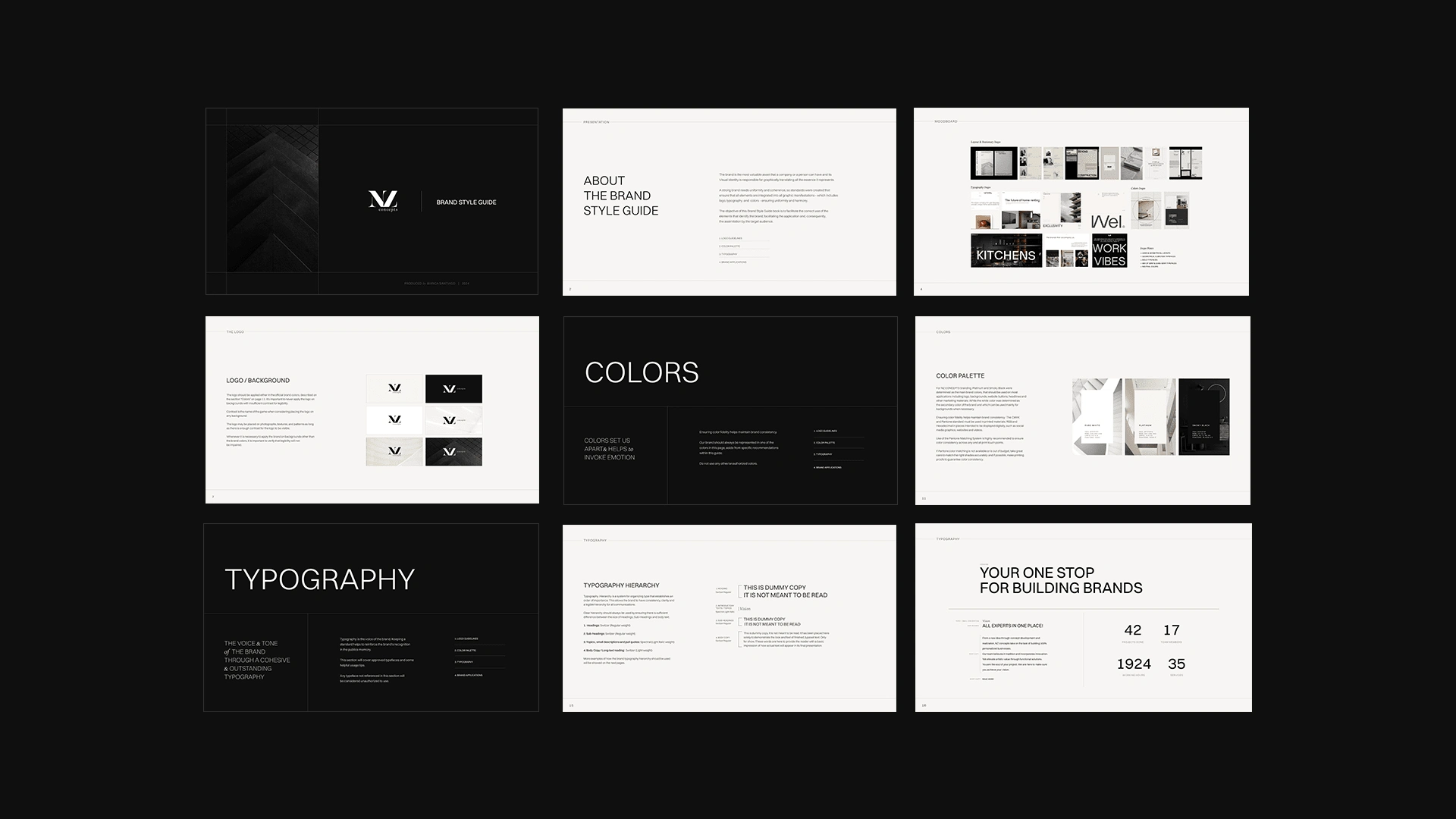
Brand Guidelines Book
Brand Guidelines Book (GIF)
Project Details
Business Type: Architecture & Marketing Services
Keywords: Modern • Clean • Sophisticated • Bold • Authoritative
Deliverables: New Color Palette • New Typography system • Stationary Design • Brand Guidelines Book
Timeframe: 3 weeks
Project Objectives:
Elevate the agency’s branding through a modern, bold, and elegant visual identity.
Redesign print and promotional materials to reflect the brand’s architectural, clean, and sophisticated aesthetic.
Integrate Swiss-style design principles with a balance of geometric and serif typography for contrast and refinement.
Utilize a neutral color palette to enhance elegance and timelessness.
Ensure consistency across all touchpoints, reinforcing the agency’s expertise in architecture, branding, and digital services.
Bianca took the time to truly understand our vision and translated it into a refined and coherent brand identity for NZ Concepts. The visual system and print collateral feel thoughtful and consistent, and the result aligns perfectly with how we want to present our studio. The collaboration was smooth and professional, and I’m very happy with the outcome.
— Nadin Zureikat, Founder of NZ Concepts
Let’s Connect!
If NZ Concepts resonates with you, I’d love to hear from you. Whether you’re envisioning a new project or simply want to exchange ideas, feel free to reach out. I’m always open to meaningful collaborations.
2 likes · 44 views · Oct 9, 2024
A cohesive brand identity and print system for NZ Concepts, creating visual consistency and a clearer, more confident presentation across all brand touchpoints.


