An Appetizing Logo for Tao Chinese Kitchen
Rashmi Lopez
Tasty & Traditional
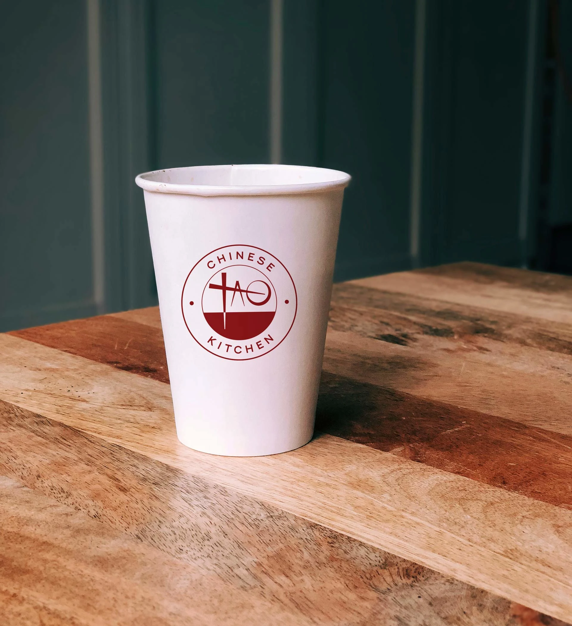
The owners of Zen Chinese Kitchen updated their name to Tao—meaning, "The Way." They wanted a very simple, clean logo to represent their food: Hearty, homey, and full of value.
Combining the shape of the letter "T" and chopstick & bowl symbols, I devised a typographic treatment of the main logo mark. The circular form of the logo itself creates accessibility where the angles of the chopsticks create modernity.
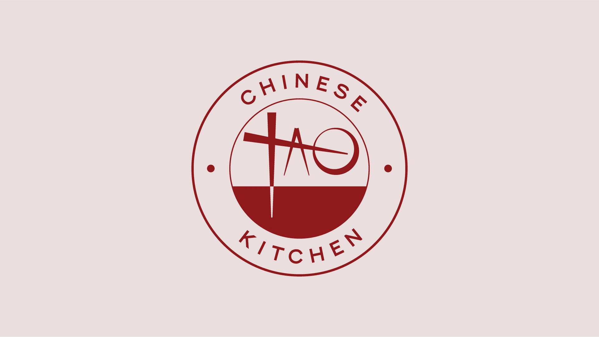
Final logo
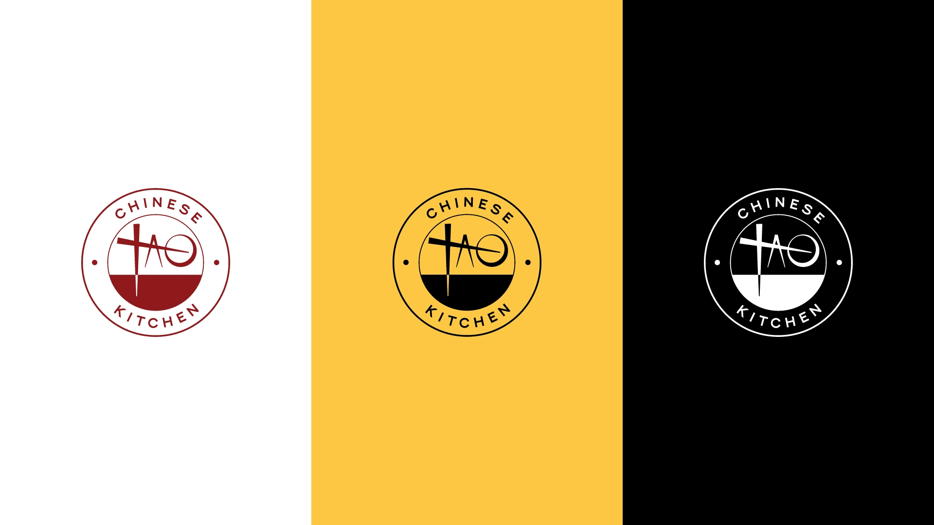
Color variations
Like this project
Posted Sep 16, 2024
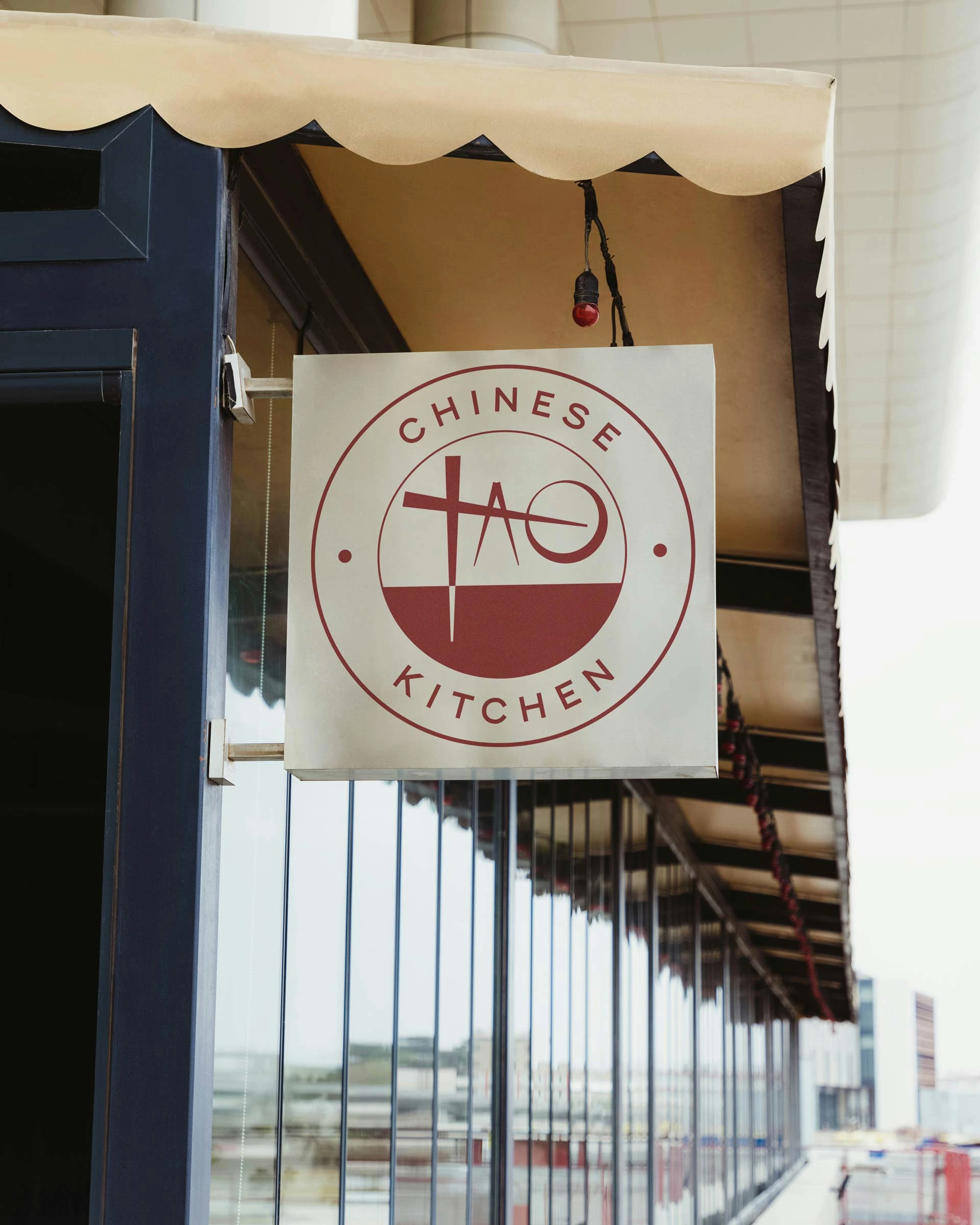
A simple, clean logo for a local Chinese eatery in Downey, California. The logo design represented a friendly atmosphere with savory, hearty food full of value.
Likes
27
Views
150