HibouT'chou : kids concept store ecom design app
Project Overview
Client: HibouT'chou Concept store
Timeline: August 2022 - September 2022
Role: Product Designer
Business Need: To drive brand awareness and increase sales, HibouT'chou required a robust e-commerce app that could overcome the trust barriers associated with online shopping in Tunisia. The app needed to offer a seamless and intuitive shopping experience that accurately reflected the in-store ambiance and product selection. Additionally, the app needed to be accessible and convenient, allowing customers to explore the product catalog and complete purchases without the constraints of physical store hours.
Problem Statement
HibouT'chou, a beloved concept store, faced the challenge of expanding its reach beyond the physical store and into the digital realm. Despite offering a curated selection of unique products, the brand struggled to build trust and convert online shoppers, particularly due to Tunisians' inherent skepticism towards e-commerce. Furthermore, the lack of a user-friendly online platform hindered the ability to showcase the full product catalog and expedite the shopping process.
Project Goals
Build Trust and Credibility: Establish HibouT'chou as a reliable online retailer by creating a transparent and secure shopping experience.
Enhance Brand Identity: Reinforce HibouT'chou's unique brand identity and store atmosphere through the app's design and user experience.
Drive User Engagement: Encourage repeat purchases and customer loyalty by offering personalized recommendations and engaging features.
Optimize Product Discovery: Showcase the full product range effectively, allowing customers to easily find desired items.
Streamline Purchase Process: Create a seamless checkout experience to minimize cart abandonment and increase conversion rates.
User Research & Insights
Potential user and their motivations
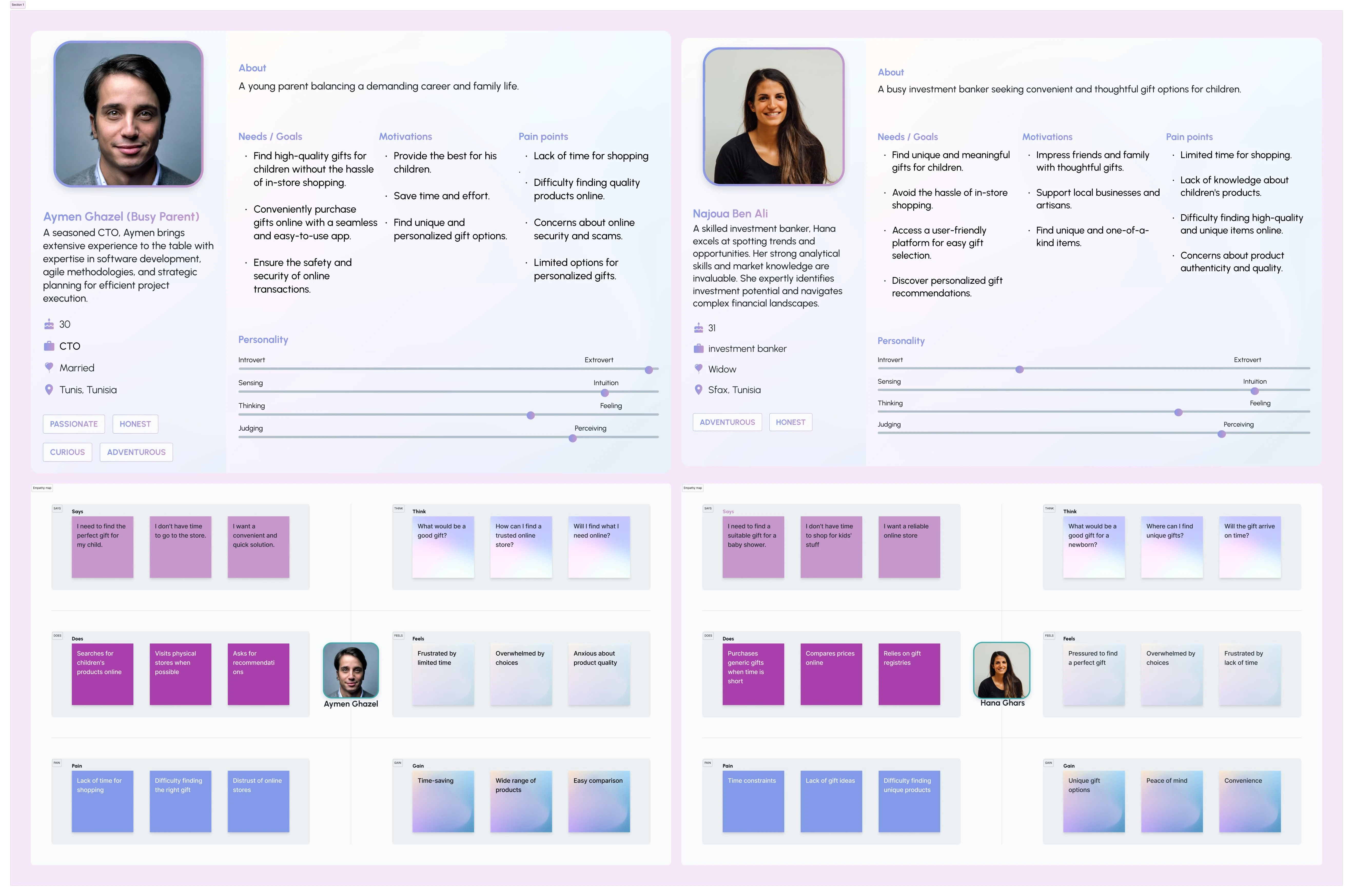
User personas & empathy maps
Research findings
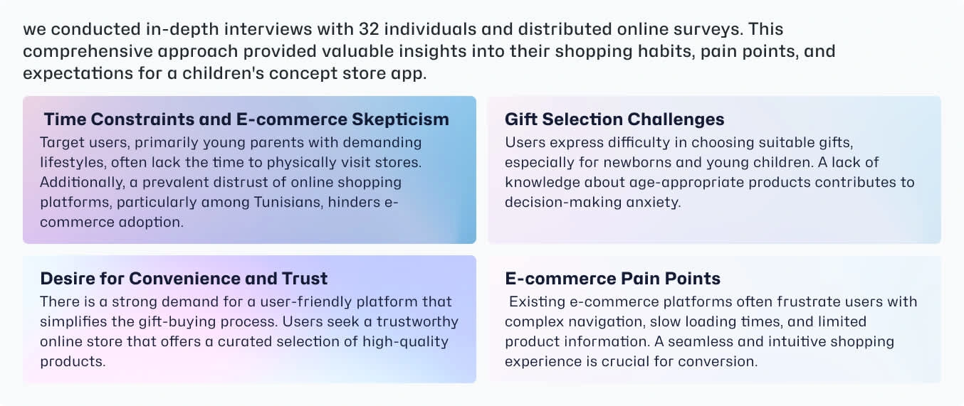
Interview data results
Defining the Strategy & Solution
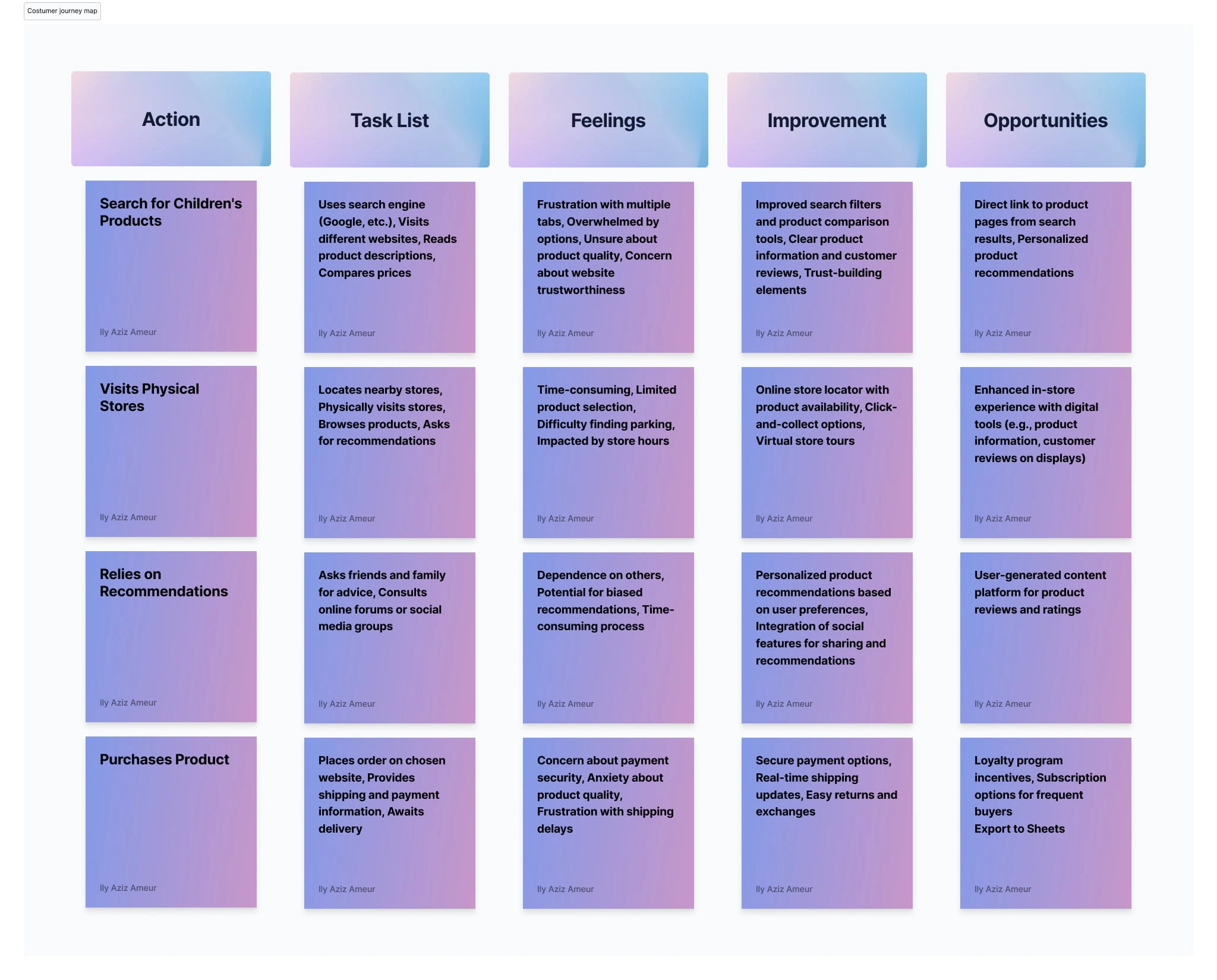
Visualizing the current-state user journey, highlighting the frustrations or obstacles identified by our users.
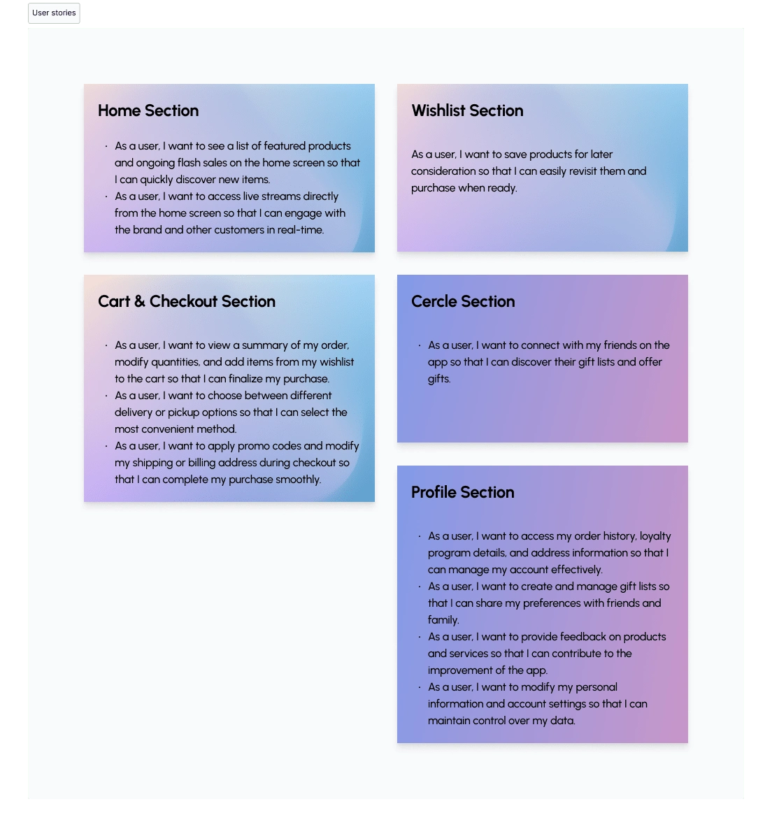
Breaking down the solution into small, specific tasks from the user's perspective
The following sitemap illustrates the core structure of the Hibout'chou mobile app. It visually represents the hierarchy of information and navigation flow within the app.
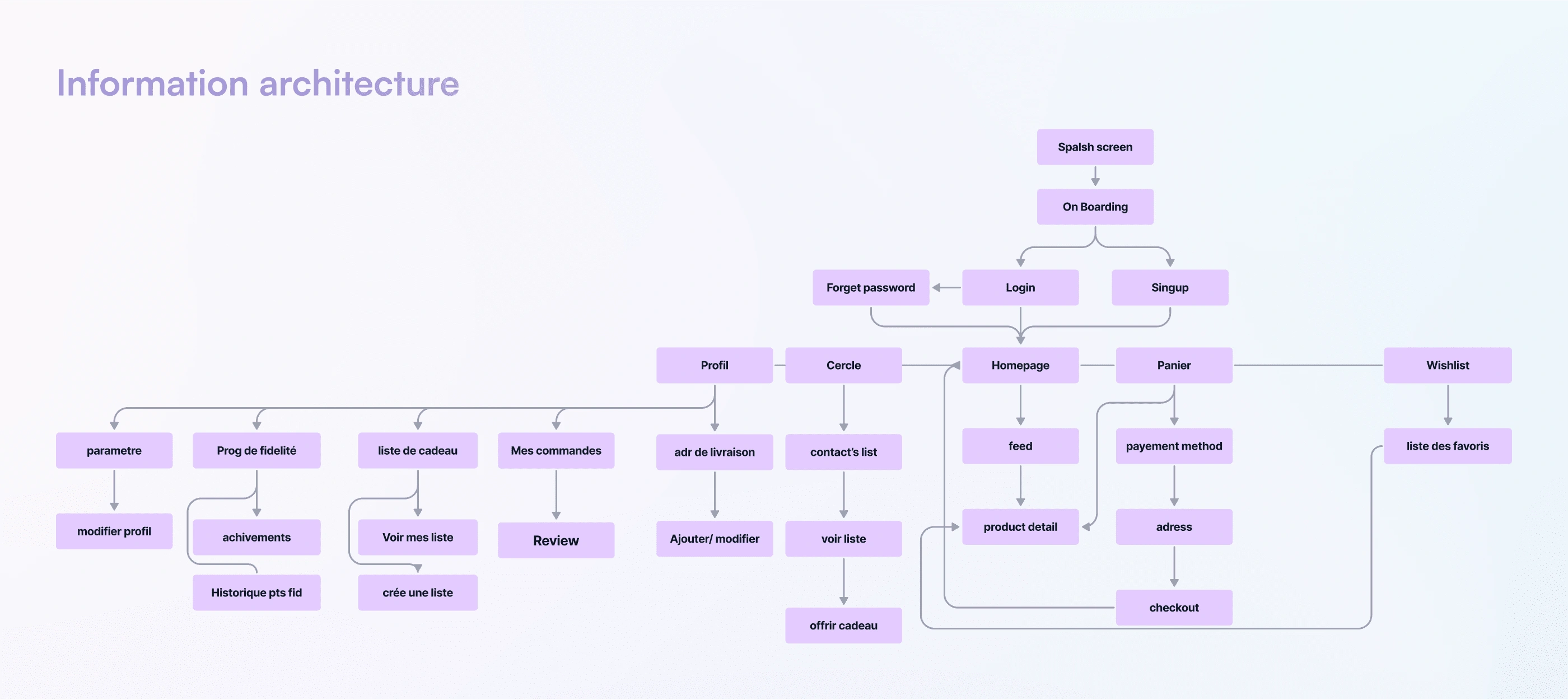
the IA prioritizes a more streamlined approach. Key functionalities are accessible from the nav bar.
This simplified IA empowers users to quickly locate the features they need, minimizing frustration and wasted time. The logical grouping of functionalities based on user tasks promotes intuitive navigation and a seamless user experience.
Wireframes and User flows
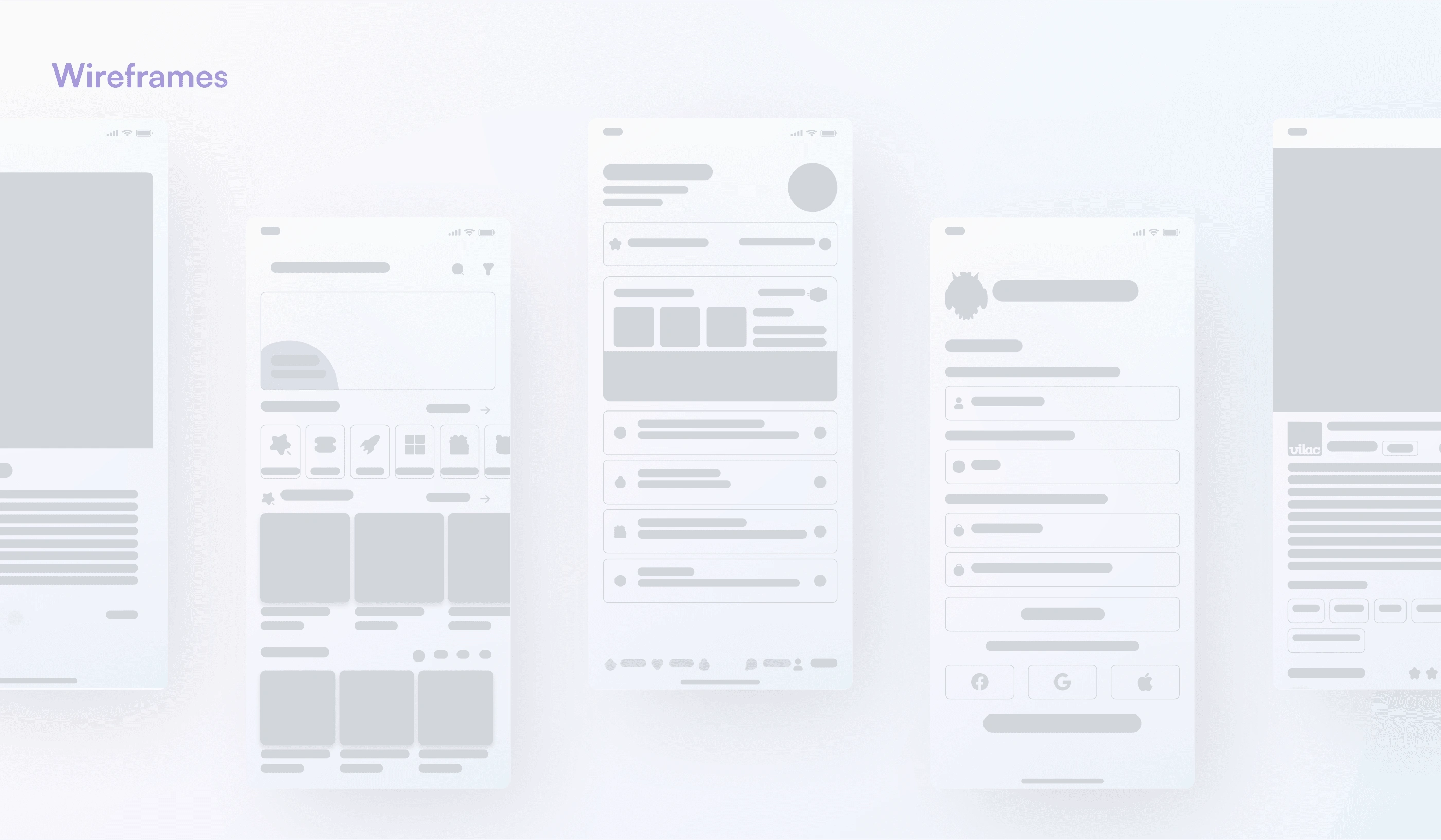
Fews of the early wireframes sketches
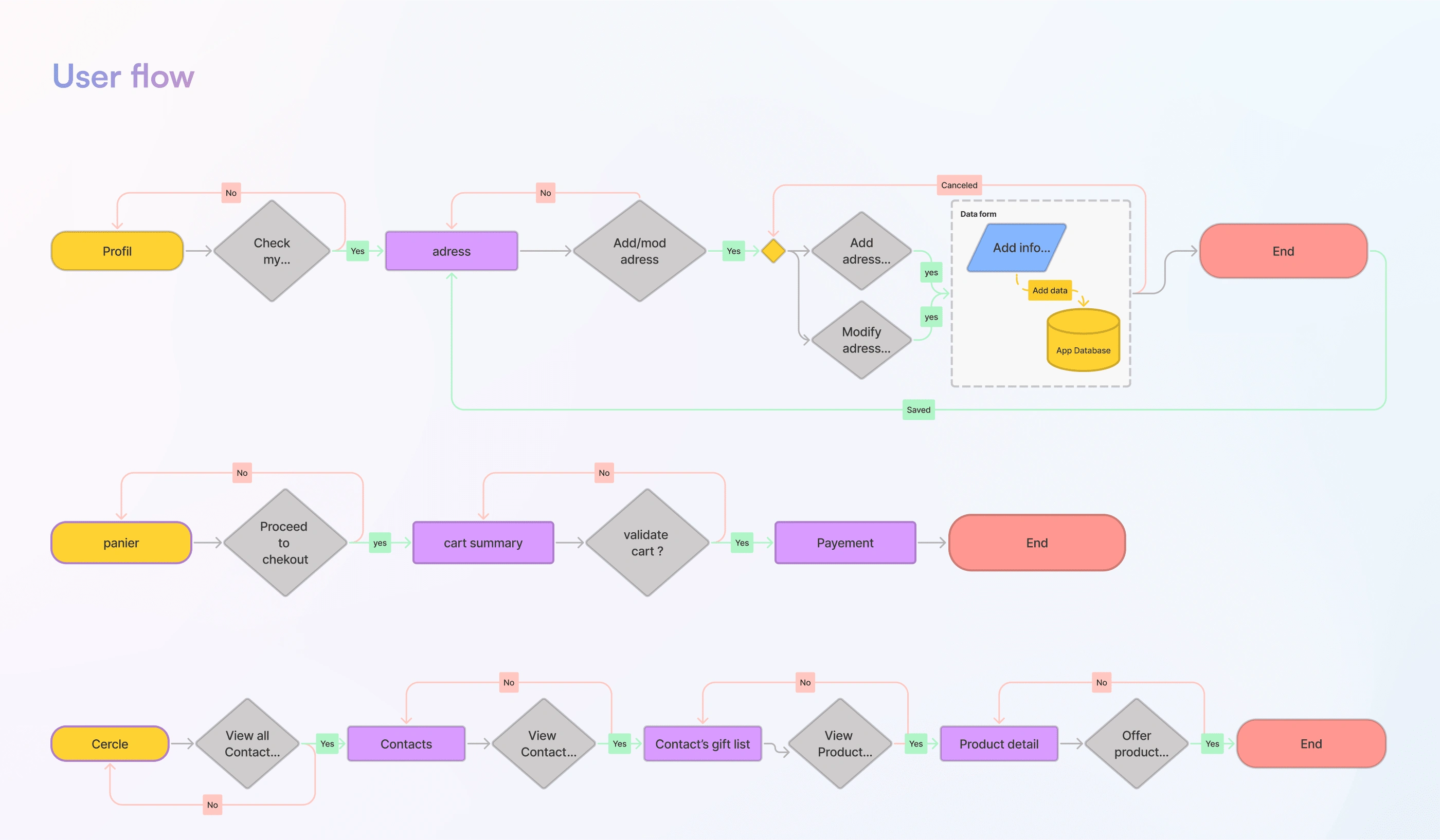
Some of the user flows
Solution and final product
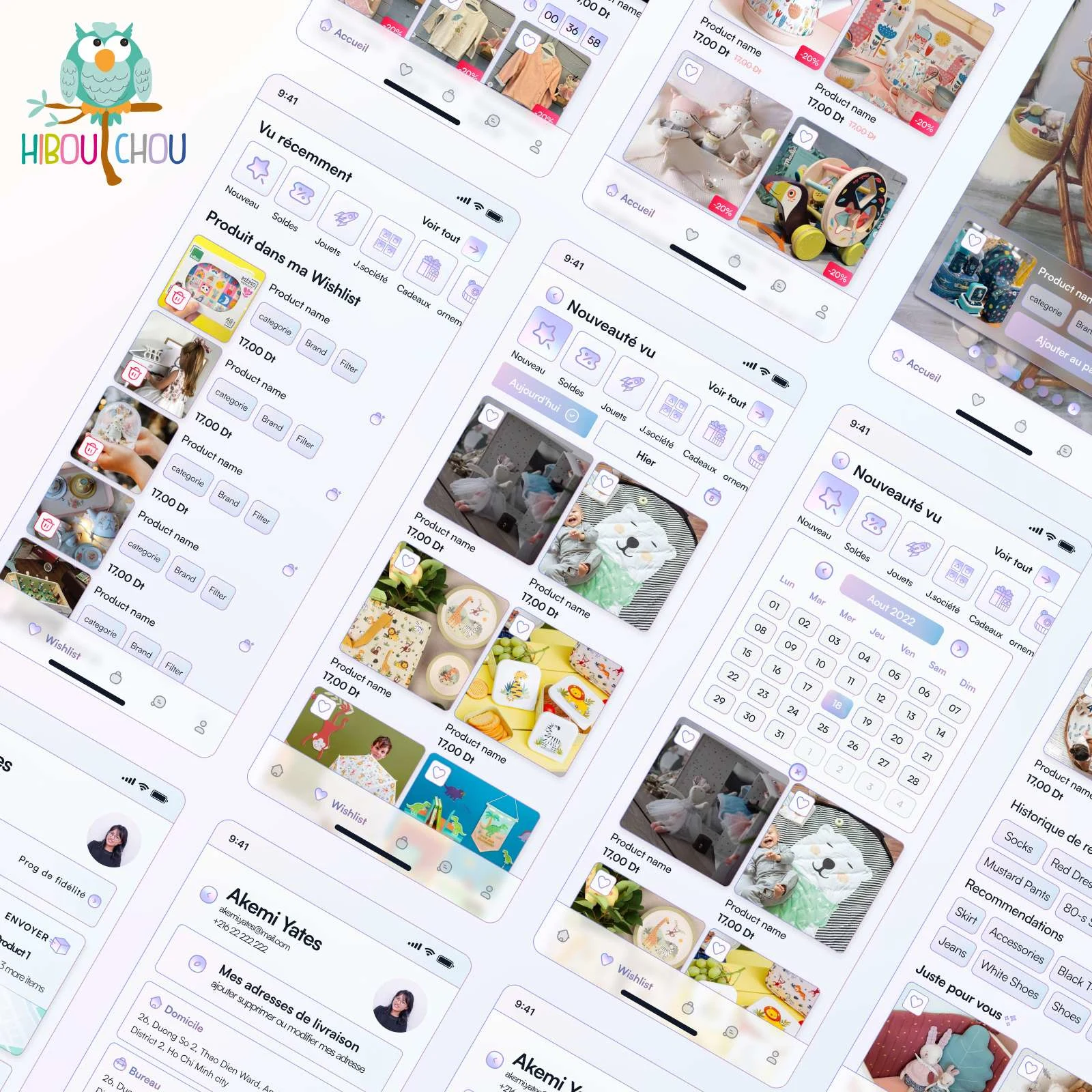
Glimpse of the app
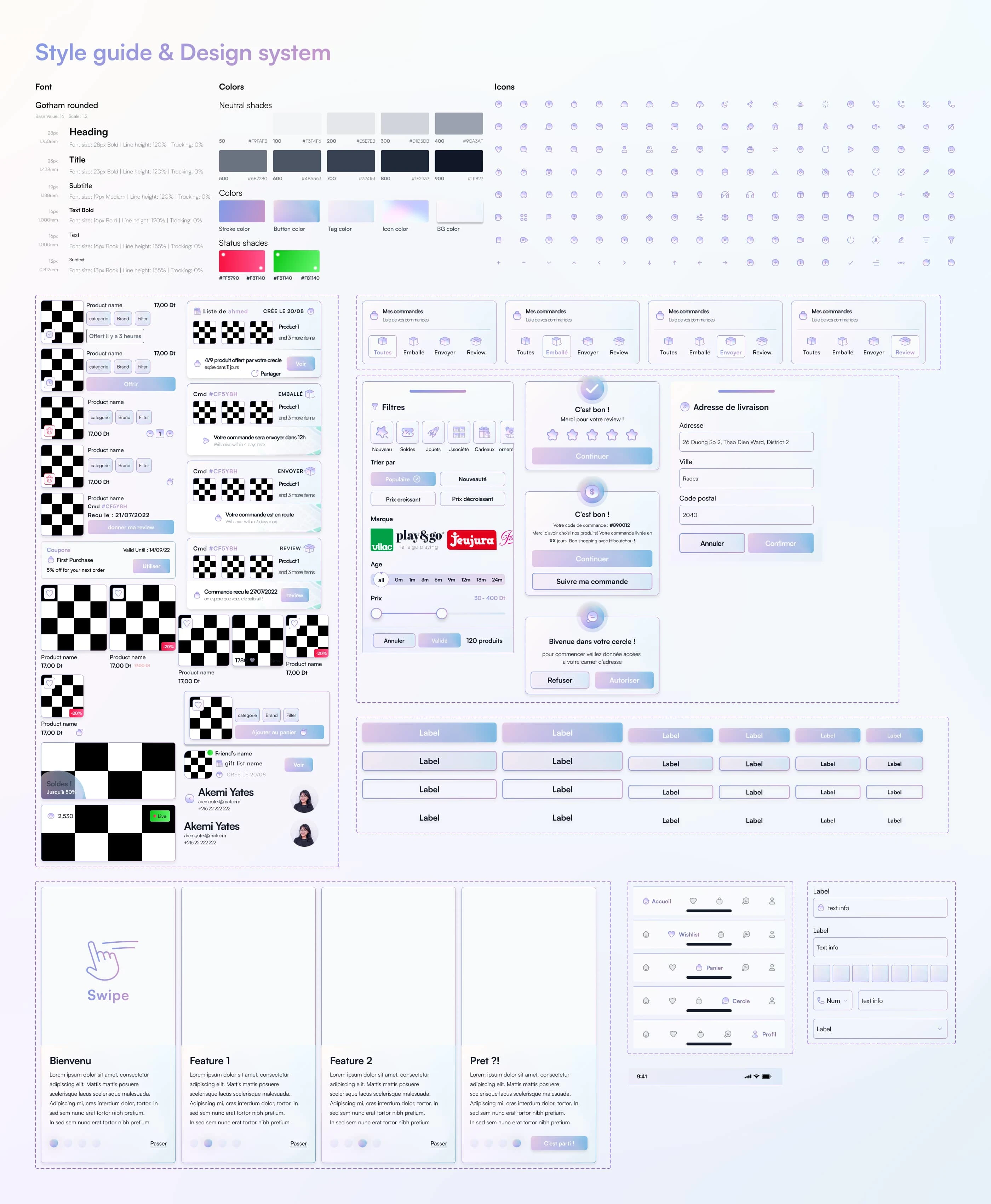
Style guide & Design system are the app foundations
Impact and Results
The HibouT'chou app redesign successfully aligned with the brand's playful and child-friendly identity. Through primary user testing with 18 individuals, we garnered overwhelmingly positive feedback.
Key findings include:
Brand Alignment: The app's design effectively captured the essence of HibouT'chou's brand, creating a delightful and engaging shopping experience.
User Satisfaction: Participants praised the app's intuitive navigation, clear product information, and overall user experience.
Feature Appreciation: The search functionality, live selling feature, and product discovery elements were particularly well-received, enhancing the shopping journey.
Increased Engagement: Early indications suggest that the app is driving increased brand awareness and customer loyalty.
These positive results demonstrate the success of the redesign in meeting the project goals and exceeding user expectations.
Next Steps / Closing thought
Working on the HibouT'chou app presented a unique opportunity to delve into the world of luxury children's products. Understanding the target audience and translating the brand's identity into a digital experience was a rewarding challenge.
To further elevate the HibouT'chou app, we recommend incorporating the following AI-driven features:
Personalized Product Recommendations: Tailored suggestions to enhance the shopping experience.
Predictive Inventory Management: Optimize stock levels and prevent out-of-stocks.
Sentiment Analysis: Gain valuable insights from customer feedback to refine the product offering.
Visual Search: Revolutionize product discovery through image recognition.
By implementing these features, HibouT'chou can solidify its position as a leading luxury children's brand and create an exceptional customer journey.
thank you for swinging by ✌️
Like this project
Posted Feb 19, 2024
Bringing HibouT'chou's playful charm to your fingertips. Designed their delightful e-commerce app for easy and enjoyable shopping."
Likes
0
Views
41
Clients
TalanSolutions

