MyFridays : Building the Future of Recurring Donations in the UK
Ily Ameur
Project Overview
Client: Shamaazi Fintech for Good company
Role: Product Designer
Timeline: September 2024 – December 2024
Business Need: MyFridays is a live platform that automates charitable giving, allowing users to donate every Friday during the Hour of Acceptance. While the platform was already active, a new version was needed to improve donor experience, engagement, and charity management before its official relaunch in Ramadan 2025.
Problem Statement
The existing MyFridays platform had two major problems:
1️⃣ Friction in the donor journey → The old experience required users to pick a charity first, which created detachment from impact and resulted in low engagement.
2️⃣ Lack of a structured charity dashboard → Charities had no clear way to track donations, manage causes, or optimize fundraising efforts, making financial planning difficult.
3️⃣The absence of a strong landing pages made onboarding less effective.
Without these refinements:
Donors might lose engagement due to complex flows.
Charities could struggle with unpredictable funding and lack of insights.
Project Goals
🚀 For Donors:
Refine the donation journey to be cause-driven instead of charity-first.
Make setting up recurring donations effortless (under 2 minutes).
Increase engagement & retention through an emotionally connected experience.
📊 For Charities:
Design and launch the first-ever charity dashboard for better donation tracking and reporting.
Enable charities to manage causes, team members, and donor insights within a single interface.
Improve financial visibility to help organizations scale their impact.
For Both sides:
Create new landing pages to streamline onboarding for both donors and charities.
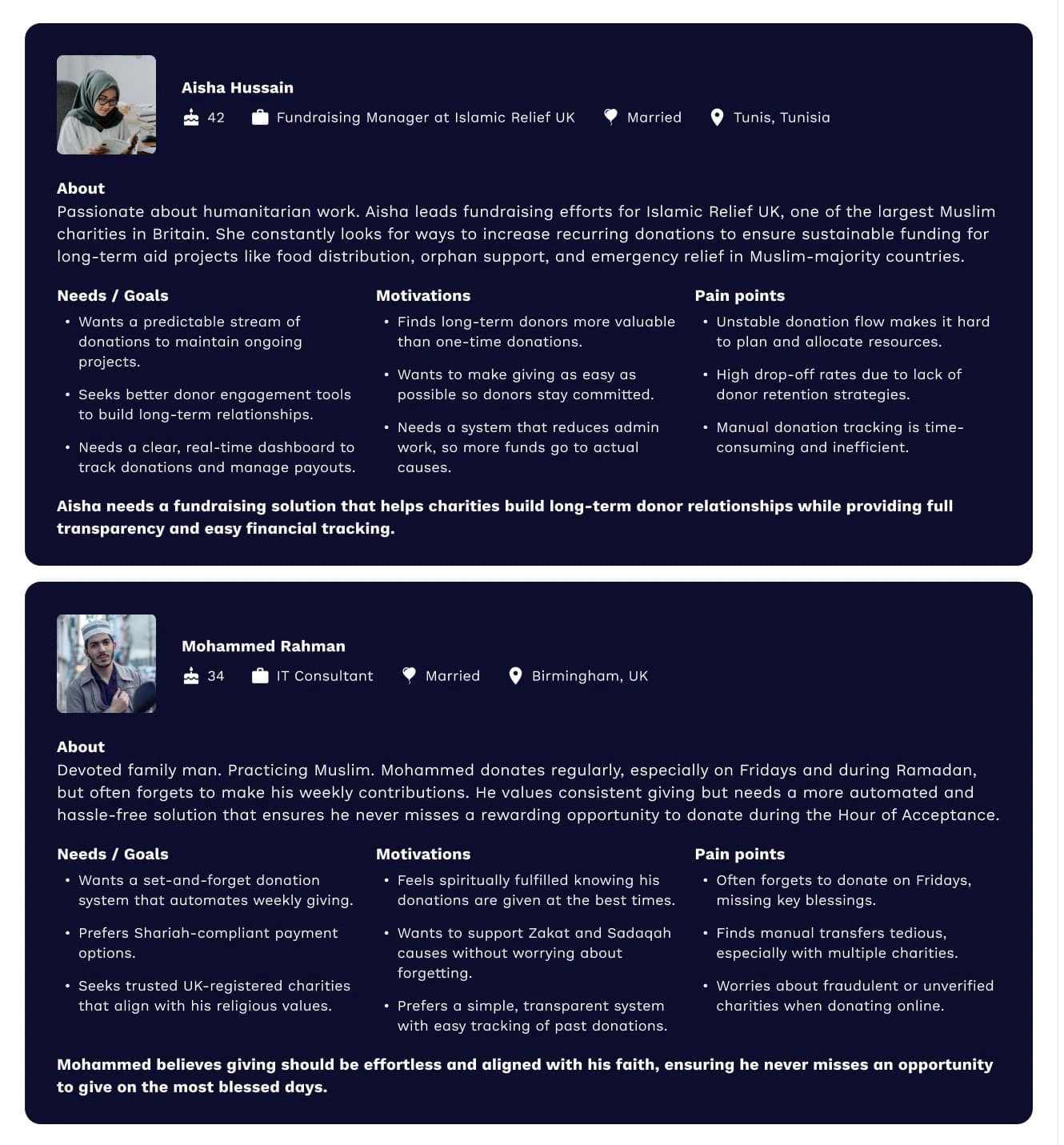
Understanding the Users
Since this project was primarily business-driven, the user needs were defined based on:
✅ Industry best practices in fintech and nonprofit UX.
✅ Competitor analysis of other automated donation platforms.
✅ Stakeholder insights from Shamaazi’s team and existing charity partners.
Potential user and their motivations
Defining the Strategy & Solution
Redesigning the Donor Experience
The Problem with the Old Donation Flow
Previously, MyFridays directed users to select a charity first, which caused low engagement because:
Users felt disconnected from how their donation made an impact.
The experience was overwhelming, making drop-off rates high.
On mobile, the old process was a long, single-page scroll, which was inefficient.
The Shift to Cause-Based Giving
To improve engagement, we redesigned the flow to start with causes instead of charities.
Users now pick a cause (e.g., Food Aid, Disaster Relief, Refugee Assistance).
Donations go directly to the cause instead of picking a charity first.
Charities still receive funds, but the journey feels more purposeful.
New Donation Flow User Journey
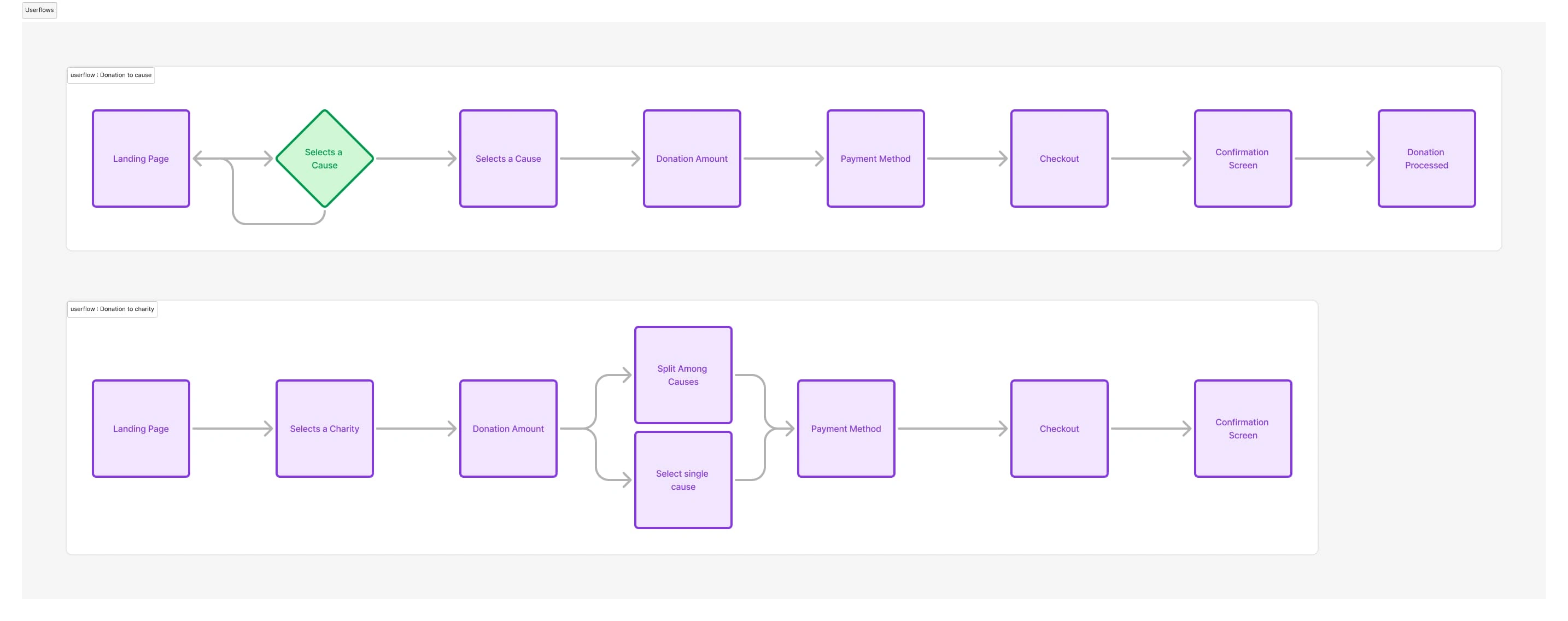
1️⃣ New Default Flow (Top): Donors are first presented with causes to support, streamlining the experience and enhancing emotional connection.
2️⃣ Alternative Charity Flow (Bottom): Users can still choose to donate directly to a charity, but this is now a secondary option rather than the default journey.
Key Enhancements
✅ Cause-Based Home Screen → The default page highlights causes first instead of charities.
✅ Frictionless Donation Flow → Users can set up weekly donations in under 2 minutes.
✅ Increased Transparency → Every cause page provides detailed impact descriptions to build trust.
✅ Mobile-Optimized Experience → The old single-page scroll was split into multiple screens for better usability.
These changes improve donor engagement, trust, and retention, making charitable giving more meaningful and accessible.
Visual Improvements
Before & After UI Comparison
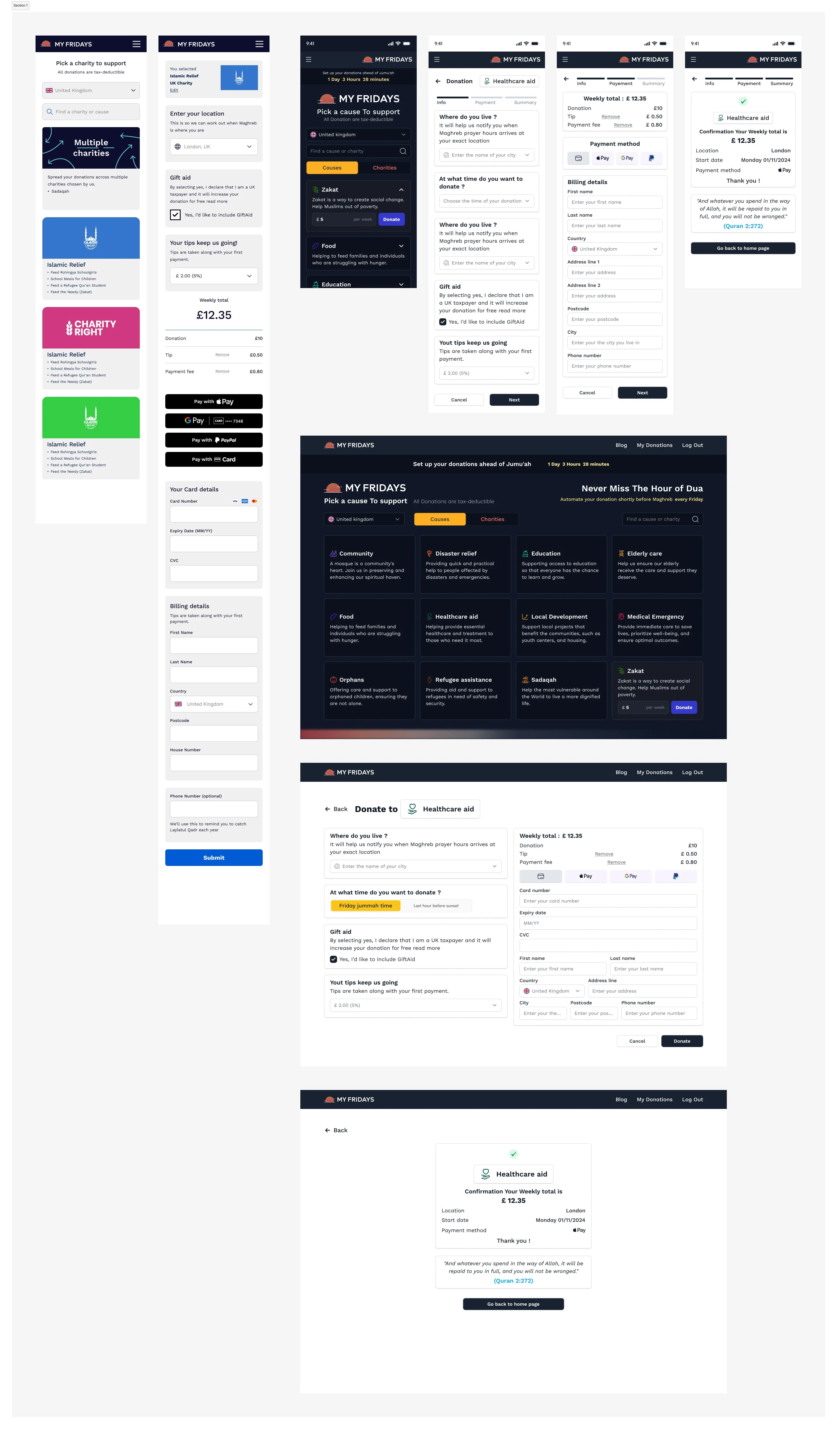
previous donation flow left New donation flow right
The previous donation flow required users to select a charity first, which often resulted in lower engagement and a lack of emotional connection. The redesigned UI now prioritizes cause-based giving, making it easier for donors to directly support issues they care about.
Key Changes in the New UI:
Cause-First Approach – The default landing page now presents causes instead of charities, allowing donors to give with purpose.
Streamlined Navigation – Fewer steps, clearer impact descriptions, and an intuitive layout guide users effortlessly through the donation process.
Split Flow for Mobile – Previously, the entire donation process was contained on a single screen, requiring excessive scrolling. We split the flow into multiple steps on mobile, making it easier to navigate and reducing cognitive overload.
Improved Accessibility & Readability – Enhanced UI components ensure a frictionless experience across devices.
These improvements create a more engaging and impactful donation experience, leading to higher donor retention and conversion rates.
Expected Impact
✅ Stronger Emotional Connection → Donors give with purpose by supporting a cause they care about.
✅ Higher Engagement & Retention → A simplified flow encourages recurring donations.
✅ Boosted Contributions → Cause-driven giving has been shown to increase donor conversion rates.
Creating the Charity Dashboard
Previously, MyFridays only allowed charities to receive donations without any dedicated tools to track and manage them. There was no centralized hub for financial reporting, donor insights, or payout management. This made it difficult for charities to:
Understand their incoming donations.
Plan fundraising efforts.
Manage team roles efficiently.
Introducing the First-Ever MyFridays Charity Dashboard
To solve these pain points, we designed a comprehensive dashboard where charities can:
✅ Monitor donations in real-time → See funds raised & active donors.
✅ Generate financial reports → Export CSVs & filter transaction data.
✅ Manage team members → Assign roles & permissions.
✅ Set up fundraising widgets → Integrate donation buttons on external websites.
✅ Track performance via leaderboards → See how their charity ranks globally & locally.
Information Architecture: Organizing the Dashboard
To ensure a clear structure, we developed a well-defined IA model, organizing the dashboard into key sections for easy navigation and usability.
Dashboard IA Structure
📌 Dashboard Overview → Total donations, scheduled payouts, active donors
📌 My Charity → Charity profile management, compliance & verification
📌 Manage People → Add & manage team members
📌 Reports → Download financial reports, analyze donation trends
📌 Leaderboard → Global & local charity rankings
📌 Causes → Create & manage fundraising initiatives
📌 Widget → Setup & integration for external donation buttons
📌 Marketing Assets → Ready-made design templates for fundraising campaigns
📌 FAQ → Support & guidance for charities
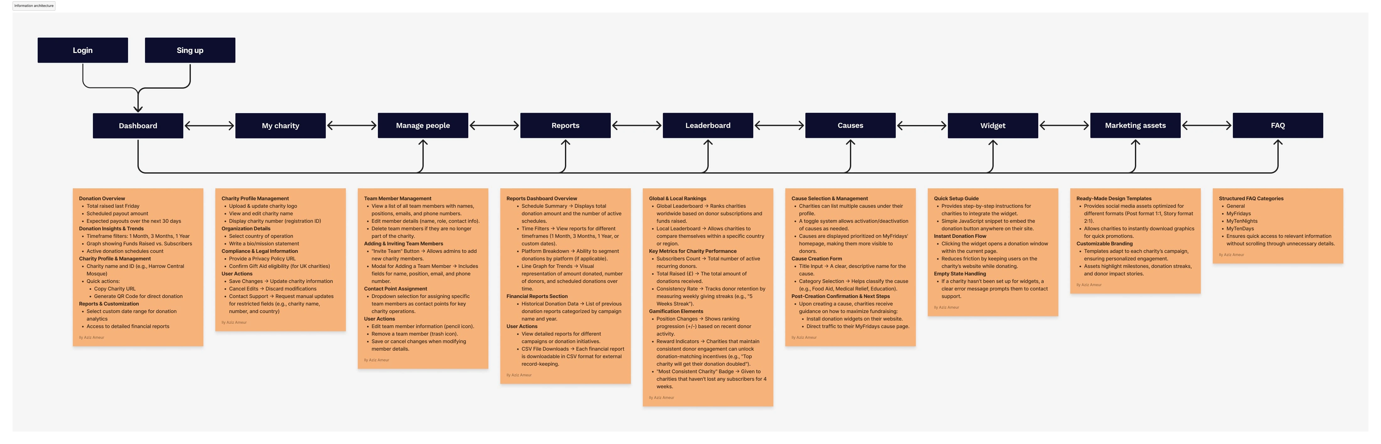
IA Visual Representation
User Flows: Designing an Intuitive Charity Experience
The Charity Dashboard introduces multiple user flows to help organizations efficiently manage their fundraising efforts, track donations, and oversee team operations. To create a seamless experience, we designed structured flows that simplify complex tasks, ensuring charities can focus on maximizing their impact rather than navigating a complicated interface.
Since the dashboard encompasses various interactions, we’re highlighting two specific user flows as examples to showcase how charities engage with MyFridays:
Creating a Cause – How charities set up fundraising initiatives and categorize their efforts.
Adding a Charity Member – The process of inviting and managing team members with role-based permissions.
By showcasing these flows, we provide insight into the structured approach used to ensure every charity action is streamlined, minimizing friction and improving usability.
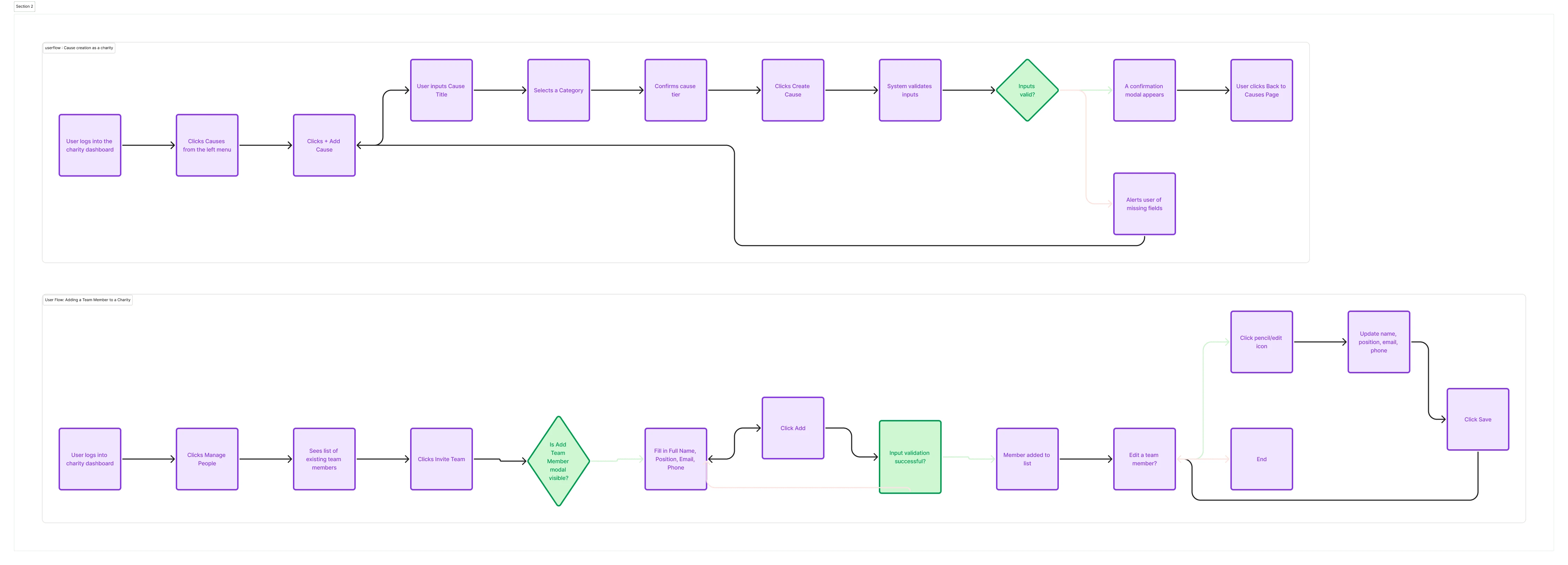
Create a Cause → A step-by-step process guiding charities through campaign setup.
Add a Charity Member → A structured flow for inviting, assigning roles, and managing access.
Wireframes: Translating User Flows into UI
To bring these flows to life, we designed wireframes that focus on:
🔹 Clarity in navigation, ensuring charities can complete tasks effortlessly.
🔹 Reducing cognitive load, breaking down actions into clear, digestible steps.
🔹 Mobile-first optimization, allowing easy access and management on any device.
These flows exemplify the structured approach we used across the dashboard, ensuring every interaction is intuitive and scalable as MyFridays grows.

Early Wireframe of the main dashboard
📌 UI Implementation
Key UI Features:
Dashboard Analytics → Tracks total donations, active donors, and payout schedules.
Detailed Reports → Generates financial reports for record-keeping.
Leaderboard System → Ranks charities based on engagement.
Cause Management → Enables quick setup of fundraising initiatives.
Widget Integration → Allows external sites to embed a donation button.
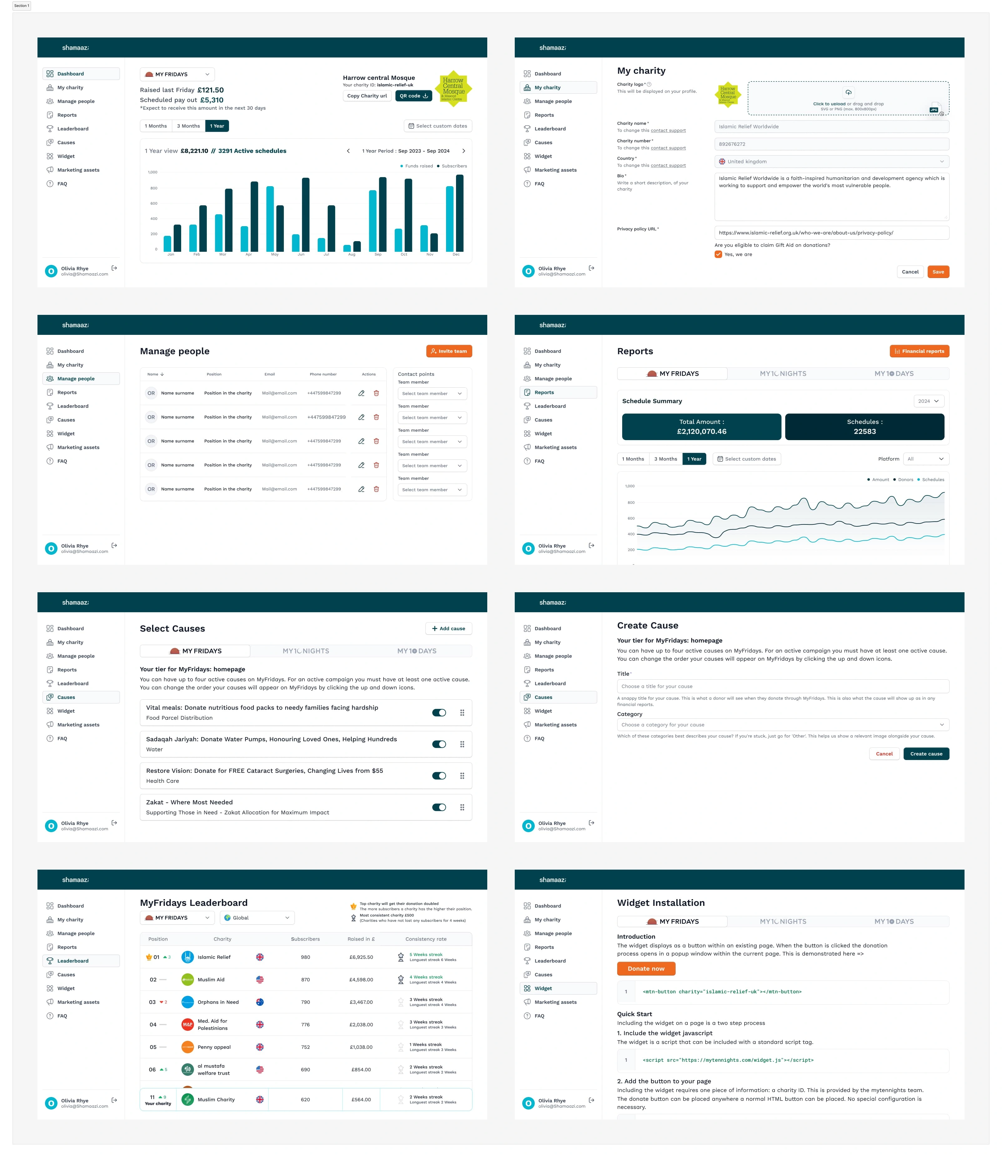
Some of the Final Screens (WEB)
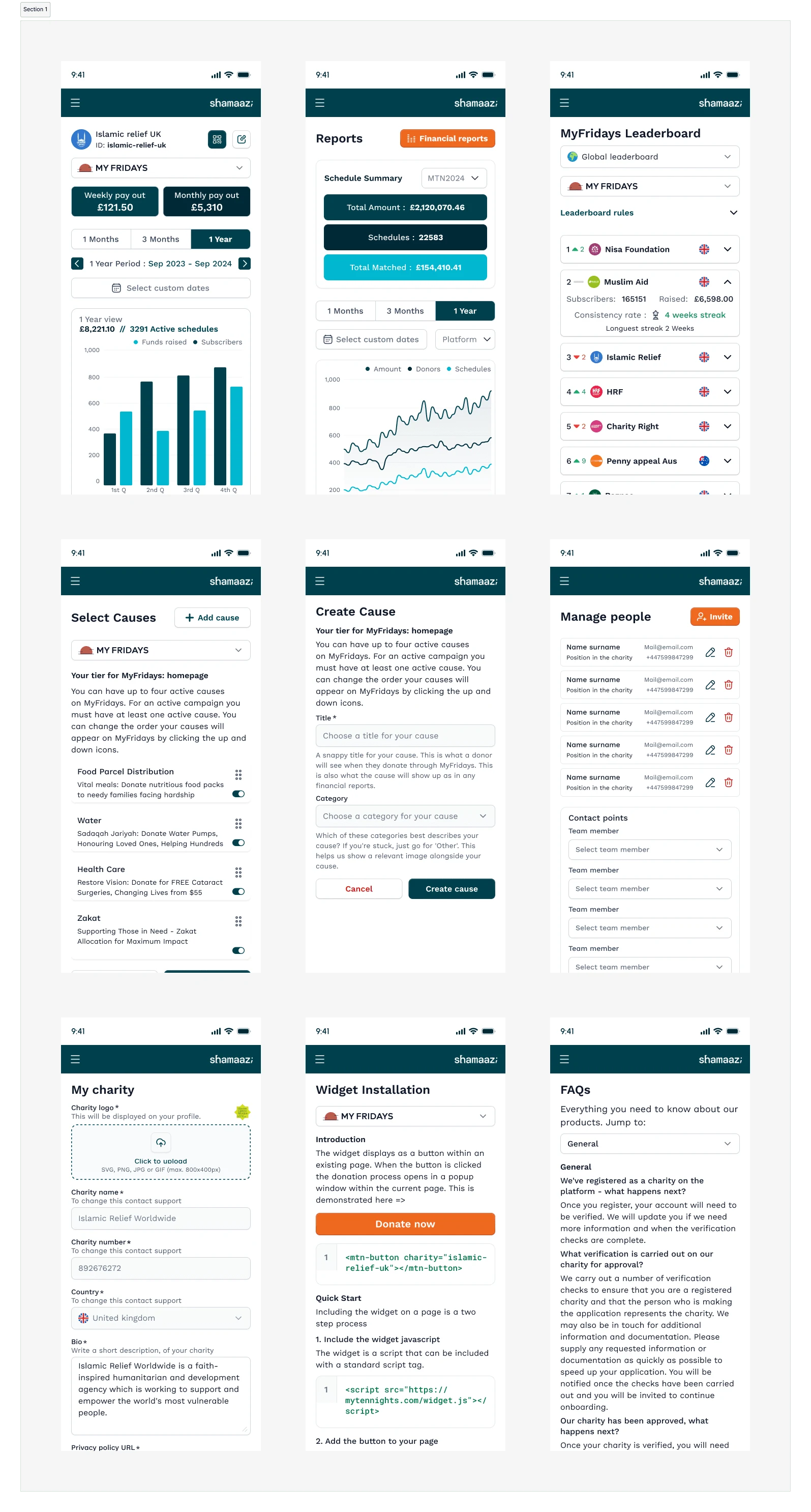
Some of the Final Screens (Mobile)
Designing a High-Converting Landing Page
Previously, there was no dedicated landing page for MyFridays. Now, we built a structured, high-converting landing page optimized for:
✅ Donor Onboarding → Educating users on MyFridays & simplifying sign-up.
✅ Charity Recruitment → Highlighting benefits & guiding charities to enroll.
✅ Trust & Transparency → Featuring testimonials, impact stats & security measures.
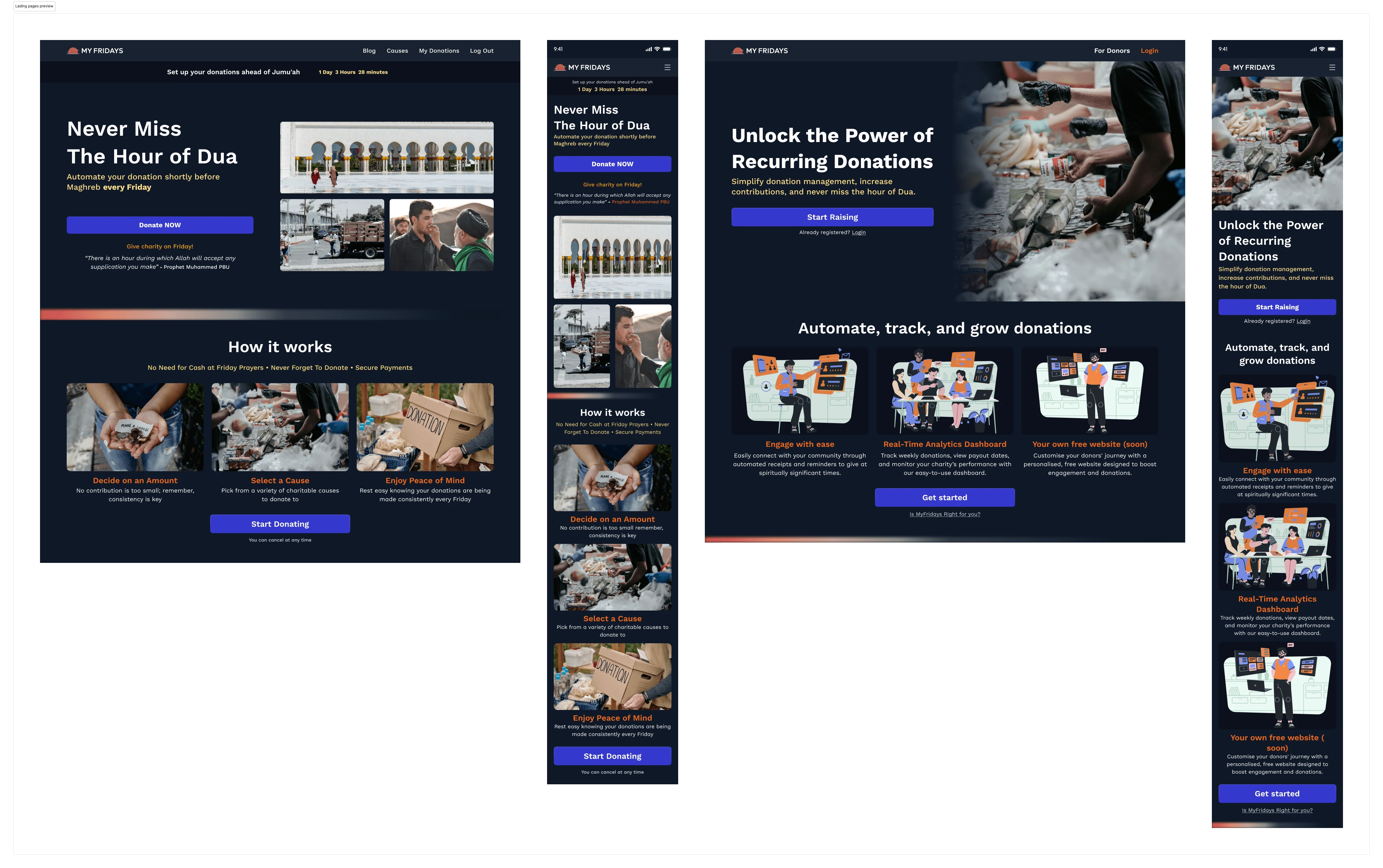
Donor (left) Charities (right)
Conclusion & Final Impact
The revamp of MyFridays was more than just a UI refresh it fundamentally changed how people donate and how charities manage their funds. By tackling three major challenges donor engagement, charity financial tracking, and onboarding conversions we built a system that is scalable, intuitive, and built for long-term impact.
🔹 Key Outcomes & Value Delivered
✅ For Donors:
The new cause-first donation flow provides emotional engagement and faster decision-making.
The simplified, step-by-step journey increases weekly giving retention.
Transparent impact tracking ensures donations feel meaningful and direct.
✅ For Charities:
The first-ever MyFridays Charity Dashboard enables real-time donation tracking, automated payouts, and seamless team collaboration.
Financial transparency & reporting tools allow charities to better manage and scale their fundraising efforts.
The leaderboard and engagement metrics drive stronger long-term donor relationships.
✅ For MyFridays as a Platform:
The new high-converting landing page boosts onboarding rates for both donors and charities.
The widget integration expands the donation ecosystem beyond the platform, allowing charities to collect funds on their own websites.
The structured IA and optimized flows make the platform more scalable for future expansion.
📌 Next Steps & Future Expansion
With the MyFridays relaunch set for Ramadan 2025, the next steps are:
📌 User Testing & Refinements → Gathering live feedback from donors and charities to further optimize interactions.
📌 Pre-Ramadan Deployment → Ensuring the system is fully tested and optimized for a high-traffic launch.
📌 Feature Expansions → Adding multi-charity donations, AI-powered donation recommendations, and enhanced donor retention tools to drive long-term engagement.
💡 Final Thoughts
Working on MyFridays was an exciting challenge that combined fintech, design, and social impact. The goal was to make charitable giving effortless, transparent, and engaging ensuring that donors felt confident in their contributions.
The project pushed me to think beyond aesthetics, focusing on how design can simplify complex financial flows while maintaining trust and usability. Crafting intuitive donation flows, refining user interactions, and ensuring a seamless experience across devices made this project both technically and creatively fulfilling.
Looking back, MyFridays transformed from a basic donation tool into a refined fintech-for-good platform, proving that great design isn’t just about looks—it’s about creating experiences that matter.
Thank you for Swinging by ✌️
Like this project
Posted Jan 30, 2025
We revamped how people give to charitable causes, built a dashboard to track their impact, and launched new landing pages to boost engagement. 🚀
Likes
0
Views
87
Timeline
Sep 9, 2024 - Jan 3, 2025
Clients
Shamaazi