Meeting potes Social Calendar app Revamp and design system setup
Ily Ameur
Project Overview
Client: Meeting Potes, a French social calendar start-up.
Role: Product Designer & Design System Lead
Timeline: November 2023 – January 2024
Business Need: Meeting Potes' limited resources led to an inconsistent UI and lack of design processes, hindering growth.
Problem Statement
Core Issue: The absence of a design system and an outdated UI created inconsistencies, negatively impacting user experience, branding, and development speed.
Impact: This led to user confusion, diminished brand trust, and slowed Meeting Potes' ability to iterate and scale in a competitive market.
Glimpse of the old user interface
Project Goals
Establish a Comprehensive Design System: Create a scalable Figma design system for consistency across the Meeting Potes application.
Revamp the User Interface: Implement a modern UI aligned with the brand, prioritizing usability and user experience.
Optimize User Flows: Redesign key user flows for enhanced navigation, reduced friction, and improved goal completion.
Increase Development Efficiency: Streamline the design-to-development handoff via the design system, minimizing errors and saving time.
Prioritizing visual language : Visual language lies at the core of any Design System and represents essential design properties. Often referred to as design tokens or atoms.
in our case, visual language spans over typography, color, and spacing, They require less time to produce than a complex UI component library, yet can have a massive difference in the perception of the brand and the product. They can effectively be used by engineers to create new components and marketing material at velocity. And that’s precisely what Meeting Potes needed at this stage.
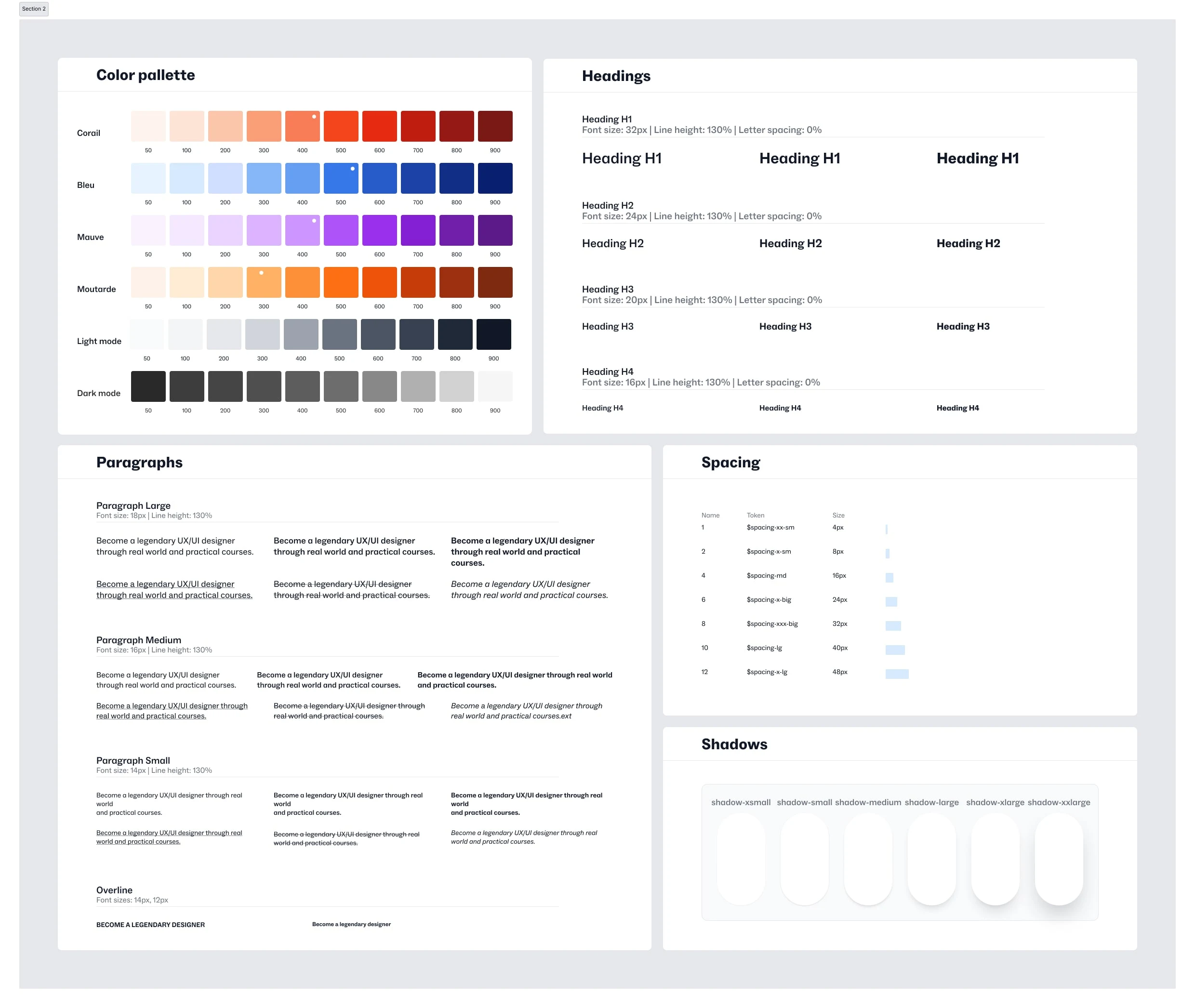
Design system Tokens— colors, spacing, shadows and typography.
Typography Transformation : "Meeting Potes previously relied on only two font weights, hindering visual hierarchy. I introduced semi-bold and bold weights, creating clearer distinctions between headings, body text, and calls to action, which improved readability and overall app structure."
Color Consistency : "The app's inconsistent color use felt disjointed. Implementing Tailwind CSS conventions (shades 50-900) established a systematic approach to color, ensuring consistency, better brand recognition, and a cleaner UI."
Dark Mode Strategy : "Anticipating demand for dark mode, I carefully chose color values to enable a seamless alternate theme. This proactive approach streamlined later development."
Side to side view of both dark and light mode
Imposing Spatial Order : "The old app lacked a defined spacing system, making elements feel cramped or unrelated. I introduced an 8pt grid, bringing structure, aligning elements, and creating visual rhythm for users."
Tools : "Figma's variables and styles features ensured easy rollout of the new typography, color, and spacing systems, promoting consistency and maintainability."
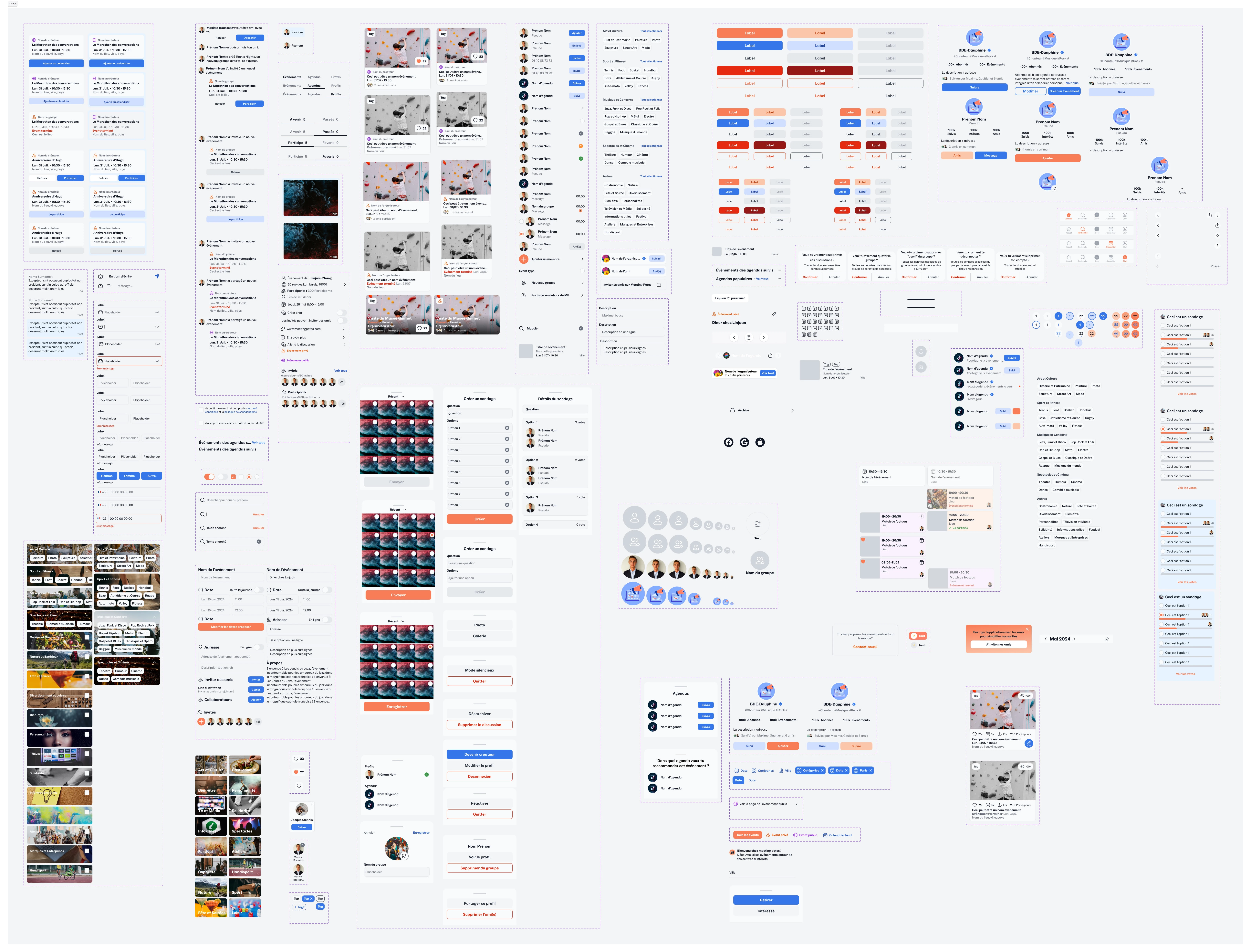
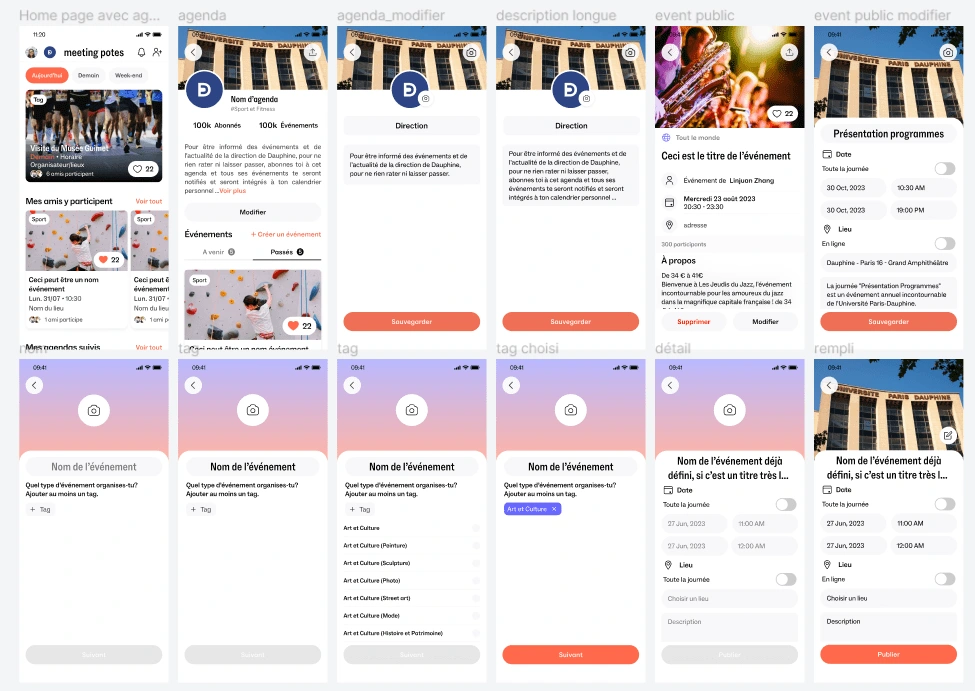
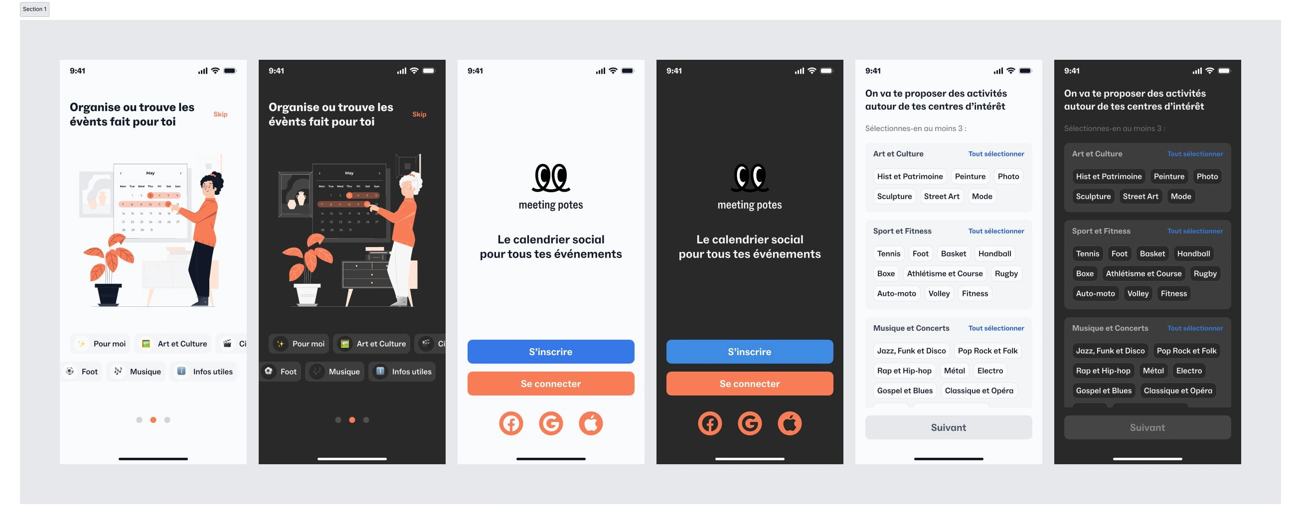
User interface revamp & New Flows
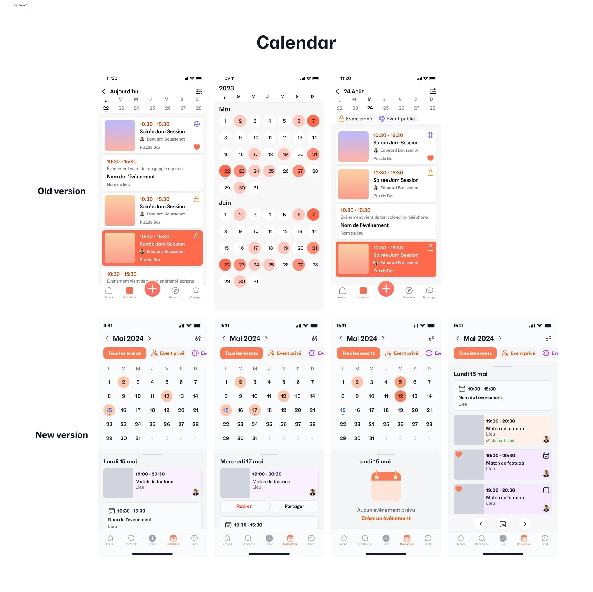
Calendar section revamp
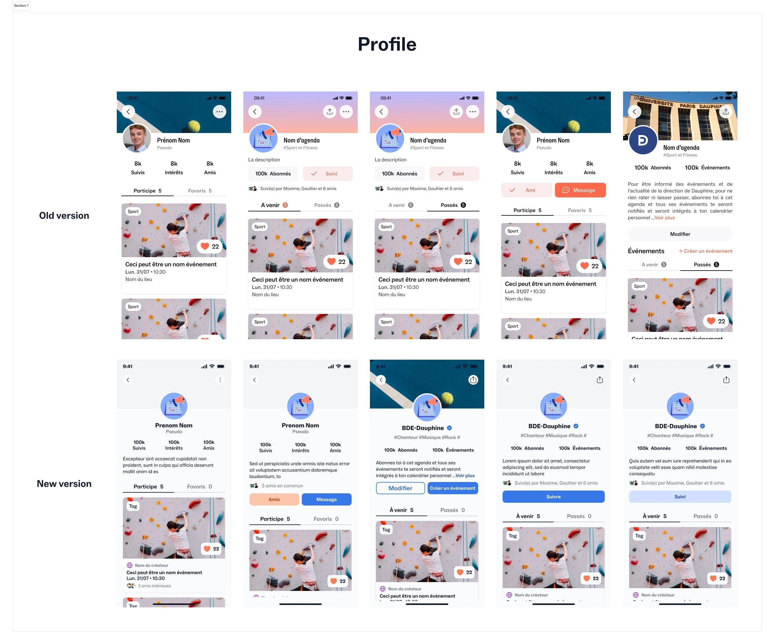
Profile section revamp
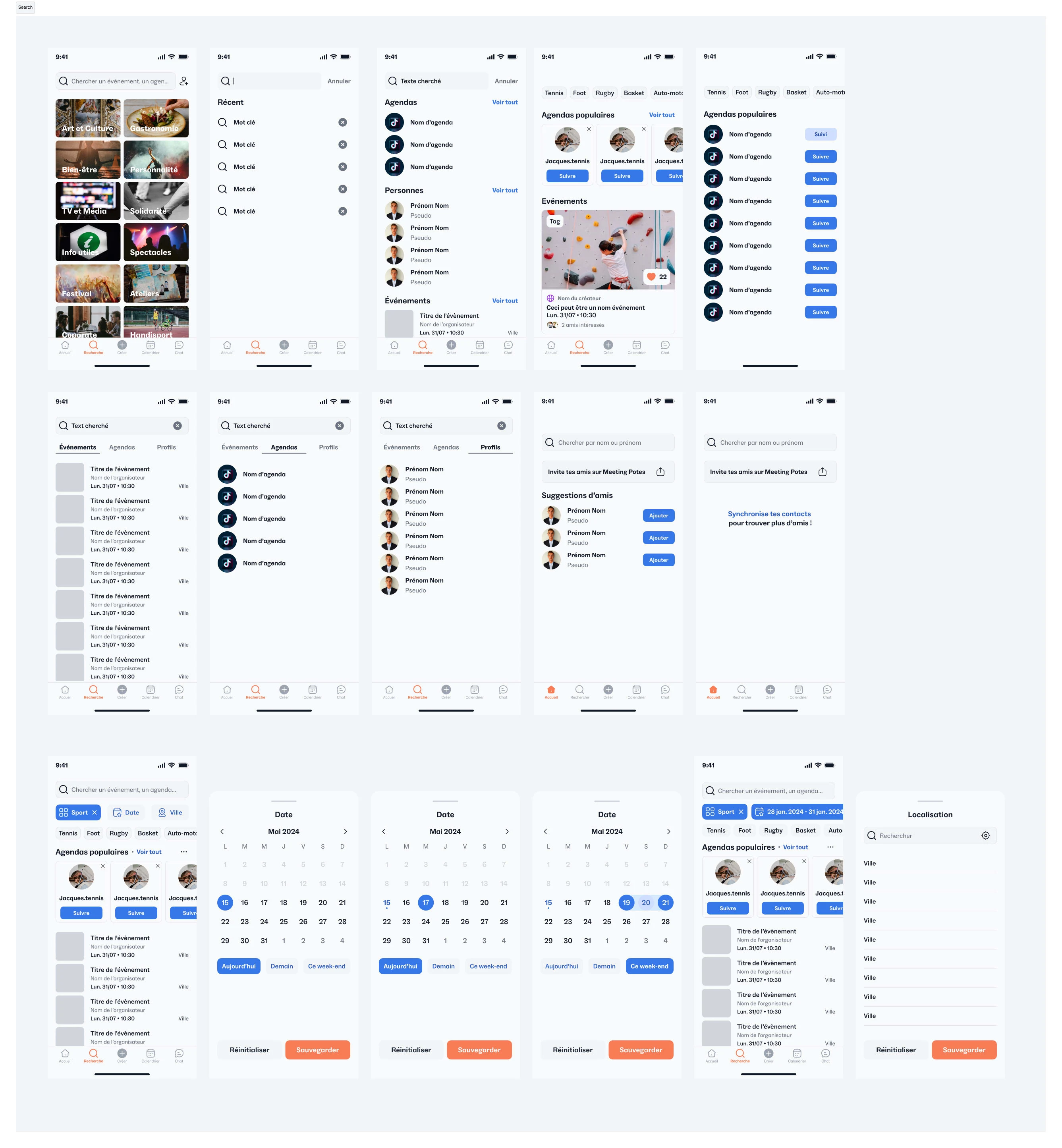
Flows revamp example
I redesigned the search entry point to foster both targeted searching and serendipitous discovery. Users are presented with a "Discover" grid showcasing various event categories, along with a prominent search bar. To further refine results, I introduced comprehensive filtering options based on date, location, event category, and subcategories (like choosing "Tennis" within "Sports"). The results page emphasizes clear typography, spacing, and visual cues, making it easy for users to quickly find the information they need.
Outcome: This multi-faceted approach to search transformed how users interact with the app. The "Discover" feature increased engagement and encouraged exploration, while the powerful filtering options allowed users to find precisely what they were looking for.
Design system in action
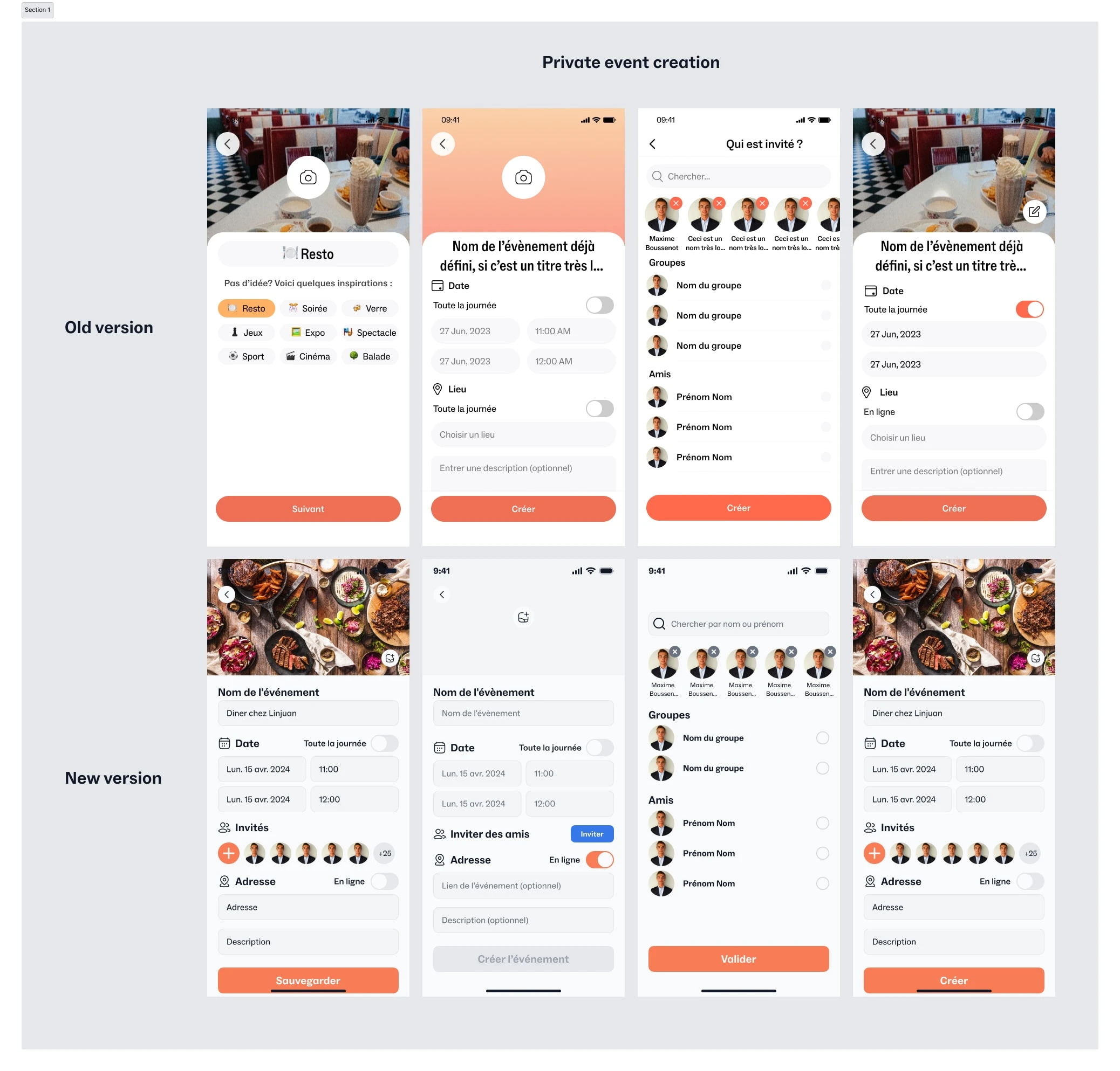
The transformation of the event creation screen demonstrates the power of a well-structured design system. The old design (top) lacked visual hierarchy and clear input fields. In contrast, the redesigned screen (bottom) leverages system-defined components, spacing, and typography for a seamless user experience.
Component Name: Form Text Input
System Tie-in: Employs standard typography (body text), border styles, and padding as defined in the design system.
Component Name: Primary Button ("Create Event")
System Tie-in: Utilizes bold brand color (#F87C56), rounded corners, and H4 typography style as defined in the design system.
Component Name: User Avatar
System Tie-in: Adheres to standard avatar sizing and circular shape, as defined in the design system.
Solution-Focused: Maintains visual consistency in user representation across the app, enhancing familiarity.
Outcomes & Results
Workflow Improvements Enabled by the Design System
Streamlined Design-to-Development Handoffs: The design system, with its well-defined components, styles, and documentation, eliminated the need for constant back-and-forth communication between design and development. This reduced ambiguity and potential for errors during implementation.
Enhanced Developer Autonomy: The clarity and structure of the design system empowered developers to confidently implement UI elements and even explore new solutions within the established visual language. This fostered a sense of ownership and increased development efficiency.
Quantifiable Impact: The introduction of the design system directly led to a doubling of development output. This demonstrates the system's tangible benefits in terms of speed and scalability.
Closing thought
The Value of Ground-Up System Creation: While building a design system from scratch for a startup presents challenges, it offers a deep understanding of the product's unique needs and the flexibility to design for future growth.
Designing for Scale: Creating a design system necessitates considering how UI elements will function in a variety of contexts. This fosters a scalable design mindset, enabling the app to evolve alongside user growth.
Balancing Revamps and User Flows: Revamping the UI while simultaneously redesigning user flows requires careful prioritization. It's critical to ensure that UI updates enhance, rather than disrupt, the core user experience.
Communication as Key: Open and effective communication between design and development teams is essential for successful design system implementation. My experience highlighted the importance of shared understanding and collaborative problem-solving.
The creation of the design system has empowered everyone in the organisation to launch new marketing pages rapidly and consistently as well as improve the product’s interface with confidence.
thank you for swinging by ✌️
Like this project
Posted Apr 8, 2024
transformed a startup's UI from inconsistent to streamlined with a design system. Took a startup from "meh" to "wow"with killer UI and killer Design system. ✨
Likes
0
Views
231
Clients
Meeting Potes