UX/UI Design + Design System for B2B SaaS AgTech Startup

Overview
Agriful is an inventory and management platform for the produce industry.
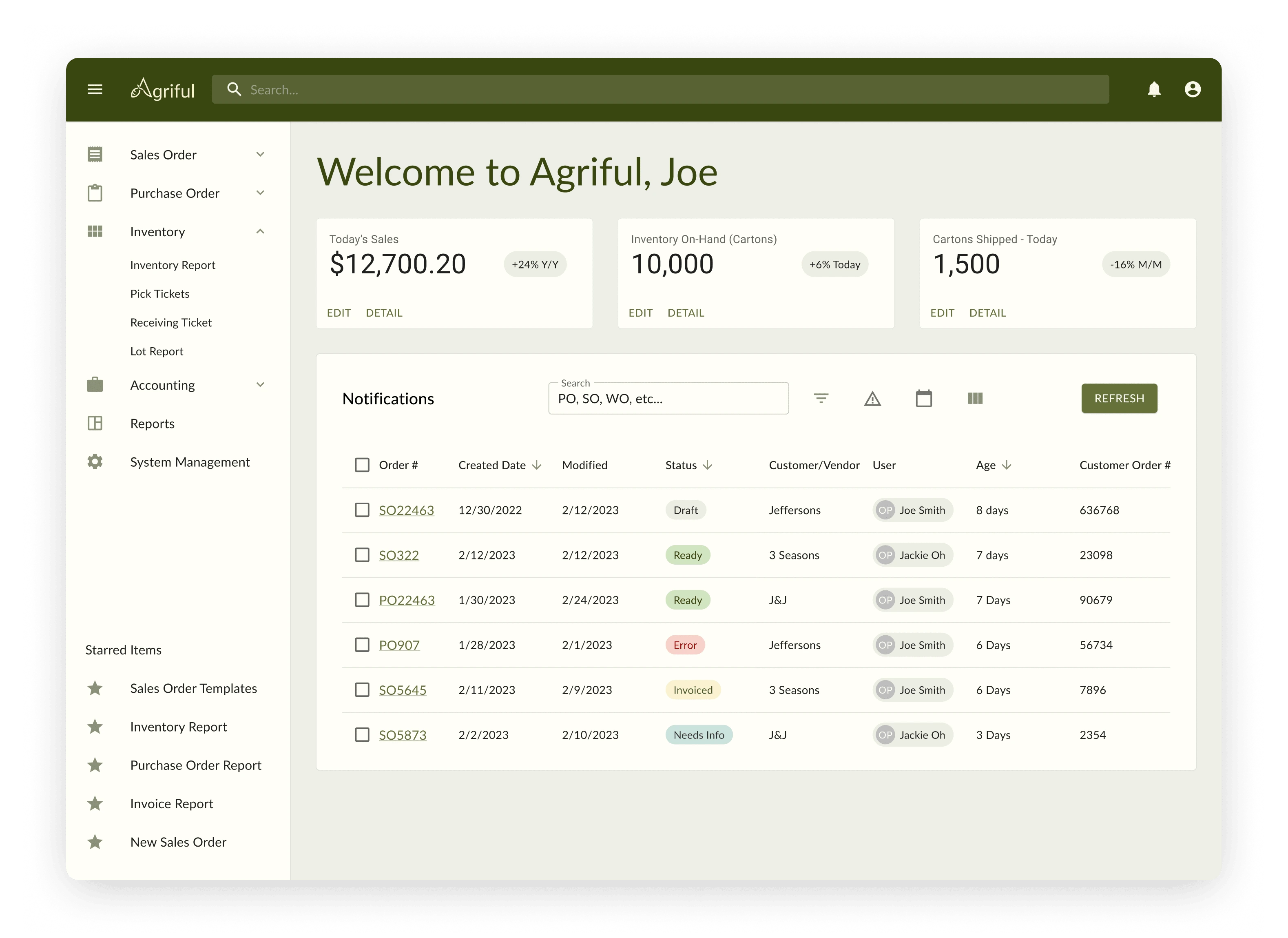
Most produce distributors still track inventory, sales and purchase orders, and commodity journeys on paper. Best-case scenario, this strategy is time-consuming and disorganized. Worst-case, issues with produce and recalls can not be tracked back to their origins when something goes wrong. In order to streamline the produce management process and help eliminate these potential compliance issues, Agriful decided to invest in a UX design and branding project to build their brand identity and create an intuitive platform that displays a high volume of information in a digestible format.
Goals
Our goals were to build a system of sales and purchase orders, inventory, lot tracking, and payment screens that show critical information in a distilled and easy-to-understand format, maximize efficiency in the produce management workflow, eliminate compliance issues, and maintain standardization under the Material UI design system. We wanted the brand to reflect warmth, growth, and harvest colors to tie into the idea of success and fruitfulness resulting from the use of the platform.
Process
To achieve these goals, we began by receiving user feedback from Agriful's advisors, which identified pain points and areas for improvement in the current process. Most advisors agreed that their current methods of tracking inventory and buy/sell orders on paper was disorganized, confusing, and left room for big risks with compliance.
Based on this feedback, we built an interface based on Material UI to be the most accessible and intuitive that it could be. We designed auto-fill sections into sales and purchase orders to reduce time spent filling out lengthy forms. We designed a system of visual alerts to notify the user when stock is low, so they can reorder what they need without wasting product. We used specific wording, icons, and color coding to clearly indicate statuses and alerts, empowering users to quickly identify quality control concerns and take swift action. Finally, we differentiated editable areas of data tables with heavier line weights and changing color on hover states, to clearly indicate where the user can and should input their own information.
We chose a series of warm neutral greens, oranges, and tans for the brand colors. We used a Material UI-recommended typeface, conventional alert colors to stay in line with user expectations, and brought in a slightly more saturated light green for contrast in the logo and other accents. When designing the logo, we were interested in keeping the design as simple as the platform, and ultimately landed on an abstract design that incorporated the "Agriful" name and tied in a lively root vegetable shape.
Results
We continue to conduct usability testing with Agriful's advisors as we iterate toward an ideal system for managing sales and purchase orders, inventory, and supply chain tracking.
Agriful's development team is currently building out the platform and incorporating user-centered design elements at every stage.
Like this project
Posted Mar 24, 2023
A long-term UX design, UI systems, and branding project for Agriful, an inventory and management platform for the produce industry.
Likes
0
Views
121


