UX/UI Design for Indoor Nav System Optimized for Neurodiversity

Overview
HyperLocal is an indoor navigation app for college campus buildings that promotes efficiency and anxiety management for Neurodivergent students.
Most college students, but particularly the Neurodivergent, are easily affected by the social anxiety of looking lost, staring at a map for "too long", or asking for directions. While outdoor navigation systems are rapidly advancing, most college campuses still have no public system of indoor navigation for their larger and more complex buildings. Furthermore, the few maps that exist at building entrances are cluttered, complicated, and cause information overload for Neurodivergent students. HyperLocal reduces anxiety by automating a big part of the students' daily routines and provided a user-informed, constantly-updated record of accessibility across college campus buildings.
Goals
Our goals were to create a standardized, comprehensive, discreet, and up-to-date indoor navigation system for UMass Amherst campus buildings. We also planned to reduce the negative effects of decision-making for Neurodivergent folks, which include time inefficiency, information overload, and decreased student performance. We aimed to reduce Spotlight Effects (the perceived judgment of others) in Neurodivergent students, and give students with disabilities a navigation system they can trust by implementing a system of user-reported route and access updates.
Process
To achieve these goals, we began by conducting interviews with Neurodivergent students, which identified pain points and areas for improvement in the current process. Most users agreed that the lack of systemization within campus buildings causes confusion, social anxiety, makes them late for exams and meetings, and decreases their academic performance over time.
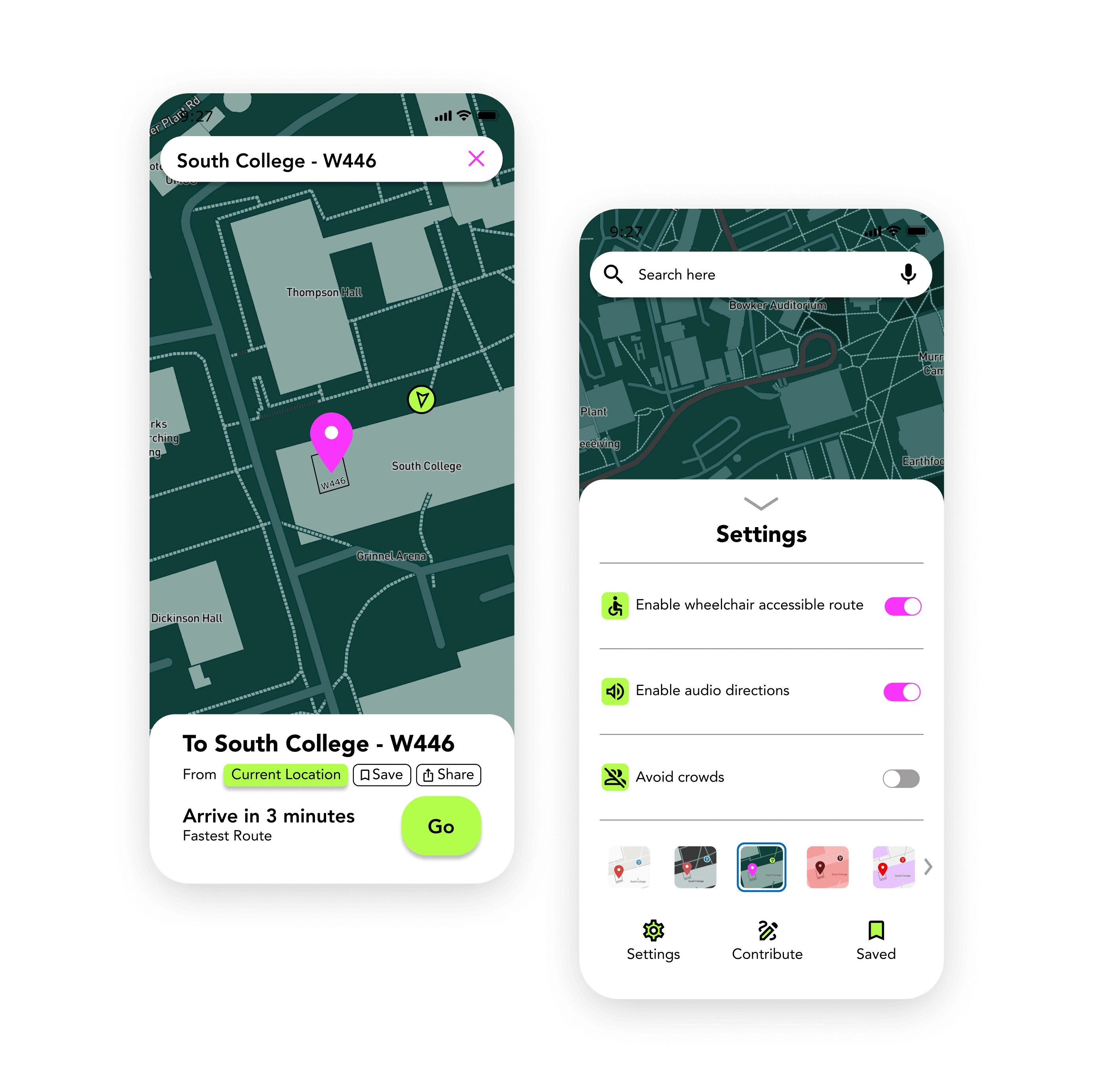
Based on this feedback, we built a navigation interface that utilizes the user's phone camera for precise wayfinding in real time. We intentionally chose clear language for the directions to eliminate confusion (ex: "the third door on your right" vs. "in 500 feet"). We designed several accessibility settings including multiple color themes for color blindness, options to enable or disable audio directions, wheelchair-accessible routes, and routes that avoid crowds. Finally, users can save frequent routes for single-tap navigation and are encouraged to submit their own routes and report when they notice an accessibility outage.
Results
HyperLocal received positive feedback during usability testing. Testers agreed that more nuanced accessibility features such as avoiding crowds and easily toggling audio off made them feel confident in using the app without drawing unwanted attention. Users also championed the inclusion of a reporting system. Submission-based updates to route suggestions ensures that HyperLocal remains in touch with user needs and continues to give the most efficient and up-to-date directions. Encouraging users to submit accessibility outages, like submitting bug reports, ensures that disabled students have a system they can trust, since most universities do not make this information easily accessible and do not frequently update it.
Like this project
Posted Sep 17, 2022
HyperLocal is an indoor navigation app that promotes anxiety reduction and time management in users, and utilizes research-backed accessible design practices.

