City Brand Identity & Logo Design | Győr

Tamás Kurucz


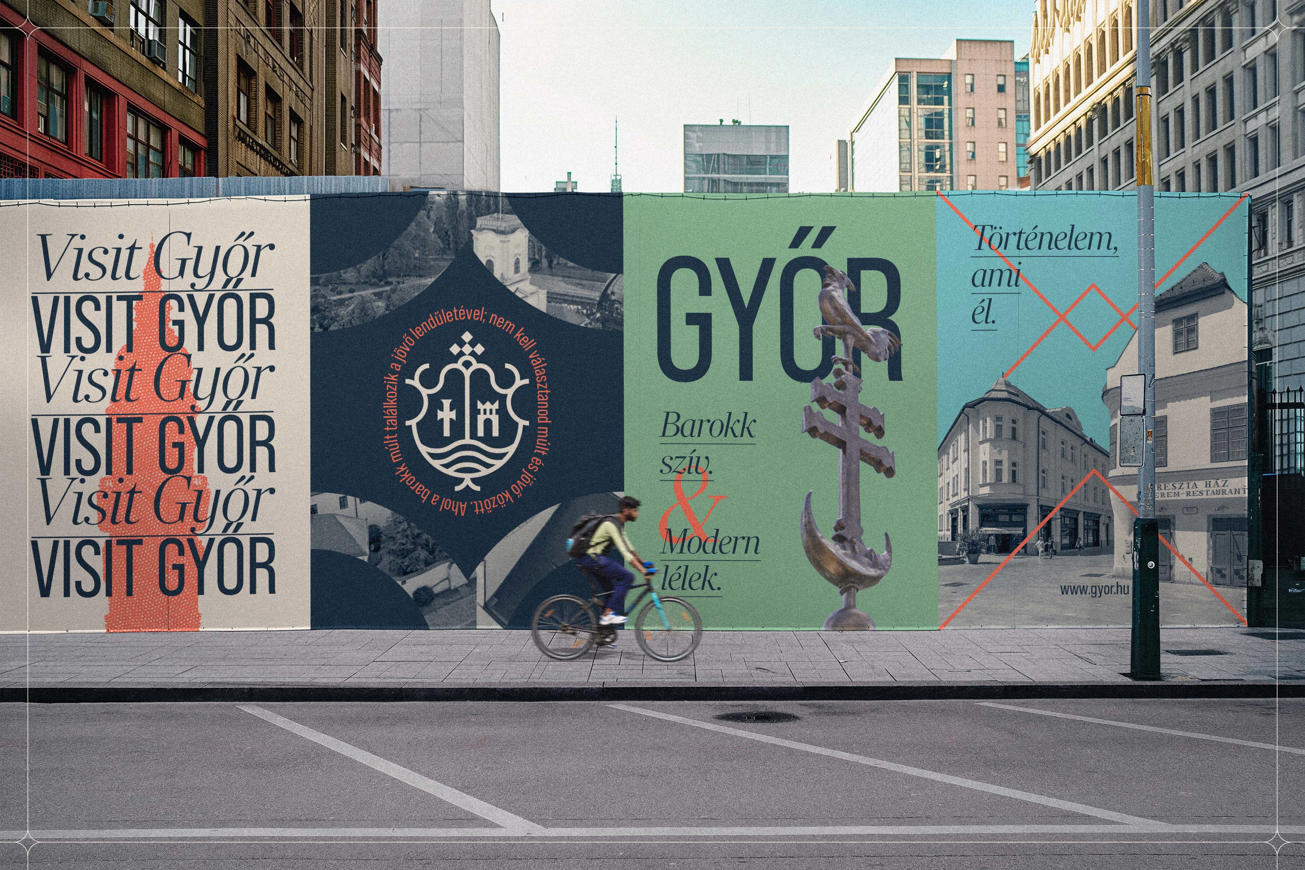
Győr
City Brand Identity & Logo Design
Case study of a city brand identity and logo design concept for Győr, balancing baroque heritage and contemporary visuality through a modernized coat of arms, clean typography and a fresh, elegant color palette.
CLIENT: Győr
YEAR: 2025
INDUSTRY: Public Sector; Destination Branding
AWARDS & RECOGNITION: Exhibited, 25rd Graphic Design Biennial - 2026, Hungary | Exhibited, 23rd Golden Drawing Pin Award and Exhibition - 2026, Hungary
Project Overview
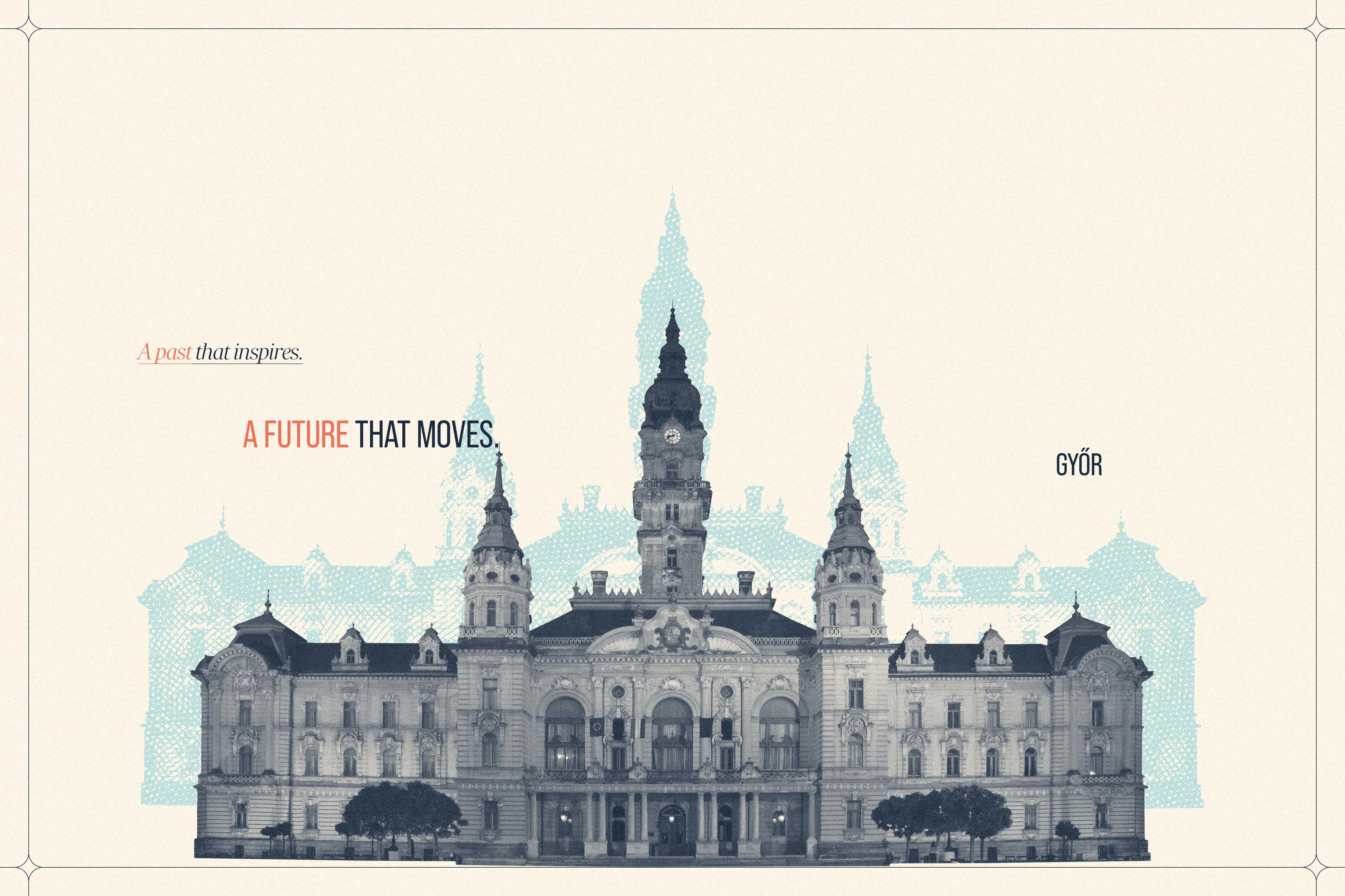
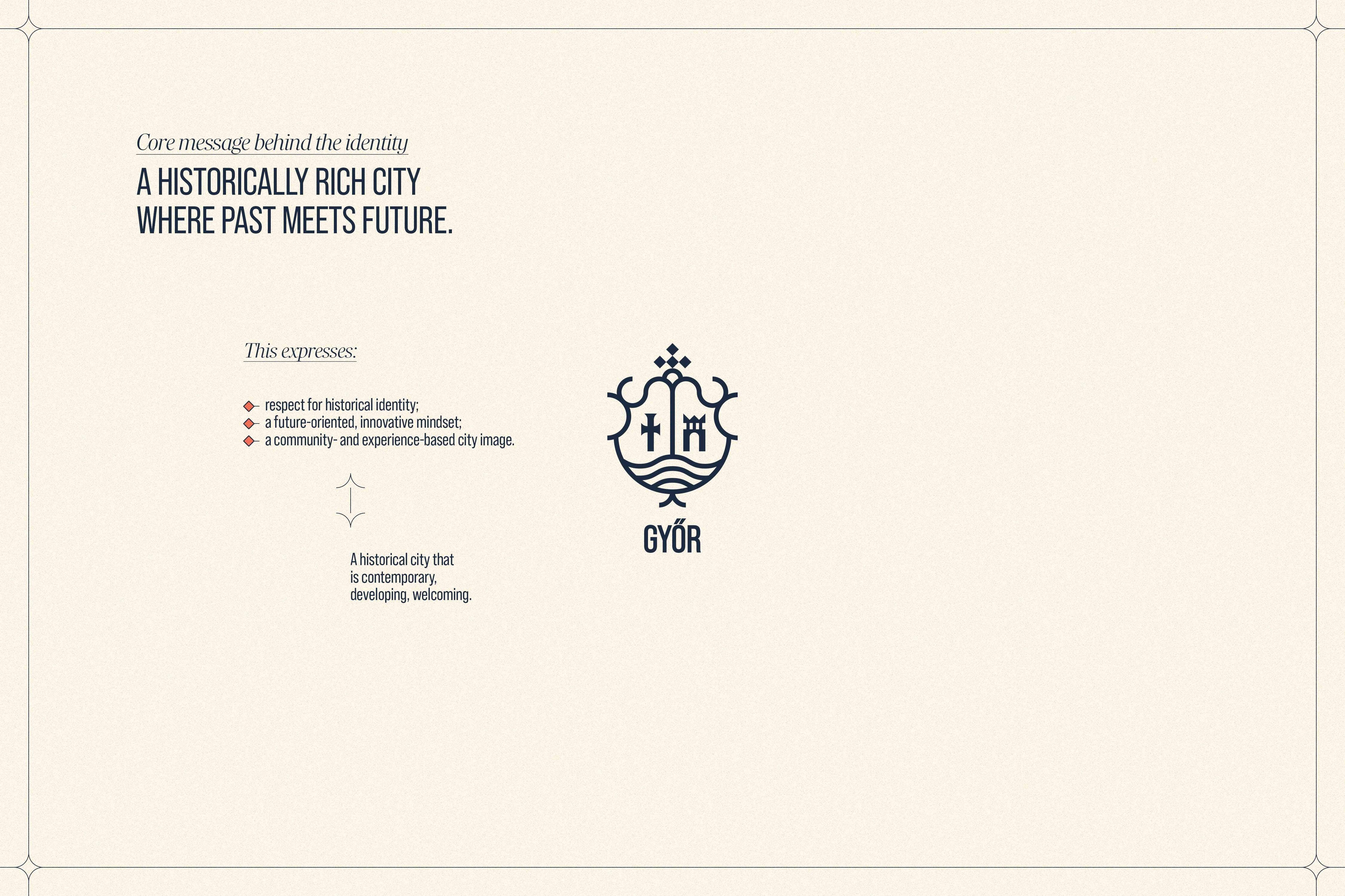
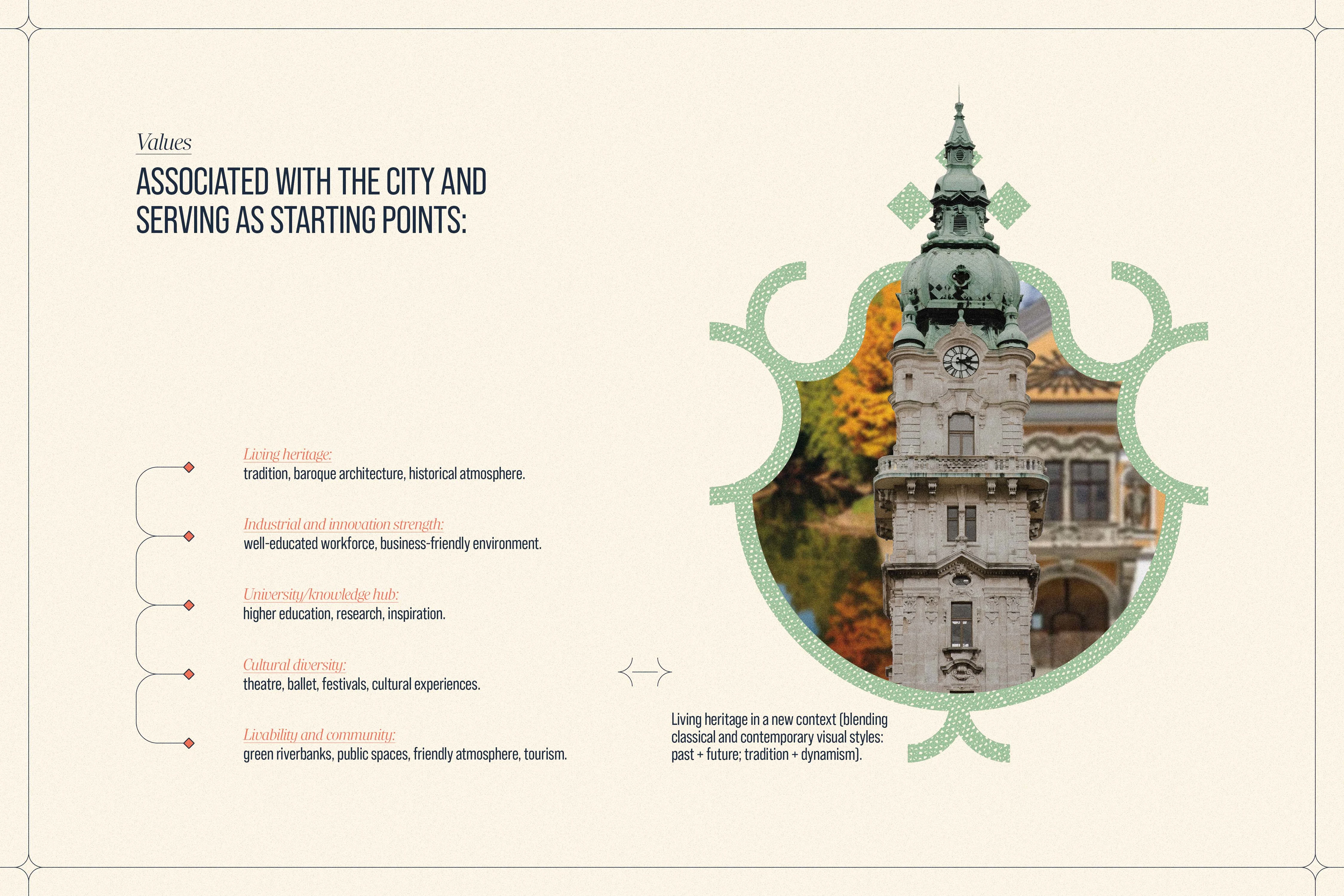
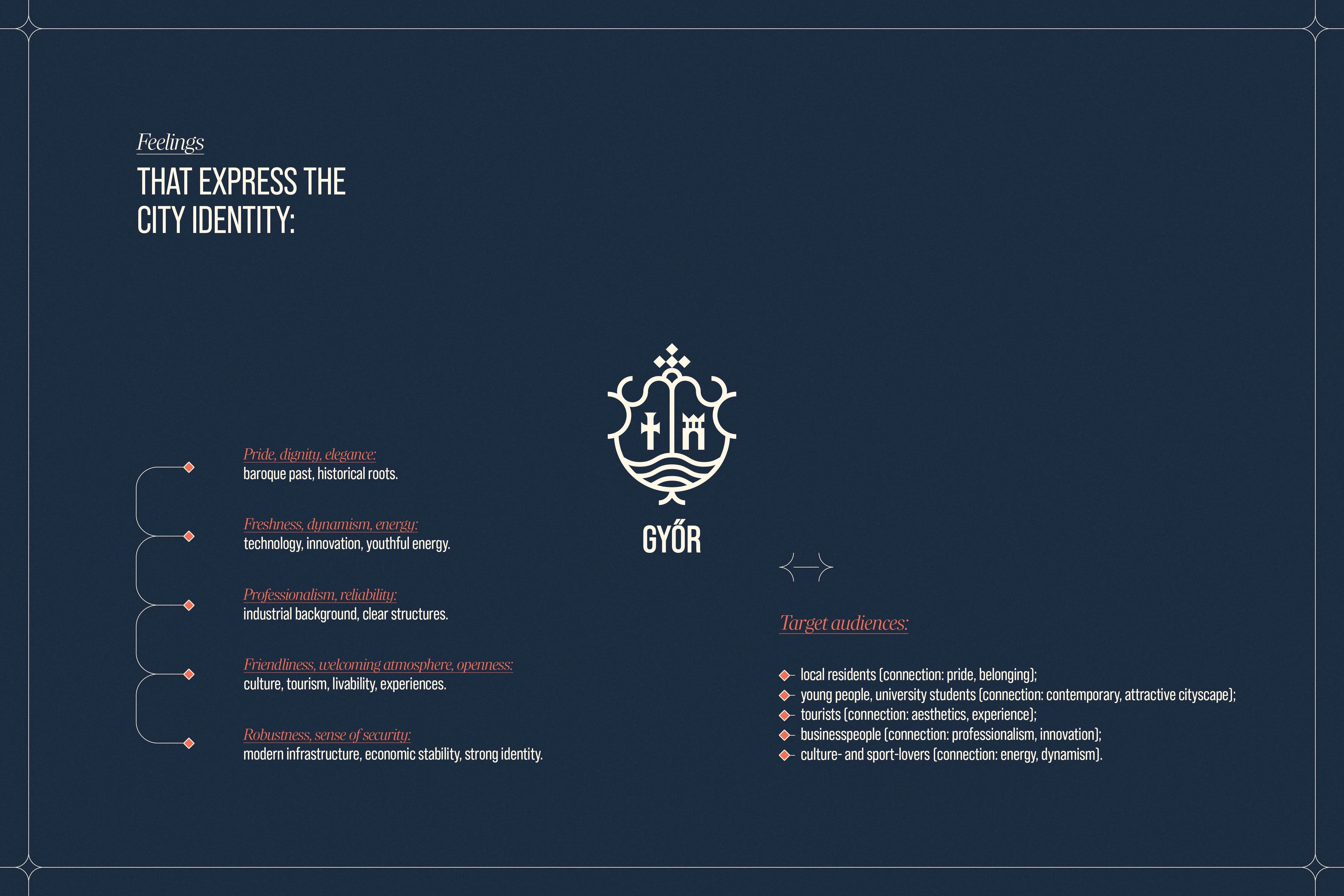
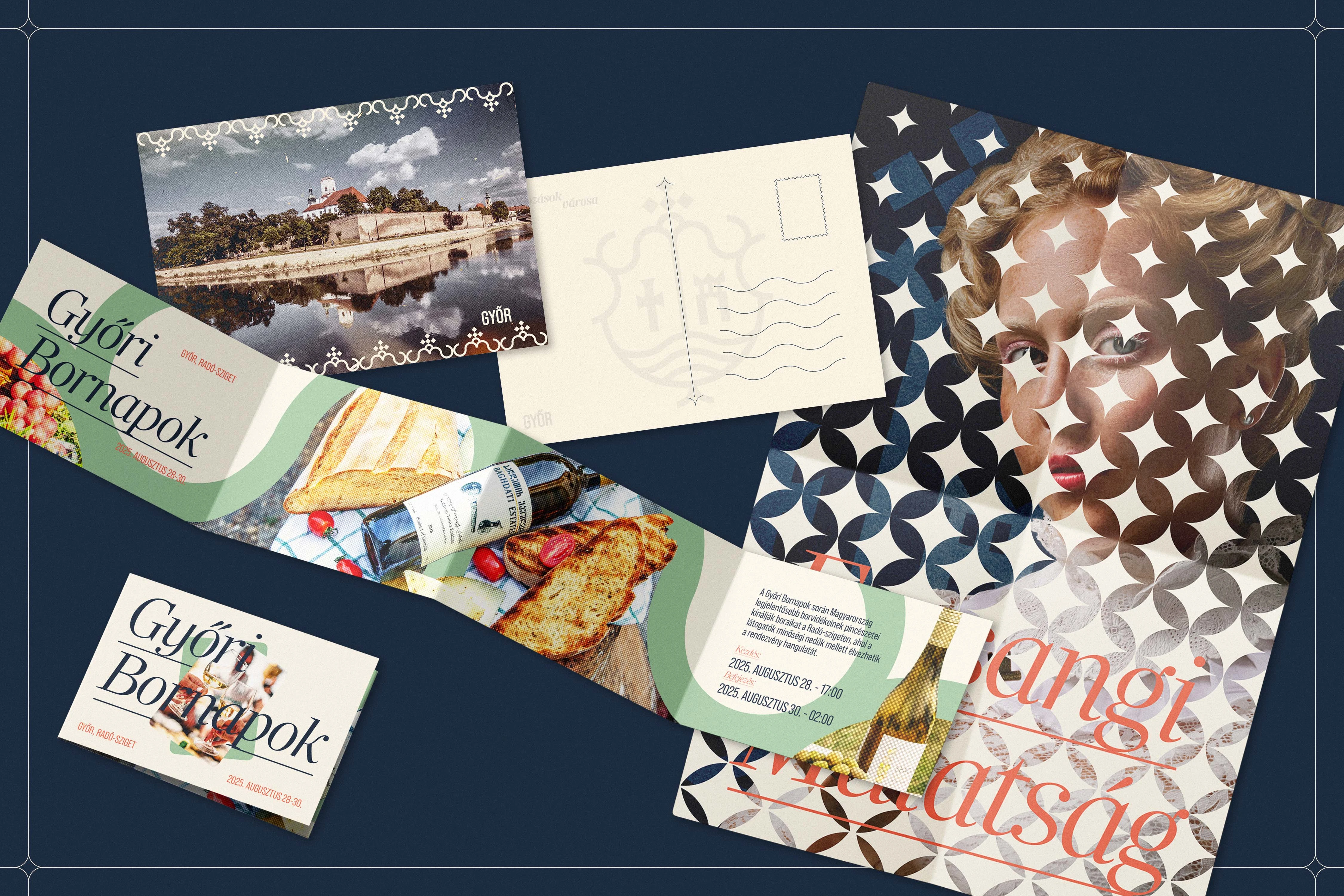
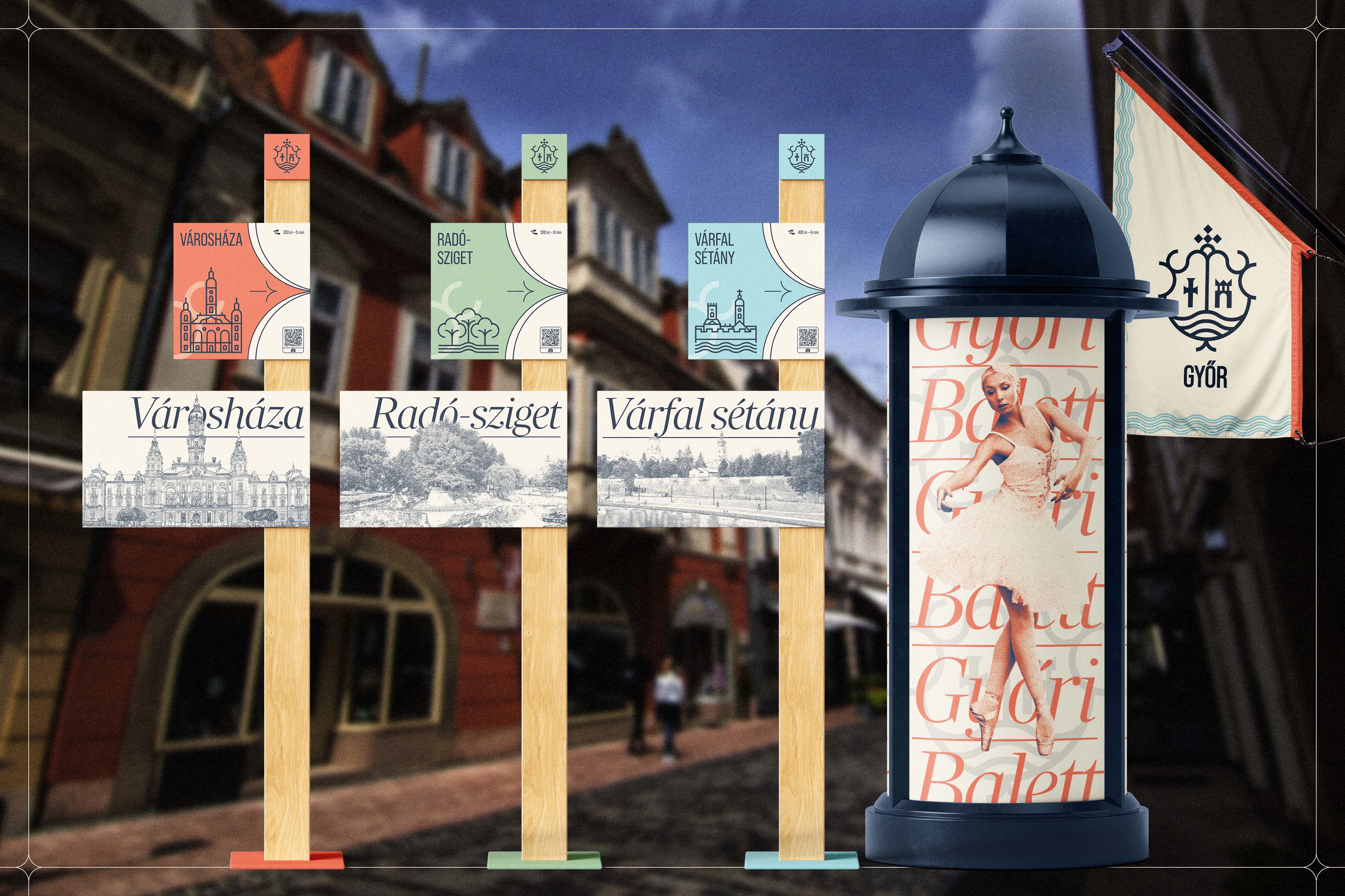
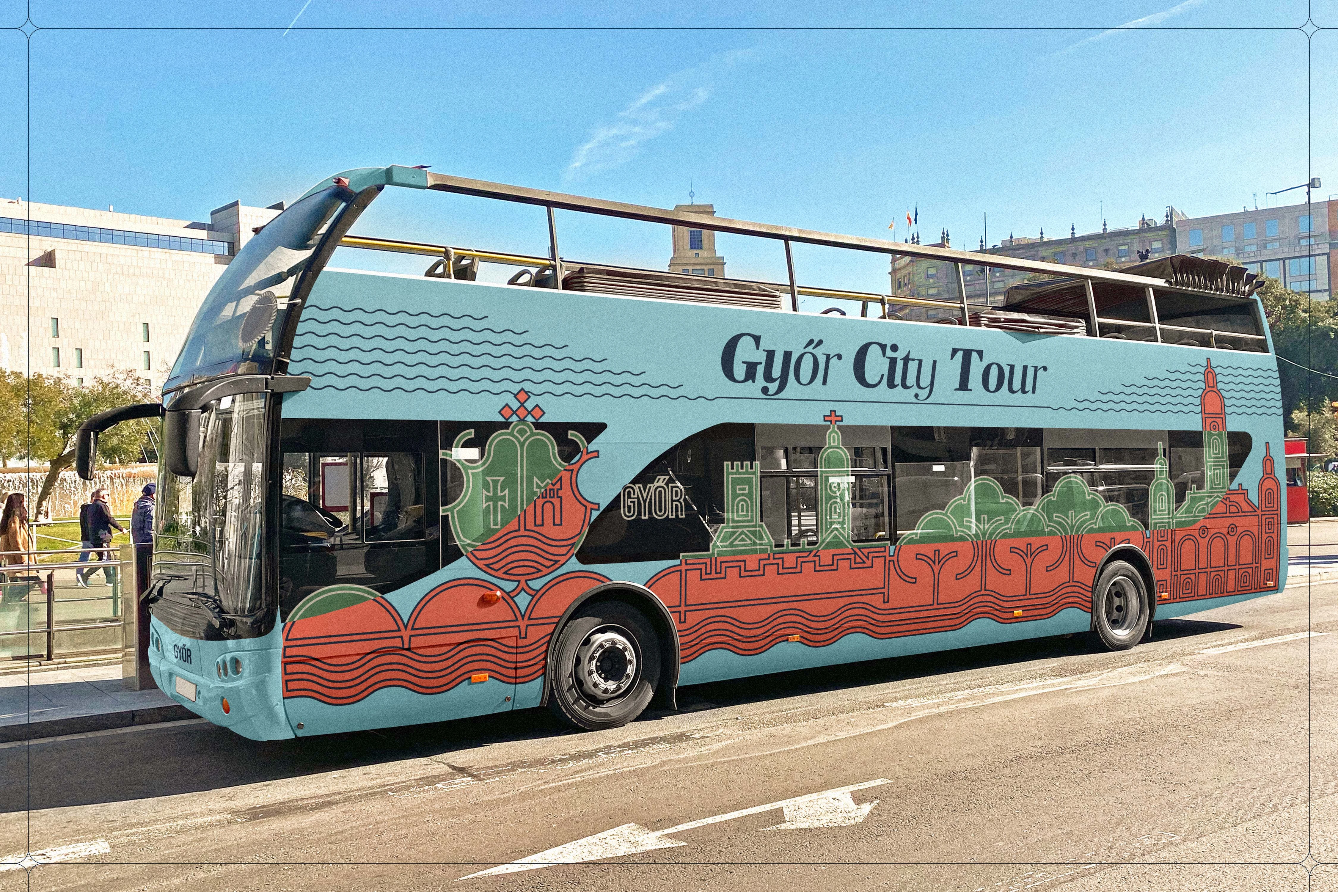
Designing a city brand identity for Győr required striking a delicate balance between its rich baroque heritage and a contemporary, forward-looking visuality. Approaching Győr as a layered, multifaceted Central European city—where industrial strength, a vibrant university life, and cultural diversity intersect—the core concept was built around the idea of "living heritage in a new context." The goal was to create a unified, human-centered visual system that resonates with a wide array of audiences, from residents and students to tourists and business stakeholders, presenting Győr as a place where the past and the future seamlessly meet.
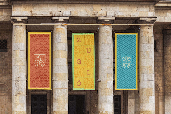
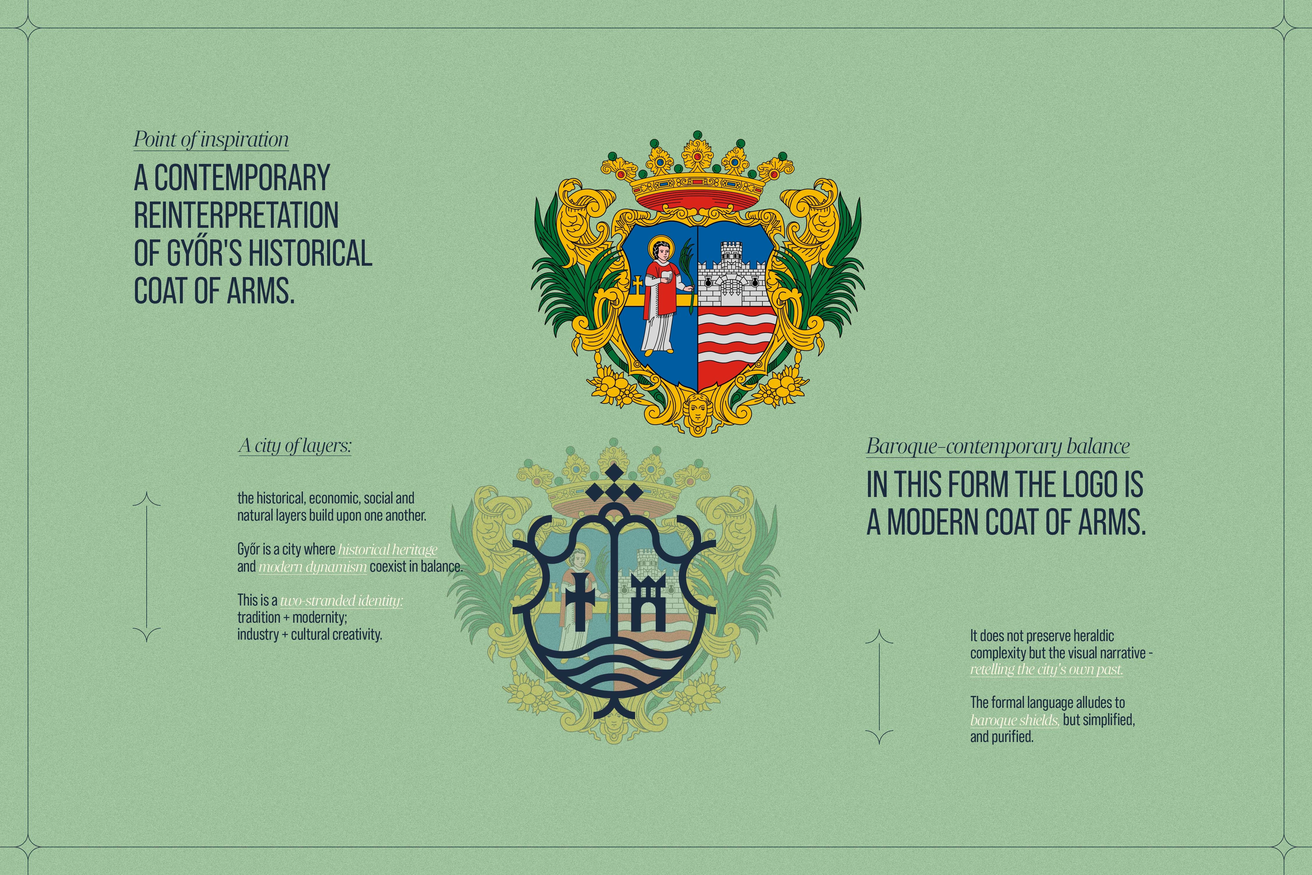
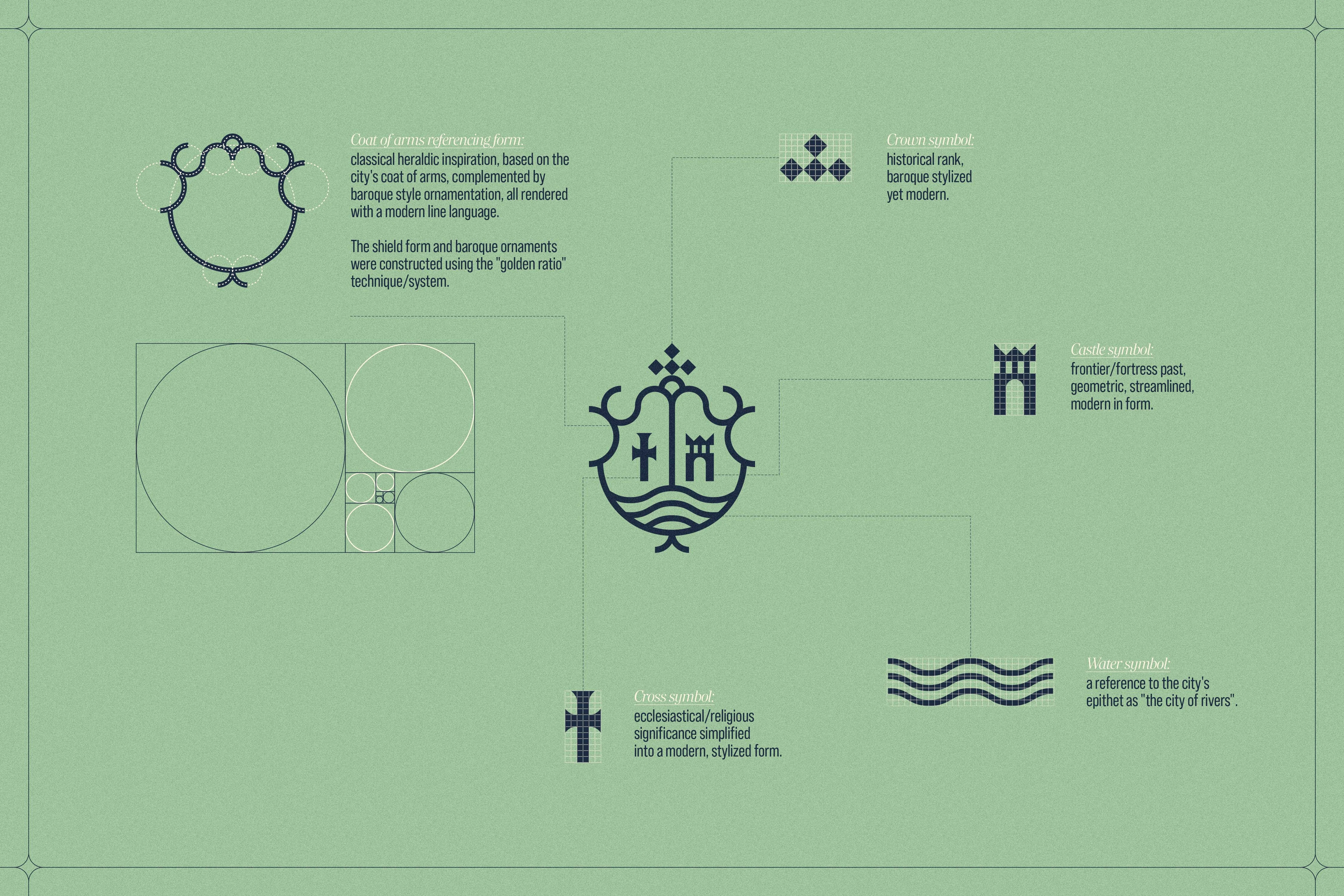
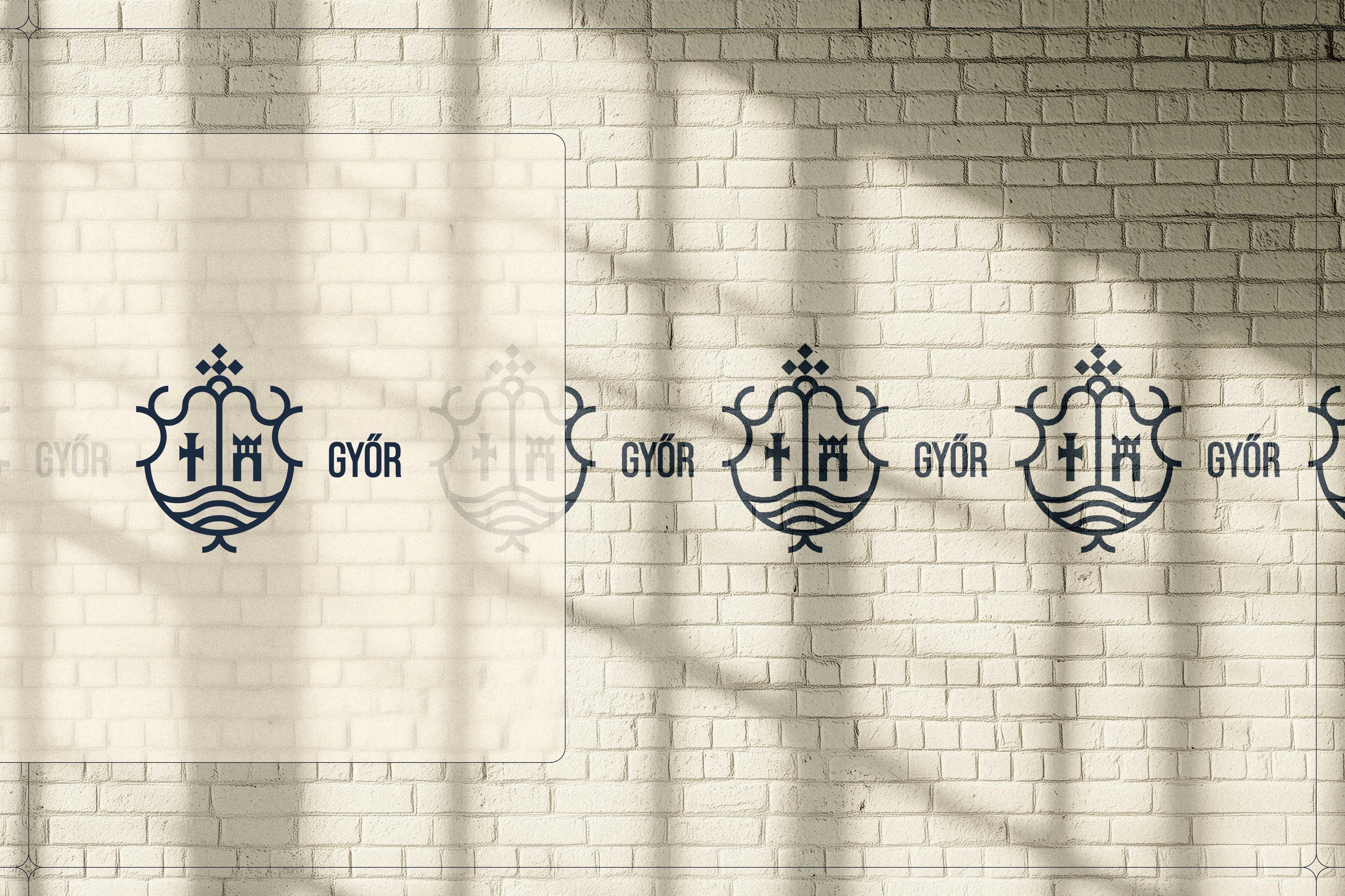
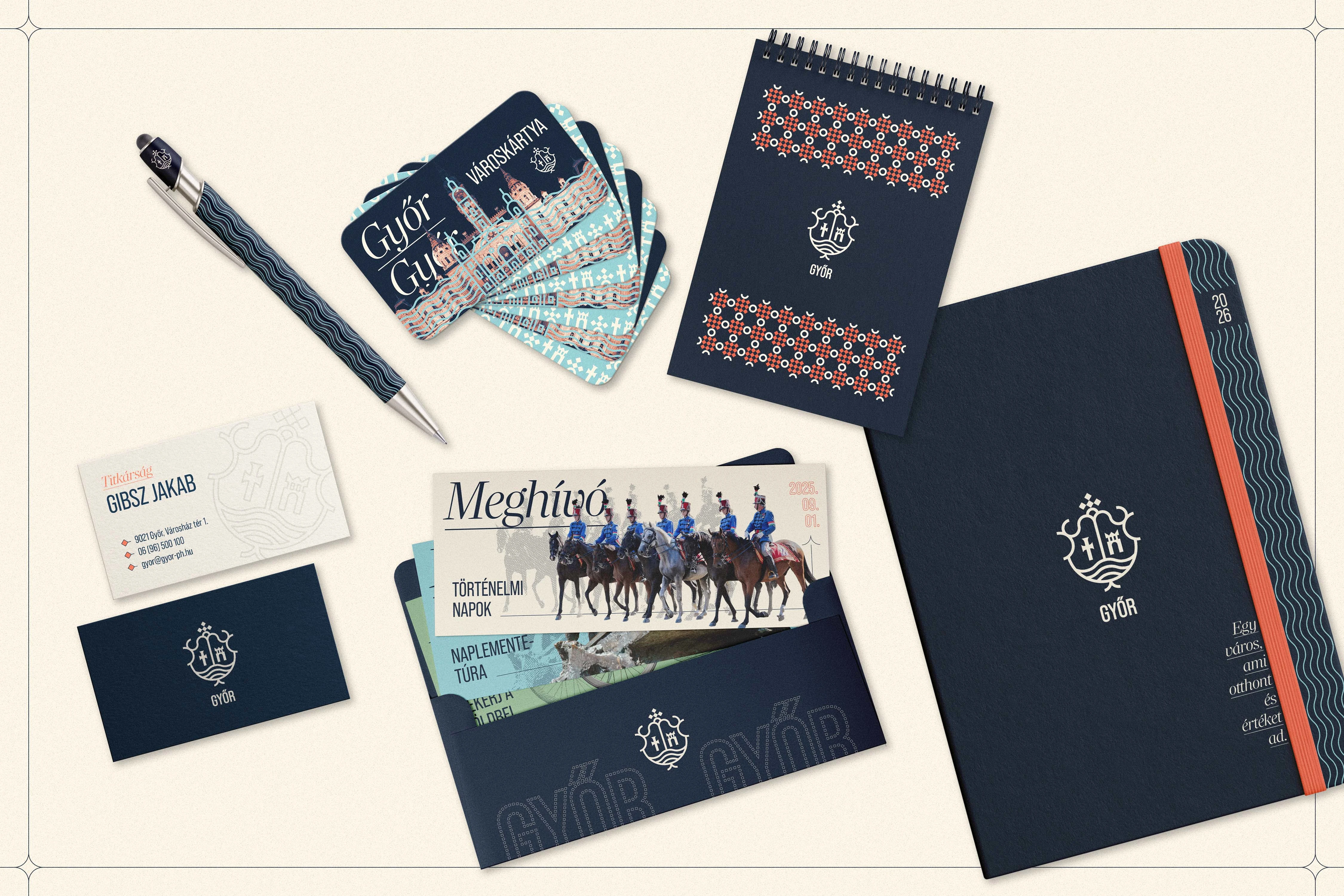
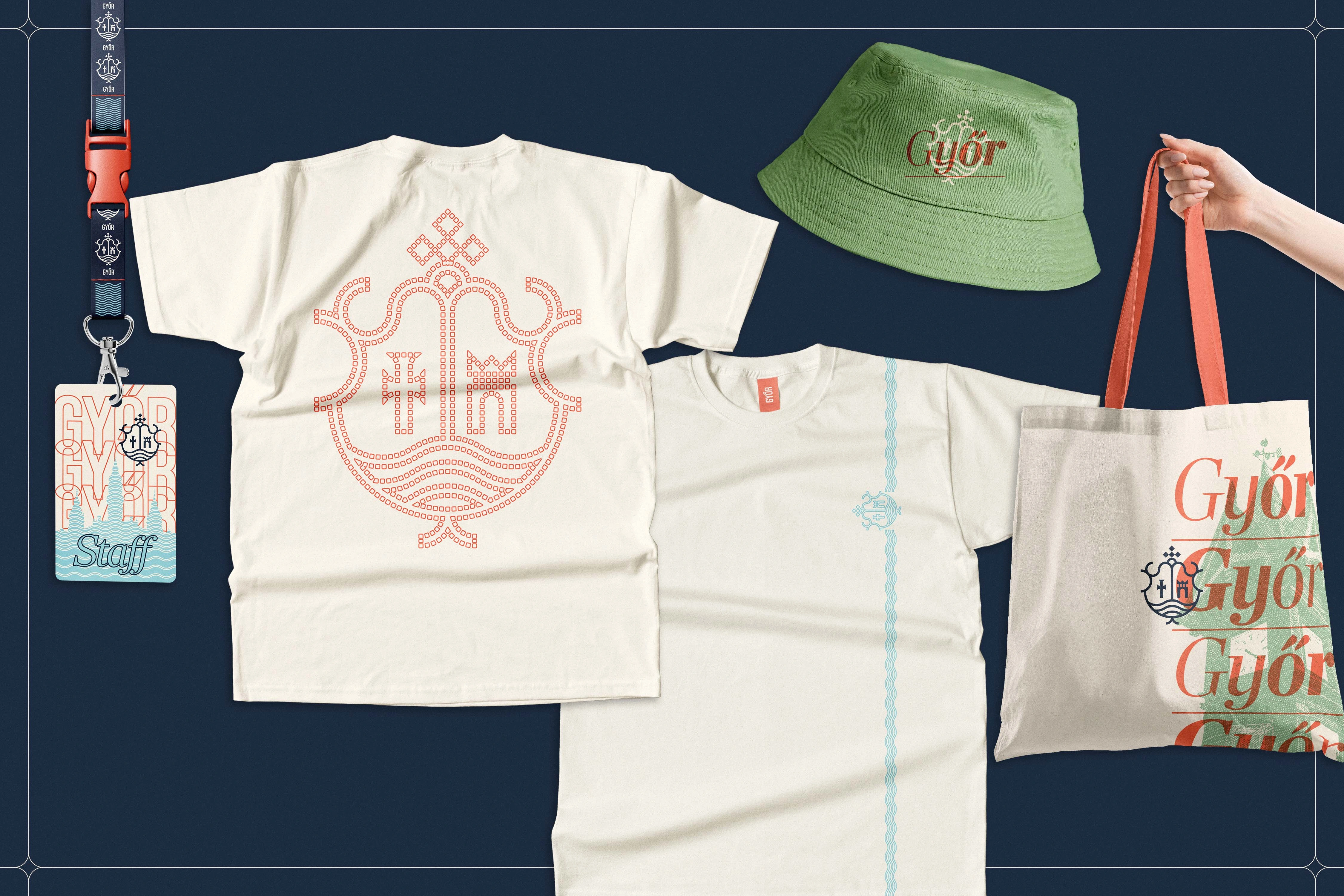
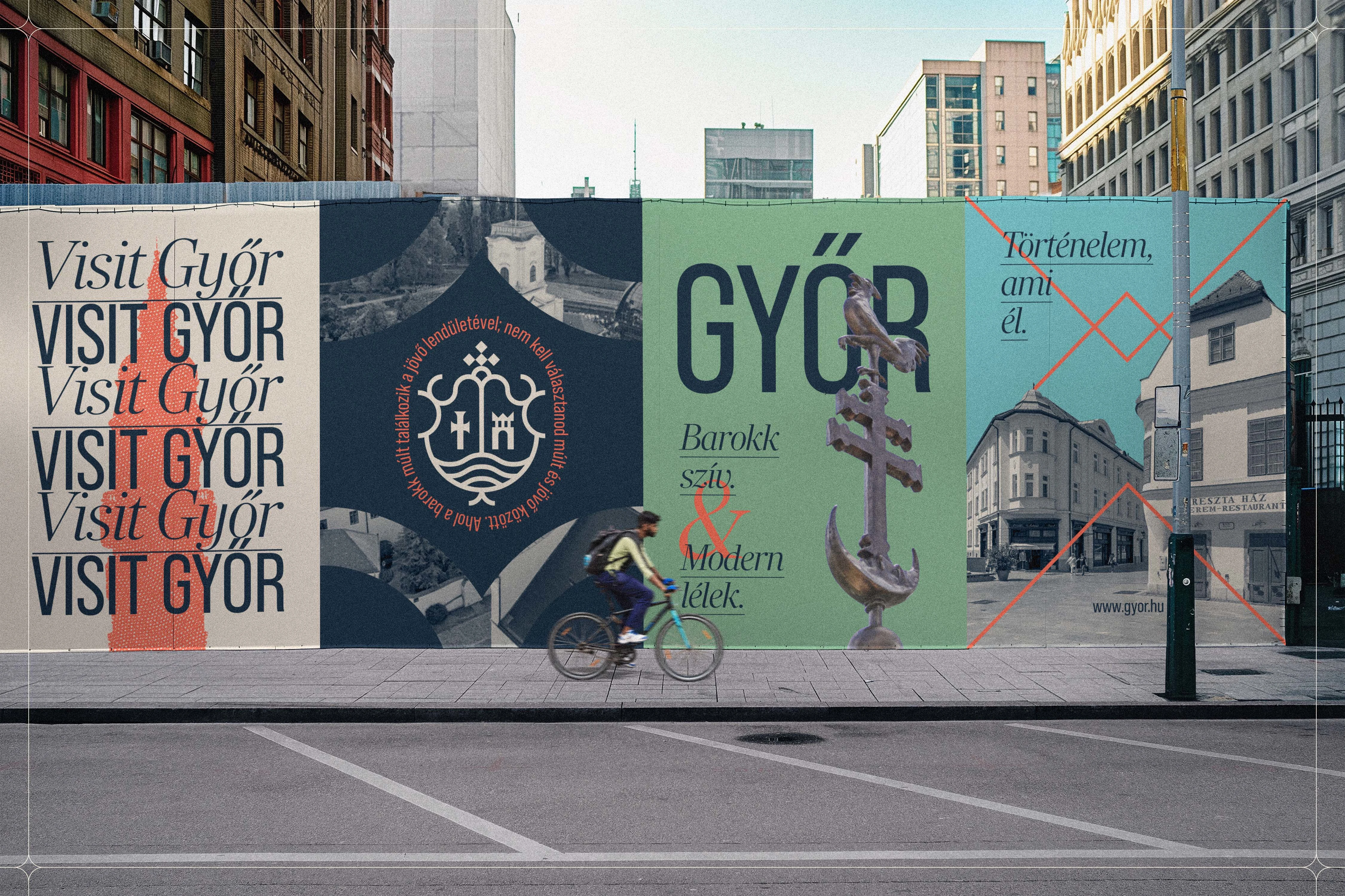
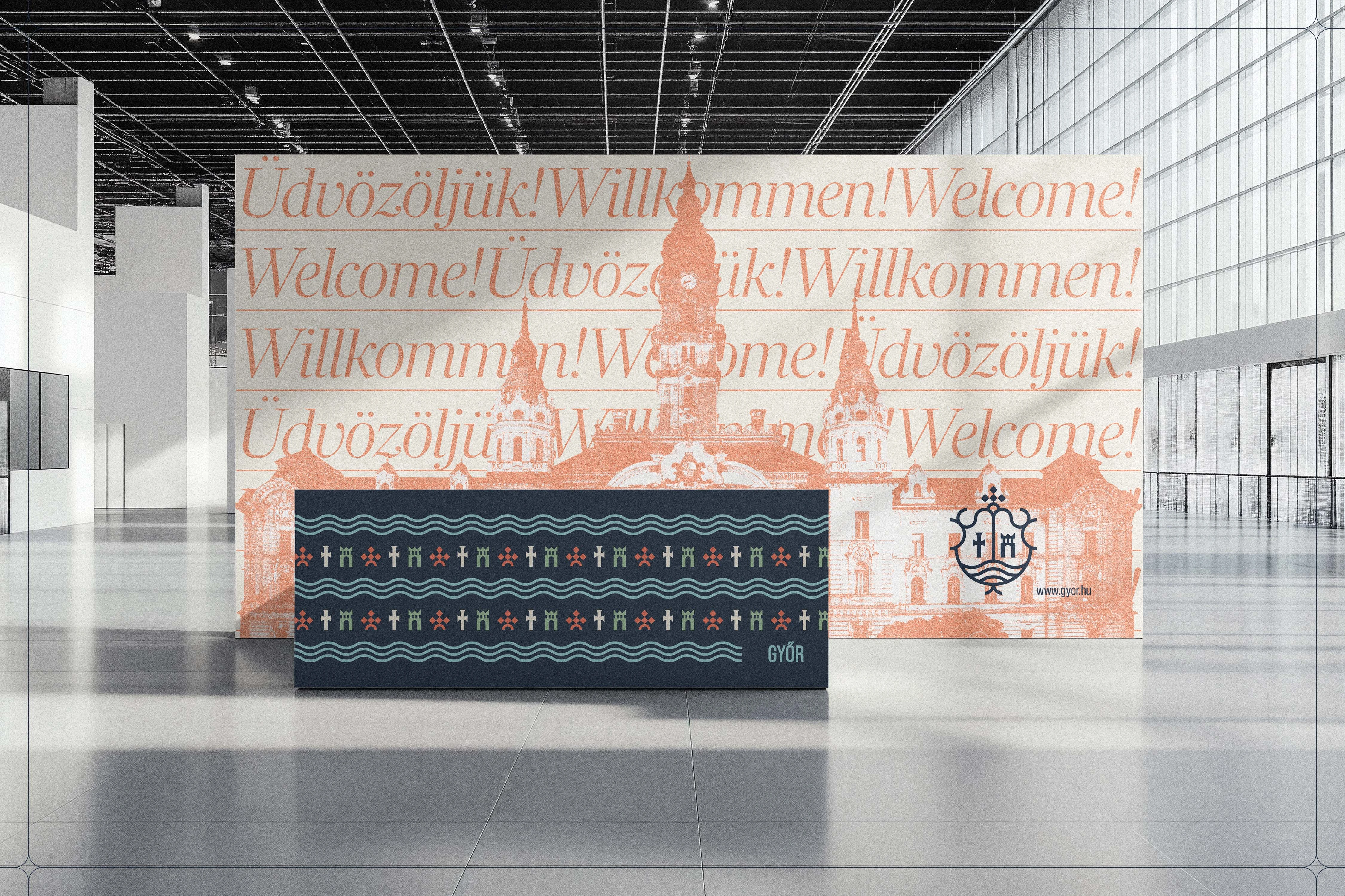
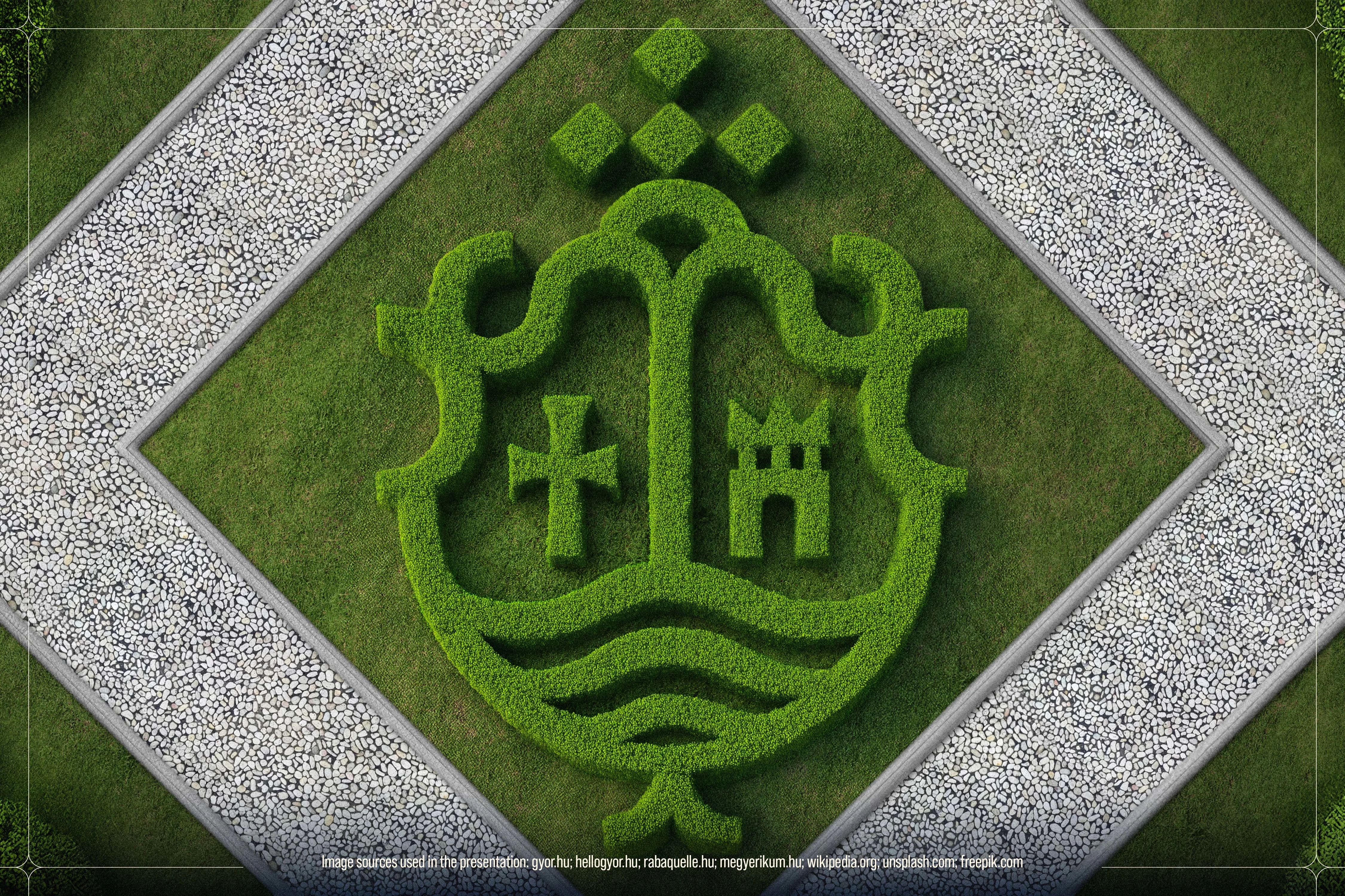
At the center of this identity is a modern reinterpretation of the city's historical coat of arms. Rather than reproducing complex heraldic details, the design reduces the emblem to clean, geometric elements that retain their profound symbolic weight. The foundational shield shape, constructed using golden-ratio proportions, subtly references classic baroque forms. Within this structural framework, four carefully crafted pictograms tell the story of the city: a stylized crown for its historical rank, a fortress acknowledging its defensive past, a cross for its ecclesiastical significance, and a flowing water symbol that celebrates Győr as the "city of rivers."
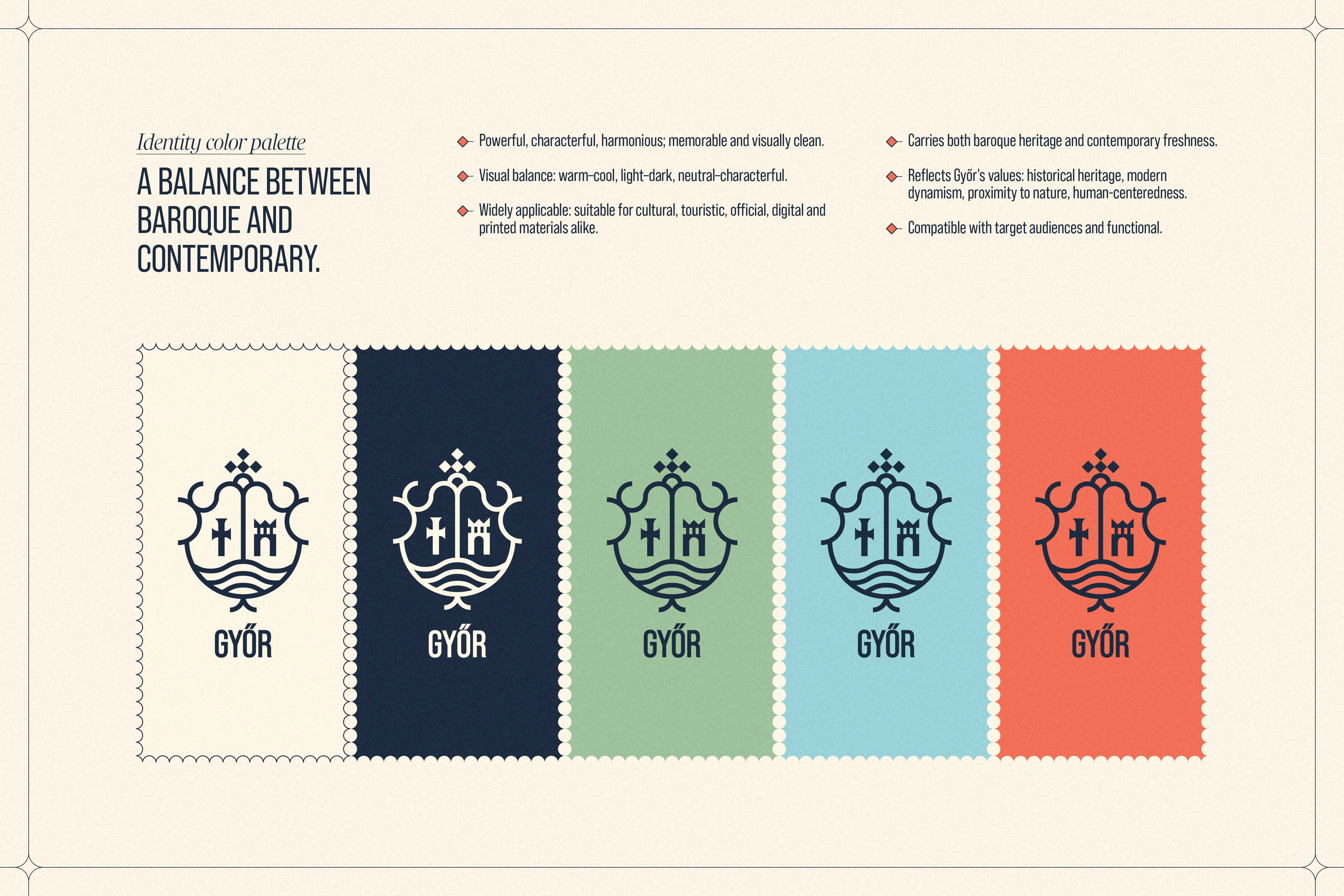
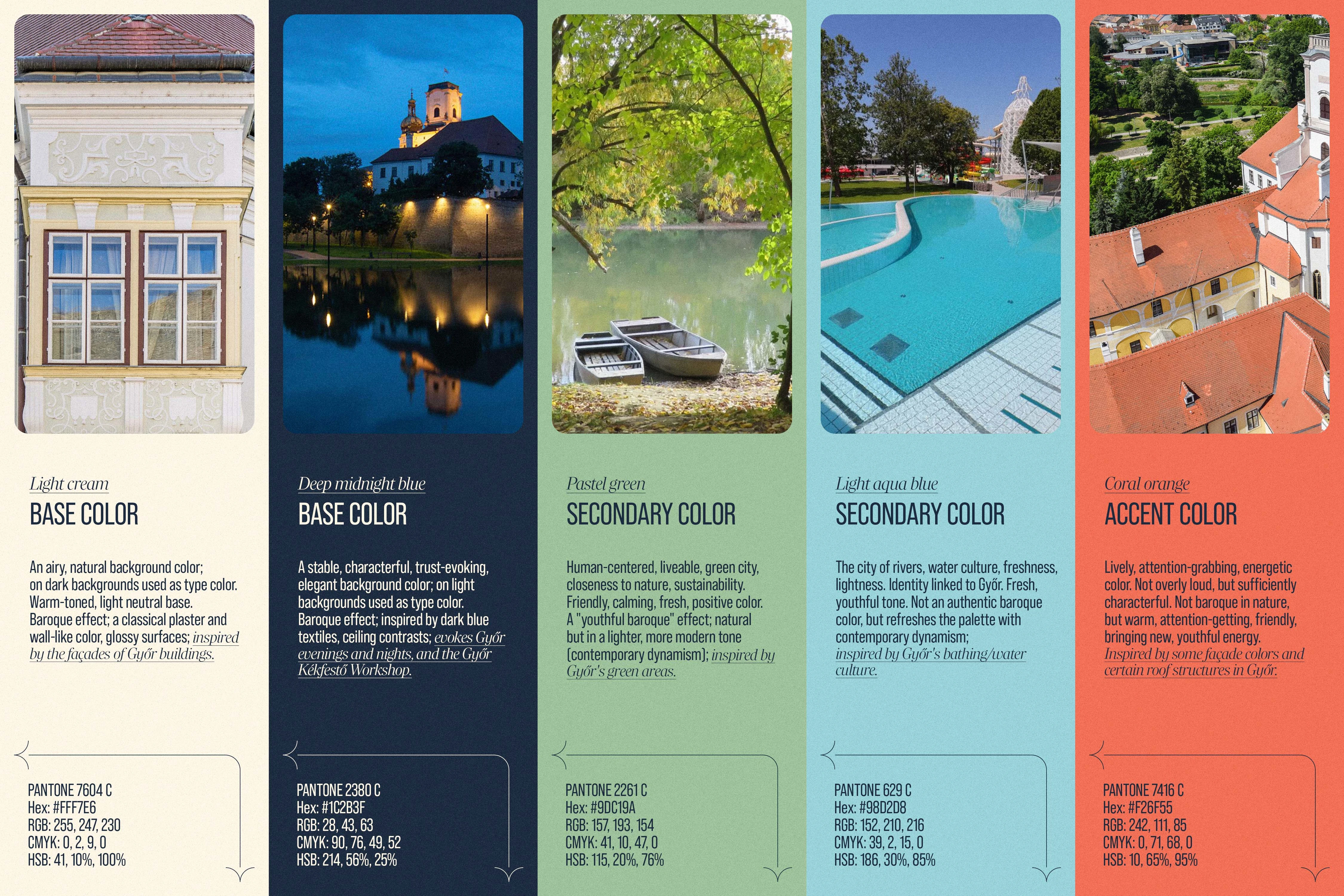
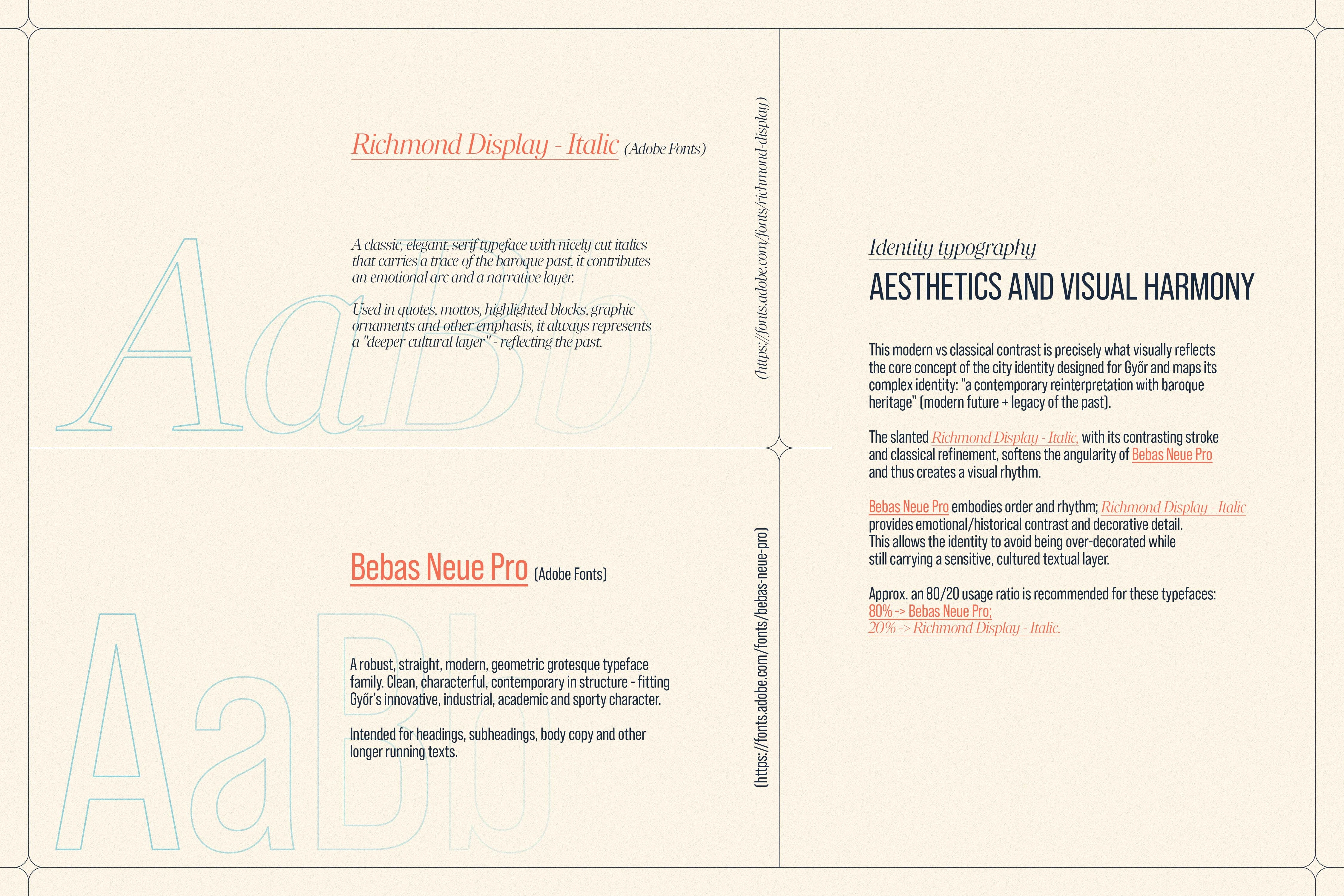
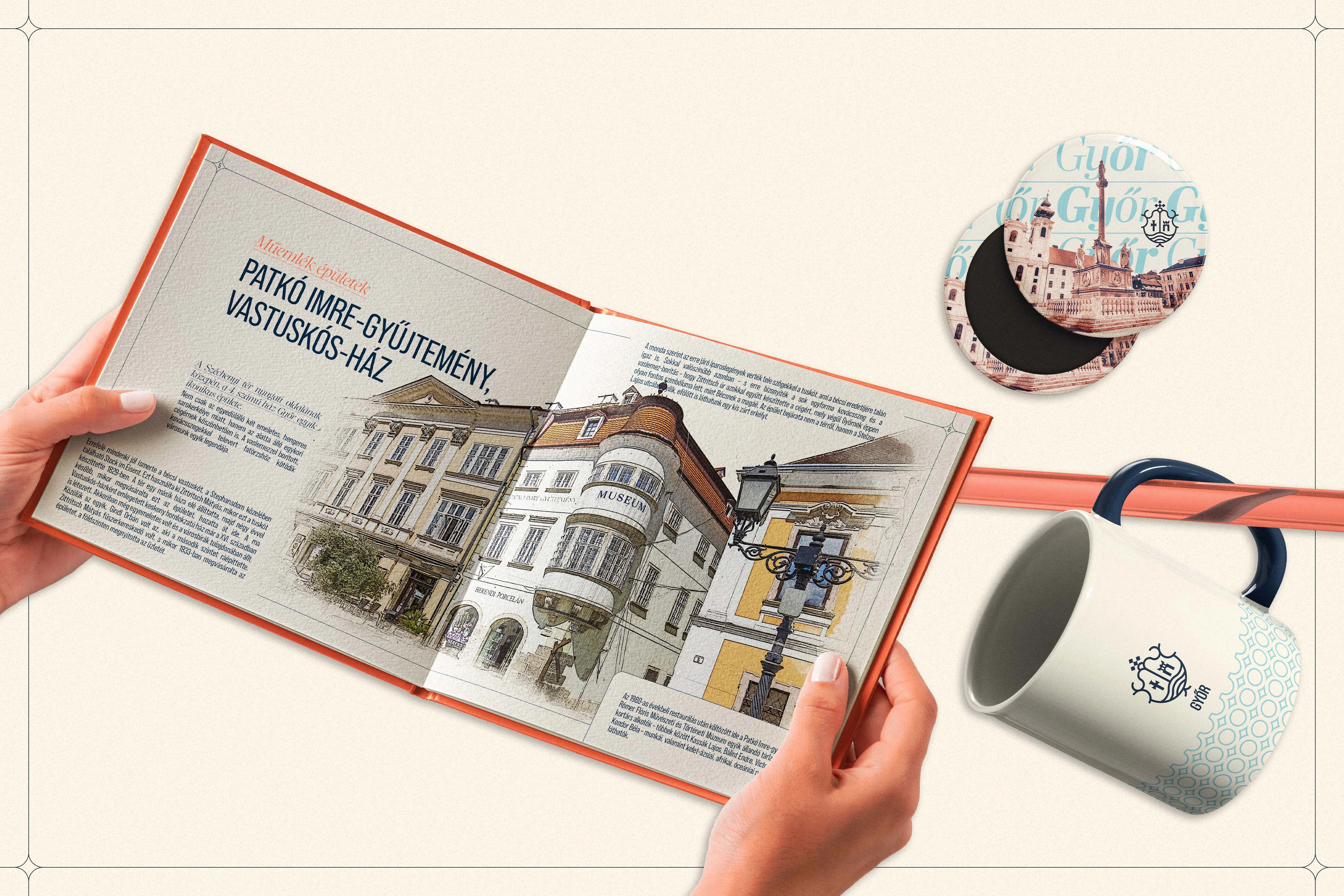
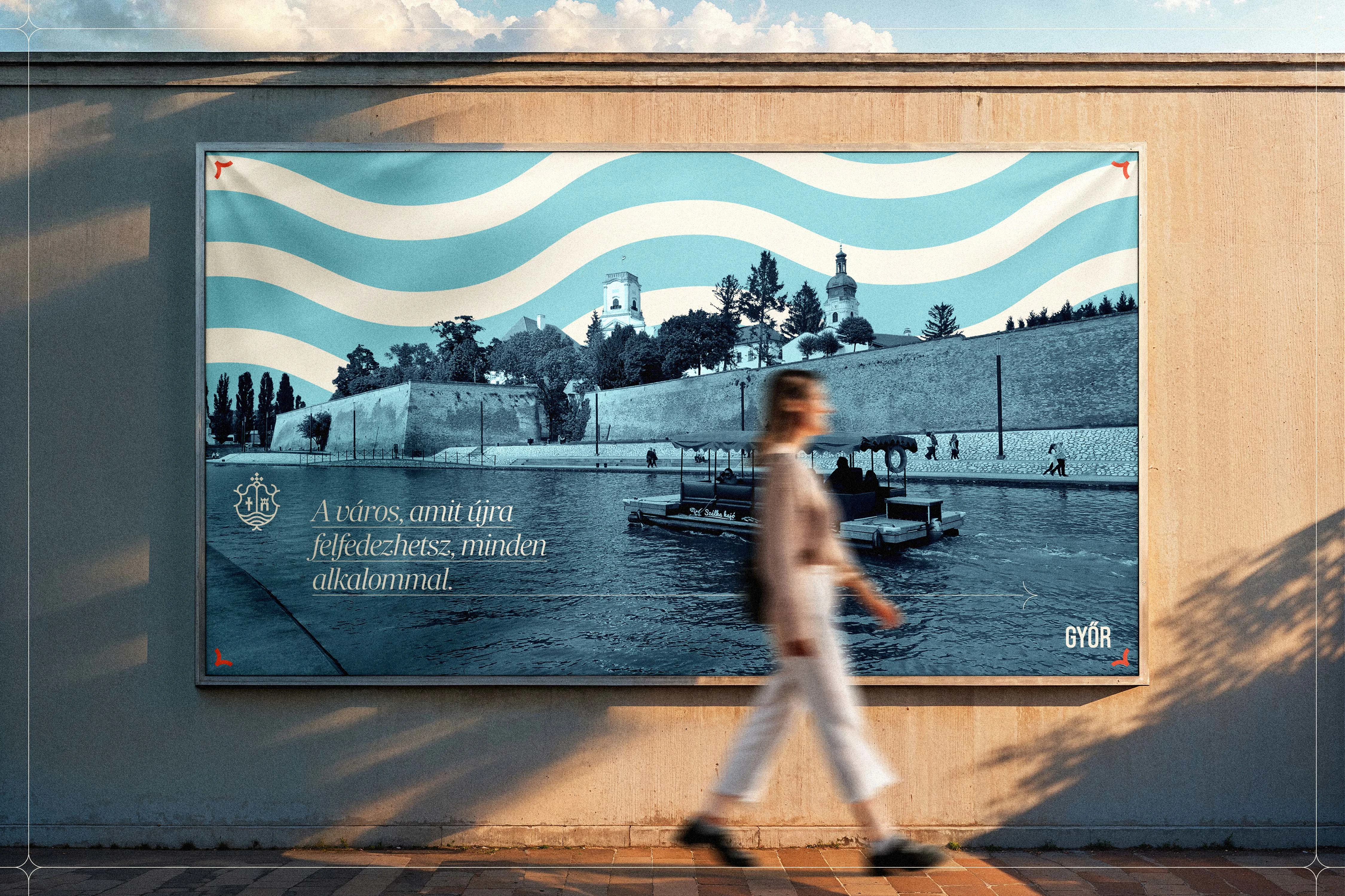
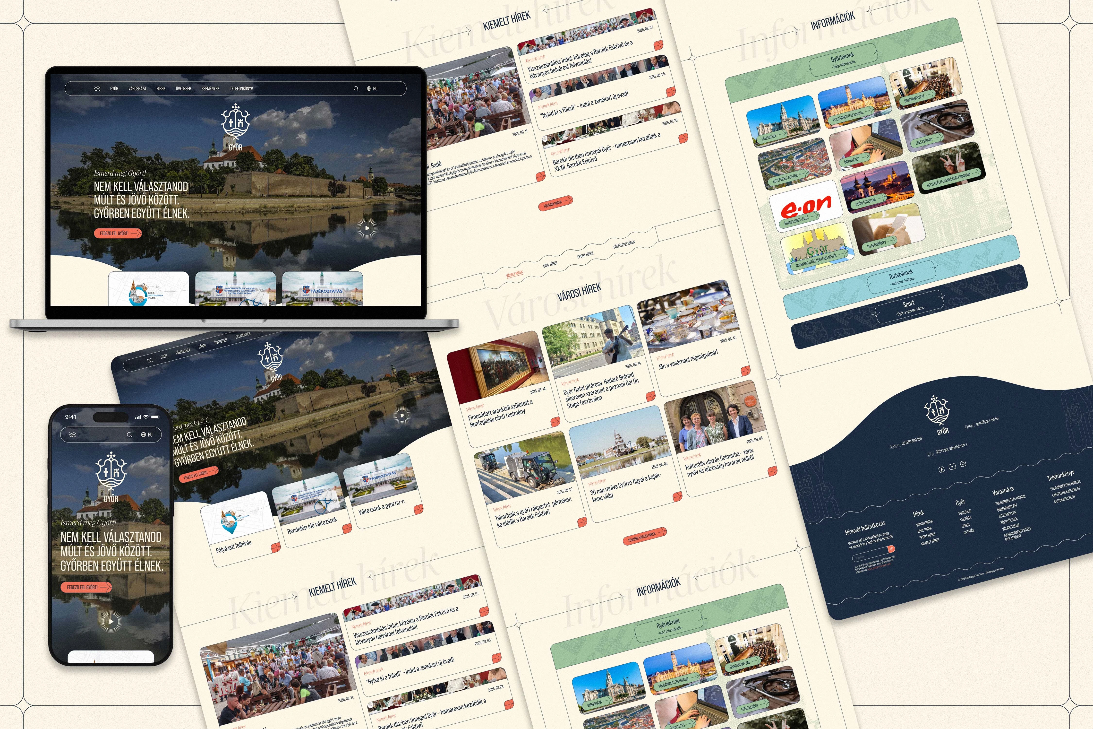
The duality of tradition and modernity continues throughout the aesthetic choices. The color palette bridges the baroque atmosphere with a fresh, current appeal: a primary pairing of light cream and deep midnight blue evokes the city's architectural facades, plaster textures, and elegant evening character. These are complemented by pastel green and light aqua blue to highlight the city's proximity to nature and water, while a coral orange accent introduces a controlled burst of youthful energy. The typographic system mirrors this balance by pairing two distinct typefaces. The straight, geometric structure of Bebas Neue Pro reflects Győr's innovative, industrial, and sporty side, while the classic serif details of Richmond Display Italic provide a subtle baroque elegance, creating a clear hierarchy and a recognizable voice.
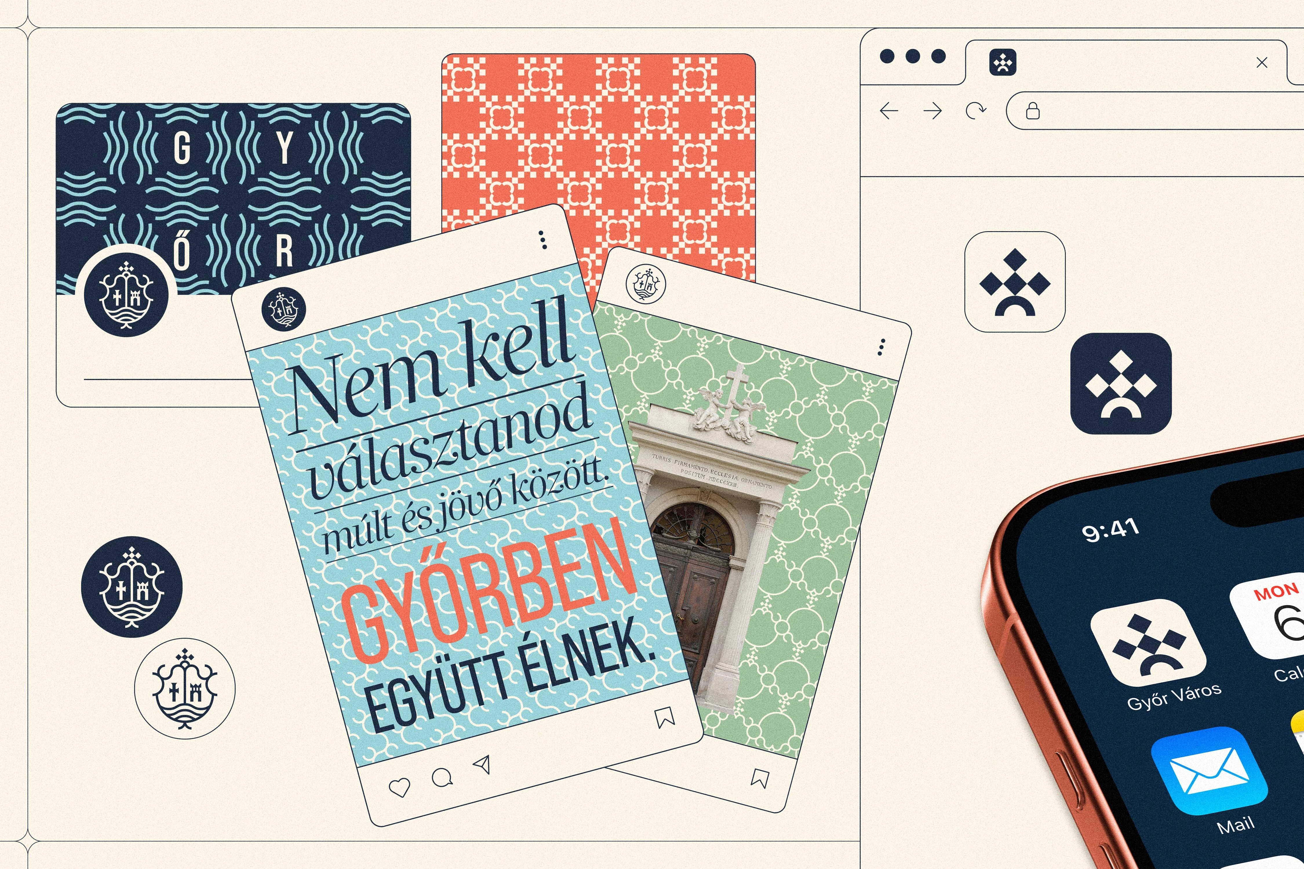
Ultimately, this competition concept delivers a cohesive, versatile, and internationally competitive identity system. By translating historical values into a fresh, structured design language without relying on overly decorative tropes, it offers a highly adaptable foundation for Győr's long-term brand-building—a visual identity that honors the city's proud legacy while confidently addressing future generations.
Like this project
Posted Jul 7, 2026
City brand identity for Győr, reinterpreting historical baroque heritage into a cohesive, structured, and forward-looking visual ecosystem.