Data Professional Survey Dashboard
Barra Malik Wibowo
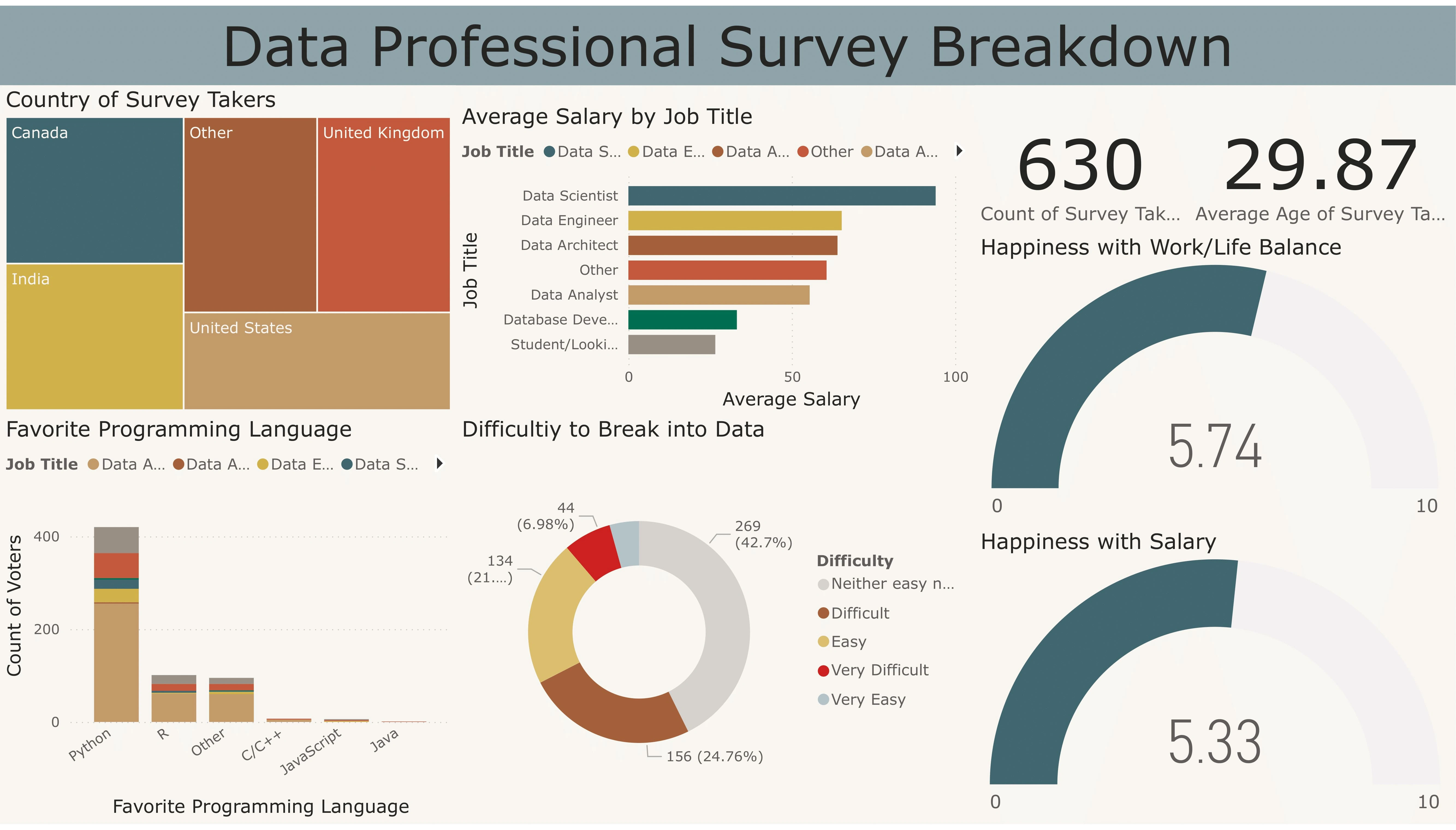
Data Professional Survey Breakdown Dashboard
Developed an interactive Power BI dashboard to analyze and visualize data from 600+ survey responses, providing key insights into the data profession.
Mapped geographical distribution across 20+ countries, highlighting global trends and industry representation.
Visualized average salaries by job title, revealing a 25% variation in compensation across roles, supporting salary benchmarking for stakeholders.
Analyzed entry challenges in the data field and identified top programming languages, giving actionable insights into professional development and industry skills.
Assessed demographics and satisfaction metrics, uncovering a 35% correlation between work/life balance and job satisfaction among data professionals.
Like this project
Posted Nov 11, 2024
Analyzed 600+ data pros survey via Power BI, revealing industry trends, salaries & correlation between work-life balance & job satisfaction.