Brand and Packaging Design for K&K Bites

Mario Pleshkov


Overview
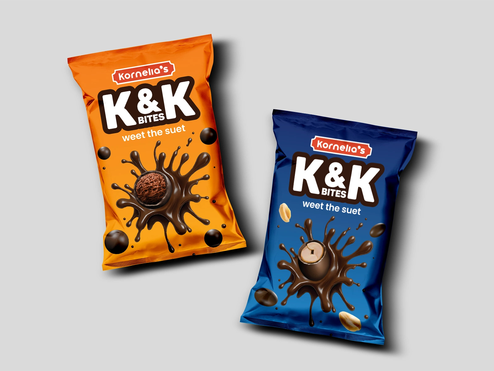
K&K Bites is a chocolate snack product line under Kornelia’s, featuring choco-covered peanuts and choco-covered cereal variants. This project encompassed building the brand identity from scratch and delivering high-impact snack pouch packaging engineered to capture attention in retail environments.
The Challenge
Starting with zero established assets, the project required crafting a complete sub-brand logo, distinct flavor palettes, and photorealistic product imagery without existing physical photos. The packaging needed to cut through dense snack aisles, clearly distinguish flavor variants, and instantly communicate appetite appeal to shoppers.
The Approach
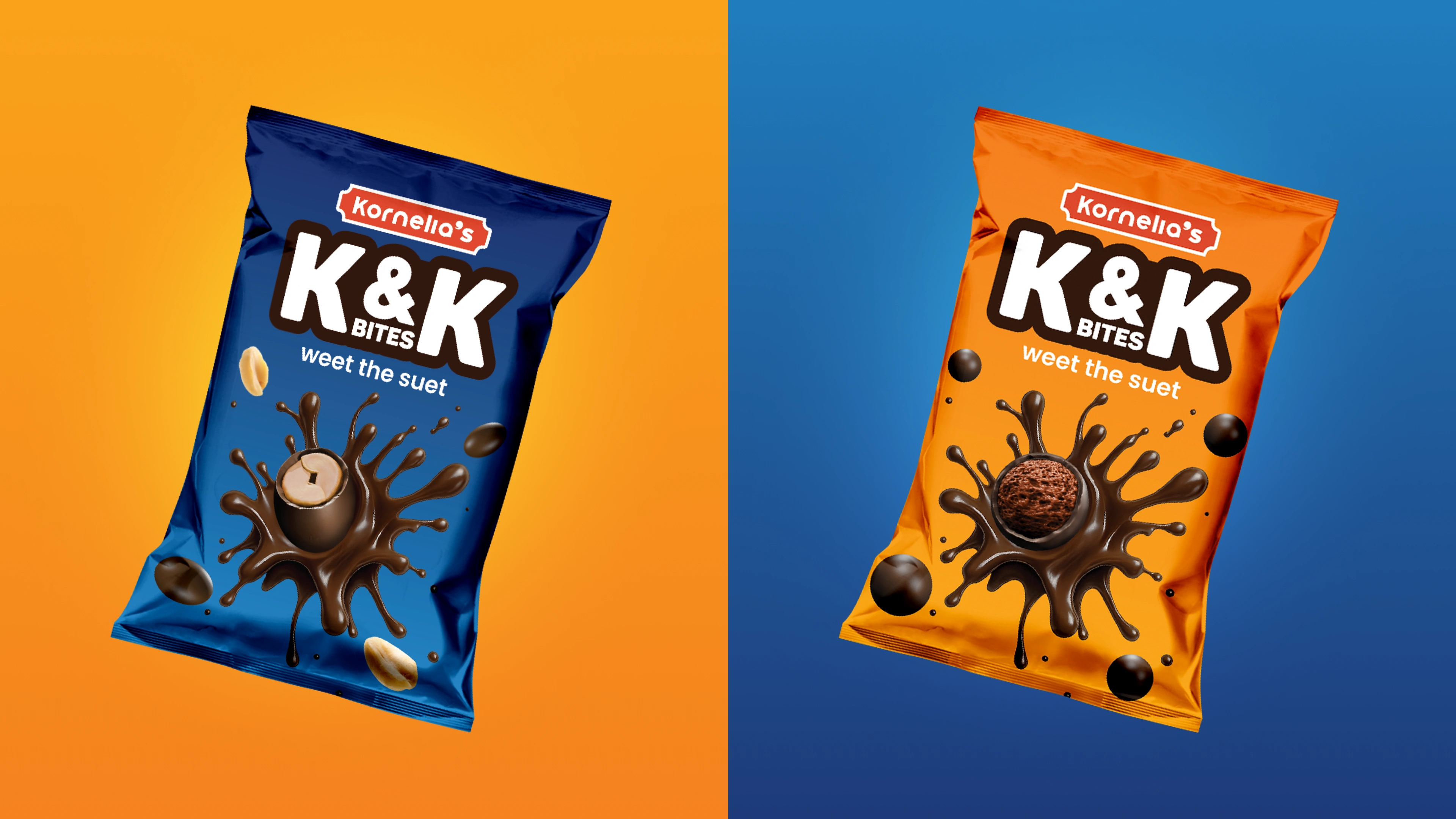
I designed a bold, high-contrast K&K wordmark and assigned an energetic dual-color palette—electric orange for peanuts and deep royal blue for cereal—to establish instant shelf separation while maintaining brand family unity. After preparing print-ready CMYK dielines in Illustrator, I modeled the flexible pouches, dynamic chocolate splashes, and ingredient renders in Blender for photorealistic display assets.
What Was Delivered
Custom K&K sub-brand mark and visual identity
Packaging dieline layouts for multiple flavor variants
High-resolution 3D pouch models and dynamic splash renders in Blender
Print-ready CMYK artwork files for manufacturing
Feel free to like, comment and follow, kindly appreciated.
Have a project? Contact via Direct Message.
Like this project
Posted Jul 17, 2026
Brand & packaging design for K&K Bites chocolate snacks. Built the sub-brand logo, print-ready pouch layouts, and custom 3D renders in Blender.