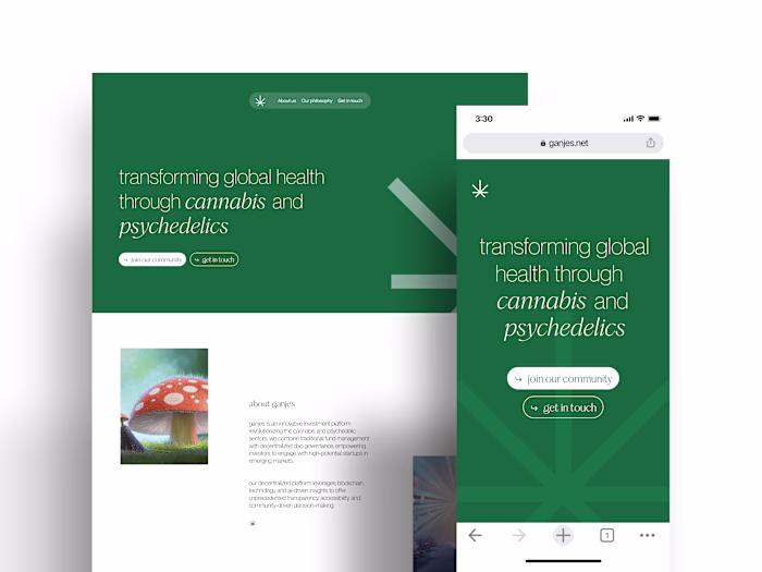
Dayflow: Brand & Product Design
Approve request to show earnings
View
PIXELUP LABS
Verified
DayFlow: Brand & Product Design
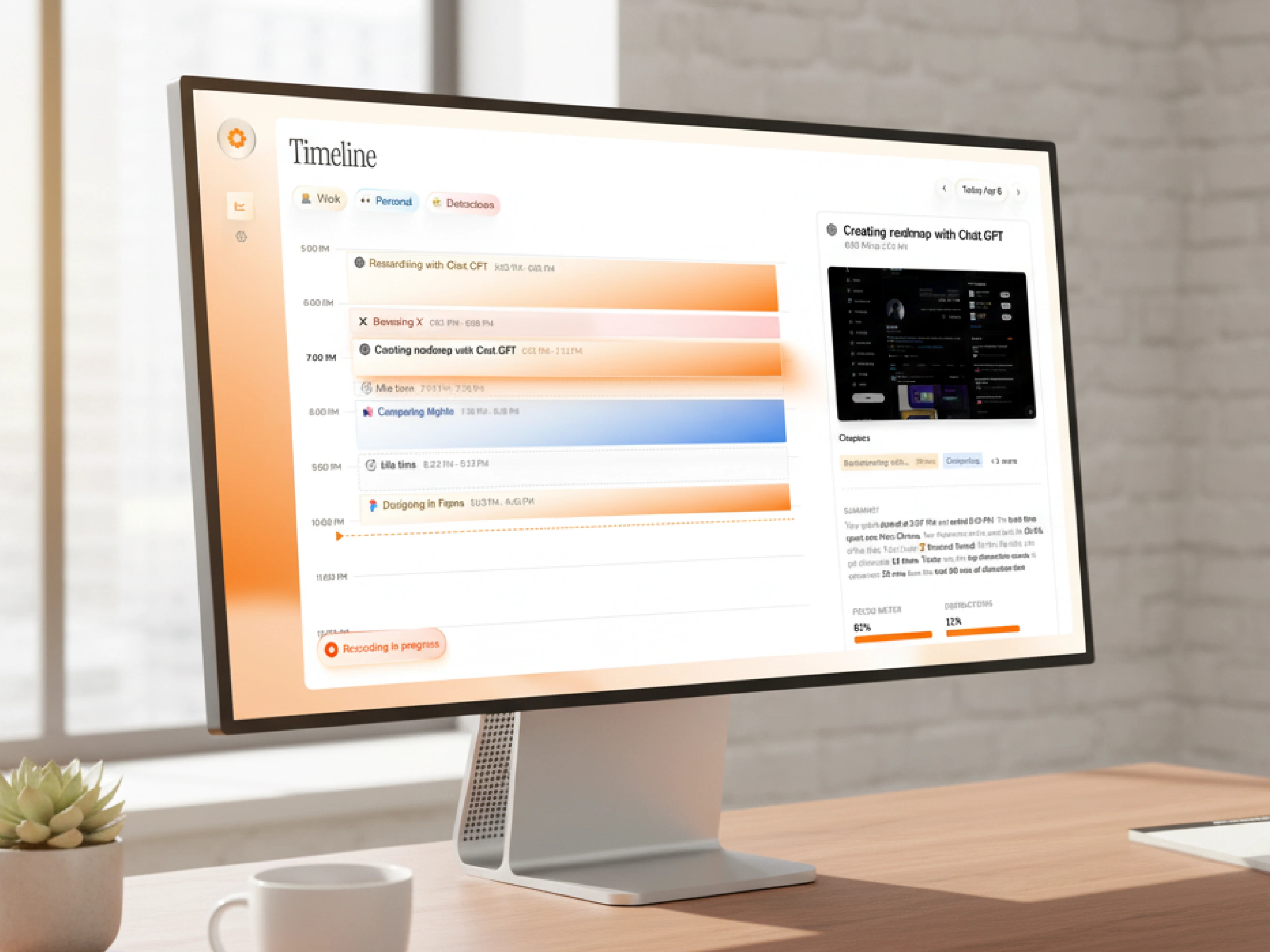
DailyFlow is a native MacOS productivity app built around a timeline-based view of your day. Not another to-do list. Not another calendar wrapper. A different interaction model entirely, designed for people who think about their work as a flow rather than a checklist.
The product was opinionated. The brand and UX needed to be too.
The problem
Productivity is the hardest category in software to launch into. Every visitor who lands on a productivity app brings five mental tabs of comparison already open: Things, Todoist, Notion, Linear, Apple Reminders, the calendar app they already pay for. The default user response to a new productivity tool isn't curiosity. It's skepticism.
DailyFlow had a genuinely different take on the problem. But "different" only matters if the brand and the product surface communicate it within seconds. A category this crowded punishes neutrality. If the brand reads as "another productivity app," the user is gone before they understand why this one is worth switching to.
The job was to design a brand and product experience that earned attention in a category trained to ignore newcomers.
The approach
One strategic call shaped everything: the brand and the product had to feel like the same opinionated point of view.
In productivity, the bar is intuitive UX. That's table stakes. To stand out, the brand has to do work the product can't do alone: signal taste, signal confidence, signal that the makers actually use this thing every day.
Brand. Built around a warm, distinctive accent (the orange visible across the timeline view) that pulled DailyFlow out of the category default of cool blues and clinical greys. Restrained type. Editorial spacing. The visual system reads less like enterprise SaaS and more like a tool a designer would keep in their dock. Distinct enough to be memorable, disciplined enough to not feel gimmicky.
Product design. The native MacOS surface was designed around the timeline as the central object, not as a feature. Every interaction, from quick task entry to drag-to-reschedule to the AI assist panel, was tuned to feel native to the OS rather than ported from a web app. Information density tuned for power users without overwhelming new ones. The kind of UX that disappears when you're using it, which is the highest compliment a productivity tool can earn.
System. Brand and product share the same language. The orange that anchors the brand shows up as the active state in the product. The typography that reads as editorial in marketing reads as scannable in the timeline. Nothing in the app feels disconnected from what brought the user in.
The outcome
DailyFlow launched with a brand and product that hold their own next to the incumbents. The visual system gives the app a personality the category mostly lacks. The native MacOS UX rewards the users who care most about the platform: people who notice when an app feels right and notice harder when it doesn't.
In a category where most launches get one shot at attention, DailyFlow earned theirs.
Like this project
Posted Oct 10, 2025
Dayflow needed to stand out in the most saturated category in software: productivity. We built the brand and native MacOS product UX to do exactly that.
Likes
2
Views
115
Timeline
May 26, 2025 - Oct 25, 2025
Clients
Dayflow