Greptile Brand and Design System Overhaul
PIXELUP LABS
Verified
🔧 Rebranding a High-Velocity AI Dev Tool: Greptile
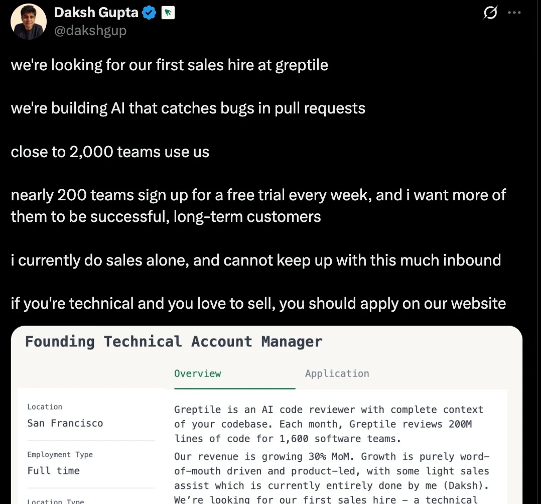
Greptile provides AI-powered code reviews for fast-moving dev teams
Overview
Greptile was moving fast. But their branding wasn’t keeping up.
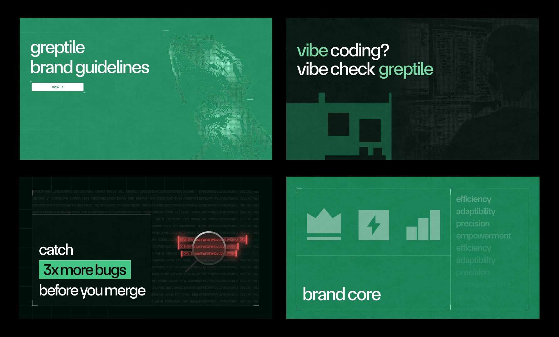
The product makes catching bugs 10x faster.
But the UI? Buggy. The brand? Forgettable.
There was no coherent system across their brand, product and website.
That’s where we stepped in.
🚨 Before the Fix
Here’s what wasn’t working:
The legacy UI felt outdated - didn’t reflect the product’s power.
Visual branding was bland - zero personality or recall.
No design system = inconsistent UX and dev inefficiencies.
Poor UX slowed down velocity - ironic for a speed-focused product.
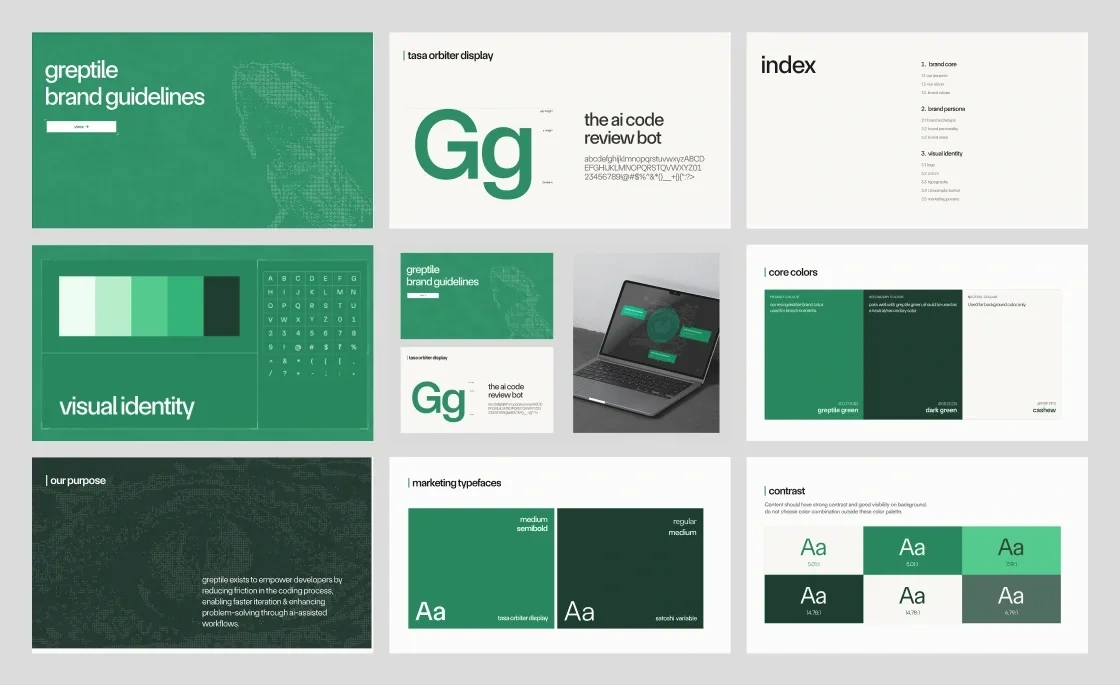
🧠 Strategic Brand Sprint
We ran an end-to-end sprint to reposition Greptile visually and experientially.
What we did:
Chose a brutalist-minimalist aesthetic to resonate with technical users.
Defined brand archetypes → Creator × Hero.
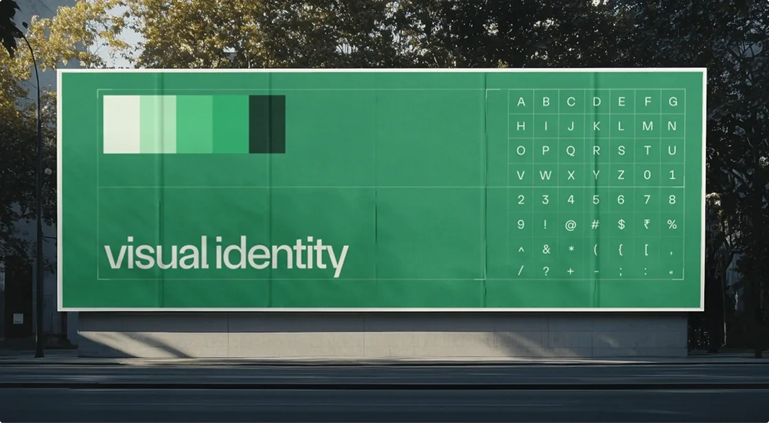
Built a bold new identity - logo, color palette, typography, spacing.
🧩 Modular Design System = Dev Superpowers
To stop design chaos, we built a 200+ component design system:
Atomic + scalable - works like LEGO for devs.
Built with developer-first documentation.
Made implementation 2x faster and 10x more consistent.
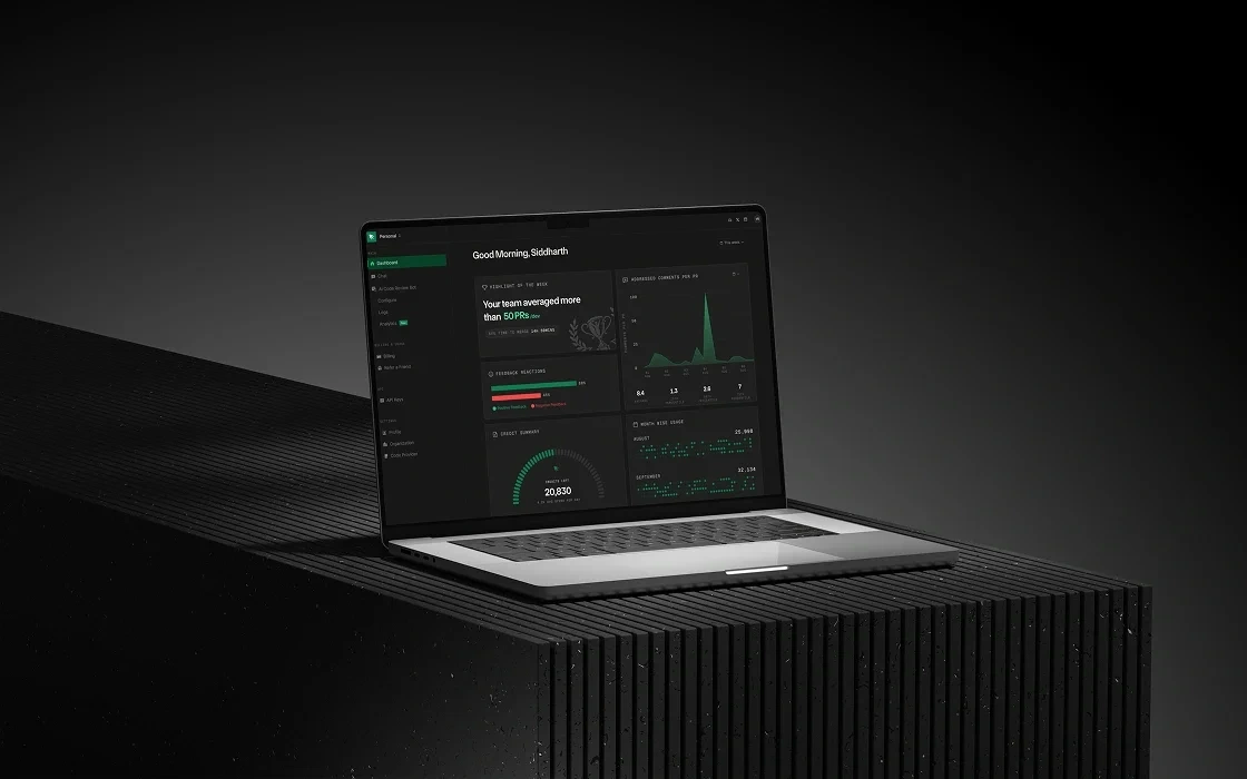
✨ Full Web App Reskin
We reskinned the entire Greptile platform, screen by screen.
Results:
Pixel-perfect UI across every user flow
Unified components = easier dev handoff
UX friction reduced, speed boosted
🚀 The Outcome
40% boost in shipping speed
+200 users/week after relaunch
A brand that finally looks as good as the tech behind it
Like this project
Posted Jun 3, 2025
Brand & design system rebuilt that helped Greptile launch into a $25M Series A from Benchmark. Their customers say the product feels "unusually well designed."
Likes
6
Views
241
Timeline
Jan 3, 2025 - May 2, 2025
Clients
Greptile