Mutual Funds feature for Trikl
Joanne Lopez
Discover
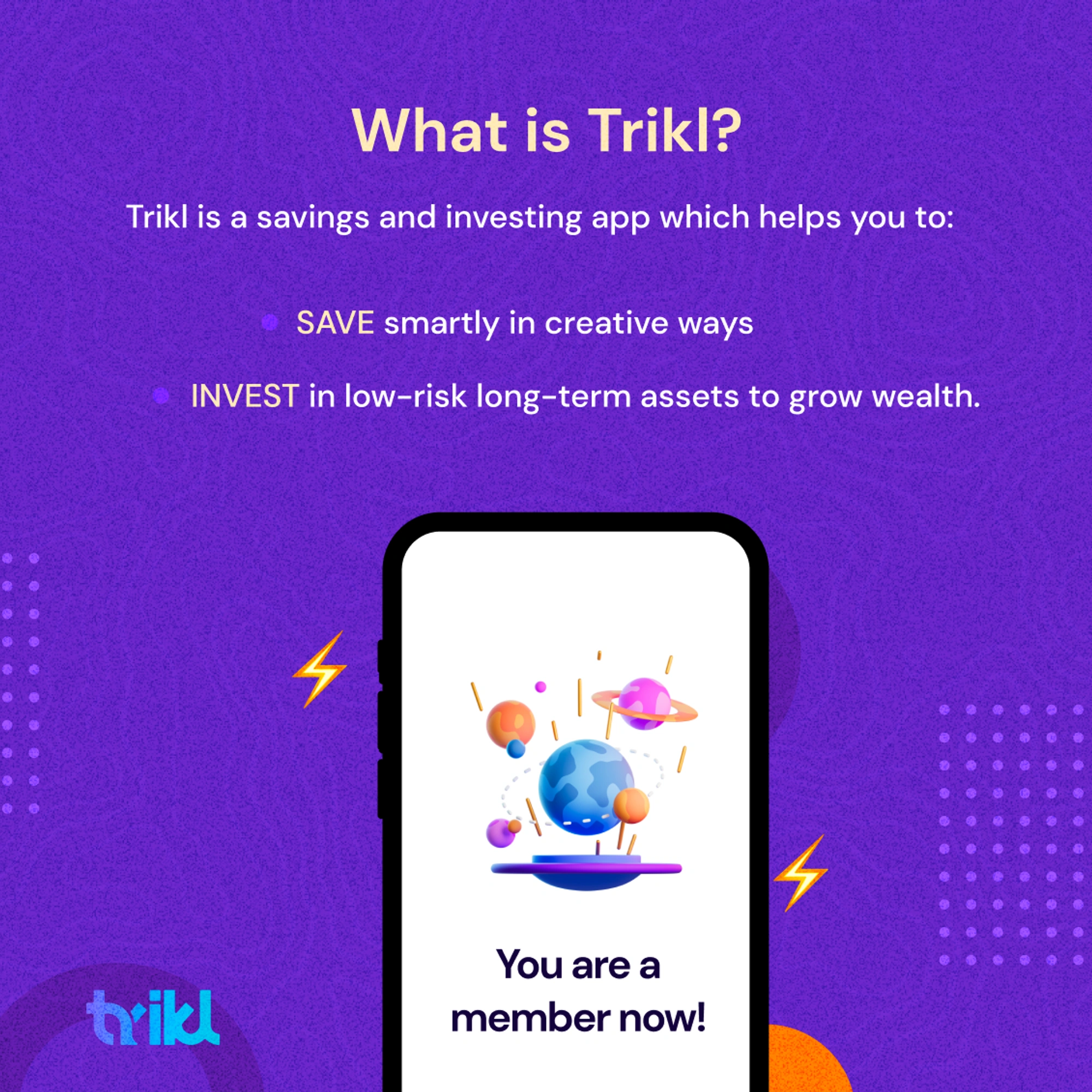
Trikl’s main value proposition is to automate both savings and investments. The goal is the help the user invest as much as possible with minimal effort.
My Role
I contributed to the overall design process and oversaw aspects related to product scoping, user flows, wireframes, rapid prototyping, and usability testing.
Additionally, I conducted user research facilitated co-workshops, and contributed to synthesizing research findings to produce viable ideas.
Project Scope
Two designers, A squad of developers, and product managers.
Why Build it?
We are witnessing a rise in digital and mobile wallets, already beginning to capture a large number of unbanked customers. Amidst the pandemic, there has been strong, sustained growth in the number of wallet transactions. As financial inclusion continues to rise, catalyzed by startups, we have set out to cater to the wave of new entrants. There is a massive opportunity to build for the next step post-inclusion participation in capital markets. A mobile-first experience can change all of that.
Assumptions
Trikl users have no idea how mutual funds work and are clueless about the importance of mutual funds and how they can benefit from them.
Online mutual fund marketplaces do not provide enough information about mutual fund investments.
Users who do know about mutual fund investment also need a simple and automated way to invest their savings.
Online mutual fund marketplaces do not provide an easy and seamless way to start investing in mutual funds.
We are building this for first-time investors who need a simple and seamless way to start saving, investing, and getting a return on their investment.
Our Goals
Build a one-stop solution for GenZ and Millenials to start saving and investing quickly.
A feature that educates and explains mutual fund investing to our user base.
Enable our banking and mutual fund partners to leverage our tech so users can be seamlessly onboarded and registered.
Create a communications architecture linking Trikl, and the payment gateway.
Build technical infrastructure to support mobile-based digital onboarding.
Competitive Analysis
We first looked into the market to examine whether existing products can help first-time users invest in mutual funds easily with no complications.
Interviews
To better understand how users invest and identify potential problems, I advocated conducting user interviews before diving into solutions. I also invited our developers to participate in affinity mapping sessions with us, so that as a group, we could brainstorm solutions based on our findings.
👥
We Found That:
People want to invest but do not know how to go about it.
Most of the apps are either not accessible or too complex for them
None of the competitors cater to new customers.
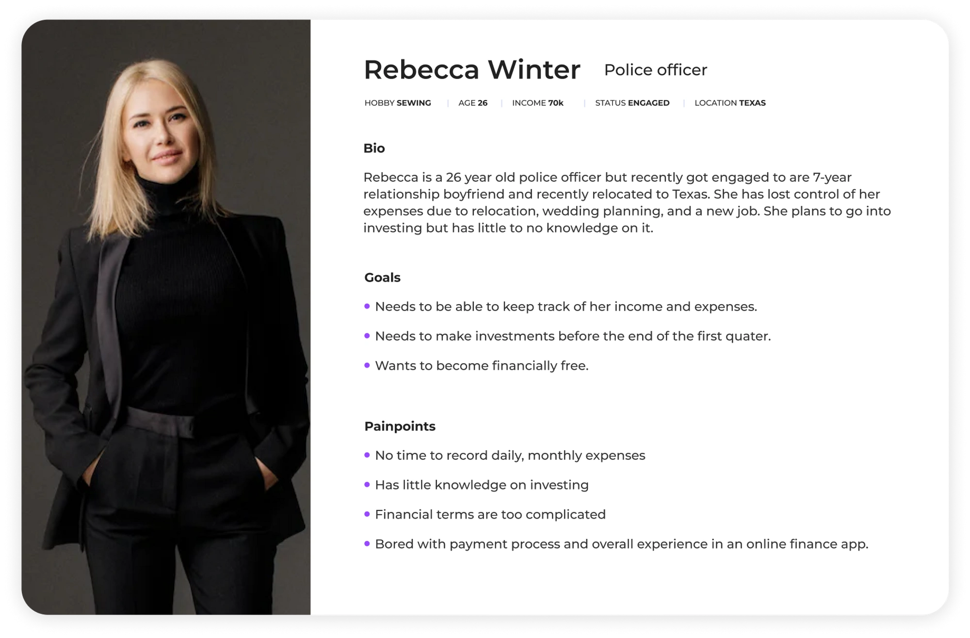
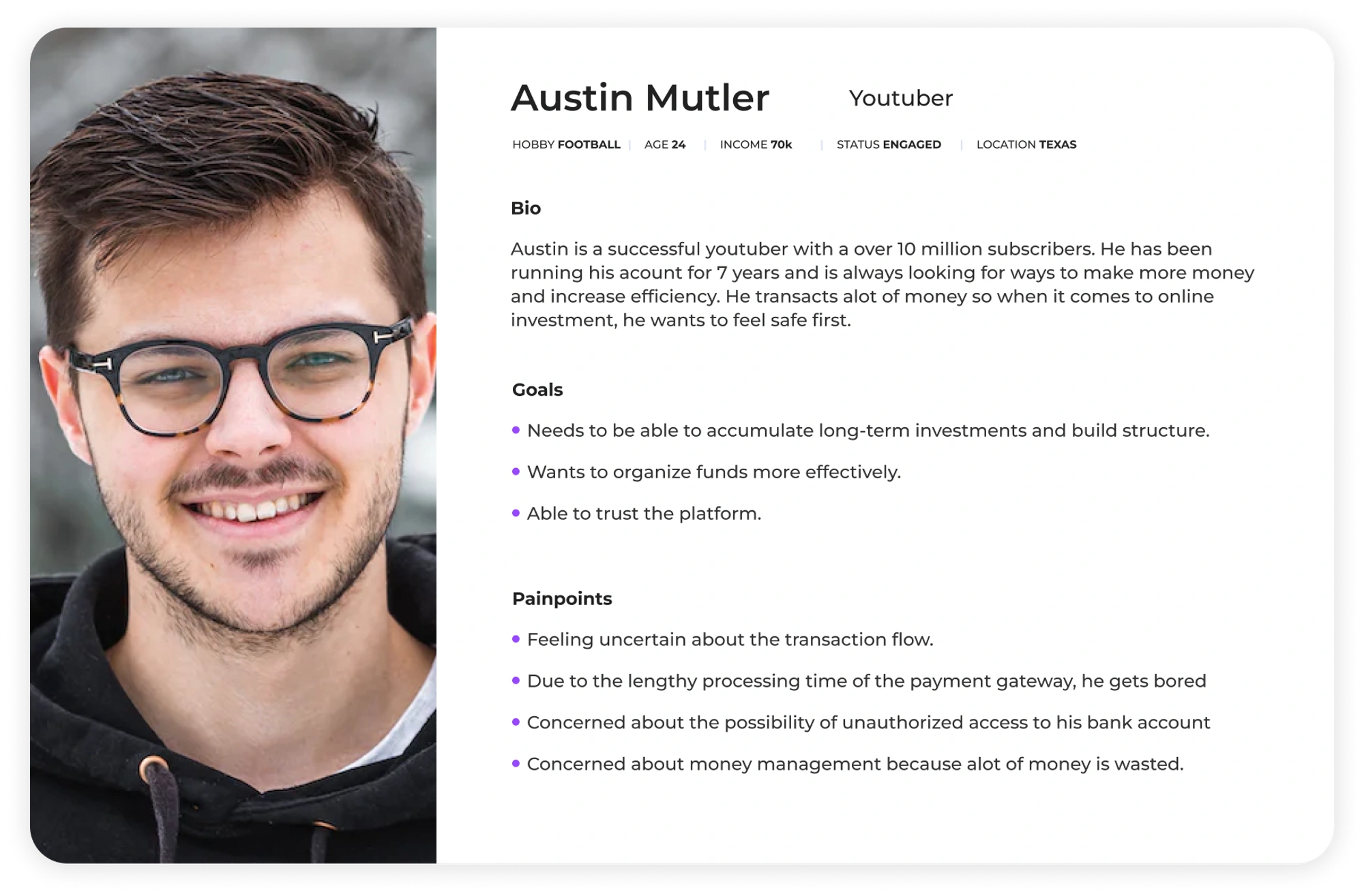
User Personas
Ideate
Design & Prototype.
In addition to the personas created to keep clear in mind the problems I would be tackling, I made the "How might we" statements that I refer back to constantly throughout the ideation process.
How might we incorporate a feature that helps users invest digitally?
How might we educate users on the benefits of investing and how the feature works?
How might we make the process as easy as possible?
Flow chart
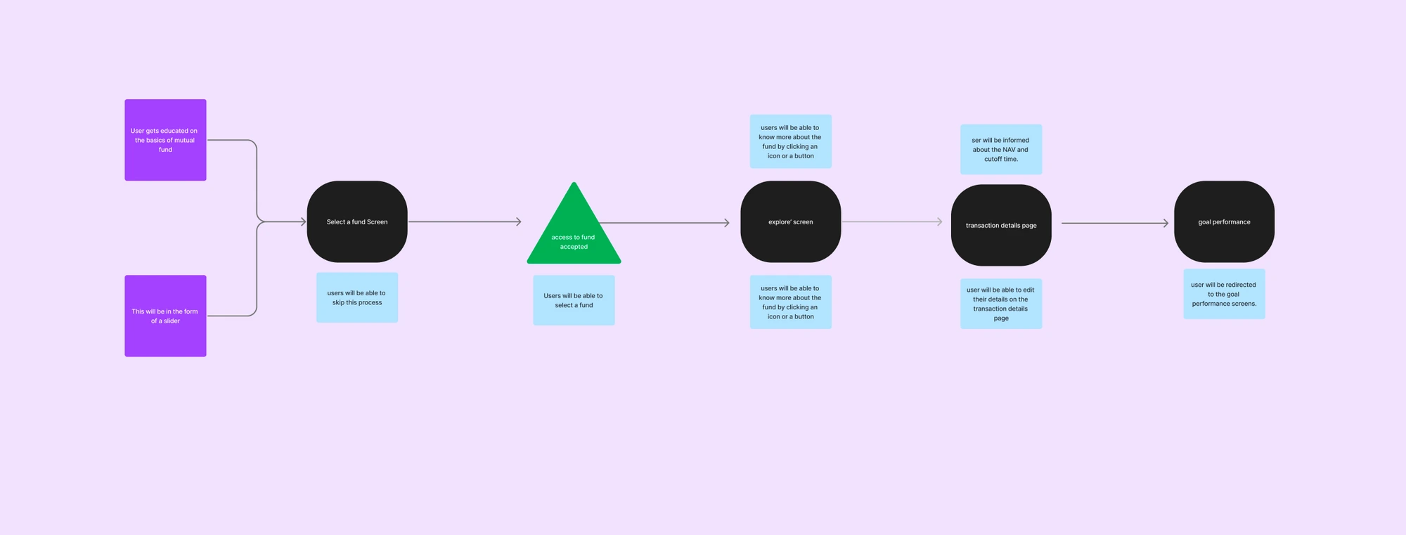
First Time User Flow
Scenario 1 - User Invests while creating a goal
Implementation Steps:
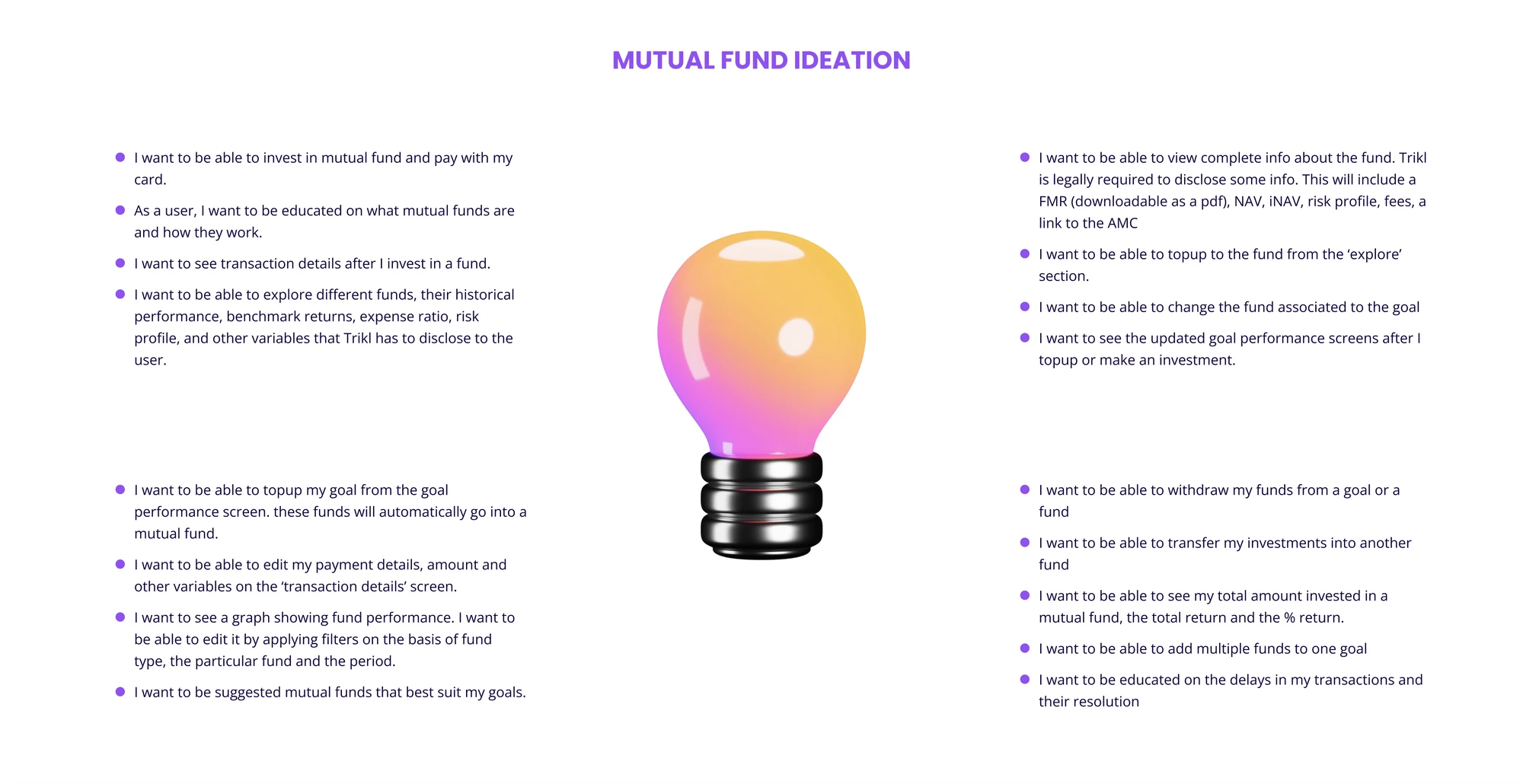
On the ‘select a fund’ screen, we will educate users on the basics of mutual funds. This will be in the form of a slider, users will be able to skip this
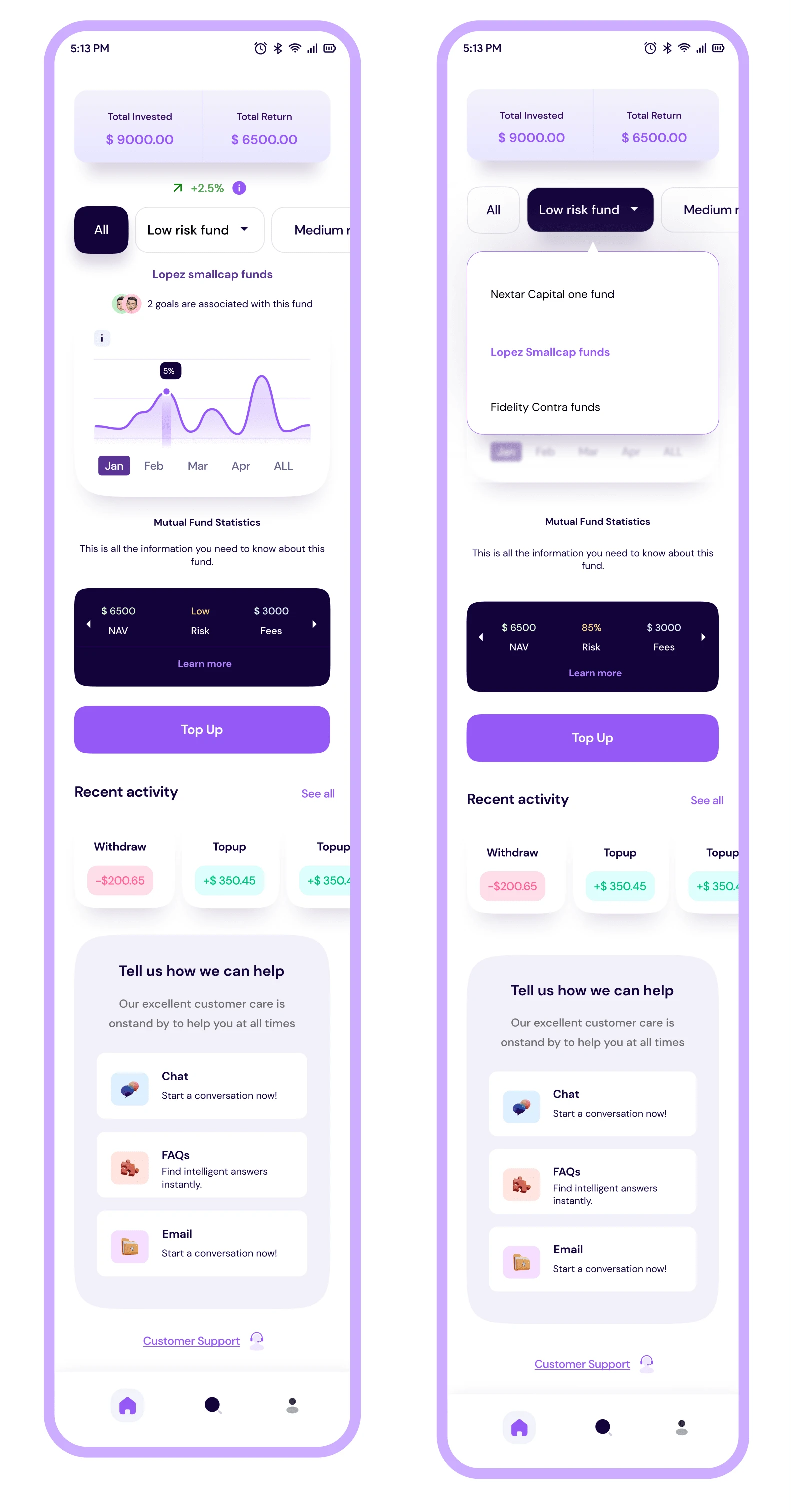
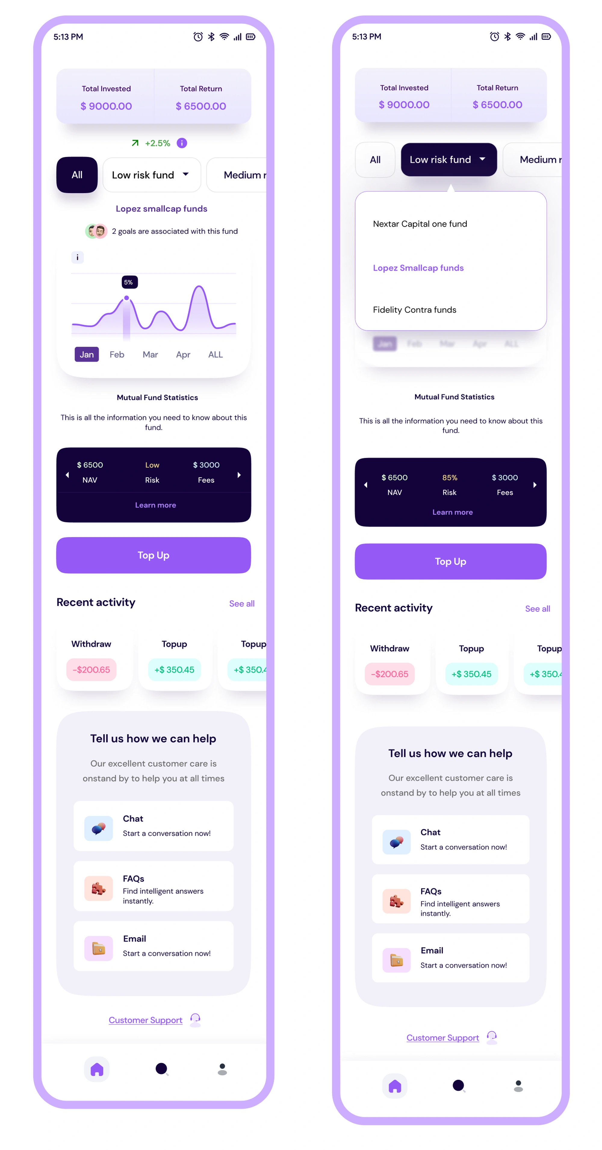
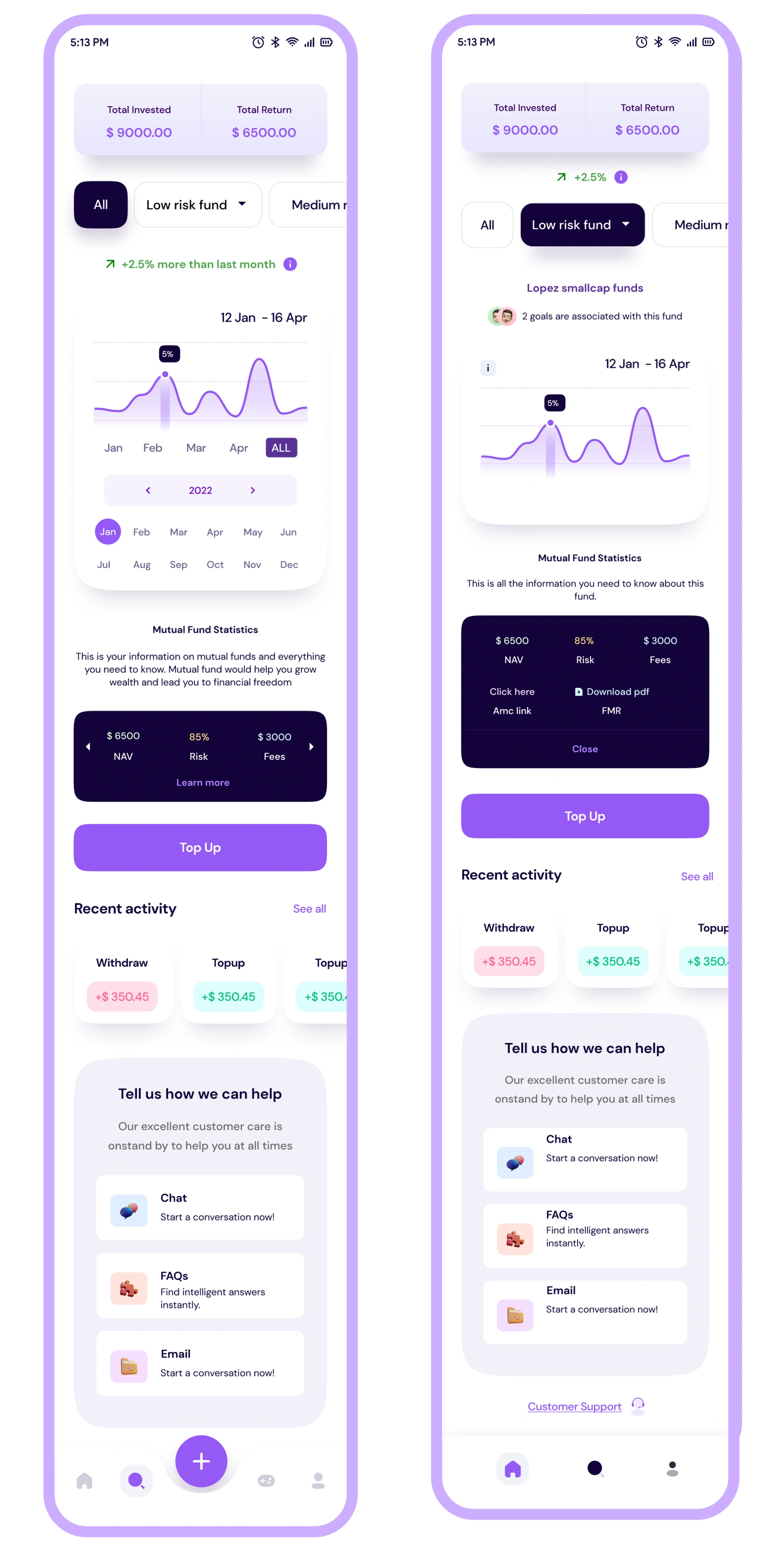
Users will be able to select a fund. We will show the name and the rate of return of the fund.
Users will be able to know more about the fund by clicking an icon or a button. this will take them to the ‘explore’ screen showing detailed info about the fund
We will offer users a transaction details page
Scenario 2 - The user clicks on the ‘explore’ CTA on the home screen.
Implementation Steps
the home screen will have an ‘explore’ CTA for mutual funds
Users will be able to see the explore page when they click the explore CTA on the home screen.
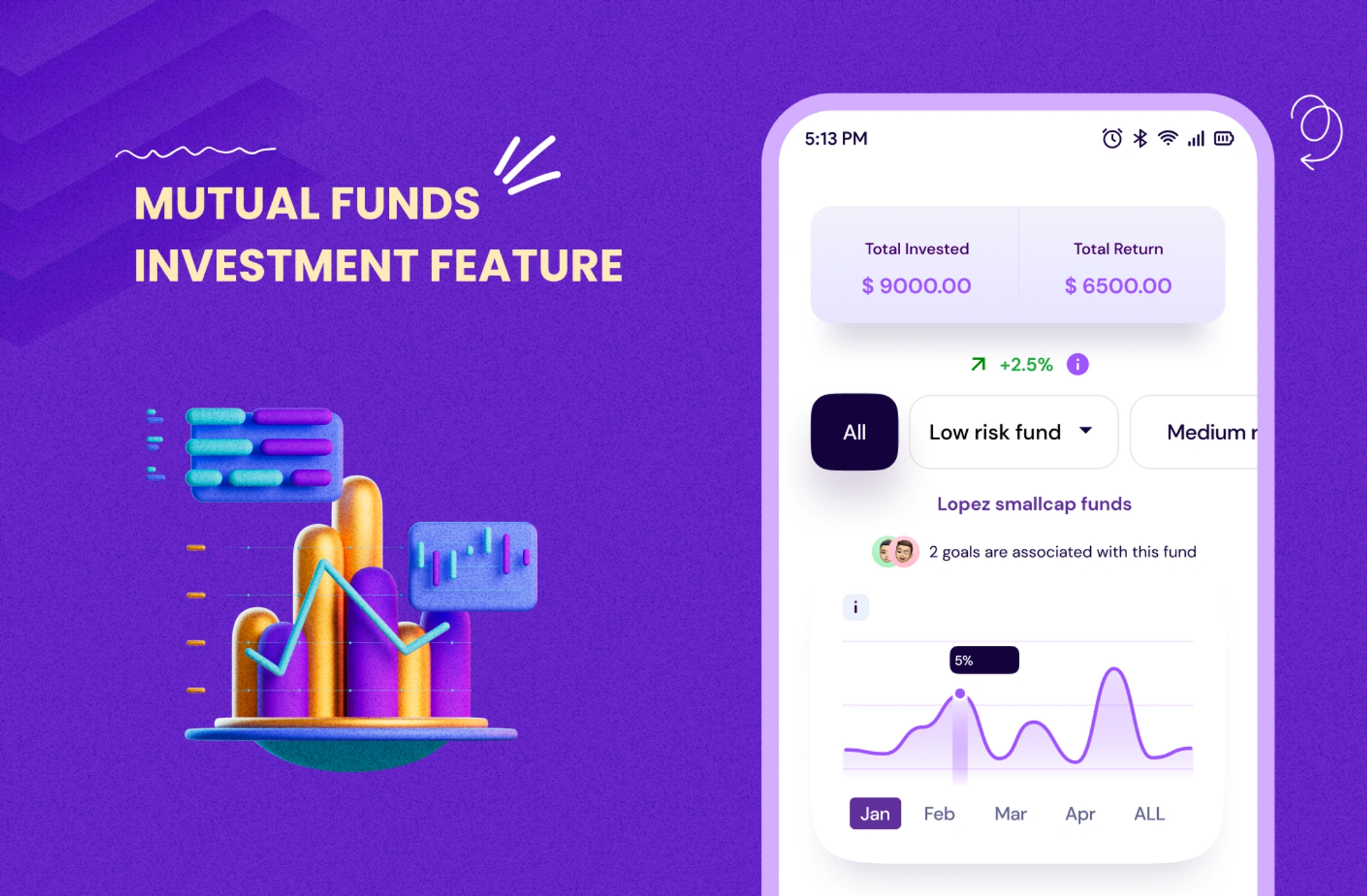
Users will be able to see the total amount invested in a particular fund, the return gained, and the % of returns.
Users will be shown a graph of the highest-performing fund as the default. this will be for the past six months. users will be able to filter this graph based on time, fund type (low, medium, high), and the particular fund. The default graph x-axis should be the last six months against a y-axis of return. these would be layered filters so users can apply multiple filters to see the nave performance, A user should be able to filter by date interval, the options would be:
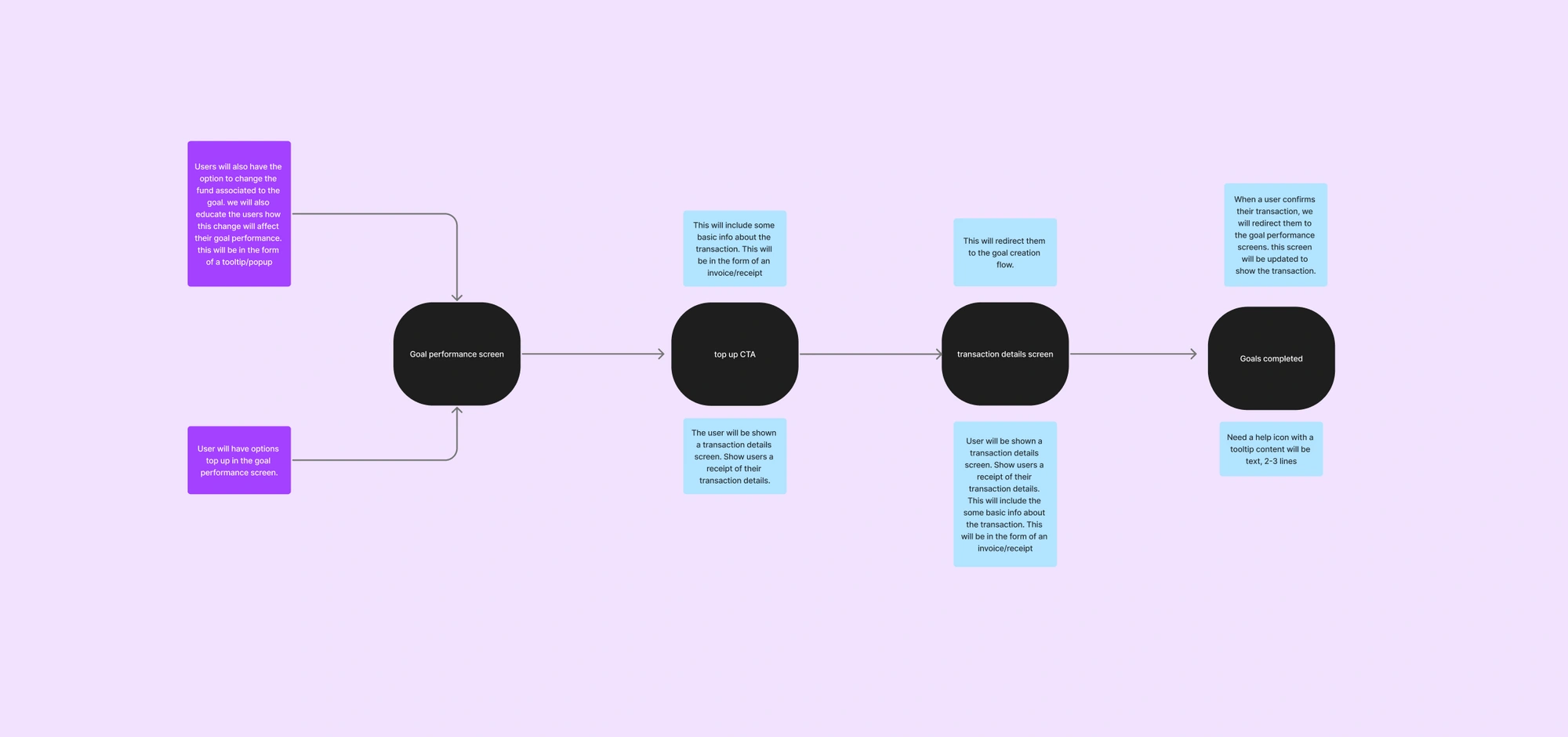
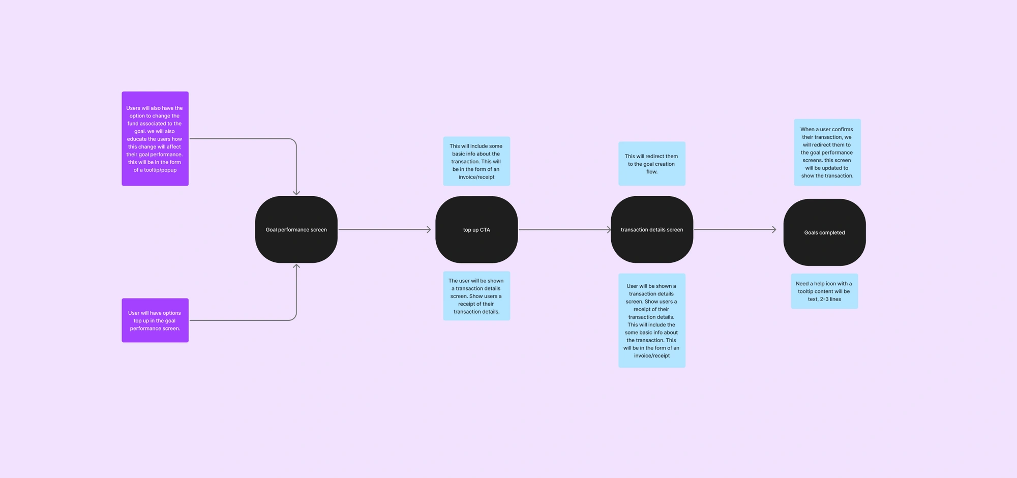
Scenario 3 - User tops up on the goal performance screens.
Implementation steps:
Users will have options to top up in the goal performance screen.
Users will also have the option to change the fund associated with the goal. we will also educate the users on how this change will affect their goal performance. this will be in the form of a tooltip/popup
when user clicks on the top-up CTA, we will show them a tooltip on how this deposit will change their goal performance, etc.
The user will be shown a transaction details screen. Show users a receipt of their transaction details. This will include some basic info about the transaction. This will be in the form of an invoice/receipt
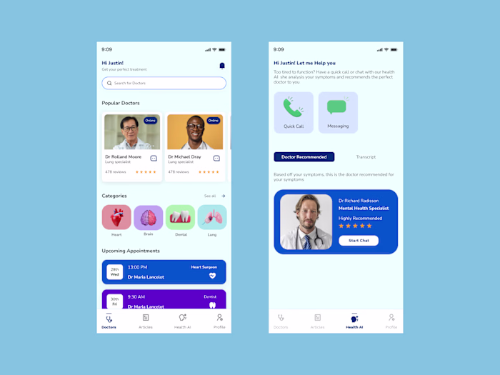
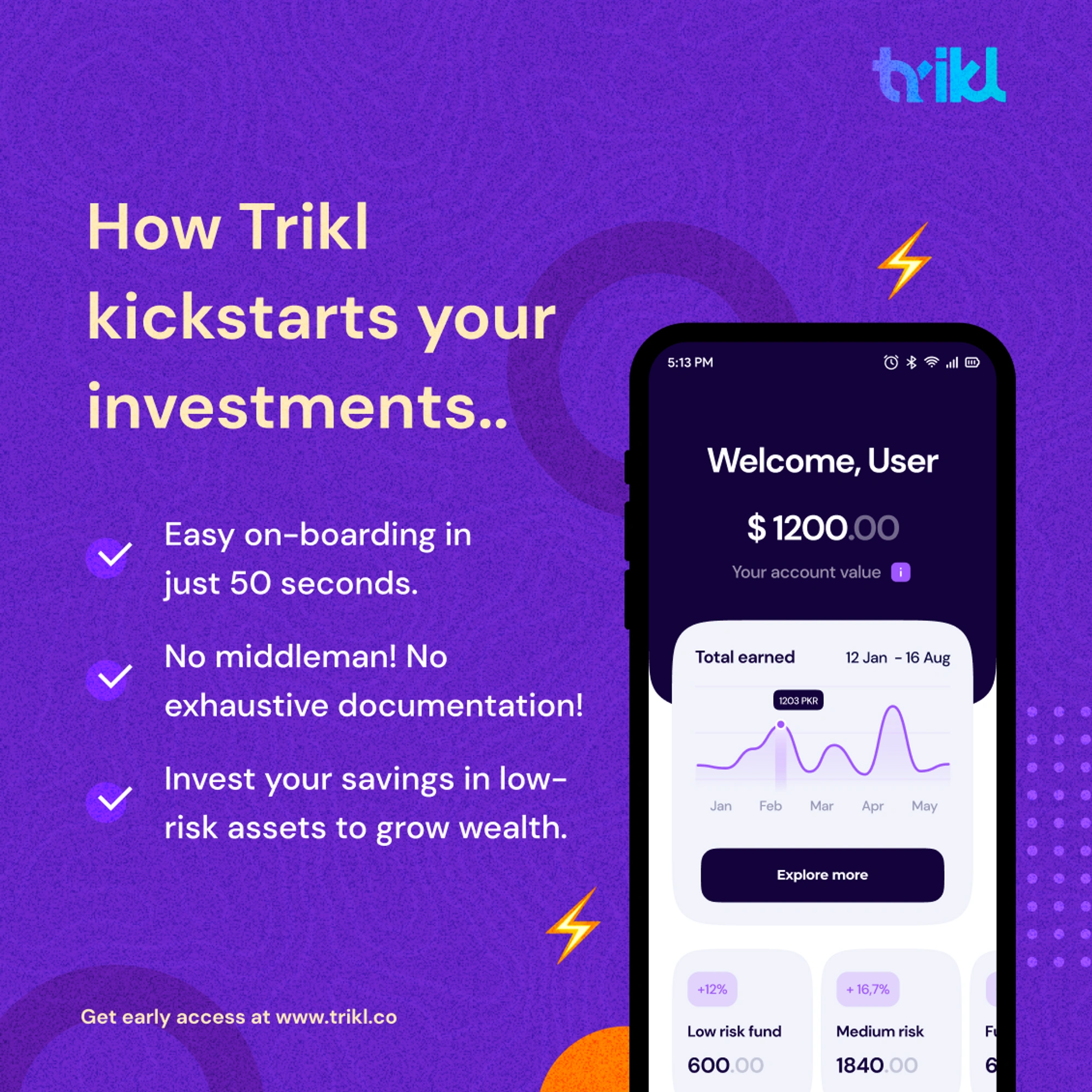
The final MVP product
Project Takeaways
Design processes are just guides to get answers.
💡
We tried following where our curiosity would take us and only then utilizing the tools that would help in getting us those insights. As a result, the outcome felt more rigorous and aligned with the user’s needs than I expected.
Like this project
Posted Feb 12, 2025
Trikl offers a seamless way to grow your wealth through diversified mutual fund investments, ensuring smart, secure, and effortless financial growth
Likes
1
Views
4