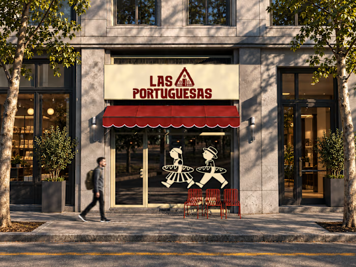
Hospitality Shift-Staffing Mobile App Design

Maria laura Sayago diaz

Hospitality shift-staffing app, mobile UI/UX design
A two-sided mobile app that connects hospitality workers with bars, restaurants and venues that need to cover shifts fast, with verified profiles on both sides.
Project overview
Designed for a hospitality staffing startup (client confidential), the app matches people who want flexible shifts (bartenders, cooks, waiters, baristas) with venues that need staff at short notice. A single sign-up splits into two experiences: workers browse and apply to shifts, and venues post offers, review candidates and hire.
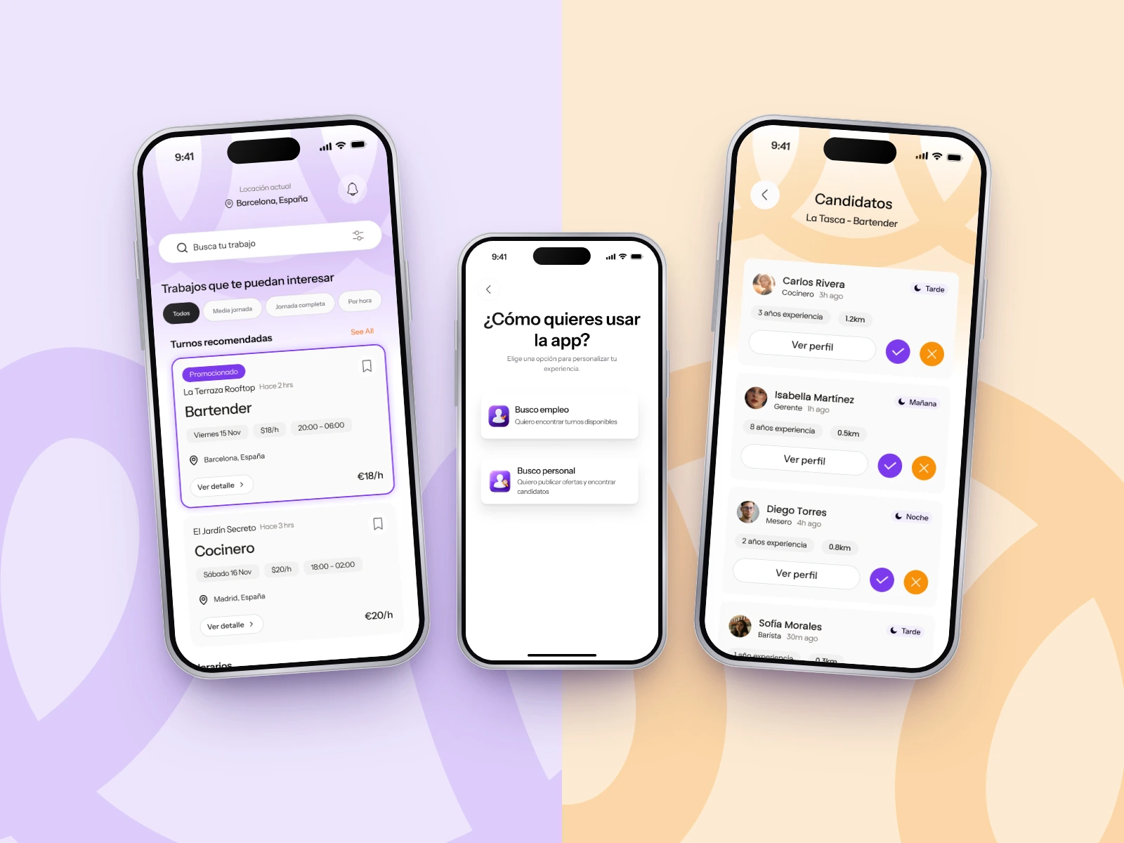
One sign-up, two roles: workers looking for shifts and venues looking for staff.
The challenge
Hospitality staffing still runs on group chats, word of mouth and last-minute calls. Workers can’t tell which offers are real or what a shift actually pays, and venues can’t check experience or credentials before someone shows up. The product needed to make a short-term hire feel trustworthy and quick on both sides of the market.
Design goals
Let workers judge an offer at a glance: role, date, hours, hourly pay and location on one card.
Match people by availability, with days and shift times (morning, afternoon, night, late night) as first-class filters.
Build trust through verification: licensed venues and workers with experience and certificates.
Remove the follow-up chase with a clear status for every application.
Strategy and UX approach
I started in FigJam by mapping the data each side needs. Workers have basic info, availability, job categories, experience and optional certificates; venues have business data and an activity licence for verification. From that model I defined the information architecture for both roles, then wireframed the onboarding, access and venue flows in grayscale before moving to UI.
Key decisions:
Role first. Users pick “I’m looking for shifts” or “I’m looking for staff” right after onboarding, so every following screen is specific to their role.
The shift is the unit. Cards, filters and profiles share the same vocabulary: day, time slot, €/hour, distance.
Worker profile as a CV. Portfolio, experience and certificates sit in tabs, so a venue can assess a candidate without leaving the app.
Contacts as a business model. Venues spend contact credits to message candidates and can promote offers. Both stay visible but secondary in the UI.
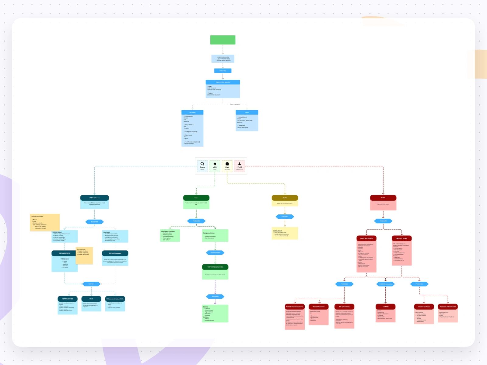
The data model mapped in FigJam for workers and venues, which became the app’s information architecture.
User flow
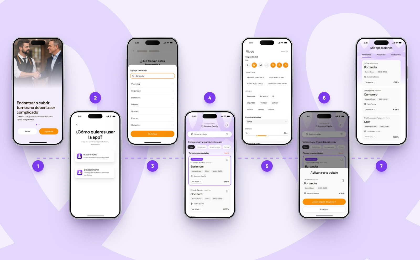
Worker: find and apply. Onboarding → choose role → pick the job types they do → home with recommended shifts → filter by days, time slot, category and experience → open a shift and confirm in a bottom sheet → track it in My applications (Pending, Accepted, Rejected).
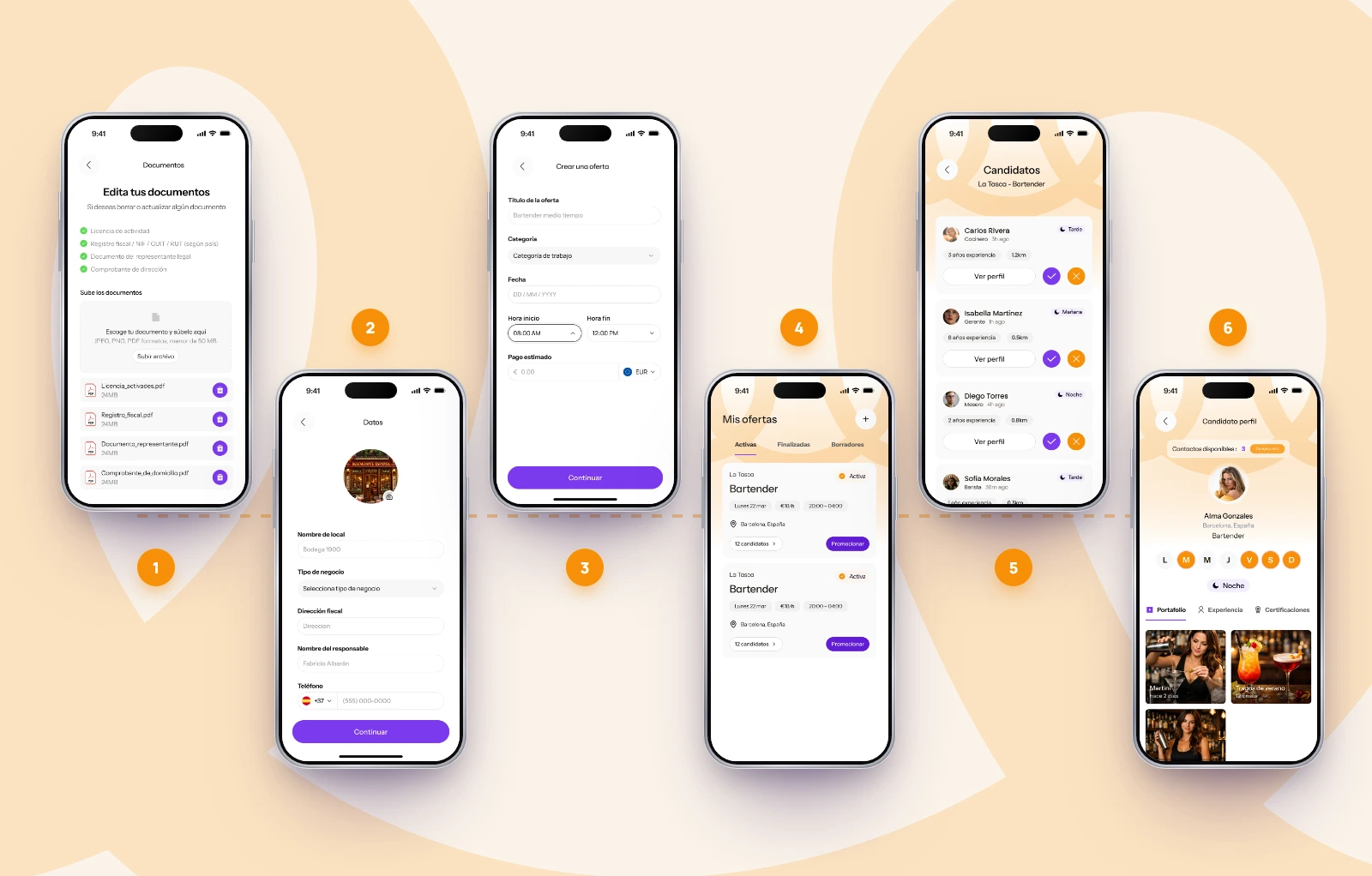
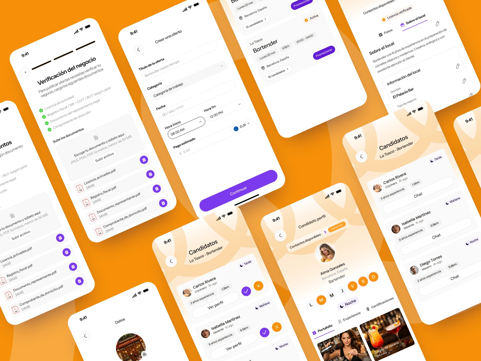
Venue: verify, post, hire. Upload licence and tax documents → complete venue details → create an offer (role, date, hours, pay, requirements) and review it before publishing → manage active offers and promote them → review candidates → open a profile and message them.
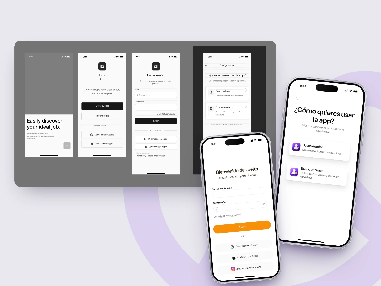
Venue flow, from business verification to choosing a candidate.\
Alt text: Six connected phone screens showing a venue verifying documents, posting an offer and reviewing candidates.
Visual direction
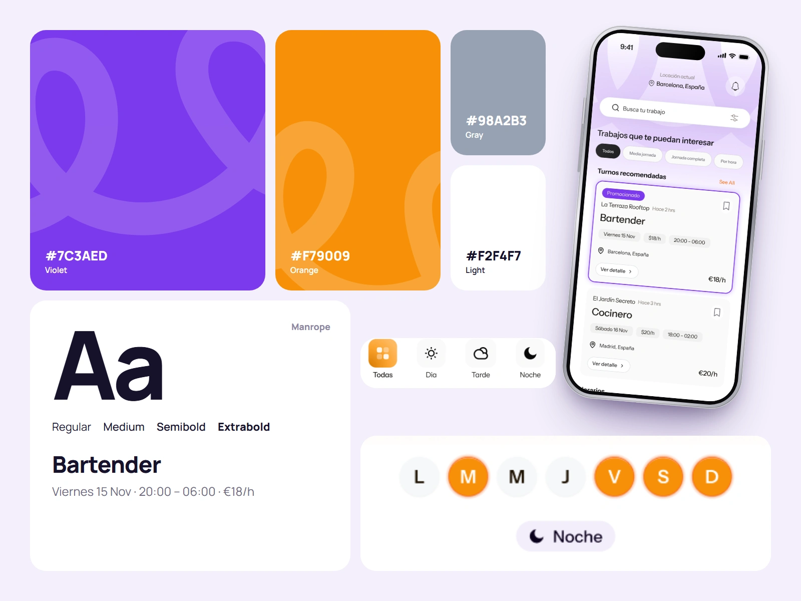
A bright, friendly look for an industry that works nights. Violet carries the primary actions and the brand. Orange marks pay, promotion and calls to action, with a warm shift for the venue’s screens. Large curved arcs in the headers carry the brand line motif into the UI. Manrope keeps long lists easy to scan, and shift times use simple icons: sun, cloud, moon.
Image caption: Palette, typography and the shift-time icons behind the interface.
Alt text: Color swatches in violet, orange and grays with hex codes, a Manrope type specimen and day, afternoon and night icons.
Key screens
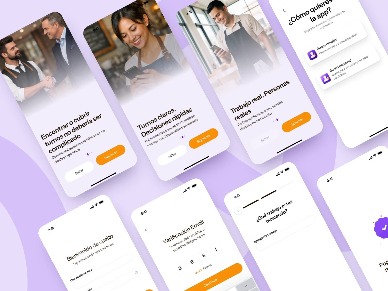
Onboarding & access. Three onboarding screens set the promise in plain language, followed by email, Google, Apple or Instagram sign-in and a 4-digit code check.
Three onboarding screens with photos of hospitality workers, next to a log-in screen and a code-verification screen.
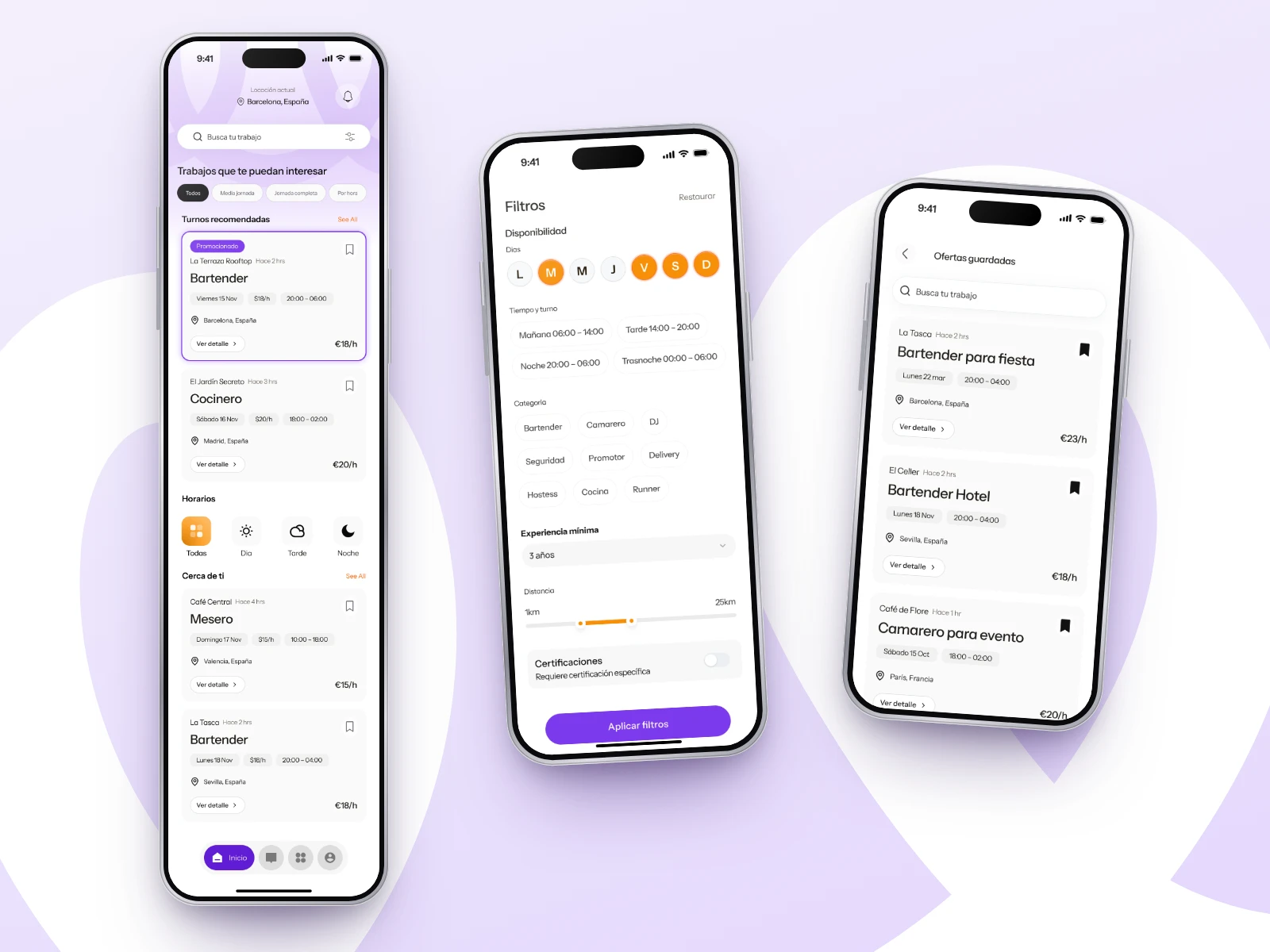
Discovery. The worker home starts with location and search, then quick filters (part-time, full-time, per hour), recommended shifts, time-slot shortcuts and nearby jobs. Promoted offers stand out with a violet outline.
A long mobile home screen listing bartender, cook and waiter shifts with pay and hours, beside a filters screen.
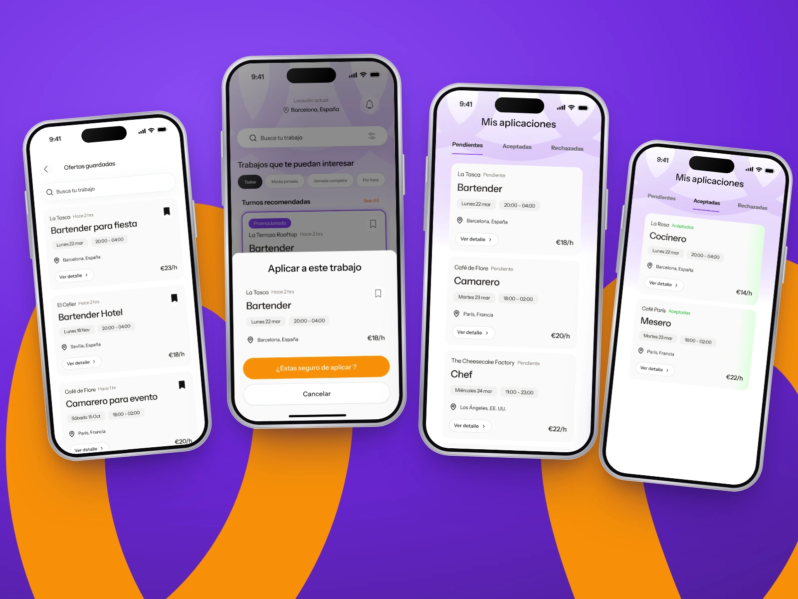
Apply & track. The worker saves shifts for later, confirms an application in a bottom sheet and follows its status by tab, with no need to call the venue.
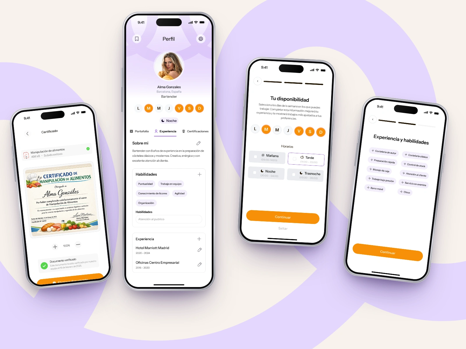
Worker profile. Bio, job categories, weekly availability, skills and verified certificates (such as food-handling) turn the profile into a hiring-ready CV.
Image caption: Profile, availability and certificates that venues can trust.
Alt text: Profile editing screens showing weekday availability, skill chips and an uploaded food-handling certificate.
Venue side. Venues verify their business, post offers, promote them and work through candidates with accept and reject actions. A contacts counter shows how many conversations they have left.
Design system
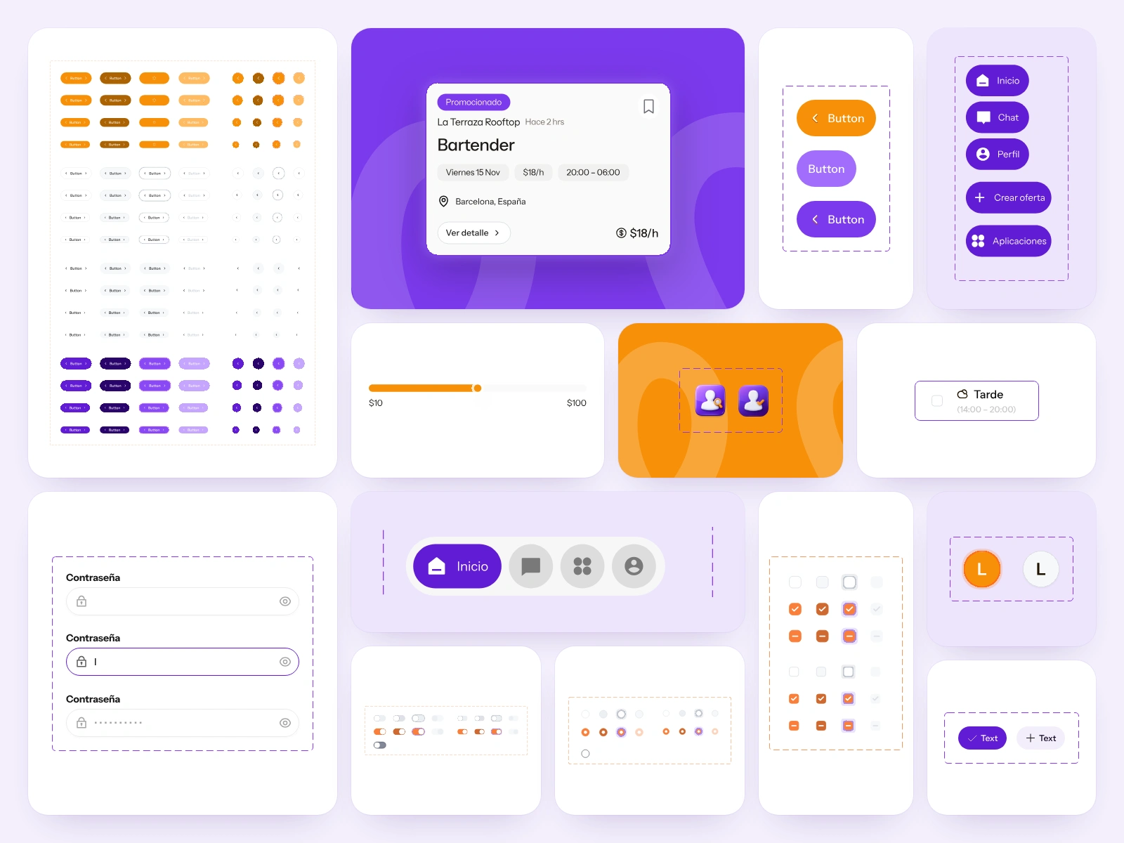
A component library in Figma keeps both roles consistent: primary and secondary buttons, the job card and its promoted variant, segmented controls, range sliders for pay, toggles, checkboxes, radio buttons, dropdowns, chips and the floating bottom navigation.
Prototype
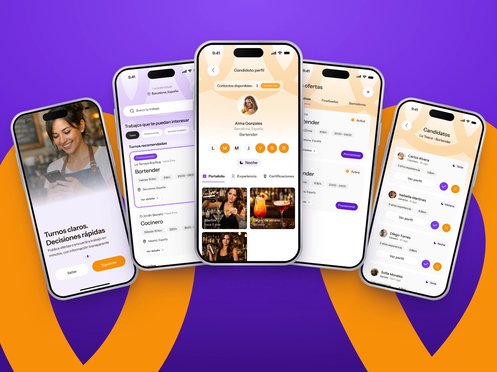
The flows were prototyped in Figma. The walkthrough video follows the worker path: onboarding, role selection, browsing shifts, filtering and applying.
My role and deliverables
My role: UX/UI designer and brand designer. I mapped the information architecture, designed the flows for both roles, created the wireframes, UI, design system and prototype, and the brand identity.
Scope: Information architecture, user flows, wireframes, UI design, design system, interactive prototype, brand identity.
Tools: Figma, FigJam.
Deliverables: FigJam information architecture, user flows for workers and venues, wireframes, high-fidelity screens for both roles, Figma component library, clickable prototype, brand identity.
Outcome
The final app gives workers and venues one place to post, find and fill hospitality shifts, with verification, availability and application status built in.
Like this project
Posted Nov 2, 2026
Designed a two-sided staffing app for hospitality workers and venues using Figma and FigJam.
Likes
0
Views
2