Las Portuguesas Visual Identity

Maria laura Sayago diaz


Las Portuguesas, visual identity
Concept project created to explore a visual identity for a Venezuelan neighborhood bakery run by a Portuguese family. A hand-drawn logotype, two bread-carrying characters and a warm bakery palette that work from the storefront to the paper bag.
Project overview
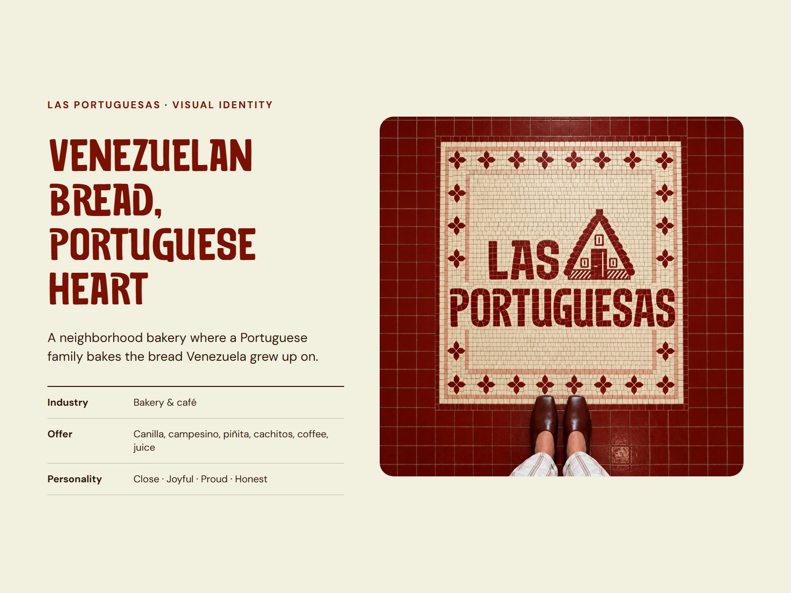
Las Portuguesas is a Venezuelan bakery made by Portuguese hands. Behind the counter there is a family with a Portugal accent; on top of it, the bread Venezuela grew up on: canilla, campesino, piñita and cachitos fresh from the oven. It's the neighborhood spot for the morning bread and the afternoon coffee, juice or sandwich.
The identity is built around that daily meeting of two traditions. Personality: close, joyful, proud and honest.
The challenge
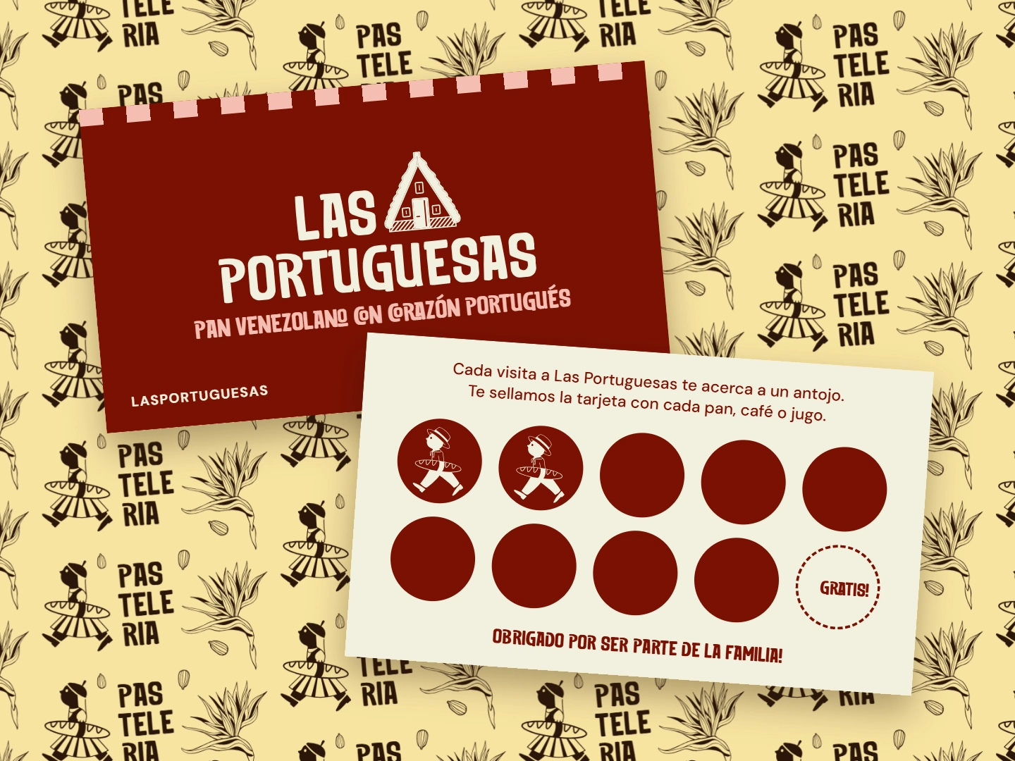
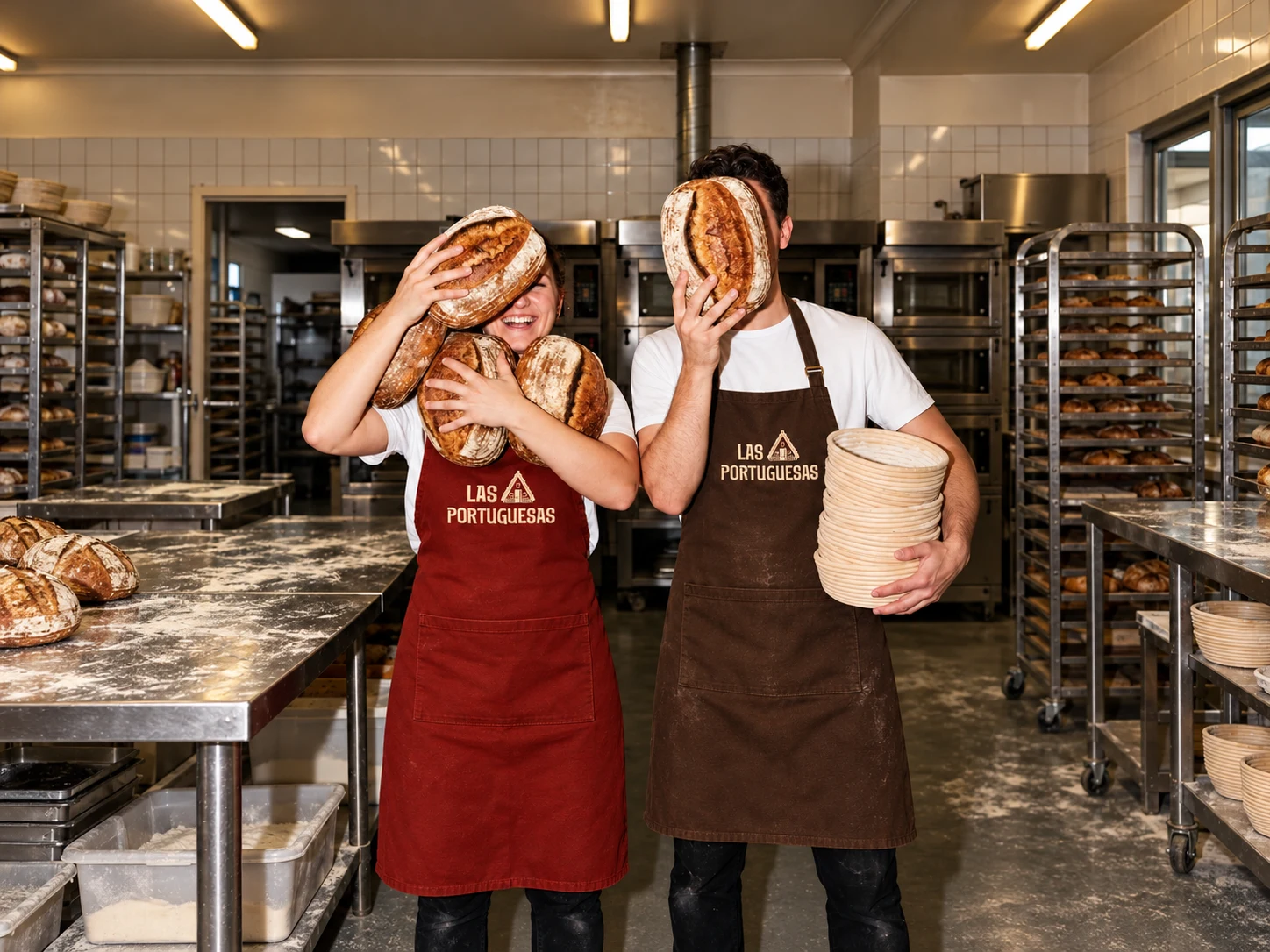
Neighborhood bakeries tend to look the same: generic signage, stock fonts, no story. Las Portuguesas needed an identity that tells its double origin at a glance, feels as familiar as the corner bakery, and holds up across very different surfaces: a street sign, a paper bag, a uniform, a sticker and a loyalty card.
Brand strategy and creative concept
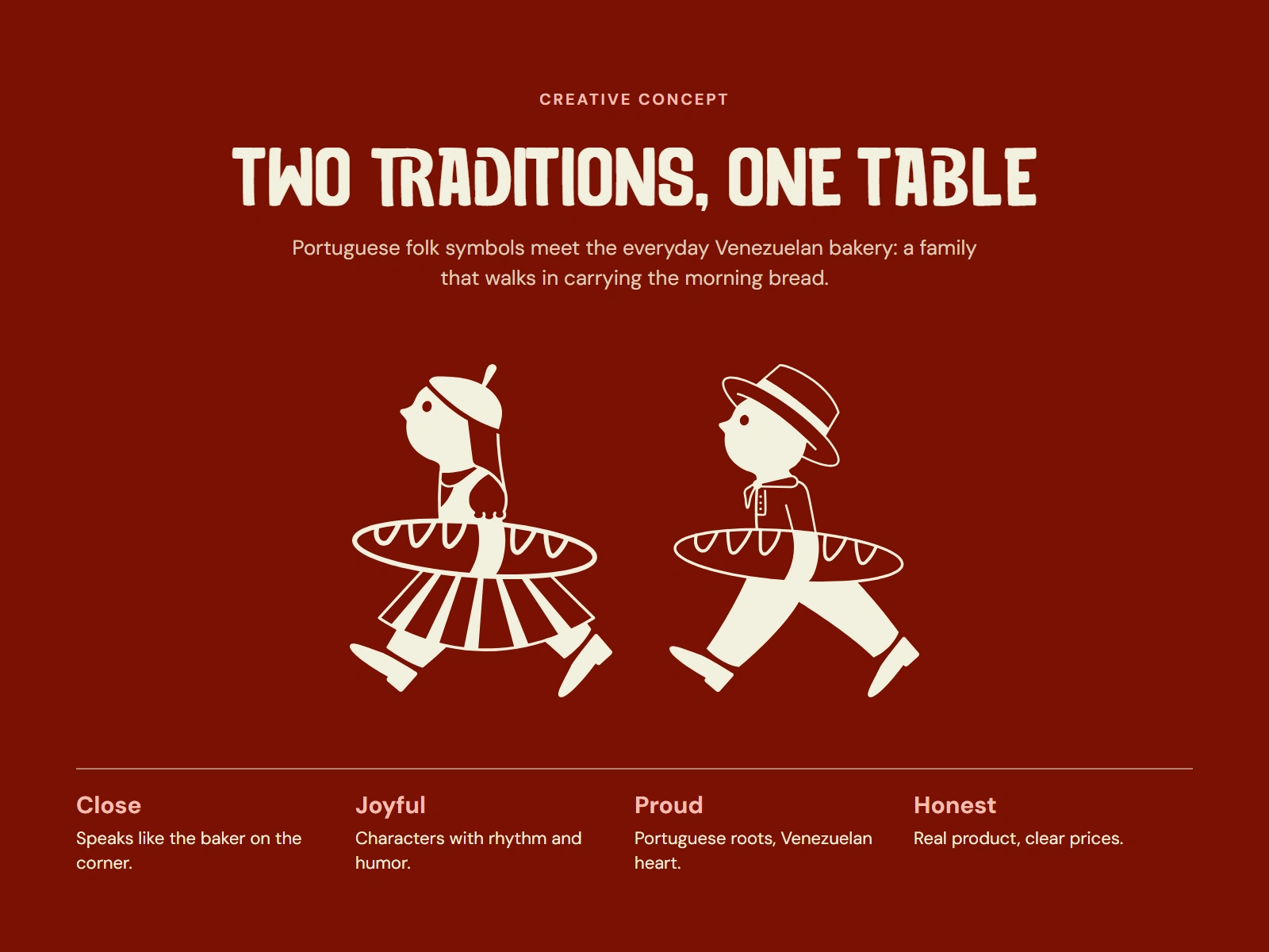
Two traditions, one table. Portuguese folk symbols meet the everyday Venezuelan bakery.
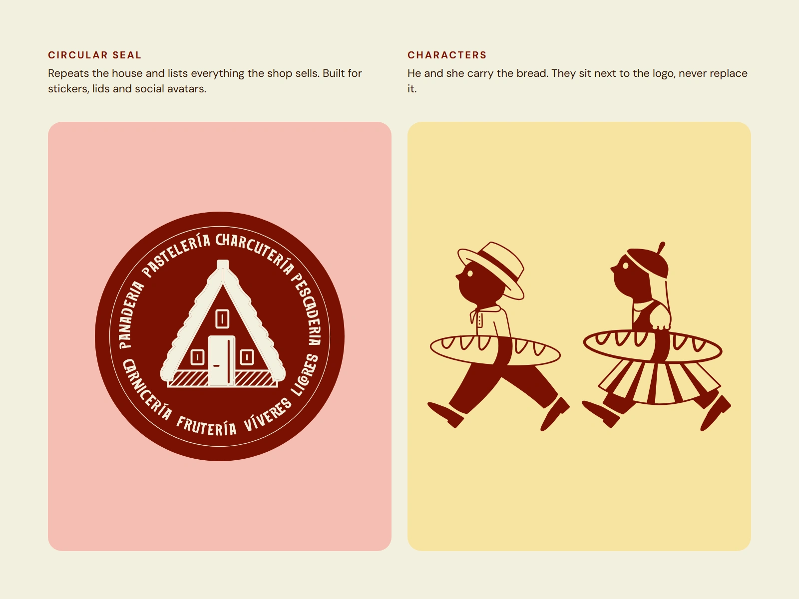
The house: the A-frame cottage sits next to the name as the Portuguese home everything comes from.
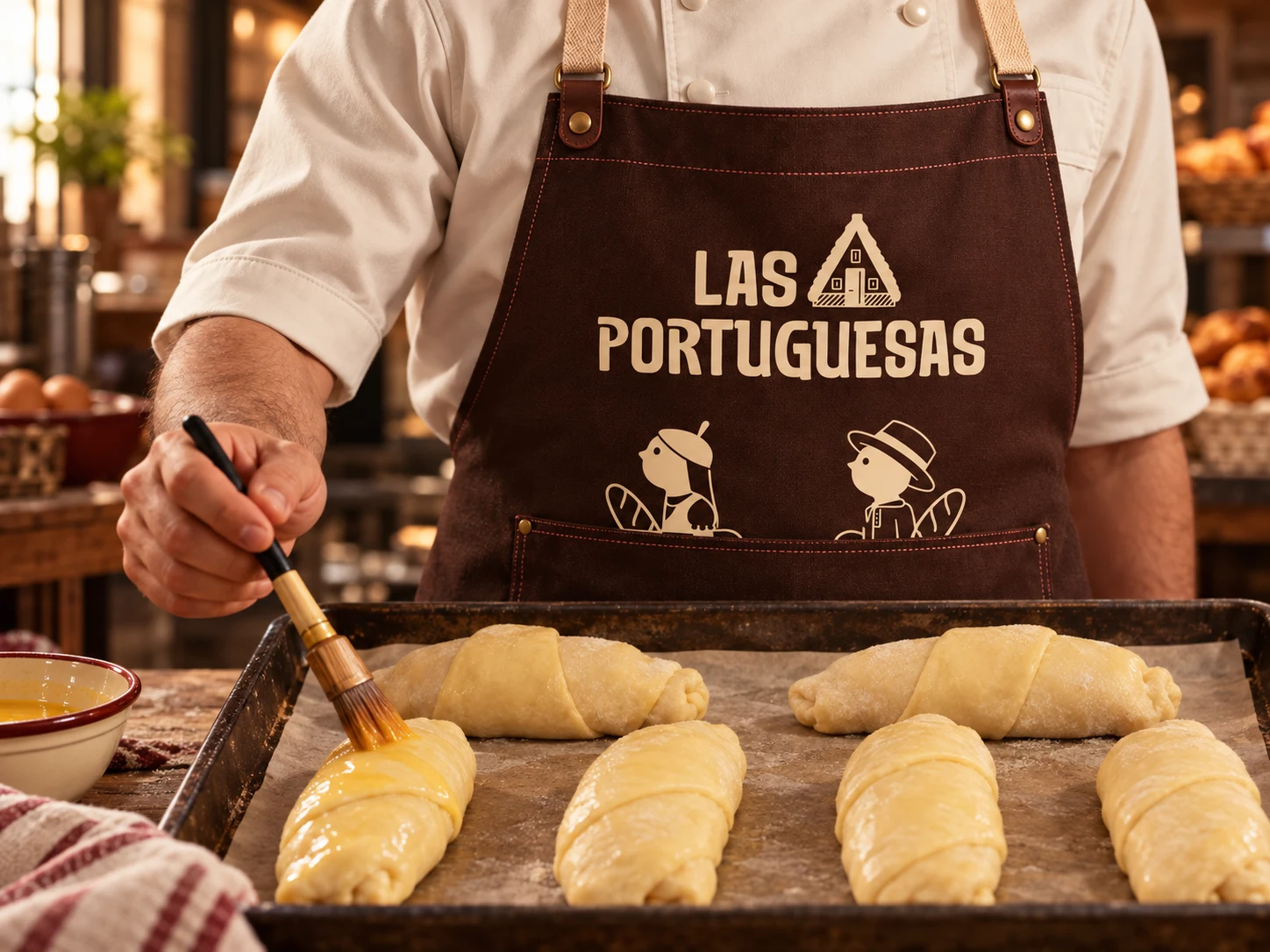
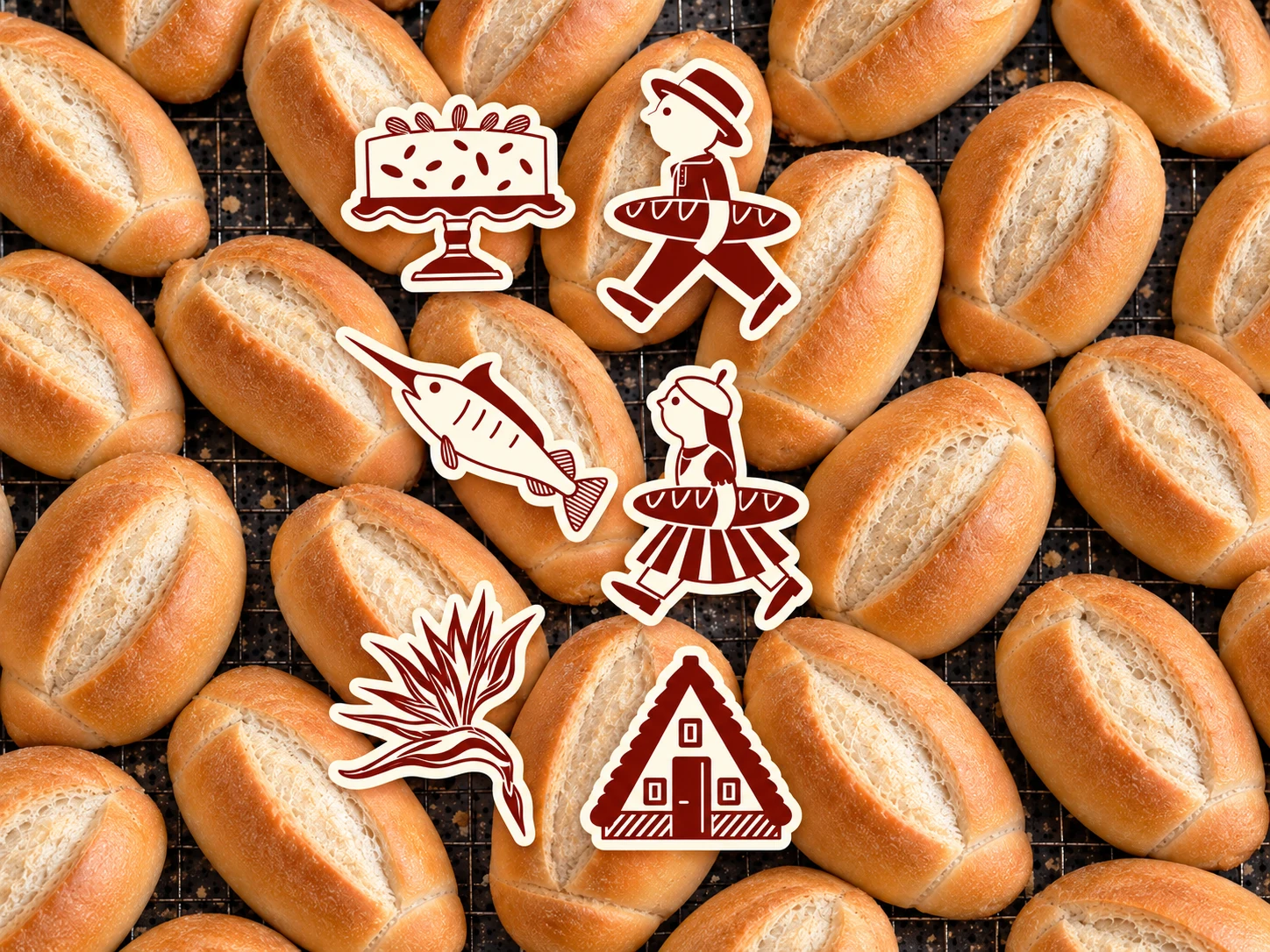
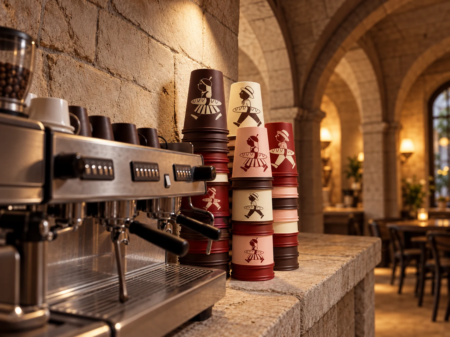
The characters: a boy in a straw hat and a girl in a beret and pleated skirt walk carrying a long loaf. They give the brand rhythm and humor and do the talking where the logo would feel too formal.
The voice: it speaks like the baker on the corner, with confidence and warmth and without rodeos.
Each trait maps to a decision. Close: rounded, heavy lettering and warm colour. Joyful: characters in motion. Proud: Portuguese icons used openly. Honest: one-colour illustrations and a short, clear palette.
Visual identity system
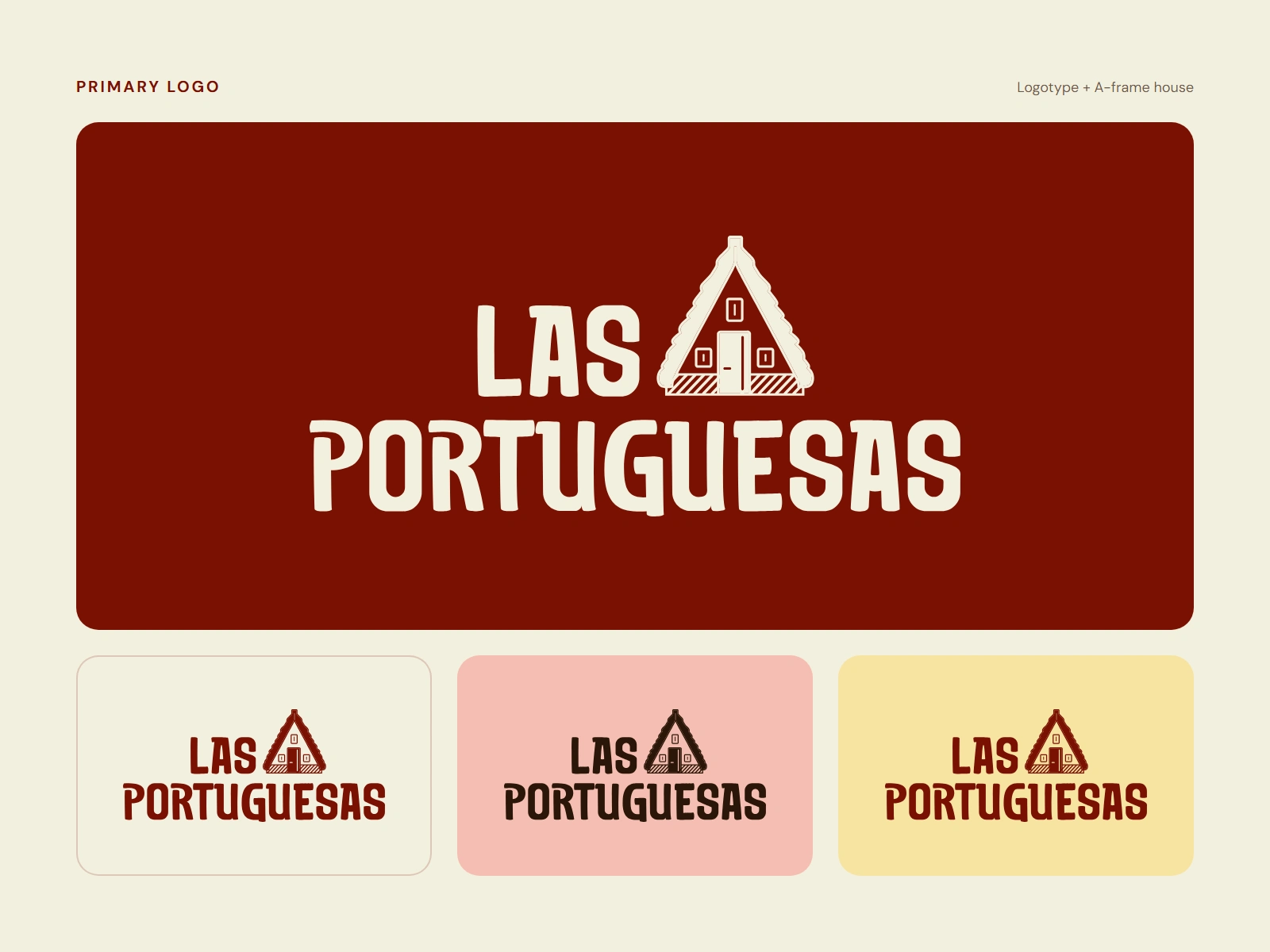
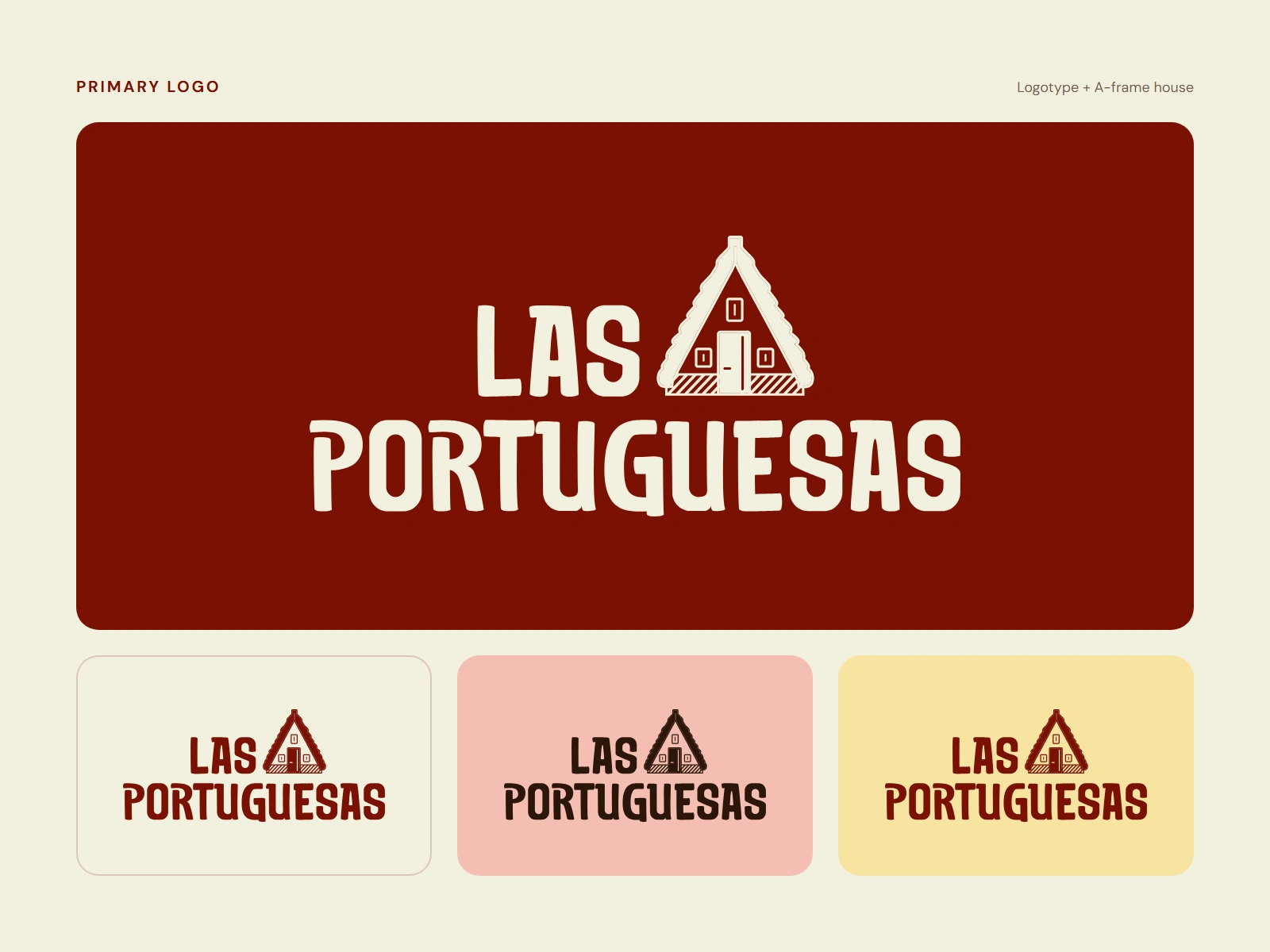
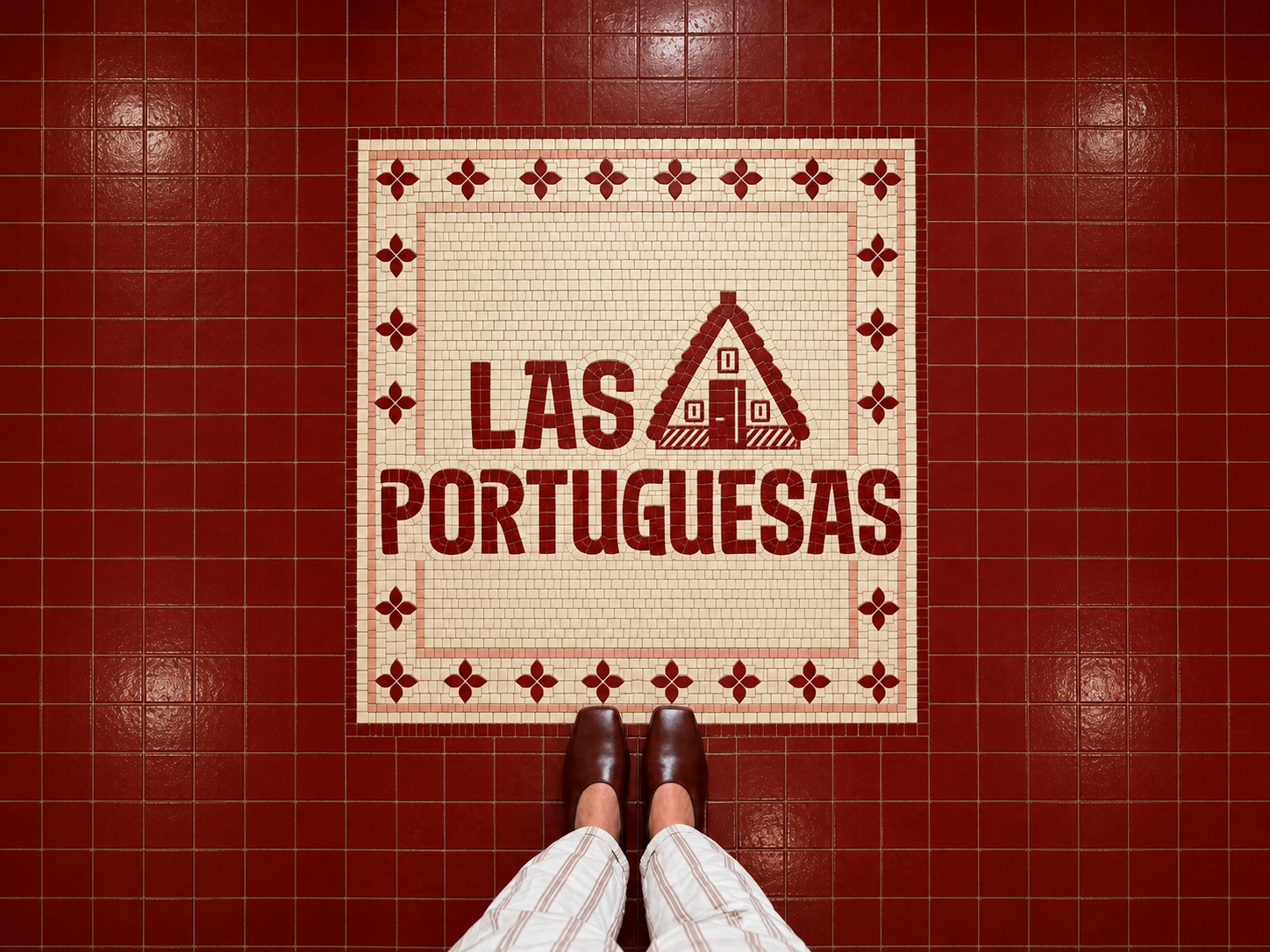
Logo. The logotype pairs the name in thick, rounded hand-drawn letters with the A-frame house. It is the main signature and always appears in a palette colour.
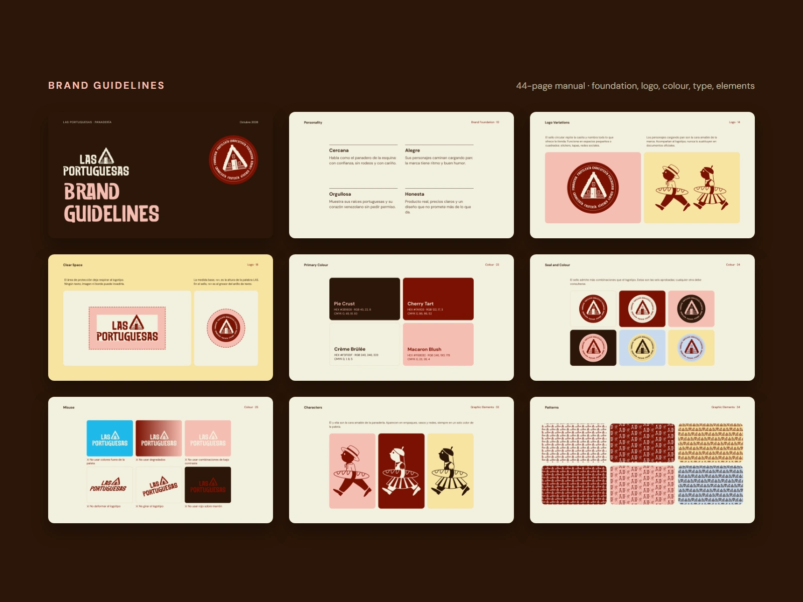
Seal and characters. A circular seal repeats the house and lists everything the shop sells (bakery, pastry, charcuterie, fish, butcher, fruit, groceries, liquor) for stickers, lids and social avatars. The two characters sit next to the logo but never replace it, always in one palette colour.
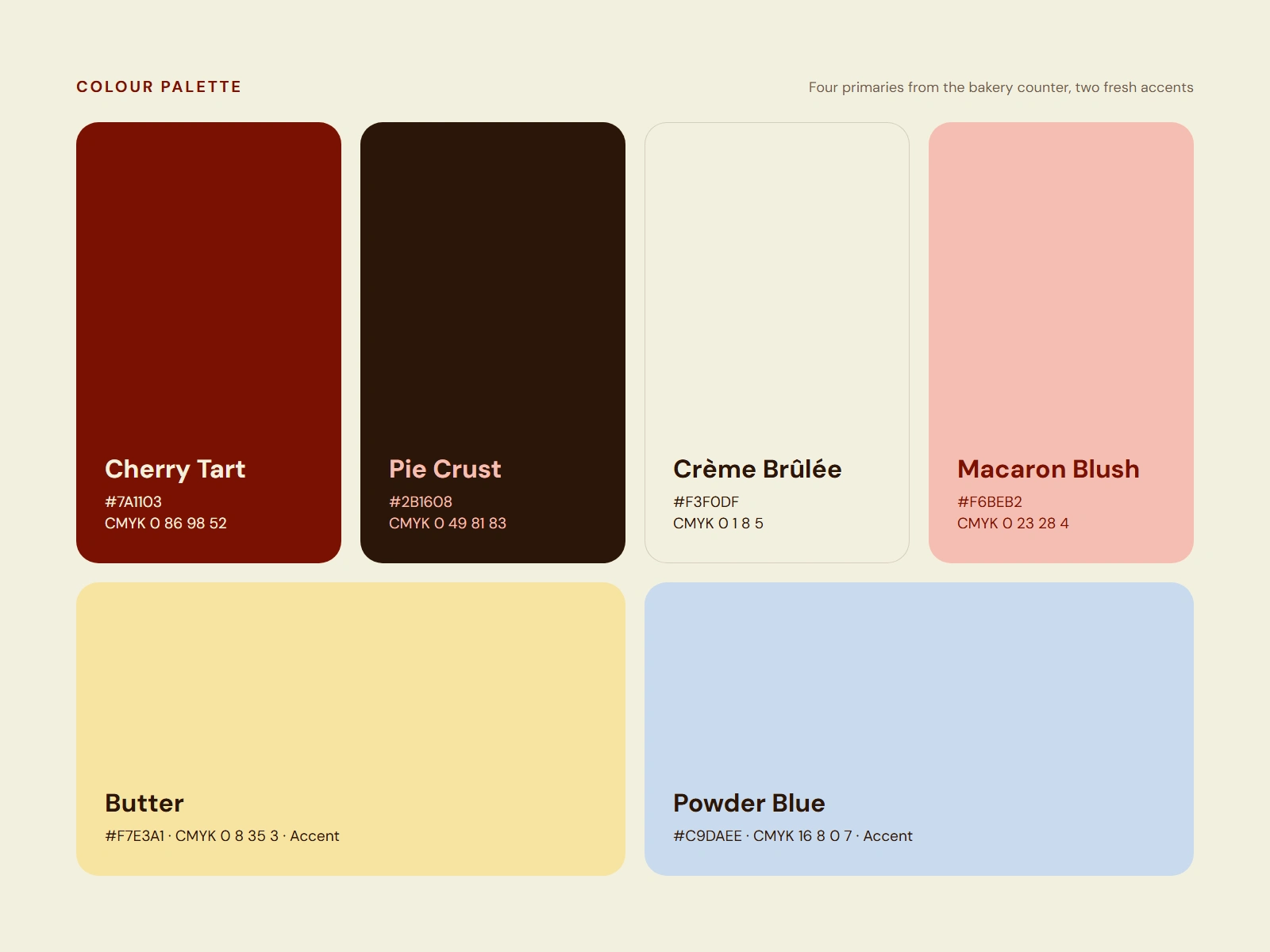
Colour. Four primaries taken from the bakery counter: Cherry Tart #7A1103, Pie Crust #2B1608, Crème Brûlée #F3F0DF and Macaron Blush #F6BEB2. Two fresh accents, Butter #F7E3A1 and Powder Blue #C9DAEE, for packaging, patterns and social. Text and logo on accents always go in Pie Crust or Cherry Tart.
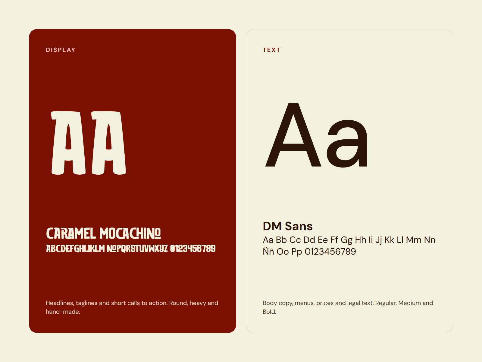
Typography. Caramel Mocachino for headlines, taglines and short calls to action. DM Sans for body copy, menus, prices and legal text.
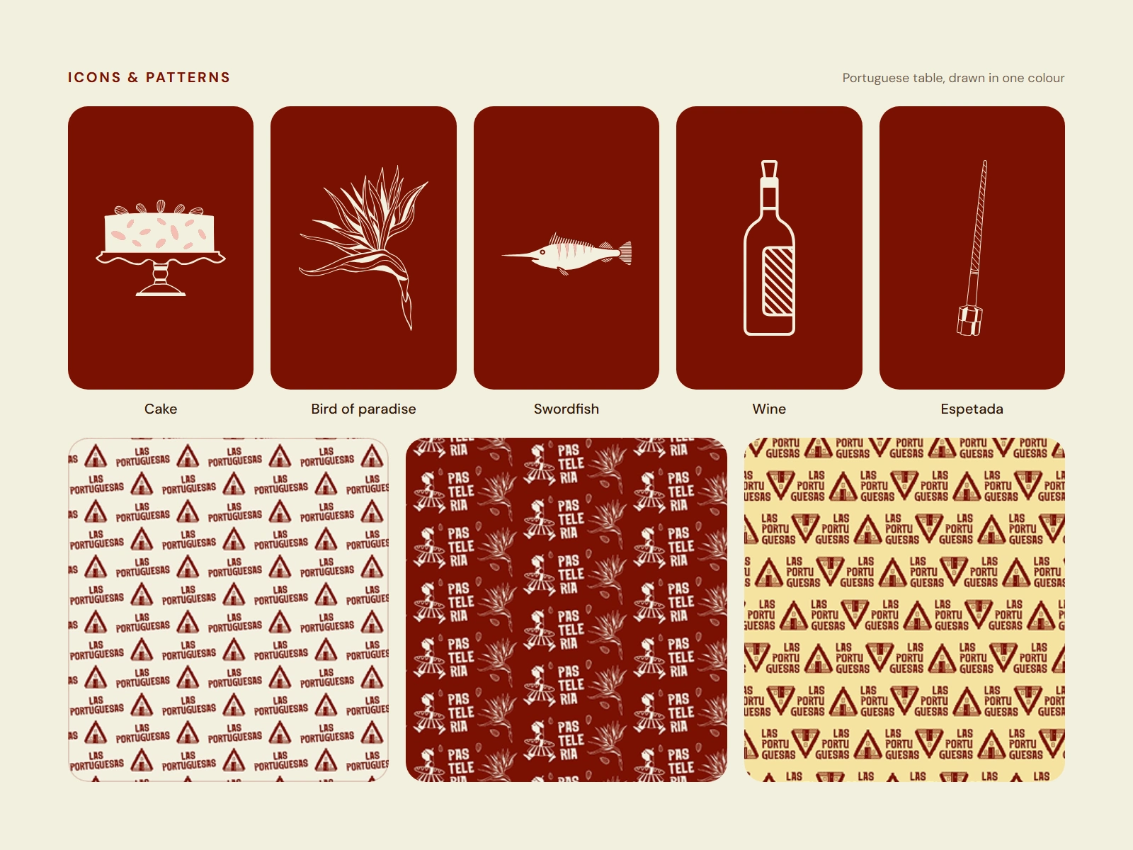
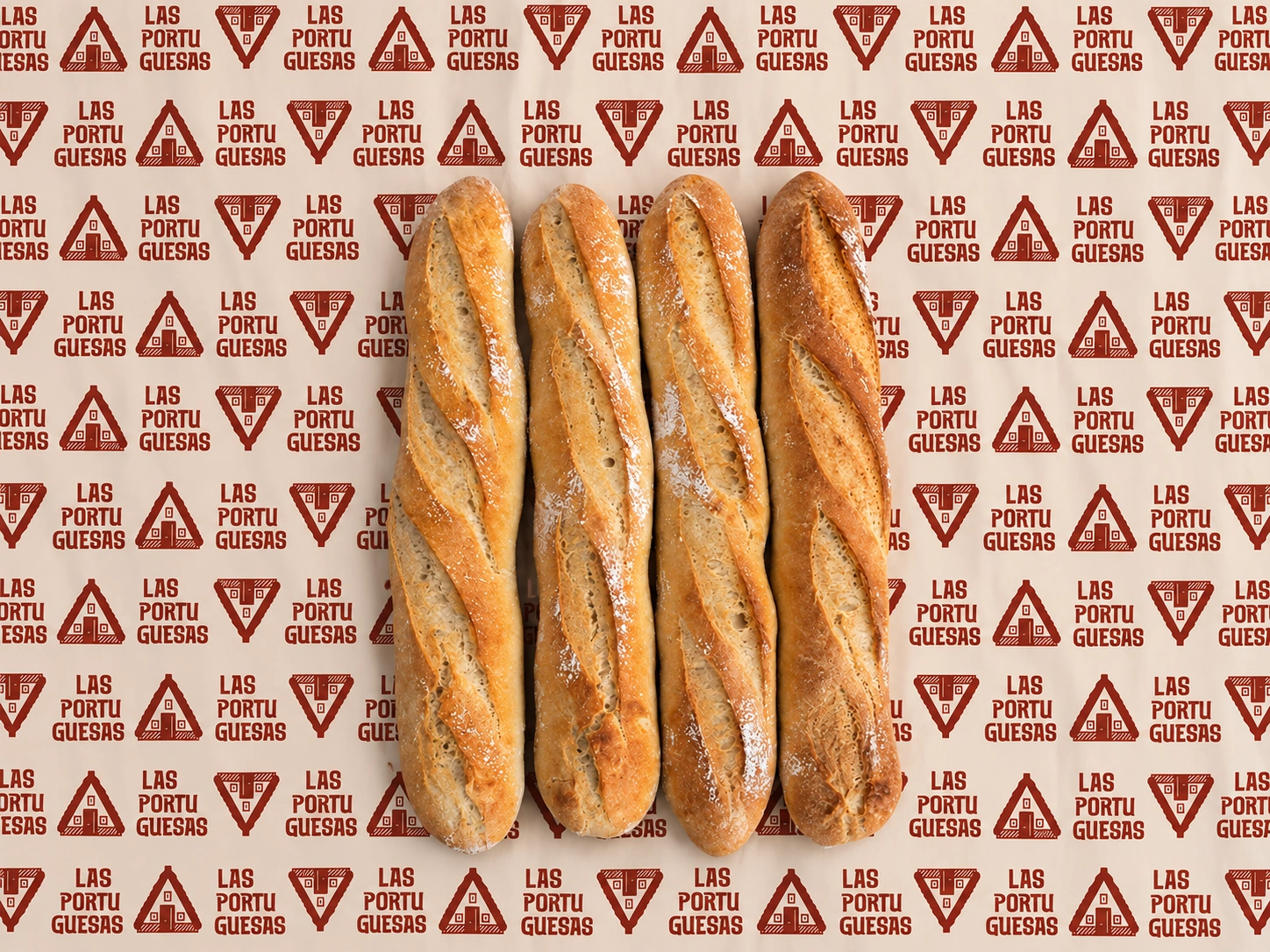
Icons and patterns. One-colour icons from the Portuguese table (cake, bird of paradise, swordfish, wine, espetada) feed the stickers and patterns. Patterns repeat the logotype, the house and the characters in each palette colour for wrapping paper and backgrounds.
Design process
The system was documented in a 44-page brand manual covering foundation, logo, colour, typography and graphic elements. It sets clear space and minimum sizes, six approved seal colour combinations, misuse examples and character rules, so the identity stays consistent when the bakery applies it on its own.
Applications
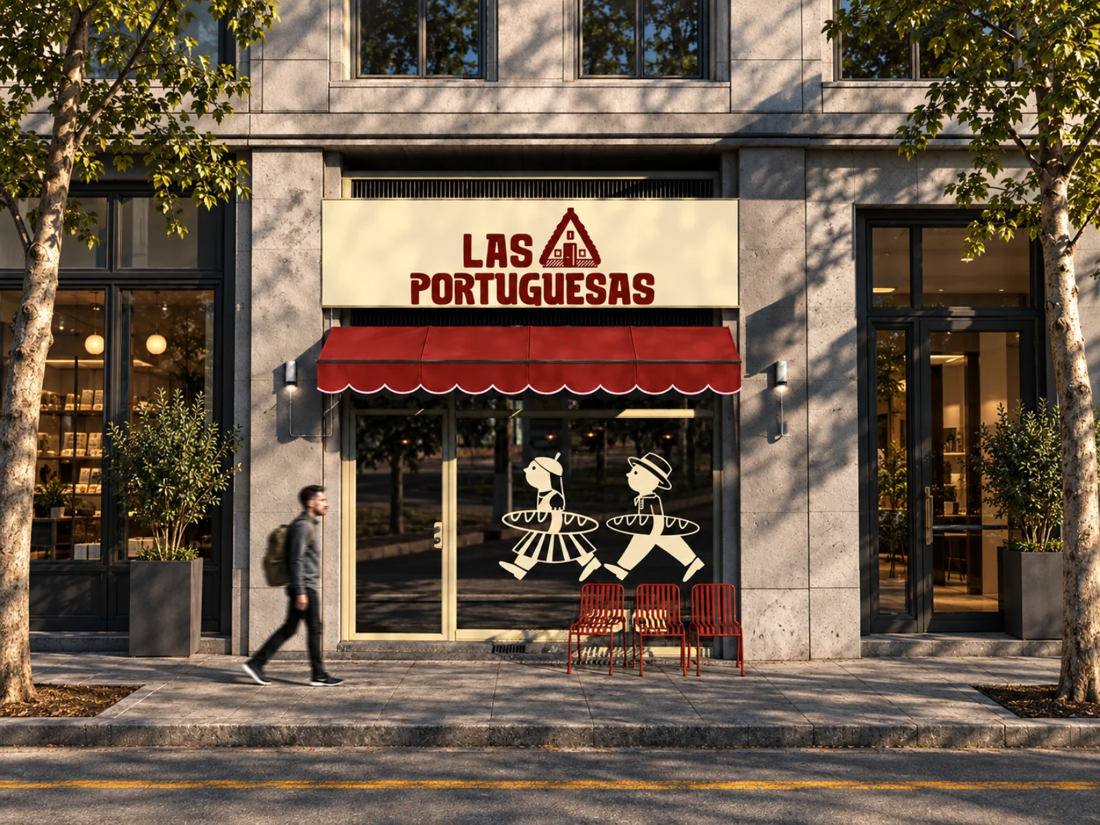
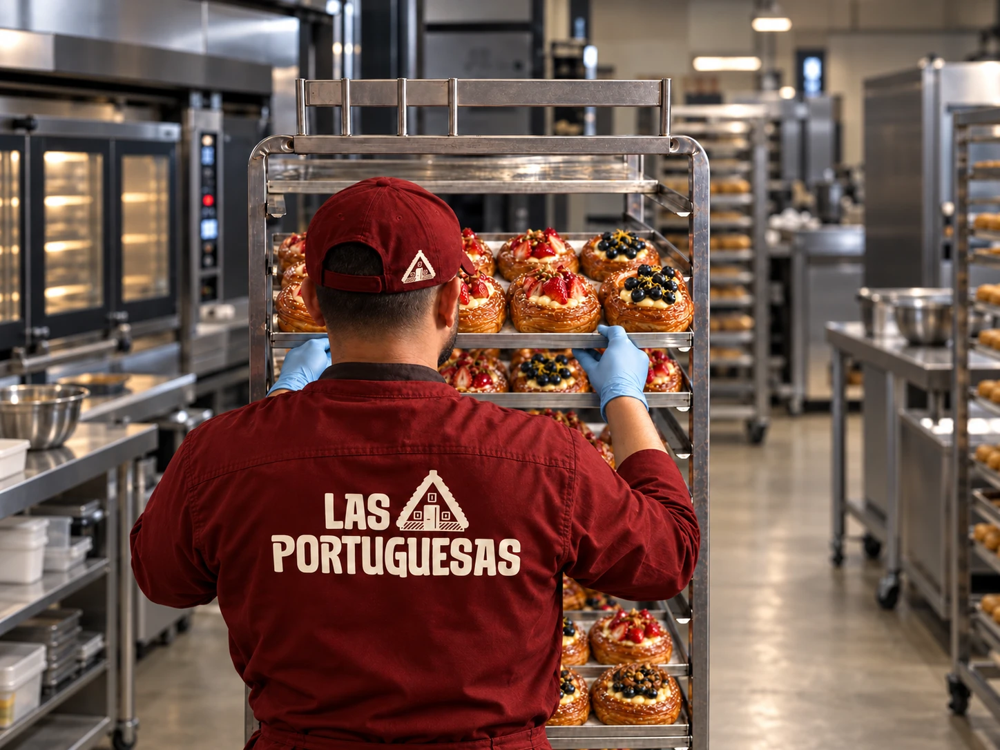
The system moves from the street to the hand without losing recognition: the logo leads on large surfaces, the characters take over on packaging, and the seal and icons fill the small formats.
My role and deliverables
My role: Brand designer covering strategy, identity design, illustration and brand guidelines.
Scope: Brand foundation, logo system, character and icon illustration, colour, typography, patterns, brand manual and application mockups.
Tools: Adobe Illustrator, Figma, Adobe Photoshop.
Deliverables: Primary logo and colour versions, circular seal, two brand characters, icon set, patterns, colour palette, typography system, 44-page brand manual, storefront, packaging, wrapping paper, uniform, stickers, loyalty card and social formats.
Roles: Brand Designer, Illustrator, Graphic Designer
Tools: Adobe Illustrator, Figma, Adobe Photoshop
Industry: Food & Beverage
Short description: Concept identity for a Venezuelan neighborhood bakery run by a Portuguese family, from storefront to bread bag.
Cover alt text: Bakery storefront with a cream sign reading Las Portuguesas, a red scalloped awning and two cream characters carrying baguettes on the window.
Like this project
Posted Oct 30, 2026
Concept identity for a Venezuelan neighborhood bakery run by a Portuguese family.