GAMBITO Visual Identity Project

Maria laura Sayago diaz


GAMBITO, visual identity
Brand identity for GAMBITO, a Cajun seafood restaurant on Margarita Island, Venezuela. Built from just a name into a full system: logo suite, hand-drawn mascot, color, typography and applications across the restaurant.
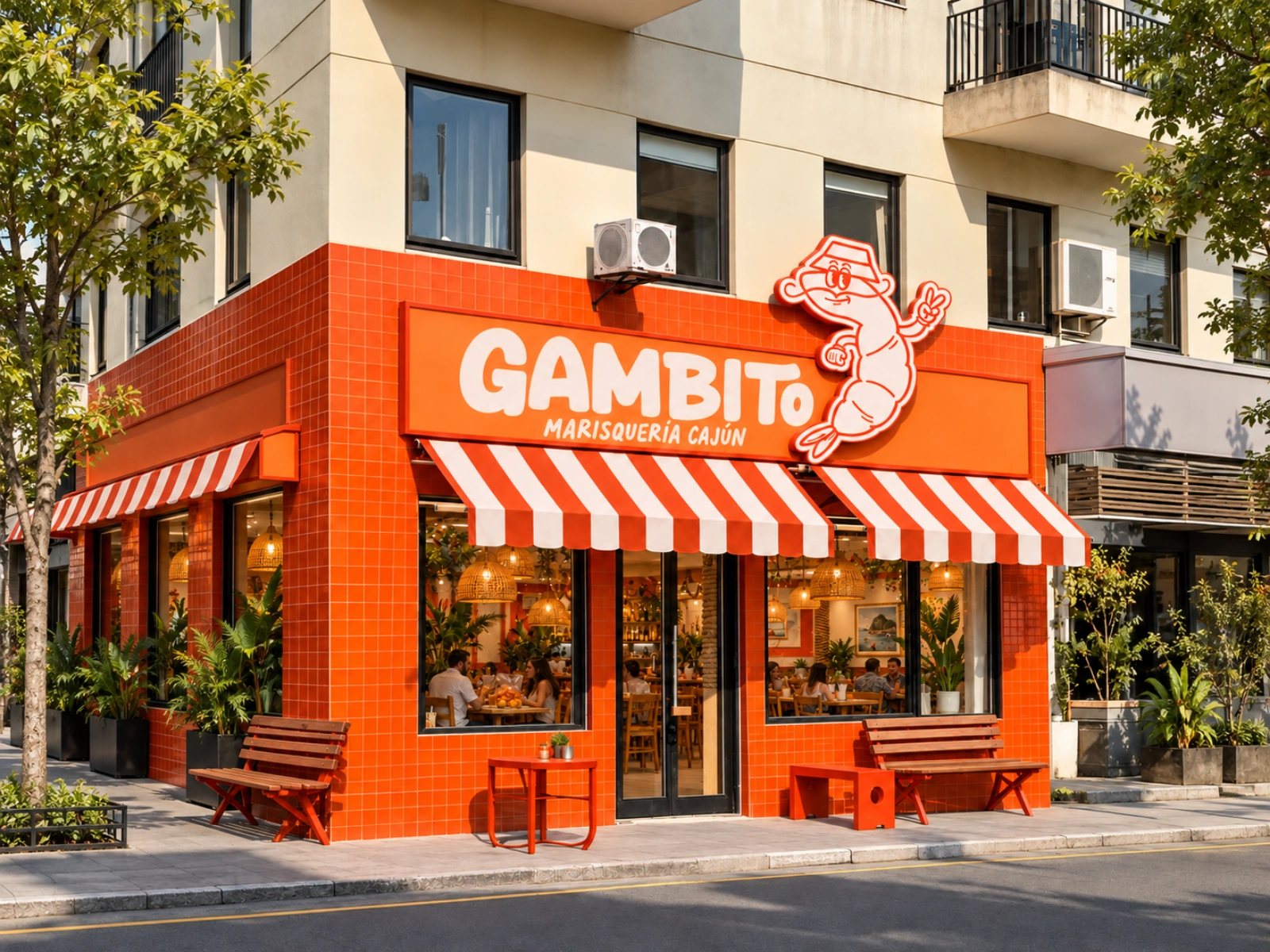
Orange-tiled restaurant storefront with red-and-white striped awnings, a GAMBITO sign and a shrimp mascot mounted on the corner.
Project overview
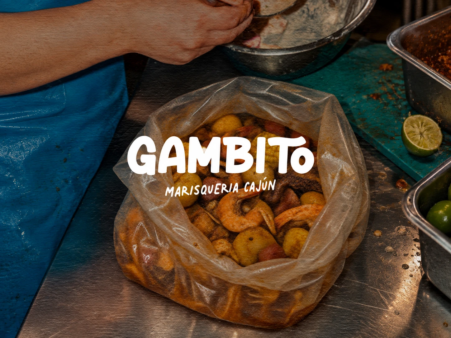
GAMBITO is a seafood restaurant on Margarita Island, Venezuela, serving Cajun-style seafood boils: shrimp, corn, potatoes and sausage, served by the bag and shared at the table. It is for everyone, families and groups of friends of every age, looking for a casual meal built around seafood.
The owner came with a name and nothing else. My job was to give the restaurant its entire visual identity, ready to open its doors.
The challenge
Cajun seafood is uncommon in Venezuela. The identity had to introduce a new food concept on the island and make it feel inviting at first sight, to locals and visitors of every age.
It also had to launch a brand from zero: one system flexible enough to cover the storefront, menu, uniforms, packaging, merchandise and social media from day one.
Brand strategy and creative concept
A seafood boil is loud, hands-on and made for sharing. The identity carries that spirit, with an island attitude to match Margarita.
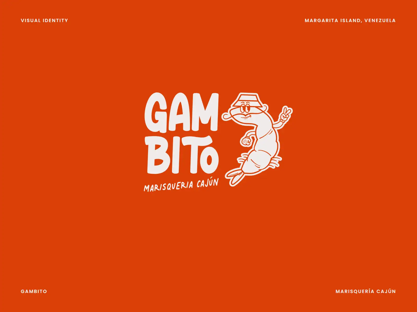
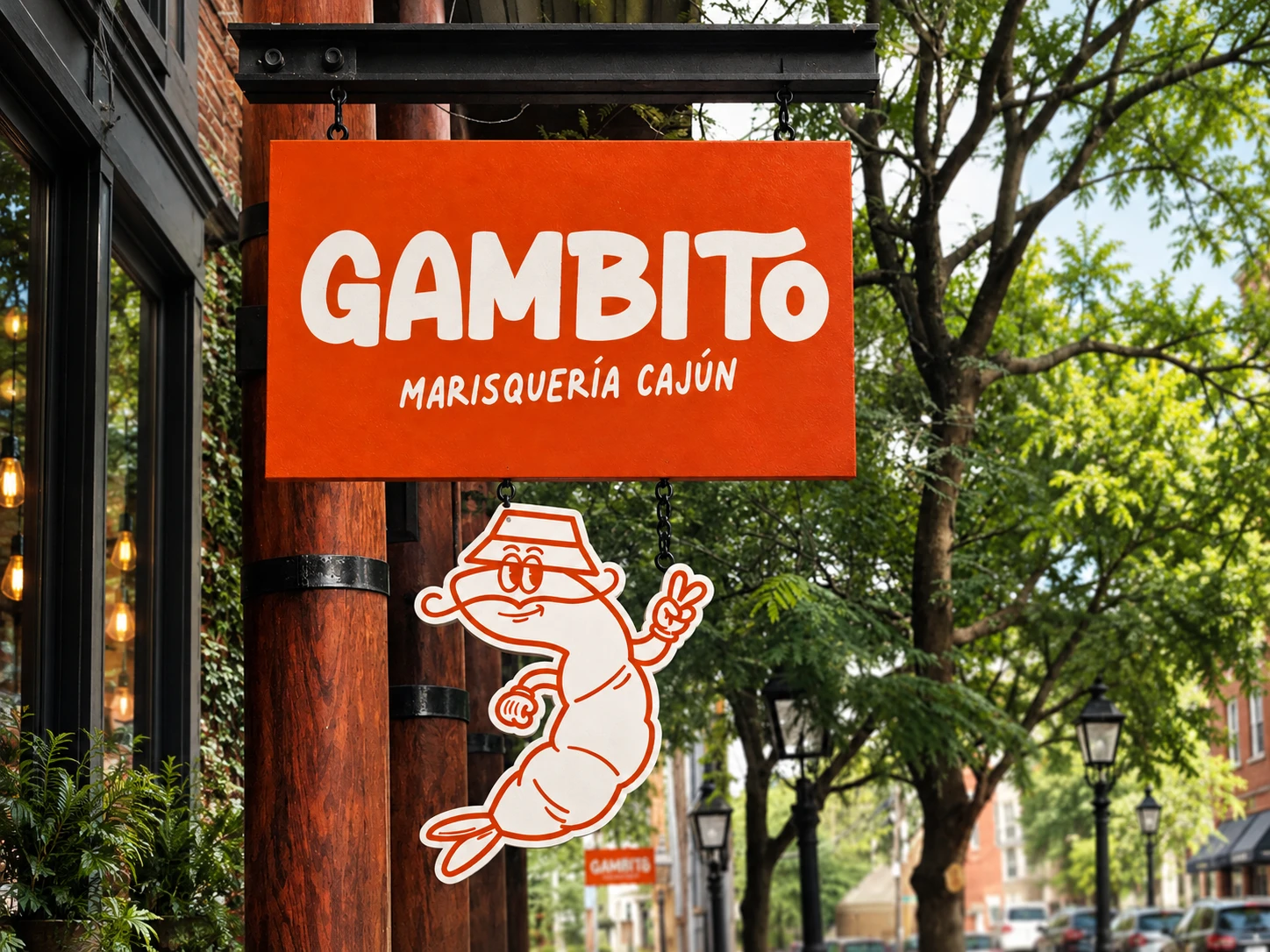
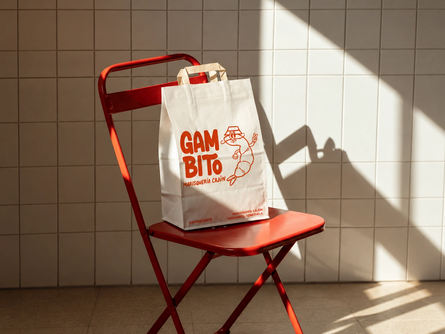
A character as the face of the brand. A hand-drawn shrimp in a bucket hat, flashing a peace sign, gives GAMBITO a friendly host that makes an unfamiliar cuisine easy to approach.
Lettering with personality. Bold, rounded letterforms with playful quirks keep the name readable from across the street while matching the mascot’s tone.
A warm, appetizing palette. Red-orange, orange, sand and off-white come straight from cooked shrimp and Cajun spice, chosen to feel pleasant and trustworthy.
Fresh and simple. Minimal elements, so the brand reads instantly on a sign, a bag or a phone screen.
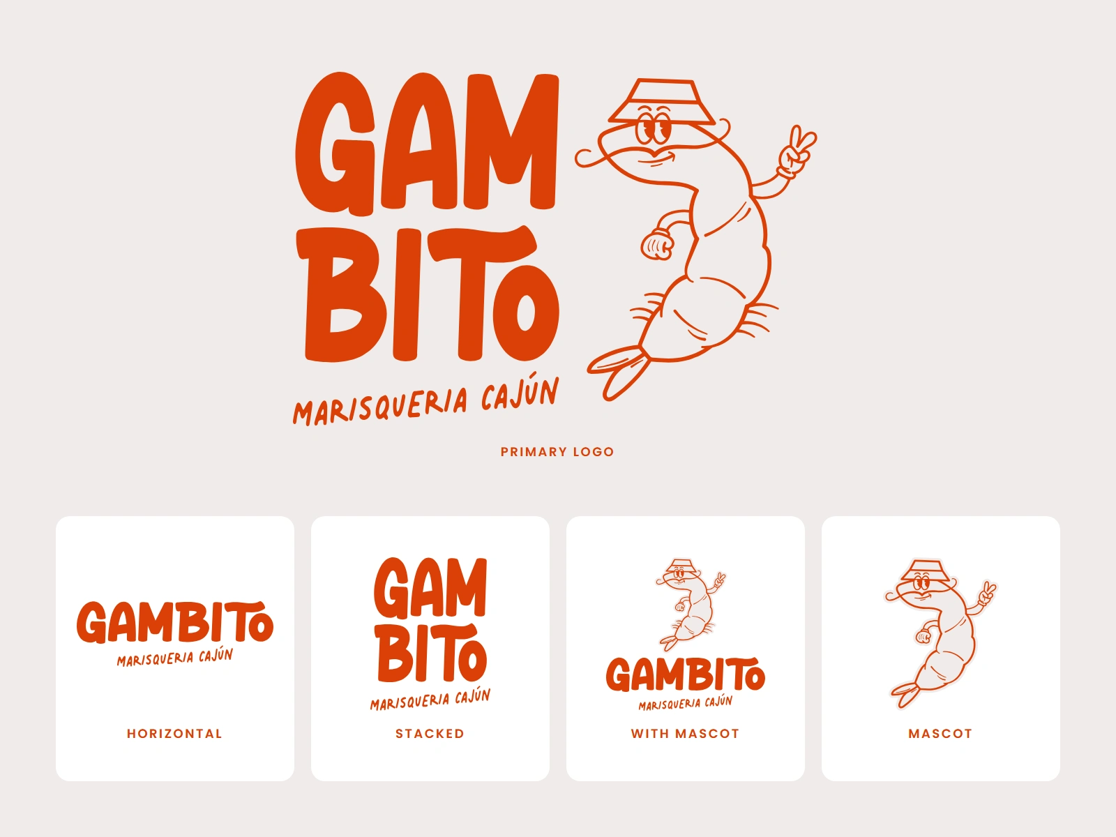
The logo suite: a primary logo with the mascot, plus horizontal, stacked and mascot-only versions for every format. logo system on cream: the primary stacked logo with the shrimp mascot, and four secondary versions in red-orange.
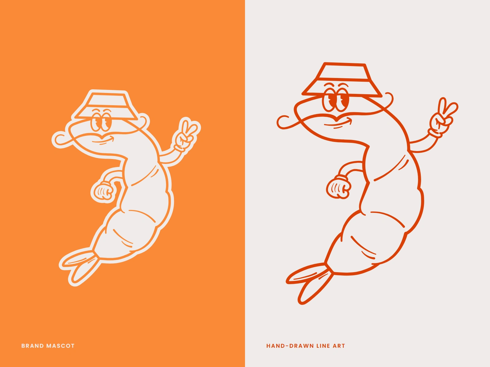
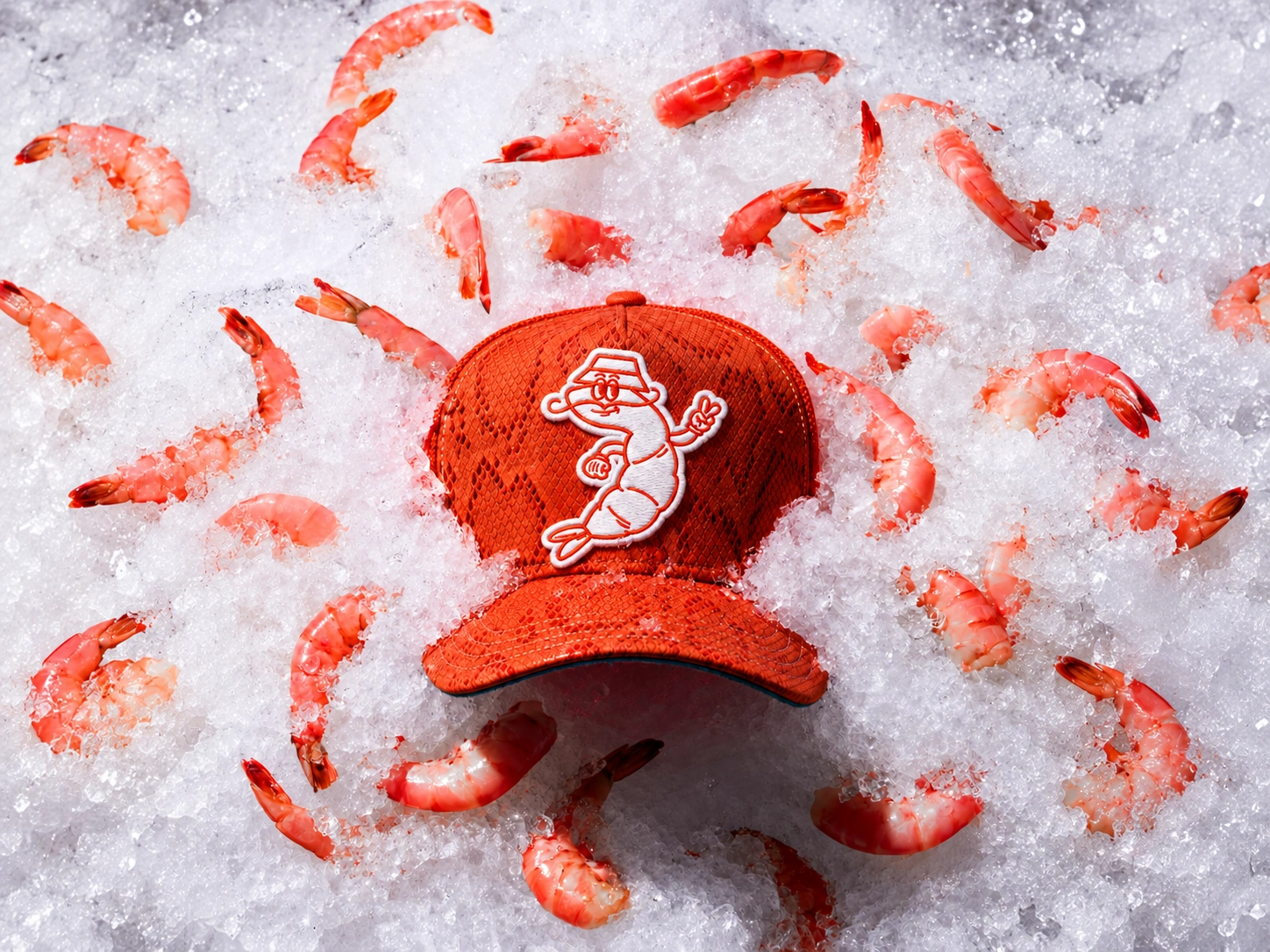
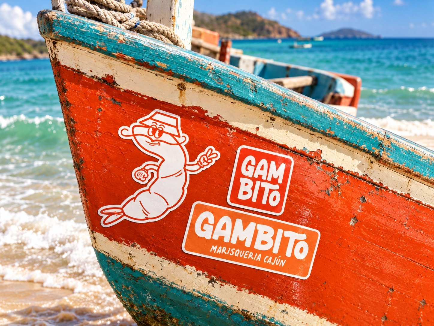
The mascot, drawn by hand, works on its own as a brand symbol in every palette color except black. Hand-drawn shrimp mascot wearing a bucket hat and making a peace sign, shown on orange and as a line drawing on cream.
Visual identity system
The system is documented in a brand guide that covers every element and how to use it:
Logos: primary logo with mascot, secondary logotype, positive and negative versions.
Mascot: a standalone brand symbol, usable in all brand colors except black.
Color: #DB4008 red-orange, #FA8A38 orange, #EFEBEA off-white and #CF8852 sand.
Typography: Hore for headlines and large titles; Palmer Lake for supporting text.
Icons: four seafood icons drawn in the same line style as the mascot.
Usage rules: clear space based on the height of the “G”, a minimum size of 3.5 cm in print and 80 px on screen, and examples of incorrect use.
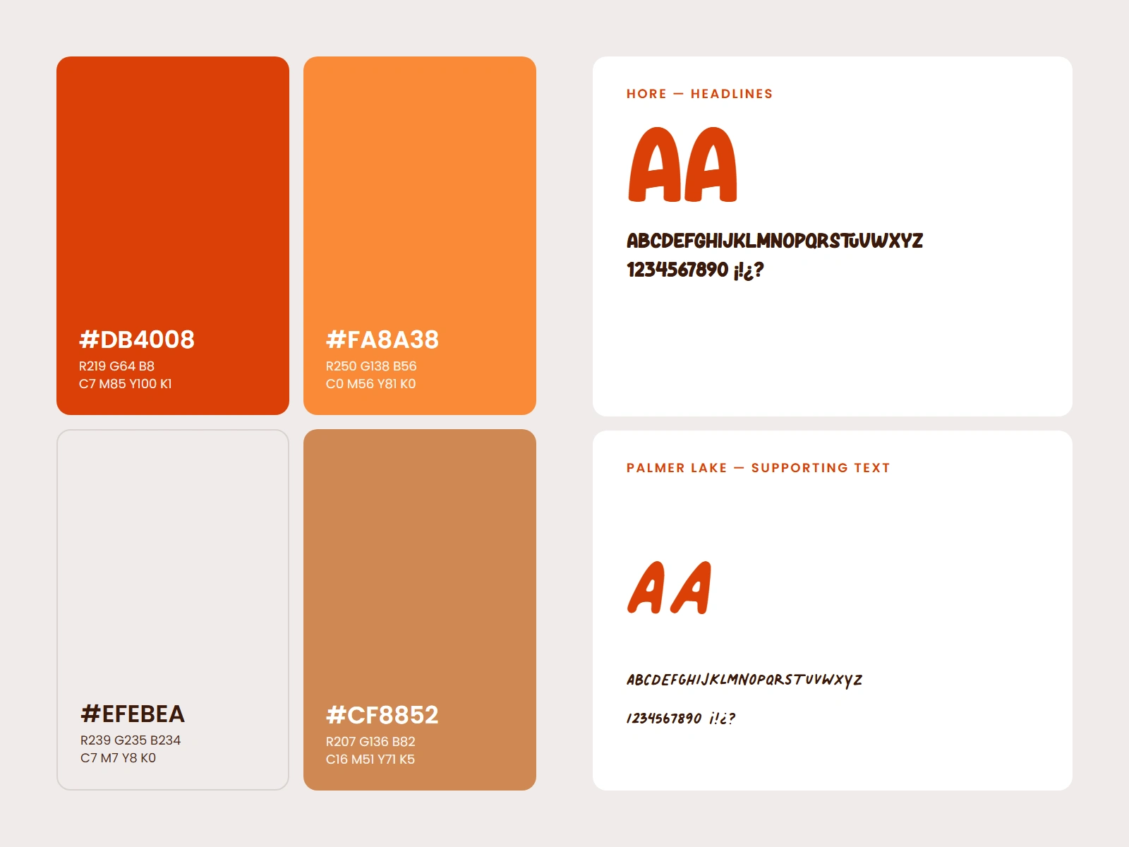
warm, food-led colors and two typefaces with distinct roles. Four color swatches (red-orange, orange, off-white and sand) with color codes, next to Hore and Palmer Lake type specimens.
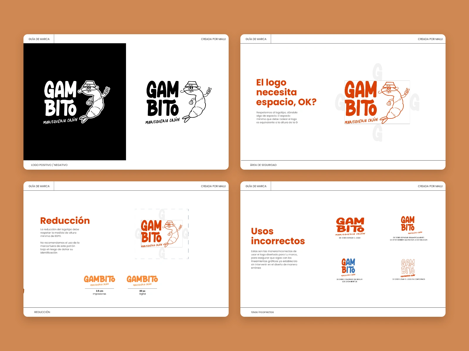
Brand guide pages showing the logo’s clear space, minimum print and digital sizes, and four incorrect uses.
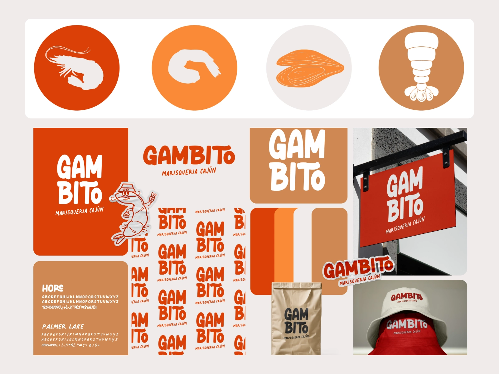
Seafood icons and a logo pattern extend the system beyond the logo.
Applications
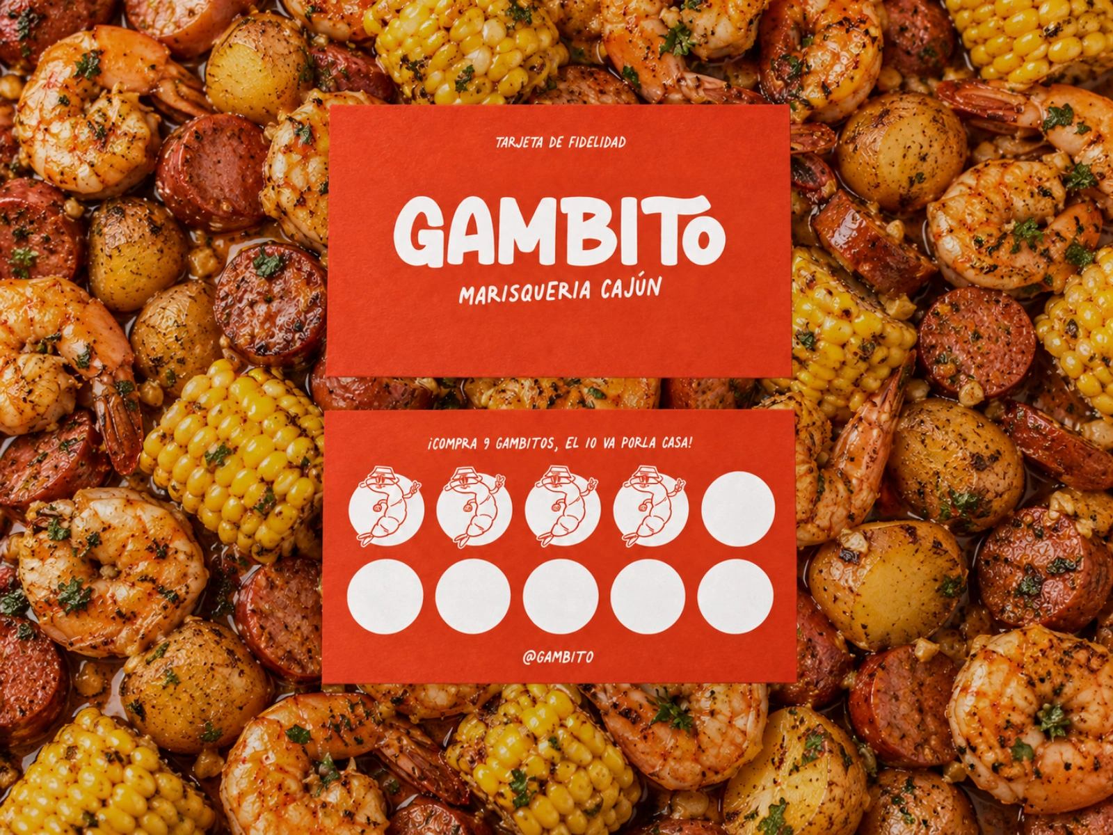
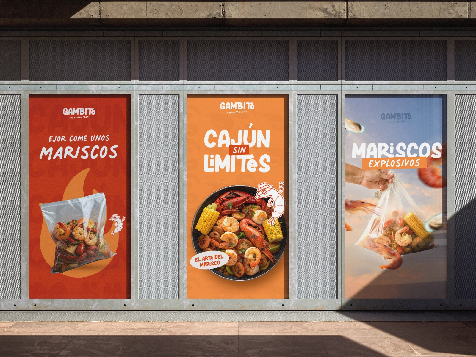
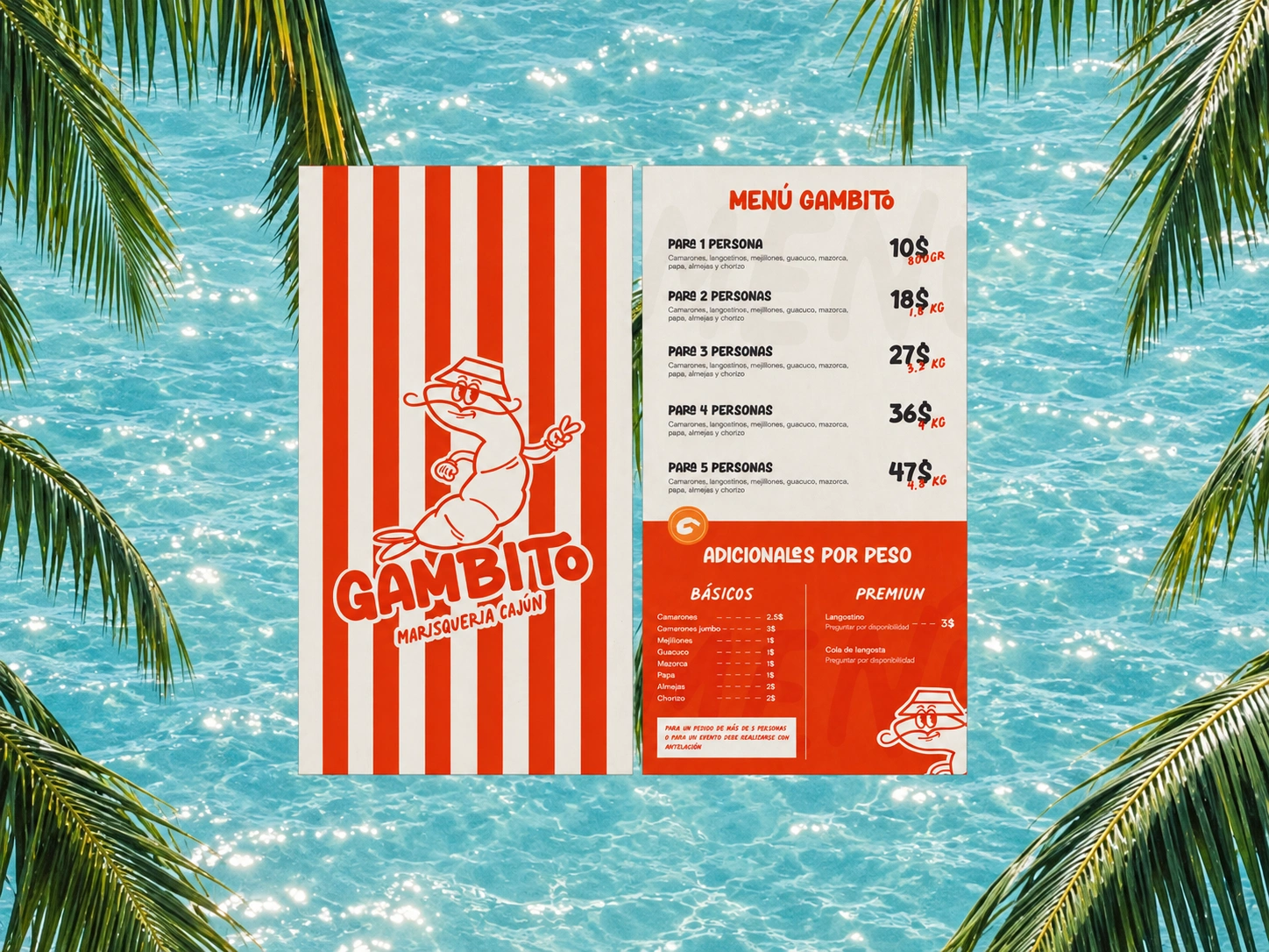
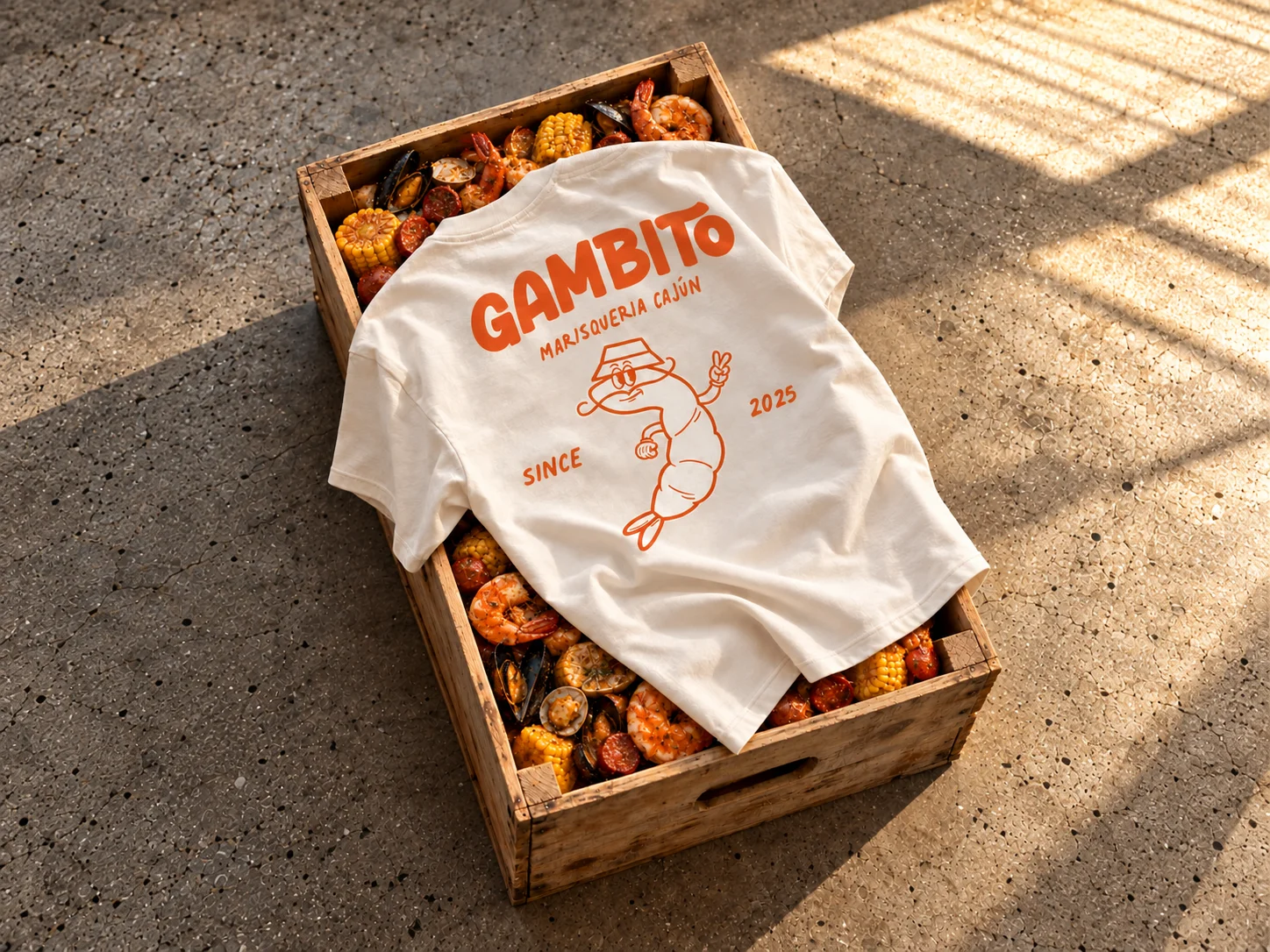
The identity was applied across every touchpoint of the restaurant. The mascot and lettering change scale, color and context, from a building facade to a loyalty card, without losing recognition.
My role and deliverables
My role: Brand designer and illustrator. I worked alone on the full identity, from the logo and hand-drawn mascot to the brand guide and every application.
Scope: Visual identity, logo design, mascot illustration, color and typography system, icons, brand guidelines, menu, print, packaging, signage, uniforms, merchandise and social media design.
Tools: Adobe Illustrator, Adobe Photoshop, Figma.
Deliverables: Brand guide; logo suite and mascot in AI, SVG, PNG, JPEG and PDF; editable source files for every piece; menu; loyalty card; packaging, signage, uniform and merchandise designs; social media and poster templates.
Outcome
GAMBITO opened with a complete identity in place from day one, bringing a Cajun seafood concept to Margarita Island with a brand that is easy to recognize and easy to like. The restaurant uses the system across its space and its Instagram, and the client received every file editable to keep the brand consistent as it grows.
See the brand in use: https://www.instagram.com/gambito_mgta/
Like this project
Posted Oct 30, 2026
Developed complete visual identity for GAMBITO, a Cajun seafood restaurant in Venezuela.