KATHARA: Mobile Streaming Platform UI/UX Design

Maria laura Sayago diaz

KATHARA: A Mobile Streaming Platform for Independent Series
A mobile-first app where viewers discover short vertical series and independent creators publish, grow and monetize their work.
Role: UI/UX Designer, mobile designer
Timeline: 5 weeks
Tools: Figma
Platform: iOS mobile app
Overview
KATHARA brings watching and creating series into one app. Viewers discover stories episode by episode in a full-screen vertical feed, while filmmakers, students and video creators publish their series by season, build an audience and earn from their work.
The problem
Independent video talent exists, but it has nowhere to be seen in a format built for the phone.
No showcase for independent creators: major platforms leave little room for emerging filmmakers and students.
Built for big screens: watching series on a phone is still clunky, and moving between episodes takes effort.
Scattered, spoiler-heavy conversation: comments live on outside social networks, without the context of the series.
Hard to monetize: creators have no direct way to earn from their work.
The solution
A creator profile and publishing flow to release series by season, episode and teaser.
A vertical, episode-based feed to watch, jump between episodes in one tap and resume anytime.
Built-in reviews and forum, with spoiler warnings and communities.
A premium subscription, coins and shoppable ads.
Process
Research (1 week): streaming and vertical-video references, creator and viewer needs.
Information architecture (1 week): eight modules (Onboarding, Discover, Explore, Saved, Viewer profile, Creator profile, Create series, Forum), dock navigation and separate flows for viewers and creators.
Flows & interaction (3 days): episode feed, review and share drawers, step-by-step publishing.
UI & design system (2 weeks): a dark, cinematic interface and components with every state.
Prototype & testing (4 days)
Brand identity
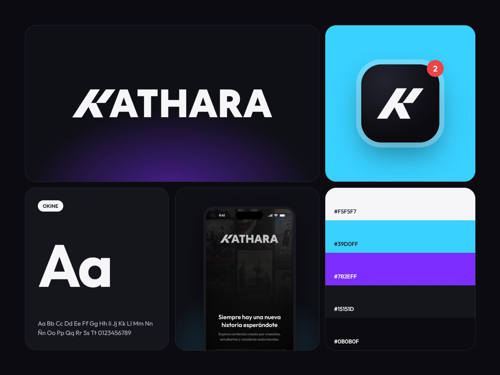
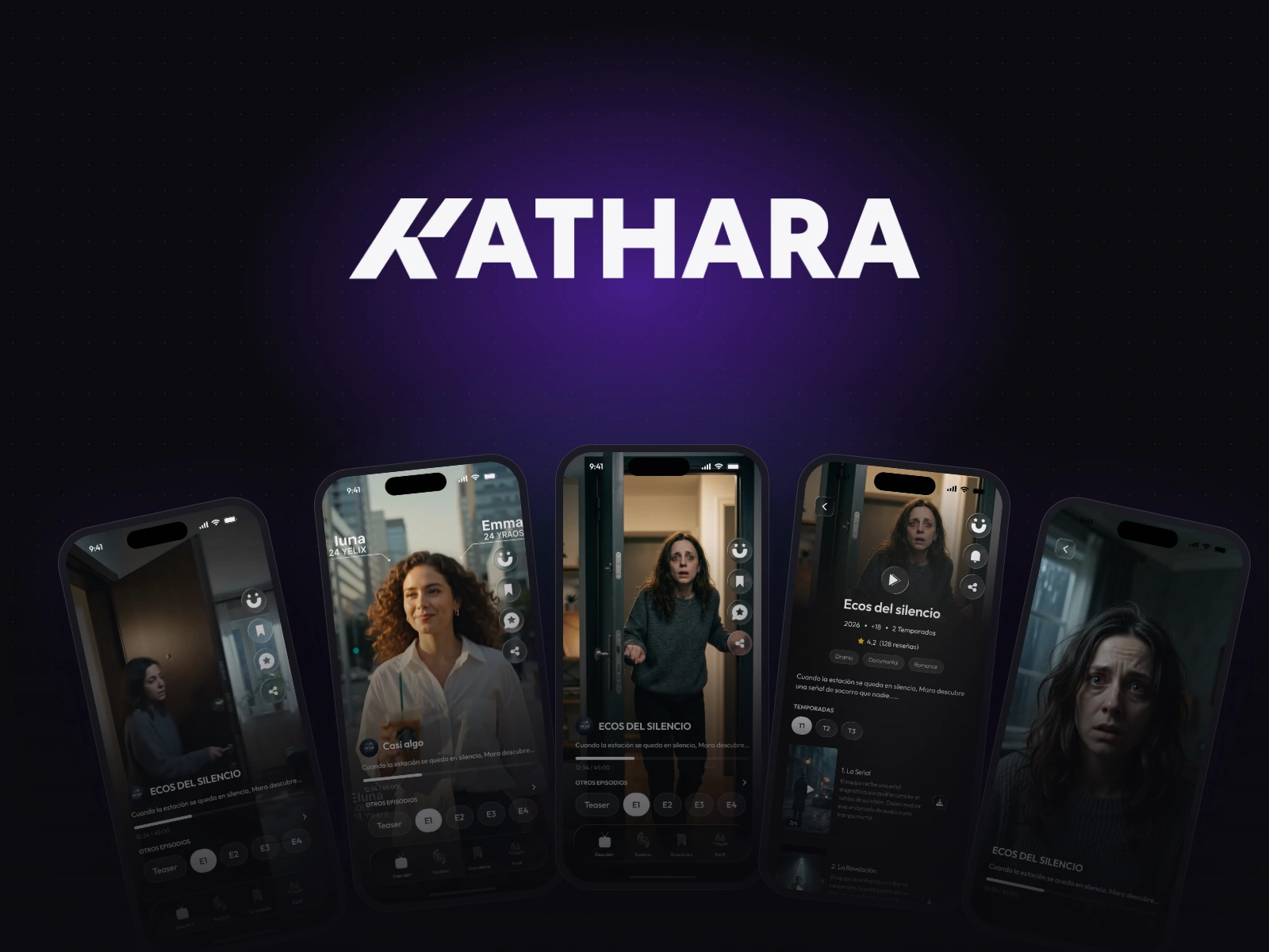
KATHARA’s identity is dark and cinematic, like a movie theater before the lights go down. Deep blacks let the content shine, cinematic purple adds emotion, and a soft neon cyan guides attention to key actions. The angled K in the logo suggests movement and forward momentum.
Onboarding
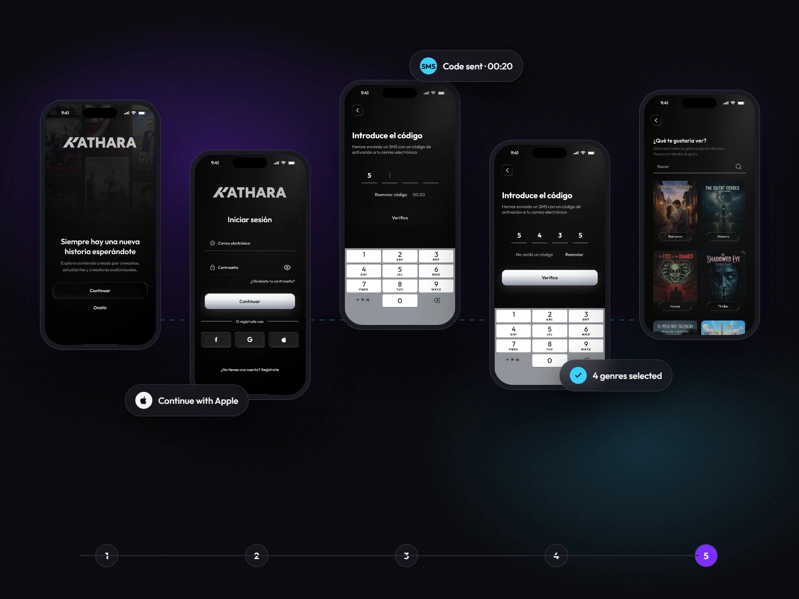
Getting in is quick: sign up with email, Google or Apple, verify by SMS and pick your favorite genres. Choosing interests up front personalizes the feed from the very first minute.
Discover
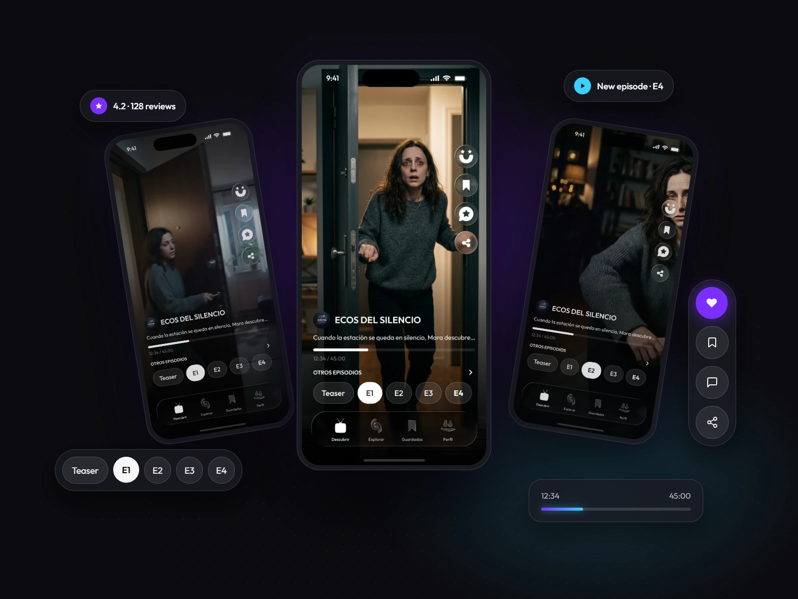
Discover: a series, full screen
The main feed plays each episode vertically, with everything a thumb away. Episodes appear as pills (Teaser, E1–E4), progress is always visible, and like, save, review and share sit in a side column that never covers the scene. Ads use the same vertical format, with a direct buy button.
Explore
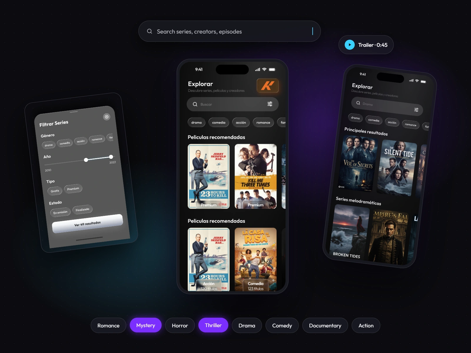
Explore: find your next story
Search, genre filters and short trailers help viewers decide fast. Results mix series, creators and episodes, and a large trailer preview lets people try a story before committing to it.
Series & Community
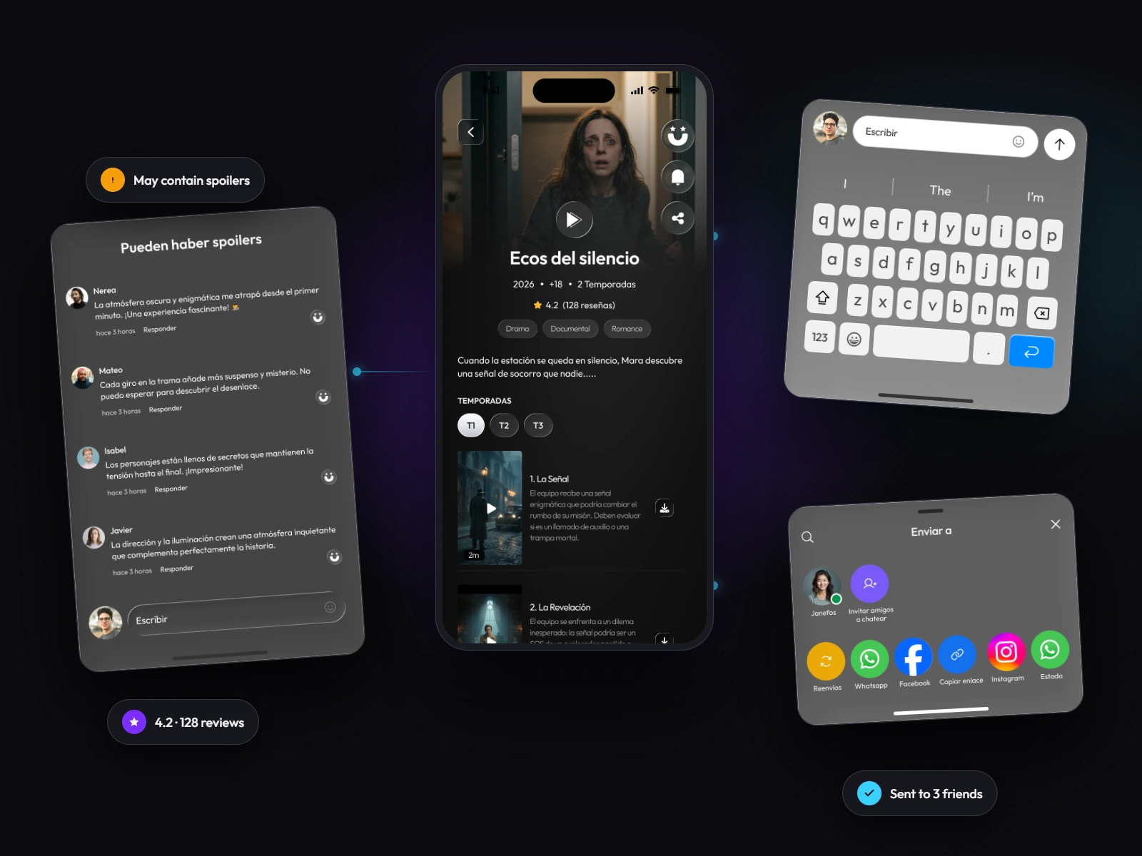
The series and its community
The series page holds everything a viewer needs to decide: seasons, downloadable episodes, cast and related titles. Around it, the conversation lives in drawers (spoiler-aware reviews, comments and sharing) that never pull you out of the story.
Creators flow
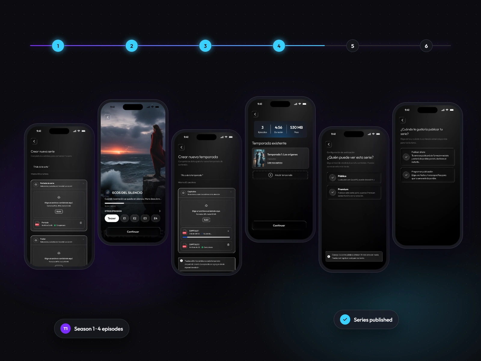
Publishing a series, step by step
The creator flow breaks a complex task into six short steps: create the series, add a trailer and teasers, set up seasons, upload episodes, choose who can watch, and schedule the release. A preview before publishing reduces mistakes and builds confidence.
Profile & Premium
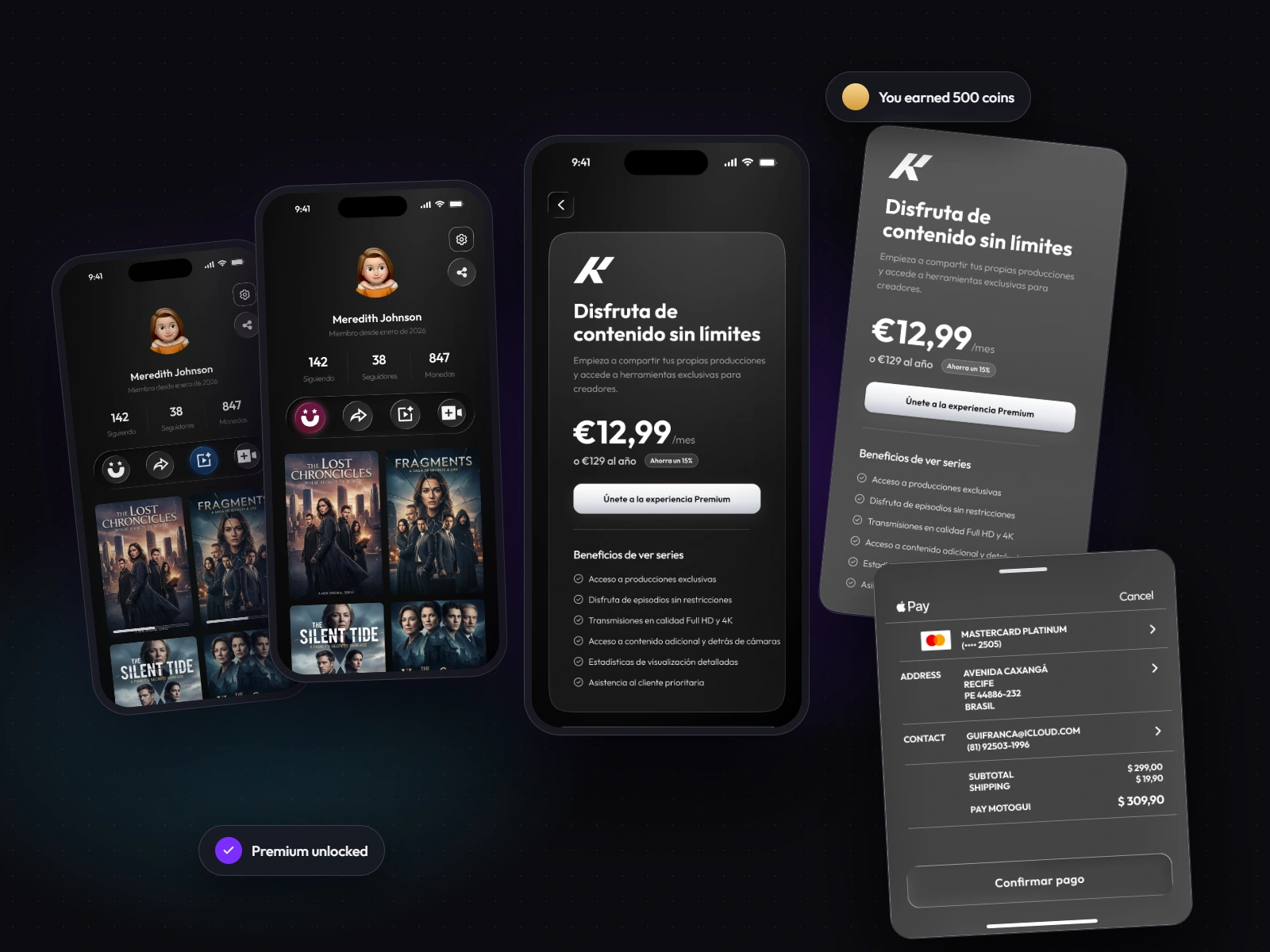
Viewers keep track of what they’re watching and what they liked. Upgrading to Premium or becoming a creator takes just a few taps, and coins reward audience participation. For creators, a metrics dashboard shows who watches, shares and saves each series.
Visual System
A component library built for a dark interface: five button types with every state (default, hover, pressed, focused, disabled, loading), inputs with validation, episode and season selectors, navigation and feedback messages. Colors: Soft White
#F5F5F7, Soft Neon Cyan #39D0FF, Cinematic Purple #7B2EFF, Dark Graphite #15151D, Deep Black #0B0B0F. Typography: Okine.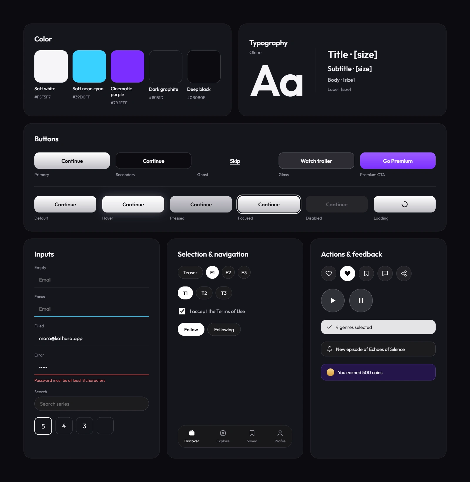
My role UI/UX Designer Scope Product strategy, information architecture, user flows, visual identity, mobile UI design and design system. Deliverables Mobile app UI, onboarding flow, discovery experience, creator publishing flow, component library and high-fidelity prototype. Tools Figma
Like this project
Posted Oct 30, 2026
Designed a mobile app for streaming independent series with a vertical feed.
Likes
0
Views
0