Bilingual Website and Brand System for The Brand Therapy

Maria laura Sayago diaz

The Brand Therapy, website design
Website and design system for The Brand Therapy, a Miami marketing agency and brand studio founded by María Julia Stolk. A bilingual site that brings marketing services, 1:1 mentorships and online courses together under one clear offer, built on a 10-part web brand system created from just a logo.
Project overview
The Brand Therapy helps founders and brands grow through three services: marketing done for them, 1:1 mentorships, and online courses. It speaks to entrepreneurs in English and Spanish.
The founder already had a website but didn’t like its design. The brand had a logo and nothing else. I created the web identity and design system, then designed the home page, the internal pages and the prototype in Figma.
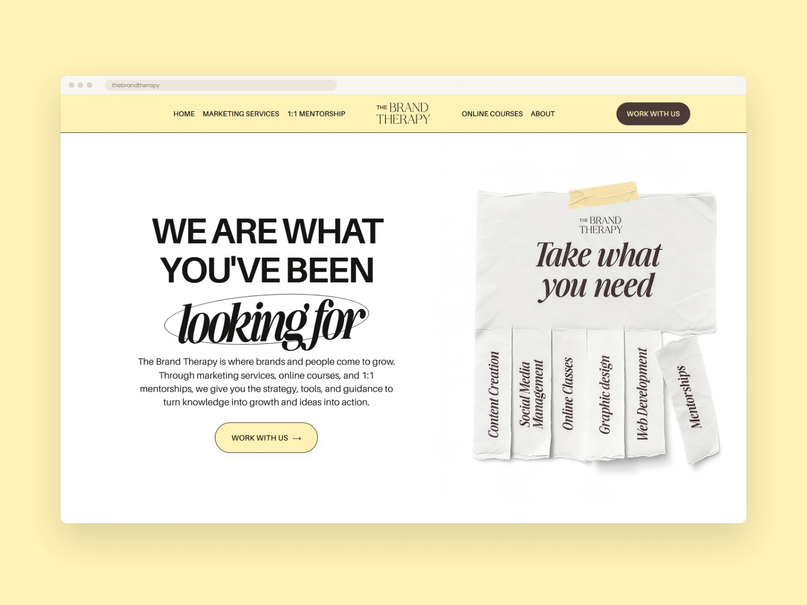
The Brand Therapy home hero: the headline “We are what you’ve been looking for” next to a torn-paper graphic listing services.
The challenge
The Brand Therapy sells three different things to the same founder: services, mentorship and courses. The site had to explain all three without feeling like three separate businesses, and lead every visitor to the right one.
With only a logo to start from, the website also needed a full visual language: color, type, layout, imagery and components. It had to be designed so the brand could keep growing consistently in two languages.
Website strategy
I started by defining the brand’s core promise, “We turn ideas into action and knowledge into growth.” I added four principles to judge every message, layout and interaction: clarity first, founder energy, useful beauty and human proof.
The offer is organized as a ladder of involvement, so visitors can choose how much help they want:
• Marketing services: “We do it for you.”
• 1:1 mentorships: “We guide you.”
• Online courses: “We teach you how to do it yourself.”
Every page follows the same narrative: promise, context, offer, proof, objection, action. “Work with us” is the main call to action. It leads to an inquiry form that asks for service, budget and timeline, so every lead arrives already qualified.
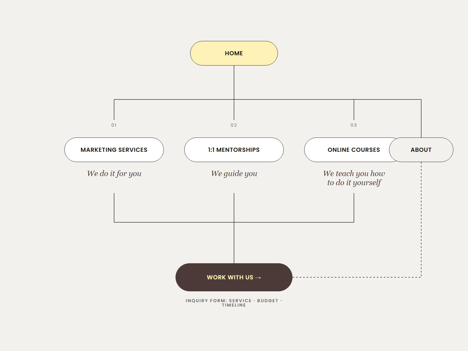
Site map of The Brand Therapy: Home branching into Marketing Services, 1:1 Mentorships, Online Courses, About and Work With Us.
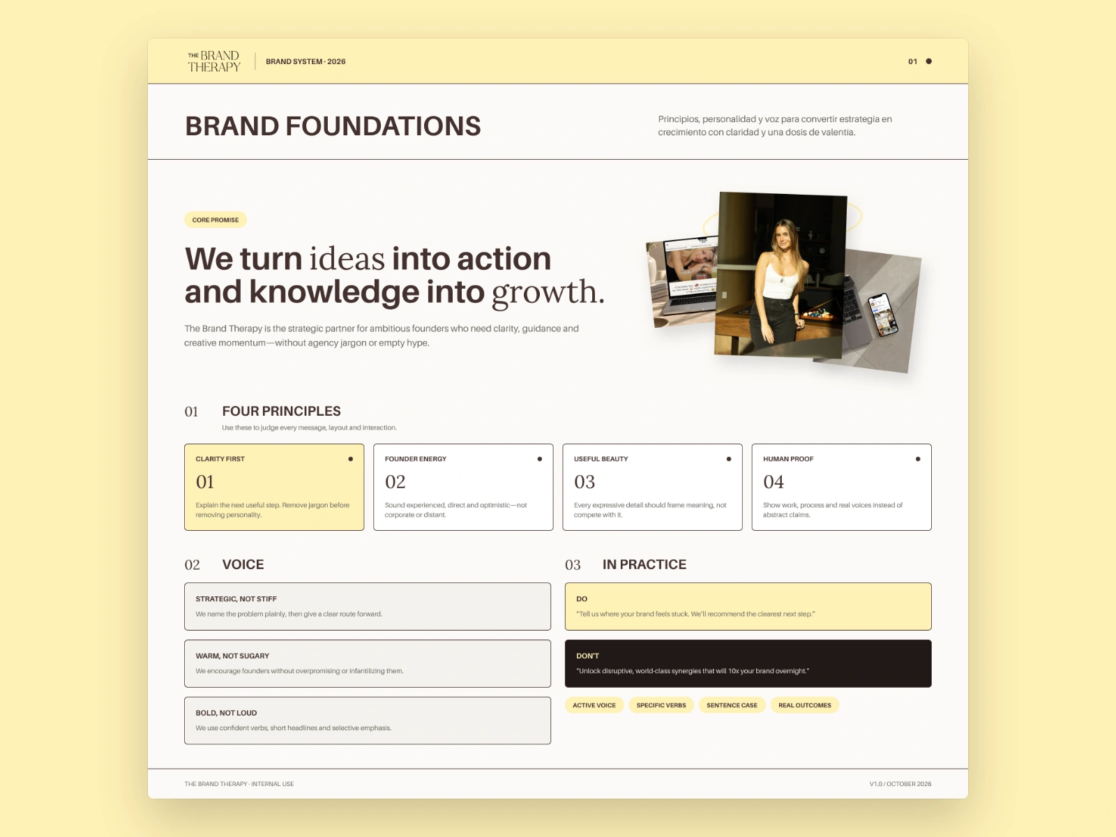
Grid of nine thumbnails showing The Brand Therapy home page sections, from the hero to the footer.
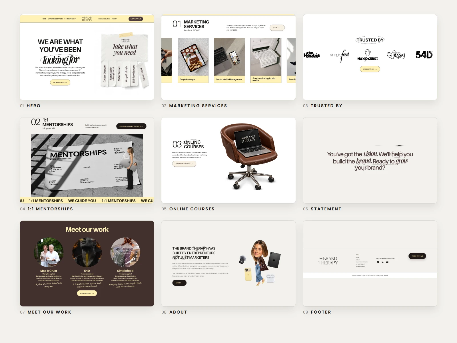
Brand foundations page with the promise “We turn ideas into action and knowledge into growth”, four principle cards and voice guidelines.
Content structure
The home page reads as a guided story, from who the brand is to proof and the founder behind it:
• Hero: the promise and a first call to action.
• Marketing services: seven services in a horizontal card slider, each one expanding into its deliverables.
• Trusted by: logos of brands the agency works with.
• 1:1 mentorships and Online courses: the guided and self-paced options.
• Statement: “You’ve got the vision. We’ll help you build the brand.”
• Meet our work: three client cases with the “therapies applied” to each.
• About: the founder story and a final call to action.
Brand and design system
I documented the web identity as a 10-part brand system, so every page, and every future one, is built from the same rules:
• Color: cream as space, espresso as authority and butter yellow as the signal for action. The core palette is Espresso #211918, Cocoa #42302E, Butter #FFF1B6, Cream #F4F2ED and Ink #171713. It adds an espresso scale and semantic colors for success, error, disabled and focus.
• Typography: editorial contrast. Aileron organizes the information, Awesome Serif adds emotion to one to three meaningful words, and Segoe Print signs human notes, one phrase per composition at most.
• Layout: a 4-point spacing system and a 12-column grid at 1440 px, with 64 px margins and 24 px gutters. Mobile uses a 4-column grid with 24 px margins. Radii are 6, 12 and 999 px for inputs, cards and pill buttons.
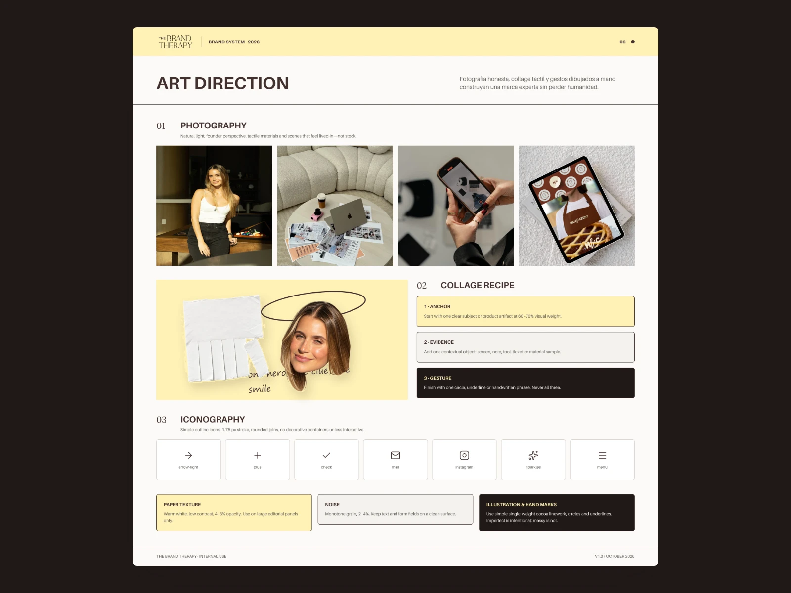
• Art direction: natural-light photography from the founder’s perspective. Collages follow one recipe: one anchor, one piece of evidence and one hand-drawn gesture (a circle, an underline or a handwritten phrase), never all three.
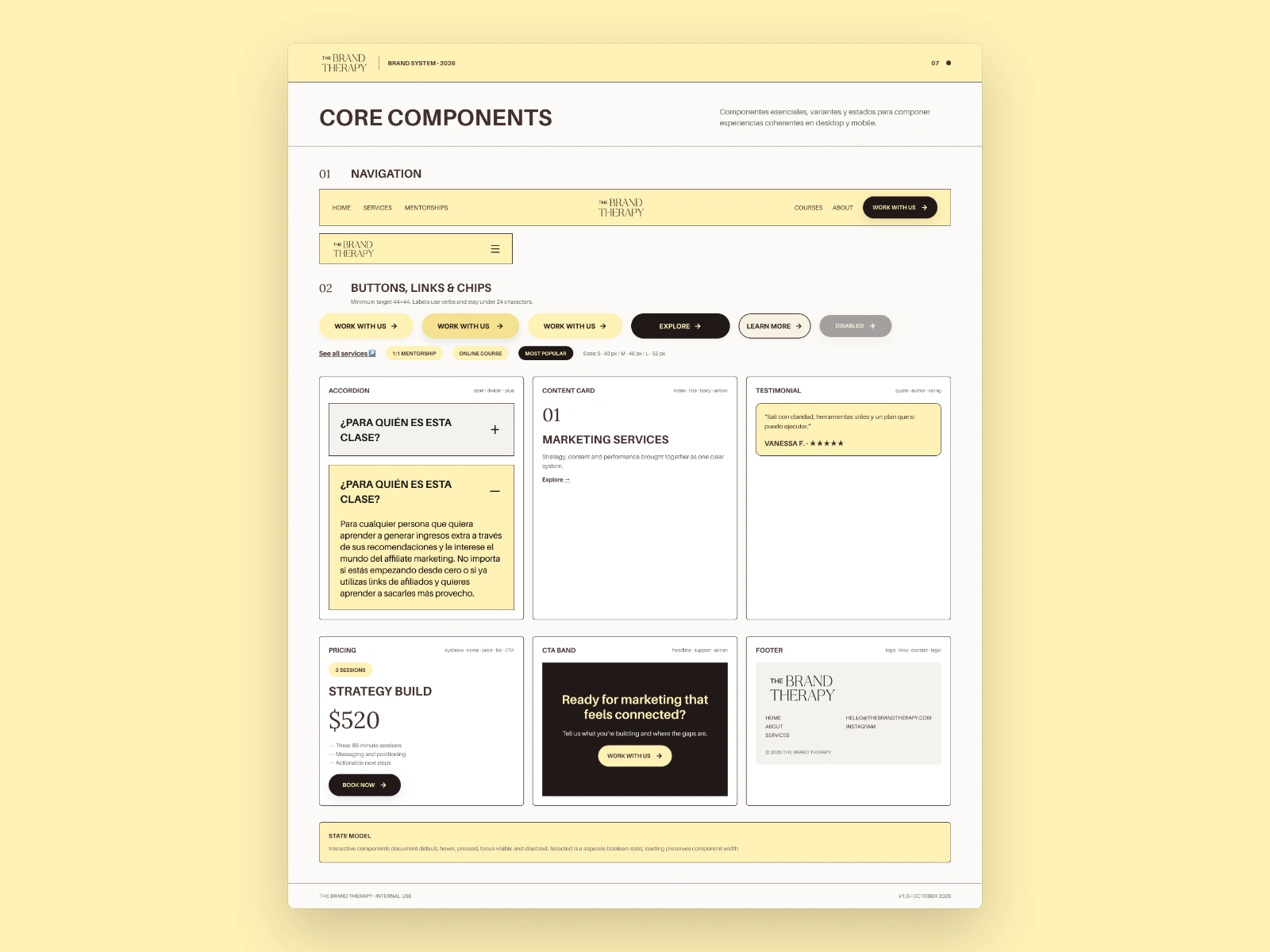
• Components: navigation, buttons and chips, accordion, content cards, testimonials, pricing, CTA band, footer and forms, each with default, hover, pressed, focus-visible and disabled states.
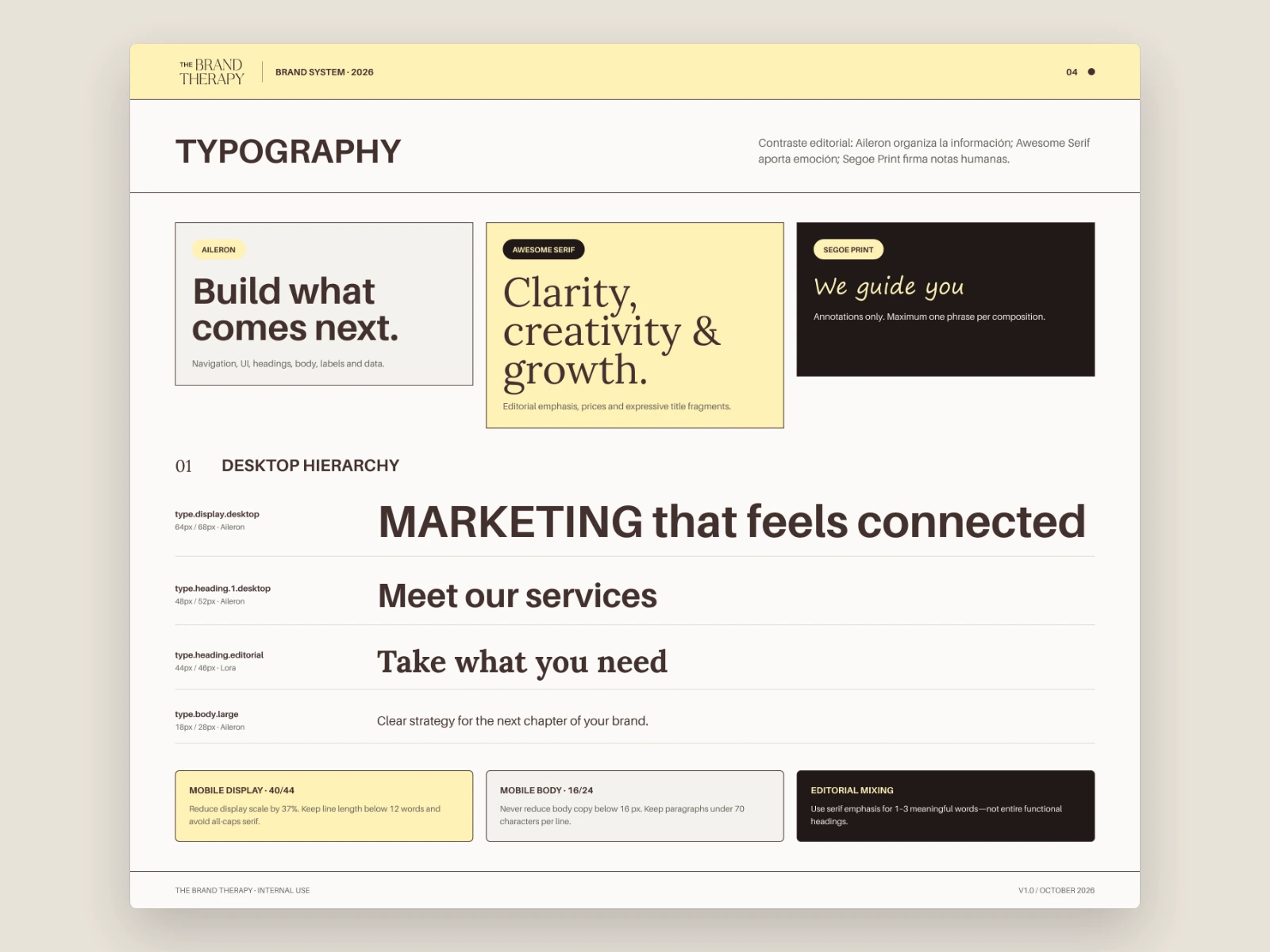
Color system page with espresso, cocoa, butter, cream and ink swatches, an espresso scale, semantic colors and contrast ratings.
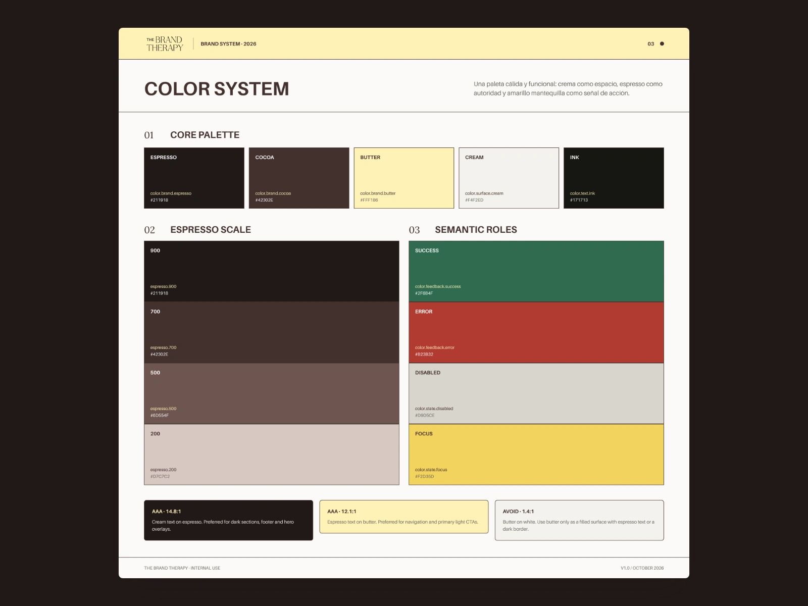
Typography page showing Aileron, Awesome Serif and Segoe Print samples, and the desktop type hierarchy.
Components page with the navigation bar, pill buttons, chips, an accordion, content card, testimonial, pricing card, CTA band and footer.
Art direction page with four lifestyle photos, a collage example with torn paper and a circled portrait, and a row of outline icons.
Accessibility
Accessibility is part of the system, not an afterthought. Text contrast is at least 4.5:1: cream on espresso reaches 14.8:1 and espresso on butter 12.1:1, while butter text on white is ruled out. Touch targets are at least 44 px, focus stays visible, and form labels never disappear. Errors are explained with text and an icon, not color alone. Handwriting is never used for instructions, and marquees and collage respect reduced motion. Content is localized for Spanish and English, not just translated.
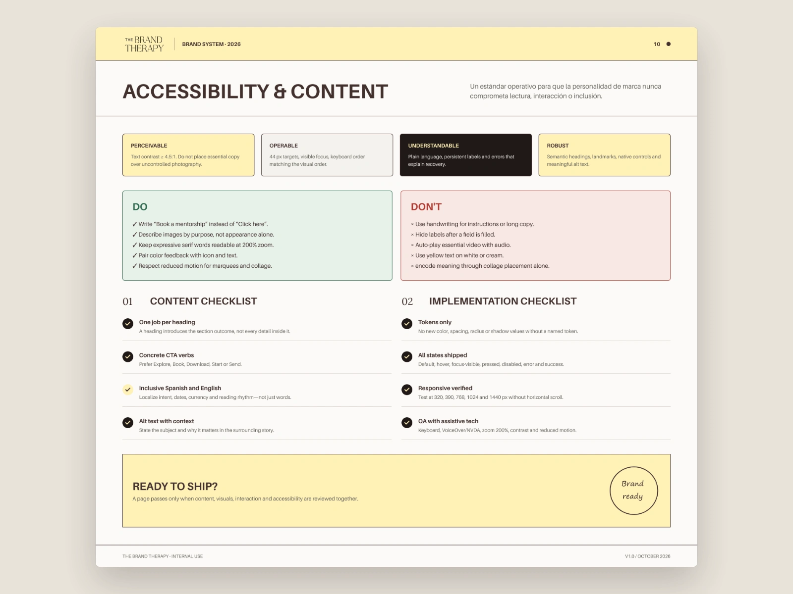
Accessibility page with four principles, do and don’t lists, and content and implementation checklists.
Responsive design
Mobile follows its own rules: display type drops from 64 to 40 px, body copy never goes below 16 px, media stacks before copy and the call to action stays visible. The navigation collapses into a single menu button, and the service cards become a swipeable row.
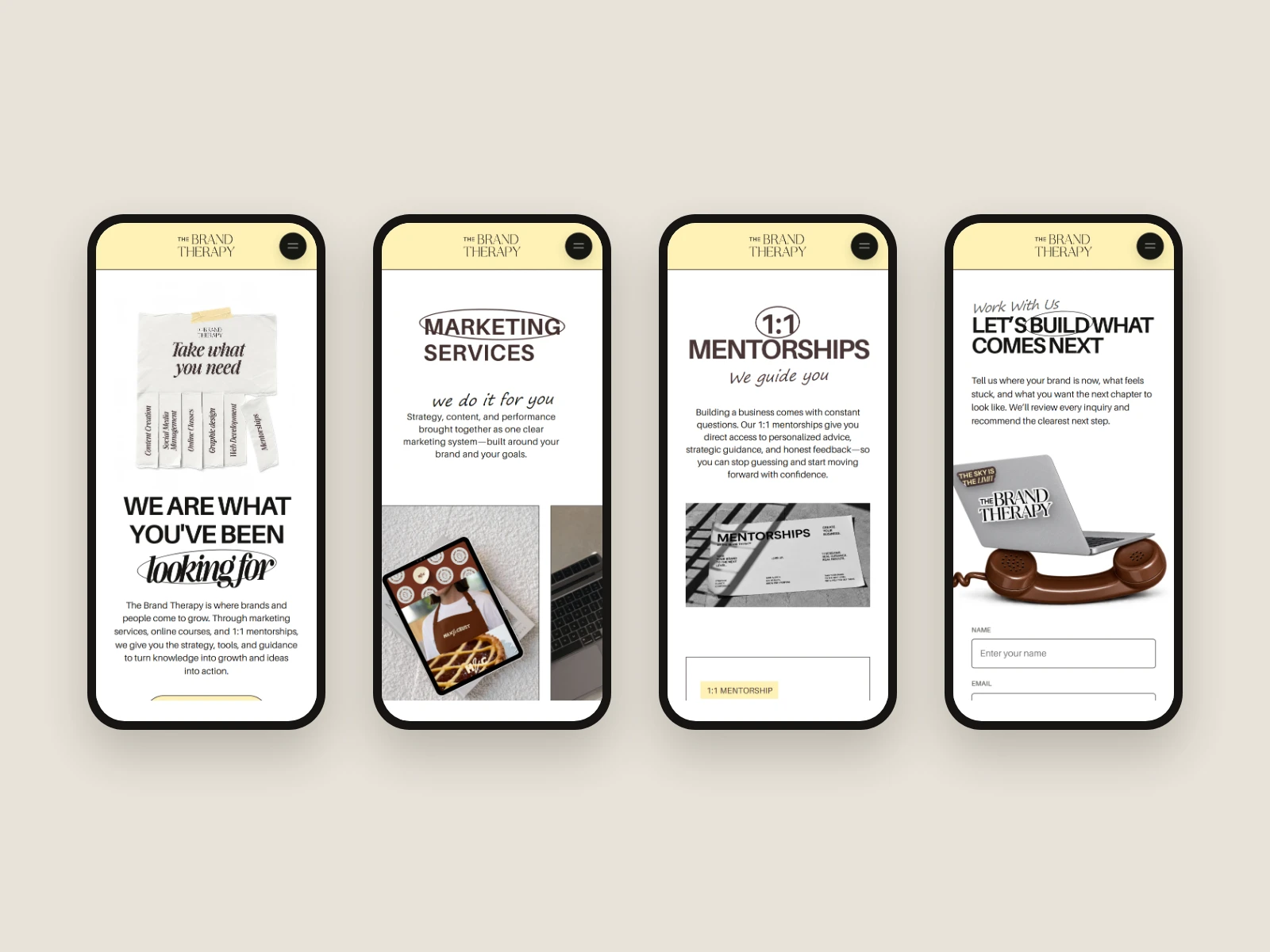
Four phones showing The Brand Therapy mobile pages with the butter-yellow header and menu button.
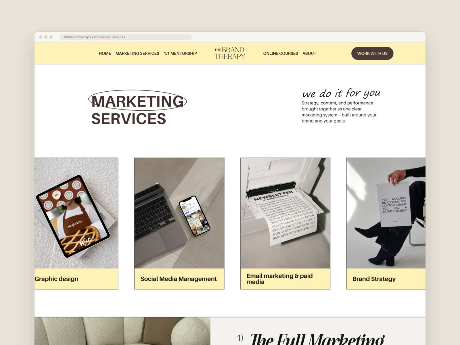
The Brand Therapy Marketing Services page with service cards showing tablets, phones and print pieces.
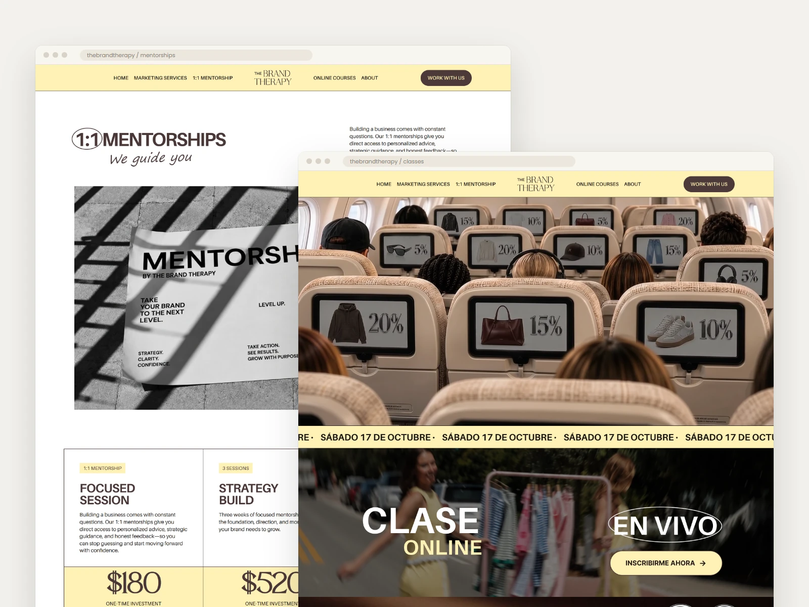
The 1:1 Mentorships page with a black-and-white poster image, and the Online Courses page with an airplane-cabin image and a “Clase online en vivo” banner in Spanish.
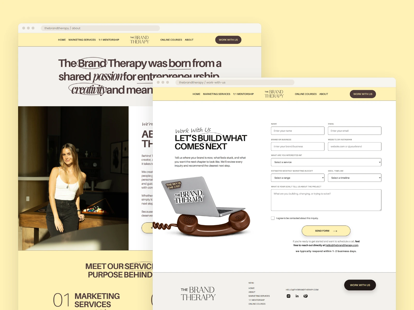
The About page with a portrait of the founder, and the Work With Us page with an inquiry form and a vintage phone with a laptop.
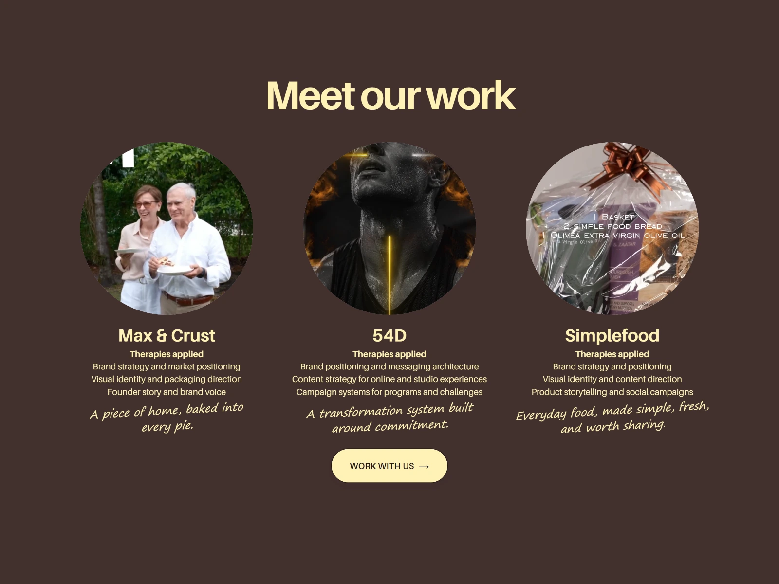
Cocoa-brown section titled “Meet our work” with three circular images for Max & Crust, 54D and Simplefood.
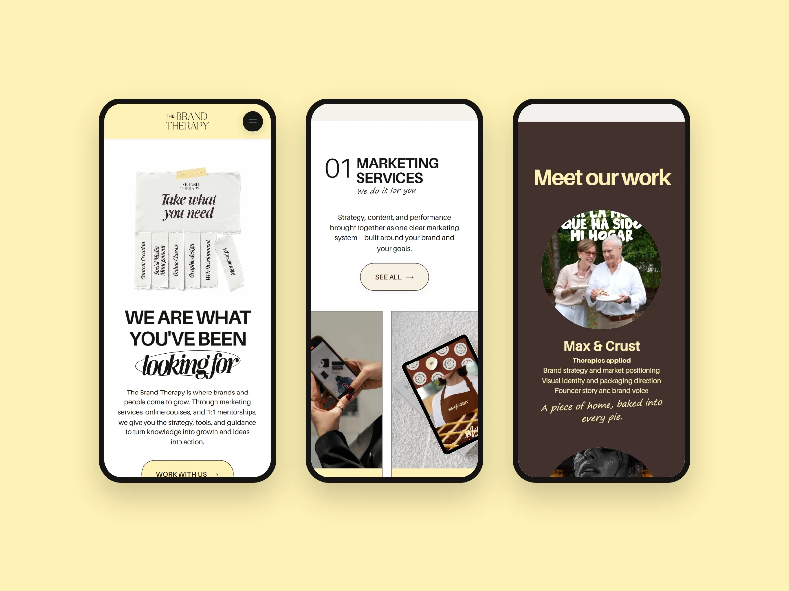
Three phones showing the mobile home page at the hero, services and client work sections.
Live website
The design is live and bilingual: https://the-brand-therapy.thebrandtherapy.workers.dev/
Video caption: A walkthrough of the home, Marketing Services and Work With Us pages, on desktop and mobile.
Video alt text: Laptop and phone on a warm editorial set, scrolling through The Brand Therapy website.
My role and deliverables
My role: Web designer. I created the web identity and its design system, and designed the home page, all internal pages and the interactive prototype in Figma. The logo already existed.
Scope: Website design, web visual identity, design system, information architecture, responsive design (desktop and mobile), accessibility guidelines, prototyping.
Tools: Figma, ChatGPT.
Deliverables:
• A 10-part brand and design system: foundations, logo, color, typography, layout, art direction, components, forms, page patterns, and accessibility and content.
• Home and internal page designs for desktop and mobile: Marketing Services, 1:1 Mentorships, Online Courses, About, Work With Us.
• An interactive prototype in Figma.
Outcome
The Brand Therapy replaced a website its founder didn’t like with one she loved. The new site gives the brand a personal, editorial presence and explains a three-part offer in one clear structure. It leads every visitor to a qualified inquiry, in English and Spanish. The design system gives the brand the rules to keep growing consistently.
Like this project
Posted Nov 1, 2026
Designed & launched a bilingual website and brand system for The Brand Therapy.
Likes
0
Views
0