Goodenough
Goodenough's mission is to redefine the way people perceive clothing and its impact on the environment.
They aim to provide an accessible platform for individuals to embrace sustainable fashion choices, minimize waste, and celebrate the unique stories that a piece of garment carries. After all, it doesn’t have to be perfect, as long as it’s Goodenough.
You can keep reading, or view the full project on my portfolio website ↓
Brand Identity
It's not your typical stuffy corporate design. It's friendly, welcoming, and feels like a warm hug.
The colors are bright and cheerful, the shapes are playful and wobbly, and the font, well, let's just say it's like the comfy sweater you never want to take off. It all adds up to a vibe that's inviting and down-to-earth, just like the Goodenough team.
Colors, Shapes, and Type
Colorful, energetic, and friendly. What else is there to say?
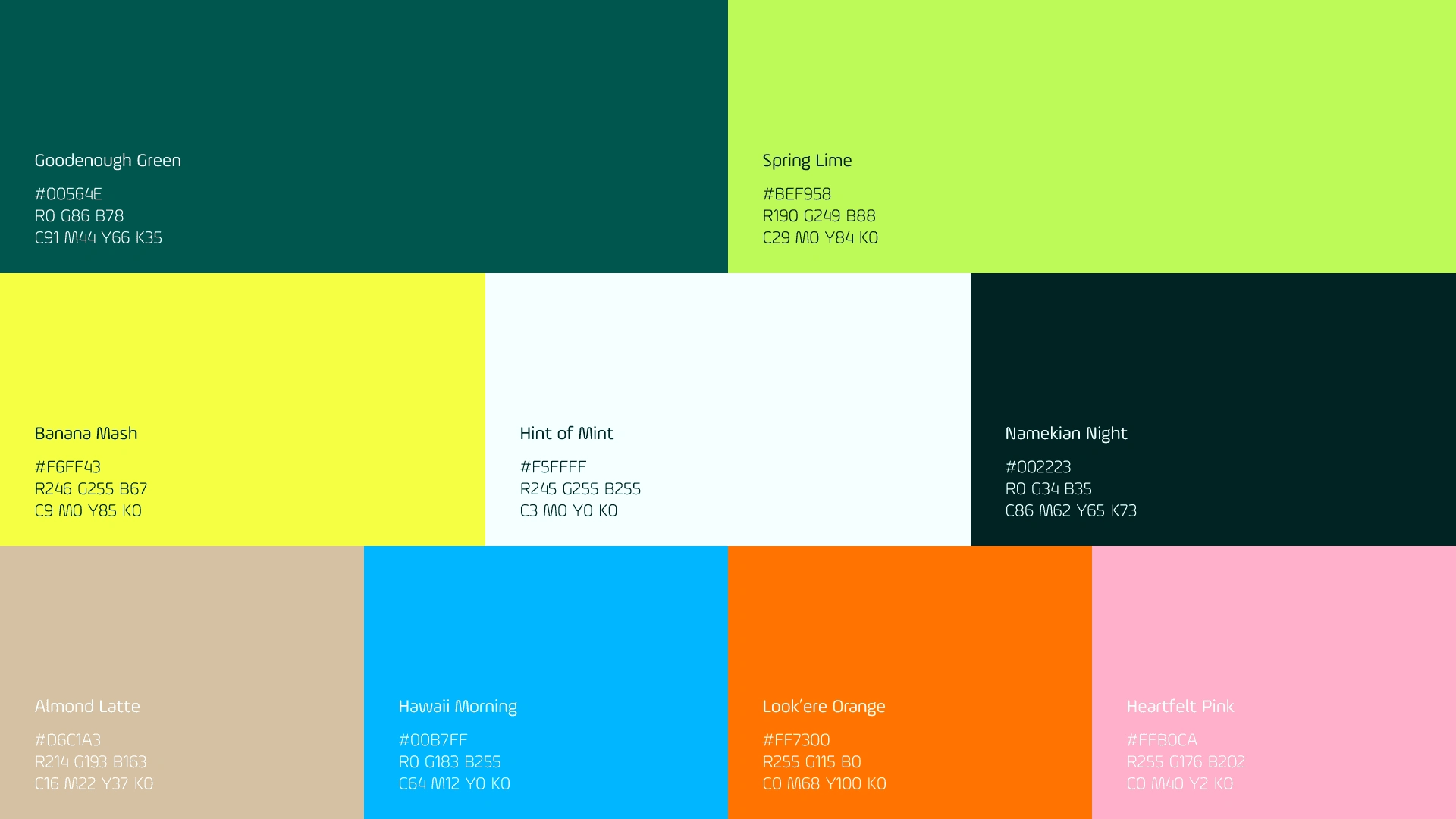
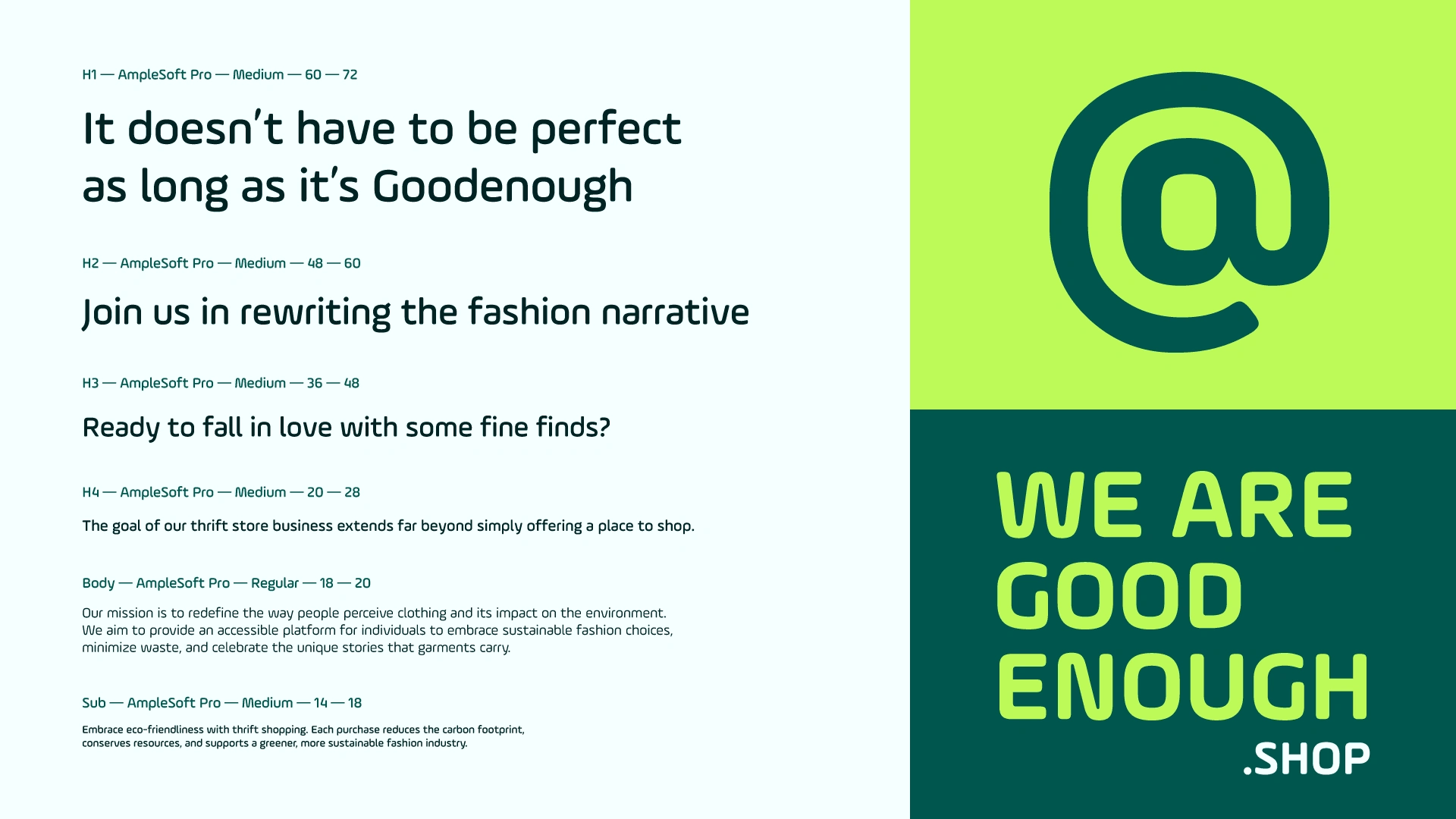
They said they like their colors like they like their coffee – bold and full of life. That's why the natural direction was a collection of vibrant and bright shades. The shapes? Think rounded everything – rectangles, circles, and wobbly shapes. The point is to convey the brand as fun, spontaneous, and full of movement. As for the font, it's modern yet approachable, with enough roundedness and legibility in all sizes. It's also a wonderful coincidence it's called AmpleSoft Pro. Get it? Ample, as in "more than enough"? Goodenough?
Iconography
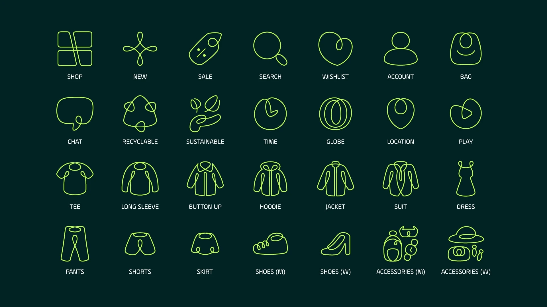
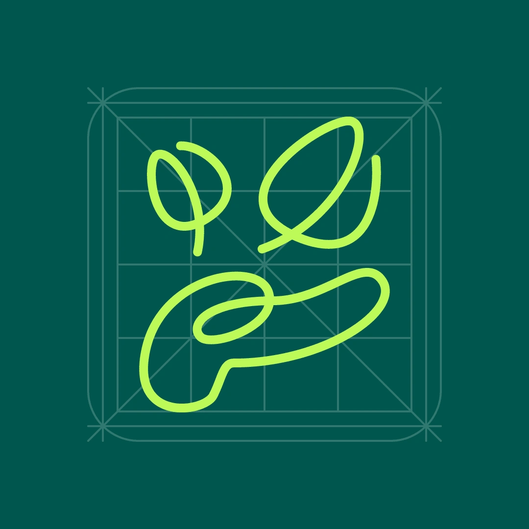
The icons are like little doodles that bring the brand to life. They're rounded, fun, and full of personality.
Most of the icons are made from just one line, keeping things simple and playful. And if you look at the clothes icons, some of them are gender-specific. The icons are interactive and animated to further emphasize on the brand being full of life.
Brand Expansion
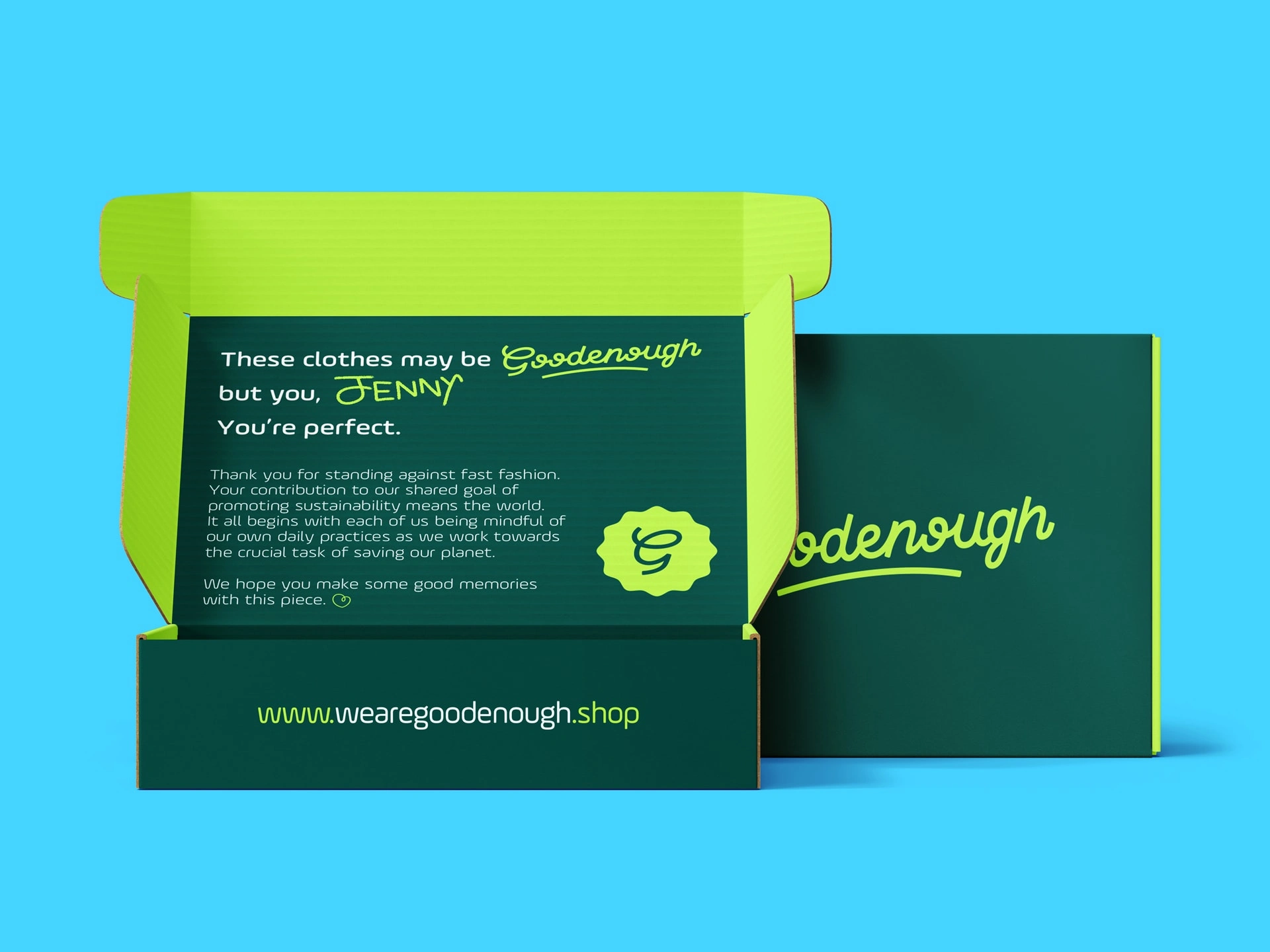
Every aspect of the brand expansion should reflect their commitment to sustainability and creativity, starting with the packaging.
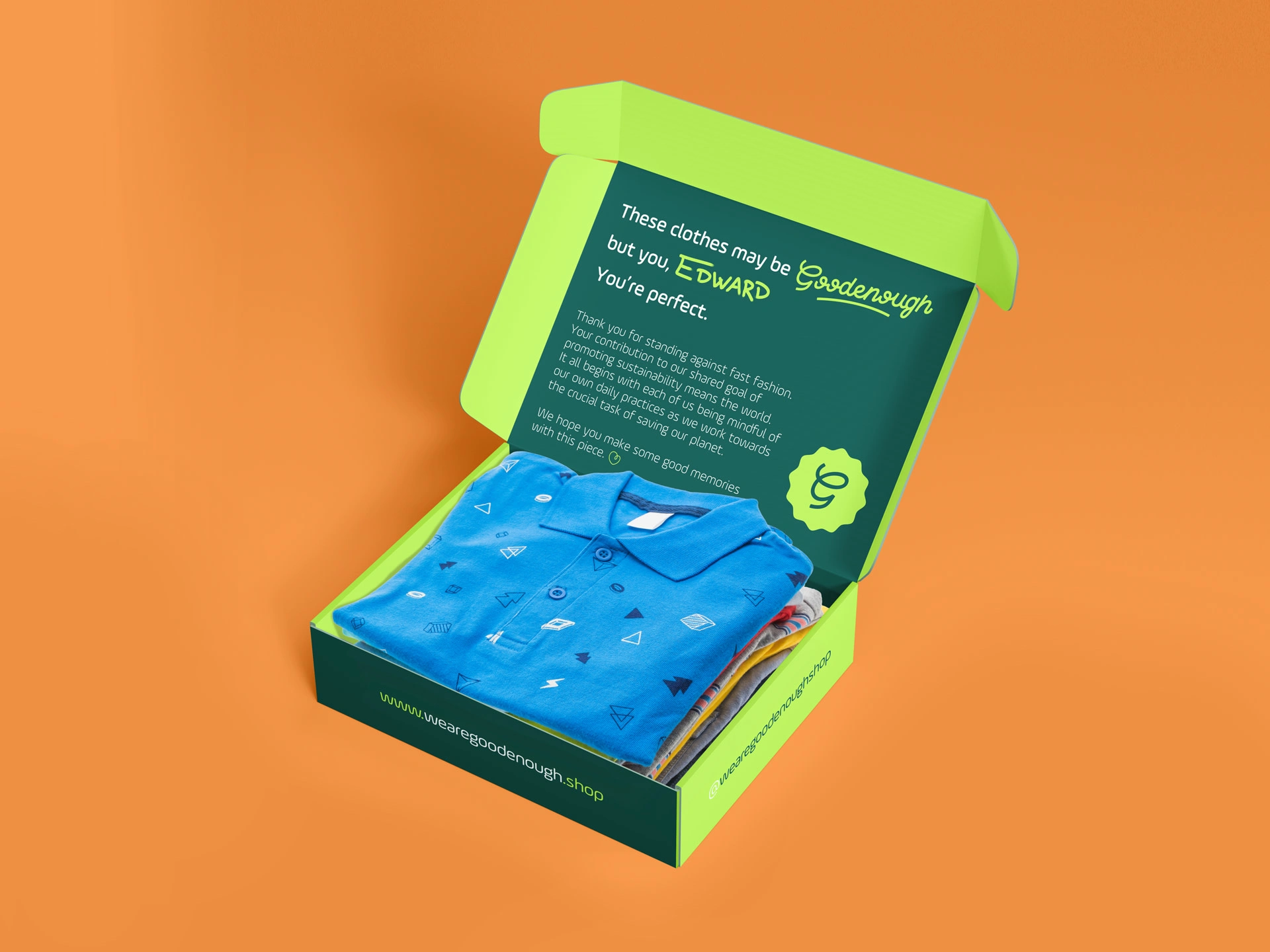
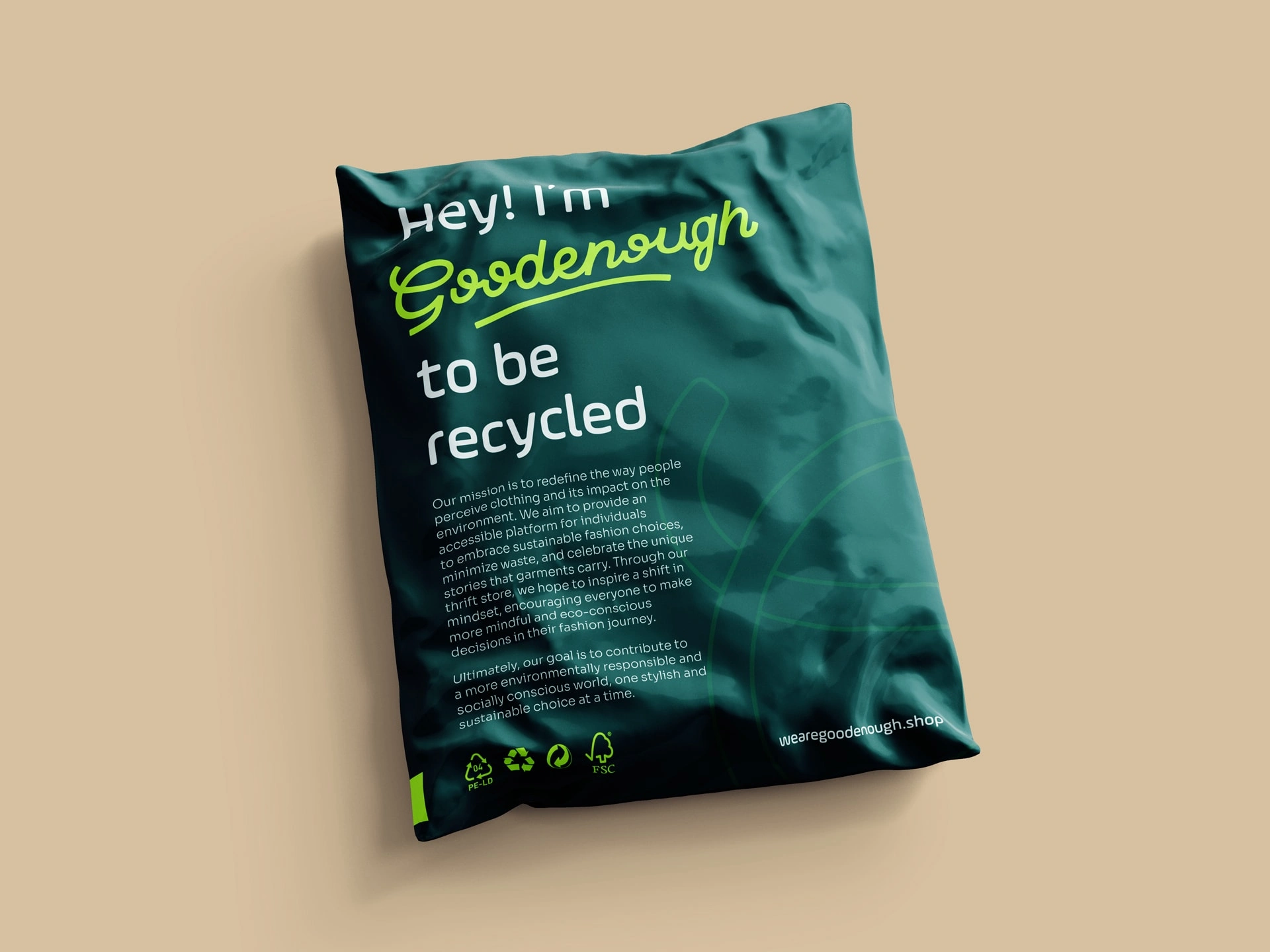
The packaging is designed to greet the client with a thank-you message with their name handwritten on the package. As for the plastic packaging, it's made from Low-Density Polyethylene, so the client, the Goodenough team, me, you, and the planet can rest easy knowing it's "Goodenough" to be recycled.
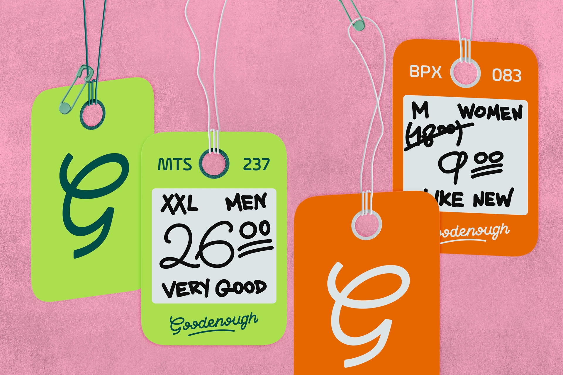
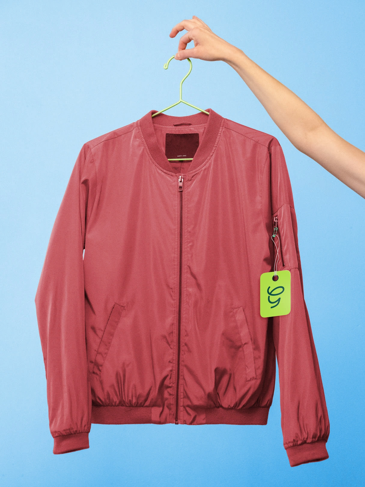
Goodbye, wasteful paper price tags.
The tags are designed to be made from reusable plastic sheets, so the price can be jotted down and then wiped clean for the next item. Each tag has a unique reference number that gets re-used for the next items. It's simple, it's smart, and it's better for the environment.
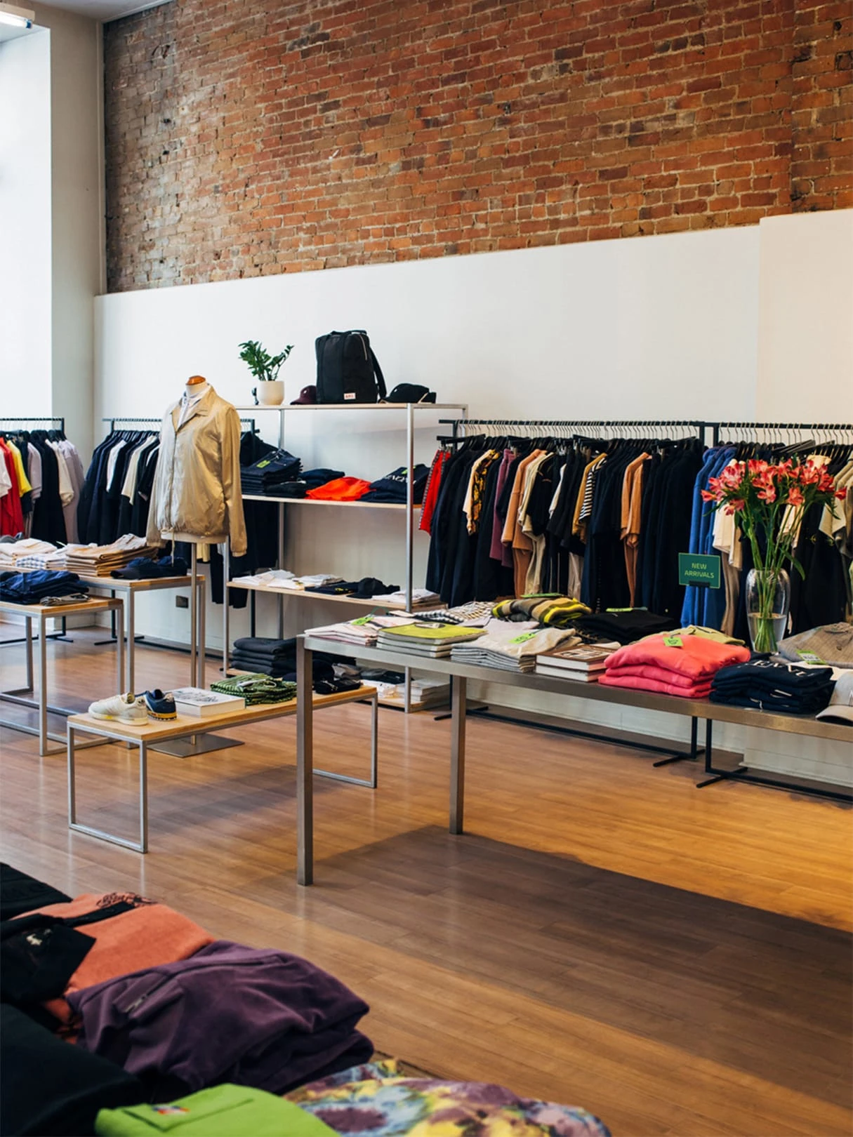
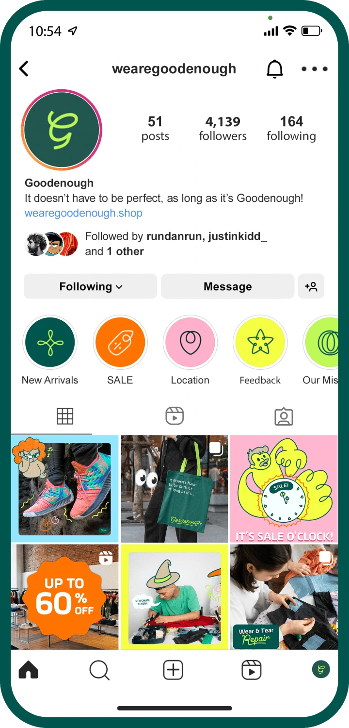
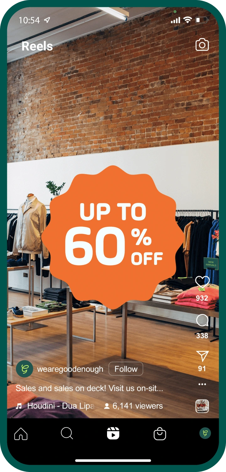
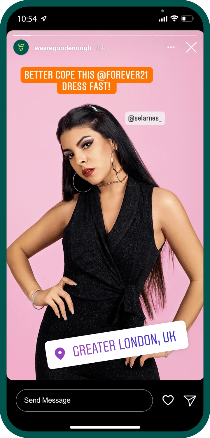
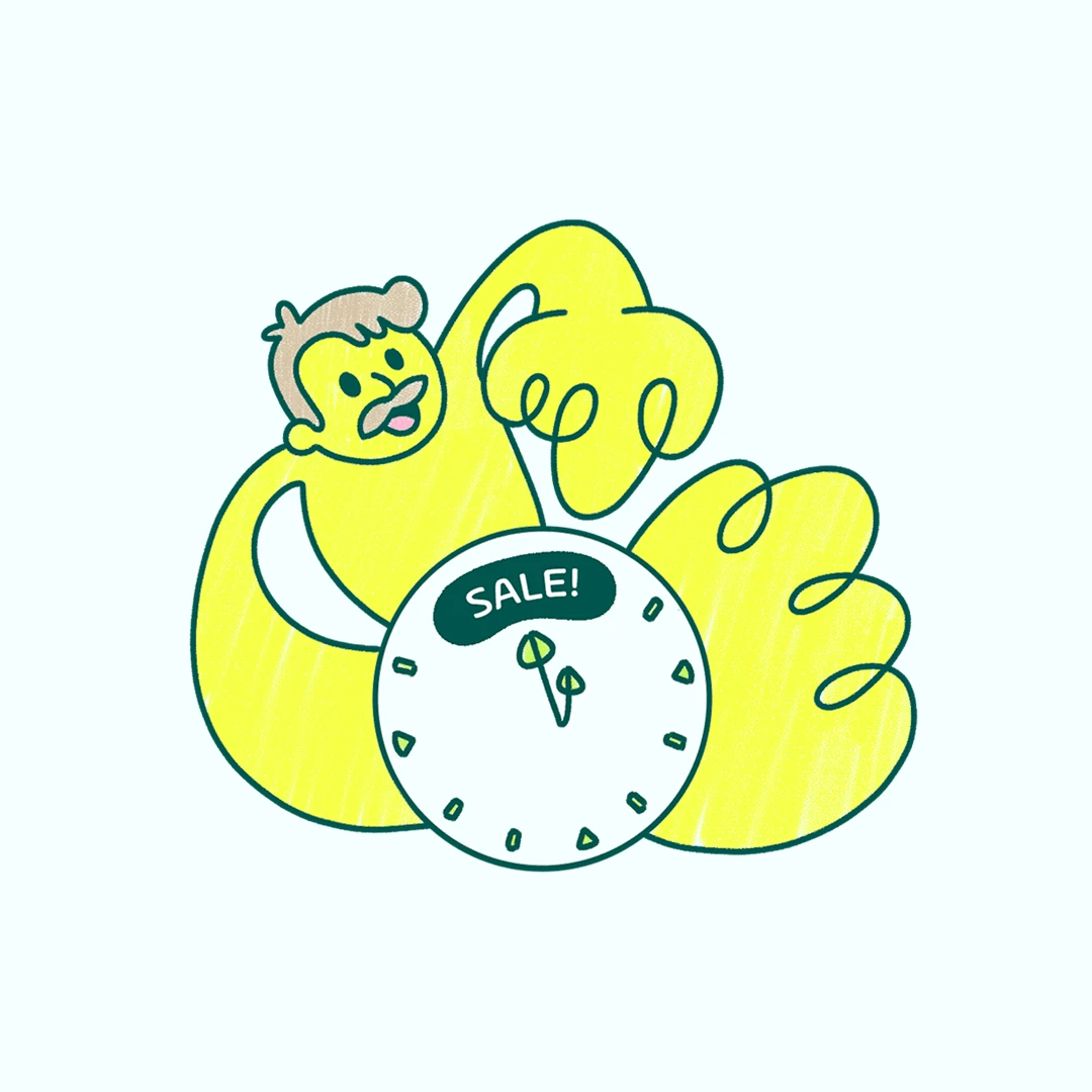
Their social media (mainly Instagram) is like a sales party.
It's not just about selling clothes – it's about sharing their love for sustainability and style with the world using fun icons, vibrant shapes, and colorful illustrations. (hold on, you will see them in a bit)
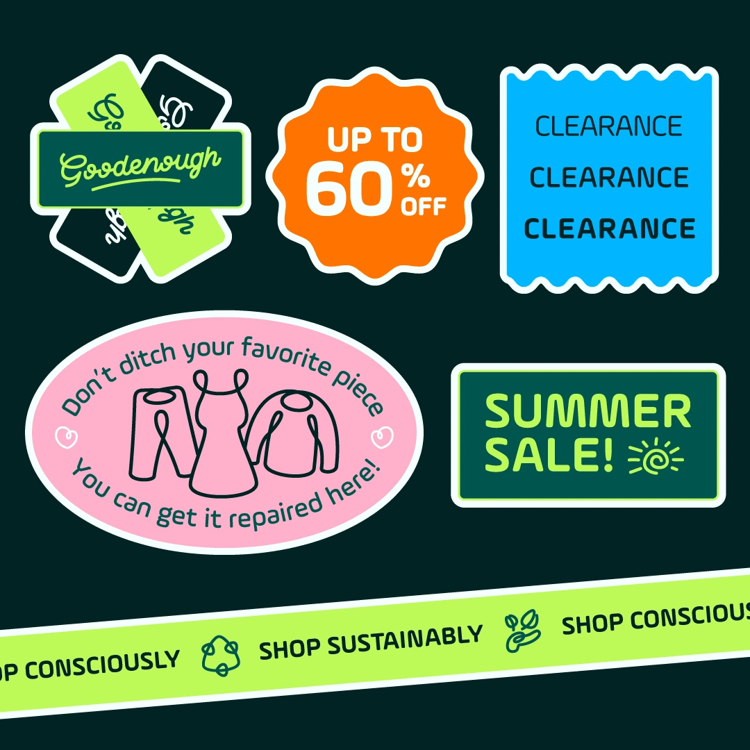
Got a rip in your favorite jeans? Don't toss them out – bring them to their store instead!
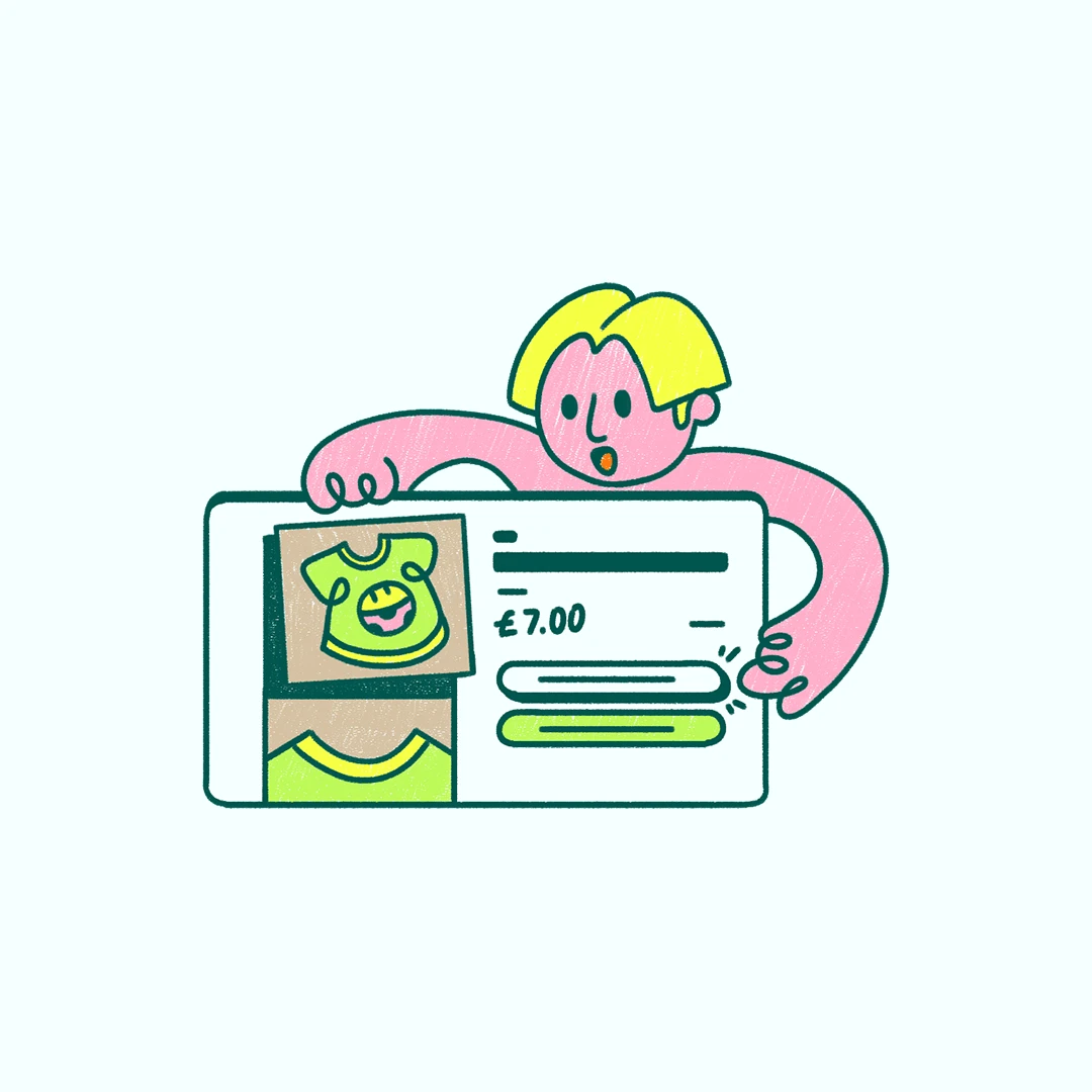
Their in-store repair service is like having your own personal tailor on speed dial. They'll fix up your clothes so they're as good as new, saving you money and reducing waste in the process, and this is displayed with these illustrations.
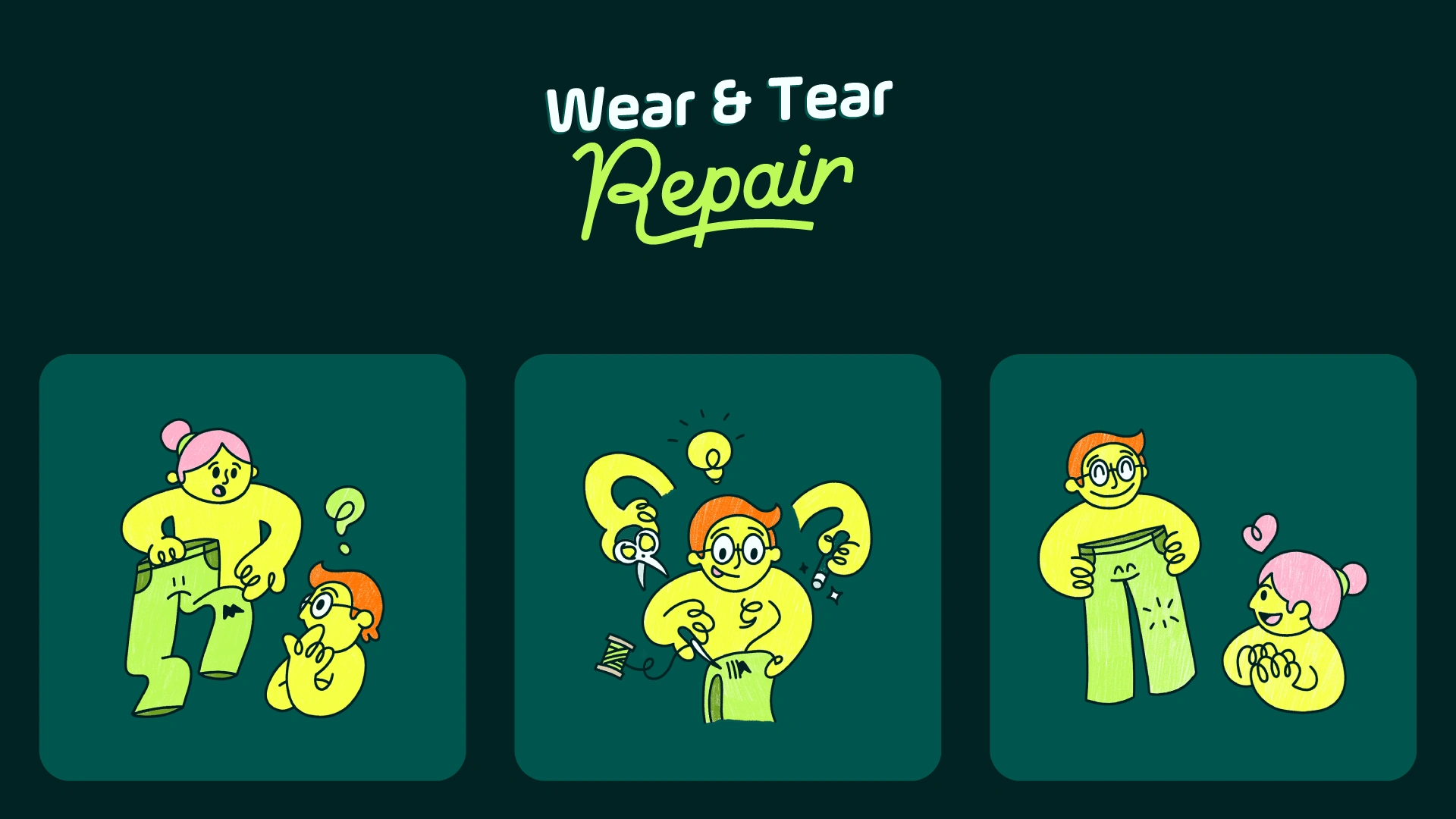
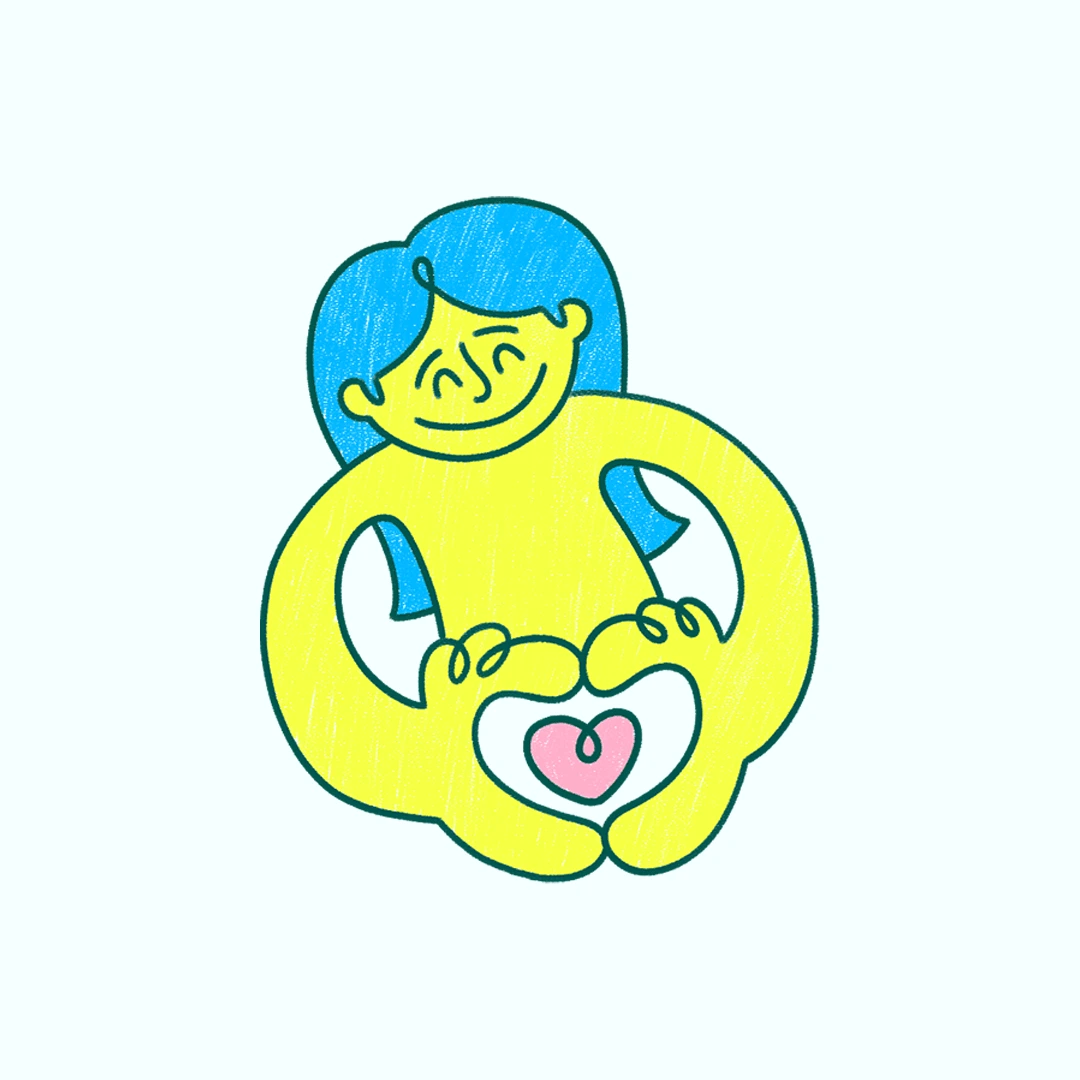
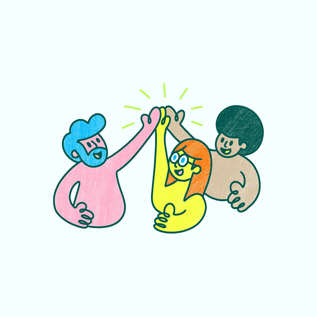
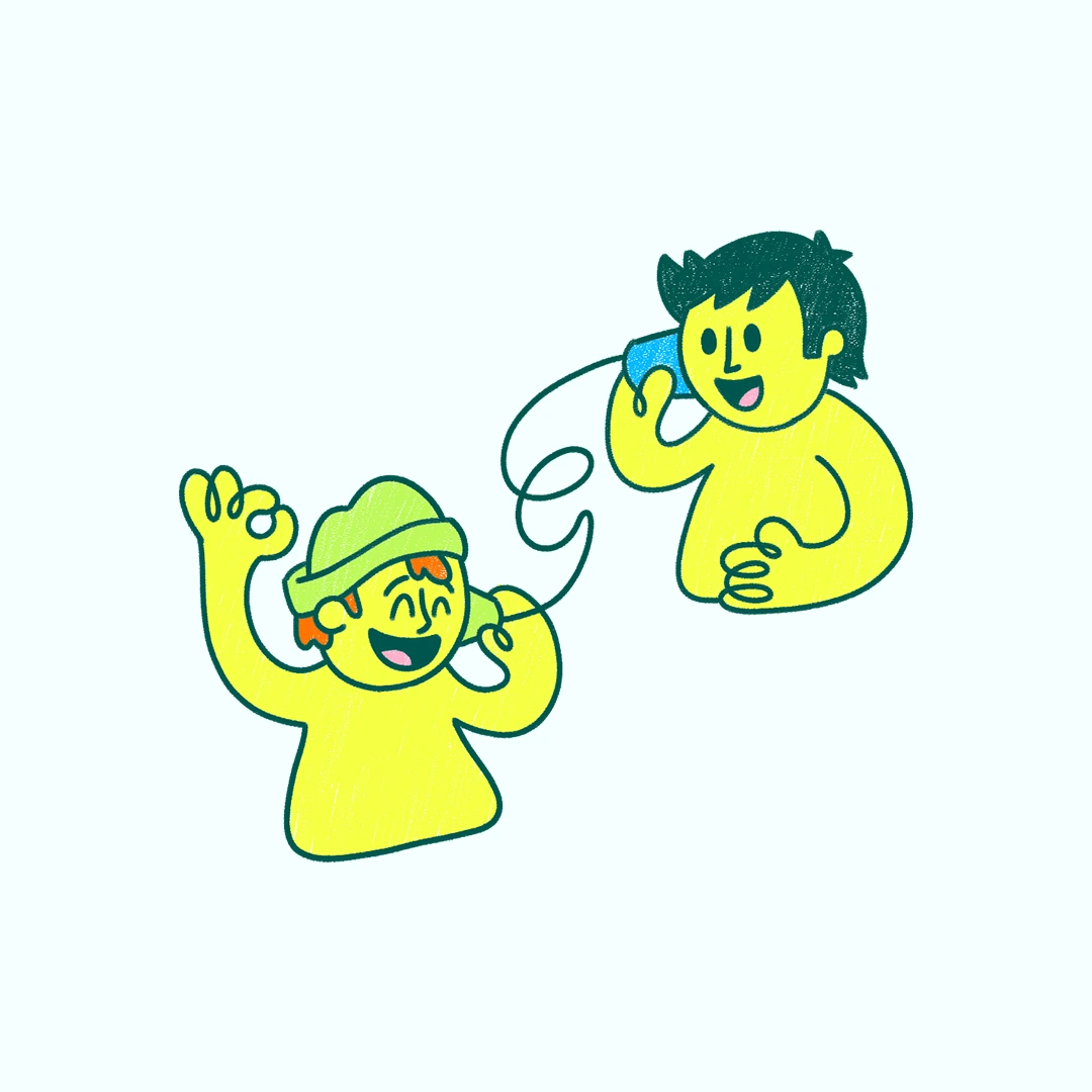
The illustrations are like little works of art. Hand-drawn and full of character.
While the initial idea was to design them in a way that compliments the icons nicely, it was later decided to make them hand-drawn but keep the roundedness and the one-line feel to convey continuity and imperfection. They add a touch of whimsy to everything the brand does, as it's all about celebrating and embracing the beauty of imperfection.

User Interface Design
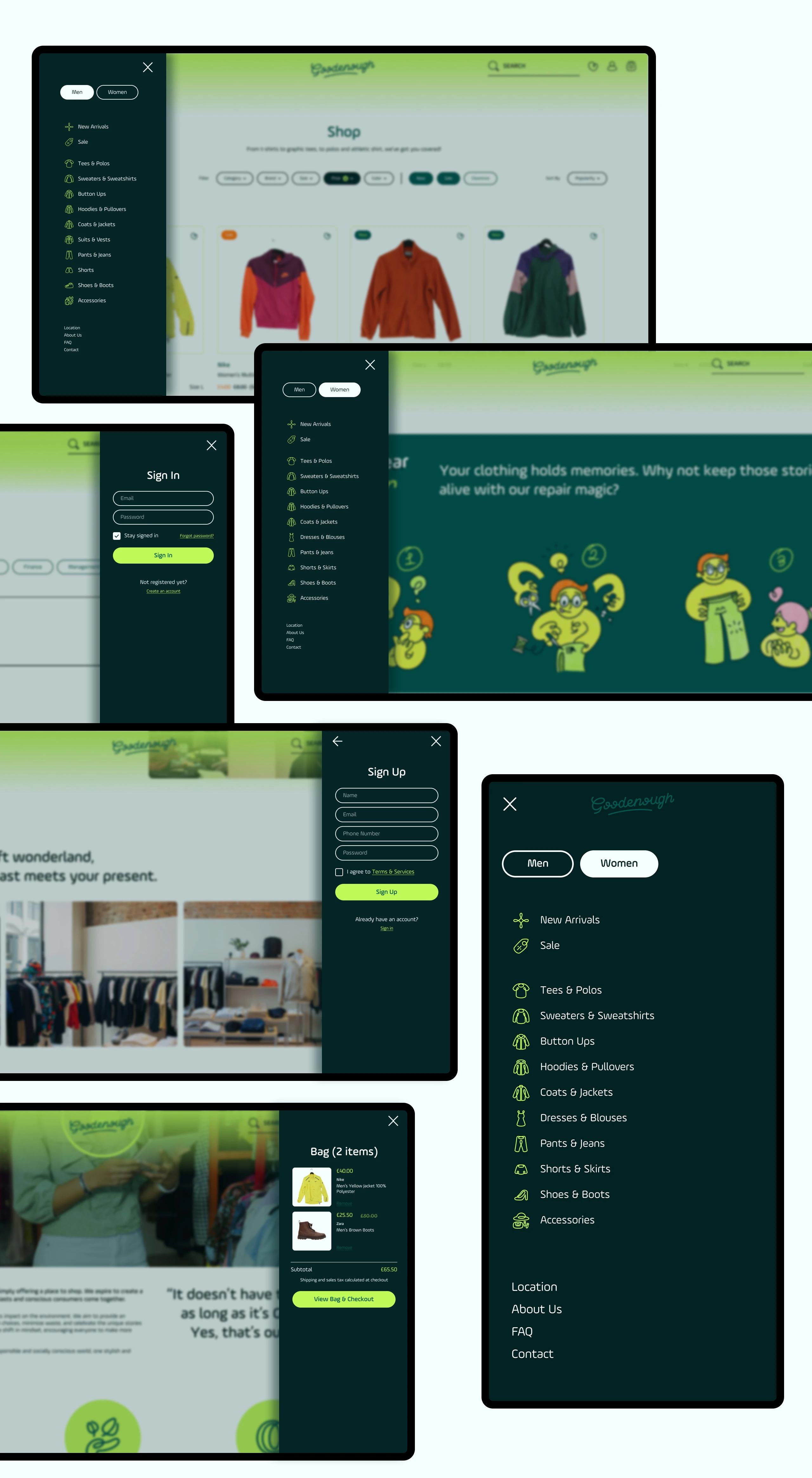
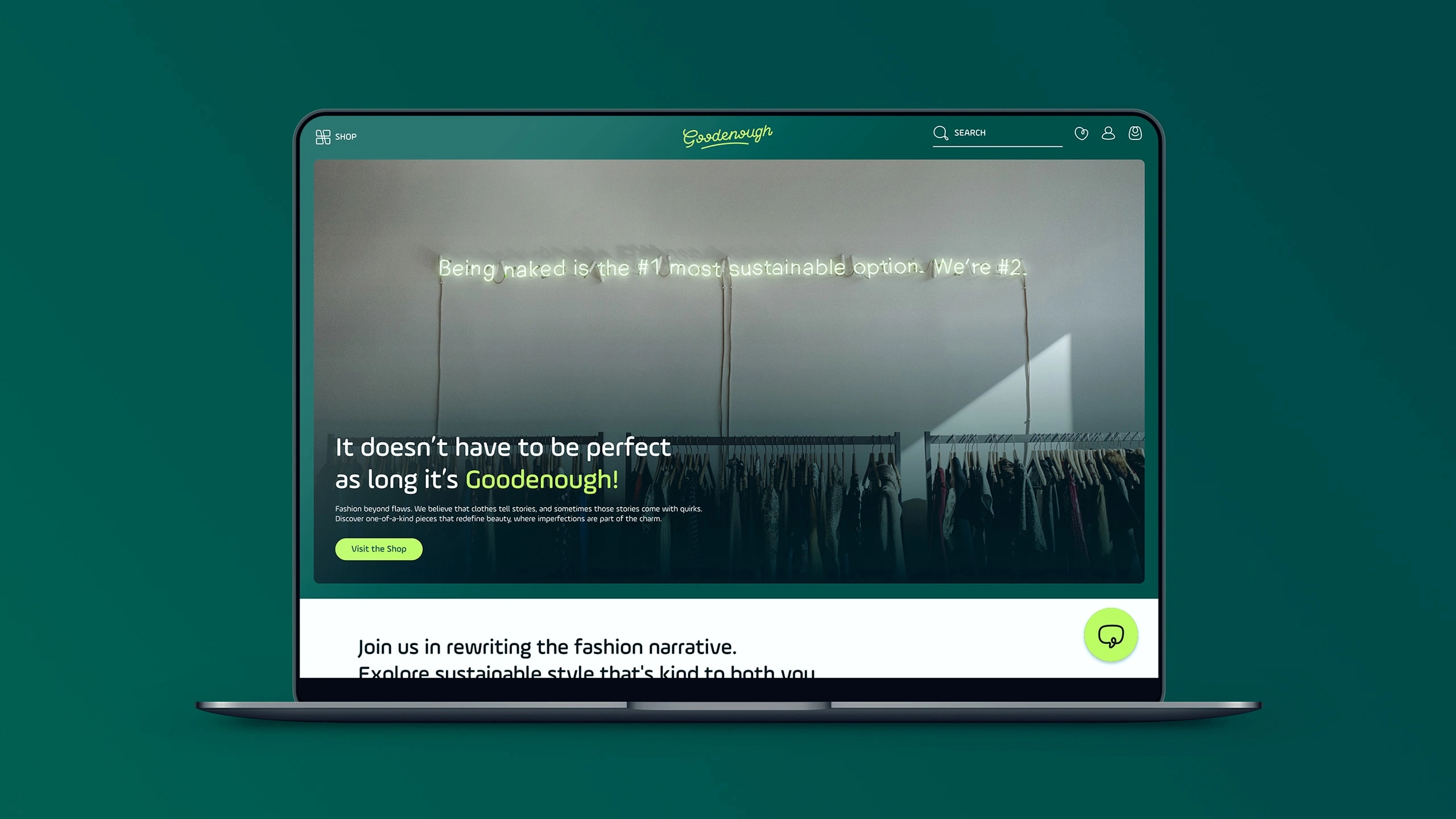
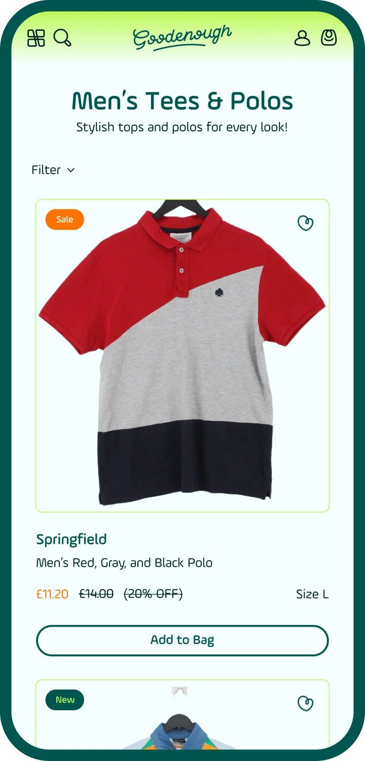
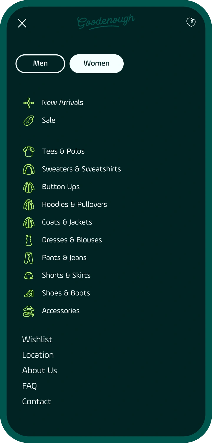
The goal in mind was clear: The website should be like a well-organized closet – everything has its place, and it's easy to find what you're looking for.
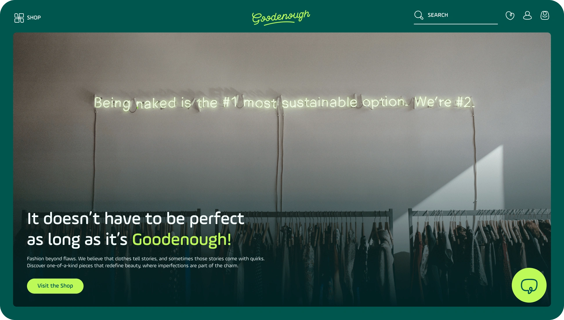

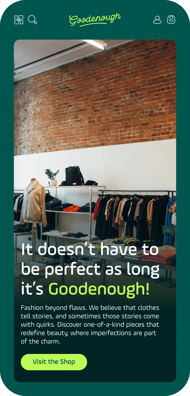
Home Page
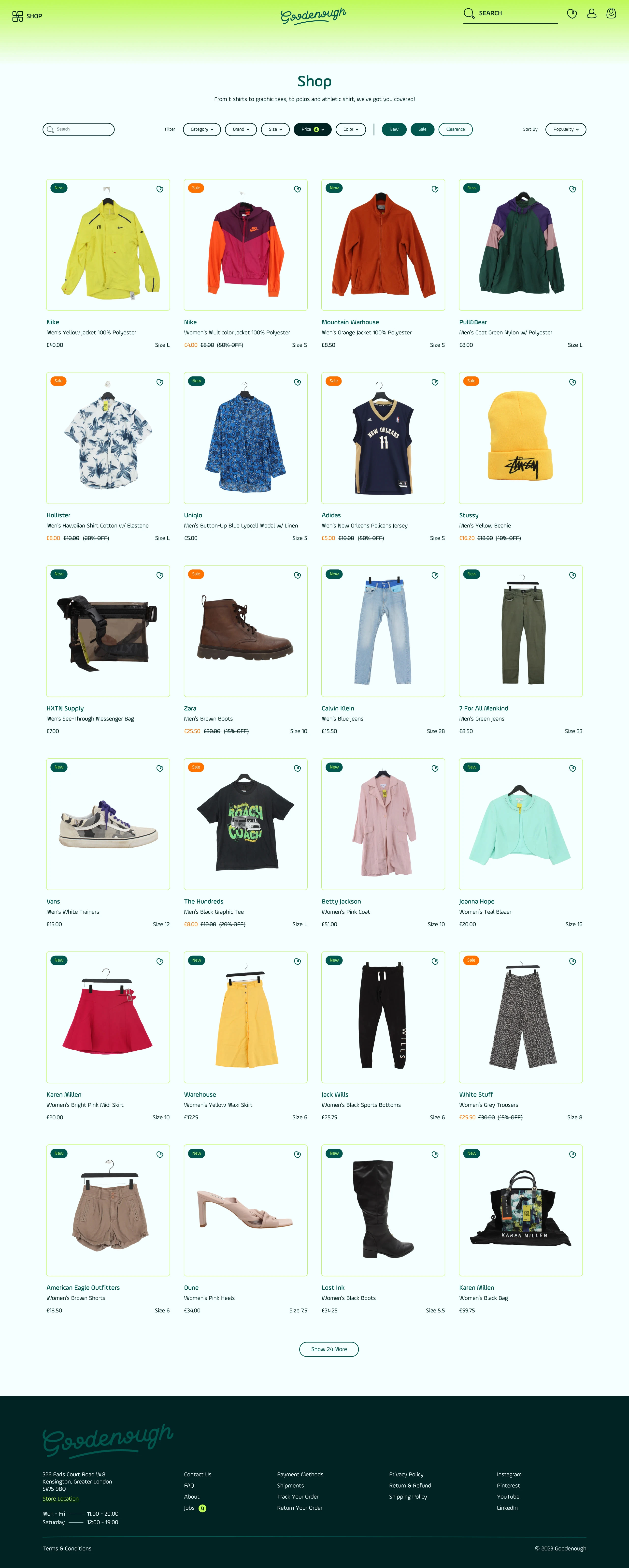
Shop Page
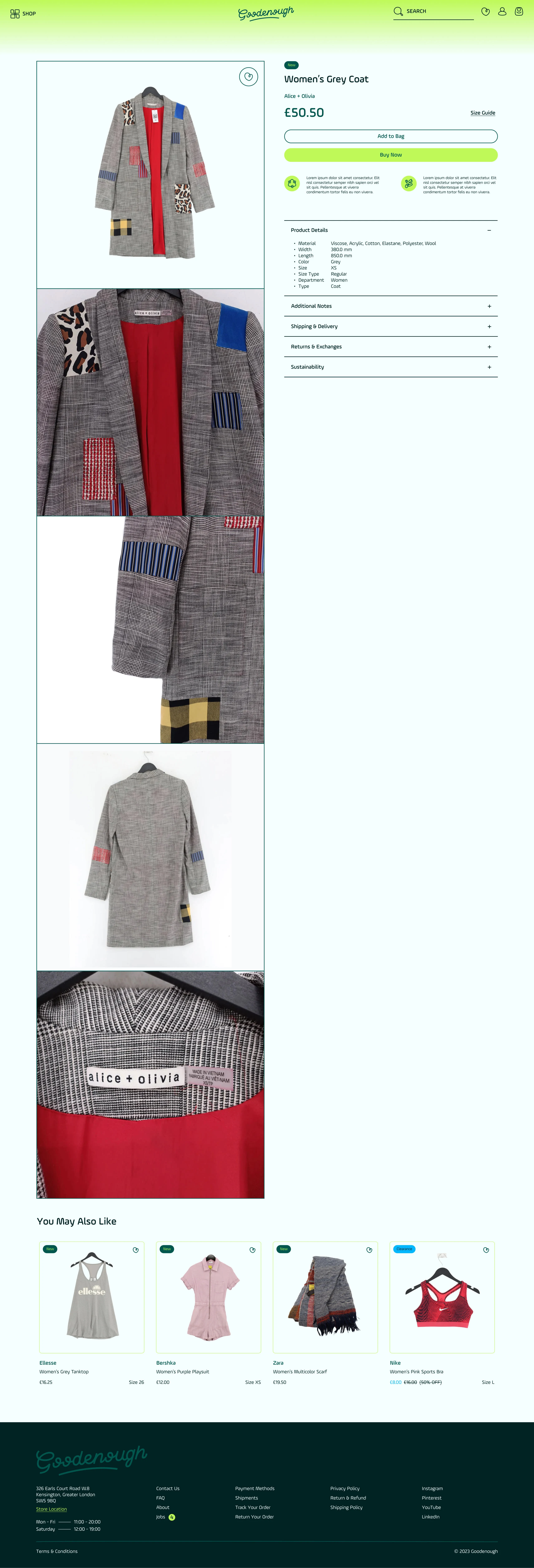
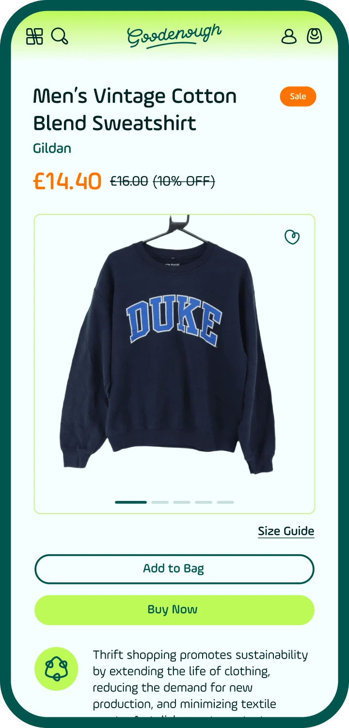
Product Page

About page
Like this project
Posted Apr 25, 2024
Goodenough's mission is to redefine the way people perceive clothing and its impact on the environment.

