Cahī
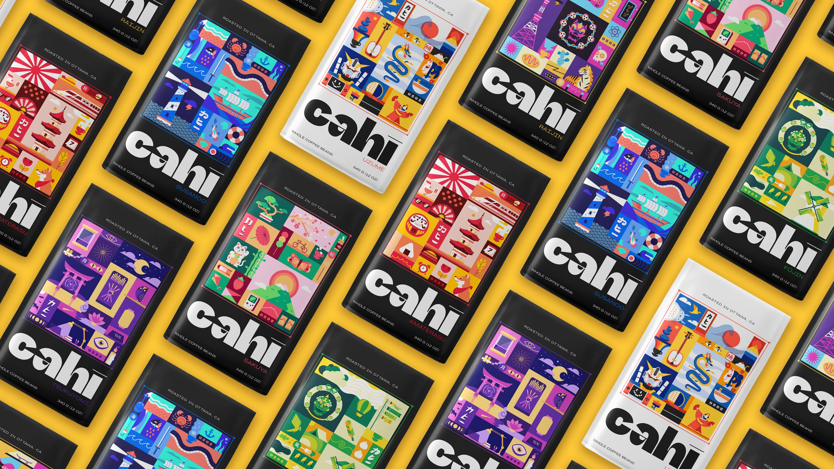
Born from the simple idea of treating coffee as a culinary art, Cahī is a newly founded coffee roasting brand based in the city of Ottawa, CA.
Cultivated from the finest coffee fields around the globe, Cahī works directly with importers to create a variety of rich flavors, ranging from soothing and sweet, to spicy and brisk, bringing customers coffee that not only arouses their taste buds, but coffee that HITS. THE. SPOT.
You can keep reading, or view the full project on my portfolio website ↓
Brand Identity
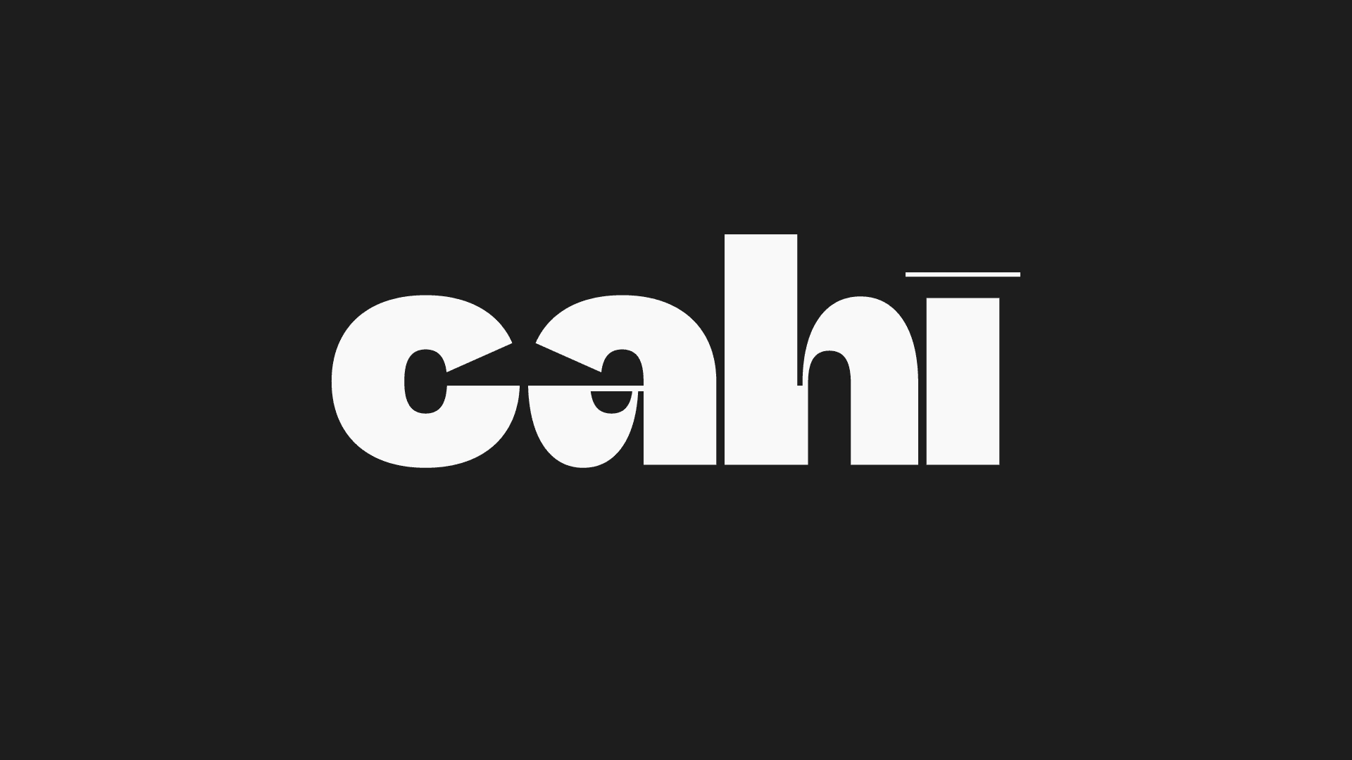
The thought behind Cahī's brand identity was creating a mark that exhibits the wide range of flavors, from light to bold.
A custom logotype was born, bold all around, with a gradual thin-to-bold bowl for the ‘a’ and shoulder for the ‘h’, as well as a thin macron over the ‘ı’.
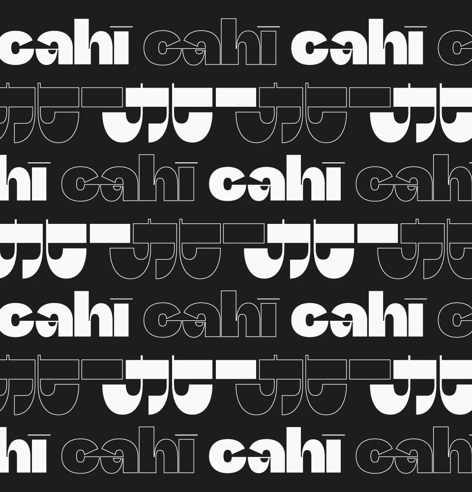
The Japanese version of the logo follows the same design format, with the horizontal lines being bold, and the vertical curved lines going gradually from thin to bold.
Brand Naming
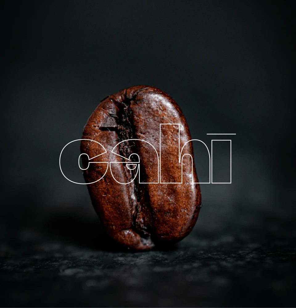
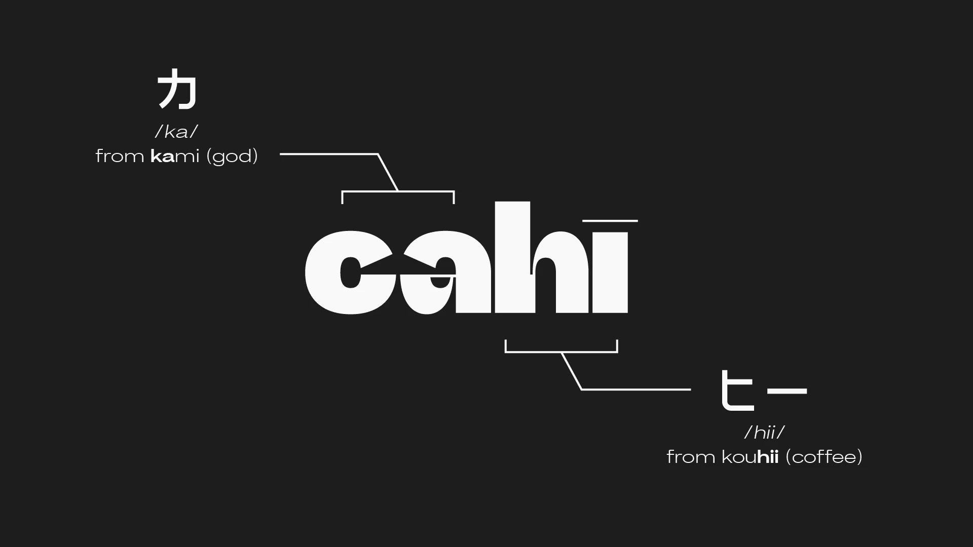
The name Cahī is a fusion of Japanese words – '神' (kami) meaning 'god' and 'コーヒー' (kōhī) meaning 'coffee'.
The client really wanted a name that was easy to remember and sounded friendly, but they also wanted it to have a strong link to coffee. They liked the idea of starting with the letter 'k' as a kind of nod to both 'coffee' and 'Canada'. After looking at a bunch of options, they kept coming back to 'Cahī' as it seemed like it was the obvious option. It just felt right – simple and reliable, like your favorite morning brew.
Illustrations
A colorful journey through Japanese culture brought to life with vibrant illustrations.
Each one of the illustrations is inspired by various elements in Japanese culture, while thematically adhering to the Shinto deities. After extensive research and reading about various aspects of Japanese culture, mood boards were constructed for each deity to set the tone and design direction for each flavor.
The elements were organized using a bento grid system, with some elements overlapping with each other, but complimentary nonetheless.
They're full of nods to Japan. Think Omurice, Koinobori, and Totsuka-no-Tsurugi, the sword Susanoo used to slice Yamata-no-Orochi's eight heads off!
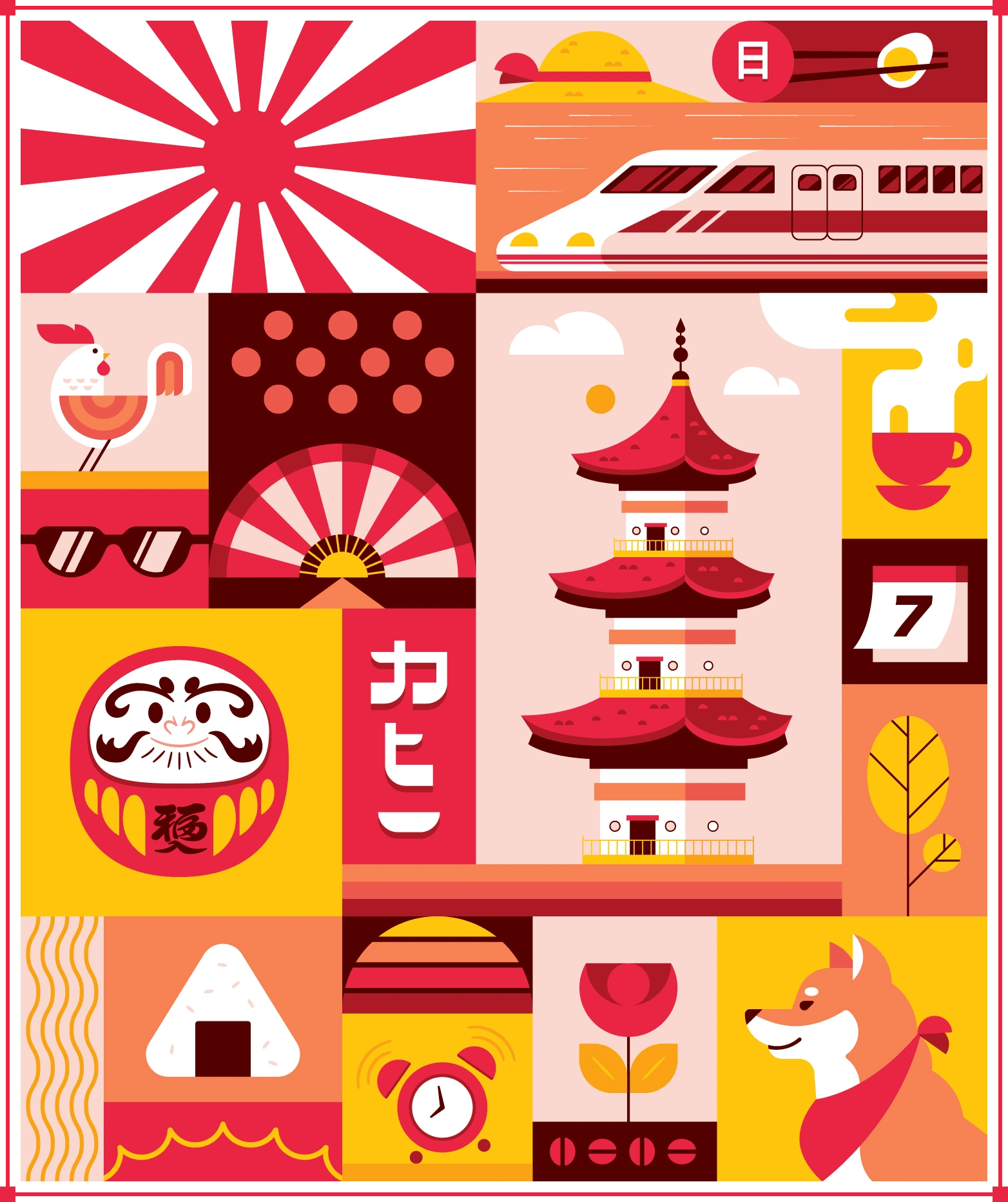
Amaterasu
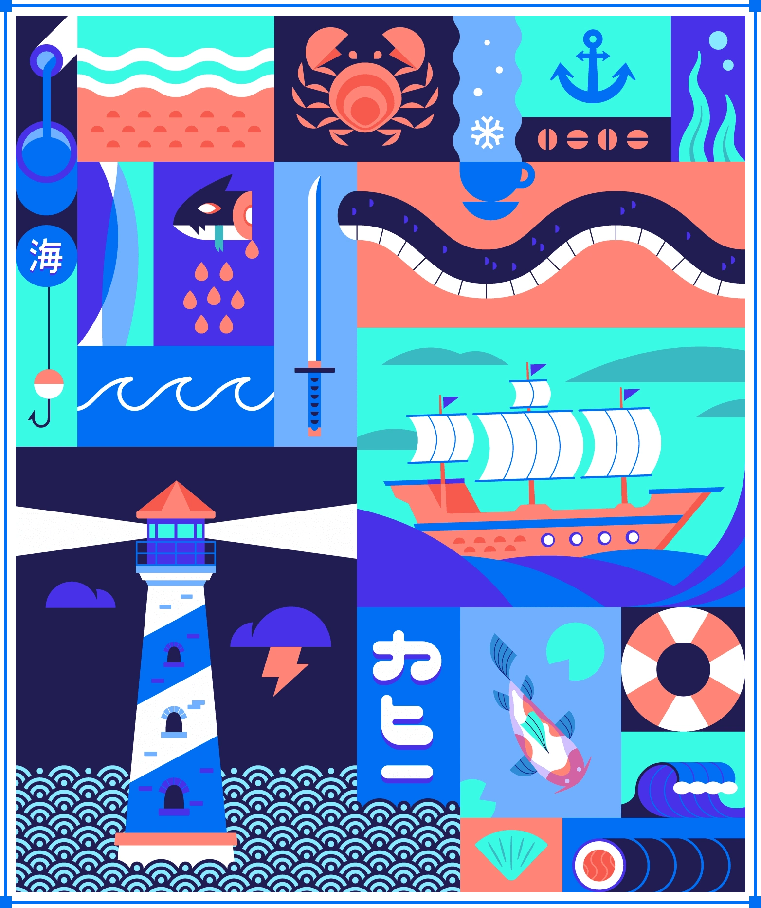
Susanoo
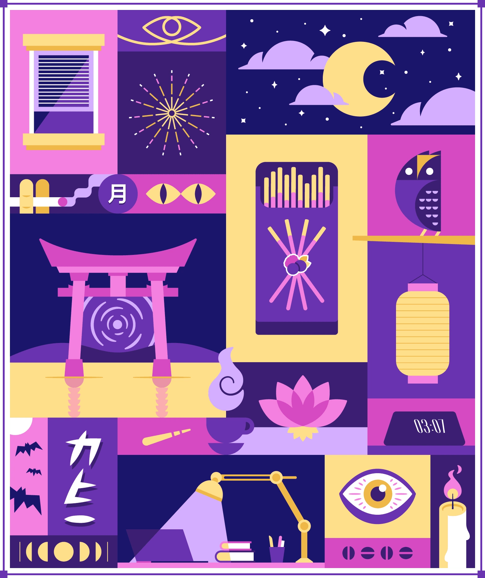
Tsukuyomi
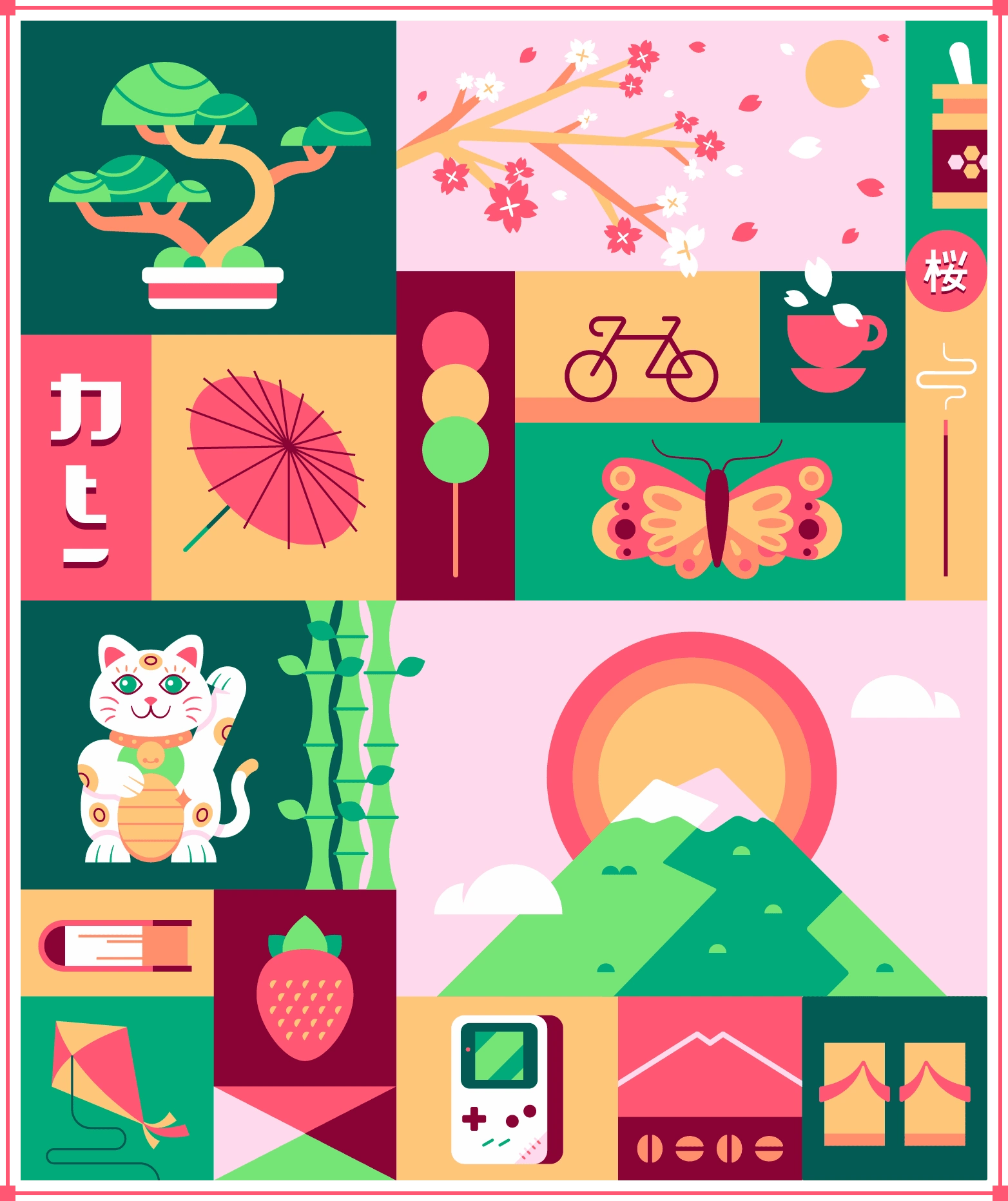
Sakuya
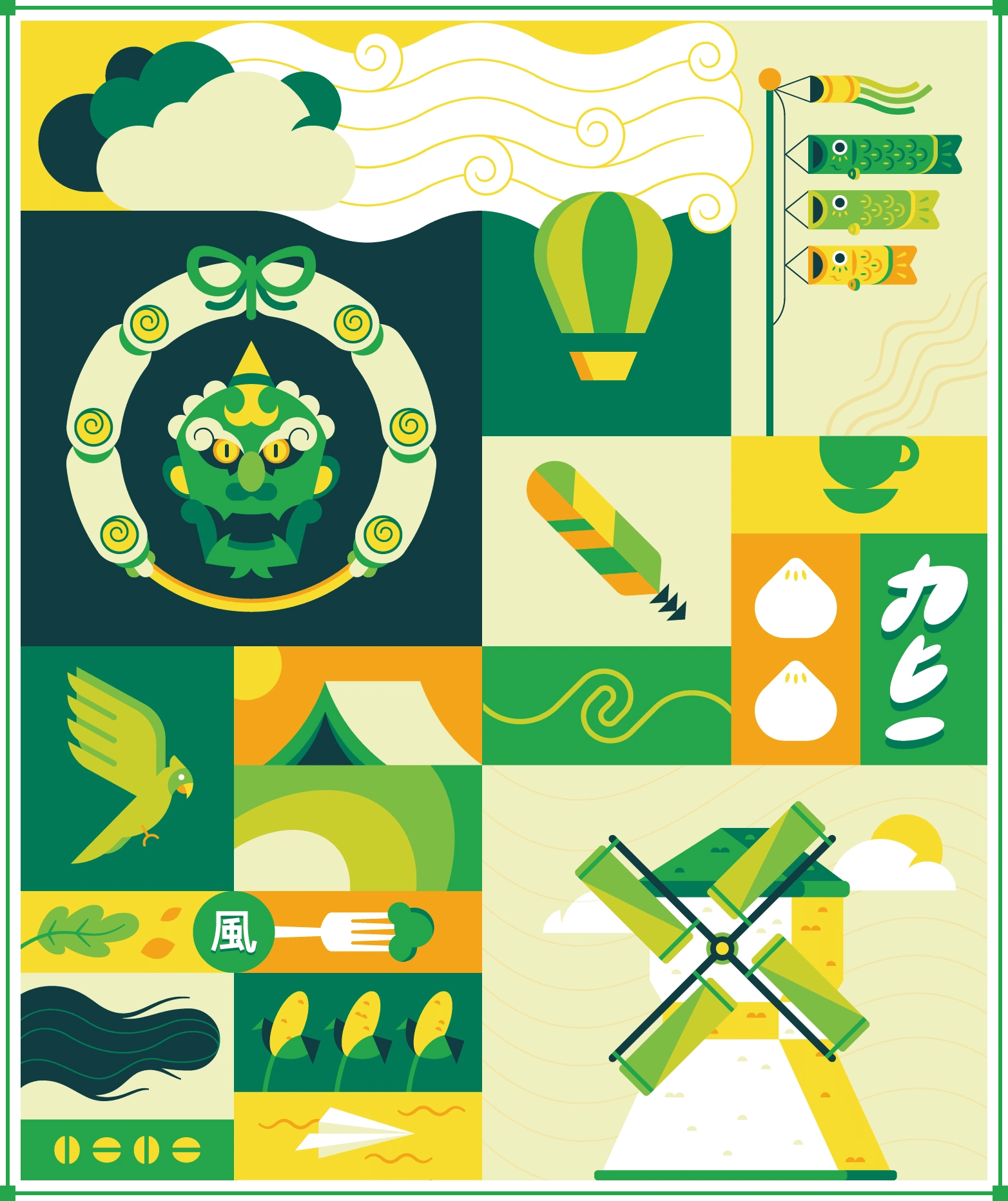
Fūjin
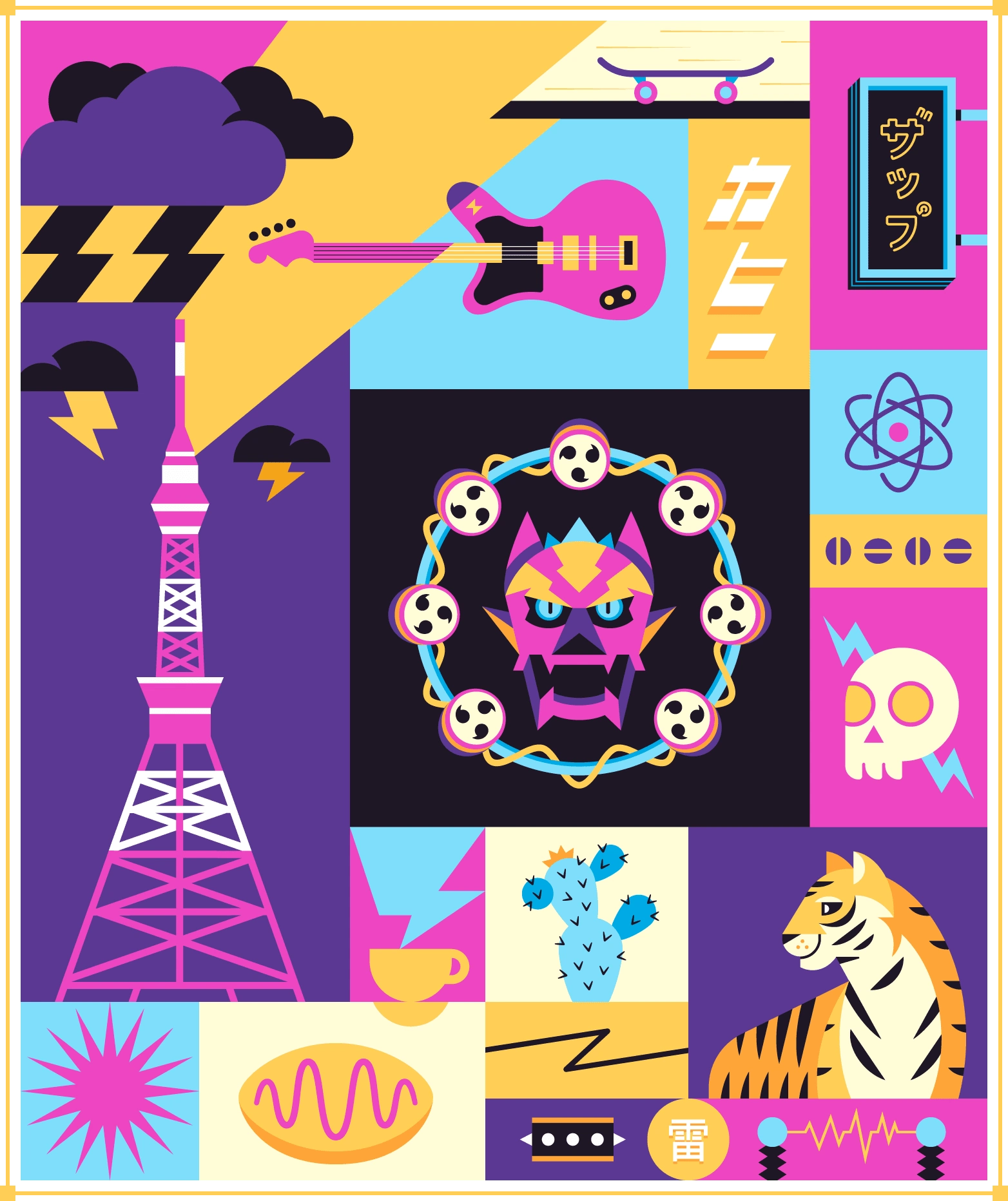
Raijin
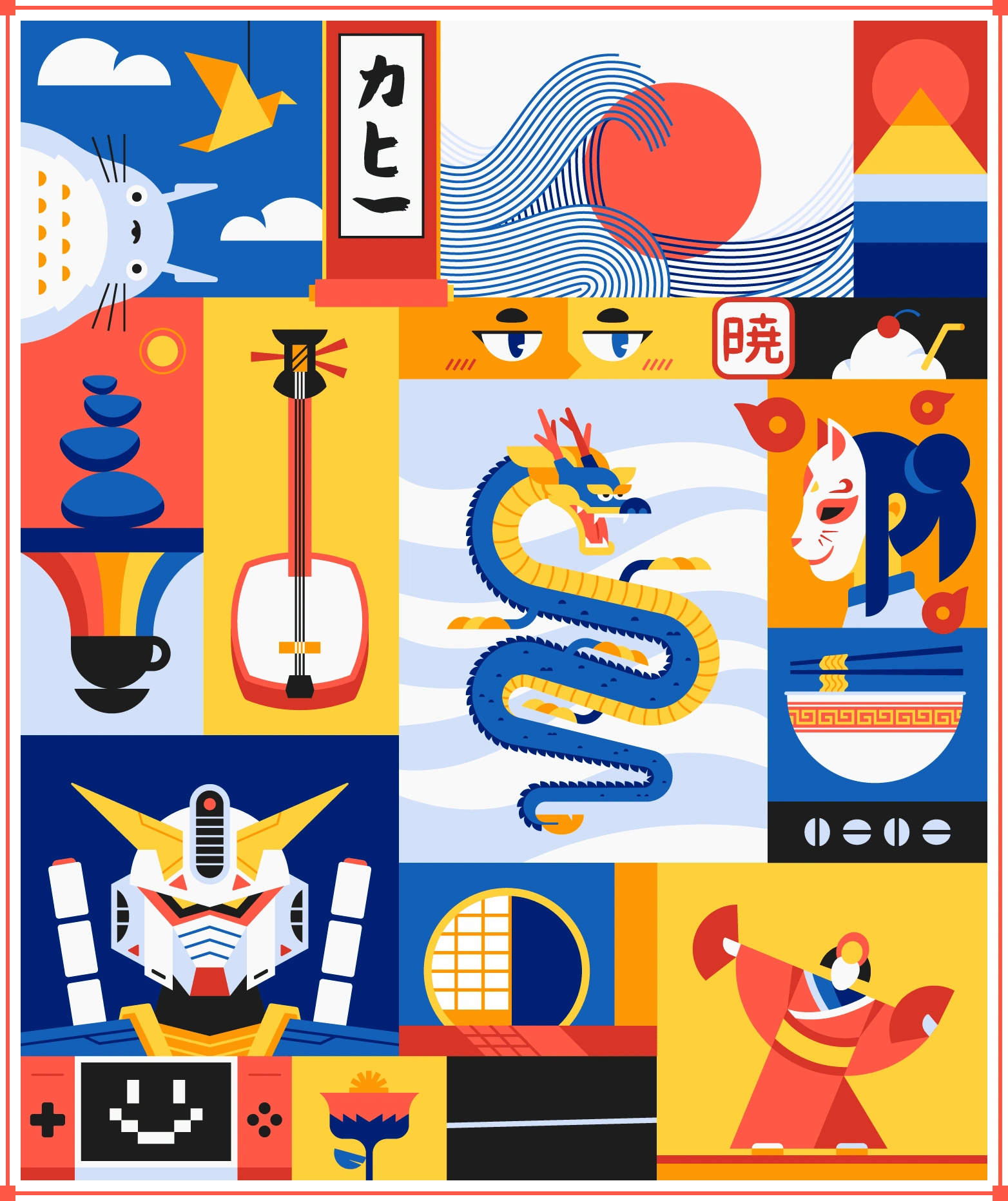
Uzume
Iconography
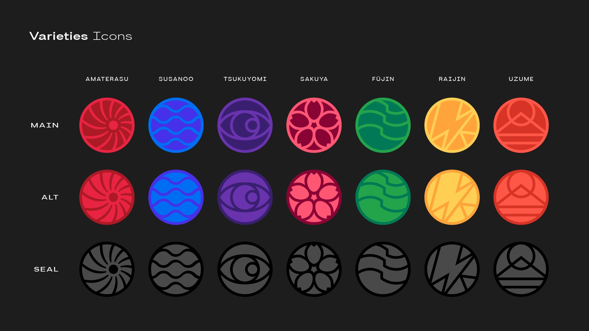
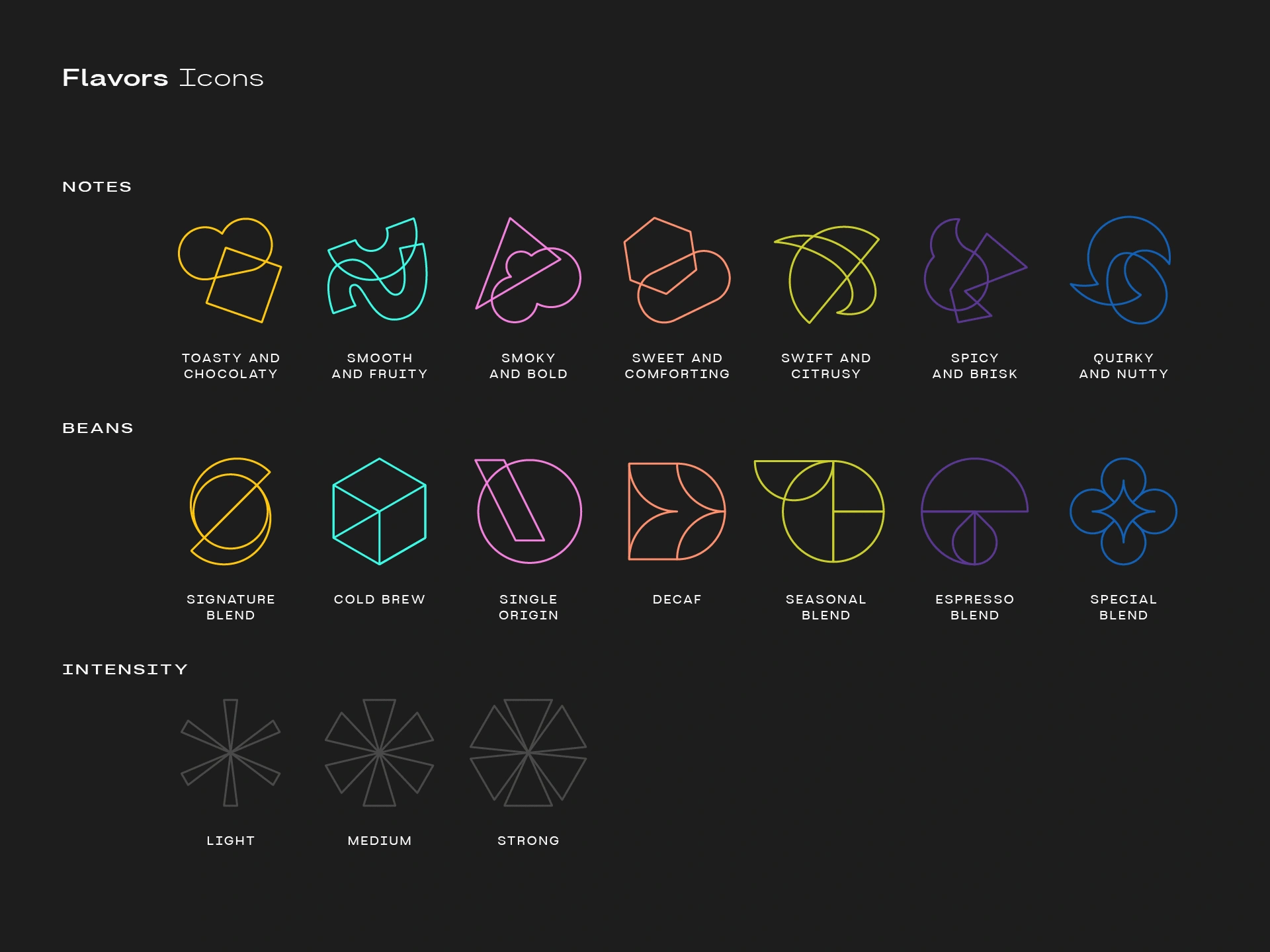
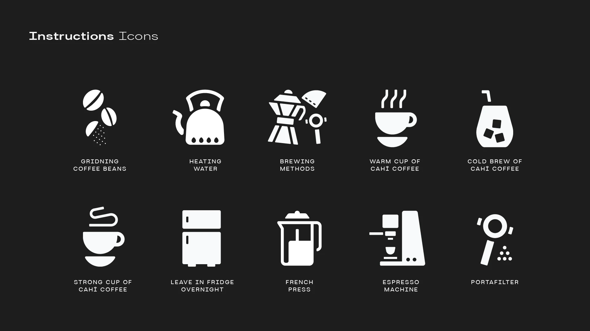
Icons played an important role in this project as a complimentary aspect of the seven themes.
The main focus was on creating icons for the seven different coffee varieties, each representing a specific flavor and Shinto deity. Then the icons for coffee notes, beans, and intensity were developed using simple geometric shapes that complemented the illustrations. Lastly, the instructional icons were designed for the back of the packaging to guide users.
Packaging Design
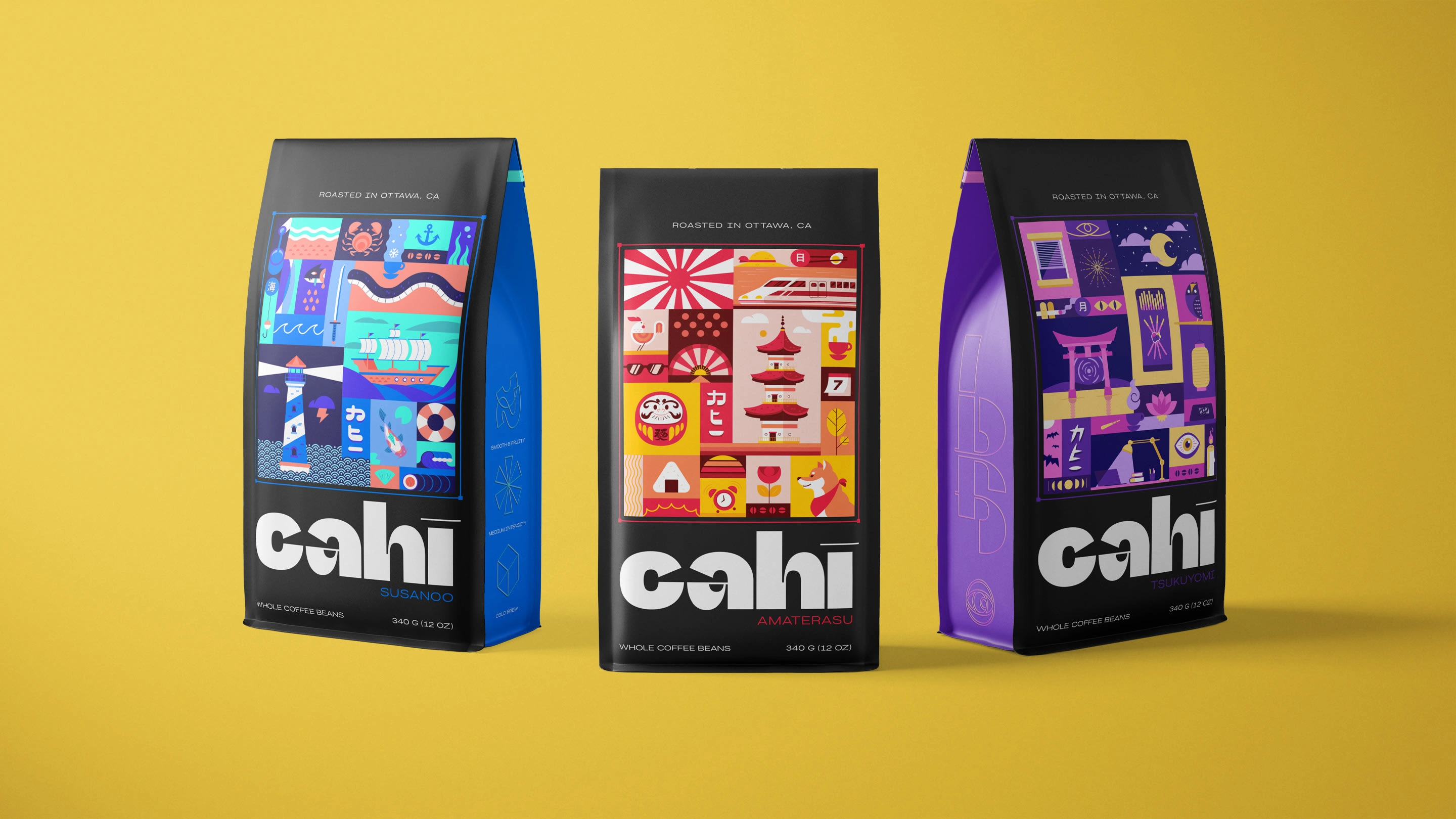
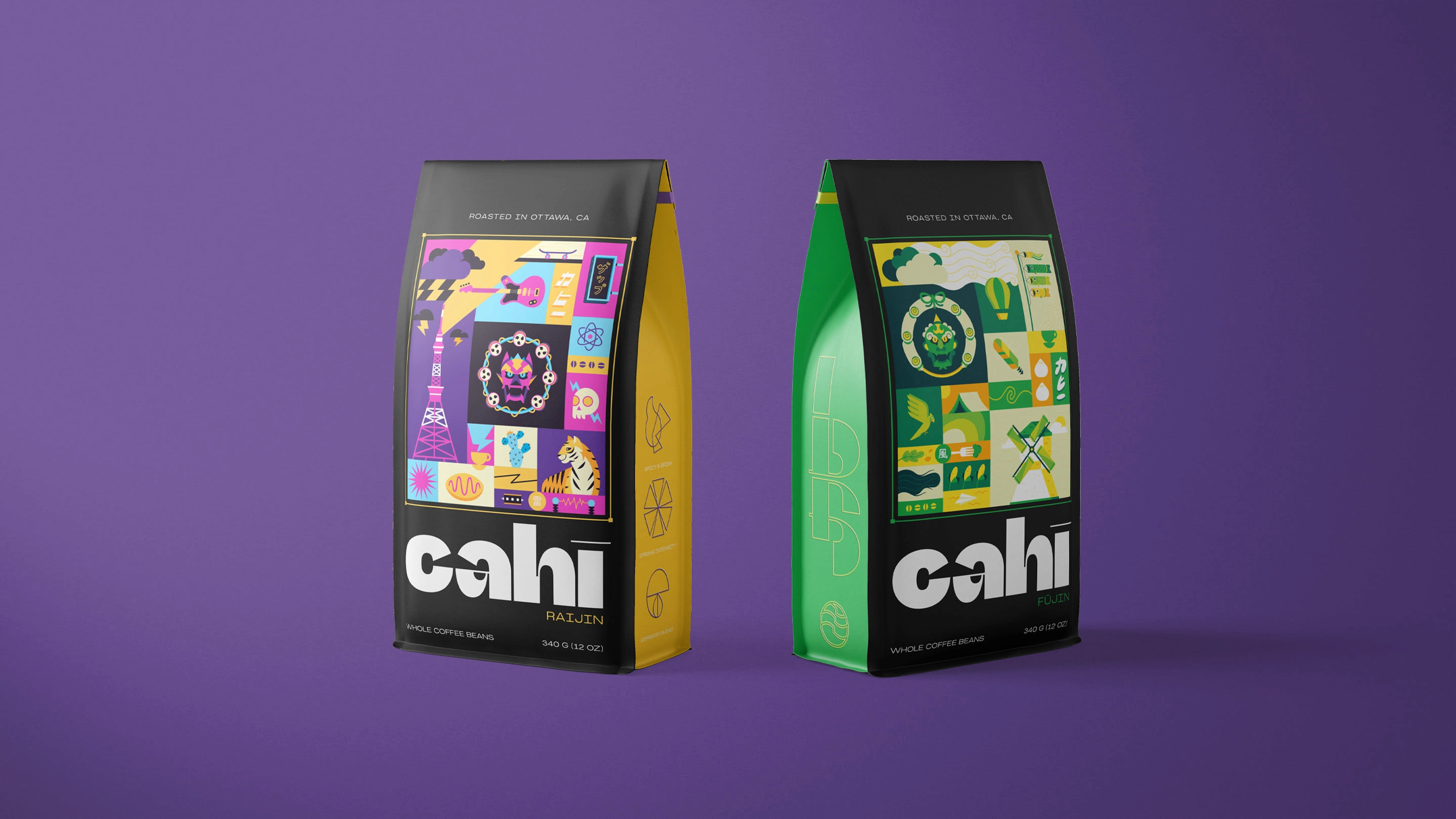
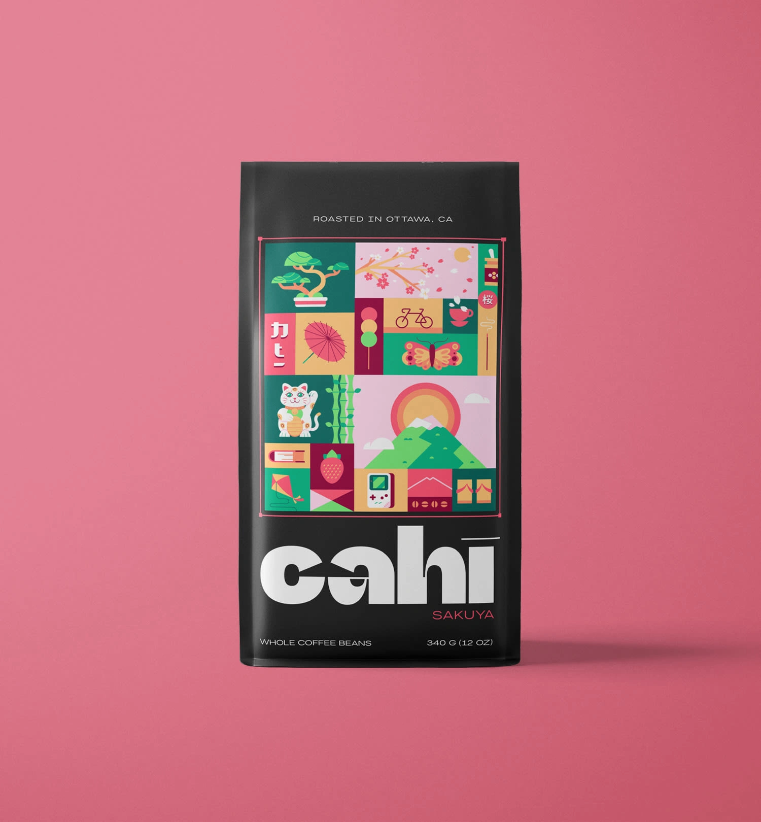
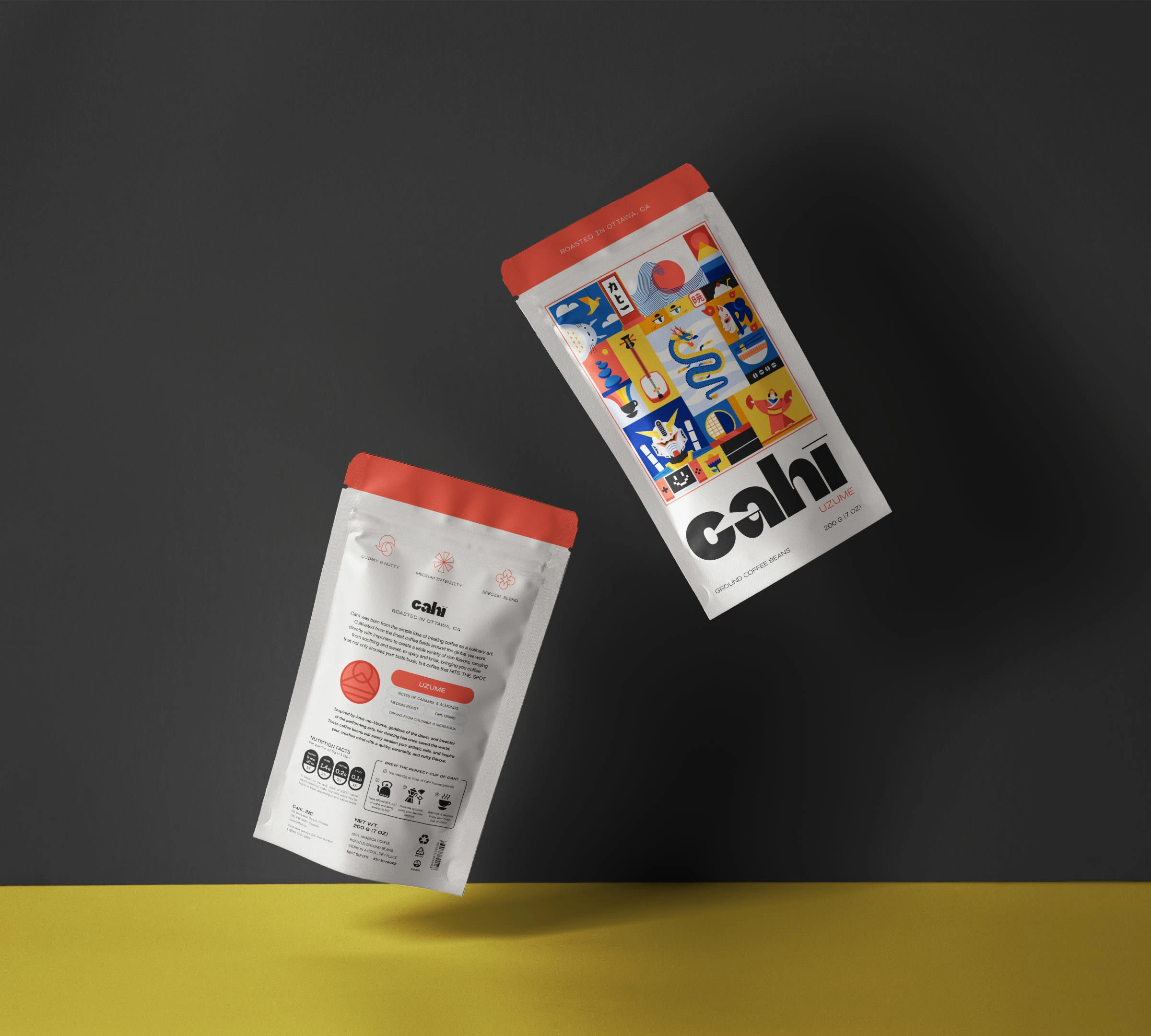
The packaging is where the magic happens – it's all about the illustrations stealing the spotlight.
Front and center, you'll find the vibrant artwork alongside the brand identity and the coffee note, represented by the name of the deity.
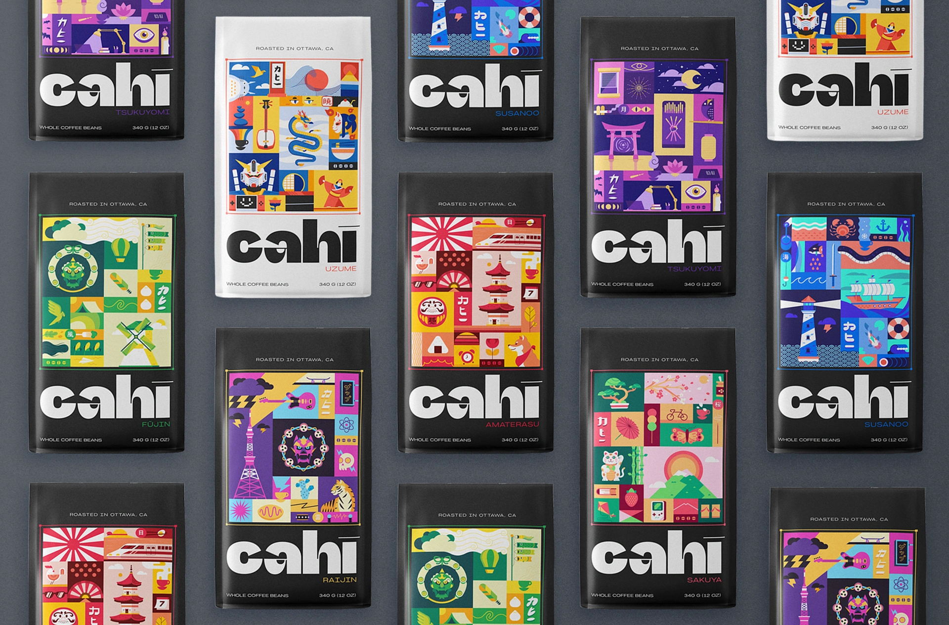
Sleek and sophisticated design for the whole beans packaging
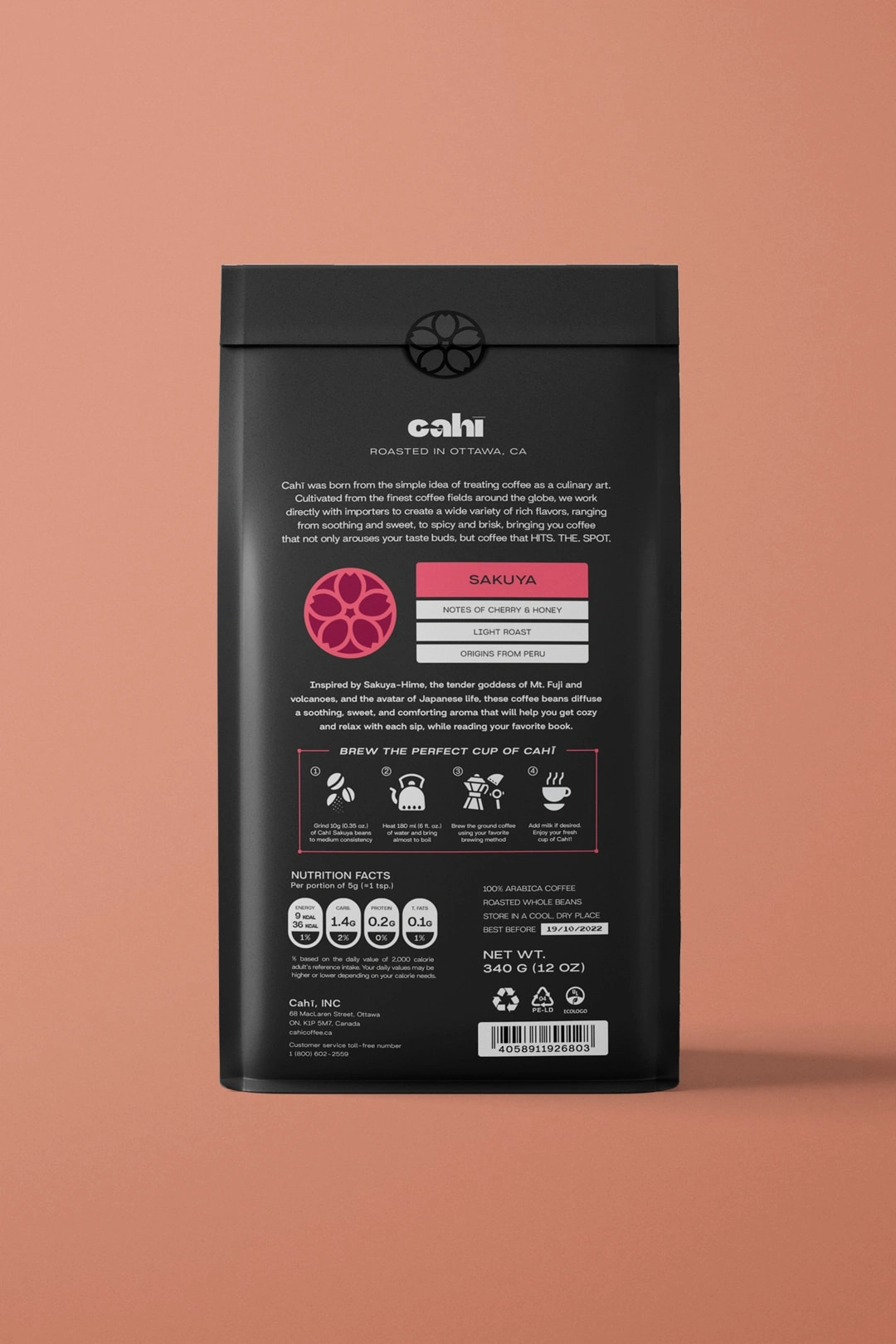
The dark gray backdrop along with the colored sides let the illustrations pop. The brand identity shines in a soft off-white hue (switched up for the Uzume limited edition for some extra flair). On the right side, you'll spot embossed icons for the coffee notes, beans, and intensity, along with the Katakana logo and the coffee variety icon on the left side. Flip it over, and you'll find a brief flavor description and handy brewing instructions – making your morning routine a breeze.
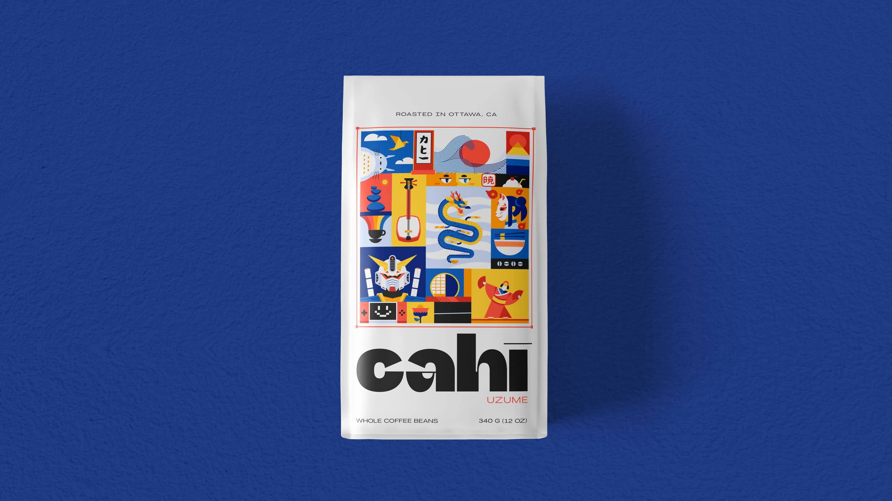
Bright, bold, and bursting with personality!
Each one of the ground bean coffee bags rocks its own vibrant color, matching the deity it represents. It's like a rainbow of flavors packed into a compact little package, ready to add some excitement to your morning routine.
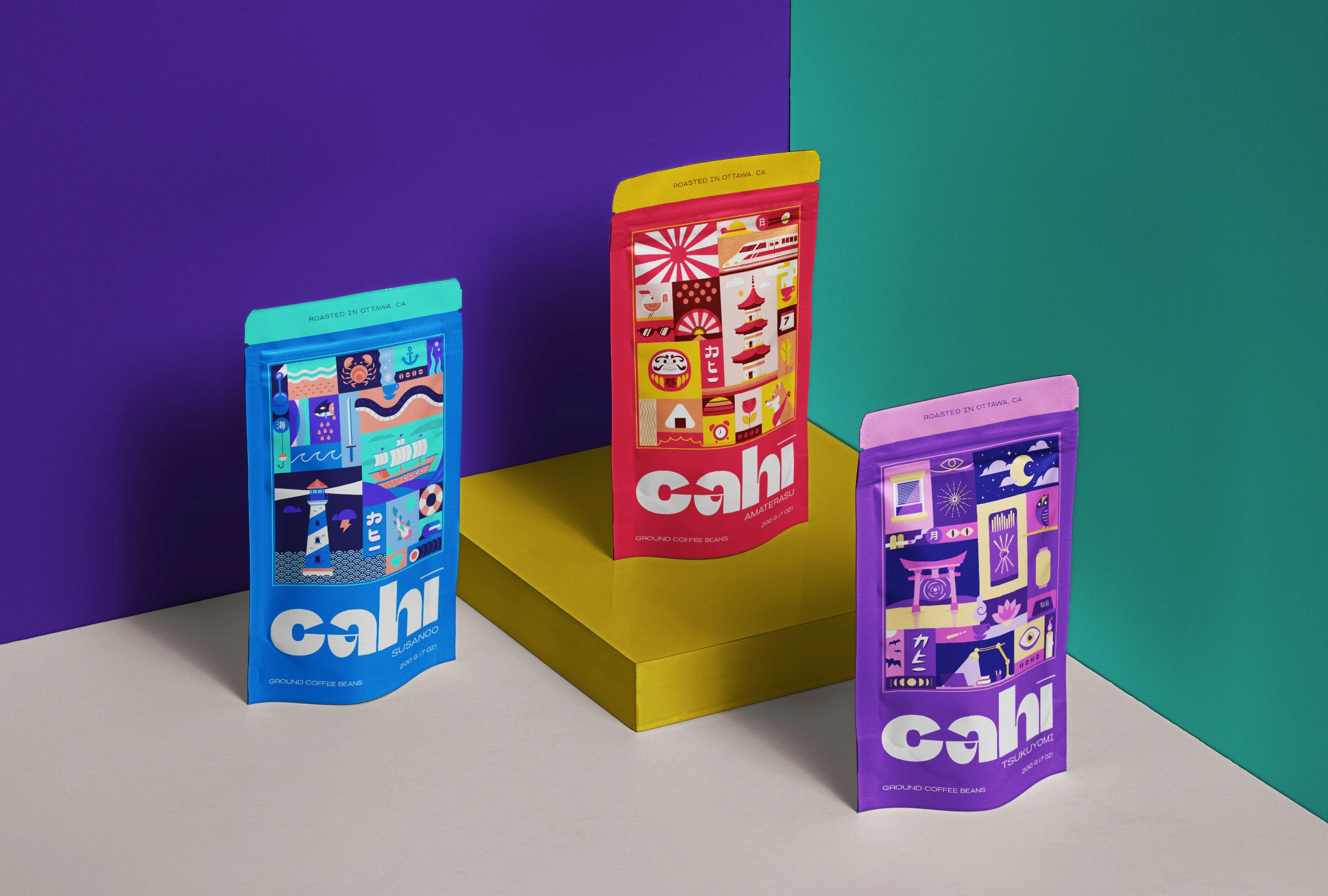
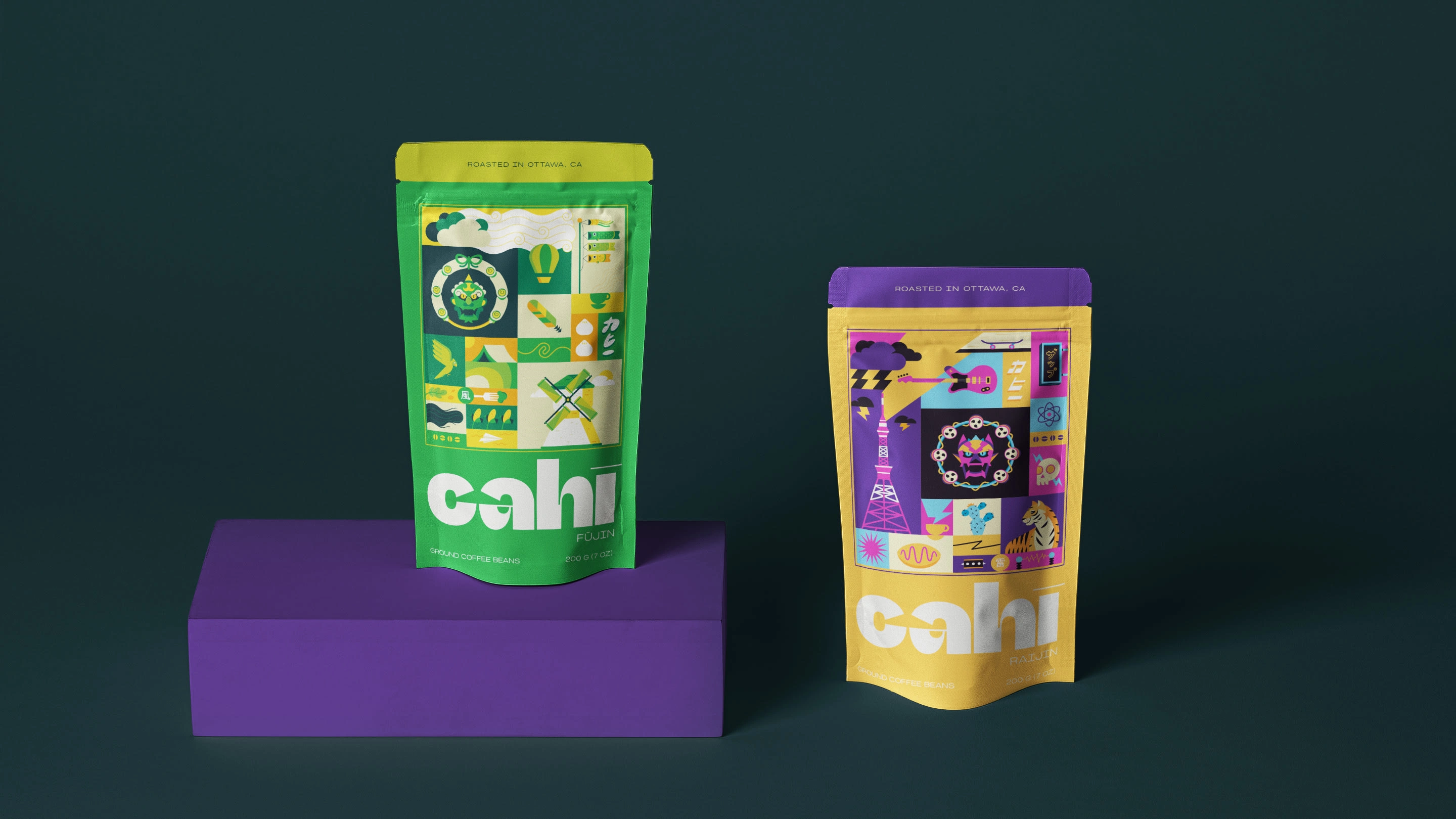
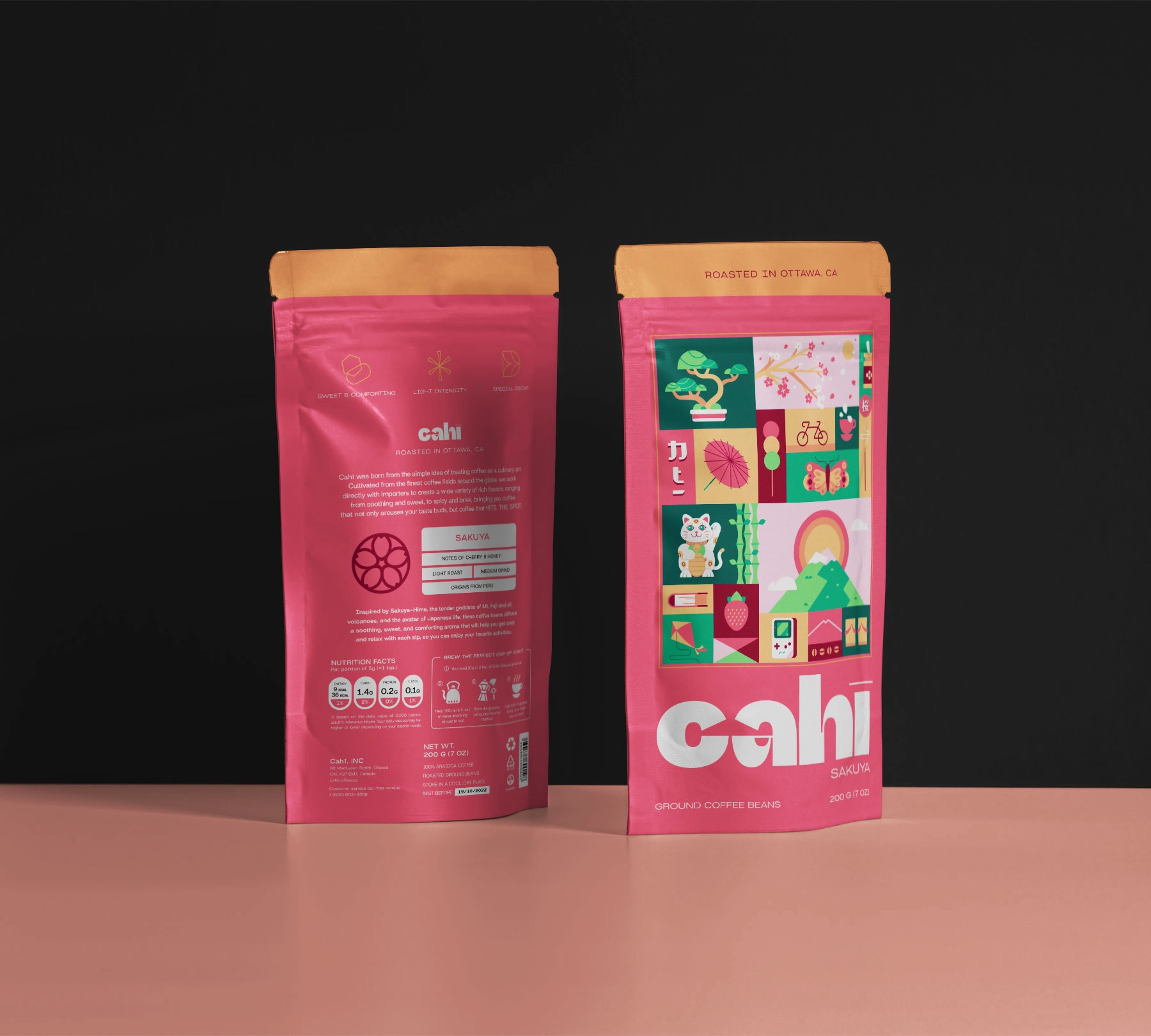
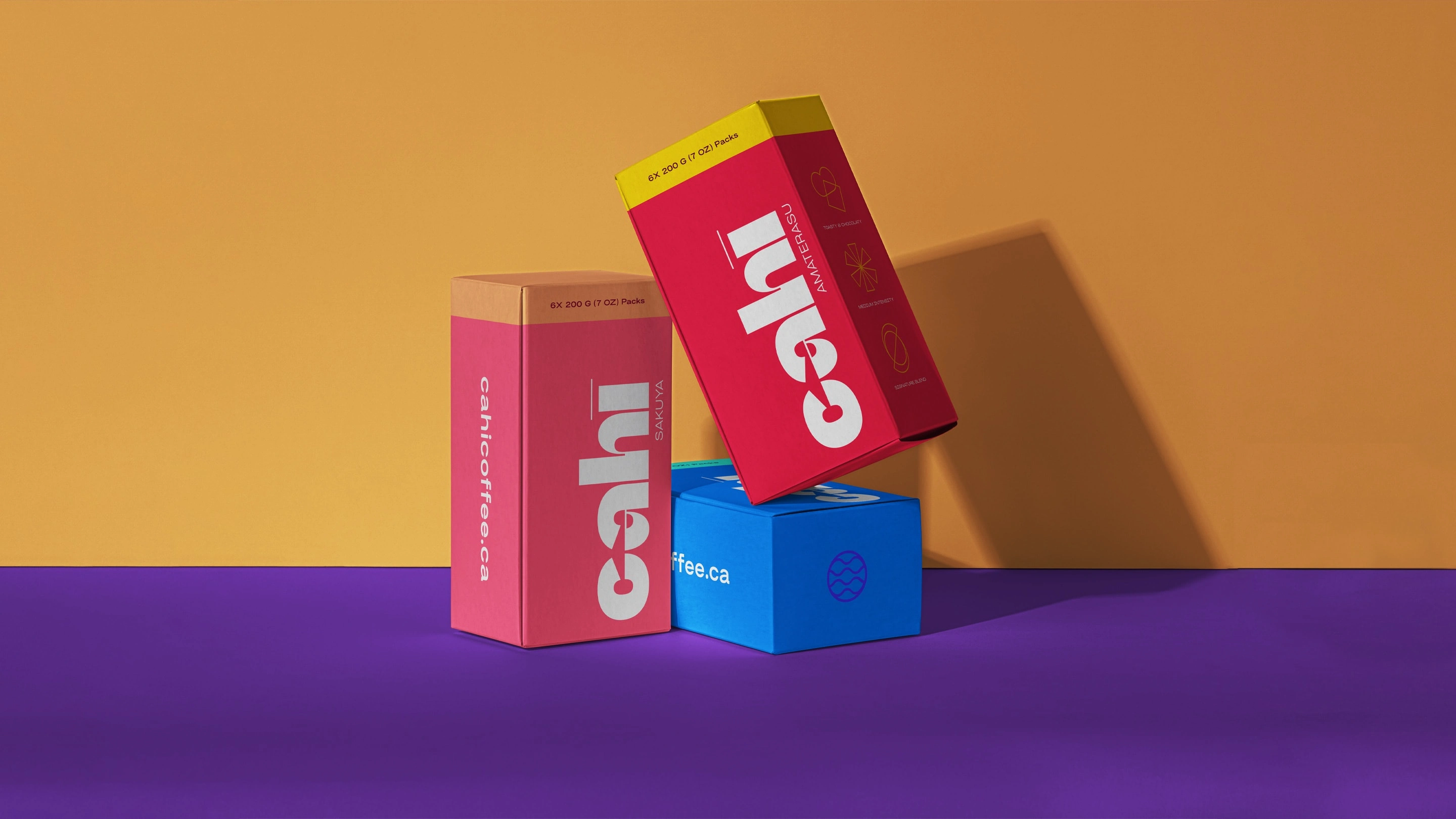
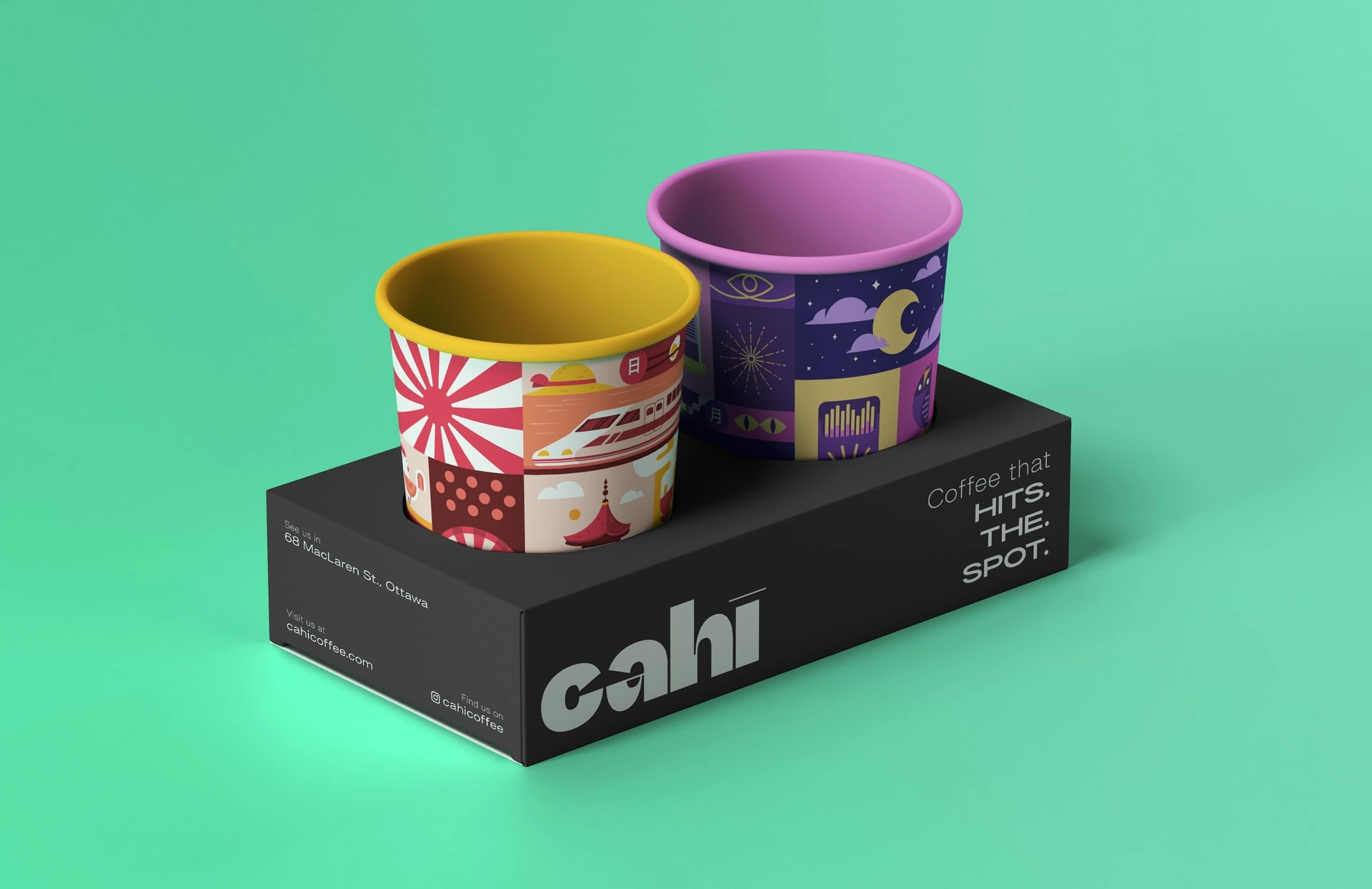
For those who like to stock up, there's a simple yet stylish box design for the 6-pack of ground coffee beans. Plus, the coffee cups are dressed to impress, with illustrations wrapping around them so you can take a piece of artwork with you wherever you go.
Like this project
Posted Apr 25, 2024
Born from the simple idea of treating coffee as a culinary art, Cahī is a newly founded coffee roasting brand based in the city of Ottawa, CA.


