Fintech Product Design
TLDR
I designed a project management app with a dashboard and step-by-step wizard that won NCR Voyix as a new client and brought in hundreds of thousands in revenue.
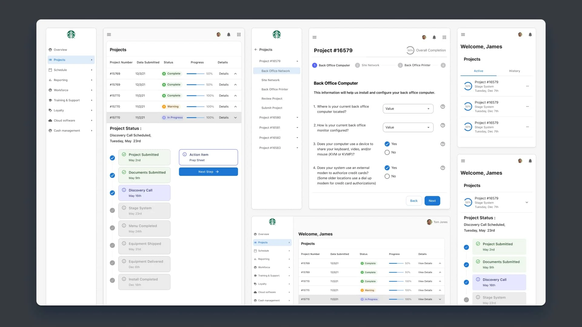
The final dashboard across breakpoints.
Project Overview
NCR VOYIX had the monumental task of updating hardware at thousands of locations across the US. Their current project management tool for these projects was outdated and lacked key functionality for PM's and Retail owners.
Before we could sign NCR as a client we had to deliver a working proof of concept to show them how we could solve their problem.
We designed a project management app that streamlined the hardware refresh process by introducing a Status Dashboard and Wizard interface, improving how project managers and retail owners handled site information.
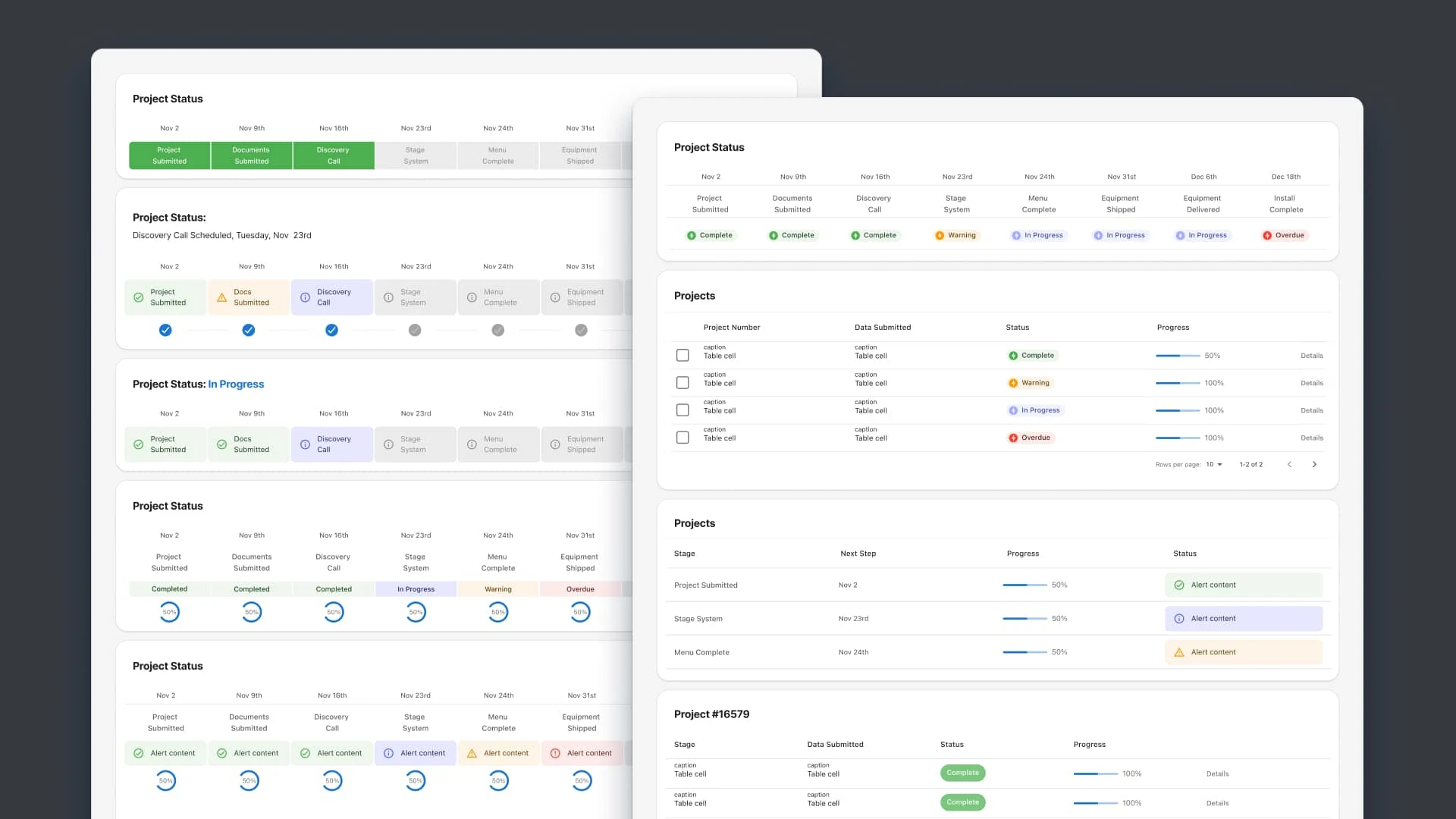
Iterations of dashboard designs.
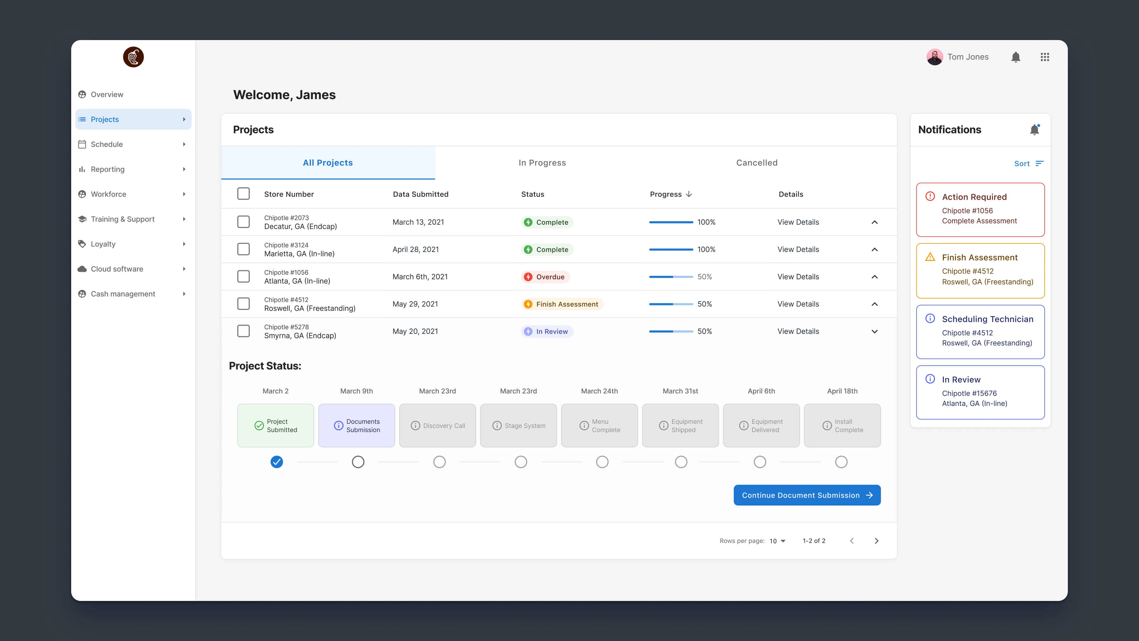
Final layouts for the dashbaord.
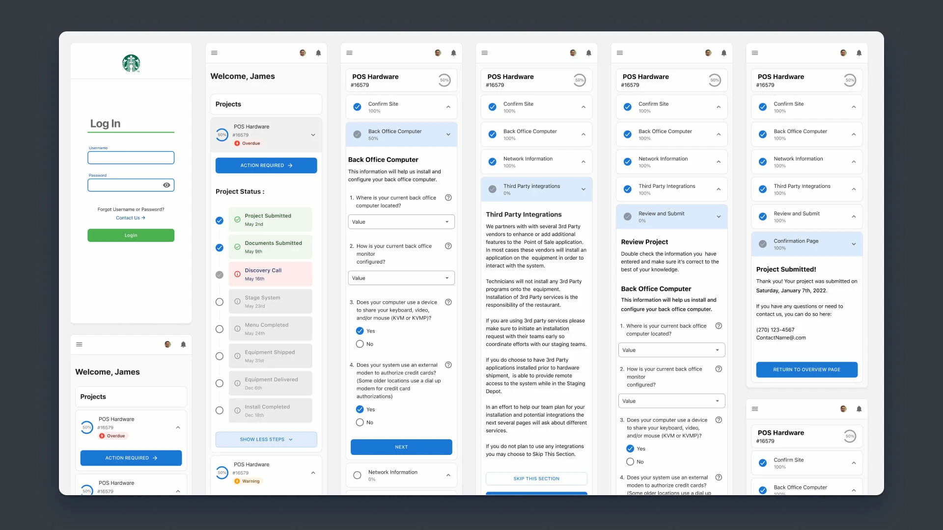
Final layout of mobile breakpoints.
Challenges
NCR’s project managers struggled to track and manage hundreds of simultaneous hardware refresh projects using an outdated legacy app.
The manual process required frequent phone calls and site visits, leading to inefficiencies and data inconsistencies.
A user-friendly solution was necessary to help project managers streamline operations and support retail locations in submitting site information.
The Goal
Create a user-friendly project management solution that lets project managers and retail owners track and manage hardware refresh projects.
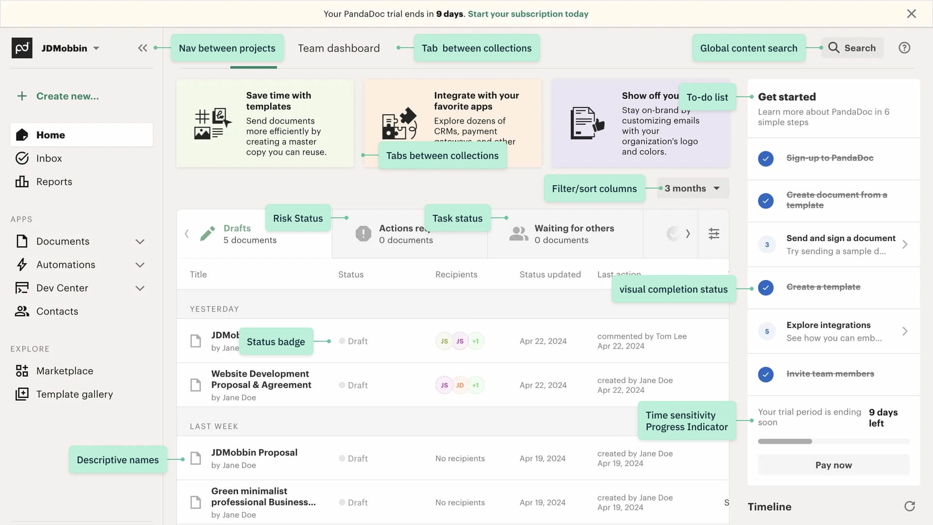
We researched and noted existing patterns for dashboards.
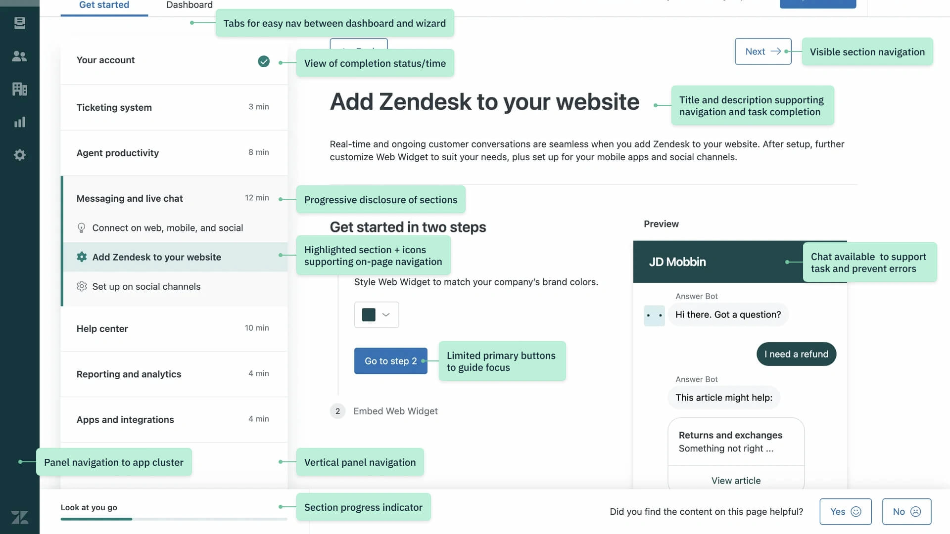
And did the same for Step-by-Step Wizards.
Solution
Working with NCR's MUI Design System, I designed the interface with the product managers.
We researched common dashboard and wizard patterns, designed a rough idea, and refined it as quickly as possible.
This included building responsive breakpoints for the project dashboard and a step-by-step flow for on-site information.
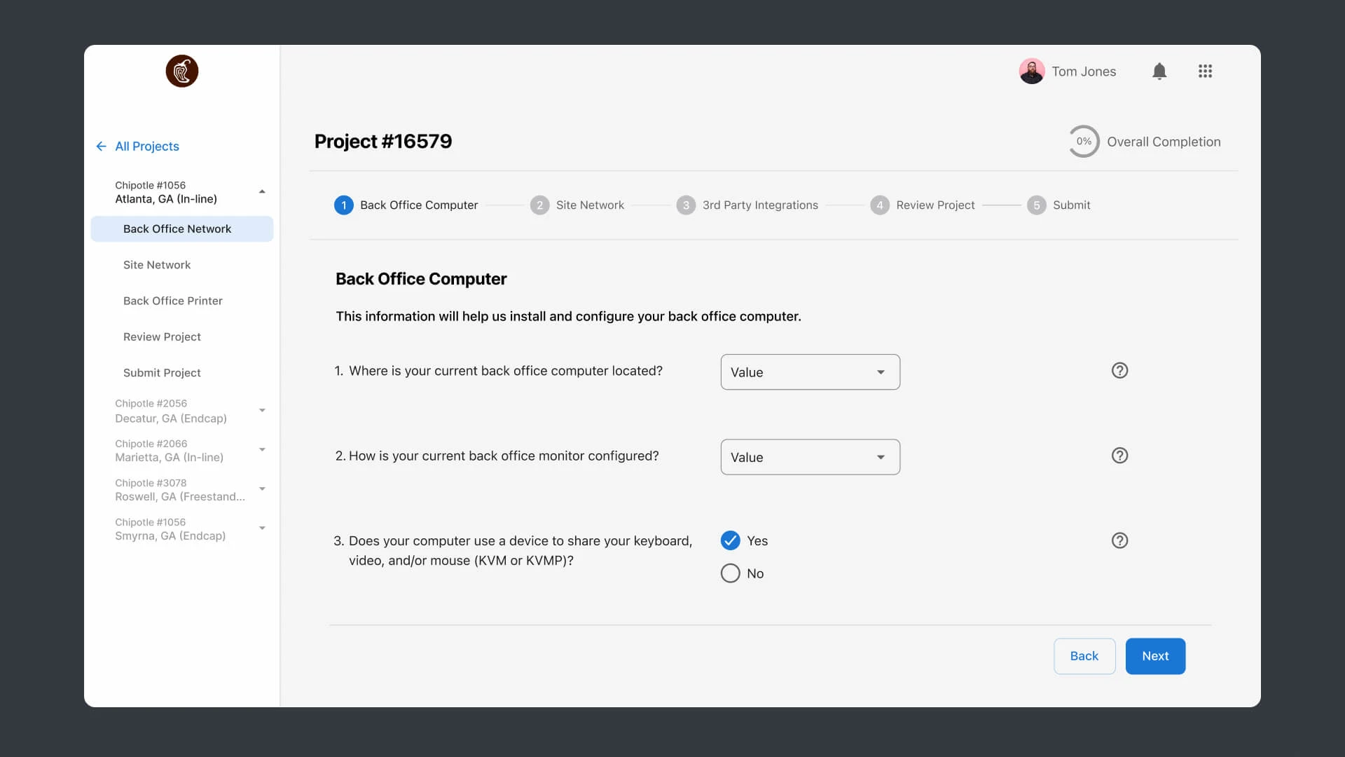
The PoC design for the step-by-step wizard UI
Key Results
This PoC landed the company's first Digital Engineering project and brought in hundreds of thousands in revenue from this project and the projects that followed.
The UI was clear but information-rich Status Dashboard gave project managers a high-level overview of ongoing and completed projects, showing real-time data through Progress Trackers.
A Wizard interface guided retail owners through a simplified process to submit site-specific information, with info tips when needed to provide support.
The interface was built with Responsive Breakpoints to ensure usability on desktop, tablet, and mobile devices.
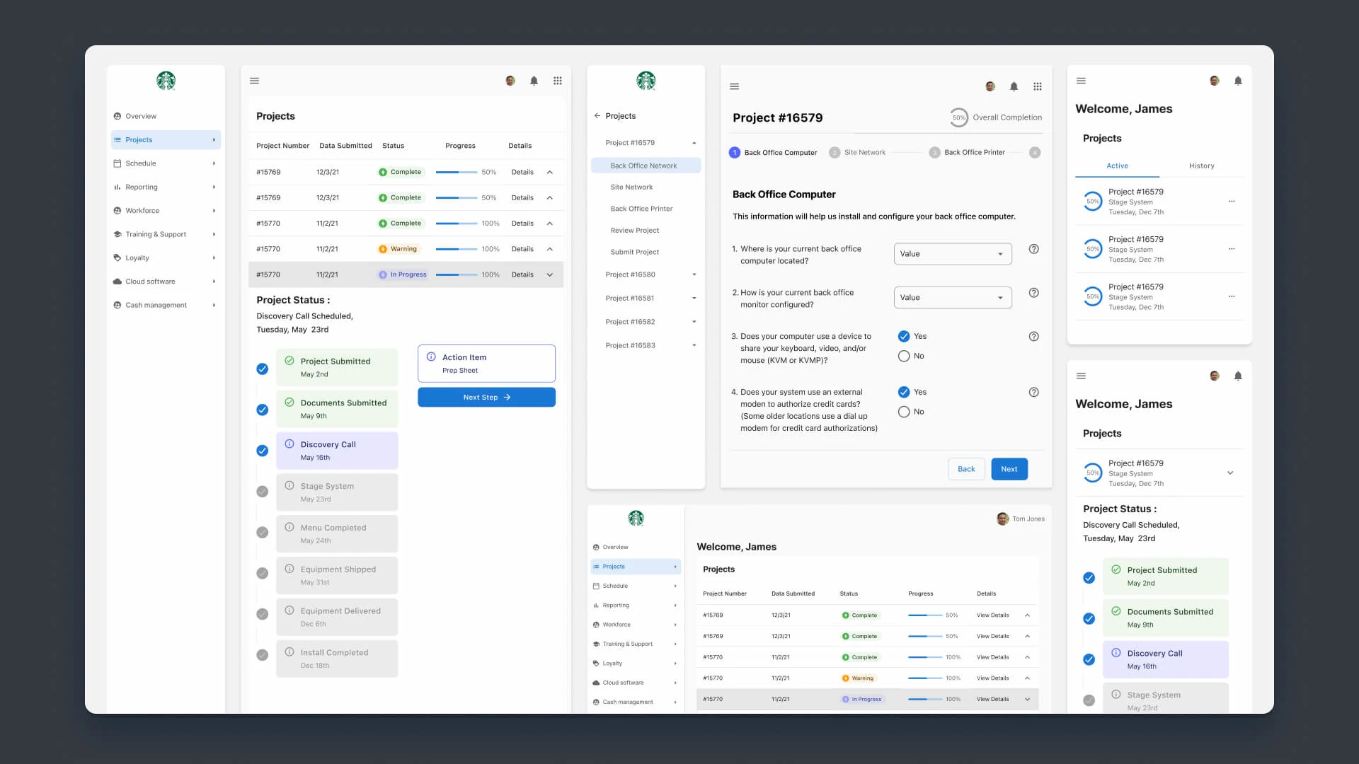
Final breakpoints and components.

Dashboard and Wizard layouts on mobile.
Like this project
Posted Sep 13, 2024
With customers nationwide, NCR needed a product to upgrade hardware at thousands of locations. I used NCR's MUI Design System to create a Status Dashboard.

