Stand 8 Rebrand & Website Design
Project Overview
As part of a cross-functional team at STAND 8, I led the UX Design of the company’s website and sales material to ensure it aligned with user needs and business goals.
Our team included copywriters, developers, a senior visual designer, and a product manager.
I advocated for Human-Centered Design carrying out User Research, Prototyping, Testing, and Accessibility improvements.
The result was a website that would grow our business.
Challenge
We needed to change our clients' perceptions of Stand 8. Historically, we had done staffing and we were good at it. That was our brand identity.
We needed them to see and choose us as a managed service provider. That would take some work.
How do clients approach vendor selection? What do they expect from top IT service providers? How can we meet and exceed those expectations?
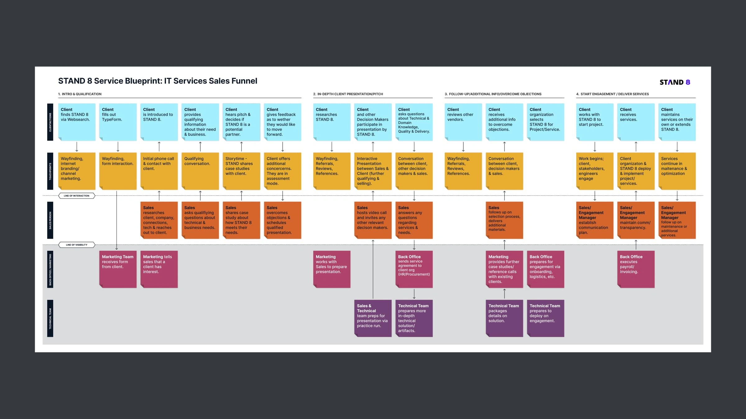
The service blueprint was helpful for team members unfamiliar with the space.
The Goal
Redesign the STAND 8 website and sales materials to align with IT decision-makers' mental models, and improve content accessibility, navigation, and brand differentiation.
Process
I utilized human-centered design methods to ensure that user needs were central.
These methods included restructuring navigation & layouts, creating low-fidelity sketches and wireframes to explore designs, and designing high-fidelity prototypes using Figma to test and iterate.
I worked with developers to provide detailed design specs and interaction models. I also entered and updated content via Contentful CMS to ensure seamless transitions between content design and implementation.
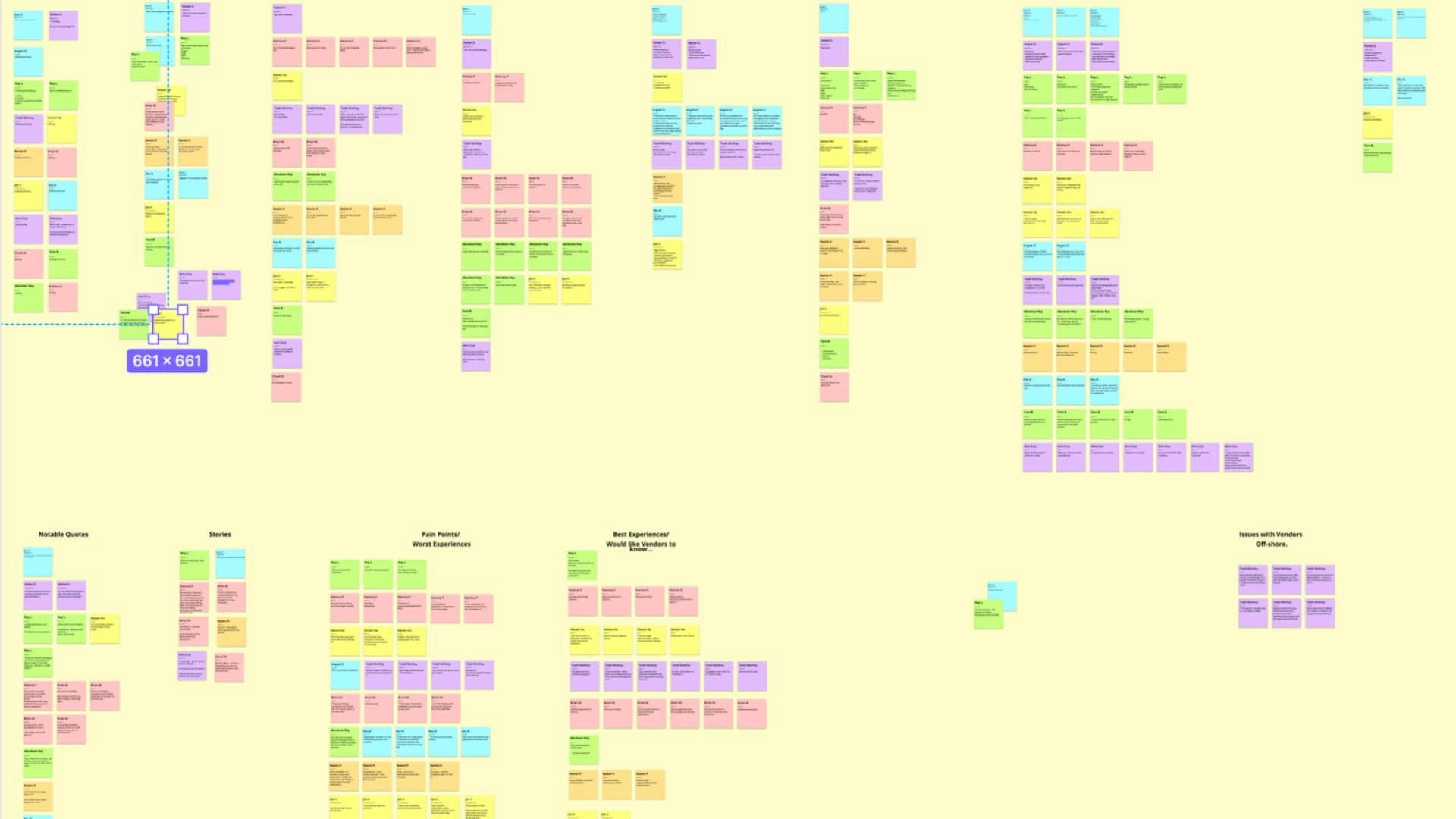
We performed contextual inquiry to understand how IT executives experience vendor selection.
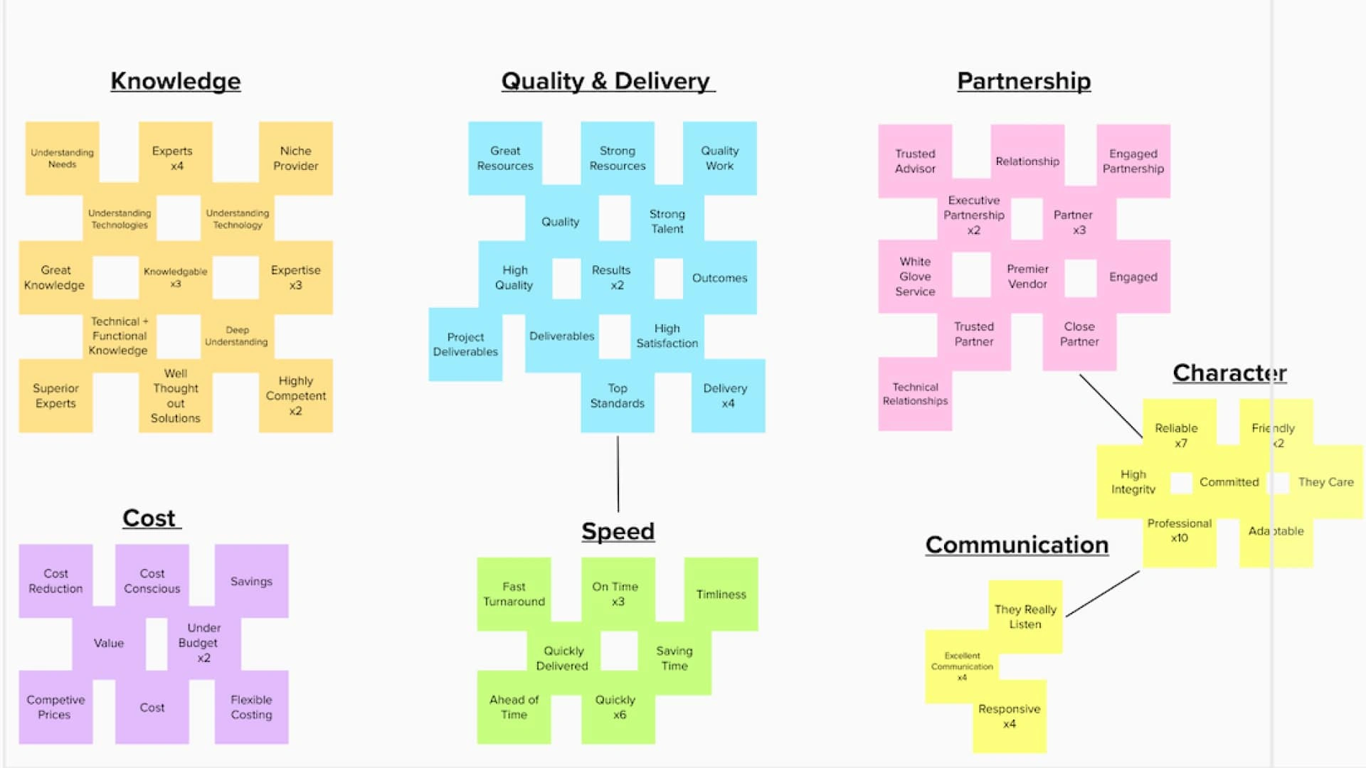
Then affinity-mapped the core themes that were important to them.
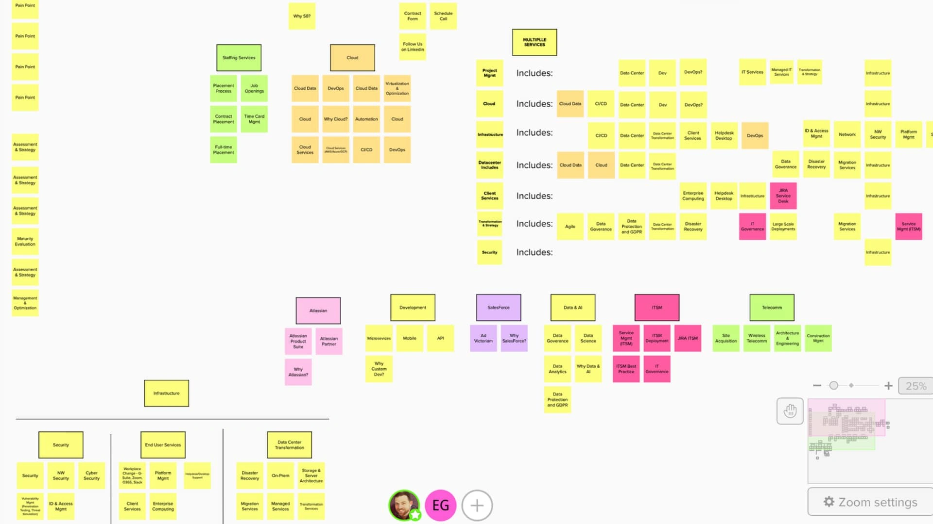
We tested out different information architectures in Miro.
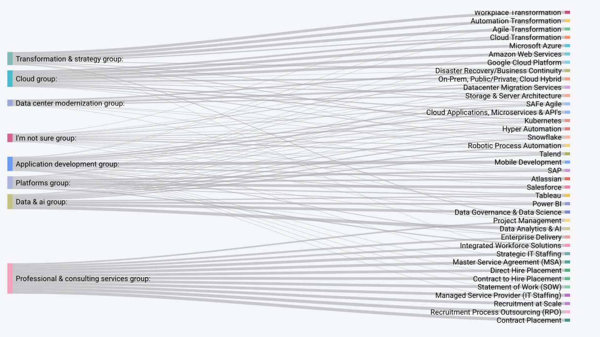
We asked executives to sort IT services into groups.
Solution
The redesigned site featured an intuitive navigation structure supported by clear content hierarchies and interactive elements to guide users through our content. This came directly from card sorts that revealed how most executive group services.
I made prototypes for micro-interactions to give our site a consistent look and feel.
We also made significant improvements in accessibility by conducting an audit against WCAG 2.2 standards and recommending changes for an inclusive user experience.
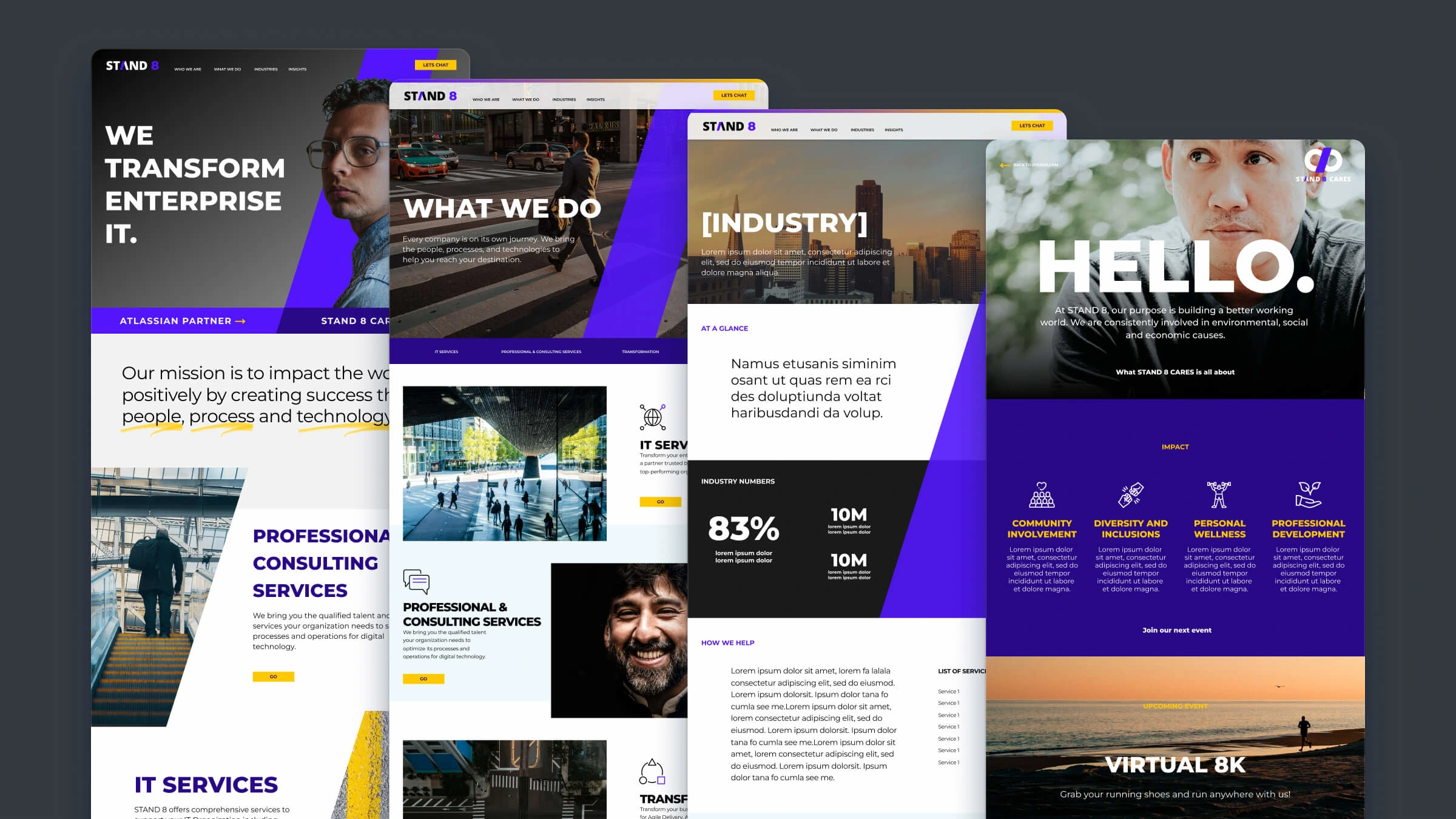
Intial layouts from out senior designer backed by our research.
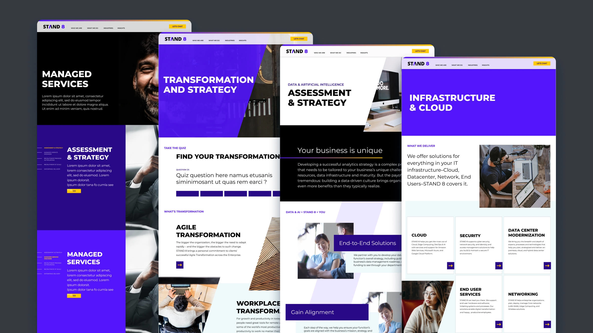
Further interations for different page types.
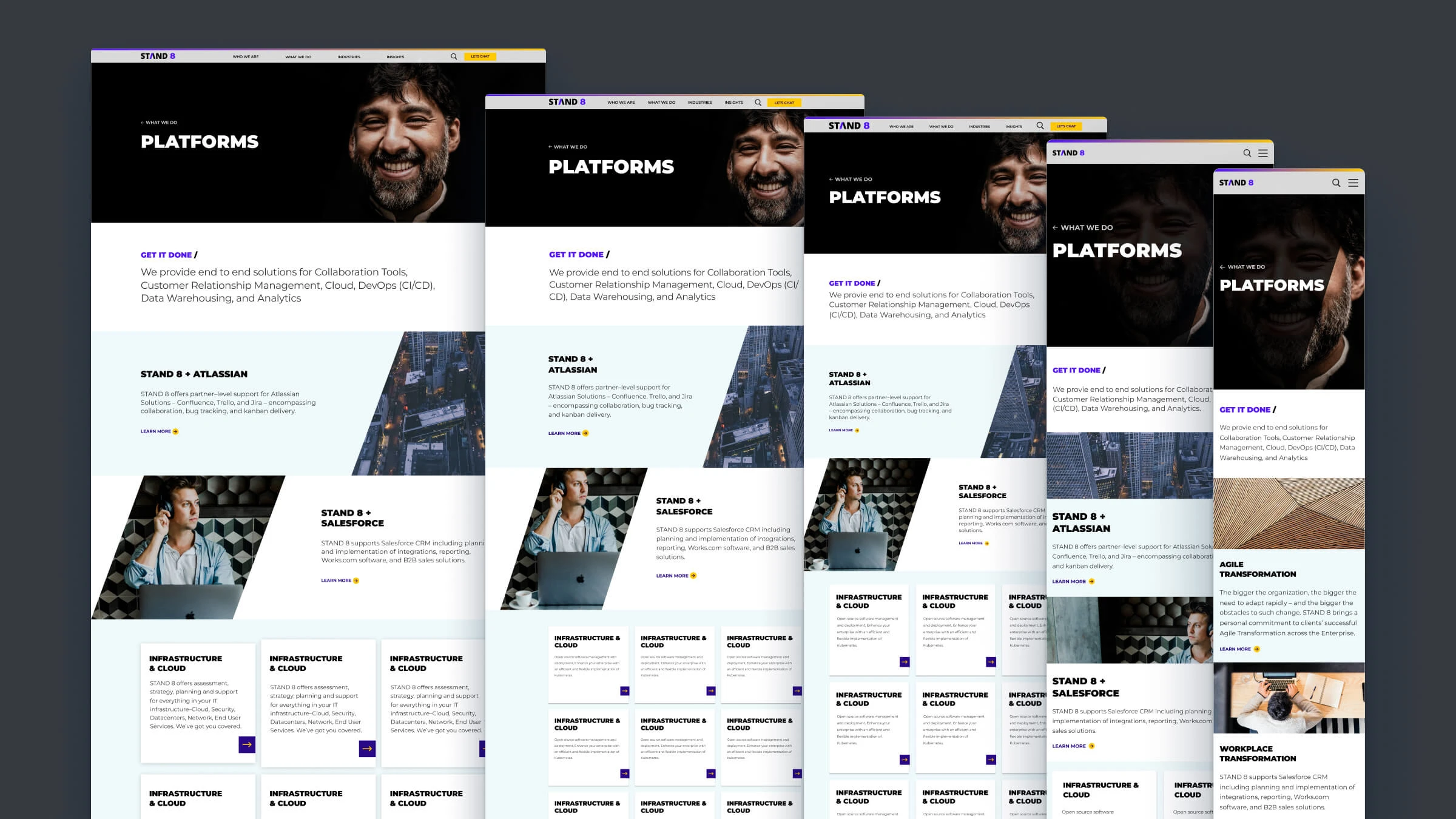
Final design for Platforms page that turned out especially well with restricted use of color.
Results
We delivered a website and brand identity that better reflected Stand 8's strengths and supported its aspirations.
We streamlined content & navigation via card sorts, achieved stronger brand differentiation through analyzing client testimonials, improved accessibility, and delivered an overall better user experience than we had previously.
This was a great foundation on which we could build content and case studies to grow the Stand 8 brand further.
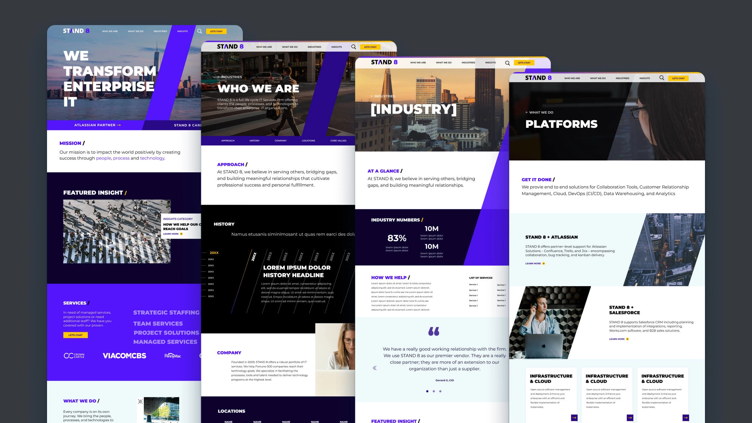
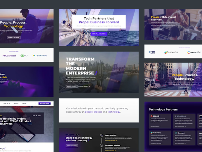
Final designs for top-level navigation pages.
Like this project
Posted Sep 18, 2024
Led the redesign of STAND 8’s website and sales material, enhancing user experience, accessibility, and brand differentiation.

