Scott Banks | UX Designer | Carter’s Digital Transformation
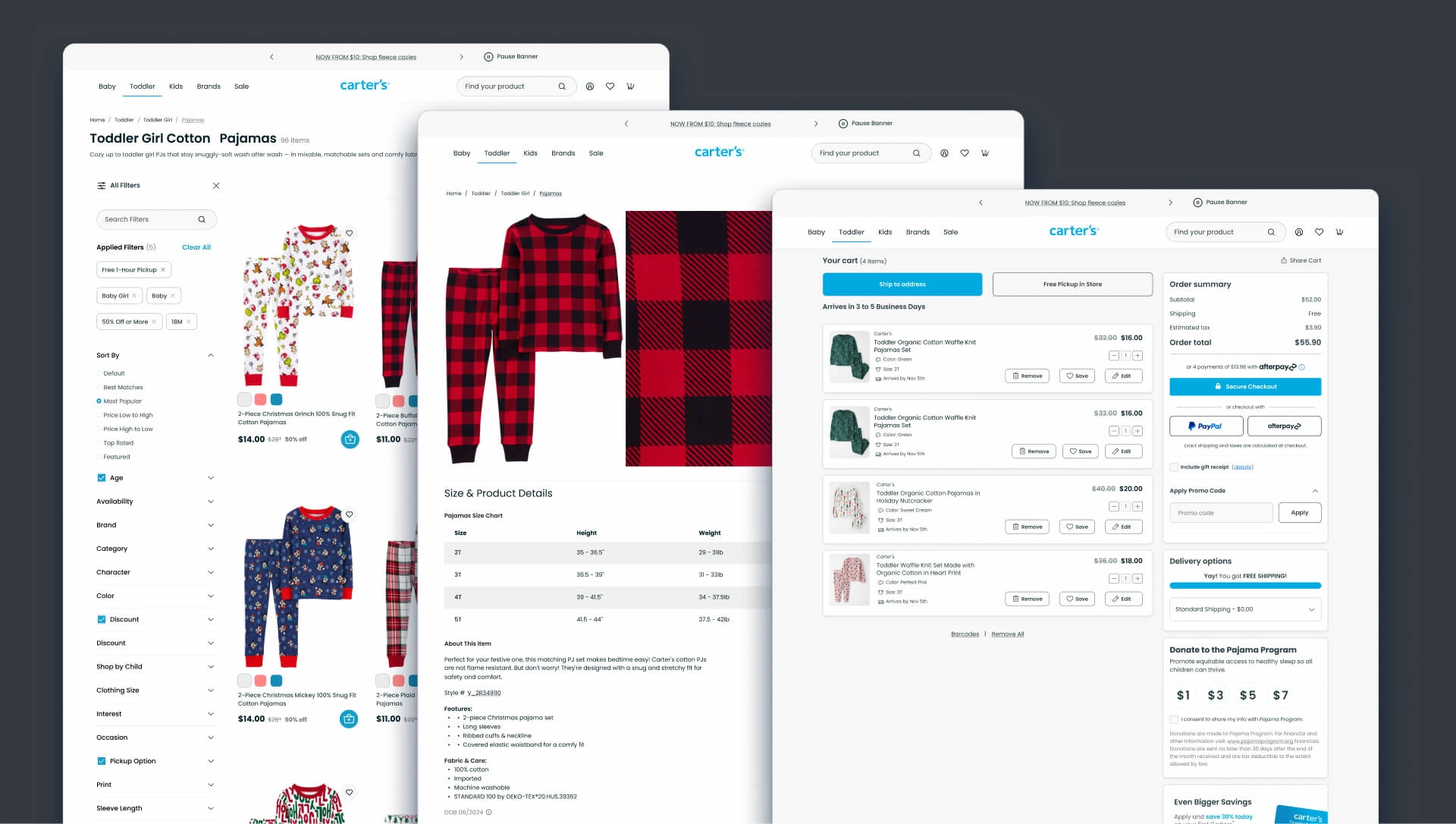
Final layouts for catalog, product, and cart pages.
Project Overview
Carter’s, a leading brand in children's apparel, needed an online experience that would match its value and meet evolving user expectations.
This unsolicited redesign focused on improving usability, optimizing the online shopping journey, and establishing a cohesive visual system to drive engagement and revenue.
The end result is an intuitive user journey that supports parents, family, and caregivers in their need to buy fashionable, quality clothes that withstand to the rigors of childhood.
Problem
Carter’s existing website had UX challenges that negatively impacted the user journey and potential revenue. Key problems include:
Inconsistent colors, UI components, and layouts added friction to the shopping experience.
Users faced difficulties in navigating the catalog and completing purchases due to a disjointed layout and inefficient cart experience.
Competitors like Children’s Place and Nike offer smoother, more intuitive online shopping experiences, setting a high standard for UX that Carter’s was not meeting.
Fixing these problems would keep loyal customers shopping at Carters and away from competitors.
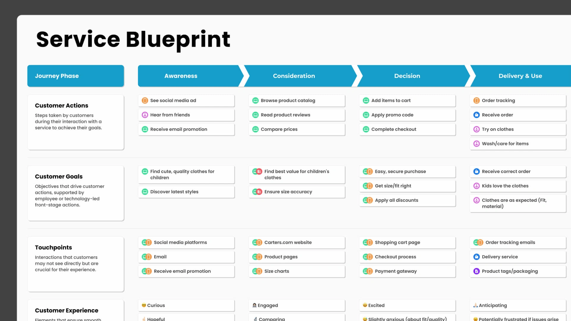
Service blueprint focused on customer goals.
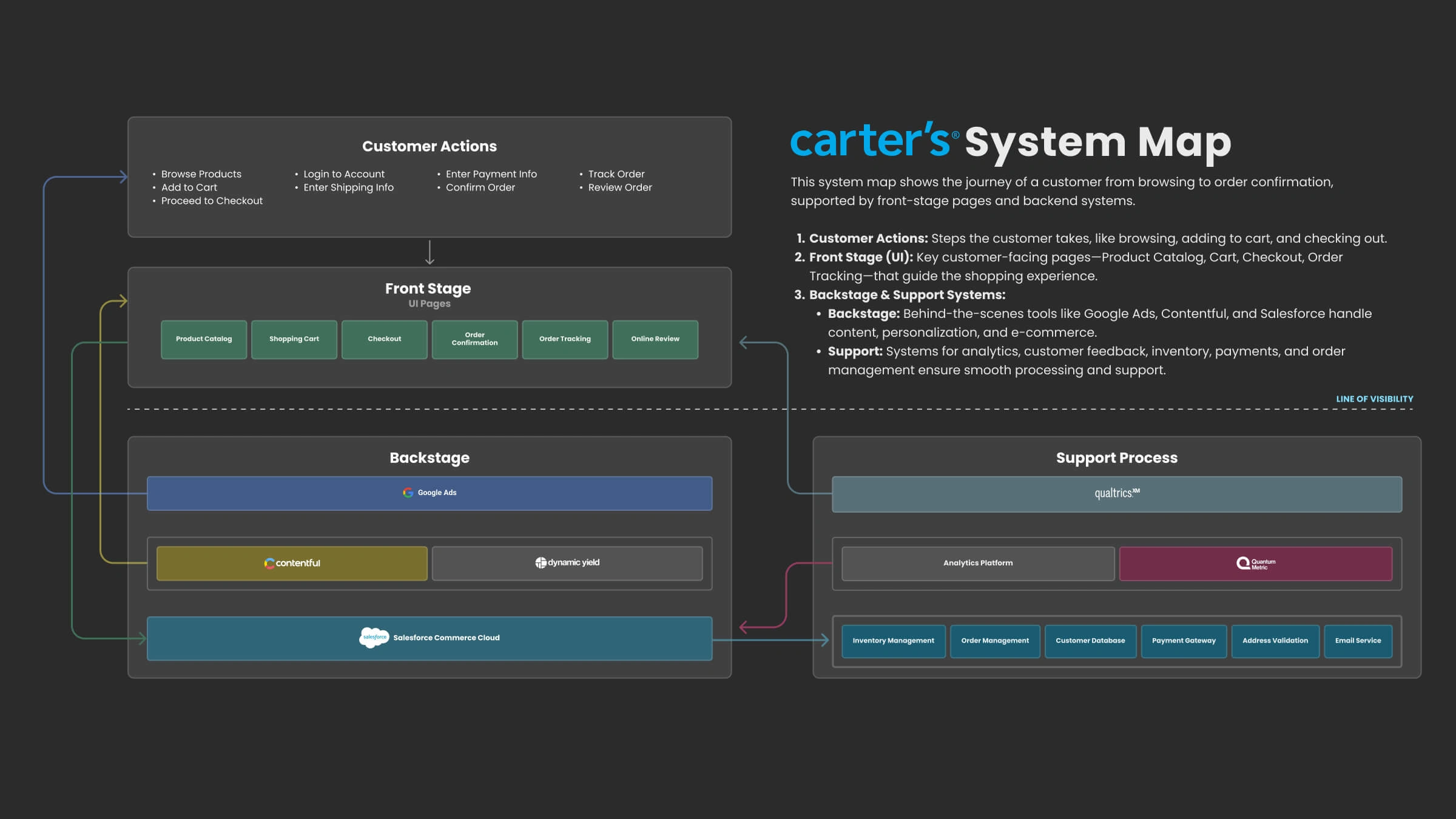
System map of Carters technology and tools.
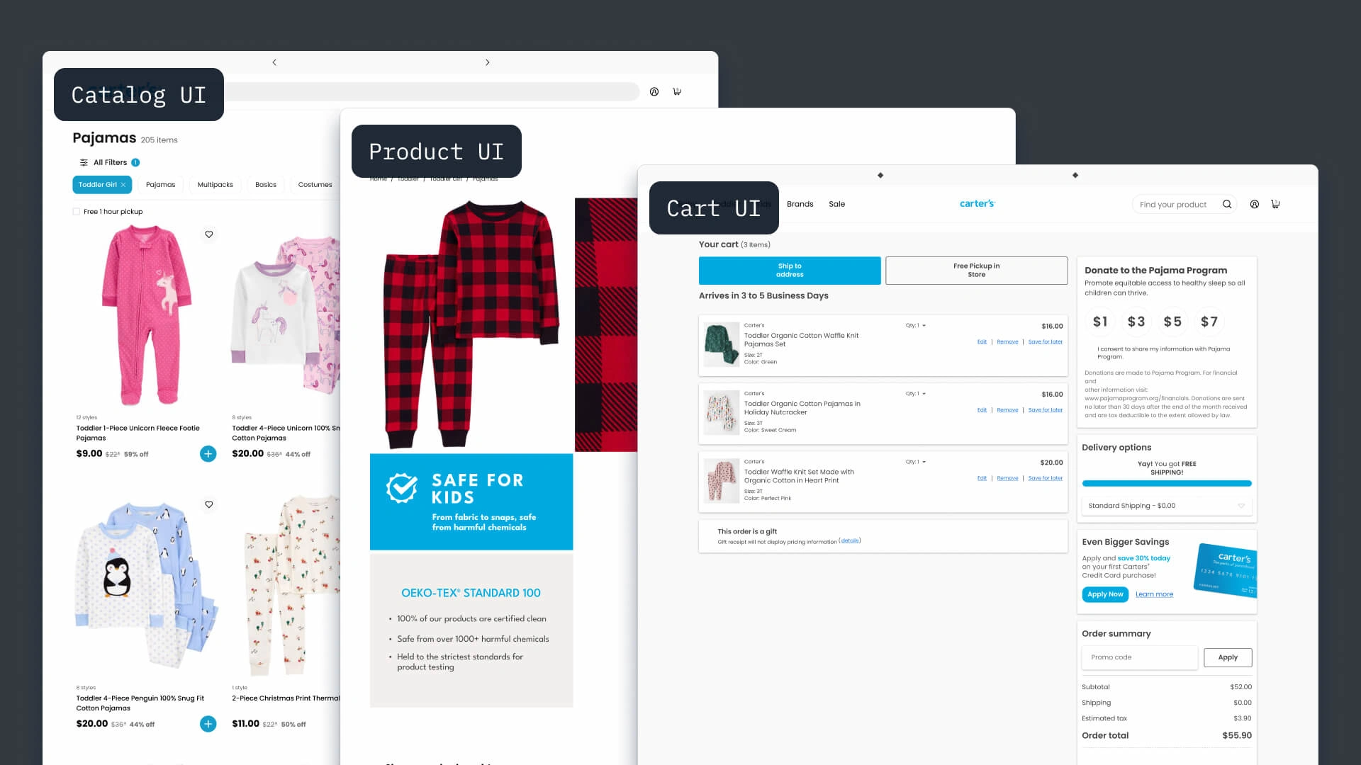
Initial designs for catalog, product, and cart pages.
Research
With customer goals in mind, I analyzed sites like Children's Place, Nike, and REI, looking at their product catalog, product, cart, and checkout pages. I noted patterns that would support Carter's shoppers' goals.
In my analysis I focused on understanding key user goals; ease of navigation, quick access to product details, and seamless checkout. Each site achieves these in similar but different ways.
The research insights I discovered guided future decisions on layout, interactions, and component design to ensure the final experience aligned with the needs and expectations of Carter’s users.
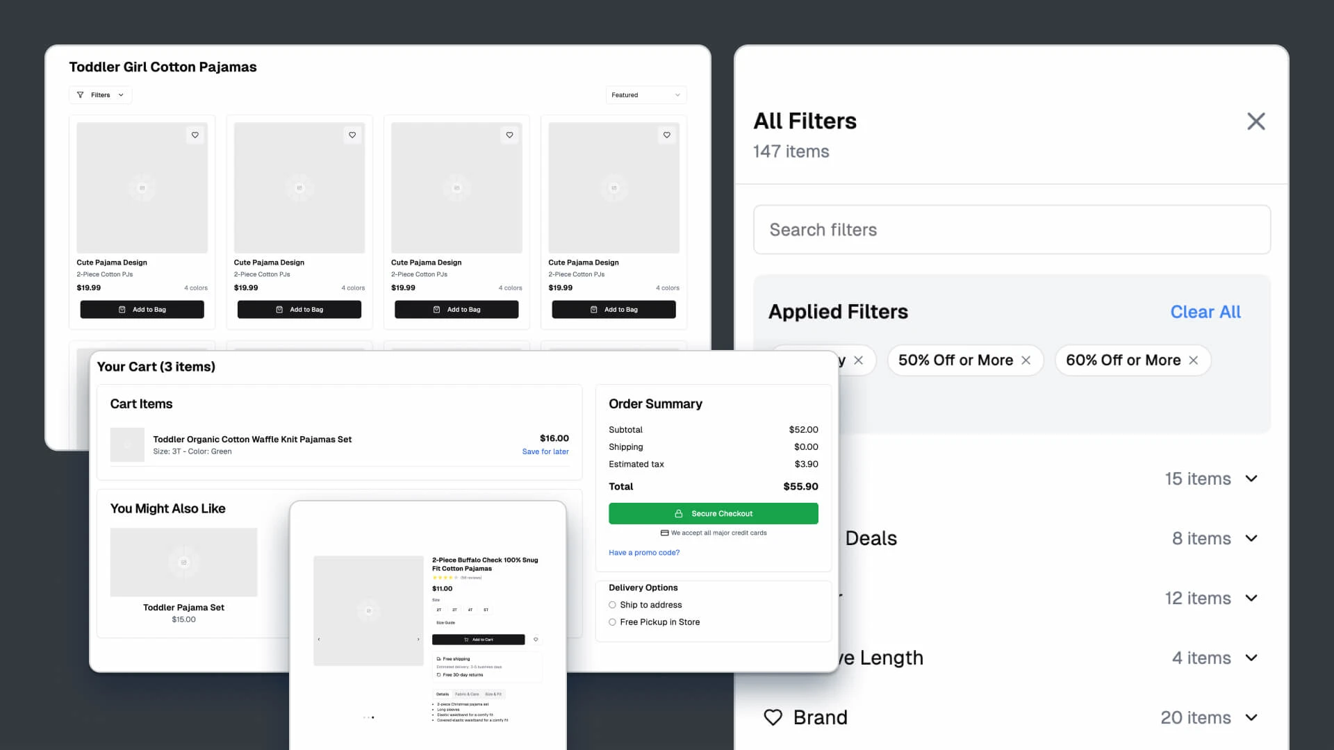
Ideation for components in v0.
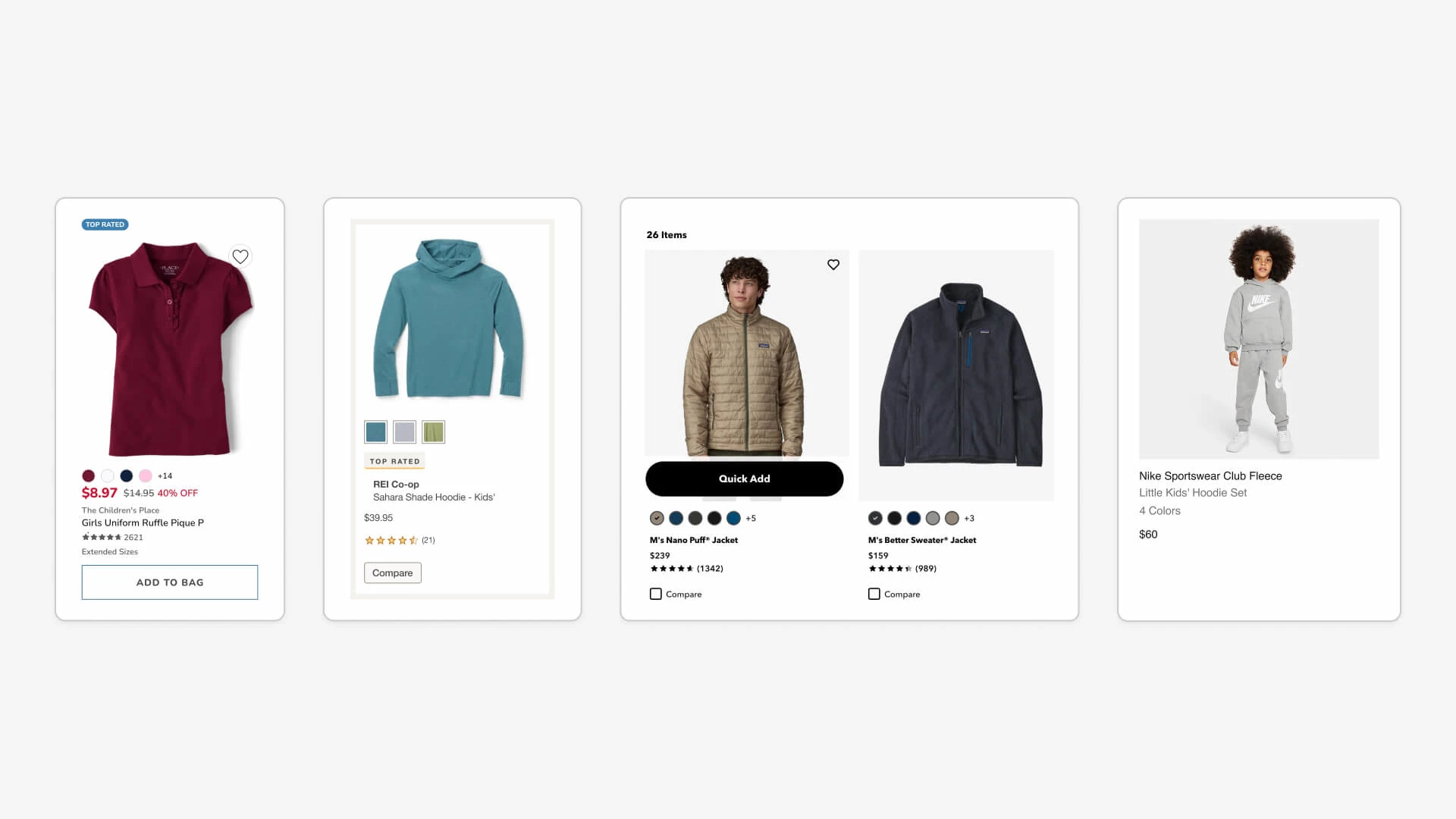
Research and analysis of competitor cards.
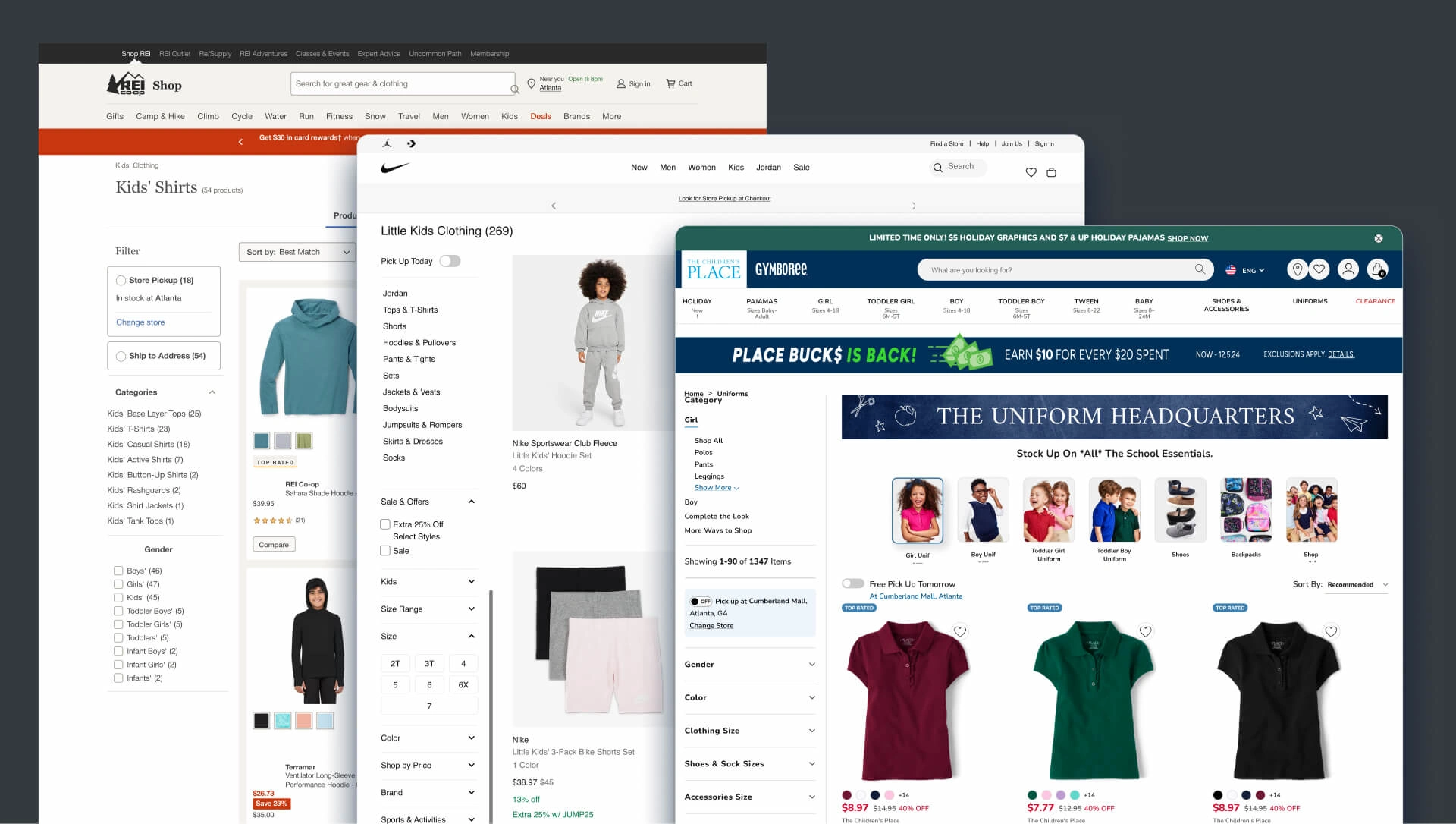
Research of competior pages.
Process
The redesign process began with collaborative brainstorming using Vercel v0 to explore ideas for improved performance and layout. In 30 seconds I was off and running. I took these and started playing with them.
I performed design linting to identify and correct inconsistencies in UI components, then standardized colors and elements to create a cohesive design system.
Prototypes of key pages—product catalog, product pages, and cart—were tested and refined iteratively, ensuring alignment with both business goals and user needs.
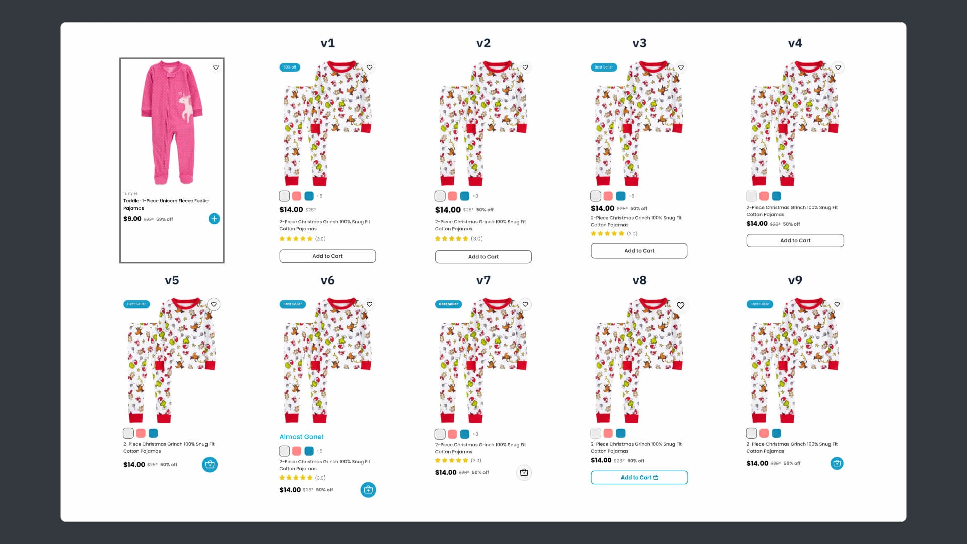
Iterations for product cards.
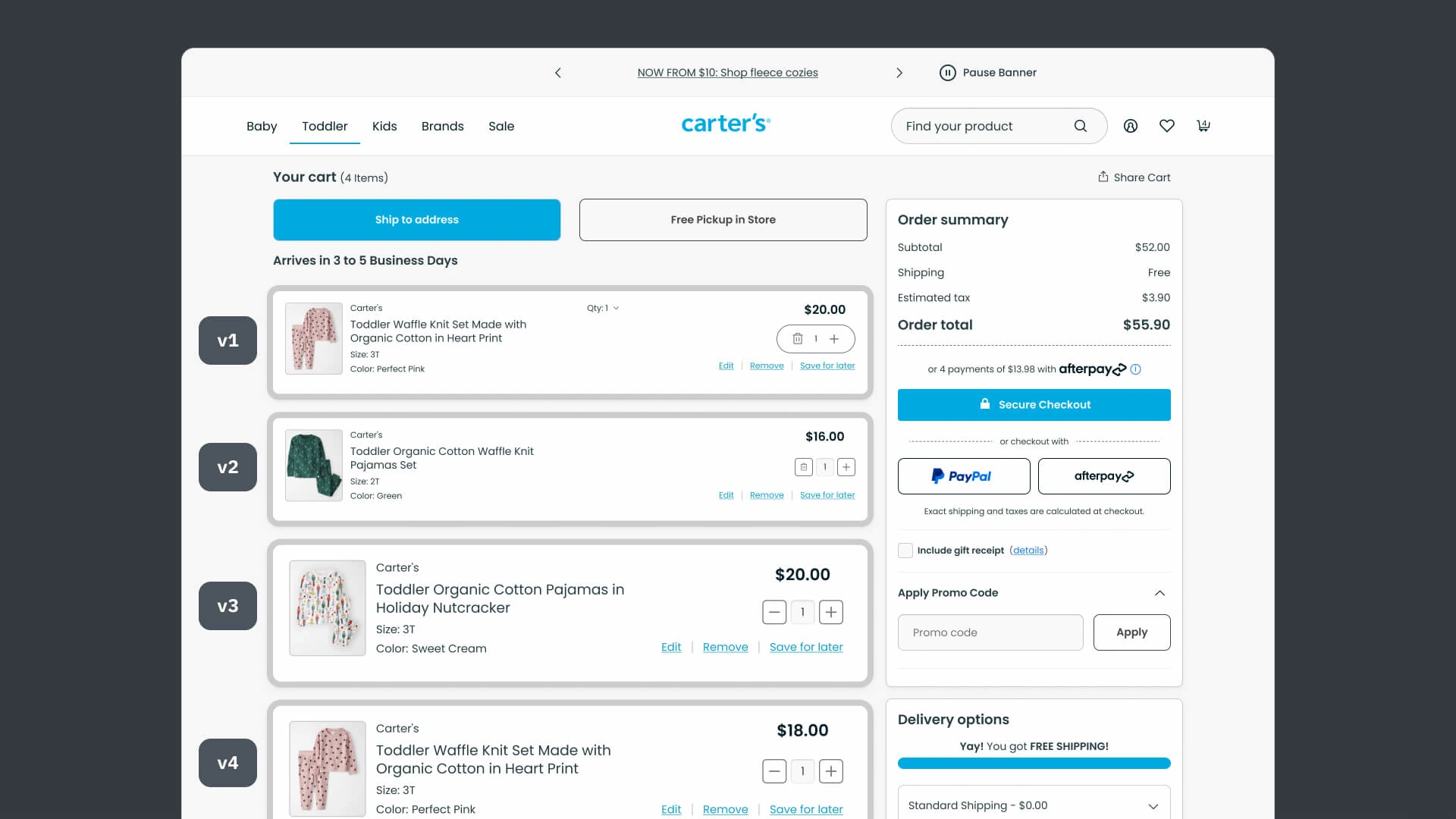
Iterations for cards on the cart page.
Solution
The final design introduced a streamlined, visually consistent e-commerce experience.
Key improvements included an optimized product catalog and card layout for easier scanning, a simplified product-to-checkout flow to reduce cart abandonment, and standardized UI elements to enhance brand credibility and usability.
These design decisions were made by keeping real people in mind. Tired parents, grandparents with different paradigms for technology, and other caregivers want stylish clothes for children that are easy to find, a good value, and easy to buy.
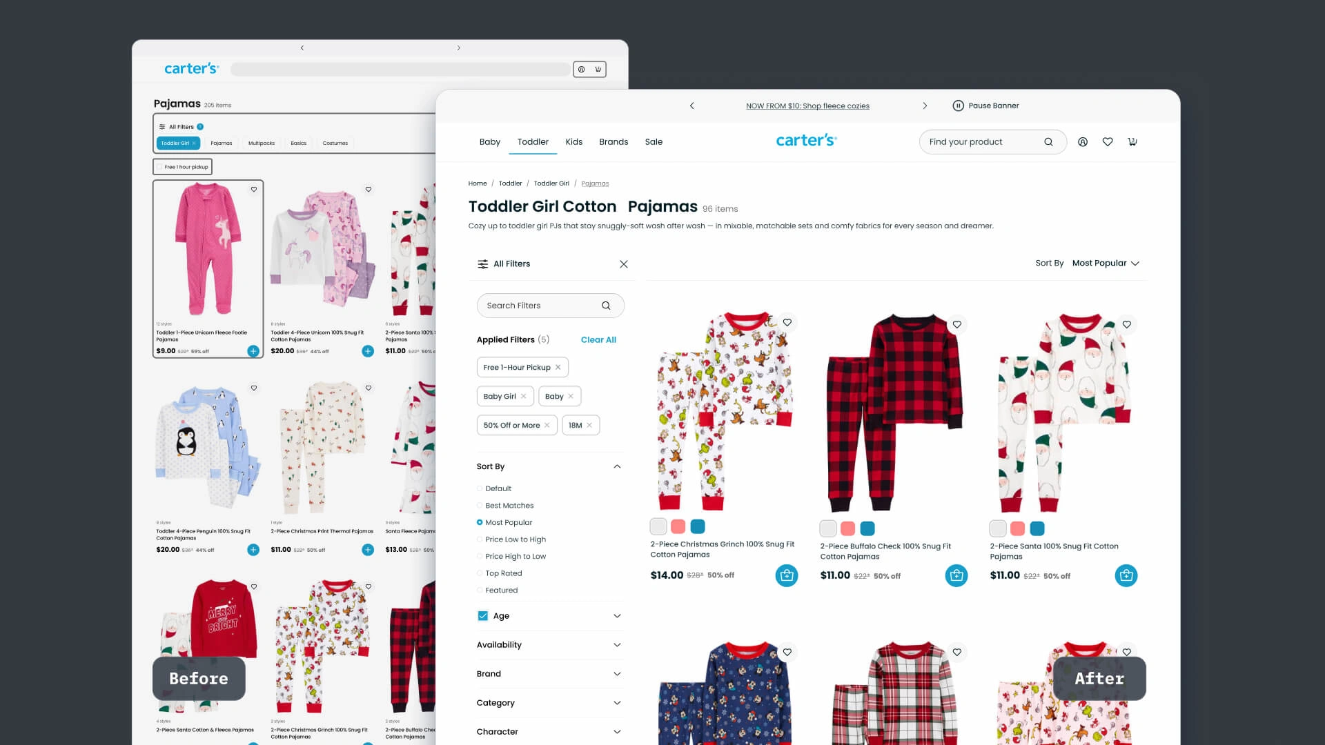
Improved design for the catalog page.
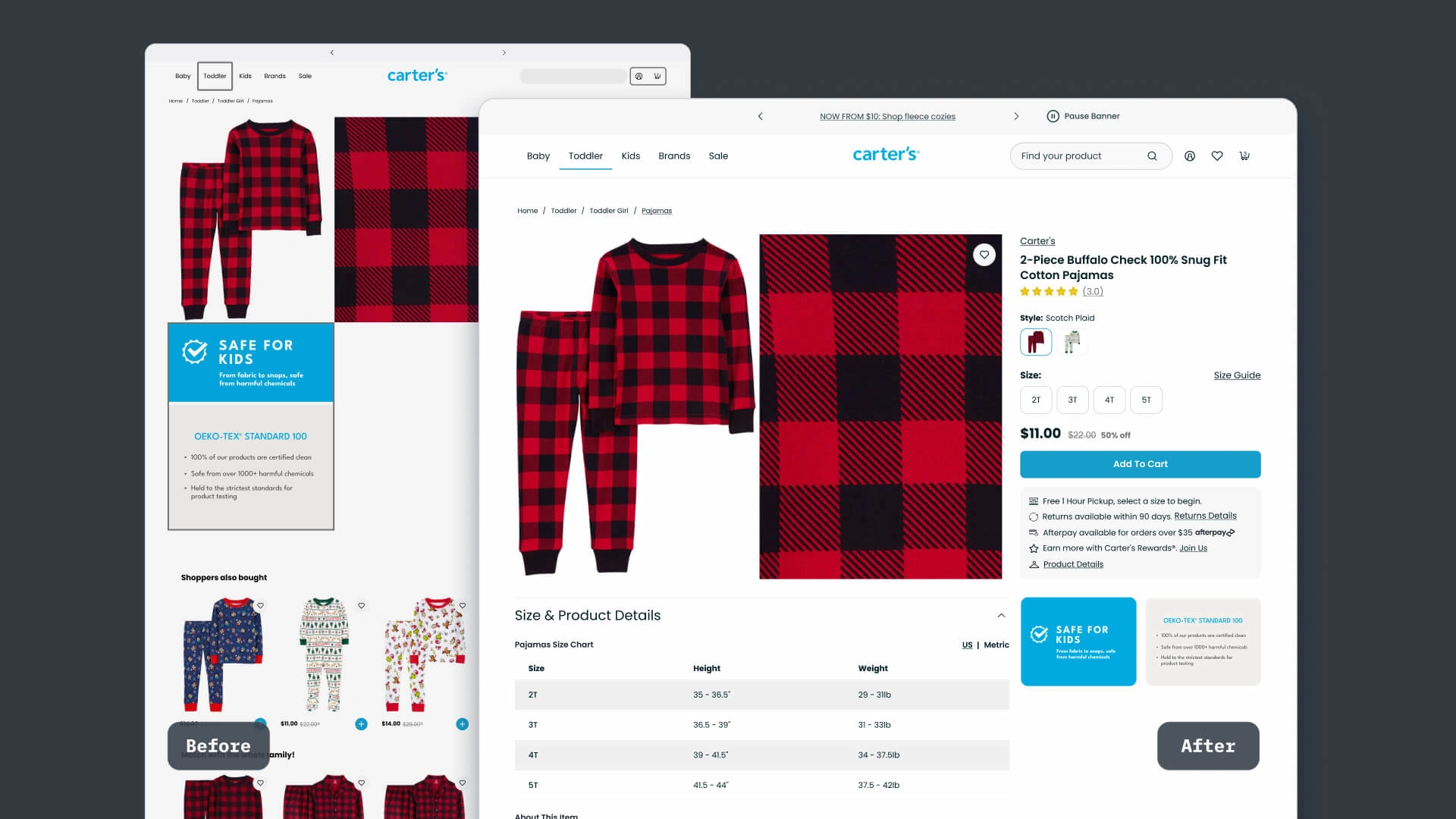
Improved design for the product page.
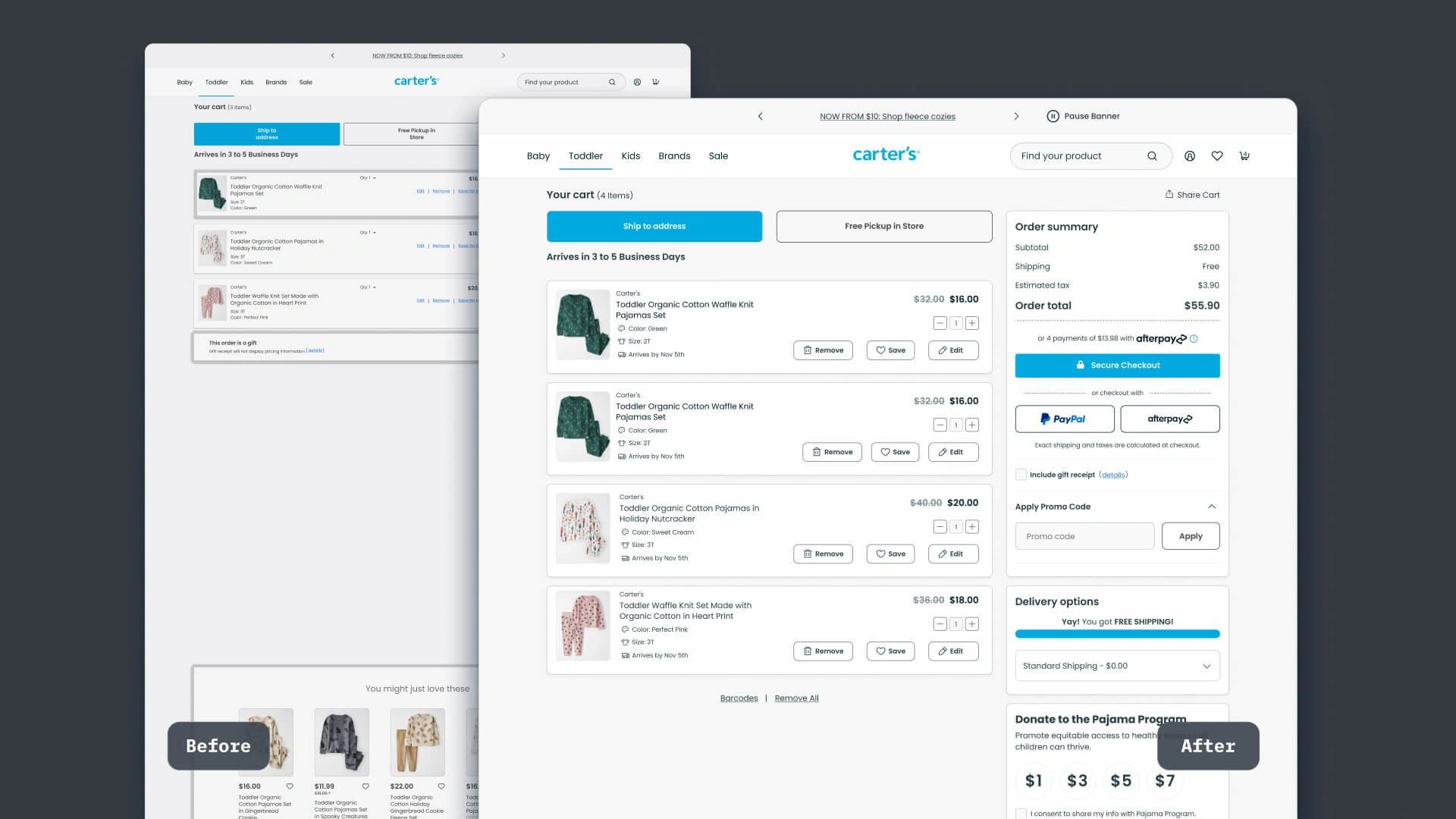
Improved design for the cart page.
Results
This redesign enhances Carter’s online shopping experience, leading to an anticipated increase in conversion rates and customer satisfaction.
This is only a starting point. Carter's internal analytics tools for measuring UX can further improve these interfaces.
These user-centered improvements position Carter’s as a stronger competitor in the digital retail space.
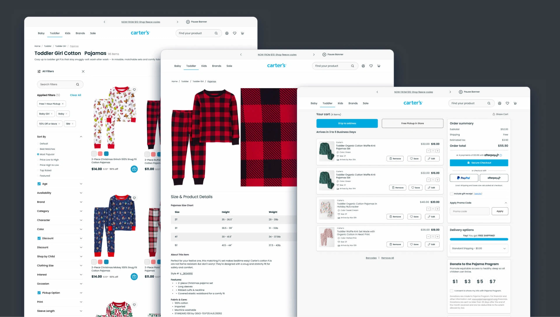
Final designs for product catalog, product, and cart pages.
Like this project
Posted Nov 16, 2024
Discover how a UX-focused redesign of Carter’s website improved user experience, increased conversion rates, and reduced operational costs.
Likes
0
Views
13

