Strategic Pitch Deck & Presentation Designs
Farida Amin
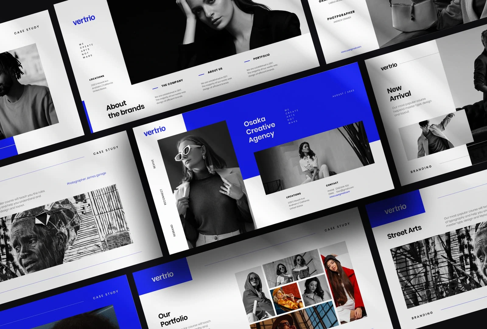
CASE STUDY: Vertrio – Branding Sophistication in Monochrome
Client Overview: Vertrio is a boutique creative agency specializing in strategy, storytelling, and digital experiences for forward-thinking fashion and culture brands. Despite their exceptional client work, their own branding lacked the sophistication, authority, and design clarity expected in their market niche.
The Challenge: The primary challenge was to craft a high-impact visual identity that reflected Vertrio’s editorial edge and global ambitions. The brand had to strike a delicate balance: bold yet timeless, premium yet experimental. It needed to speak directly to creative directors, luxury strategists, and fashion houses across international markets.
Our Vision: To establish Vertrio as a modern authority, we envisioned a brand system rooted in monochromatic elegance, enhanced with striking contrast and precision. The identity had to perform across multiple touchpoints—from pitch decks to case studies, social media content to in-person proposals—without losing its core DNA.
Design Strategy & Execution:
1. Visual Identity System 🌈
Grid-Driven Layouts: We implemented modular grid systems that conveyed structure and clarity, signaling Vertrio’s commitment to strategic thinking.
Black & White Photography: Carefully curated imagery exuded quality, depth, and a timeless editorial aesthetic, allowing the work to speak louder than the brand.
Signature Royal Blue Accents: Introduced as the singular color pop to create brand recognition across decks, social assets, and web elements.
2. Typography & Logo Design 📝
A refined serif paired with a minimalist grotesque typeface created a visual rhythm of authority and modernity.
The custom wordmark retained clean geometry while expressing distinctiveness with subtle modifications to letterforms.
3. Presentation & Deck Design 📄
We created a pitch deck suite with reusable templates designed for storytelling and client persuasion.
Each slide followed the grid logic with asymmetric layouts, editorial spacing, and layered text/image relationships.
4. Digital Experience Design 🚀
Website mockups carried the same sophistication into the digital realm, integrating smooth transitions, scrolling animation, and bold negative space.
Mobile responsiveness was a key priority, ensuring the identity scaled seamlessly across screen sizes.
5. Touchpoint Adaptability 🌐
From business cards to Instagram posts, the identity system scaled effortlessly while maintaining consistent emotional tone.
We designed branded case study templates, an internal pitch strategy kit, and social media launch assets.
The Impact:
Vertrio’s rebrand unlocked powerful shifts in perception:
Elevated perceived value, enabling the agency to pitch confidently to higher-end clientele.
Opened doors to new markets, with increased engagement on digital platforms and stronger proposal conversions.
Created an emotionally resonant presence that matched the caliber of their client work.
Client Quote: "This identity feels like a mirror of where we’re going. For the first time, our visuals reflect our standards. The strategy, design, and storytelling have changed the way we show up in every room."
Design Tools Used ⚖️:
Adobe Illustrator & Photoshop for visual identity
Figma for presentation systems
Adobe InDesign for pitch decks
Webflow (prototype stage) for interactive mockups
Inspiration Sources 🌌:
The understated brilliance of Kinfolk Magazine
The architectural grid logic of Neue Helvetica layouts
The monochrome palettes seen in luxury fashion editorials like SSENSE & Vogue Italia
Final Thought: Branding isn't just visuals, it's presence, posture, and persuasion. Vertrio’s monochrome brand now speaks in a visual language as confident as their ideas. From static decks to dynamic interactions, every detail says: we see the future, and we design it.
Visual Voyage Presentation Design
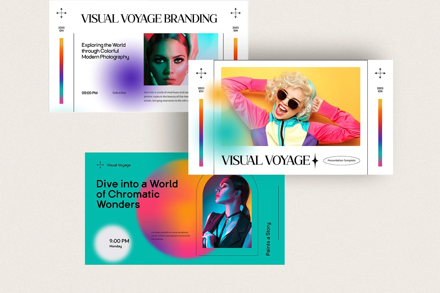
CASE STUDY: Visual Voyage – A Chromatic Brand Narrative
Client Overview: Visual Voyage is a vibrant photography and event brand that celebrates the emotional and experiential power of color. Known for capturing the spirit of modern culture through visual storytelling, they needed an identity that could elevate them from just another event brand to a recognized name in contemporary creative spaces.
The Brand Challenge: Despite a loyal following, Visual Voyage lacked a cohesive brand identity. Their existing materials failed to reflect the emotional depth and richness of their photographic work. The challenge? Develop a brand that not only looked stunning but embodied their philosophy of color as emotion, movement as message, and visuals as voice.
Creative Vision: We set out to create an identity that could serve as a bold visual compass, guiding users through a sensory experience across digital and real-world touchpoints. The design language needed to be playful yet polished, dynamic yet deliberate, emotive yet elevated.
Strategic Design Approach:
1. Color as Identity 🌈
We used duotone portraits and gradient overlays to reflect emotion, mood, and narrative tone.
A custom chromatic system was developed using warm vs. cool palettes to communicate energy levels and story arcs within events.
Every color choice was rooted in color psychology to subconsciously connect viewers with the intended emotion of the visual.
2. Iconography & Visual Markers 🔹
Introduced circular motifs and spiral-inspired elements to symbolize constant creative motion and evolution.
Linear grid systems supported layout harmony while allowing moments of intentional disruption to suggest spontaneity and human presence.
3. Typography with Personality 📑
A pairing of a modern geometric sans-serif with a soft-serif editorial typeface created balance between tech-forward minimalism and emotional expression.
Type treatments included subtle motion transitions in presentations and social assets to reinforce brand dynamism.
4. Branded Touchpoints & Use Cases 🌐
Designed a brand deck that served both as an identity primer and a visual manifesto.
Social templates for Instagram stories, posts, and reels that used color-blocking and masked image layouts.
Speaker kit slides and promotional posters featured oversized typography and motion-based accents.
Event backdrops, ticket stubs, and branded merch further unified the experience.
Scenarios Applied:
Event Launches: High-impact visuals boosted anticipation and audience participation.
Workshops & Pop-Ups: Branded slideshows and venue graphics created an immersive attendee experience.
Collaborator Kits: Clearly defined the brand tone for sponsors, speakers, and cross-promotion partners.
Tools & Techniques ⚖️:
Adobe Illustrator + InDesign for layout and brand decks
Figma for templates and responsive use-case scenarios
After Effects for animated type and brand motion graphics
Results & Impact:
Post-launch, brand recognition among creatives grew by 60%, as tracked via social metrics and post-event surveys.
The brand identity became a flagship asset, leading to invitations for speaking engagements, collabs, and merchandise opportunities.
Visual Voyage’s platforms now feature a vivid, cohesive visual language that matches the richness of their photography and storytelling.
Client Testimonial: "We finally feel seen. This brand isn’t just a look, it’s who we are, communicated in color, type, and layout. People remember us now. They feel us."
Conclusion: Visual Voyage is now a color-driven brand with clarity of purpose. From slides to swag, their identity carries both emotion and design discipline. It’s not just a brand you see, it’s a brand you experience.
Drawing Pitch Deck Design.
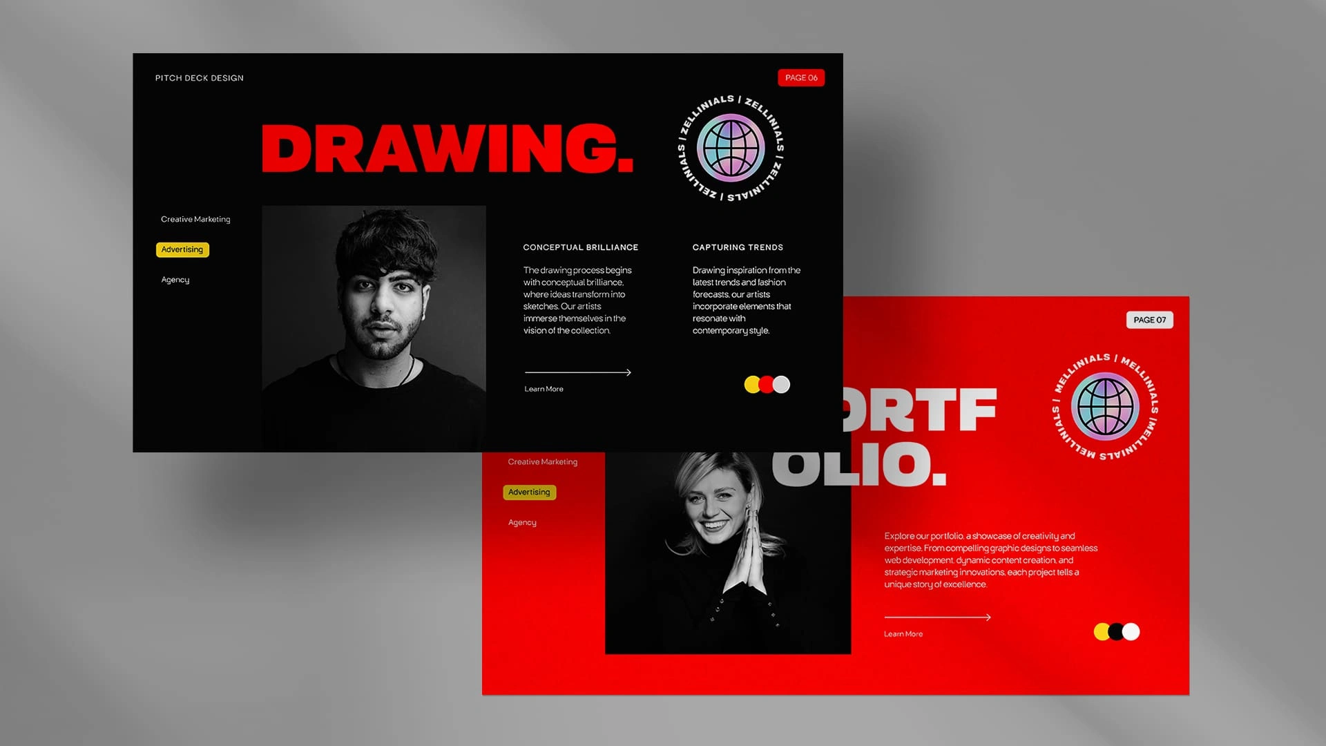
CASE STUDY: Drawing – Bold Branding for a Trendsetting Agency
Client Overview: Drawing is a cutting-edge creative agency working at the intersection of culture, technology, and design. Specializing in trend-driven campaigns, they needed a visual identity that embodied unfiltered boldness, cultural fluency, and unapologetic creativity.
The Brand Challenge: While their client work was disruptive and memorable, their own brand presence fell flat—relying on minimal visuals and a tone that felt too safe for the bold ideas they were pitching. The challenge was to inject energy, provoke emotion, and reflect their position as a creative catalyst in every brand touchpoint.
Creative Direction: We set out to build an identity that feels like an instant punch of personality. From the first slide to the last scroll, the brand had to grab attention and refuse to let go. It had to be brutal in style, editorial in tone, and global in reach.
Design Strategy & Execution:
1. Visual Tone of Voice 👊🏾
Oversized Wordmark ("DRAWING.") with a bold period reflects absolute creative confidence.
Every layout led with aggressive whitespace or high-impact color blocking to create rhythm and visual drama.
We chose to disrupt visual expectations, making the brand impossible to ignore.
2. Power Palette 🔴🟨🔳
Bold red as the dominant tone, conveying urgency, strength, and forward motion.
Deep matte black offered contrast and edge, while electric yellow was used sparingly to draw attention to interaction points.
The result: an emotionally charged palette with sharp psychological impact.
3. Iconography & Symbolism 🌐
The use of circular motifs and a neon-style globe referenced the agency’s international network and cultural agility.
Custom-designed symbols and UI glyphs infused brand materials with a feeling of movement and digital relevance.
4. Typography System 📜
Selected a brutalist, high-weight grotesque typeface for headers and CTA copy.
Paired with a minimalist sans-serif body font for contrast and readability.
The typography itself became a visual character, bold, opinionated, and on-trend.
5. Application Across Scenarios 🌐
Website: Animations featured magnetic scrolling and bold scroll-jacking interactions.
Pitch Decks: Custom-designed slides used red/black/yellow contrast with oversized quotes and layered photos.
Brand Swag: T-shirts, tote bags, and lanyards featured the wordmark and neon globe, becoming wearable brand statements.
Social Media: Instagram stories and reels utilized color flickers, glitch effects, and high-contrast carousel sets.
Real-World Impact:
The rebrand became a catalyst for new business: engagement rose by 78% within the first three months.
Internal teams reported a dramatic shift in confidence and alignment, using the brand deck as a rallying tool.
Pitch decks began landing not just responses, but invitations to collaborate from trendsetting fashion, fintech, and entertainment clients.
Client Feedback: "This feels like us. Bold. Loud. Cultural. It finally looks like the work we create. We’re not blending in anymore, we’re leading."
Design Tools Used ⚖️:
Adobe XD and Figma for UI design and layout prototyping
Illustrator for iconography and vector brand assets
After Effects for animated type and globe transitions
Inspiration Sources 🎨:
Brutalist digital design
High-energy fashion editorials from Hypebeast and Dazed
Music festival branding and neon light installations
Conclusion: Drawing’s new brand identity isn’t just bold for the sake of boldness. It’s a system of energy, confidence, and visual dominance, calibrated to win attention, drive emotion, and lead conversations. It’s not just how the brand looks, it’s how it feels. And now, it finally feels like the future.
Like this project
Posted Jun 12, 2025
Crafted impactful decks with editorial styling, bold layouts, and brand-aligned storytelling for business, creative, and investor use.