SaaS Design
:
🎧 Project Title: AI Voice Generator SaaS Platform – UI/UX Design for Revocalize
Overview:
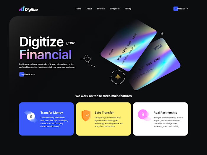
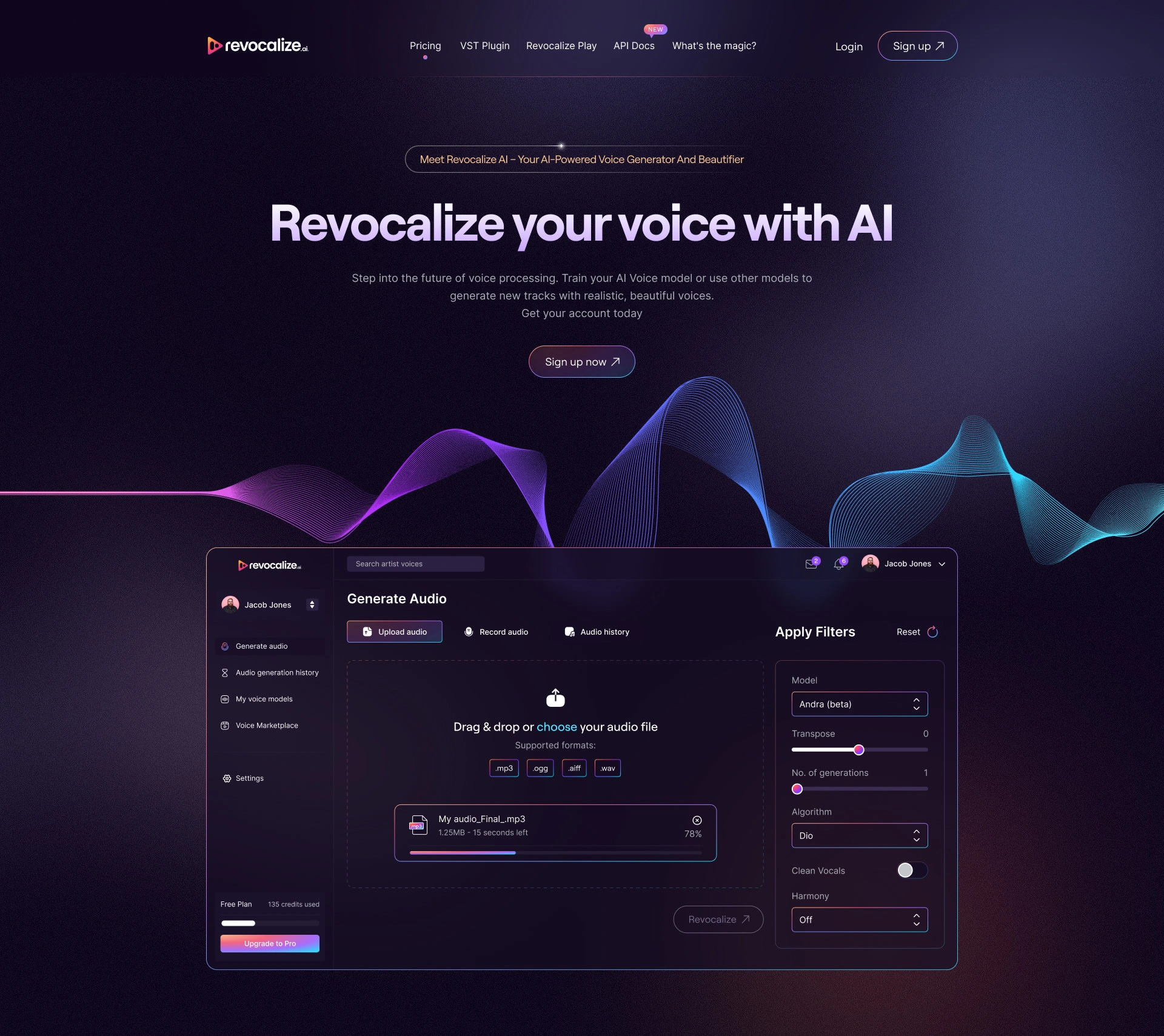
Revocalize is an advanced AI-powered voice generation and beautification SaaS platform designed for creators, musicians, and audio engineers. The platform allows users to train AI voice models, apply studio-grade filters, and transform their vocal tracks effortlessly. I was tasked with designing a futuristic, intuitive, and responsive user interface for both the landing and dashboard experiences – prioritizing usability, aesthetics, and conversion optimization.
🧠 My Approach:
As a UI/UX designer with extensive experience in SaaS, I focused on a user-first approach, blending immersive visuals with clear functionality. My primary goals were:
Clarity & Conversion: I designed a modern hero section with a compelling call to action ("Sign up now") and strong value proposition ("Revocalize your voice with AI"), encouraging immediate user engagement.
AI-centric Design Language: I leveraged vibrant gradients, waveforms, and depth elements to reflect the AI and audio tech vibe, keeping it consistent with the brand identity.
Streamlined Audio Workflow: In the dashboard, I emphasized simplicity and efficiency. Users can easily upload or record audio, apply filters, and generate new versions with minimal effort.
Modular Layout: Built with scalability in mind, I created reusable UI components for future feature expansion (e.g., audio history, voice models, marketplace).
Dark Mode Aesthetic: Prioritized for audio-focused environments, the design features a sleek, contrast-rich dark mode for better visual comfort.
🛠️ Tools & Technologies Used:
Figma: Complete UI/UX design and prototyping
Adobe Illustrator: Custom icons and visual assets
Spline (for concepting 3D waveform graphics)
ChatGPT (AI): Assisted in writing engaging copy and generating UI copy variants
Framer & Webflow (optional handoff): Suggested for future live prototype if needed
📌 Key Features Designed:
Landing Page:
Eye-catching gradient animations
Concise feature explanations
Clear CTAs and pricing info
Dashboard Interface:
Audio upload and recording system
Filter panel with AI model selection, transpose, harmony, and vocal options
Drag & drop interface with real-time upload feedback
Toggle options for Dio algorithm, clean vocals, and harmony layers
Sidebar Navigation:
Clear separation of features like audio history, voice models, and settings
Account/user panel with seamless switching
🎯 UX Enhancements:
Tooltips and microinteractions for beginner users
Placeholder states and progress indicators to show real-time actions
Integrated credit usage meter for Free vs Pro users
📣 Client Feedback:
"This is exactly what we envisioned — futuristic, clean, and built around user clarity. The dashboard flow is incredibly intuitive and matches the vibe of our audio tech. The use of gradients and motion elements really elevates the brand. Great attention to detail and functional depth!"
The client appreciated my deep understanding of SaaS UI/UX standards, and how I transformed their complex product idea into a visually stunning and user-friendly experience.
📌 Keywords:
SaaS UI Design, AI Voice Generator, Dark UI, Audio Tech, AI SaaS, Dashboard UX, Figma Design, Gradient UI, Drag & Drop Interface, User Experience, AI Tools, Voice Processing App, UX for Creators, Framer, Web App UI, Audio Beautifier, Creative Tech Interface
Microsoft - SaaS
🌐 SaaS Website Design – Empowering Digital Experiences with Microsoft Ecosystem
Role: UI/UX Designer | Figma Expert | Branding & Visual Systems | Design Systems Integration
Project Type: Enterprise SaaS Website — Concept Design
Client Theme: Microsoft × Accenture Partnership Initiative
🧠 Overview
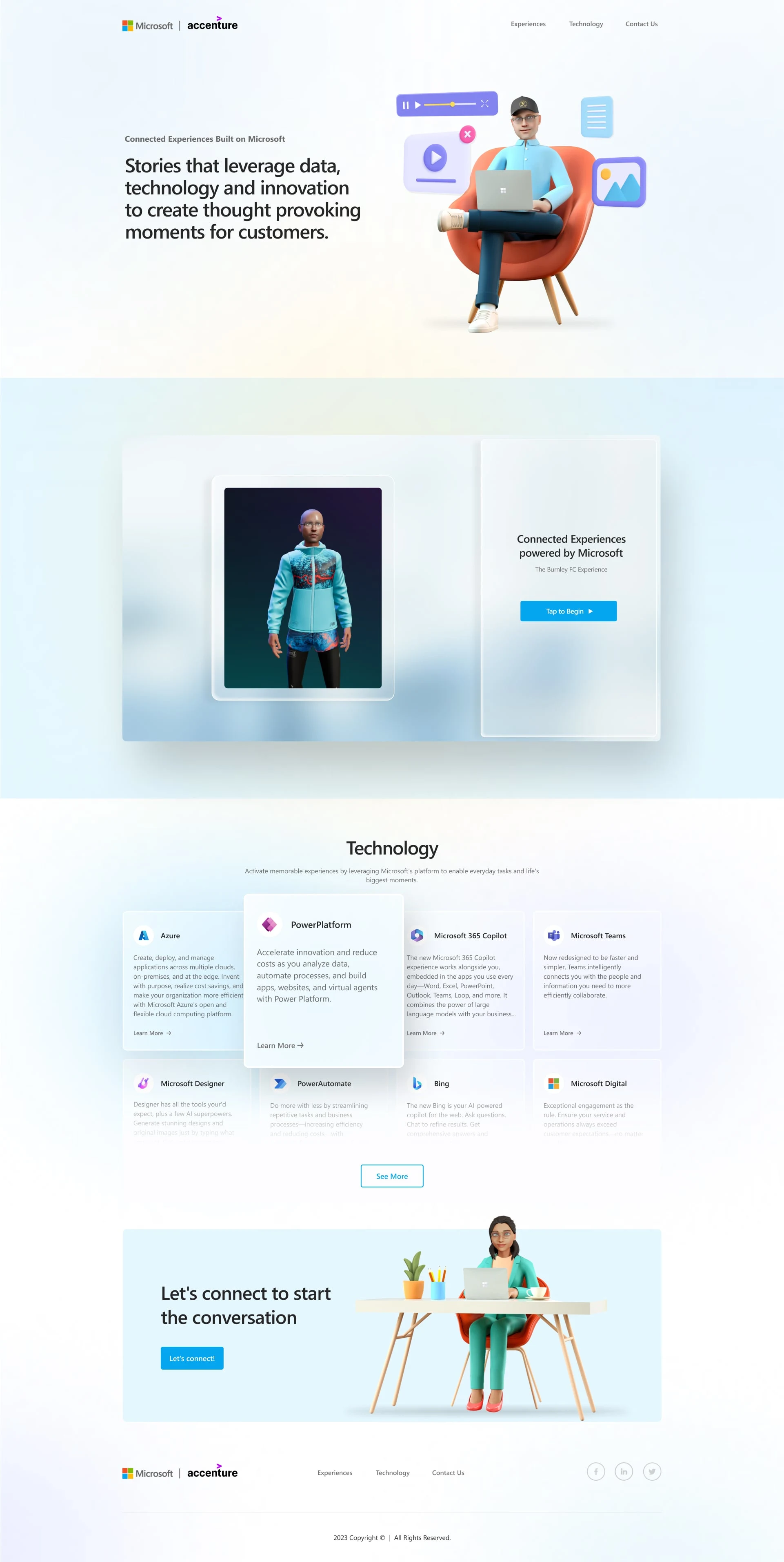
This SaaS website concept was built around the idea of connected digital experiences, powered by Microsoft technologies. The design celebrates enterprise transformation through AI, automation, cloud services, and data — while keeping the interface minimal, vibrant, and approachable. With 3D illustration, immersive visuals, and modular layout logic, I created a site that speaks to innovation, collaboration, and business enablement.
It was designed with a narrative-first approach, carefully balancing enterprise seriousness with modern playfulness through the use of avatars, dynamic cards, and interactive content blocks.
🎯 Objective
The goal was to design a conceptual SaaS website that showcases how companies like Microsoft and Accenture help brands leverage data, cloud computing, automation, and AI platforms to craft memorable, scalable digital experiences.
The tone needed to be:
Professional yet inviting
Tech-centric with storytelling
Modular and scalable
Clean, enterprise-level SaaS UX
💼 My Contributions
UX Research & Information Architecture
UI/Visual Design in Figma
Design System Setup for Scalable SaaS Modules
3D Character & Icon Composition Integration
Content Writing (UX copy + microcopy)
Accessible UI (WCAG-friendly color system)
🛠 Tools & Platforms Used
Figma (for high-fidelity UI/UX)
Spline & Adobe Illustrator (for 3D illustration integration)
Notion & Whimsical (for wireframes & sitemap)
ChatGPT (for structured, keyword-rich content strategy)
🔍 Sections Breakdown
📌 Hero Section: Thought-Provoking Introduction
Strong headline: “Stories that leverage data, technology and innovation...”
3D avatar-based hero visual with multimedia icons
Elegant fade gradient for a soft enterprise feel
Partner logos (Microsoft + Accenture) with sleek branding alignment
🧬 Experience Panel: Real-World Scenario Example
Split-screen format with live avatar on the left and headline-led CTA on right
Promotes customer immersion through case-study-based storytelling
Clean, white card UI to maintain minimalism and corporate readability
⚙️ Technology Stack Overview
Modular card layout showcasing:
Microsoft Azure
Power Platform
Microsoft 365 Copilot
Teams, Bing, Power Automate, and more
Each card contains a clear value proposition, clickable CTAs, and product segmentation
Hover-friendly animations designed for interaction on desktop/tablet
📩 Let’s Connect Section: Humanized CTA
Light blue background with a seated character for warmth
Encouraging, soft CTA: “Let’s connect to start the conversation”
Call to Action designed for lead generation and user engagement
🧭 Footer Navigation
Simplified menu: Experiences | Technology | Contact Us
Clean copyright
Social icons for LinkedIn and Twitter for B2B targeting
✨ Key Design Principles Applied
Minimalistic enterprise UI
Persona-based storytelling
AI + automation tool promotion
Scalable component-based layout
Light-mode SaaS aesthetic
Responsive & accessible design
📌 Keywords / SEO Tags
Microsoft SaaS Website
Enterprise UX Design
Cloud Transformation UI
Digital Experience Platform Design
Connected Experiences Website
AI & Data Platform UI
Microsoft Azure Design
Power Platform UX
Figma SaaS Website
Business Automation UI
Enterprise Design System
Copilot Website UI
Microsoft 365 Web Design
Web App Design for Enterprises
B2B SaaS Design Portfolio
📢 Client/Stakeholder Feedback
“The clarity, elegance, and storytelling in this design instantly position our solutions as premium and approachable. You’ve turned complex technology into something relatable and beautiful.”
“We love how the visual elements aren’t just for decoration — they truly guide the user and support the brand message.”
💬 Final Notes
This SaaS web concept stands at the intersection of tech innovation and human experience. It’s designed to not just present features, but to engage users with the promise of transformation — using Microsoft's AI, data, and cloud platforms.
Whether you’re an enterprise brand, a SaaS founder, or a product marketing leader, this project showcases how great design can bridge complex tech with human storytelling.

NASA - SaaS
🚀 NASA "First Woman" Experience – Immersive SaaS-Style Storytelling Website
Role: UI/UX Designer | Visual Storyteller | Figma Expert | Responsive Design Strategist
Project Focus: Interactive Web Design | Education & Innovation | Space Technology Storytelling
Platform Type: Government/Education SaaS-Style Microsite
🧠 Overview
This project is a fully immersive, animated microsite created for NASA's "First Woman" initiative, designed to educate, inspire, and engage the next generation of explorers — especially young girls and students. The website mimics a SaaS-style structure and flow, while serving as an interactive educational platform, rich in multimedia, storytelling, and space technology education.
The design merges the impact of animation with the clarity of interface usability, all while preserving NASA’s futuristic yet credible branding. Each scroll unveils a new layer of content — from mission objectives to character backstories to tech innovations — built with a modular layout and responsive-first mindset.
💼 What I Did
UI/UX Design with a Narrative-Driven Layout
Custom Figma Design System for Modular Web Layouts
Responsive Wireframes and Content Flow Mapping
Visual Storyboarding & Sectional Animation Integration
Interactive Cards for Character and Mission Exploration
Educational UI that mimics SaaS product features
🧰 Tools Used
Figma – Complete high-fidelity design & prototype
Illustrator & Photoshop – Comic/character integration
Spline & Lottie (Planning Phase) – For possible animations
Notion – For wireframes & structure planning
ChatGPT + Grammarly – For UX copy and keyword flow
🧑🚀 Design Narrative
This NASA site isn't just a webpage — it's an interactive product, a storytelling SaaS platform with characters, tech, missions, and calls to action. The entire structure was modeled after modern product storytelling websites seen in SaaS brands like Notion, Webflow, and Stripe — but adapted for space education and STEM advocacy.
The user flows are segmented like a product tour — leading viewers through the app, characters, tech stacks, interactions, and how to “get involved.”
📌 Key Sections & UX Features
🎬 Hero Section – “First Woman” Launch
Full-width feature trailer (video embed) with mission callout
NASA branding merged with cinematic visuals
Modern CTA: Download the App or Explore Mission
👩🏽🚀 Meet the Characters Section
Character cards in a SaaS card layout
Each card contains visuals, description, and personas (Commander Moonikin Campos, RT the Robot, Callie Rodriguez)
Designed for engagement and relatability
🧪 Technologies Featured
Educational SaaS-style explainer cards
Explanation of lunar tech, rovers, robotics, AI guidance, etc.
Scroll-based visuals showing environmental simulation
🔁 Interactive Missions UI
Horizontal scroll gallery mimicking an interactive dashboard
Mission-specific UI (Mission Output, Command Center, etc.)
Embedded simulation designs similar to user product onboarding
🌖 Inspiration Segment – “Inspiring the Next Generation”
Visual of the moon surface with inspirational messaging
Motivational UX copy targeting educators and students
Featured testimonials from NASA figures and animated personas
🎓 Education & Learning Modules
LMS-style interface showcasing:
STEM Learning Kits
Mission Activities
3D Exploration Tools
🧑🎓 Your Future at NASA – Career Callout
Split layout encouraging user sign-up and future pathway exploration
Placeholder for career portal or internship pipeline
🚀 Get Involved Cards
Interactive block layout with links to:
Artemis Missions
Student Campaigns
First Woman Comic Series
🧑💻 Footer – Optimized for Discovery
Standardized SaaS-style footer layout with navigation
Legal, social links, and NASA contact center info
✨ Design Highlights
Immersive storytelling meets educational SaaS UI
Figma-based, pixel-perfect responsive layout
Scroll-based visual journey with modular UX
Interactive storytelling driven by micro-interactions
Multi-character integration through cards and sliders
Webflow-style SaaS structure adapted for public sector
🎯 Target Audience
K-12 Students & Teachers
STEM Educators
Space & Tech Enthusiasts
Female Future Explorers
Parents and NASA Followers
Government & NGO Collaborators
📈 Keywords / SEO Tags
NASA Web Design
STEM Education Platform
Interactive Science Website
Government SaaS UI
Space Exploration Website
Educational Microsite UX
Storytelling UI/UX
Comic Book Website Design
Figma UI for Education
First Woman NASA Design
Public Sector Web Product
Responsive Web Design for NASA
Kid-friendly SaaS UI
STEM-focused SaaS Experience
App Promo Landing Page
💬 Client/Stakeholder Feedback
“The design perfectly captures NASA’s goal: to inspire the next generation through story, science, and interaction. It’s educational, beautifully designed, and highly usable — exactly what a mission like First Woman deserves.”
“From UX to illustration to layout, this design elevates what educational websites should be in 2025 — smart, human, and deeply immersive.”
🌌 Final Thoughts
This project redefines what it means to tell stories through design. It’s not just a static interface — it’s an exploratory platform that merges mission-critical education with SaaS-like interactivity. From students to space enthusiasts, the experience is built to inform, inspire, and involve.
Like this project
Posted Jul 11, 2025
Futuristic SaaS UI/UX for Revocalize, an AI voice generator platform enabling users to create realistic voiceovers with a seamless, modern interface.
Likes
0
Views
44

