
A visual identity for women’s strength training
ROAR is a client brand identity project focused on women’s strength training. I designed the logo and visual system, developed its branded applications, and created the accompanying animations.
The design challenge was to connect a compact digital identifier with larger campaign and physical applications. “Where Women Rise” gives the presentation a consistent message, while the identity brings that message into signage, social graphics, merchandise, and stationery.
ROAR’s identity across typography, campaigns, signage, and merchandise.
One letter connects the system
I paired a condensed uppercase wordmark with an isolated R. The full lockup identifies ROAR and its training offer; the R provides a compact alternative for icons and smaller placements.
That same letter becomes a larger graphic device. Cropped, outlined, or repeated, it gives campaign layouts structure while maintaining a connection to the logo. The construction board, projecting sign, and repeated-R composition show this relationship at different scales.
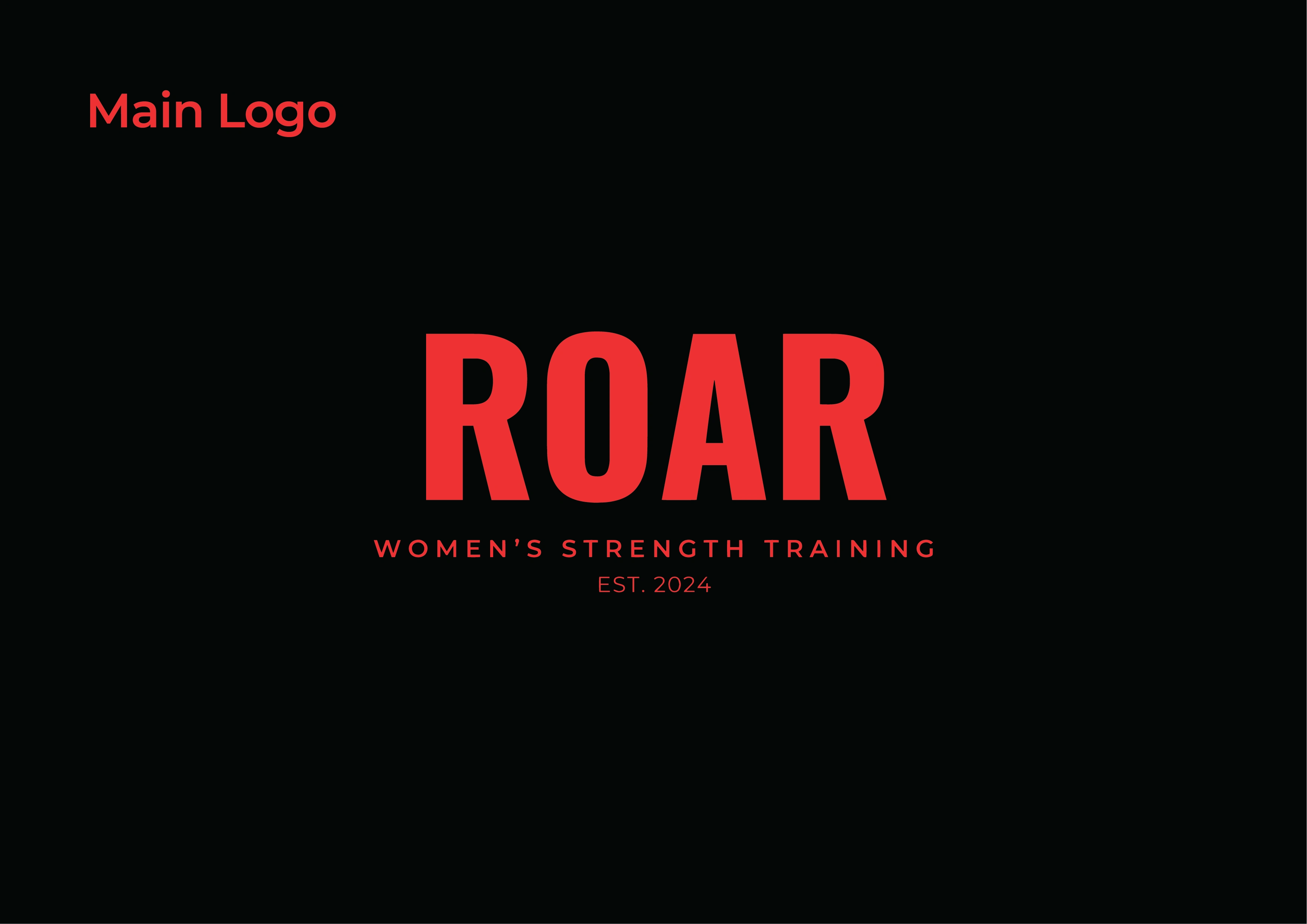
The primary ROAR lockup and women’s strength training descriptor.
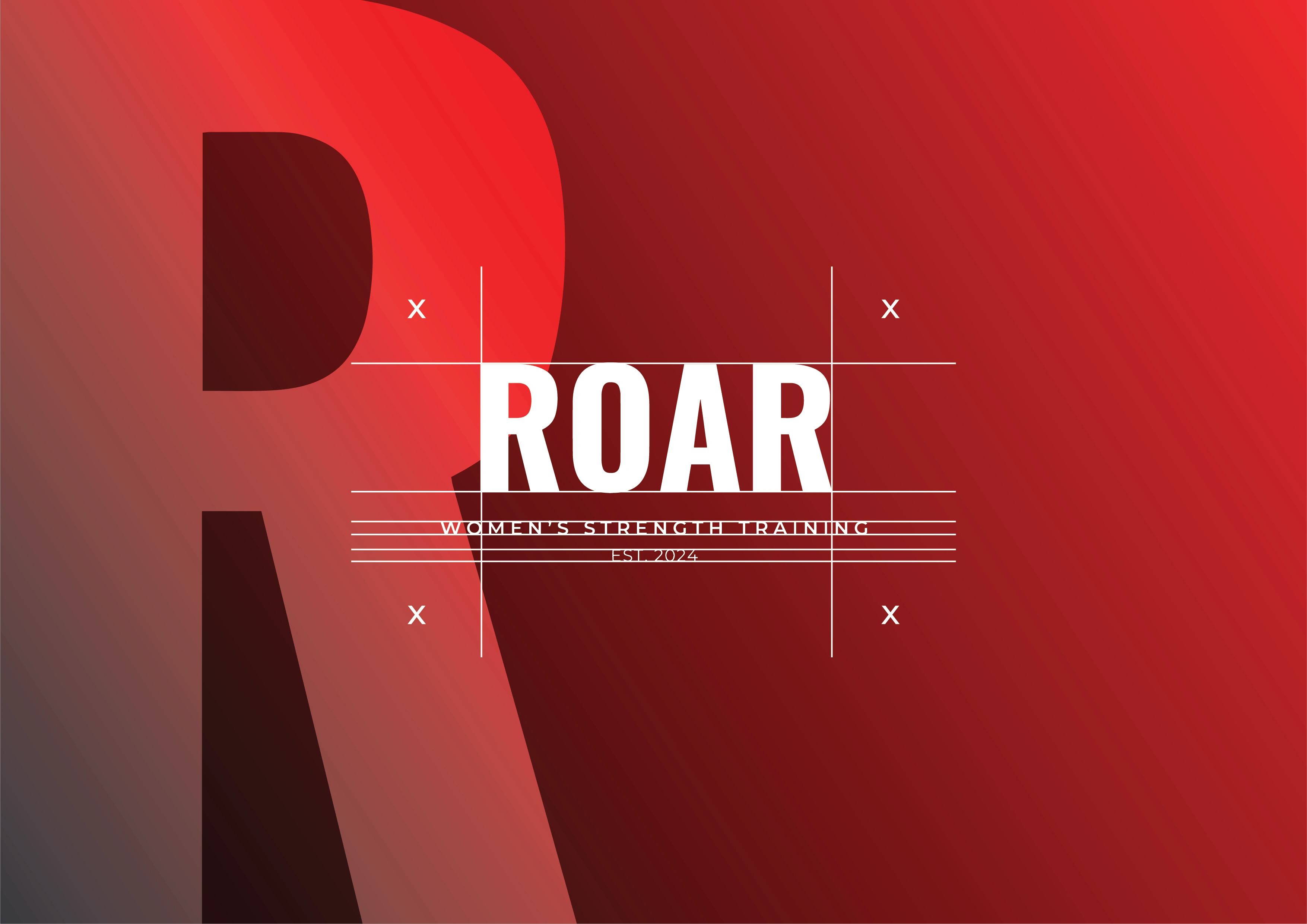
Alignment and spacing within the logo lockup.
Typography and color establish the hierarchy
Red, black, and white connect the applications. Gradients add depth to campaign backgrounds, while flat combinations keep the logo clear.
Oswald carries the condensed headline character, with Montserrat supporting longer information. The campaign layouts pair this hierarchy with training imagery, allowing short messages such as “Where Women Rise” to remain prominent.
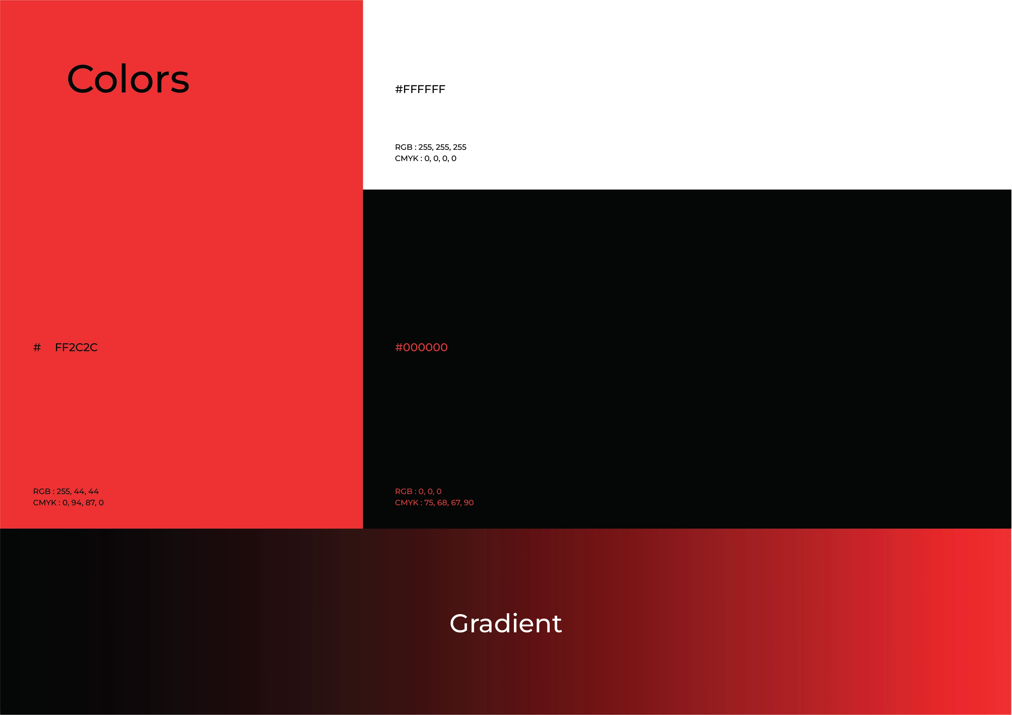
Red, black, white, and gradient treatments connect the system.
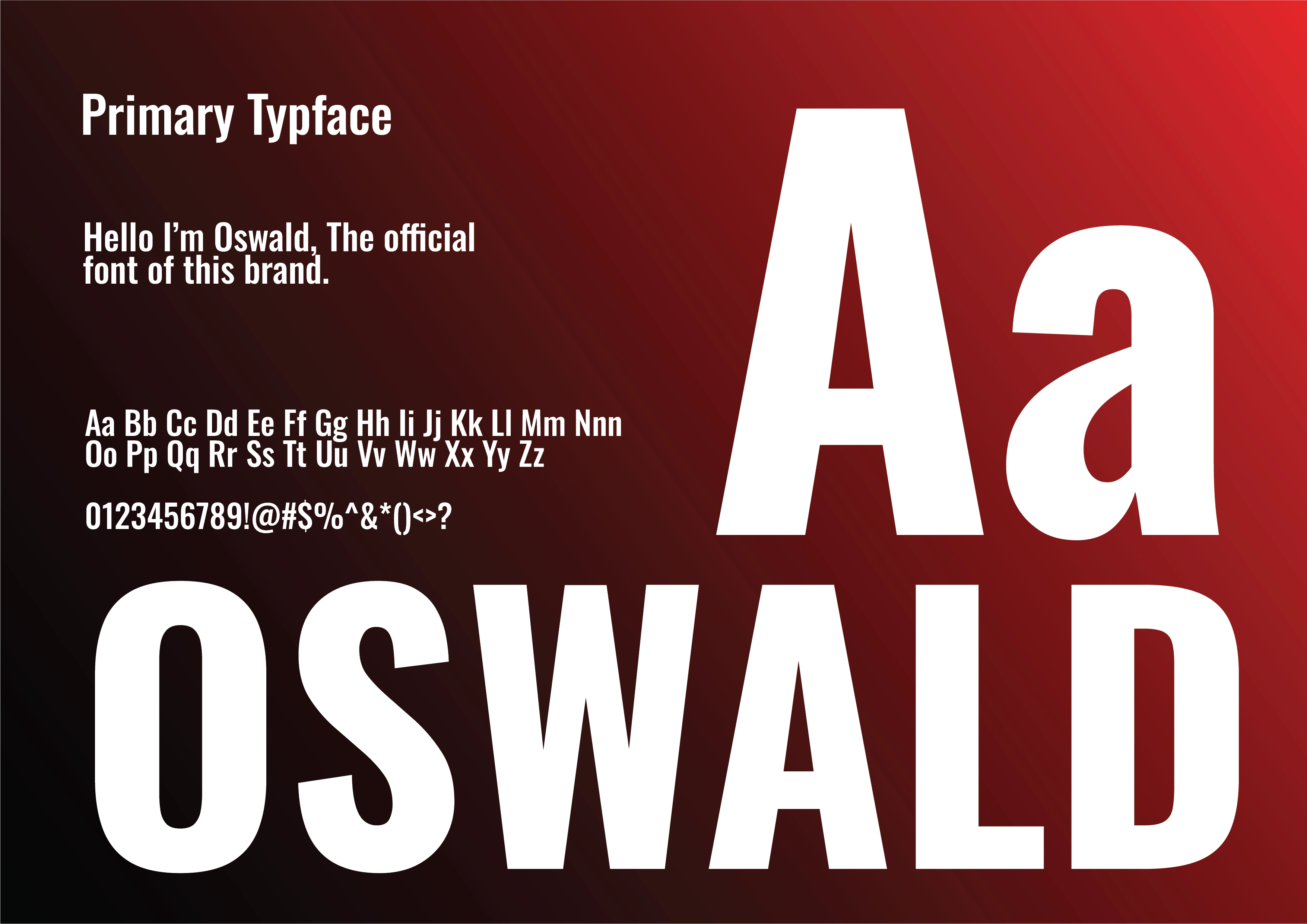
Oswald establishes the condensed headline character.
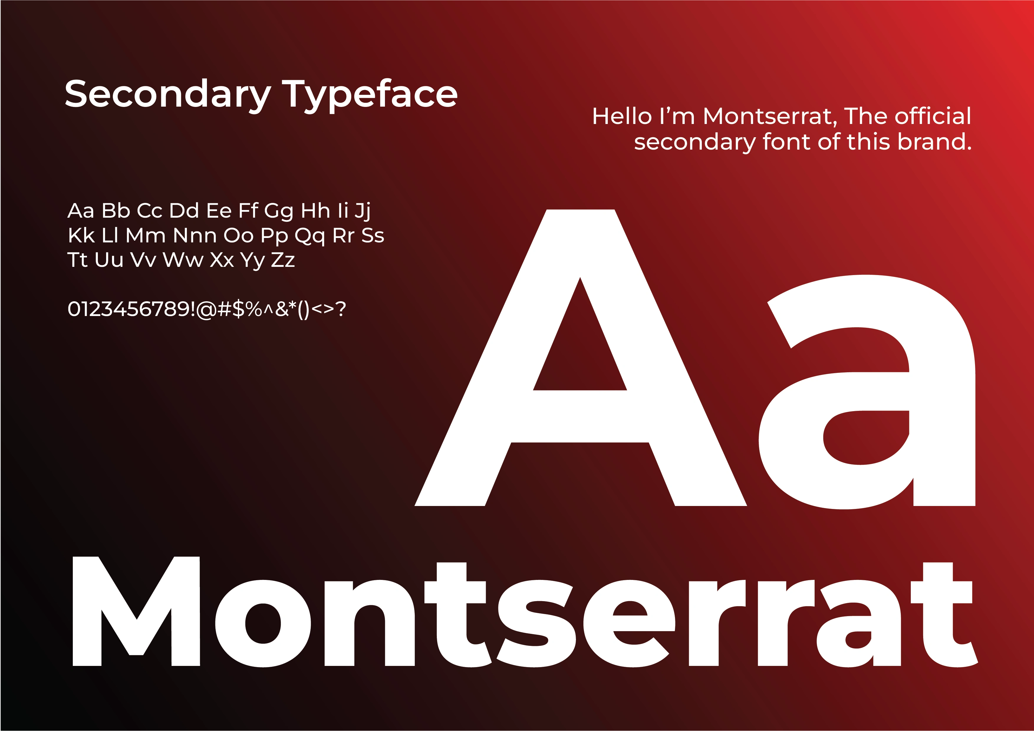
Montserrat supports the secondary information hierarchy.
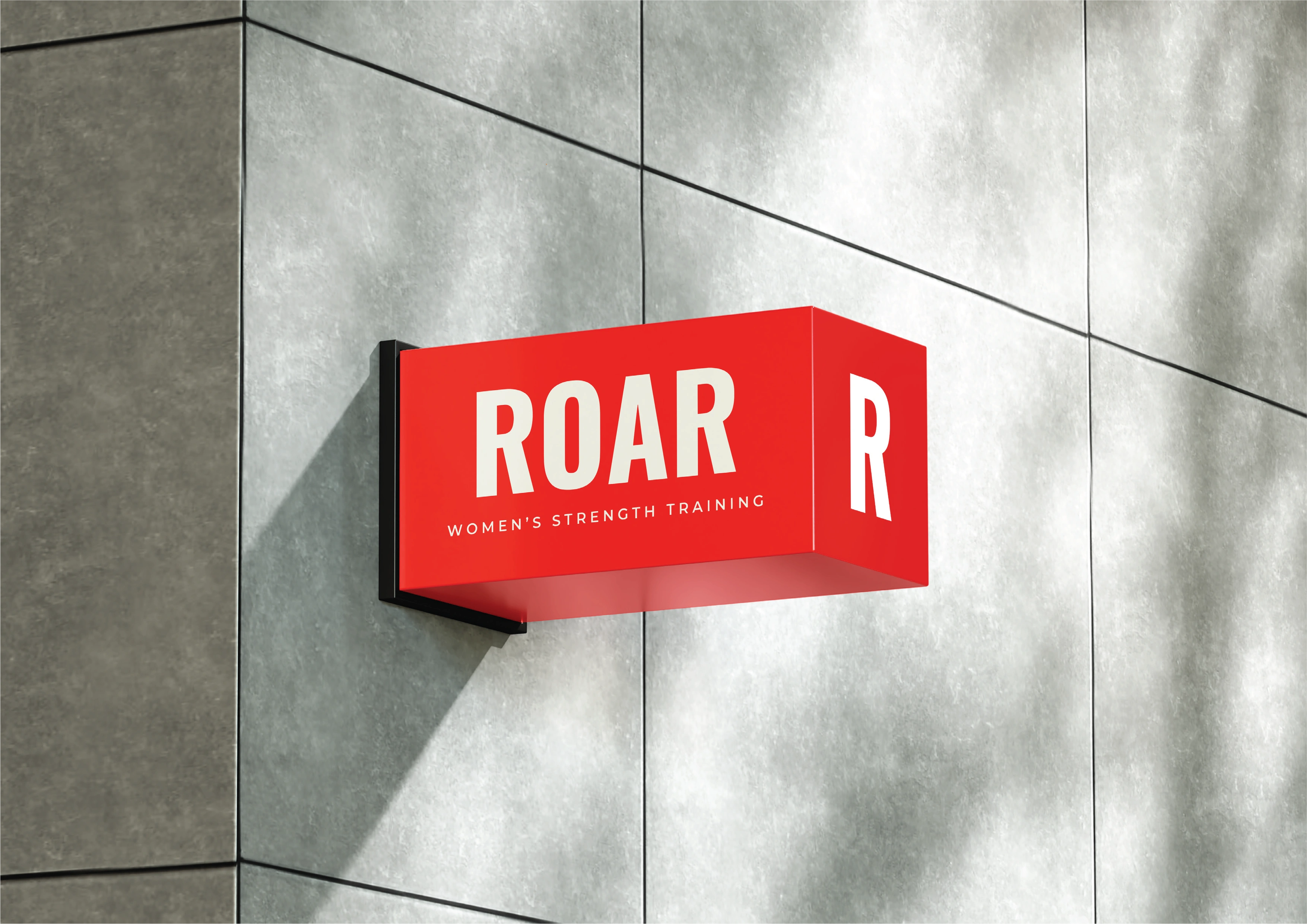
The wordmark and R applied to a projecting sign mockup.
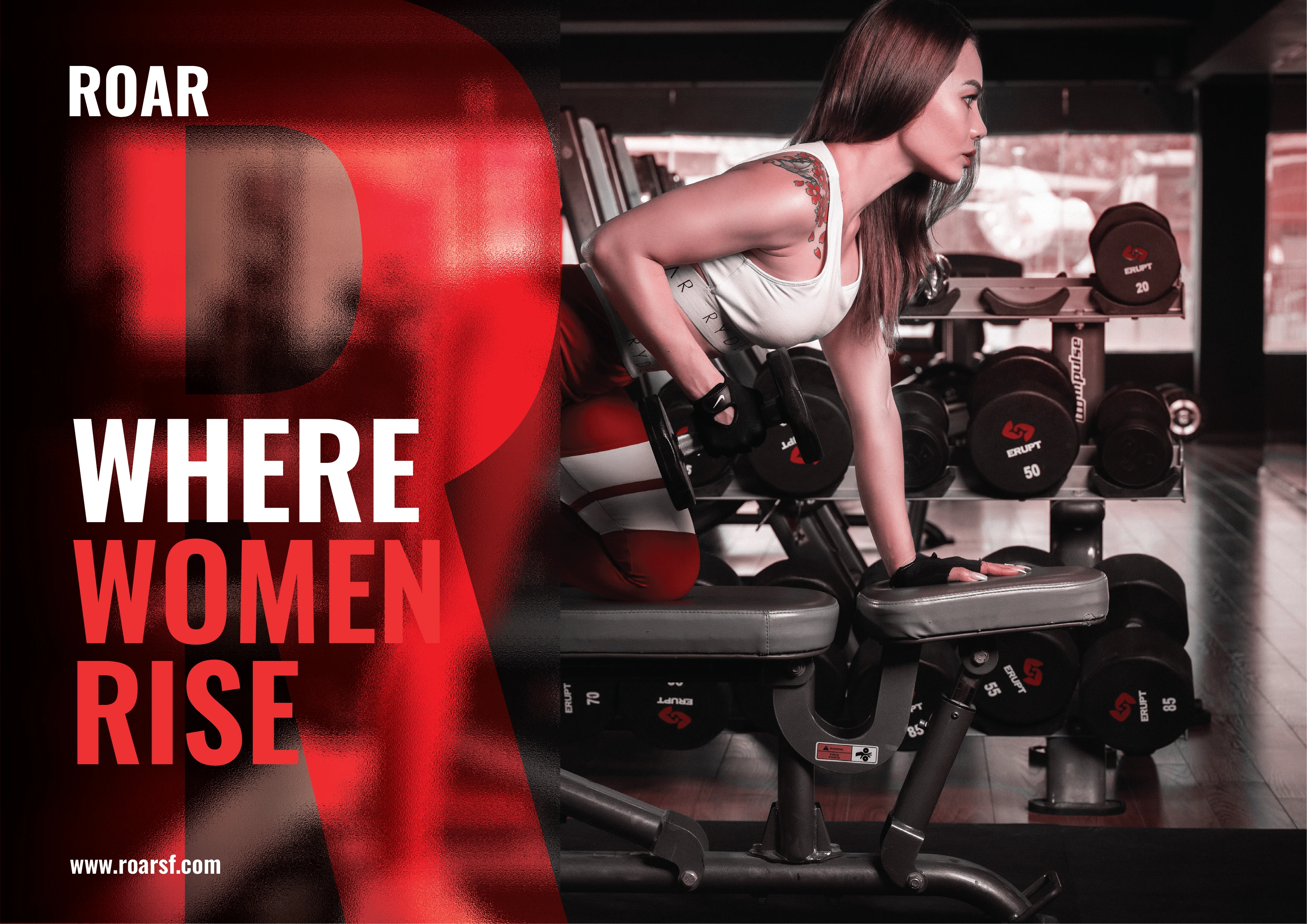
Training imagery and the oversized R frame “Where Women Rise.”
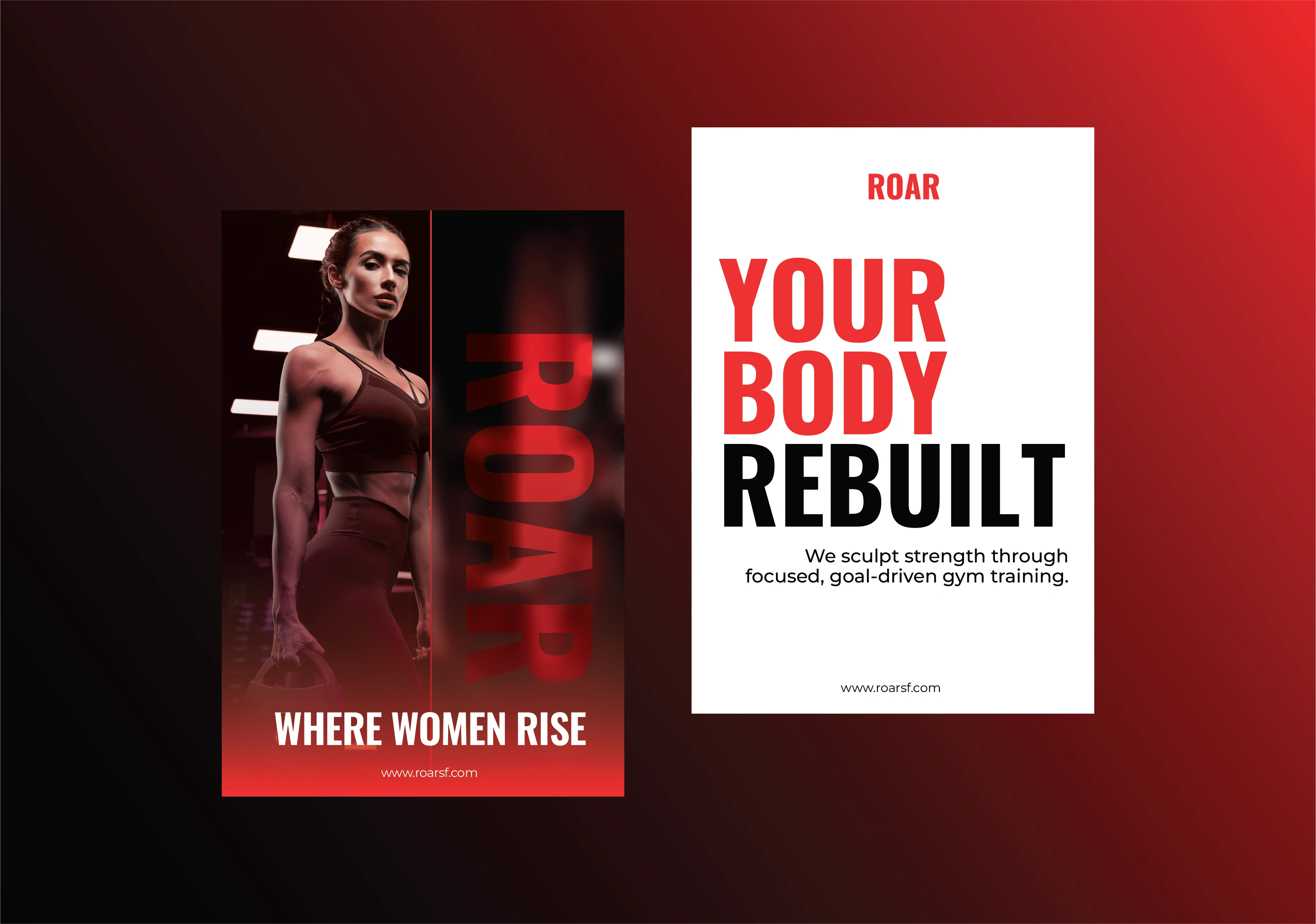
Two poster compositions using the same visual language.
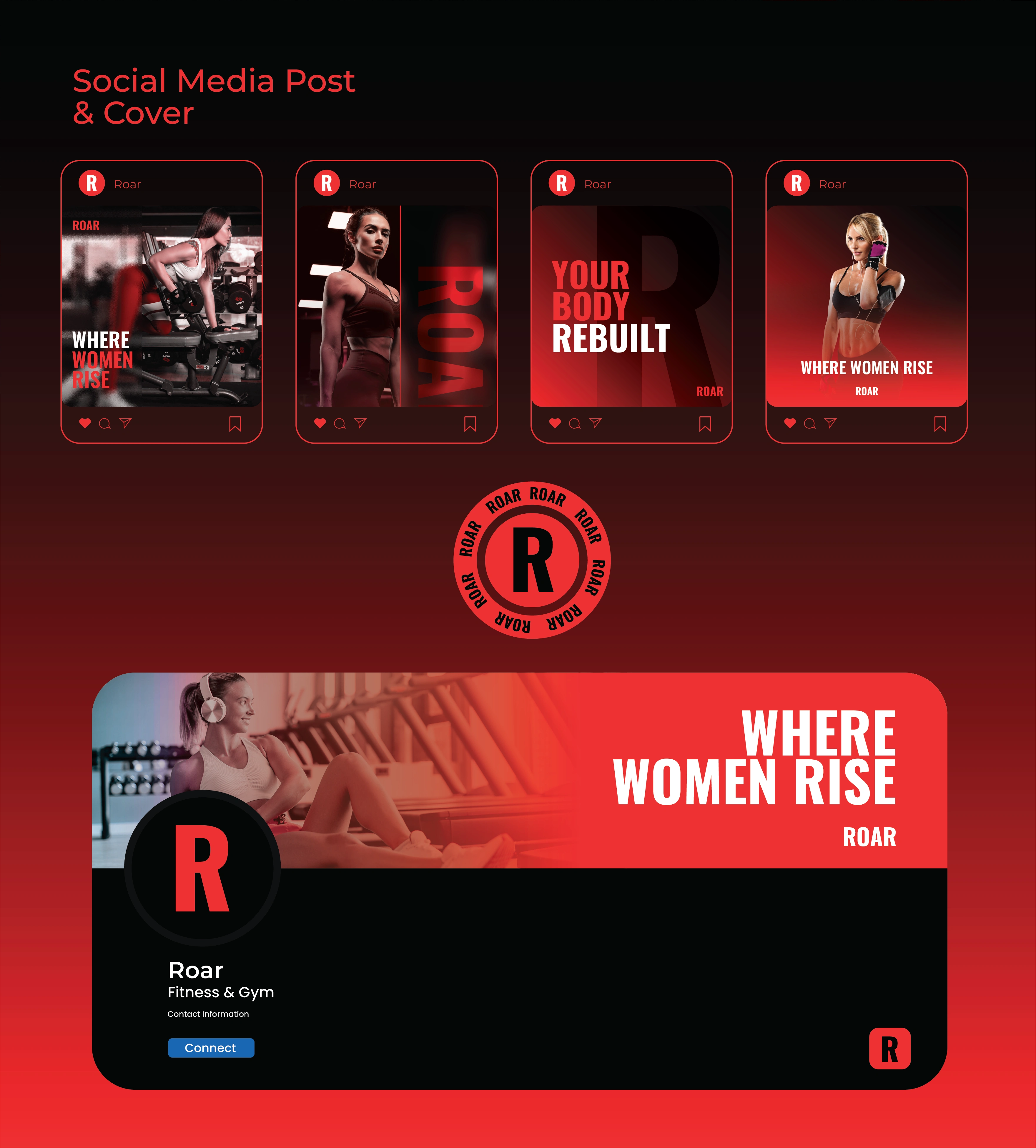
Social posts, profile imagery, and cover applications.
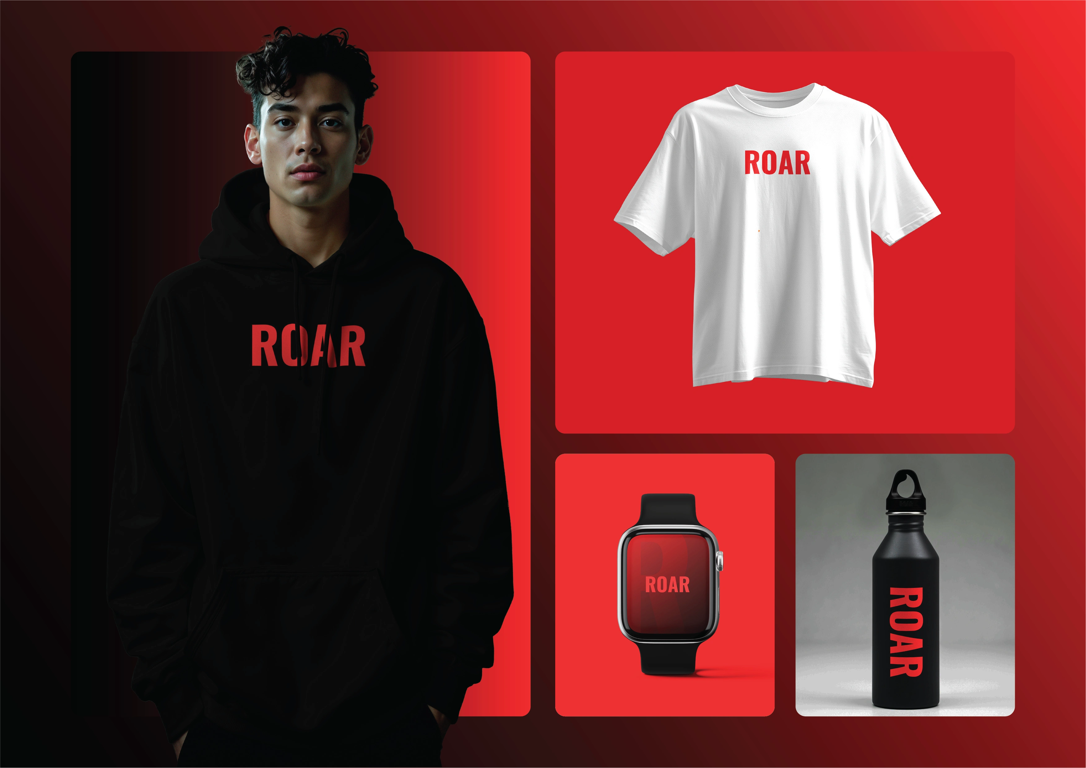
Apparel, bottle, and smartwatch visualizations extend the identity.
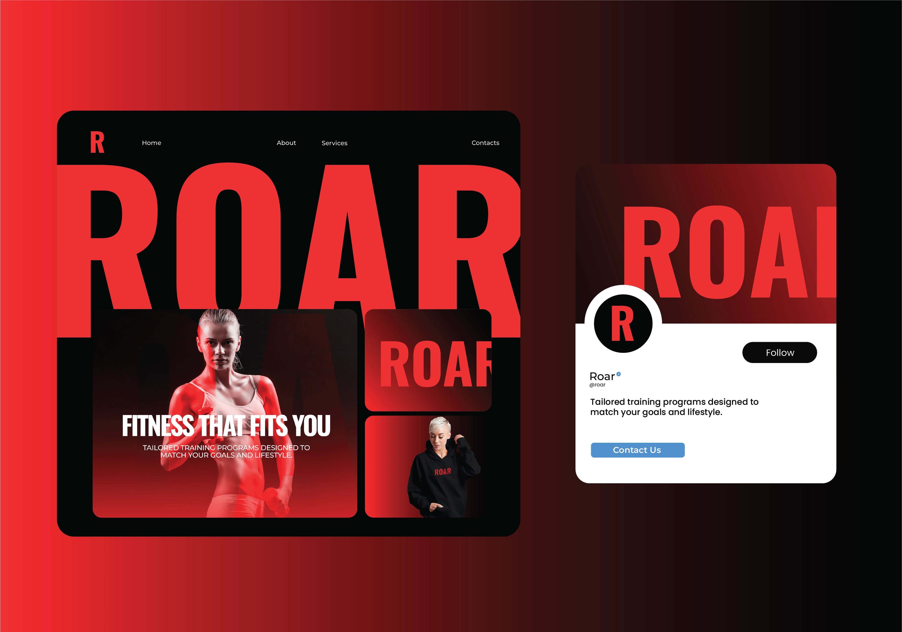
Digital brand applications shown in desktop and social mockups.
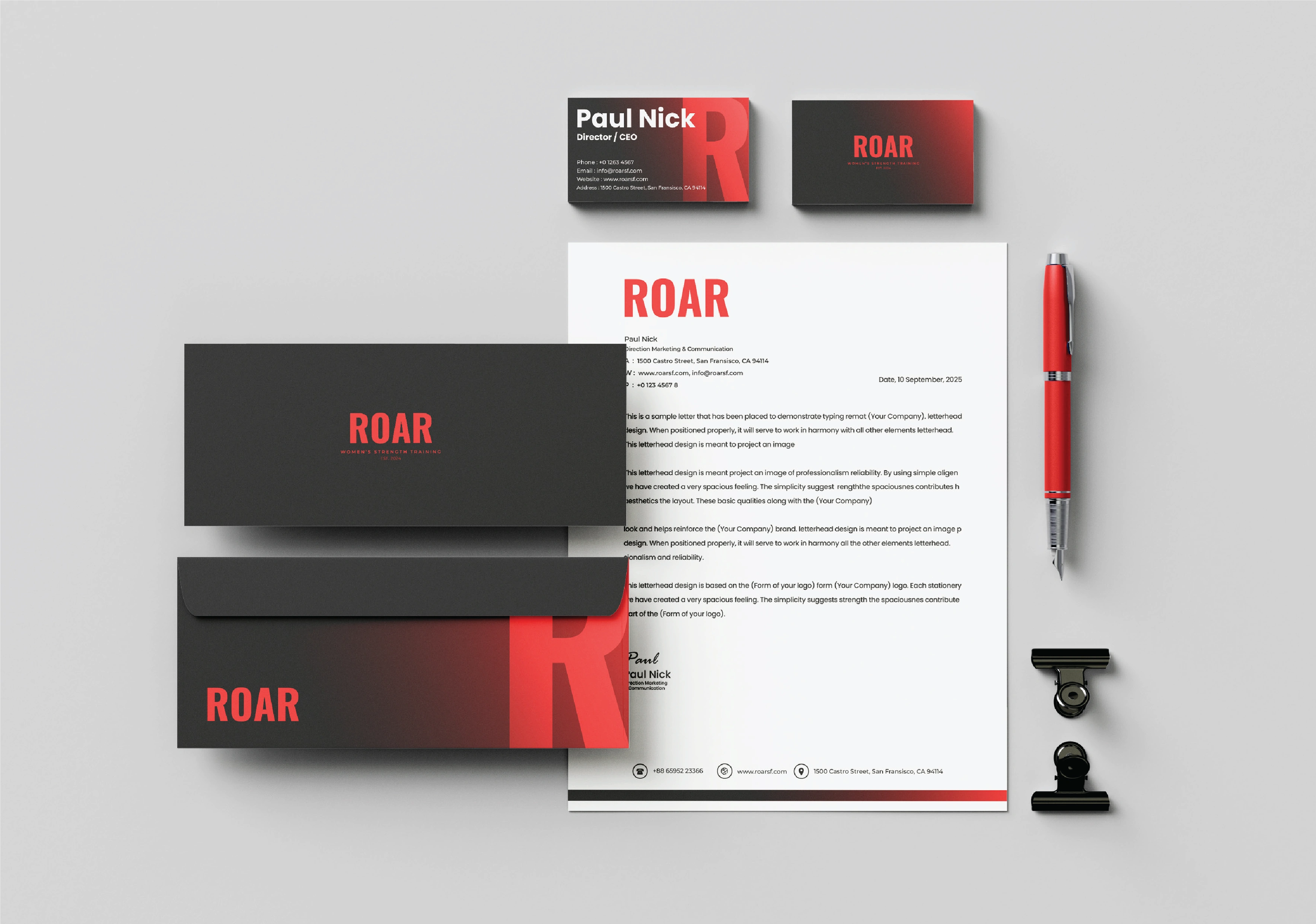
Stationery applications bring the system into printed communication.
Bringing the identity into motion
I animated the identity to show how its elements work together. The opening showcase moves between the R, typography, signage, apparel, and campaign cards. A switch from black to white changes the setting while retaining the same visual cues.
A second motion piece combines training imagery, animated statements, application grids, and a closing ROAR lockup. I used Adobe Illustrator, Adobe Photoshop, and Adobe After Effects across the project.
Training imagery, campaign statements, and branded applications in motion.
A consistent family of applications
The finished presentation demonstrates the identity across digital mockups, outdoor graphics, signage, stationery, and merchandise. These are visual applications; this case study makes no claim about manufacturing, website launch, or measured business results.
Planning a fitness brand? Explore my complete brand identity service.
0 likes · 1 view · Nov 16, 2026
Logo design, visual identity and motion design for ROAR, a women’s strength training brand, across campaigns, signage, digital mockups and merchandise.


