Sketchbook Style Portfolio Design

Omoniyi Daniel


Jacki
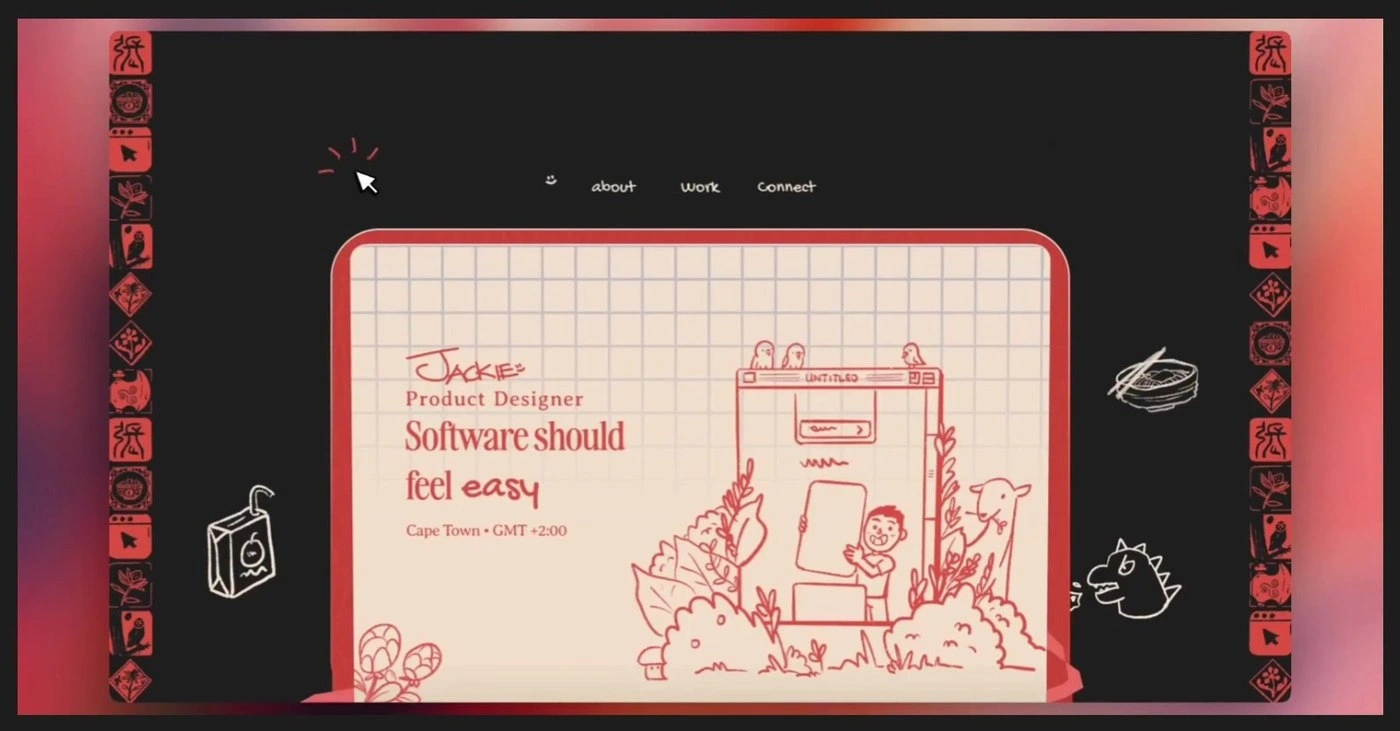
A hand-drawn, sketchbook-styled portfolio for a product designer — built to prove range and personality before a single case study loads.
Overview
A portfolio that reads like a real notebook, not a template
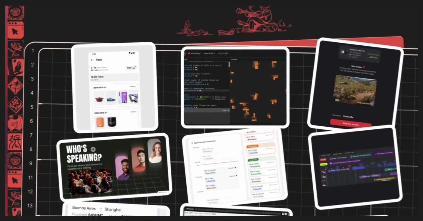
Jackie is a product designer based in Cape Town, South Africa. This case study covers her personal portfolio site: a hero built like an open notebook page, a scattered corkboard of real project screenshots, an interactive checklist that draws a hand-illustrated scene as you complete it, and a closing joke instead of a closing pitch.
Every section behaves less like a typical about/work/contact template and more like flipping through someone's actual sketchbook — grid paper, torn sticky notes, a page that physically turns.
The Challenge
Judged twice — once for the work, once for itself
A product designer's portfolio gets evaluated on two tracks at once: the work inside it, and — more quietly — the site itself, as a live sample of the designer's own taste and craft. That second judgment happens in seconds, while a recruiter has a dozen other tabs open that all look like variations on the same clean grid.
The implicit brief: prove range across a real, varied body of work — checkout flows, logistics tools, live-streaming apps, event software — without turning into a wall of case-study thumbnails, and do it somewhere a recruiter actually remembers afterward, not just quietly approves of.
Research & Insight
What a skimmed portfolio still needs to land
01
Attention is a five-second budget
The hero has less time than it takes to say "I make clean interfaces" — which is also what every other hero says. It needs to do more than describe competence.
02
Range is hard to prove with one flagship project
A single deep case study shows craft on one problem. A decade of client work across industries needs a format built to show breadth without collapsing into a thumbnail wall.
03
Personality is the actual tie-breaker
Once a portfolio clears "can this person design software," the deciding question is usually "do I want to work with them" — a skills list can't answer that, but a sense of humor can.
04
Specific beats generic, every time
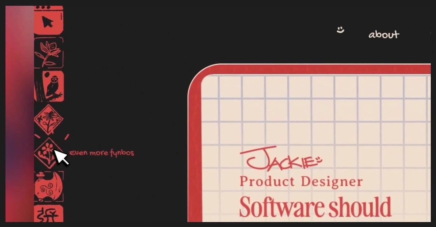
A location stamp and a plant native to one coastline says more about who's behind a site than any "open to opportunities" badge.
The Approach
Five decisions, all in service of being remembered
Frame the whole site as an object, not a webpage
Grid paper, a page that turns, torn sticky notes, screenshots pinned at odd angles — the metaphor is a physical notebook, not a component library, and it's carried consistently enough to read as a decision rather than a skin applied to a standard template.
Let the headline hedge its bets on purpose
"Software should feel ___" cycling through easy, empowering, fun, honest says more about range in four words than a paragraph of positioning copy — and costs nothing to test three more alternatives.
Show the work as a pinboard before it's a list
The first look at Jackie's project history is a scattered, overlapping stack of real screens pinned at odd angles against a ruled, numbered backdrop — evidence pulled straight off a desk, not a curated highlight reel.
Turn the ask into a small game
"What I look for" could have been three bullet points. Checking each one off instead draws a little more of a hand-illustrated scene, so a form nobody wanted to fill in becomes the most fun three clicks on the page.
Sign off with a joke, not a repeated pitch
The footer doesn't restate the CTA. It drops a favourite film quote and a signature — the same confidence as the fynbos tooltip: the work already made its case, so the last word can just be a good one.
The Solution
A notebook that rewards the person actually reading it
What's live: a notebook-styled hero with a hand-illustrated scene and a cycling headline, sitting inside a page that behaves like paper. Hovering "about" surfaces an in-progress doodle tag instead of a dead link; hovering "connect" unfurls hand-drawn social icons rather than jumping straight to a new page. Scroll, and the page physically turns to a "3 things I strongly believe in" spread — three sticky notes, torn and taped at angles — before giving way to the project pinboard.
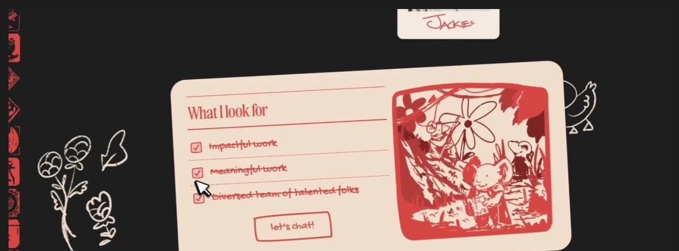
Further down, "What I look for" turns three requirements into that interactive checklist: check off impactful work, meaningful work, and a diverse, talented team, and a hand-drawn jungle scene builds itself in, panel by panel, next to a plainly labelled "let's chat!" button. The page's left and right edges stay bordered in small illustrated tiles the whole way down, and it closes on a looping film clip with a subtitled line and a signature, instead of a repeated call to action.
Like this project
Posted Aug 17, 2026
Created a unique, sketchbook-style portfolio for a product designer.