Interactive 3D Brand World for Écurie Chevalex

Omoniyi Daniel


Chevalex
An interactive 3D brand world for a western riding school — one diorama, two skies, and a lot of reasons to book a lesson.
Overview
A full-service stable, told through one custom world
Chevalex — full name Écurie Chevalex — is a western-style riding school and boarding stable. The business is broader than most local equestrian sites let on: private and group lessons, day camps, half-board (demi-pension) for owners with their own horses, and a herd of lesson horses on-site. The six-item main navigation — Chevalex, Cours, Camps de Jour, Demi Pension, Nos Chevaux, Contacts — makes that range clear before a visitor reads a word of body copy.
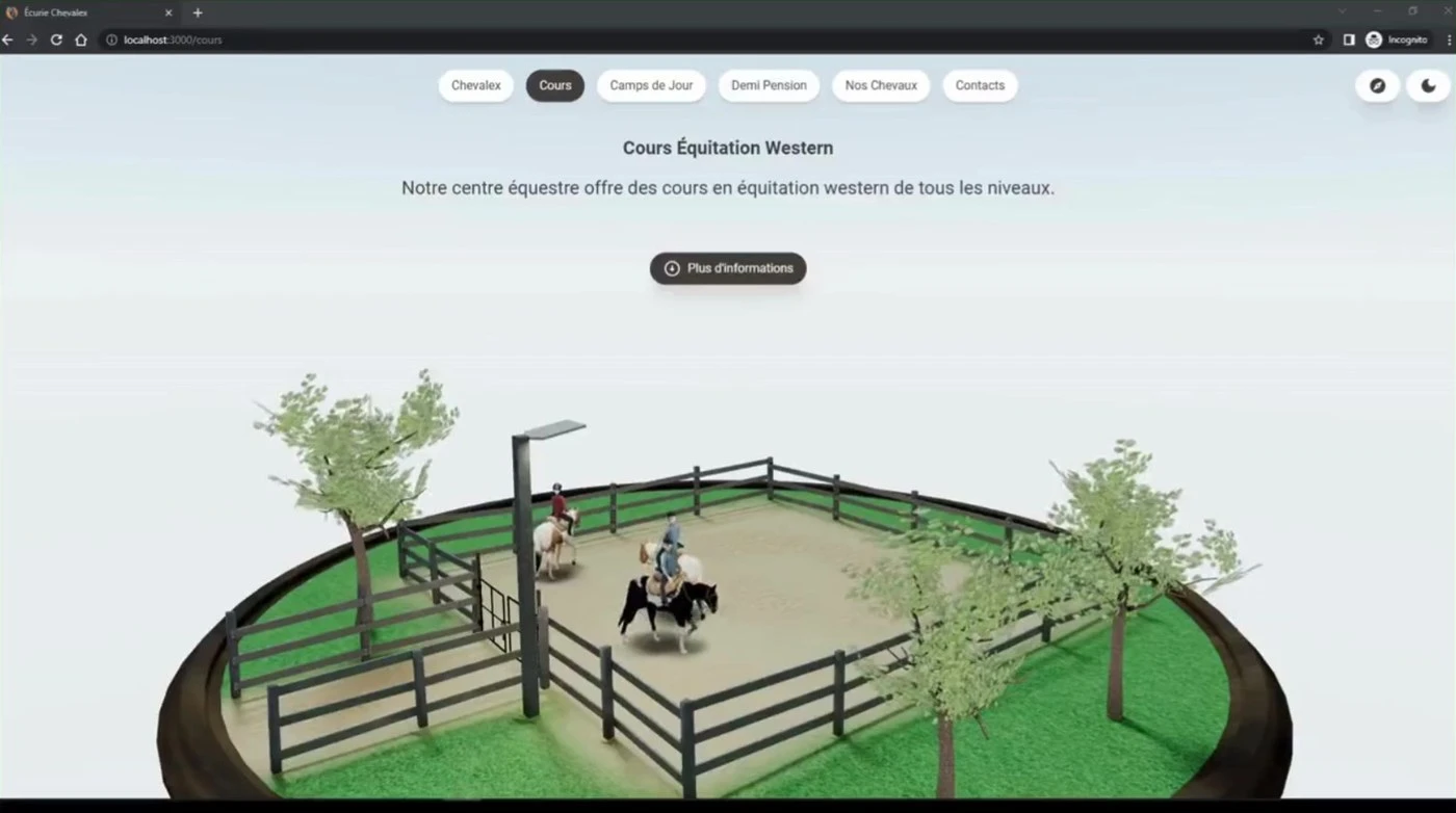
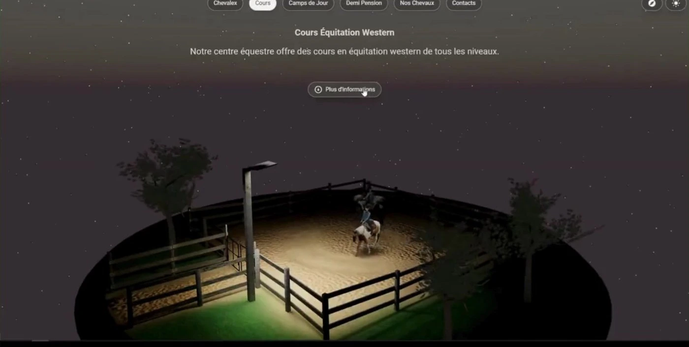
This case study covers the Cours (Lessons) page, built around a custom, fully interactive 3D diorama of a riding arena — one visitors can push into for a rider's-eye view, and one that convincingly turns from a bright afternoon into a lamplit night at the click of a single icon.
The Challenge
Two visitors, one scroll, no template that fits either
Search for riding lessons in most regions and the results look identical: a templated site, a slideshow of stock or slightly-blurry phone photos, a contact form. That's a hard field to stand out in, and it undersells a genuinely tactile, sensory business — the weight of tack, the sound of hooves on sand, the particular gold light over an arena at six in the evening.
The Cours page also had to work for two different visitors in the same scroll. A parent booking a five-year-old's first lesson needs reassurance before anything else: is this safe, is this the right level, what does trying it actually involve. A rider — or a horse owner scouting board — is evaluating the facility itself: the footing, the fencing, how the horses are kept. One page, two very different bars to clear, in French, in a discipline (western riding) that narrows the available template options to close to zero.
Research & Insight
What actually gets a lesson booked
Four observations shaped everything that followed:
Trust is physical
A stable either looks like a place you'd hand someone the reins, or it doesn't. Stock photography can't manufacture that feeling — it has to be built or shot on-site.
Skill level is the first objection
"Is this too advanced for my kid, too basic for me" is the question that stops a booking before it starts. It needed to be unmissable, not folded into an FAQ.
Age is a qualifying filter
Parents searching for a first lesson often filter on minimum age before anything else. Burying "5 ans et plus" in fine print costs bookings that would otherwise convert immediately.
One place, two skies
A golden-hour lesson and a school-night lesson under the arena lights are different moods. A site that only shows one is only telling half the story.
The Approach
Four decisions, all downstream of the research
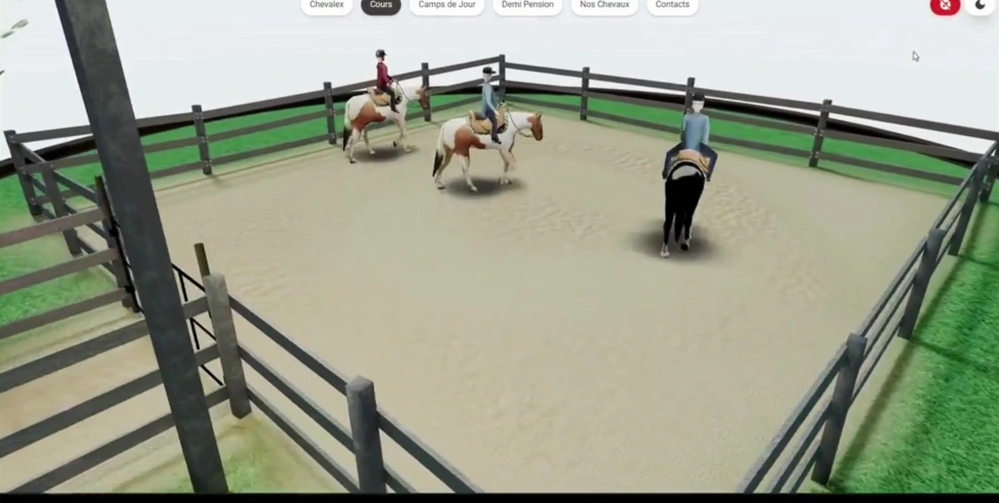
Build the world, don't photograph it. Rather than commission or source photography for the hero, the page centers on a custom low-poly 3D diorama — a round paddock, dark rail fencing, a single street lamp, wind-stirred trees, mounted riders walking a loop. It's an asset no competitor's stock-photo homepage can replicate, and it reads as crafted from the first frame.
Let visitors touch it. Two controls sit in the top corner. One pushes the camera from the wide establishing shot down into the arena at rider's-eye height. The other flips the entire scene from day to night — sky gradient, ambient light, cast shadows, all of it — in one continuous transition. Neither is essential to booking a lesson. Both exist because a visitor who plays with the scene for five seconds is a visitor who remembers the site.
Keep the chrome soft. Every interactive surface — the six-item nav, the two icon toggles, the CTA — is a fully rounded pill. Paired with a rustic subject, that softness does real work: it keeps a lesson barn approachable rather than tipping into rodeo-poster kitsch, which matters when the target visitor is a nervous parent, not a rodeo fan.
Save real photography for the moment trust is decided. The 3D world sells the feeling; it isn't where a parent decides whether their kid is the right fit. That job goes to the skill-level section below the fold, which drops the illustration style entirely for real photography.
The Solution
The moment the lamp becomes the only light on stage
What shipped: a headline ("Cours Équitation Western") and one-line description sit above a CTA ("Plus d'informations") and the diorama itself. The two icon controls stay fixed top-right — always available, never intrusive. Clicking the day/night toggle doesn't cut to a different image; it animates the pale sky gradient down to a star-flecked dusk-to-plum gradient while the lamp switches on, becoming the single most memorable moment on the page.
Scroll past the hero and the diorama gives way to "Cours offerts pour tous les niveaux" — a plain-language heading, a thin amber rule, and three real rider photographs (Débutant, Intermédiaire, Avancé), each framed in a matching accent ring, closing with a one-line footnote on minimum age. It's a deliberate tonal shift: illustrated and playful above the fold, photographic and matter-of-fact below it.
Like this project
Posted Aug 17, 2026
Designed a 3D interactive website for Écurie Chevalex to enhance lesson bookings.