Wrangler - Redesign and UX

Goal
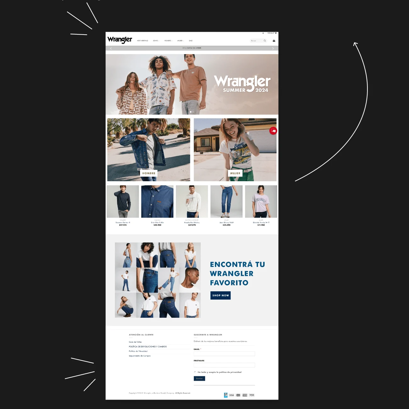
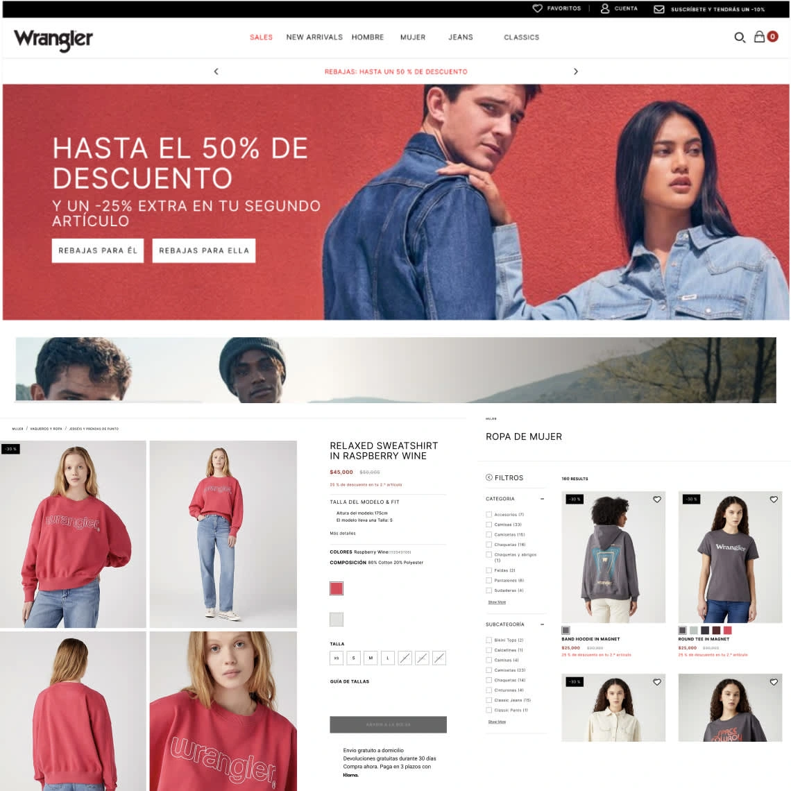
The main goal was to enhance the overall user experience and design navigation of the Wrangler Argentina website. It had areas that needed improvement in the shopping experience, and the aim was to align it more with the visual identity of Wrangler in other countries.
Design process
A Discovery phase and a website audit were conducted to identify user pain points and address any inconsistencies. Bugs or programming errors were reported, resulting in an experience that did not align with our desired goals.
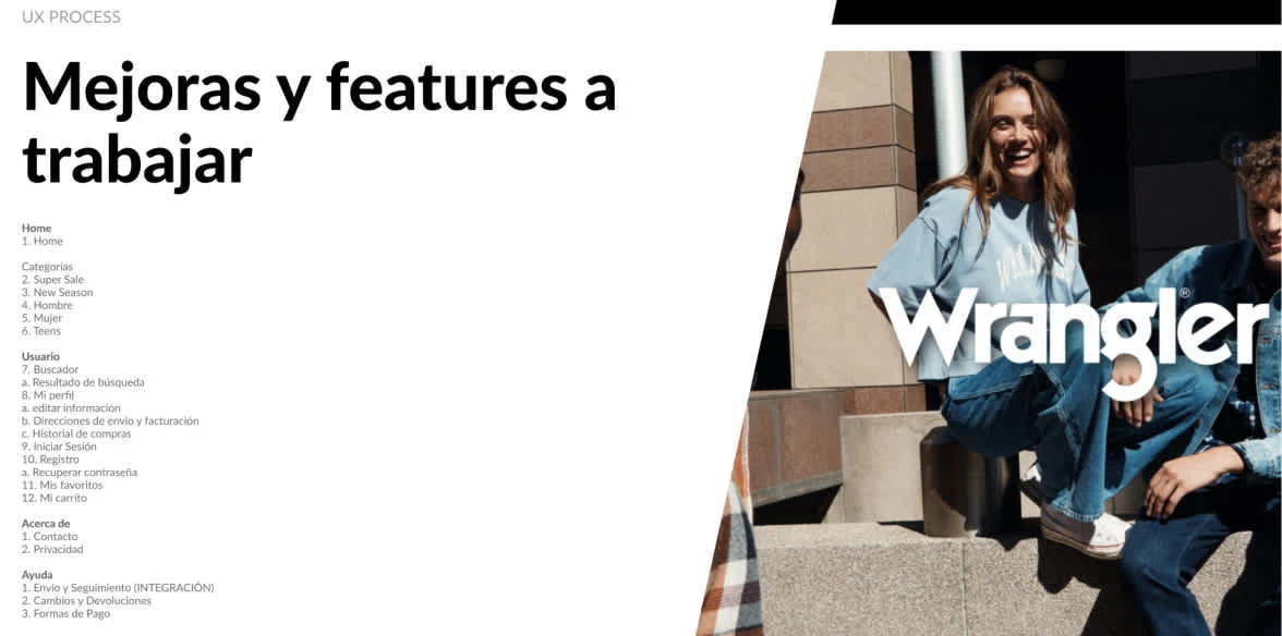
Information Architecture
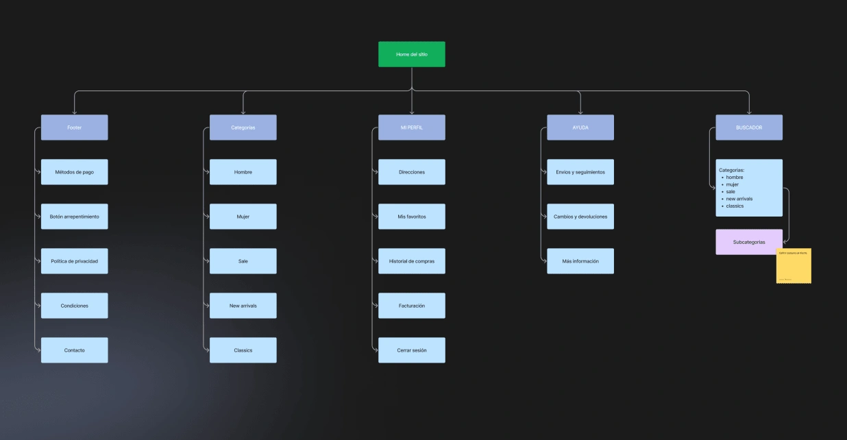
Flow Diagramming
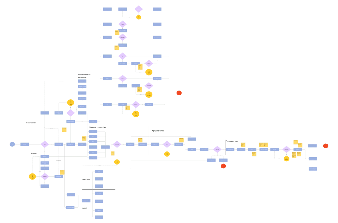
The complete flow of the purchasing experience was outlined, including error scenarios and access to specific segments. Additionally, simple flows like logging in, account creation, or logging out were addressed, among others.
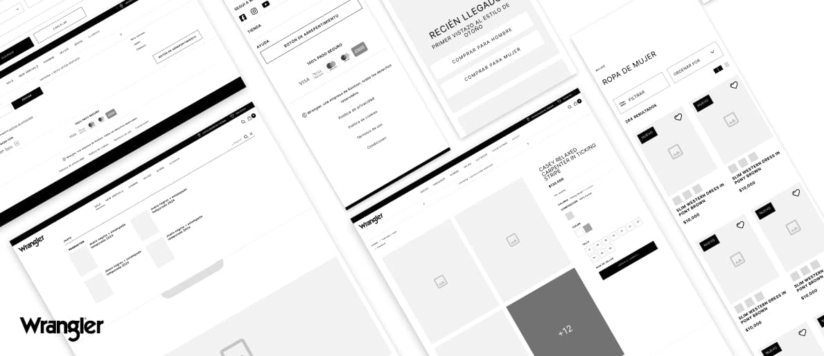
Wireframing
All interfaces were designed using flowcharts as a foundation to create the initial low-definition screens. A presentation was made to the client, specifying the applied improvements and showcasing how they would look based on this proposal.
Result
Every interface was designed using flowcharts as a foundation to create the initial low-definition screens. A presentation was made to the client, specifying the applied improvements and showcasing how they would look based on this proposal.
Like this project
Posted Jan 14, 2025
Redesign project for Wrangler's e-commerce, one of the most recognized clothing brands in the world, aimed at improving its shopping experience.
Likes
0
Views
14

