Project update: Neon Finance Design
Igwe Ugochukwu
Project update: Neon Finance Design Exploration
One thing I always do before committing to a final direction is explore at least two distinctly different approaches. Not variations of the same idea — genuinely different visual languages.
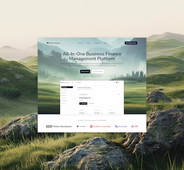
For the Neon.Finance hero section, here's what that looked like:
Direction A Geometric abstraction
Clean shapes in the background. Minimal. Precise. The visual language of a product that is structured, reliable, and data-driven. Strong choice for a B2B fintech audience that values clarity over warmth.
Direction B Landscape photography
An open landscape mountains, mist, space. Unexpected for finance. But emotionally it aligns with the product's promise: calm, clarity, control over your money. More human. More memorable.
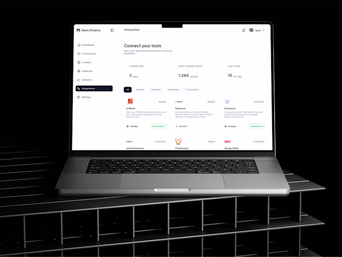
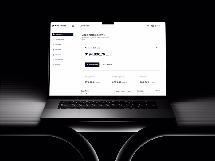
The client chose Direction B. It performed better in feedback because it made people feel something before they read a word.
This exploration process is built into how I work. You don't just get a final design from me you get thinking behind it.
If you're looking for a designer who asks "what should this feel like?" before asking "what should this look like?" I'd love to work on your project.
Currently available. Message me to start a conversation.
Like this project
Posted May 15, 2026
Project update: Neon Finance Design Exploration One thing I always do before committing to a final direction is explore at least two distinctly different app...
Likes
0
Views
2