
Igwe Ugochukwu
Mobile & Web App Designer - Figma & Framer Expert
Ready for work
Igwe is ready for their next project!
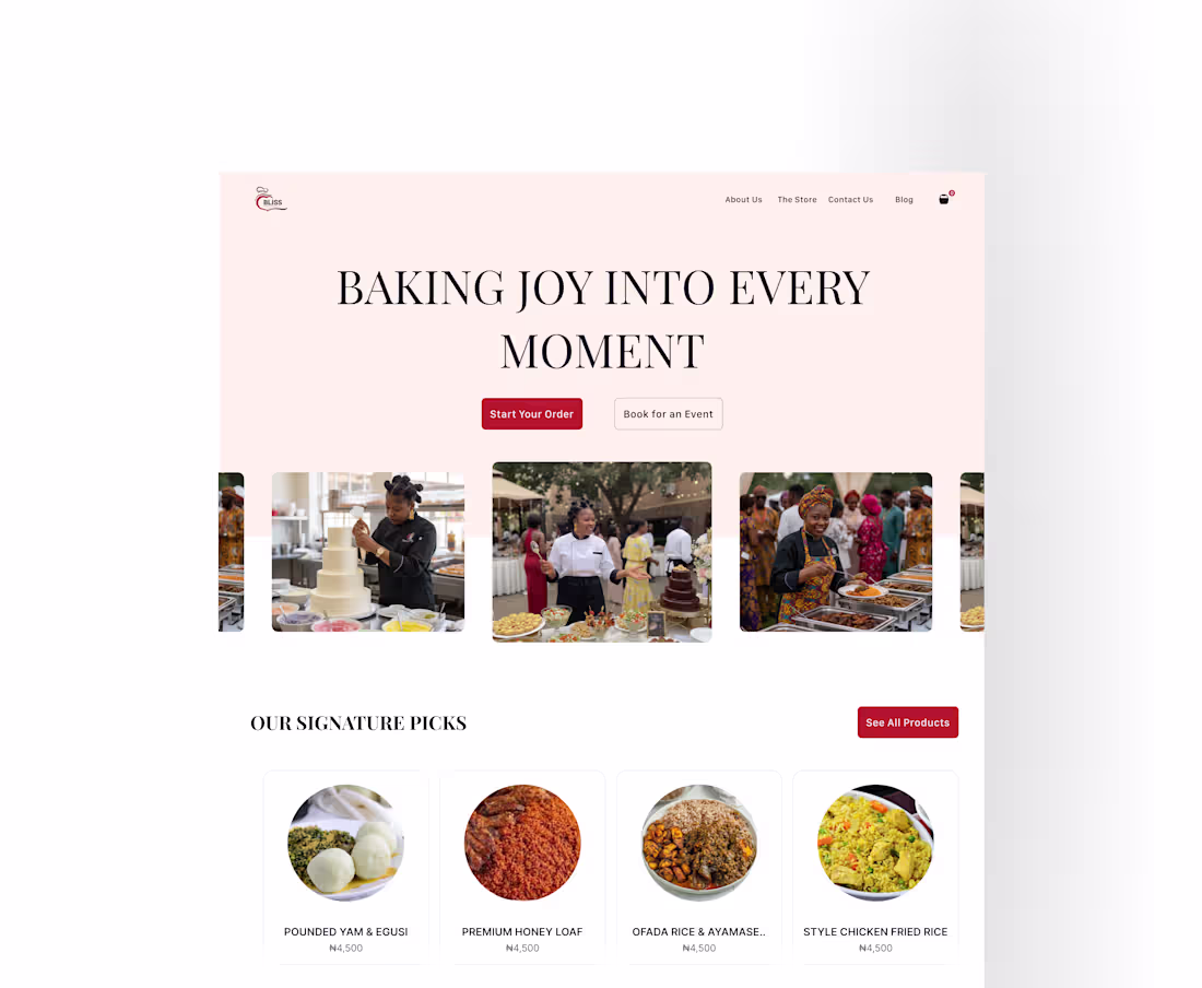
Project: Bliss — Bakery & Catering Website
The brief: Design a website for a Nigerian bakery and catering business that makes visitors feel something warm and hungry before they read a single word and converts that feeling into orders and event bookings.
The thinking: Most food business websites make the same mistake they lead with information instead of emotion. They say "order cakes online" when they should be making you feel the joy of the occasion the cake is for. Bliss isn't just selling baked goods. They're selling moments birthdays, weddings, celebrations, family gatherings. The design had to reflect that.
Key decisions:
Headline: "Baking Joy Into Every Moment" sells the feeling before the product. Every visitor knows what this business is about in under two seconds.
Photography: Real event photography placed immediately below the fold. For a food and catering business, authenticity builds trust faster than any copy. Real events, real food, real people enjoying it.
Dual CTA: "Start Your Order" and "Book for an Event" sit side by side because Bliss serves two distinct customer types — retail buyers and event clients. Both need to feel seen immediately without having to navigate anywhere.
Colour palette: Warm pink — soft, inviting, appetite-stimulating without being overwhelming. Feels like walking into a bakery.
Signature Picks section: Product listings below the fold with circular photography, clean typography and pricing in Naira — familiar, local, trustworthy.
Tools: Figma
Deliverable: Full website design hero, signature products, event catering sections
Available for food business, SME and e-commerce website projects. Message me to discuss yours.
1
26
Project: MealPlan — Full Website Design + Framer Development
The brief: Design and build a complete marketing website for a Nigerian meal planning app one that converts visitors into app downloads and feels genuinely made for its African audience.
The process: I handled this project end to end. Figma for the full design system, Framer for the build. No handoff between designer and developer because I am both.
This matters more than most clients realise. When the person who designed the site is also the person building it, nothing gets lost. Every interaction is exactly as intended. Every spacing decision survives from design to production. The animation you approved in the prototype is the animation on the live site.
What was built:
→ Fully responsive landing page desktop, tablet and mobile
→ Scroll-triggered animations built natively in Framer
→ App store download CTAs integrated into multiple sections
→ Testimonials section with real Nigerian user voices
→ How It Works section with step-by-step visual flow
→ Full CTA section with dual download buttons
The result: A production-ready website that looks exactly as designed, loads fast, and speaks directly to its Nigerian audience from the first headline.
Tools: Figma + Framer
Deliverable: Live, published website
If you need a website designed and built by the same person — with zero gap between the design and what actually launches that's exactly what I do.
Book a free call: https://calendly.com/igweugochukwu692/30min
1
27
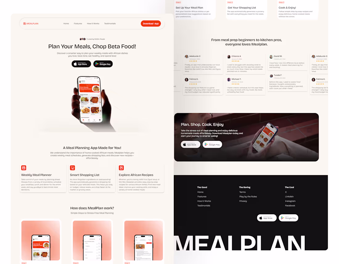
Project: MealPlan — Full Landing Page Design
The brief: Design a complete landing page for a Nigerian meal planning app that converts visitors into app downloads built specifically for the African market.
The thinking: Most food apps are designed with a Western audience in mind. The photography is generic, the copy is corporate, and the whole thing feels like it could belong to any product anywhere. For MealPlan to work in Nigeria, it needed to feel like it was designed by someone who actually understands Nigerian food culture because that's exactly who the users are.
Every section was built around that idea:
Hero: "Plan Your Meals, Chop Beta Food" the headline speaks directly in the user's voice. Not aspirational marketing language. Real talk.
Features: Each feature was written around a real Nigerian pain point forgetting to buy crayfish, wasting food because there was no plan, spending too much at the market. Specific beats generic every time.
How It Works: Three steps kept deliberately simple Set Up, Get Your List, Cook & Enjoy. Because the product promise is ease, the process explanation had to be easy too.
Testimonials: Nigerian names, Nigerian problems solved, Nigerian outcomes. Representation in your own product builds instant trust with your audience.
Tools: Figma
Deliverable: Full landing page hero, features, how it works, testimonials, CTA sections
Available for landing page and consumer product projects. Send me a message to discuss yours.
4
2
63
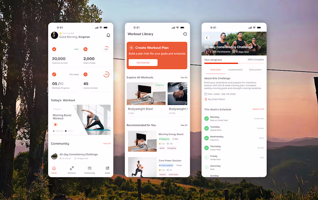
Project: Fitness Tracking App — Full Mobile UI
The brief: Design a fitness app that keeps users motivated and consistent not just on day one, but through week six.
The thinking: Most fitness apps lose users in the first two weeks. Not because the workouts are bad because the app stops feeling rewarding. I designed around three moments that matter most in a user's day.
Morning (Home screen): The user opens the app before a workout. They're looking for motivation. The home screen leads with achievement details, including calories burned and steps taken, before showing what's left to do. Win first, gap second.
Planning (Workout Library): Too many choices create paralysis. The library screen has one prominent primary action "Create Workout Plan" before opening up into the full catalogue. One clear next step always visible.
Accountability (Challenge screen): Individual motivation fades. Community motivation compounds. The challenge screen shows personal progress (58% complete) alongside 15,000 other participants and a structured weekly schedule. It makes the commitment feel shared, not lonely.
Design decisions:
→ Orange accent throughout energetic, warm, action-oriented without being aggressive
→ Progress rings over bars feels personal, like a wearable device
→ Real photography in workout cards makes the next session feel tangible
→ Community section on the home screen social proof built into daily use
Tools: Figma
Deliverable: Full app UI across home, library, challenge, and community screens
Open for mobile app UI and product design projects. Send me a message to talk about yours.
6
4
109
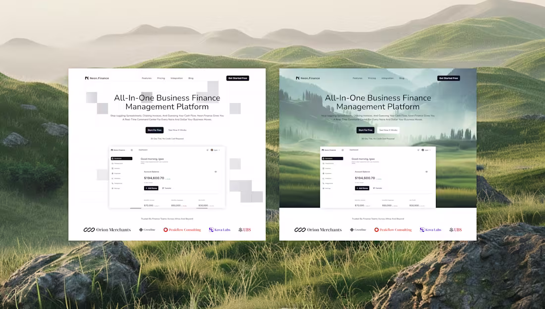
Project update: Neon Finance Design Exploration
One thing I always do before committing to a final direction is explore at least two distinctly different approaches. Not variations of the same idea — genuinely different visual languages.
For the Neon.Finance hero section, here's what that looked like:
Direction A Geometric abstraction
Clean shapes in the background. Minimal. Precise. The visual language of a product that is structured, reliable, and data-driven. Strong choice for a B2B fintech audience that values clarity over warmth.
Direction B Landscape photography
An open landscape mountains, mist, space. Unexpected for finance. But emotionally it aligns with the product's promise: calm, clarity, control over your money. More human. More memorable.
The client chose Direction B. It performed better in feedback because it made people feel something before they read a word.
This exploration process is built into how I work. You don't just get a final design from me you get thinking behind it.
If you're looking for a designer who asks "what should this feel like?" before asking "what should this look like?" I'd love to work on your project.
Currently available. Message me to start a conversation.
1
22
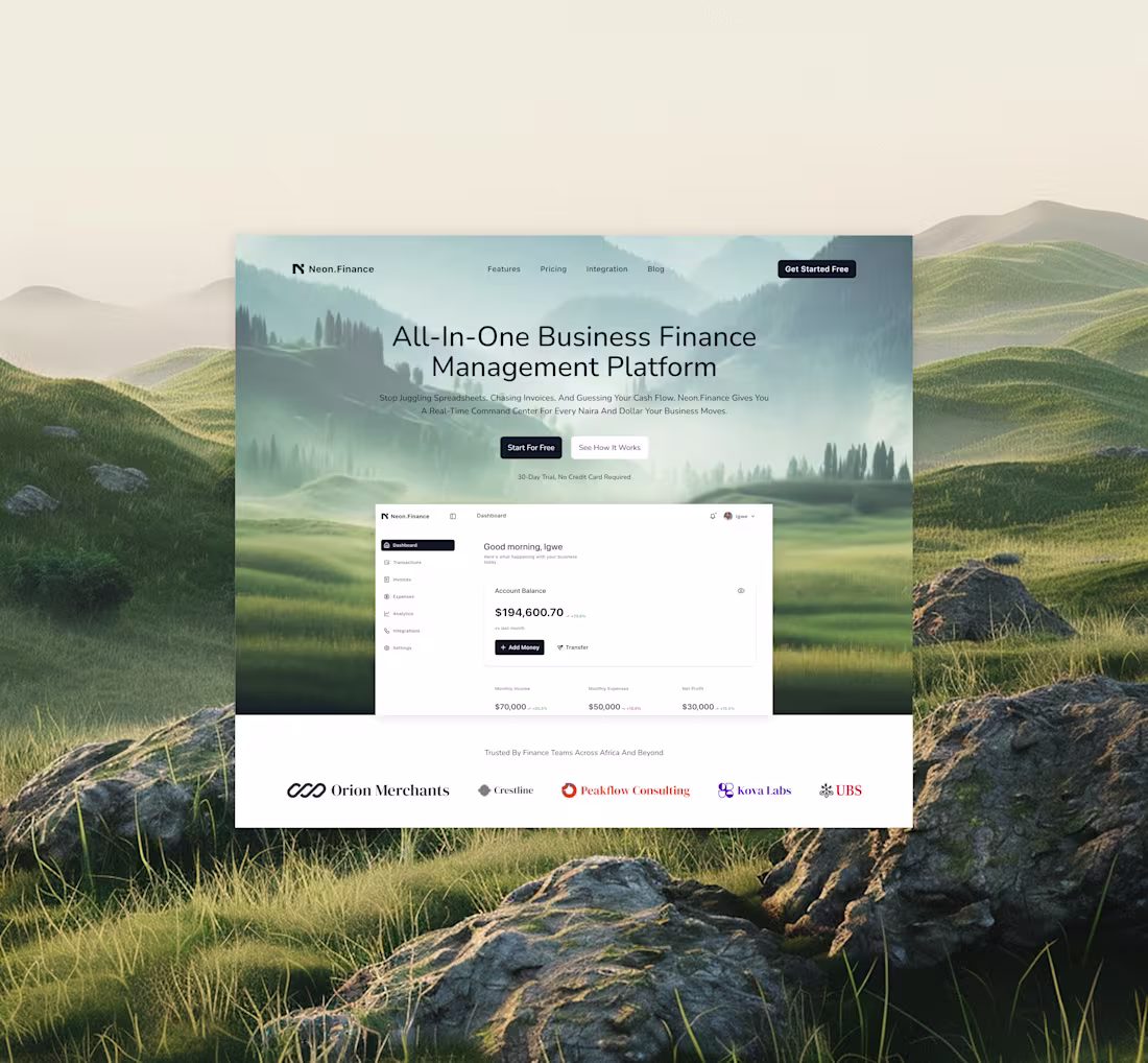
Project: Neon Finance Hero Section Design
The brief: Design a landing page hero for a business finance platform that feels different from every other fintech on the market trustworthy, but not stiff.
My thinking: I didn't want to open with abstract shapes or stock photography of people pointing at laptops. I wanted the visitor to feel something the moment they land calm, clarity, control. Those are the feelings a good financial tool should give you.
So I used a wide landscape photograph mountains fading into mist as the background. It's unexpected for fintech, but it works because it's emotionally aligned with the product's promise: your finances, finally under control.
The dashboard mockup sits over the landscape so visitors see the actual product immediately. No guessing what it is. And the subheadline does the real job it names the exact pain ("juggling spreadsheets, chasing invoices, guessing cash flow") before asking for anything.
Key decisions:
→ Landscape bg — calm and expansive, not corporate
→ Product mockup above the fold — proof before promises
→ Pain-first subheadline — speaks to the user before selling to them
→ Two CTAs — "Start For Free" (primary) and "See How It Works" (for the cautious visitor)
→ Social proof bar (logos) immediately below — trust before scroll
Tools: Figma
Available for landing page and product UI projects message me to discuss yours.
1
29
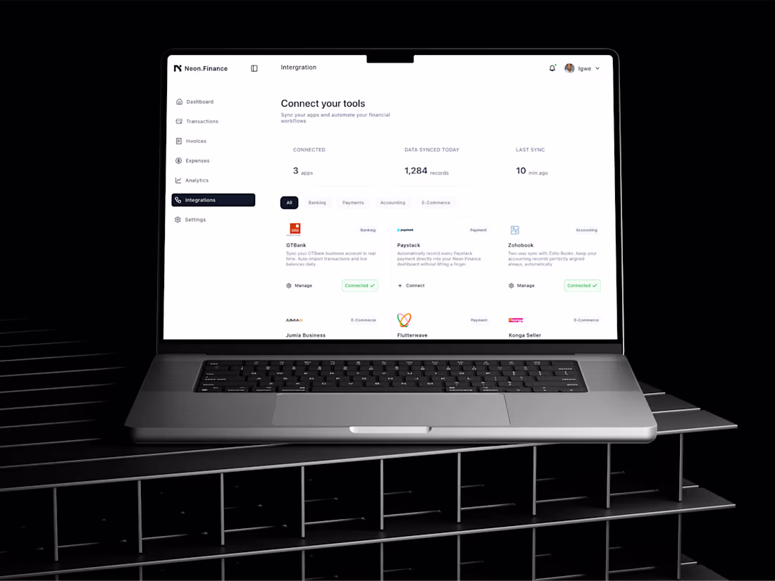
Integrations Screen — Neon Finance (http://Neon.Finance)
One of the most underestimated screens in any SaaS product is the integrations page. Users land here when they're ready to commit, they want to connect their tools and trust the platform with their data. Get this screen wrong and they bounce. Get it right and they feel like the product was built for them.
My approach for Neon Finance (http://Neon.Finance) was to make every integration feel familiar. GTBank, Paystack, Flutterwave, Jumia, Konga, Zohobook these aren't random tools. They're the exact stack a Nigerian business owner already lives in. Seeing them listed here, with real logos and clear connection states, turns a product feature into a moment of recognition: "this was built for me."
Key decisions on this screen:
The stat bar at the top 3 apps connected, 1,284 records synced, last sync 10 minutes ago answers the user's anxious question before they ask it: "Is my data safe and up to date?" Yes. And it tells you exactly when.
The filter tabs (All / Banking / Payments / Accounting / E-Commerce) let users scan only what's relevant to them. No scrolling through irrelevant tools.
The card layout keeps every integration at visual parity — no tool feels more important than another, which keeps the UI honest.
Connected vs. unconnected states are distinct but not aggressive. "Connected ✓" in green is calm, not celebratory. It just says: this is done.
0
21
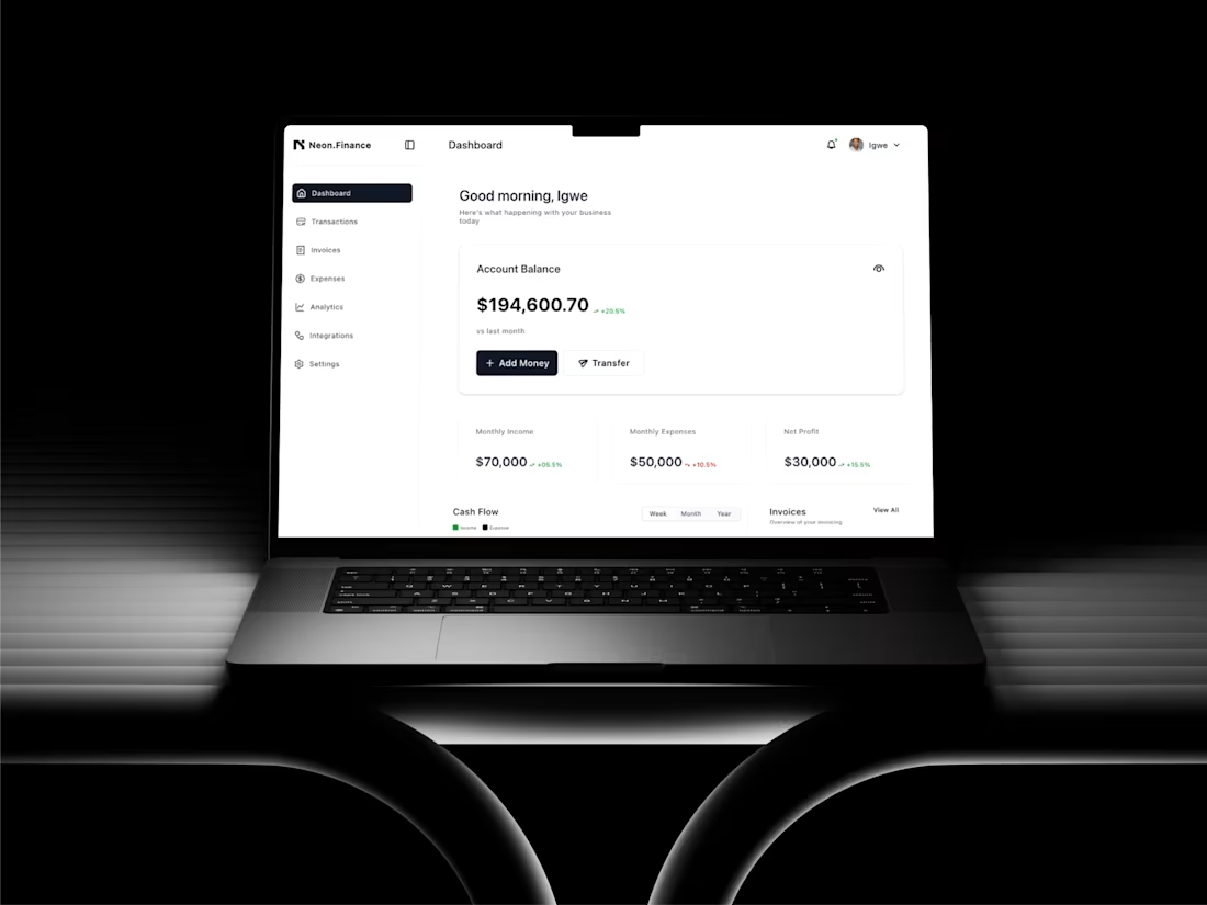
Project: Neon Finance (http://Neon.Finance) Fintech Dashboard UI
The brief: Design a financial dashboard that gives business owners a clear, real-time view of their money balance, income, expenses, profit, cash flow, and invoices without cognitive overload.
My approach: Financial data is inherently dense. My priority was hierarchy over decoration. I made the account balance the single most prominent element on the page. Every other metric supports it. The dark sidebar creates a navigation layer that never competes with the content. I used green sparingly only to indicate positive change so when it appears, it carries meaning.
Key design decisions:
→ Two-tone layout (dark nav, white content) for instant spatial clarity
→ Balance card with hide/show toggle privacy for sensitive environments
→ Quick-action buttons (Add Money, Transfer) within the balance card zero navigation needed for the most common actions
→ Metric row scannable in under 2 seconds
Tools: Figma
Deliverable: Full dashboard UI, component library
Available for SaaS and fintech UI projects. Message me to discuss your product.
2
2
78
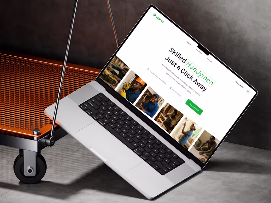
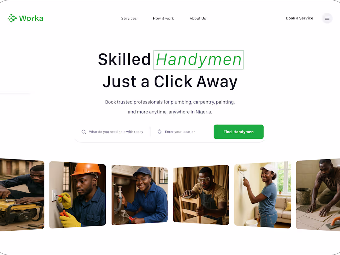
Project: Worka — Handyman Booking Platform
The brief: Design a web platform that helps Nigerians find and book skilled handymen fast plumbing, carpentry, painting, and more.
My approach: I started with the user's core need speed and trust. The hero section was designed to answer two questions instantly: "What is this?" and "What do I do next?" I used strong typographic hierarchy, a search-first layout, and real photography of the workers to build immediate credibility.
Key design decisions:
→ Bold, high-contrast headline with a green accent on "Handymen" to anchor the eye
→ Search bar as the primary CTA — lower friction than a button
→ Grid of worker photos to humanise the platform before the user scrolls
→ Clean nav with only 3 items — nothing to distract from booking
Tools: Figma
Deliverable: Full website design ready for Framer development
Available for similar projects. Send me a message to discuss your brief.
2
1
27
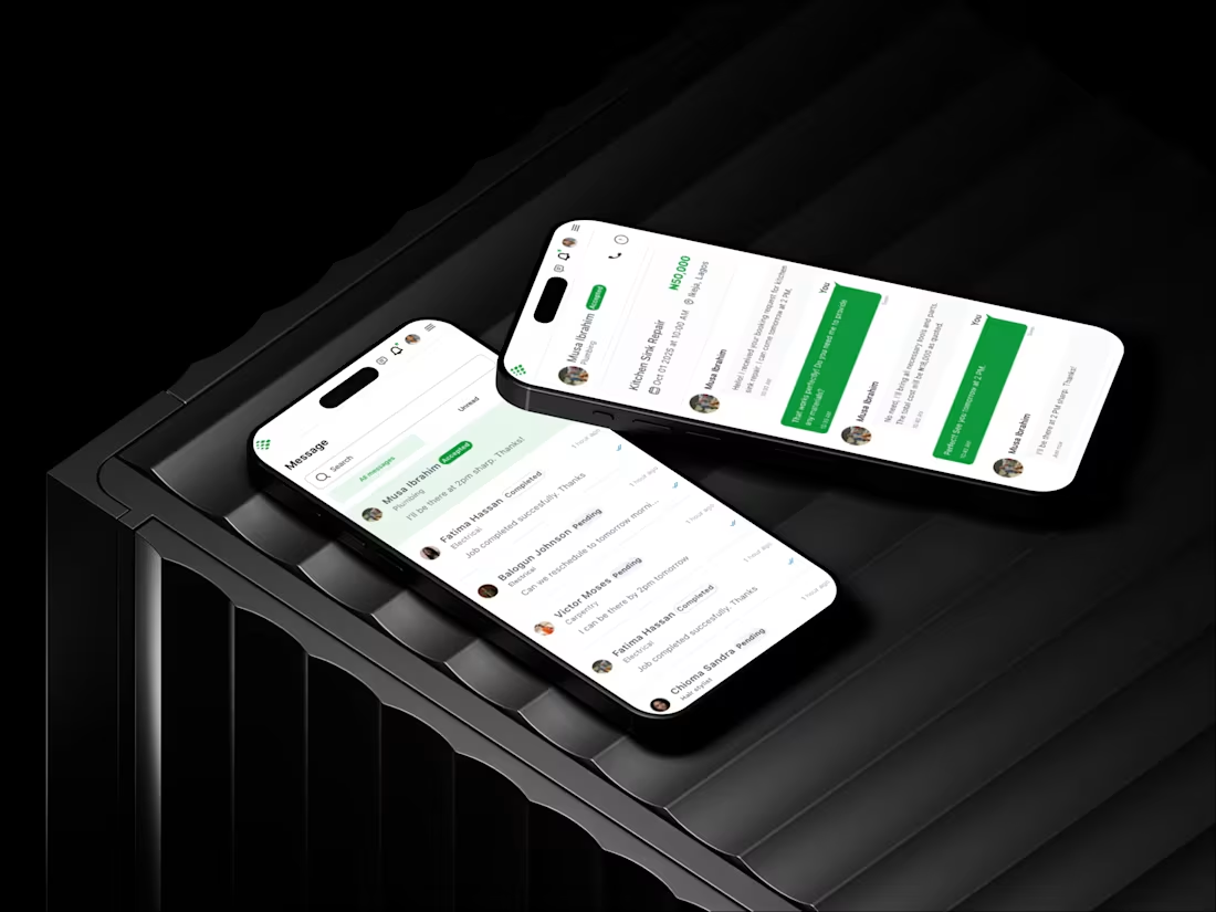
Part 2. The messaging screen.
This is where most service apps die.
Not because messaging doesn't work. But because getting TO the messages feels like solving a puzzle.
This? Brain-dead simple. Job list. Message preview. Tap. Done.
I've watched people abandon platforms because responding took four taps and two back buttons. They just stopped opening the app.
Your users have 6% of their brain available. The other 94% is thinking about dinner or whether they left the stove on.
Design for the 6%.
Message previews? Decide what's urgent without breaking flow. Embedded in job flow? No mental gymnastics. Search at top? Find clients fast.
Question: What's an app you love DESPITE terrible UX? One you use because you have to, not because it's pleasant?
Working with founders who want products people actually enjoy using.
3
59
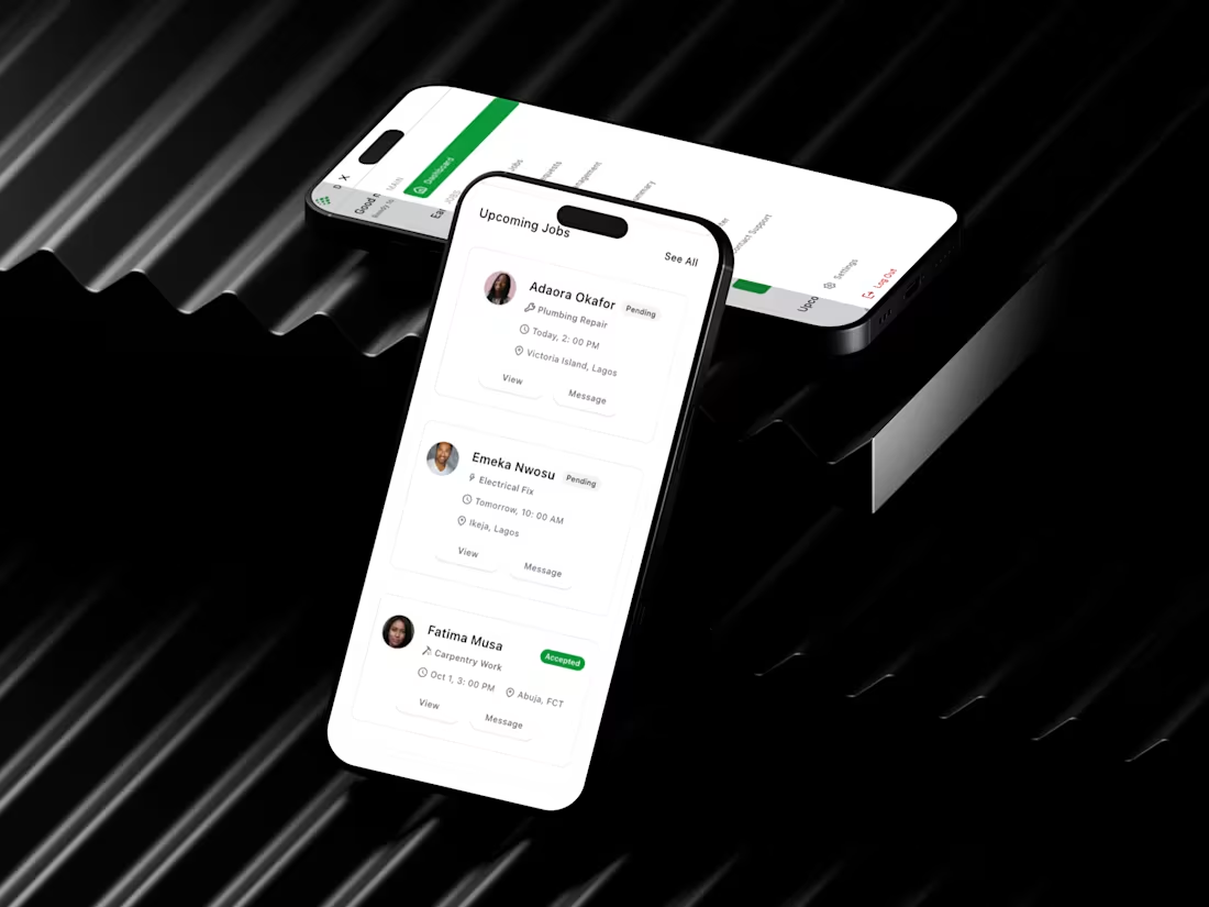
Most marketplace apps fail the parking lot test.
Can someone use your app in their car, coffee in one hand, deciding which job to take before driving off?
This handyman interface passes that test.
Job cards show what matters: client, service, time, location, status. One tap to view. One tap to message. Done.
I design for real contexts. The contractor between appointments. The worker planning their day at 5:45 AM. The person with dirty hands who can't unlock their phone three times.
If your app needs two hands and full attention, that's not a user problem it's a design problem.
I build mobile experiences for the real world, not just Figma. Apps people open 10 times a day, not once a week.
Need a mobile product that fits actual lives? Open for projects now.
2
1
60
Your onboarding flow is probably killing conversions.
After auditing 47 products, the data is clear: users drop off after 3 steps.
Not 5. Not 7. Three.
Here's why most teams get this wrong:
They assume users need context before they can do anything useful. So they build long flows account setup, profile completion, preferences, tutorials.
But users don't care about your setup process. They care about solving their problem.
The fix? Show value before asking for commitment.
For a project tool, that's not "create workspace" or "invite team." It's checking off a task.
If your product asks for more than 3 things upfront, you're losing people who would've converted.
Looking for a product designer who understands conversion and UX? Let's talk. Book a call on my profile.
1
44
Most booking platforms are designed by people who've never rushed to book something at 11 PM before an event.
This space rental platform gets out of your way. Location, dates, guests, search—done. No five-step wizard. No "create account to see prices" nonsense.
I build for real scenarios. The stressed event planner with 48 hours to find a venue. The property owner checking dashboards between meetings. The team lead searching for an offsite space on their commute.
Your users aren't in a lab. They're distracted, in a hurry, probably on their phone. Design for that reality.
If your booking platform fights users instead of helping them, we should talk. I specialize in turning complicated journeys into simple, obvious paths.
Open for projects that need strategic UX, not just visual polish.
1
45

Real talk: This handyman platform proves you don't need 47 features to win.
One strong value prop. Clear visuals. Simple booking flow. Done.
I've spent years stripping away the noise from interfaces – helping products go from "looks nice" to "actually converts." This one converts because it respects the user's time and intelligence.
Your service business doesn't need a complicated website. It needs one that makes hiring you the obvious choice.
If your platform feels like it's working against you instead of for you, that's a design problem. And design problems have design solutions.
Open for projects that need strategic UX thinking, not just pretty screens. Let's build something that performs.
2
3
58
I focus on product design that feels stable, intentional, and ready to scale.
This work is about more than visuals—it’s about structure, flow, and making products easier to trust and use.
I’m currently available for UI and product design projects.
Message me if you want thoughtful design not noise.
2
41
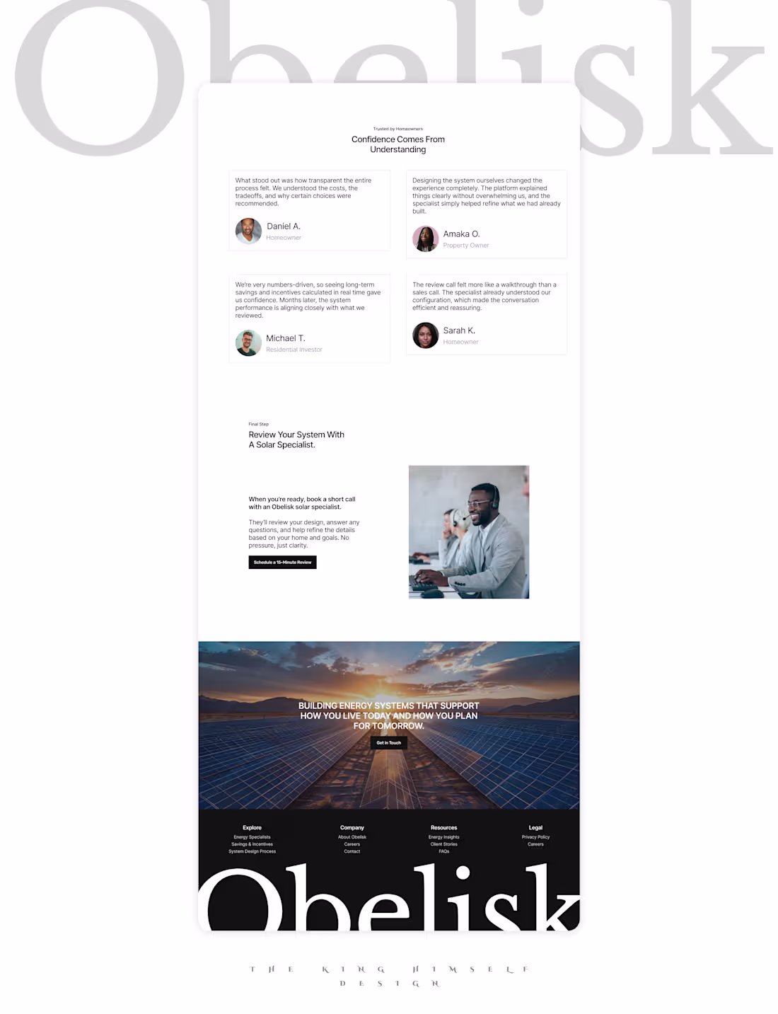
The closing sections of Obelisk’s landing page focus on human proof and thoughtful conversation. Testimonials emphasise clarity and transparency, while the final CTA is designed as a review, not a forced commitment.
This is how I approach landing page design for high-ticket products and long-term decisions. Calm structure, clear UX thinking, and trust built gradually through design and copy working together.
If you’re building a climate tech, fintech, or complex product where credibility matters, I help teams with product design and UX design create digital experiences that convert through confidence, not pressure.
0
26
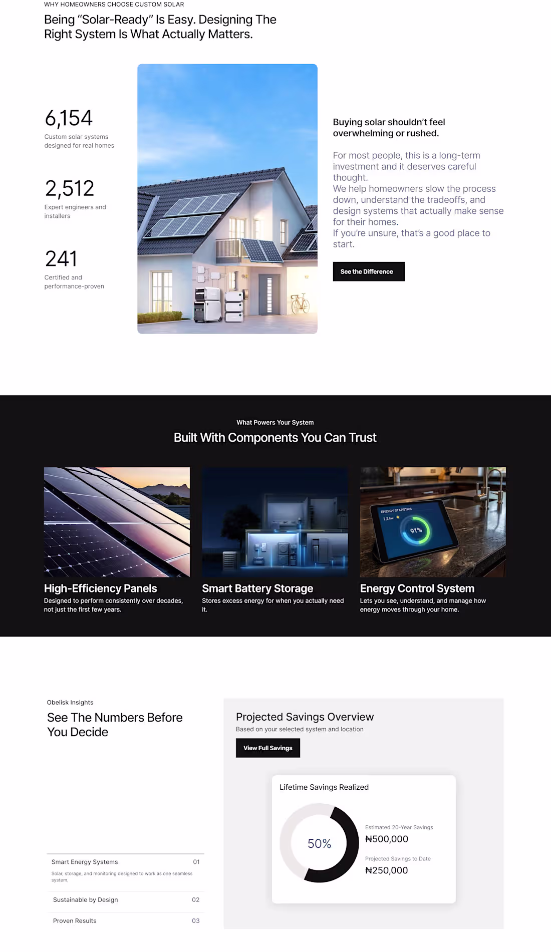
Following the hero section, the next priority was trust.
For Obelisk, that meant showing numbers early, addressing hesitation directly, and treating users like decision-makers — not leads in a funnel.
The value dashboard is designed to answer the questions people actually have before committing to solar:
How much do I need? What does this look like long term? What are the tradeoffs?
This is where conversion happens not through urgency, but through understanding.
1
35
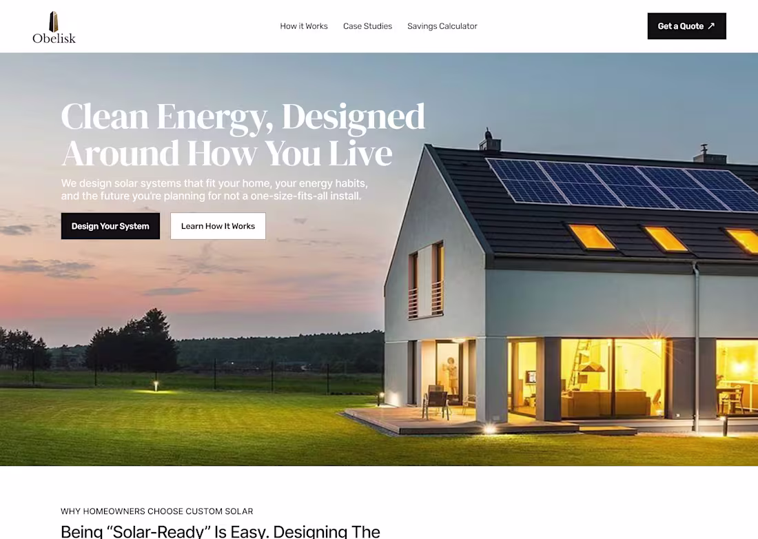
Hero-first thinking.
Many solar landing pages jump straight into product, savings, or CTA buttons. For Obelisk, we flipped the script.
The hero doesn’t sell it frames a worldview: energy independence is personal, it’s long-term, and it starts with understanding the home and habits, not pushing products.
Design + copy + imagery, all working quietly together to build trust. That’s how a landing page becomes more than a marketing page.
2
39
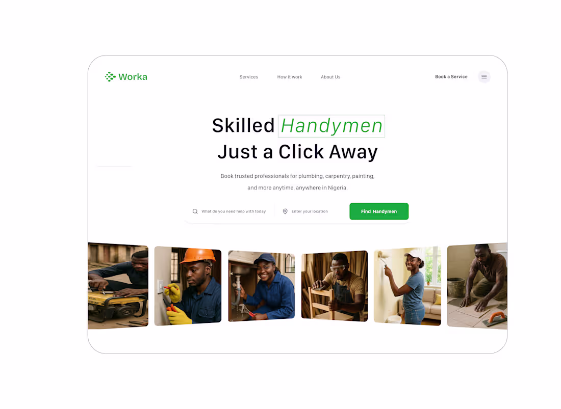
Worka — responsive landing and hero designed for a two-sided marketplace: homeowners who need fast, reliable help and handymen who want discoverable paid work.
Design priorities: clear service categories, location-first search, trust signals, and a simple onboarding CTA for professionals. The result is a single page that converts both customers and providers.
If you’re building a service marketplace and want a landing page that attracts users and signs up professionals, I can design it.
#WebDesign #MarketplaceDesign #FreelanceDesigner #ResponsiveDesign
0
44
Hero section for Worka, a handyman booking platform.
Designed to simplify trust and booking through clarity, hierarchy, and human-centered layout.
Focused on creating a clean UI that instantly communicates purpose — Skilled handymen, just a click away.
Looking to design a landing page that converts?
Let’s build together.
#UIDesign #WebDesign #LandingPageDesign #FreelanceDesigner
3
50
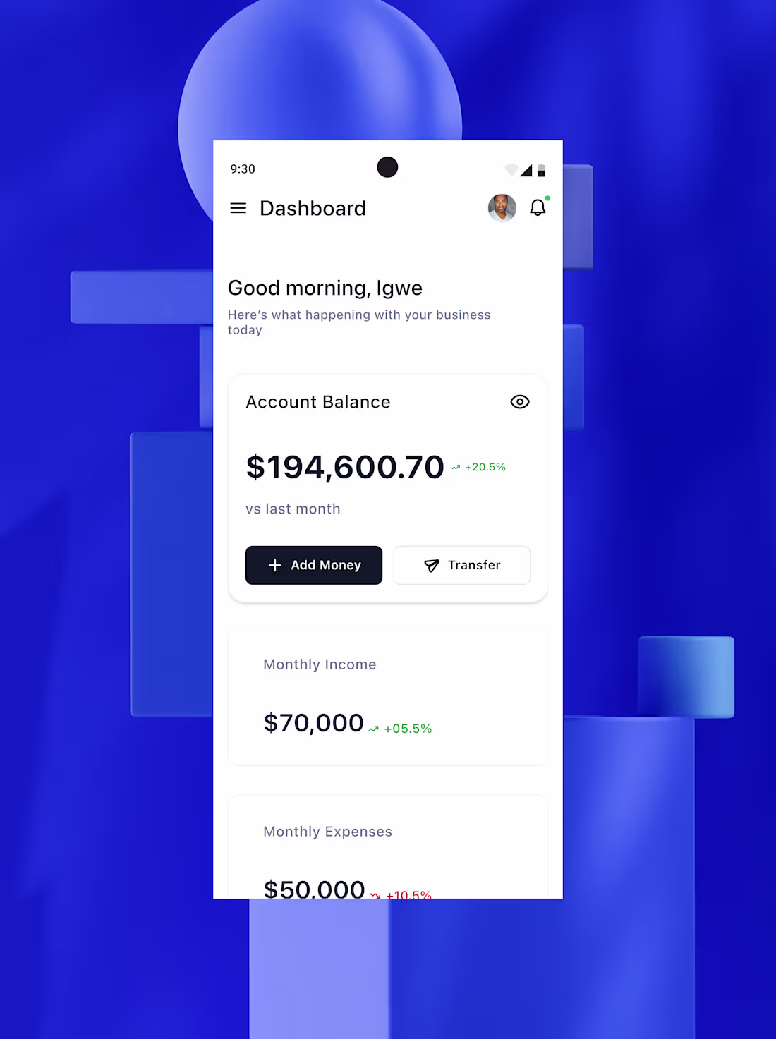
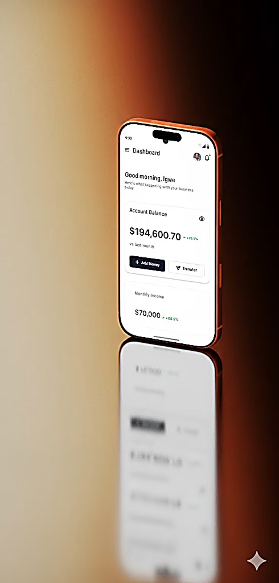
This mobile dashboard is the responsive version of the Neon Finance web app, designed to help small business owners track income, expenses, and business performance on the go.
It features a clean, modern, and intuitive UI that adapts perfectly to mobile screens while keeping key metrics like account balance, profit growth, and cash flow easily accessible. The design emphasizes clarity, usability, and responsive experience, ensuring consistency across devices.
Looking for a UI/UX Designer to create a responsive dashboard or mobile app for your business?
Let’s build it together Hire me to design your next project!
#ShareYourWork #UIDesign #UXDesign #ProductDesign #MobileDesign #DashboardUI #FintechDesign #SBMDashboard
0
40
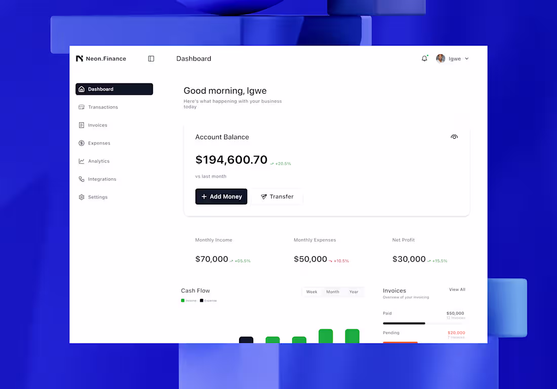
A clean and modern Small Business Management dashboard designed to help business owners track income, expenses, and profits effortlessly. The goal was to create a minimal, data-driven interface that simplifies financial insights while keeping everything visually engaging and easy to navigate.
With a focus on clarity, balance, and usability, this design ensures users can monitor their cash flow, invoices, and overall business performance at a glance.
✨ Designed for productivity. Built for simplicity.
#UIDesign #SBMDashboard #FintechDesign #UXDesign #DashboardUI #ProductDesign #BusinessTools #shareyourwork
2
51
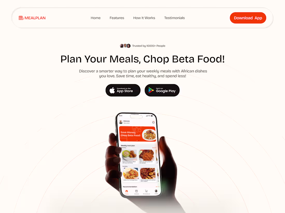
A Mealplan Framer Website
0
1
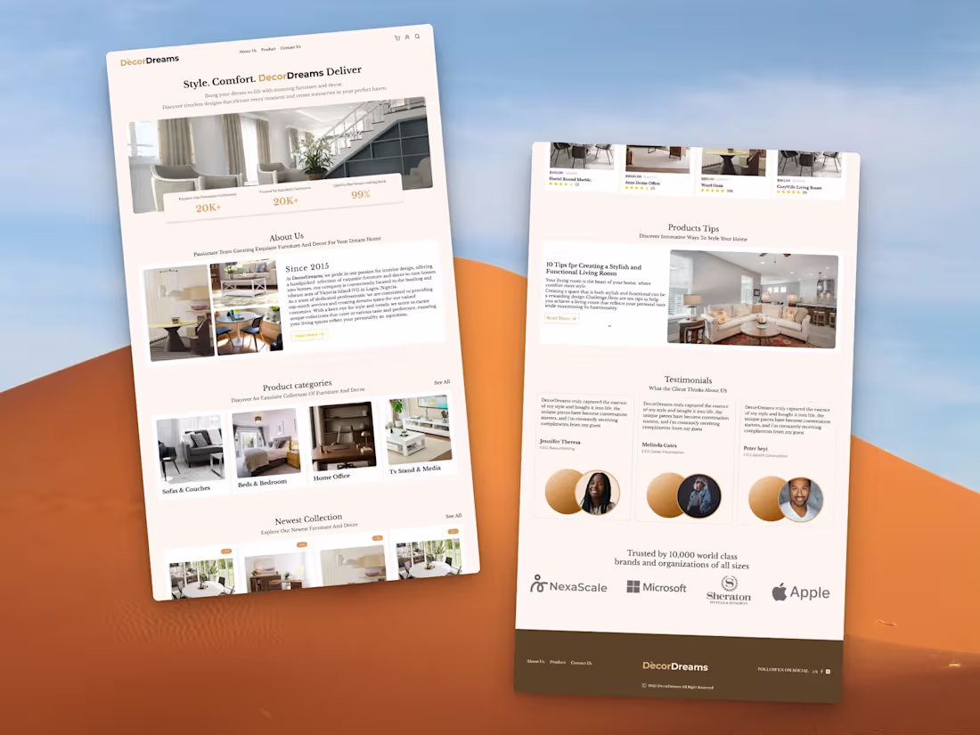
Luxury Furniture Website
0
2
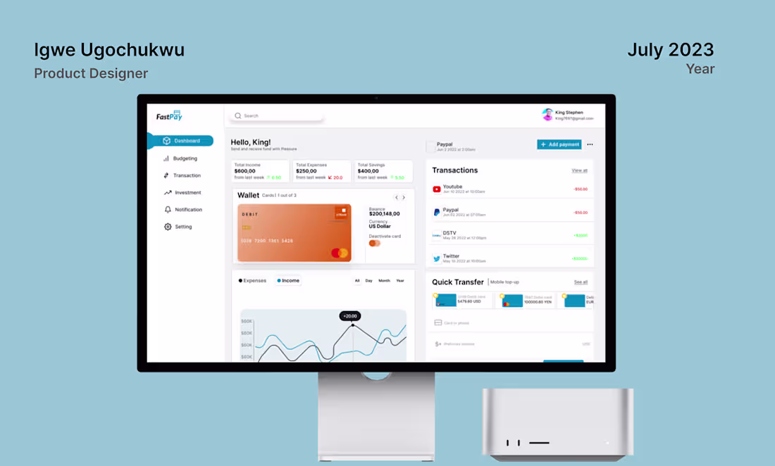
Fintech Dashboard
0
5
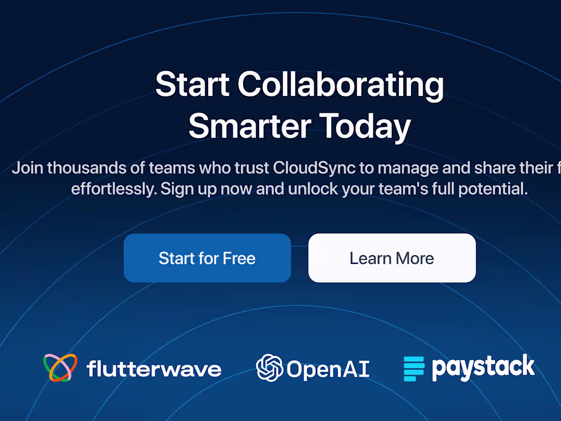
File Collaboration Landing page
0
3