Project: Neon Finance Hero Section
Igwe Ugochukwu
Project: Neon Finance Hero Section Design
The brief: Design a landing page hero for a business finance platform that feels different from every other fintech on the market trustworthy, but not stiff.
My thinking: I didn't want to open with abstract shapes or stock photography of people pointing at laptops. I wanted the visitor to feel something the moment they land calm, clarity, control. Those are the feelings a good financial tool should give you.
So I used a wide landscape photograph mountains fading into mist as the background. It's unexpected for fintech, but it works because it's emotionally aligned with the product's promise: your finances, finally under control.
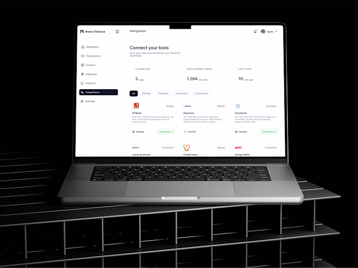
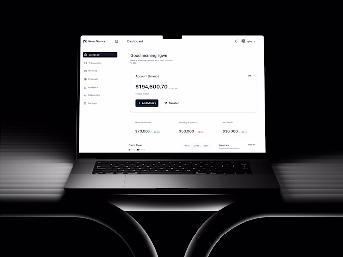
The dashboard mockup sits over the landscape so visitors see the actual product immediately. No guessing what it is. And the subheadline does the real job it names the exact pain ("juggling spreadsheets, chasing invoices, guessing cash flow") before asking for anything.
Key decisions:
→ Landscape bg — calm and expansive, not corporate
→ Product mockup above the fold — proof before promises
→ Pain-first subheadline — speaks to the user before selling to them
→ Two CTAs — "Start For Free" (primary) and "See How It Works" (for the cautious visitor)
→ Social proof bar (logos) immediately below — trust before scroll
Tools: Figma
Available for landing page and product UI projects message me to discuss yours.
Like this project
Posted May 14, 2026
Project: Neon Finance Hero Section Design The brief: Design a landing page hero for a business finance platform that feels different from every other fintech...
Likes
0
Views
0