Duna Arq. — Brand Identity for an Architecture Studio

Vinicius Rodrigues


Every story is unique.
Duna is an architecture studio that believes each project should reflect the identity of its clients. The brand needed to hold that same idea.
Born from the desert
The identity is born from the desert, and from four things it stands for: fluidity, texture, time and form. That became expressive typography, earthy colours and a clean composition.
Six colours with names
The palette has six colours, each with its own name: Ébano Urbano, Terracota Viva, Areia Caliza, Cacau Bruto, Argila Suave and Branco Fosco.
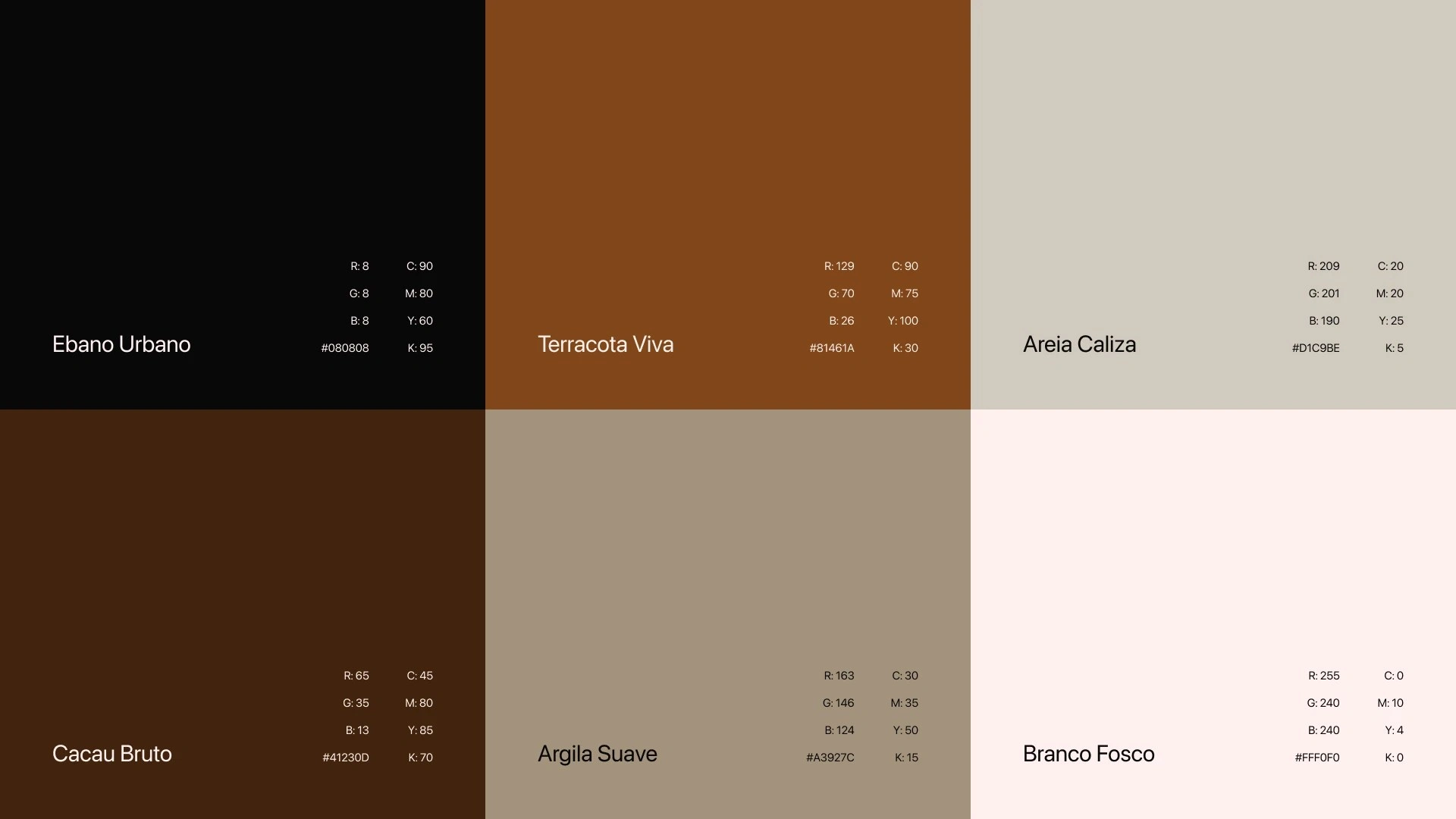
Duna Arq. colour palette
They have to work in two very different places. On screen they hold contrast, and on paper they stay warm and tactile.
From a digital signature to embossed print
The system adapts across media without losing itself, from a digital signature all the way to print finished with embossing. It works large and quiet on a wall, and small and precise on a business card.
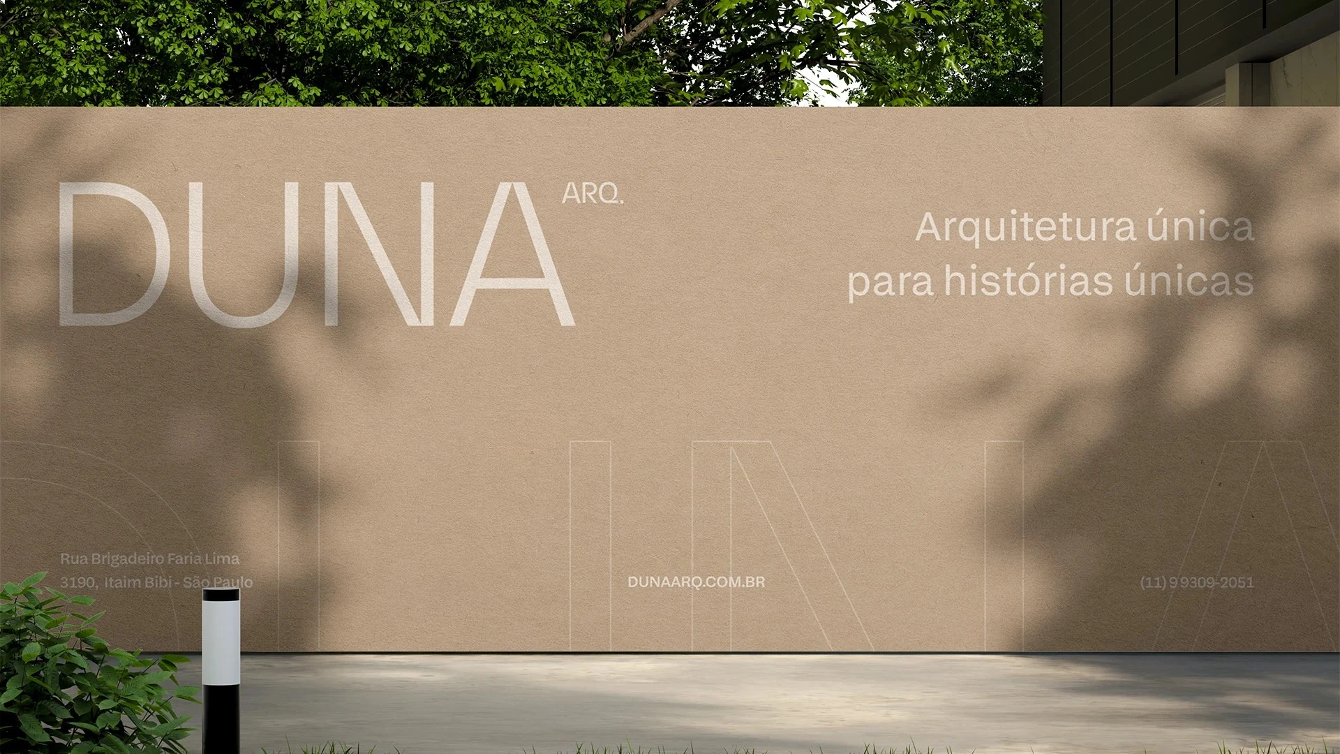
Duna Arq. signage
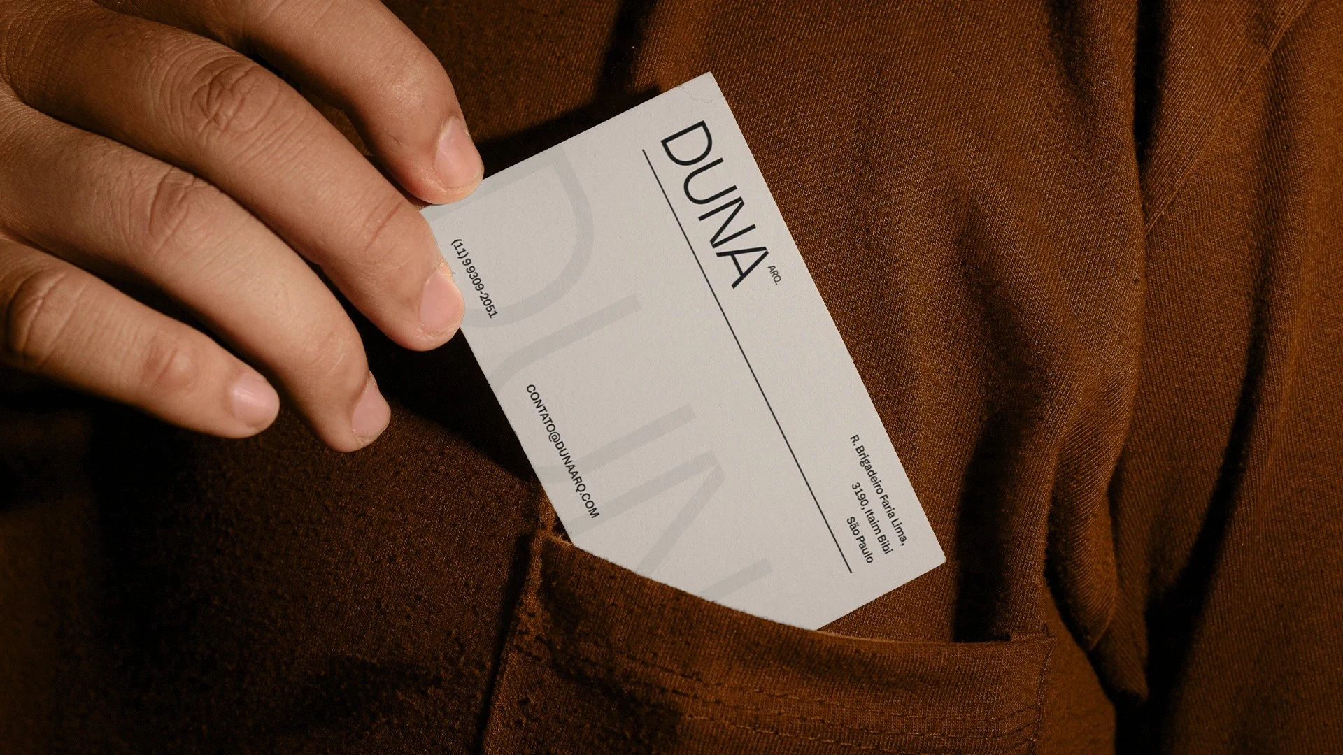
Duna Arq. business card
The same language carries into the website, where typography and colour do most of the talking.
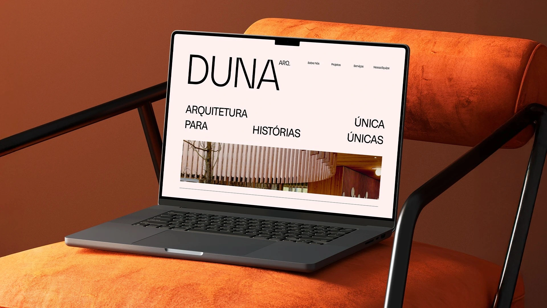
Duna Arq. website
What I did
Wordmark and lockups. The typographic system, set in Early Sans Variable, and the colour palette. Stationery, signage and posters. Merchandise. Website design.
Like this project
Posted Sep 20, 2026
Visual identity for an architecture studio where each project reflects its client's story. Born from the desert: fluidity, texture, time and form.
Likes
0
Views
2