Using Excel for dashboard creation: Warsaw Weather Analysis
Francesco Stara
In this weather data analysis project, I delved deep into daily meteorological data from Warsaw, the city I call Home. Harnessing Python for initial data preprocessing and in-depth analysis, Microsoft Excel for crafting dynamic visualizations, and statistical tools for trend identification, I sought to comprehensively understand the climatic trends and patterns of my home city. This project stands as a testament to the blend of data science techniques and visualization tools applied to a topic of personal relevance.
You can see the project also on my portfolio: https://francescostara.com/.
The objective of this project is to analyze daily weather data from Warsaw, Poland, to identify trends and patterns. The dataset includes daily weather readings from 1993 to 2022, including the average, maximum, and minimum temperatures (TAVG, TMAX, TMIN), precipitation (PRCP), and snow depth (SNWD). The data is publicly available on Kaggle (Here).
After cleaning the data and some initial exploration, I moved to Microsoft Excel for the creation of an interactive dashboard, showcasing the potentiality of the famous spreadsheet software.
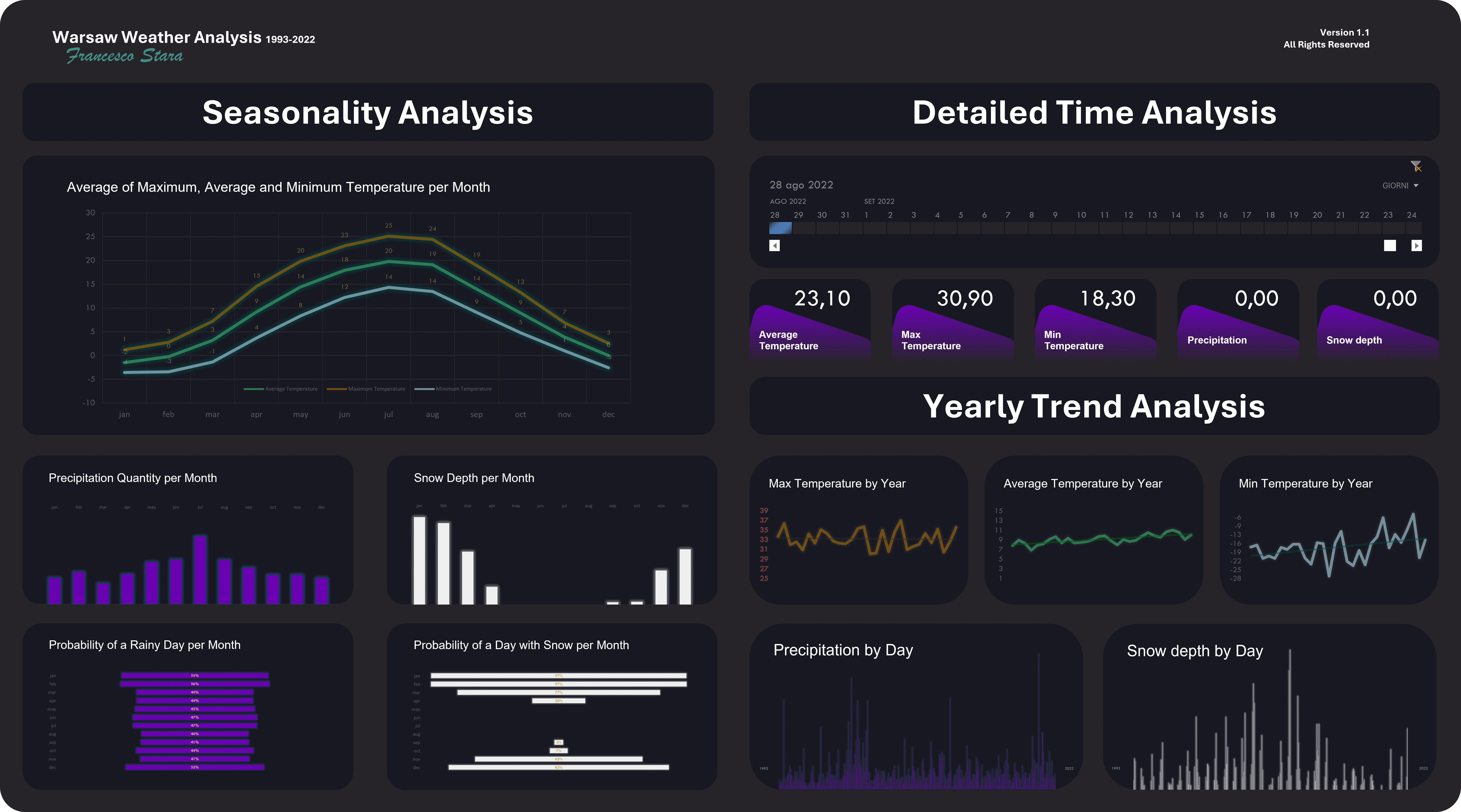
You can download here the Excel file and try it yourself (is not working with Google Sheets so please download it and open it with Microsoft Excel):
Like this project
Posted Feb 24, 2024
The objective of this project is to analyze daily weather data from Warsaw, Poland, to identify trends and patterns.
Likes
1
Views
39