Annual Report for The SOAR Initiative
Sydney Sauer
Project Overview
As a nonprofit organization, The SOAR Initiative releases an annual report detailing their progress towards their mission. I created this compelling, storytelling document from start to finish, including creating a report outline, analyzing their data (stored in Excel), creating a layout in Canva, and optimizing the finished product for print and digital distribution.
View the whole product here, or keep reading to see some highlights!
Data Snapshots
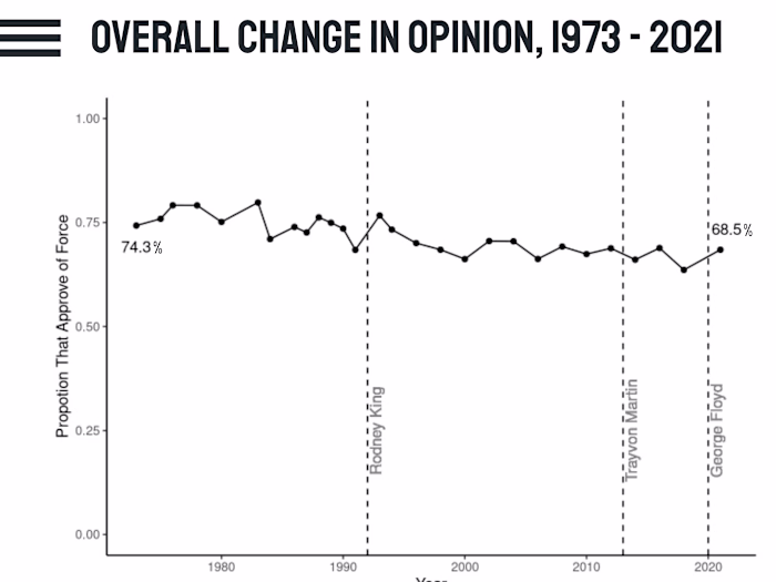
(Note: Images are a little blurry since they were pulled from the report itself. View the full report here to see charts in their original resolution.)
To intuitively demonstrate how the program has grown over time, I displayed this year's counts of mission-critical metrics with their percentage increase from the previous year:
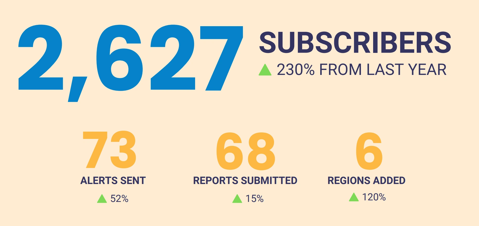
Simple layout of summary figures for the organization's fiscal year results.
Of course, summary figures are not enough! I also created graphs using Excel data from various programs within the organization to demonstrate how important metrics changed over time. For example, the following chart shows how total expenditures were split between two programs:
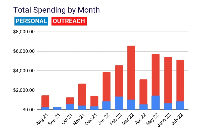
Total spending by month, separated by type of expense.
It was important to the organization that these charts were presented creatively, so I created innovative data visualizations, like this custom donut pie chart:
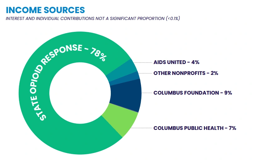
Income sources, shown via a donut chart.
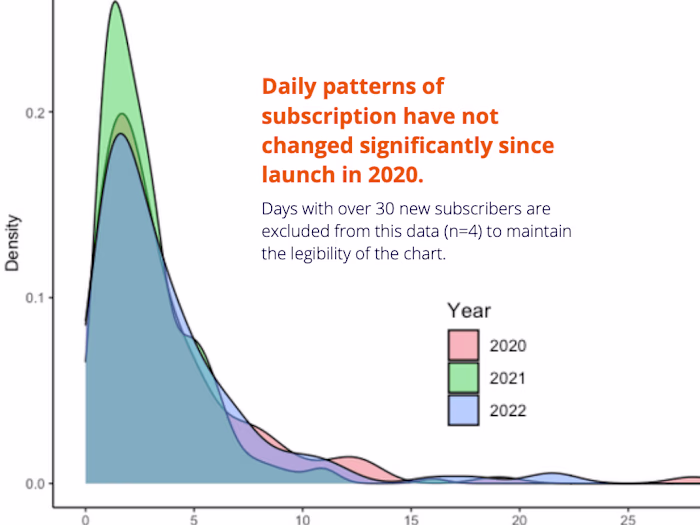
Finally, I also conducted original interviews with staff members to write up stories about the organization's progress for the year. By weaving these narratives together with facts and figures, I created a thought-provoking report that captured donors' attention. For example, here's one full page of the report where I incorporated three different data sources into a cohesive story:
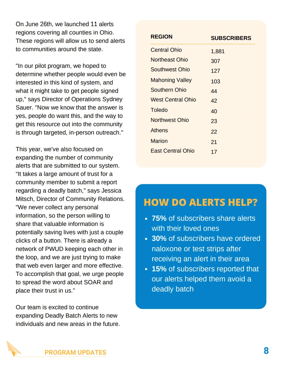
Full page of report demonstrating multimodal data collection.
Like this project
Posted Apr 24, 2024
A data-driven annual report for an overdose prevention nonprofit. I analyzed all the data and designed compelling visualizations and page layouts. Check it out!
Likes
0
Views
13