Public Opinion About Police in the US
Sydney Sauer
Project Overview
I created this Google Slides presentation for a final project in my data visualization class, where I learned how to analyze large datasets using R. By crunching the numbers from a nationally representative survey of American attitudes, I demonstrated changes in beliefs about police brutality from 2012 to 2021.
Highlights
At the beginning of the presentation, I provided the specific variables that I had pulled from the national survey. This allowed people watching the presentation to understand and ask questions about the specific questions which were asked.
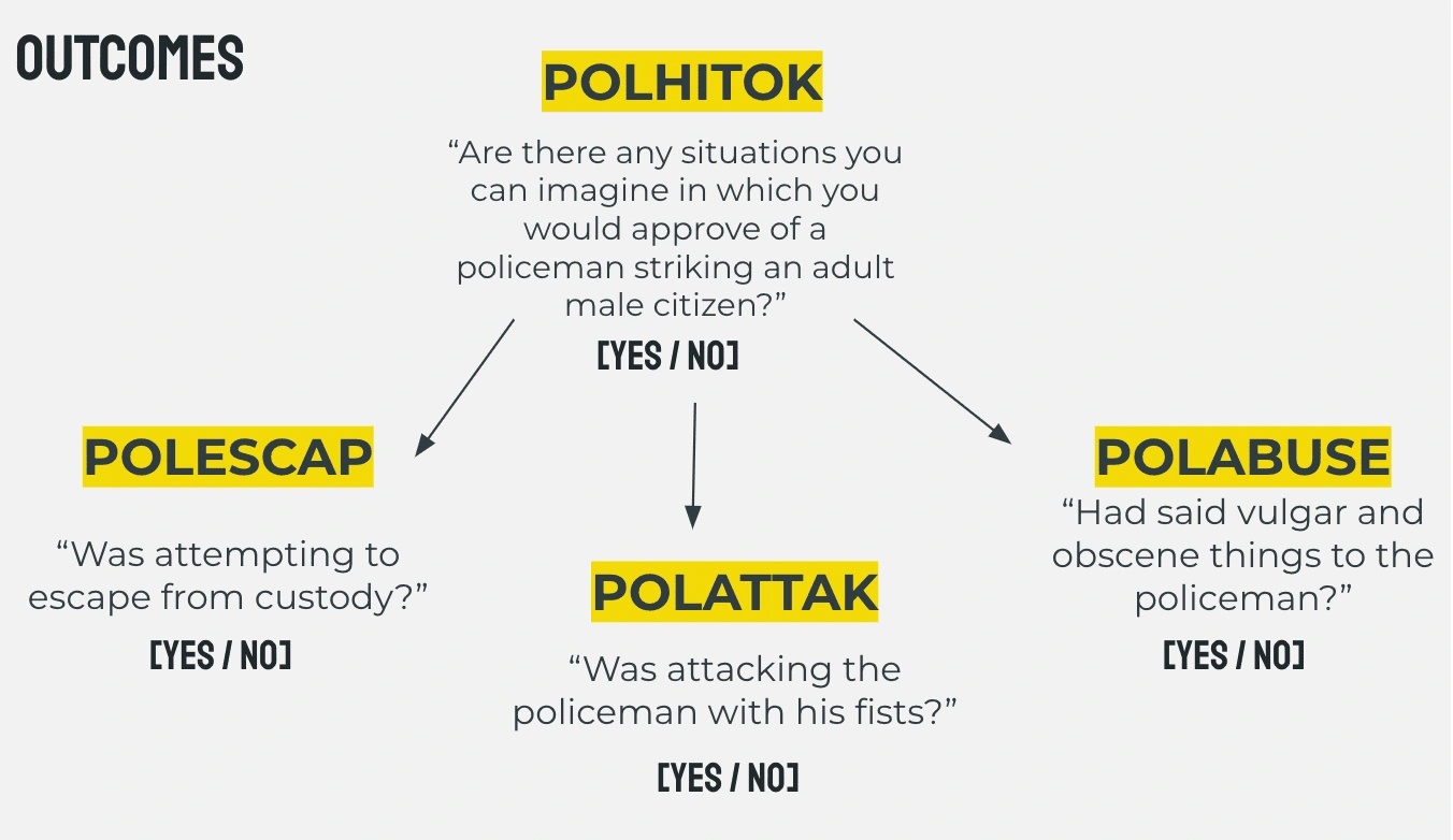
Graphical explanation of the survey questions and flow.
Then, I analyzed the data about how these attitudes had changed over time! I created a plot of the average approval ratings for police brutality over time and added markers for major events in the Black Lives Matter movement, such as the murder of George Floyd:
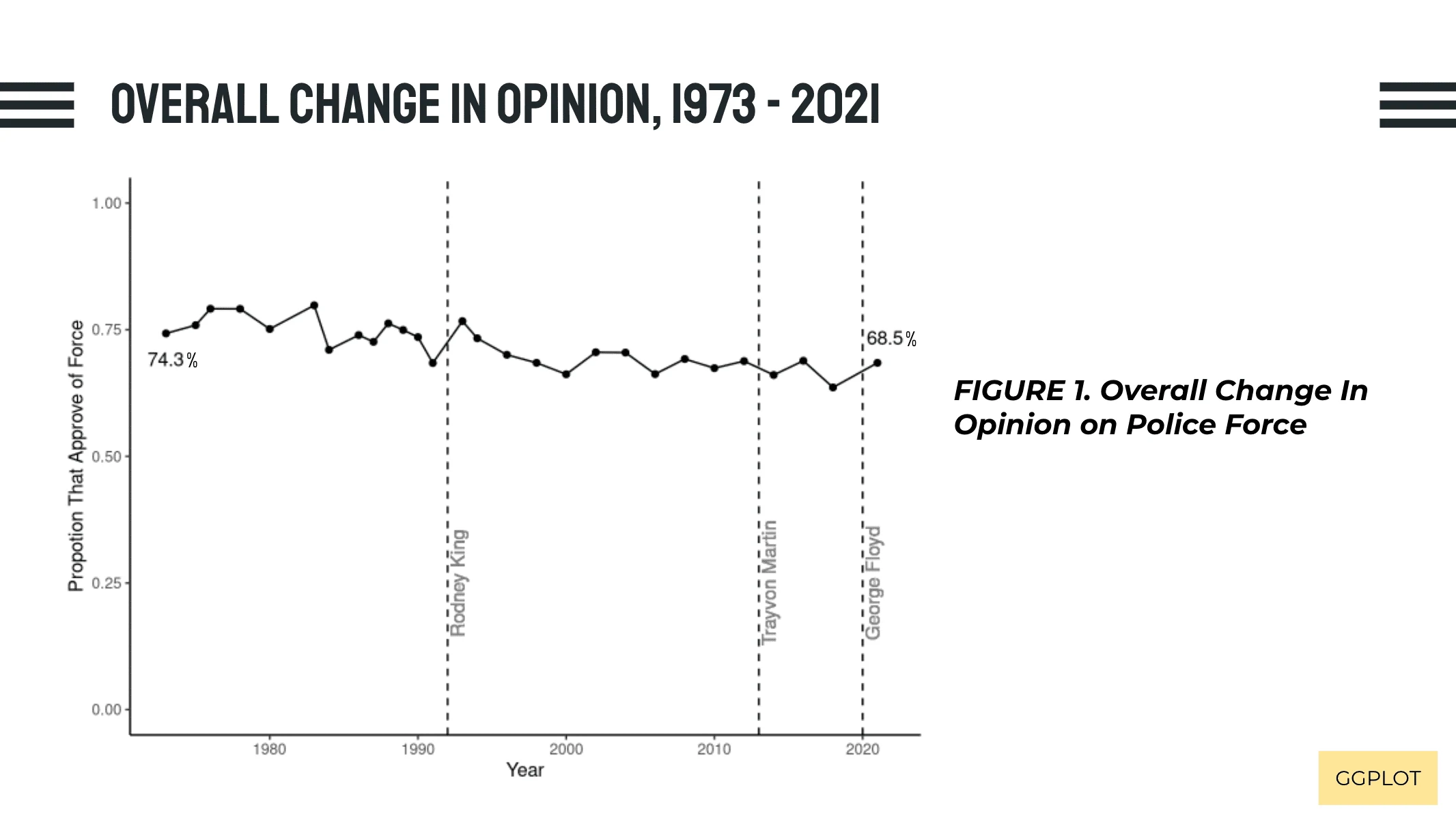
Changes across survey waves in approval of police force.
I then dove deeper into these findings by analyzing what types of violence citizens approved, focusing on changes from 2012 to 2021. This bar chart demonstrates how attitudes about overall police brutality change drastically over time and when the suspect was engaged in different activities:
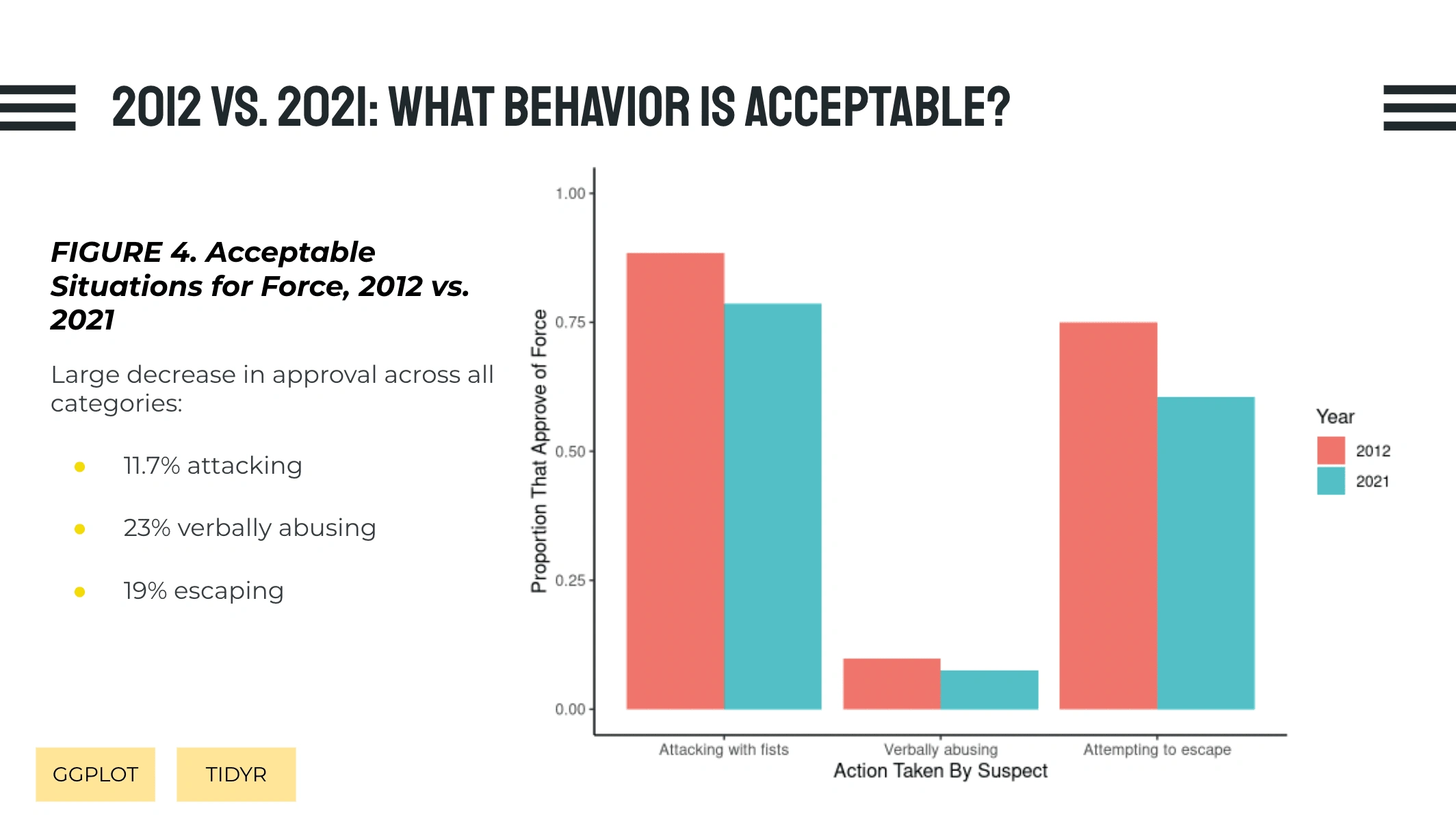
Changes from 2012 to 2021, stratified by defensive action type.
Like this project
Posted Apr 24, 2024
How have Americans' attitudes about use of force by police officers changed over time? For my data visualization final class project, I found the answer.
Likes
0
Views
10