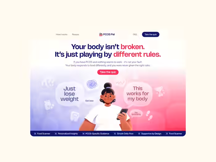
PCOS Pal App Store Screenshot Redesign
Approve request to show earnings
View
Prem Pandey
Verified
PCOS Pal Appstore Screenshots
PCOS Pal already had a working app and strong product vision.
But the App Store screenshots weren’t communicating that clearly.
The goal wasn’t just making them “look better.”
It was building a screenshot system that instantly explained the product, built trust, and made women with PCOS feel understood.
Client: PCOS Pal
Role: App Store Screenshot Design • Copy • Visual Direction
Platform: iOS App Store
Category: Women’s Health / AI
Value: $600 + $100 Bonus
00 - The Existing Screenshots
Good product. Weak presentation.
Before redesigning anything, I audited the existing screenshots.
The biggest issues:
• no clear story or flow
• weak first screenshot
• inconsistent layouts and hierarchy
• generic wellness-app feeling
• too feature-focused
• lacked emotional connection
The screenshots explained features -
but not why users should care emotionally.
And for a PCOS audience, emotional clarity matters a lot.
Existing Screenshots
01 - Research & Moodboarding
I started by researching:
top-performing App Store screenshots
health & wellness apps
AI products
competitor positioning
visual storytelling patterns
The goal was understanding:
✓ what grabs attention
✓ what feels premium
✓ what feels trustworthy
✓ and where PCOS Pal could stand out
Most competitors looked either:
✕ too clinical
✕ too generic
✕ or too “wellness influencer”
So the new direction needed to feel:
emotionally intelligent, modern, and supportive.
Moodboarding
02 - Planning The Story
Before designing visuals, I planned the screenshot narrative first.
The flow needed to answer:
→ What does the app do?
Food scanning, tracking, guidance.
→ Why is it different?
Built specifically for PCOS.
→ How does it make users feel?
Clear, confident, and back in control.
The final structure became:
Attention
Results
Tracking
Food Scanner
Clarity
Confidence
Guidance
Social Proof
Not random screens.
A connected story.
03 - Copy Before Design
I wrote the copy before designing the visuals.
Because on the App Store:
Headlines matter more than decoration.
Lines like:
“Stop guessing.”
“Track progress.”
“Choose with confidence.”
“No shame. No extremes.”
were designed to reduce friction and create an emotional connection instantly.
The copy focuses less on features -
and more on how the app helps users feel.
04 - Final Design Direction
Once the direction was approved, I designed the full screenshot system using the same branding language from the landing page.
That included:
bold typography
split pink/blue gradients
custom character illustrations
layered compositions
emotional storytelling
app-focused mockups
The goal was to make the screenshots feel cohesive, memorable, and easy to understand within seconds.
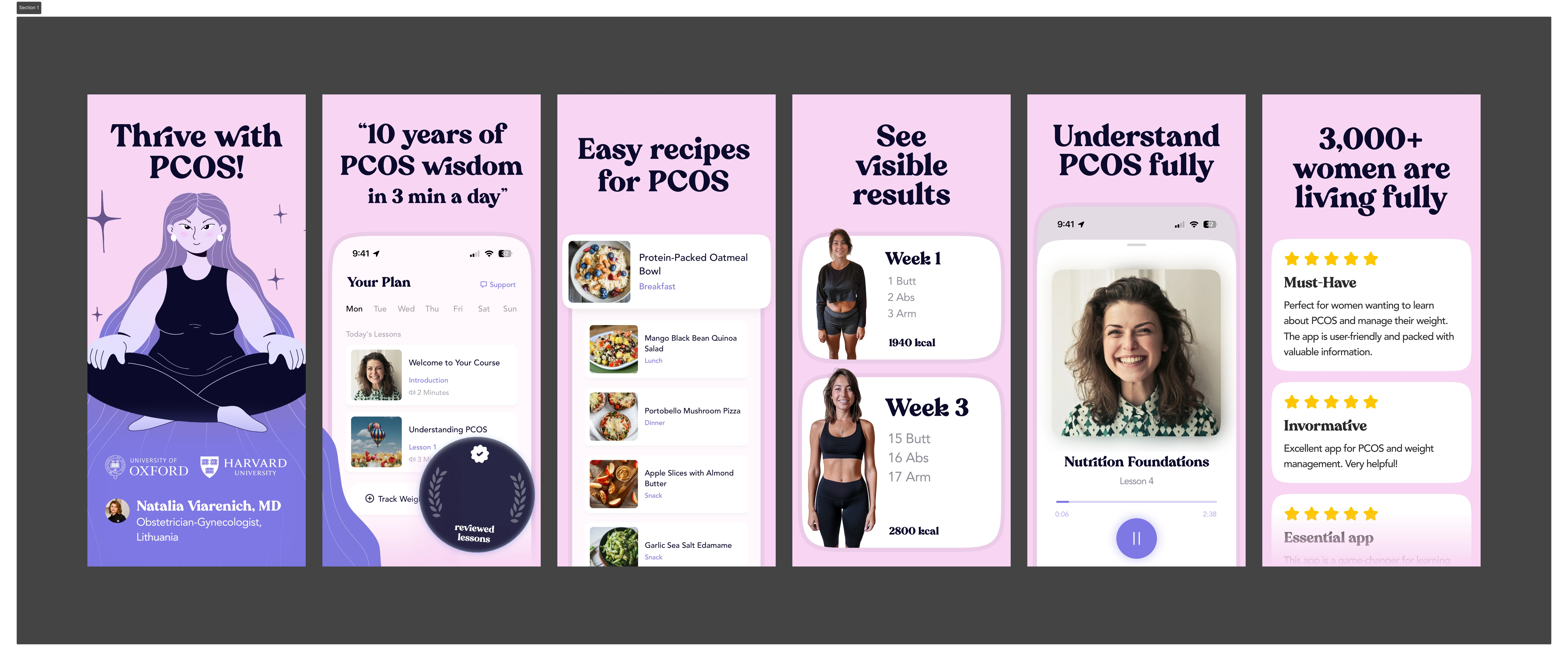
05 - Screenshot Highlights
↗ “Healthy or Harmful?”
Introduces confusion around food choices immediately.
Strong contrast.
Strong hook.
↗ “Surprising Results”
Shows the food scanner experience while visualizing PCOS-related insights.
↗ “Track Progress”
Shows realistic transformation and progress tracking without fake fitness culture.
↗ “Choose With Confidence”
One of the strongest storytelling screens — visually comparing better food choices and clearer outcomes.
↗ “Move Smarter”
Reframes workouts around hormone support instead of punishment.
↗ “Your PCOS Plan”
Makes the product feel personalized and supportive.
✦ “Eat With Stability”
Turns healthy eating into something approachable and realistic.
↗ “Trusted by 150K Women”
Ends with social proof, trust, and reassurance.
06 - Outcome
• Built a complete App Store screenshot system
• Extended the landing page branding into mobile acquisition
• Improved consistency across product marketing
• Created screenshots designed for clarity + conversion
The final result feels less like a generic health app -
and more like a product that actually understands its audience.
And honestly,
that difference changes everything.
Need screenshots that actually make people stop scrolling?
I design App Store creatives that feel clear, polished, and built to convert.
→ App Store Screens
→ Landing Pages
→ Framer Development
Like this project
Posted May 7, 2026
Redesigned App Store screenshots for PCOS Pal to improve clarity and emotional connection.
Likes
1
Views
10
Timeline
Feb 13, 2026 - Feb 17, 2026
Clients
Slayyy