Landing Page Design for PCOS Pal
Approve request to show earnings
View
Prem Pandey
Verified
PCOS Pal - Designing a landing page that made women with PCOS feel understood.
PCOS Pal already had a working app, branding foundations, and a strong mission.
What they needed was a landing page that translated all of that into something users could instantly trust.
Not another generic health-tech page.
Not another “eat less, exercise more” wellness brand.
Something that actually felt human.
Client: PCOS Pal
Role: Landing Page Design • UX Strategy • Copy • Visual Direction
Tool Stack: Figma, ChatGPT, Gemini, Midjourney
Category: Women’s Health / AI
Value: $1,100 → expanded into multiple follow-up projects
01 - The Problem
The product was strong.
The experience around it wasn’t there yet.
Women with PCOS are constantly overwhelmed with:
→ conflicting diet advice
→ generic tracking apps
→ “just lose weight” conversations
→ wellness influencers selling fake fixes
→ doctors dismissing their concerns
This audience is skeptical for a reason.
They’ve already tried:
calorie tracking
restrictive diets
random supplements
fitness plans
“healthy eating”
…and still felt stuck.
So the challenge wasn’t:
“How do we make the app look good?”
It was:
“How do we make someone feel understood within the first 5 seconds?”
That became the entire direction of the project.
02 - Strategy
Before opening Figma, I went into the world this audience lives in - PCOS forums, Reddit threads, App Store reviews, competitor pages.
One truth came through consistently:
"Every competitor talked at women with PCOS. None of them made them feel understood first."
That gap became the strategic foundation. The insight that shaped everything:
The insight
"Your body isn't broken. It's just playing by different rules." - shift blame from the person to the bad advice they'd been given.
The direction
Warm, human, slightly bold. Not clinical. Not hustle-wellness. A friend who happens to know a lot about PCOS.
Copy before visuals
Wrote all copy before designing. Every section had to earn its place emotionally before it got a visual treatment.
My role
Extend their existing brand into a cohesive web experience. Not reinvent - elevate. Consistency, hierarchy, storytelling.
03 - Hero Concept
The strongest five seconds on the whole page.
The hero became the most important design decision on the project.
The concept: a woman standing between two worlds.
Left side - the old world
Confusion. Generic advice. "Eat less." Pills. Scribbles. Pressure. Everything she's already tried.
Right side - the new world
Clarity. Guidance. Calm structure. Confidence. What PCOS Pal actually offers.
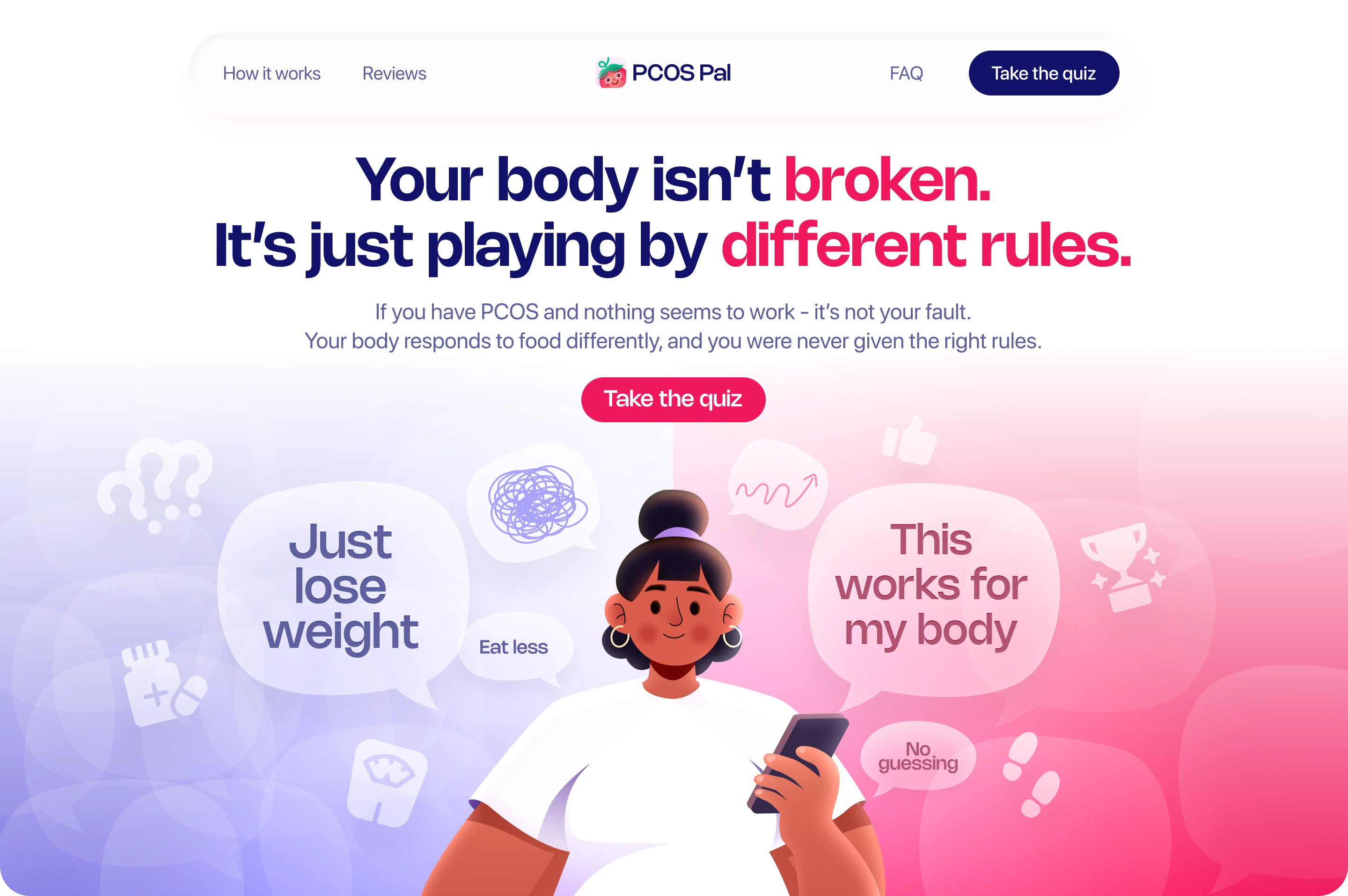
Hero Section
The woman in the center never changes. Only the information around her changes. That single visual idea summarized the entire product: she didn't need fixing - she needed clarity.
Getting there took four directions. Three were rejected - here's why:
Rejected
→ Soft gradient, meditating figure
Too calm. Didn't reflect the real frustration of living with PCOS.
→ Bold fuchsia, abstract blobs
Great energy, wrong emotion. Felt like fashion, not healthcare trust.
→ Cream, flat figure
Safe but forgettable. No tension, no story, nothing to hold on to.
Approved
→ Blue/pink split with custom character
Showed both worlds simultaneously. The confusion on one side, clarity on the other. One image, the entire product story.
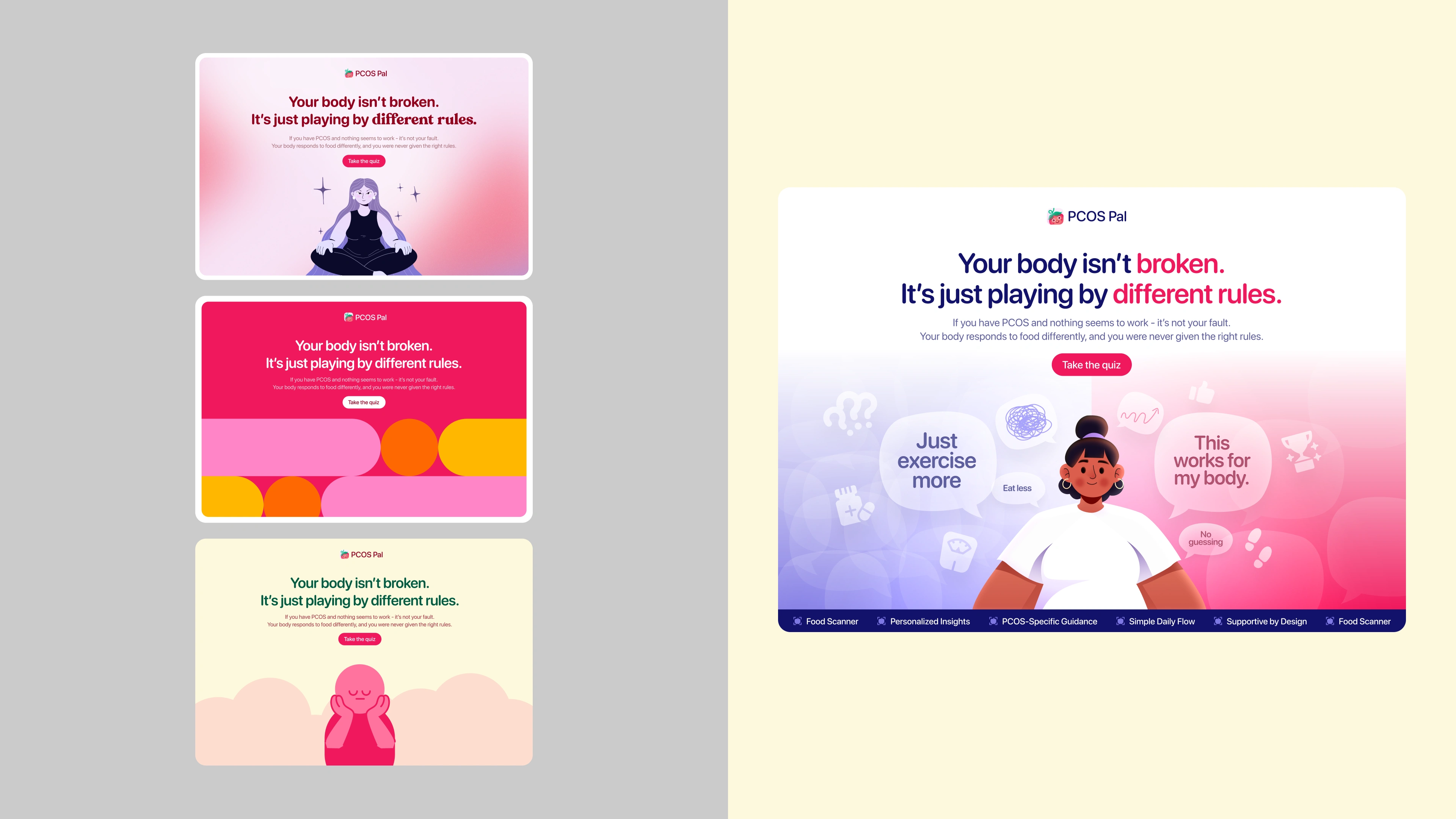
Rejected Vs The Approved Concept
04 - Design Work
1. Competitive + audience research
PCOS forums, Reddit, App Store reviews, competitor pages. Built the brief from real user language, not assumptions.
2. Wireframe + copy
Structured the emotional arc of the page first. Wrote every headline, subheading, and CTA before anything was designed.
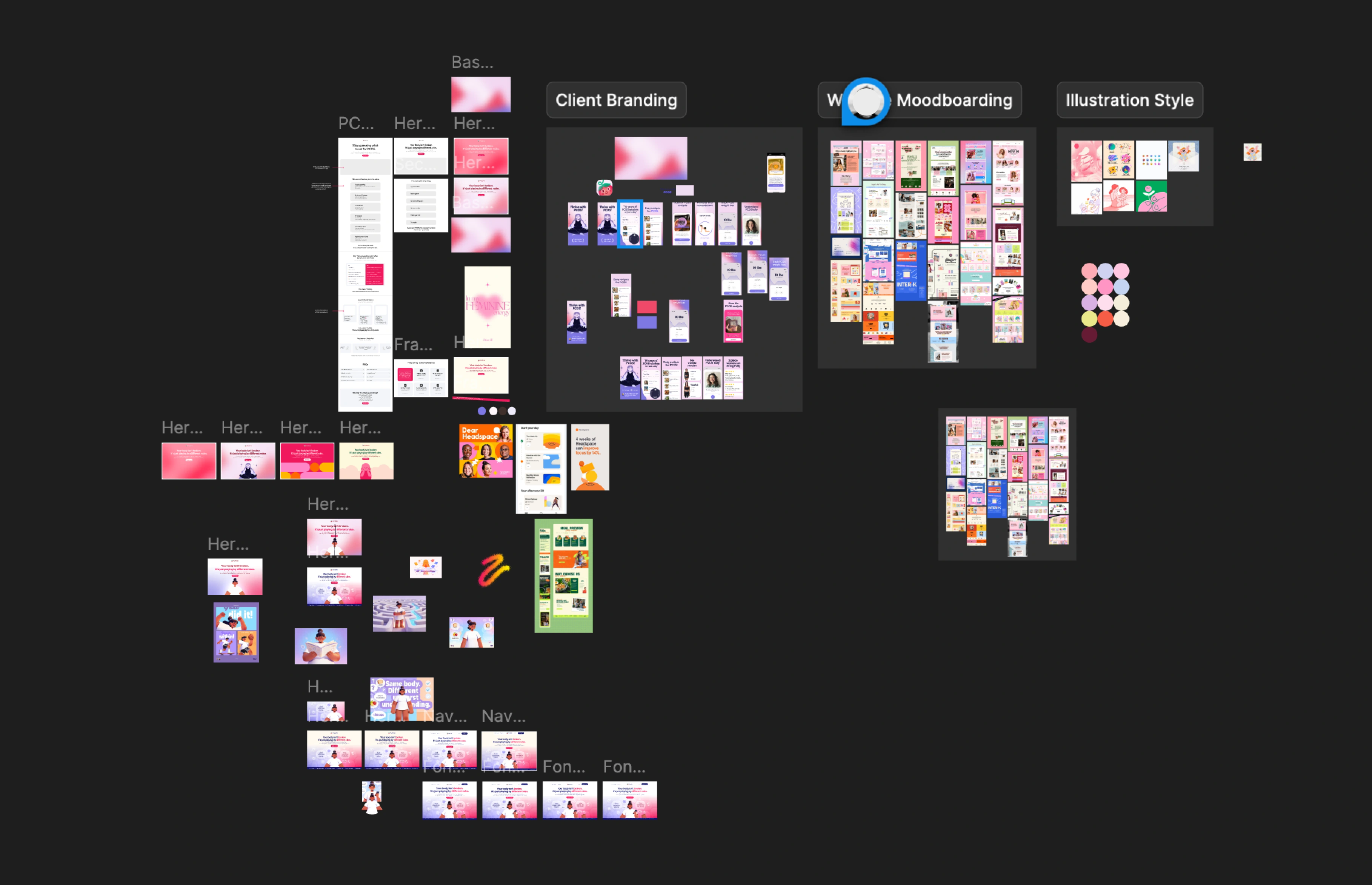
3. Moodboarding + visual direction
Three research boards: client branding, wider moodboard references, illustration style. Set the visual language before any UI.
4. Hero explorations → four directions
Built and tested multiple concepts. Presented rejected and approved to the client with clear reasoning for each.
5. Typography refinement
Tested multiple pairings across iterations. Landed on Nohemi - geometric, confident, warm. Feels modern without being cold.
6. Full page design
Built every section end to end with a consistent visual system. Hero, pain points, myth vs. reality, how it works, testimonials, FAQ, CTA.
05 - The Page
The finished page follows a deliberate emotional arc - each section exists to move the user from skepticism to trust.
→ Validation "Your body isn't broken." - reframe before selling.
→ Recognition Six pain-point cards that mirror the user's real experience back at them.
→ Education Myth vs. Reality — builds credibility without feeling clinical.
→ Simplicity Three-step product flow. No calorie math. No rules. Just clarity.
→ Trust Real testimonials + a FAQ that answers the doubts she already has.
→ Low-friction CTA "Take the quiz." Not "download now." Personal, not pushy.
06 - Outcome
$1,100
Landing page design - including an unprompted $100 bonus from the client.
$2,500+
Total value from the relationship: dev, App Store screenshots, A/B ad creative.
4 projects
Client returned for Framer build, App Store screenshots, and ad testing.
0 → 1
From inconsistent brand assets to a unified visual system across web and mobile.
07 - What I Learned
Three things this project
made clear.
1. Audience skepticism is a design constraint.
When someone has been burned before, every visual choice has to earn trust. Nothing can feel sales-y, overpromised, or generic.
2. Copy is design. Writing the page before designing it forced every section to justify its existence emotionally. The layout followed the words — not the other way around.
3. Great work creates the next brief. The landing page led to Framer dev, App Store screens, and ad creative. The best client acquisition strategy is doing work so good they don't want anyone else.
Great health product design isn't about making things look "wellness-y."
It's about making people feel understood, safe, and clear.
That's what PCOS Pal needed. That's what I designed.
Let’s work together.
I enjoy designing products that are complex under the hood but simple to understand.
Especially in: SaaS · AI · Infrastructure · Developer Tools
If you’re building something ambitious,
Like this project
Posted May 7, 2026
Designed a landing page for PCOS Pal to foster user trust and understanding.
Likes
2
Views
14
Timeline
Jan 6, 2026 - Jan 18, 2026
Clients
Slayyy