Apptics Stealth Landing Page and Brand Identity
Approve request to show earnings
View
Prem Pandey
Verified
Apptics Stealth/AdHub
(Landing page + Full brand identity)
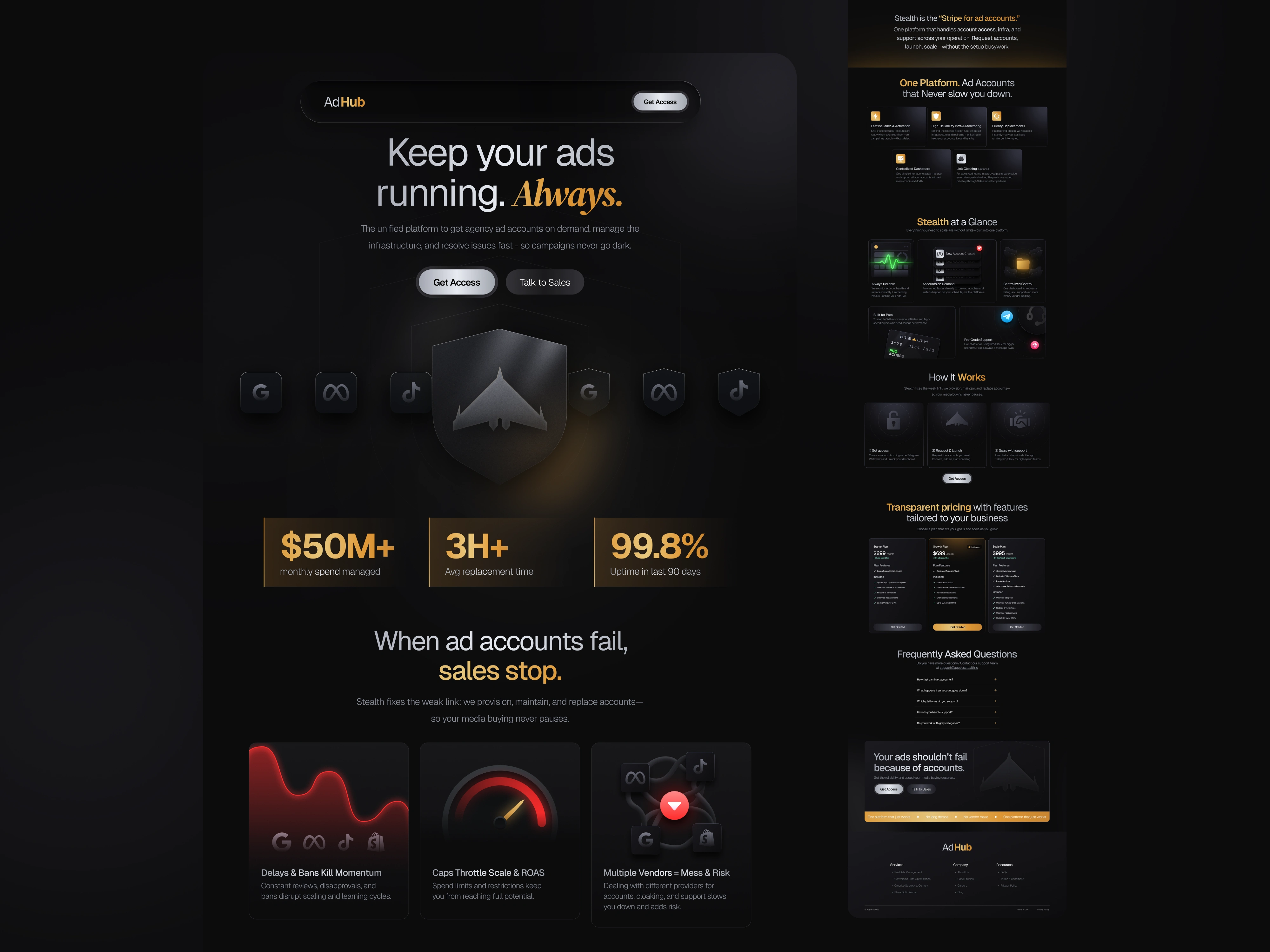
A premium, enterprise-focused landing that promises uninterrupted ad infrastructure. “Keep your ads running. Always.
🧠 Project Overview
Apptics Stealth is a platform built to keep ad campaigns running — always.
When ad accounts get restricted or banned, Stealth instantly provides replacements, ensuring zero downtime for advertisers and agencies.
I led the full Brand Identity, Product Design, and Copywriting for the landing page, crafting a system that feels premium, fast, and reliable.
🎯 The Goal
Build a brand and landing experience that:
✅ Feels powerful and premium
✅ Communicates trust and control
✅ Converts curious visitors into confident buyers
🪶 The Brand Identity
I chose a Black & Gold system — inspired by stealth, power, and confidence.
🖤 Black → represents reliability, depth, and technology.
✨ Gold → adds sophistication, exclusivity, and high value.
Together, they created a luxury-tech feeling, positioning Apptics Stealth as the “elite infrastructure” for digital advertisers.
🎨 Design Direction
The visual identity needed to say one thing:
“We never stop. Your ads won’t either.”
So every element — color, typography, spacing — was built around focus and momentum.
Typography: Bold, condensed sans-serif for strength.
Layout: Dark, structured, and minimal — every section feels purposeful.
Contrast: Gold accents draw the eye toward the most important CTAs.
🧩 Product Design Process
1. Research
I explored how top B2B SaaS and AdTech platforms (like Stripe, Supermetrics, and HubSpot) balance clarity and complexity.
Insight: B2B buyers want assurance, not aesthetics. So, the design had to look serious yet simple.
2. Wireframing
I built a clear flow:
Hero Section: The promise, Keep your ads running. Always.
Problem / Pain Points: What’s broken in ad infrastructure?
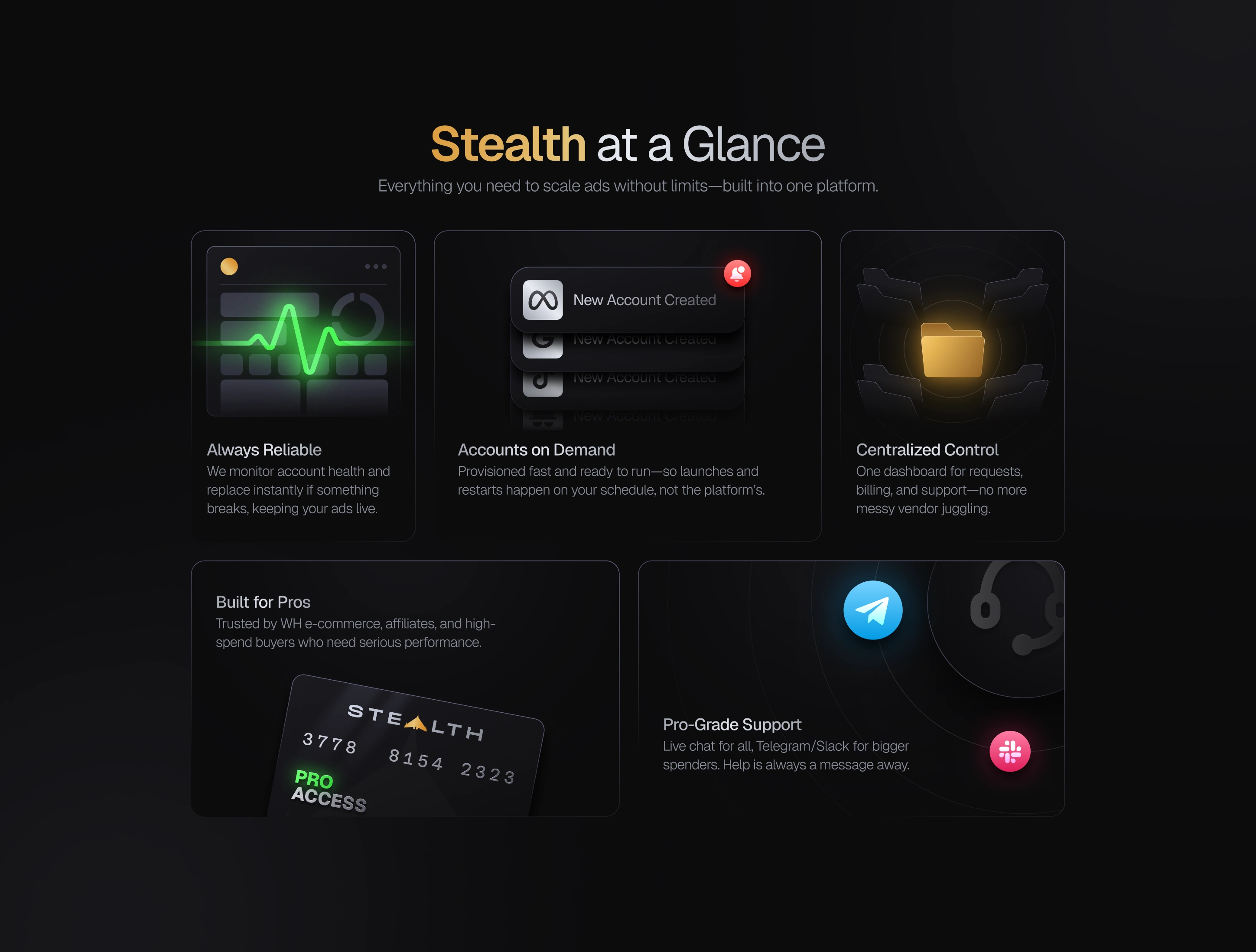
Solution/Features: How Stealth Fixes It Instantly.
Social Proof: Metrics and Testimonials for Building Trust.
Pricing: Clean, transparent, and confidence-driven.
FAQ: Handles last doubts before conversion.
Each scroll reveals clarity - not noise.
3. Visual Design
Once the structure worked, I moved to visuals:
High contrast black backgrounds to convey strength.
Gold gradients to symbolize performance and speed.
Micro details like hover animations and highlights for interactivity.
The result: a dark premium aesthetic that feels like enterprise-grade infrastructure.
✍️ Copywriting & Voice
I wrote every line to sound confident but calm,:
no buzzwords, just clarity and control.
“Keep your ads running. Always.”
“Stealth replaces your banned or limited accounts in hours — not days.”
Each sentence had one job: to make users trust the system.
💡 Key Highlights
✅ Clear differentiation: “The Stripe for ad accounts.”
✅ Premium tone: minimal design, confident words.
✅ Conversion mindset: CTA placements at natural scroll points.
✅ Consistency: Same gold-black energy across web & brand assets.
📈 Outcome
The final landing feels bold, trustworthy, and smooth.
It tells a complete story — from chaos to control — through design.
What worked:
Strong first impression
Seamless visual hierarchy
Premium brand feel
Conversion-focused narrative
Thanks for reading till the end 🙌
If you want a high-converting brand and landing that looks premium and feels effortless
Message Me →
let’s design your next big launch.
Like this project
Posted Oct 10, 2025
Developed a premium landing page and brand identity for Apptics Stealth, ensuring uninterrupted ad infrastructure.
Likes
6
Views
62
Timeline
Aug 16, 2025 - Ongoing