Case Study: NotClass
Prem Pandey

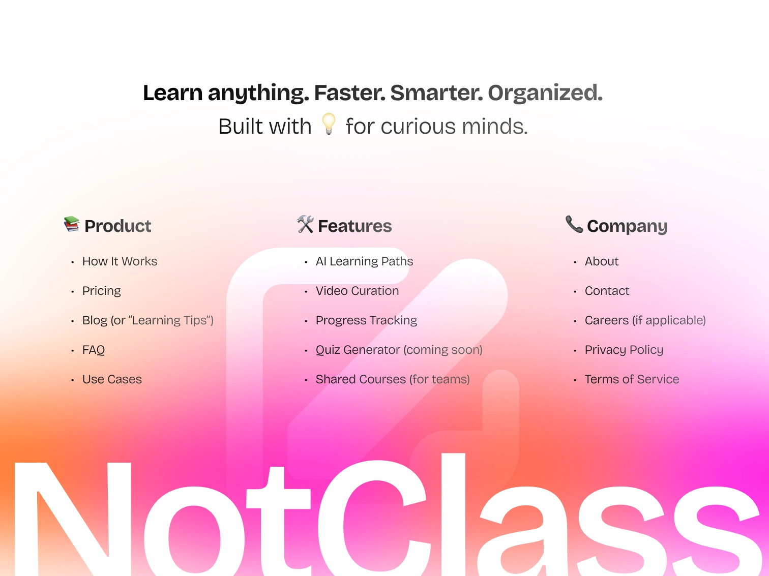
NotClass - Learn Smarter,
Not Longer (Case Study)
💡 Project Overview
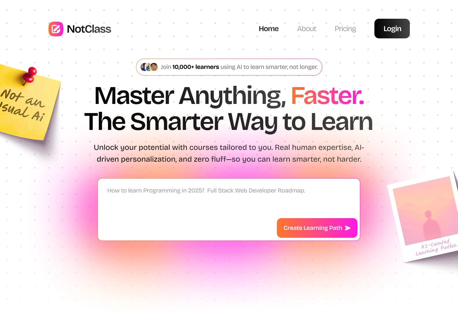
NotClass is a modern learning platform that blends AI precision with human expertise to help learners master any topic faster.
The goal? To design a conversion-focused landing page that communicates NotClass’s unique positioning, “Real human expertise. AI-driven personalization. Zero fluff.”
👥 The Challenge
Online learning today is cluttered with endless courses, random YouTube tutorials, and information overload.
Learners often spend more time searching what to learn than actually learning.
The challenge was to create clarity in chaos — to visually communicate that NotClass filters the noise and builds a personalized, trusted learning path for each user.
🎯 My Role
Product Designer & UX Strategist
Responsible for: UX Research, Wireframing, Visual Design, Copy Direction, and Prototype Flow
🧠 Research & Insights
Before diving into visuals, I explored:
Top platforms like Skillshare, Coursera, and Superhuman’s landing storytelling
Learner pain points from Reddit & Twitter threads (“too many courses, no clear structure”)
UI trends from high-converting SaaS products (minimal layout, comparison charts, and testimonial trust)
Key Insight:
“People don’t want more content — they want direction.”
That single sentence became the core design principle.
✏️ Wireframing & Flow
I started with a simple structure:
Hero Section: Value-driven headline → “Master Anything, Faster.”
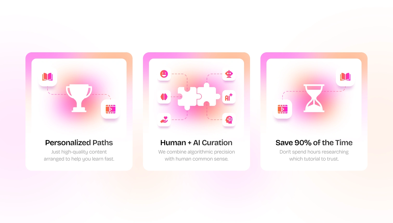
Value Proposition: “AI + Human” approach
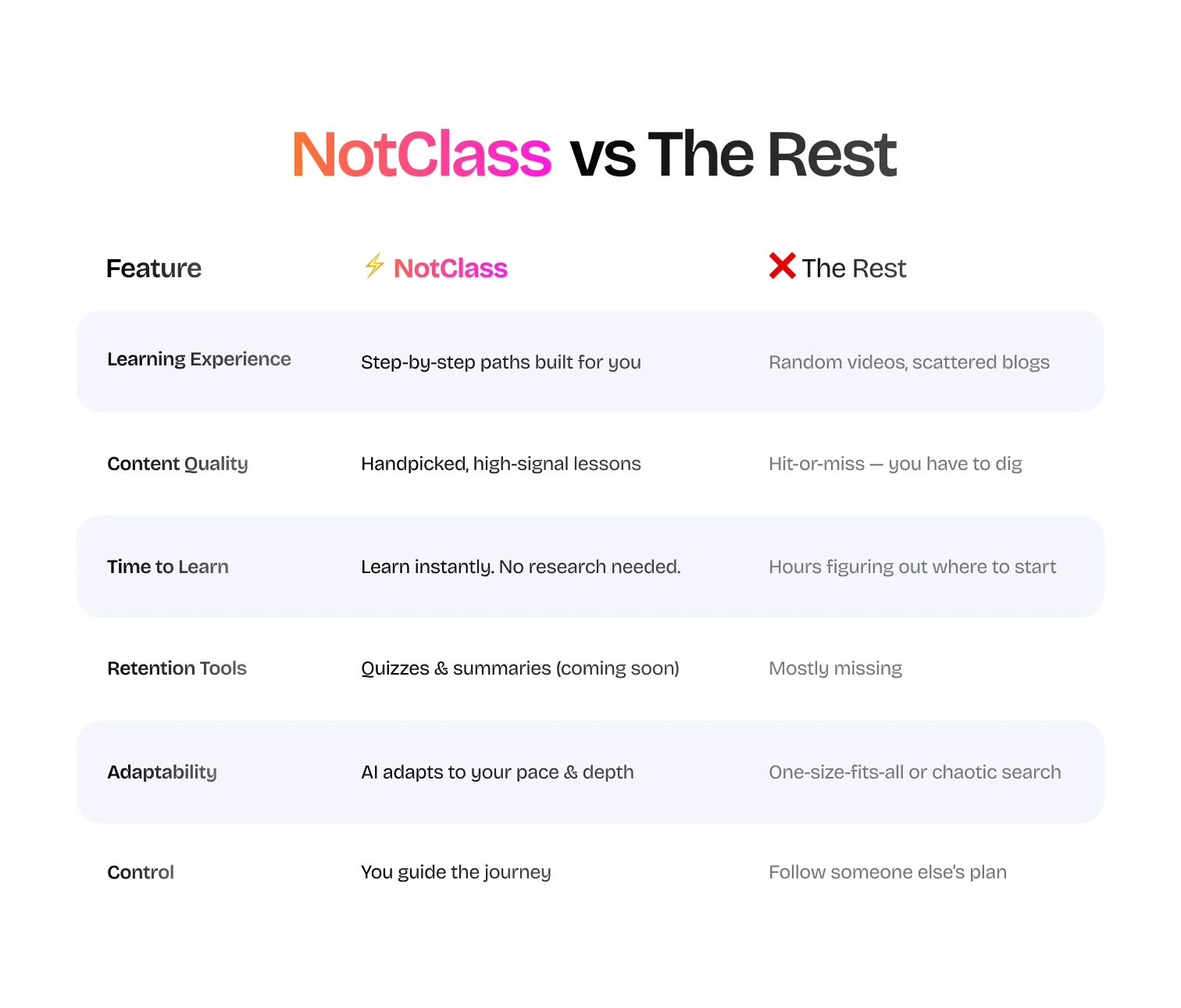
Comparison Table: “NotClass vs The Rest” for instant clarity
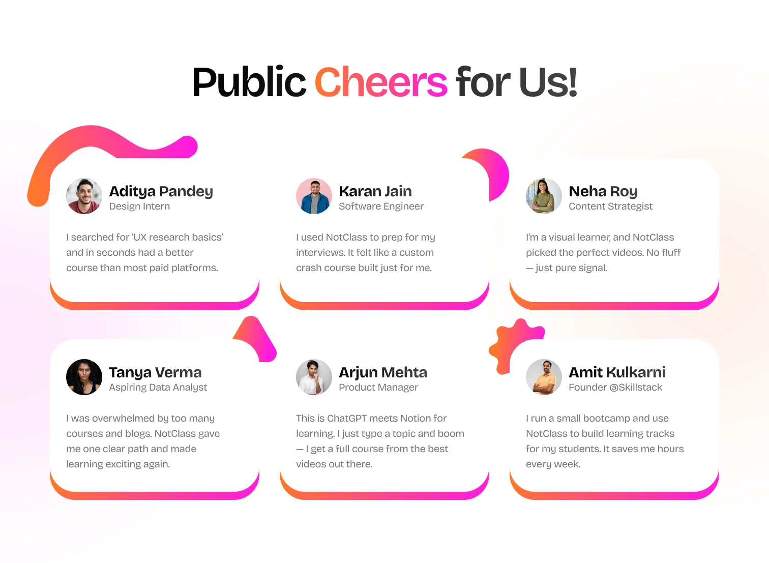
Social Proof: Real testimonials showing diverse learner goals
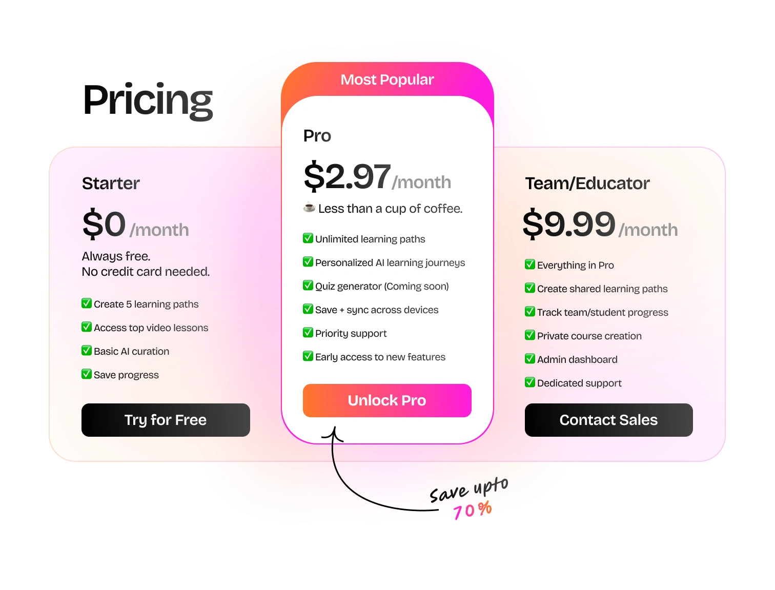
Pricing: Transparent, tier-based, and risk-free
FAQ: Closes objections right before conversion
Each section was designed to reduce cognitive load and guide users effortlessly toward conversion.
🎨 Visual Design & Brand Direction
The tone was set to feel smart yet approachable — inspired by Notion, Linear, and Superhuman.
Design Language:
Typography: Clean sans-serif with subtle contrast for hierarchy
Color Palette: Calming neutrals with a touch of intelligent red and pink, balancing focus and trust
Layout: Spacious, modular, and information-first
Icons & Emojis: Used sparingly to make the learning theme feel friendly, not robotic 🤖
💬 Copywriting Collaboration
Design and copy worked hand-in-hand — the voice was crafted to sound:
Confident, not corporate
Simple, not oversimplified
Human, not AI-written
Examples:
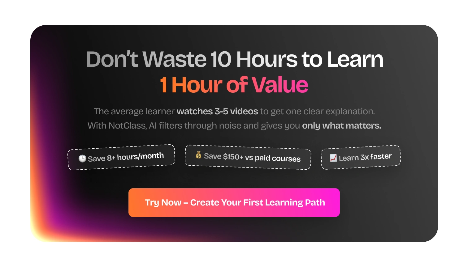
“Don’t waste 10 hours to learn 1 hour of value.”
“AI filters the noise. You focus on learning.”
Each line tells a story of efficiency — the true value of NotClass.
🔍 Key Design Highlights
✅ Instant differentiation: The “vs The Rest” section makes the product stand out in 5 seconds.
✅ User trust: Real testimonials with names and job titles build authenticity.
✅ Conversion strategy: Repeated CTAs (“Try Now – Create Your First Learning Path”) placed contextually through the scroll.
✅ Pricing psychology: Framed as “less than a cup of coffee.” — familiar, low-friction decision.
⚙️ Tools Used
Figma: Wireframing, Design System, High-Fidelity UI
Notion: Copy collaboration
Framer: Prototype Interactions
Thanks for reading till the end 🙌
If you liked this project and want something similar for your brand or product
Let’s build something meaningful together!
Message Me →
Like this project
Posted Oct 10, 2025
Designing NotClass - where AI meets human wisdom to make learning smarter, faster, and beautifully simple.