KinetiQ Brand Identity
Prem Pandey
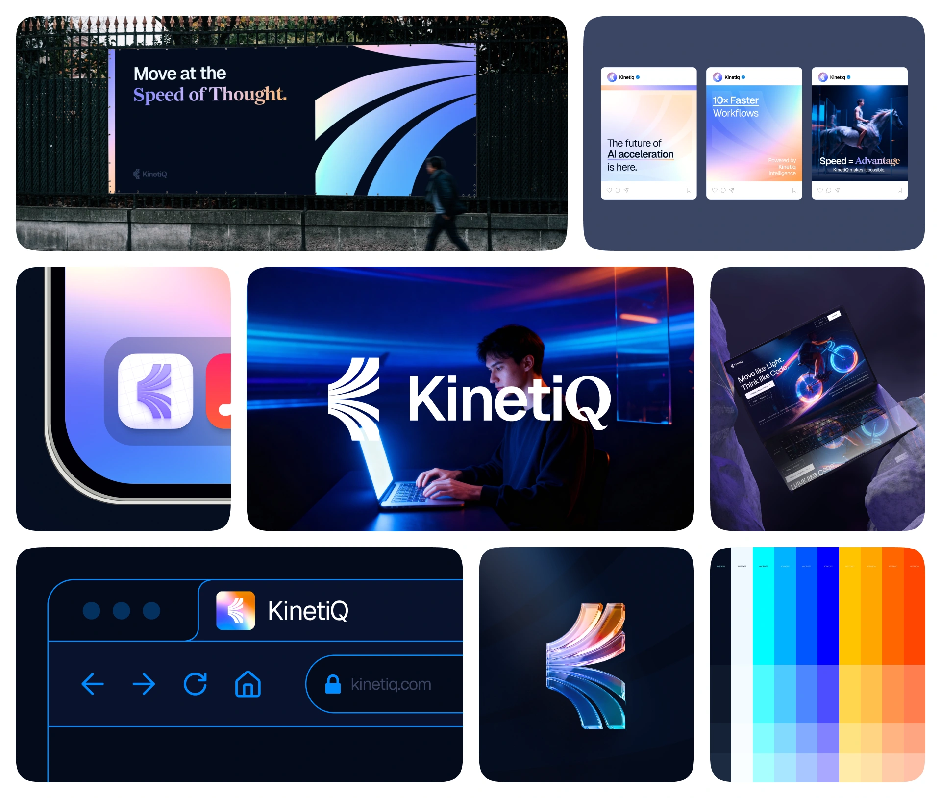
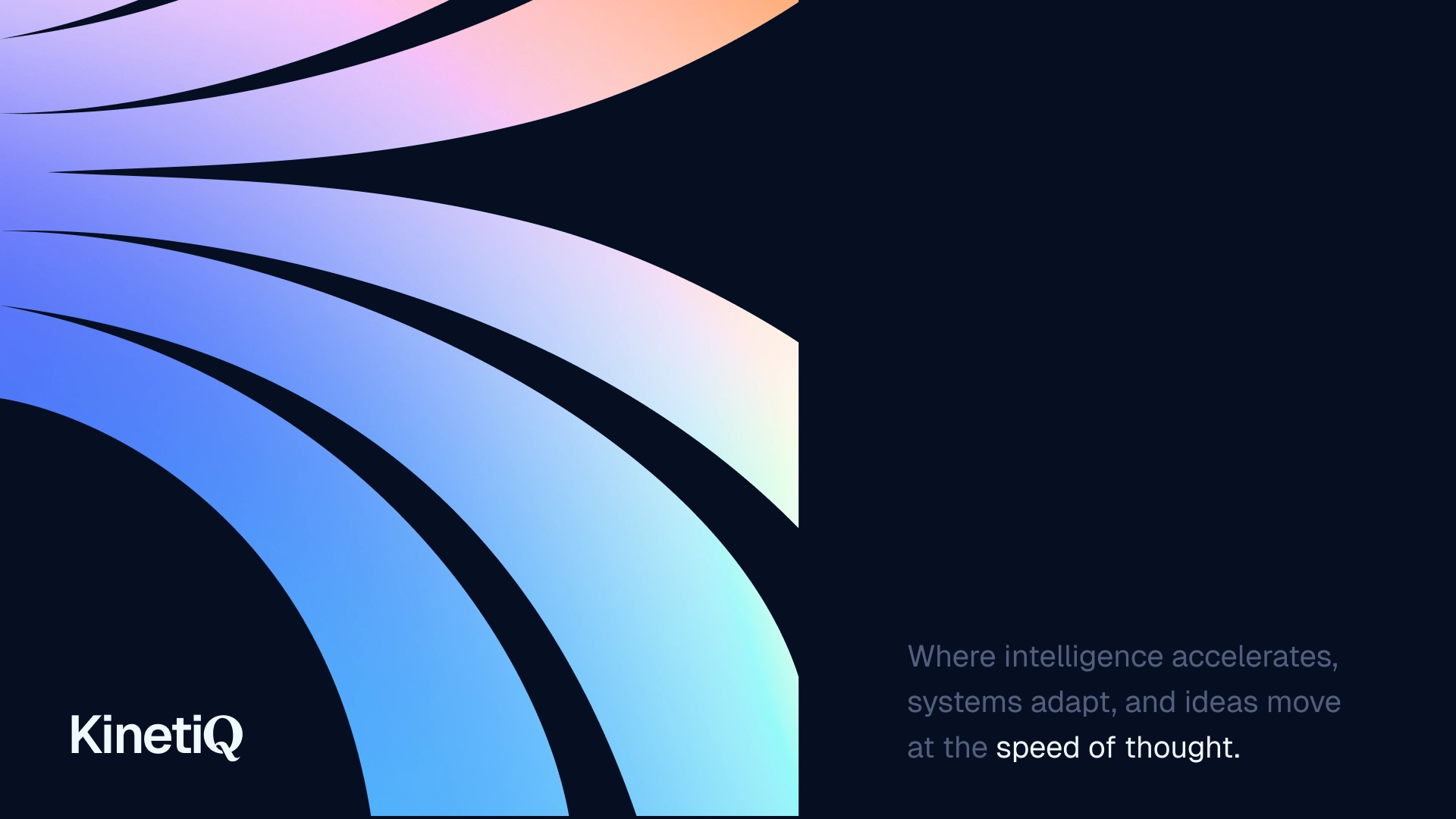
KinetiQ: Brand Identity
About Brand:
KinetiQ is a concept AI acceleration platform that helps people work smarter and faster.
In simple terms, it’s a tool that makes workflows feel lighter, smoother, and more intelligent - almost like everything is moving in motion.
I imagined KinetiQ as a brand built around speed, clarity, and futuristic energy - a system that feels alive and always moving forward.
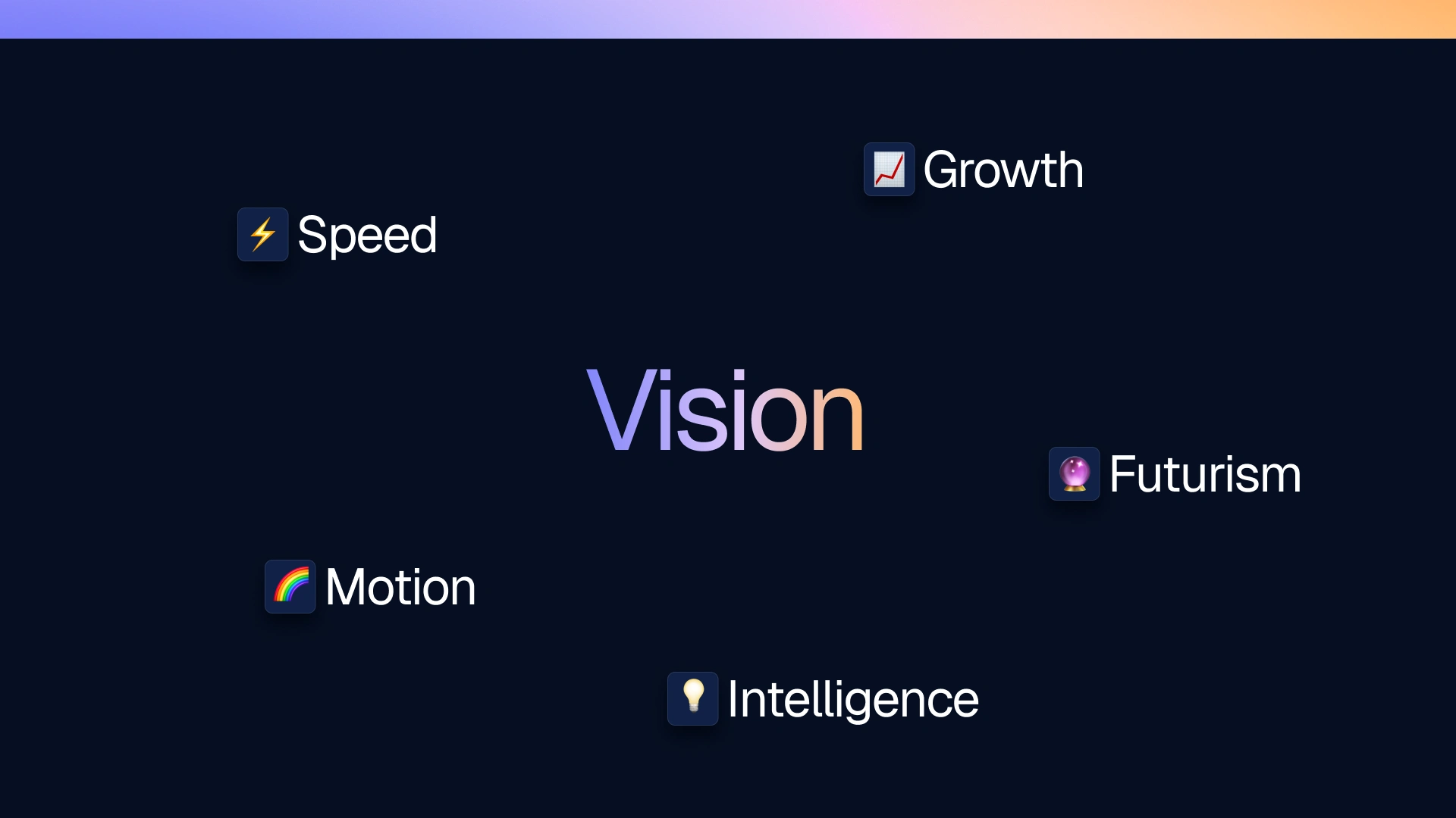
The Vision
Before designing anything, I defined what I wanted the brand to express:
⚡ speed
🌈 motion
💡 intelligence
📈 growth
🔮 futurism
These five ideas shaped every decision that came later.
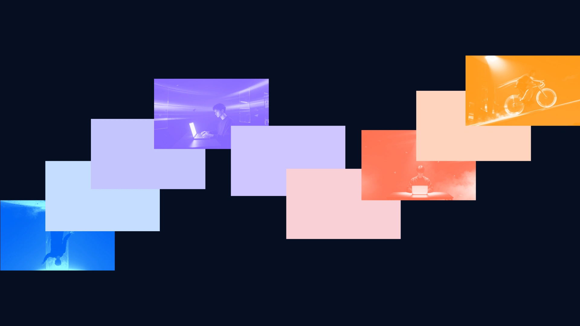
Mindmap - Exploring Ideas
I created a mindmap filled with words like:
“motion,” “flow,” “growth,” “curves,” “arcs,” “light,” “productivity,” “systems,” “energy,” “AI,” “kinetic movement.”
This helped me understand the brand's soul and the visual story it should tell.
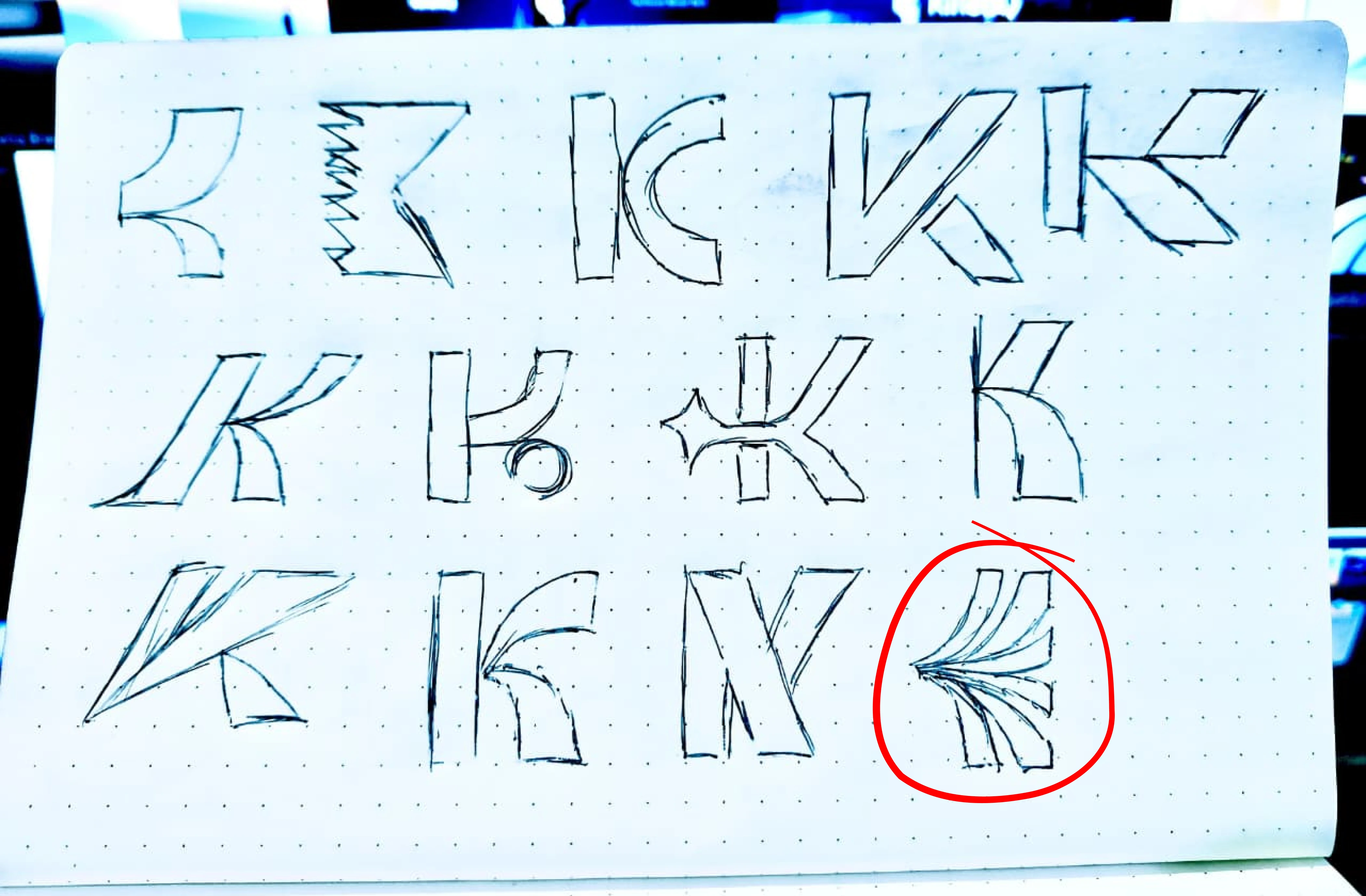
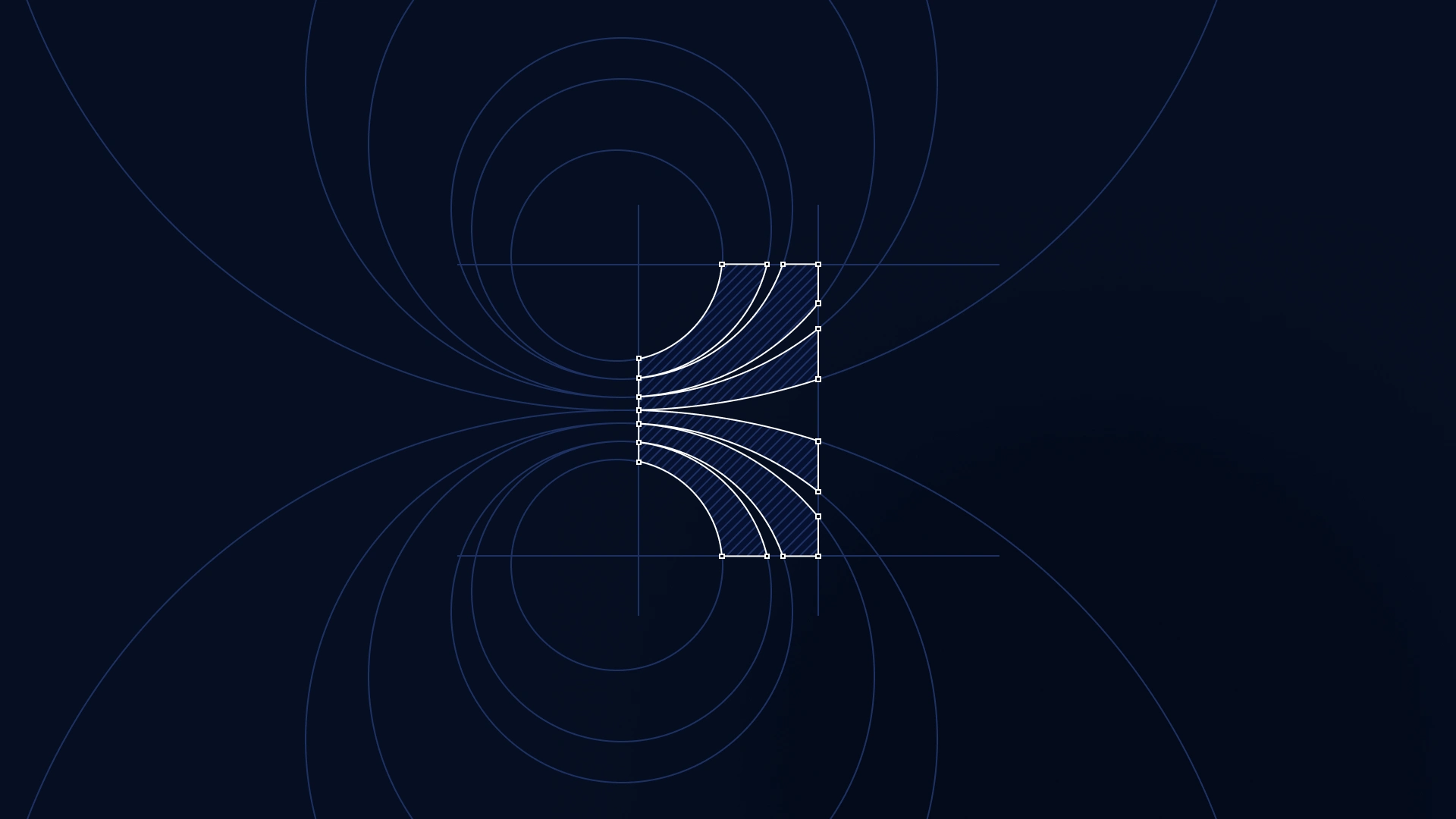
Sketching the Logo
I started with rough sketches inspired by arcs, rays, waves, and curved movement.
The big idea was to show growth in motion - something expanding outward, just like accelerated intelligence.
Sketch after sketch, I explored how the curves could look clean, modern, and meaningful.
Logo Development - From Sketch to Identity
After sketching, I moved into digital refinement:
adjusting curvature
balancing stroke thickness
testing scale and proportions
smoothing transitions
experimenting with gradient paths
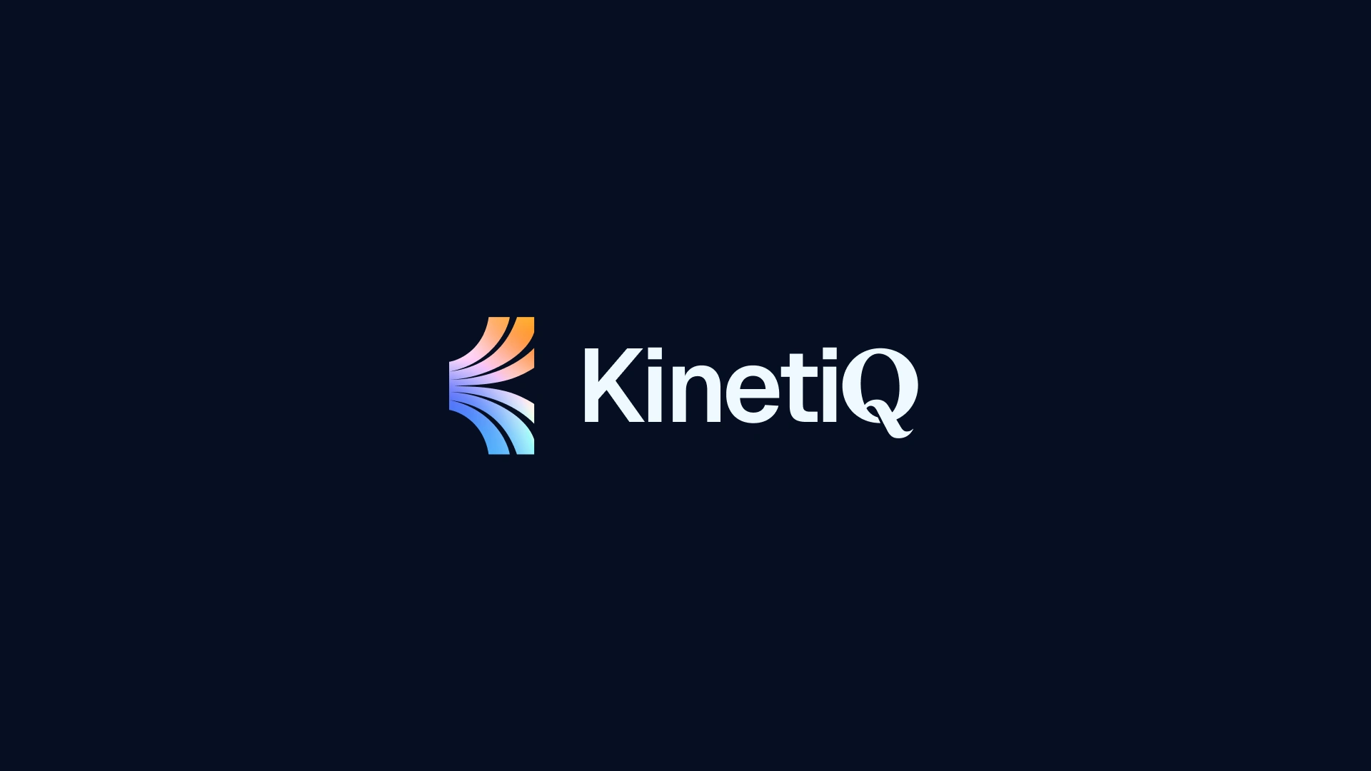
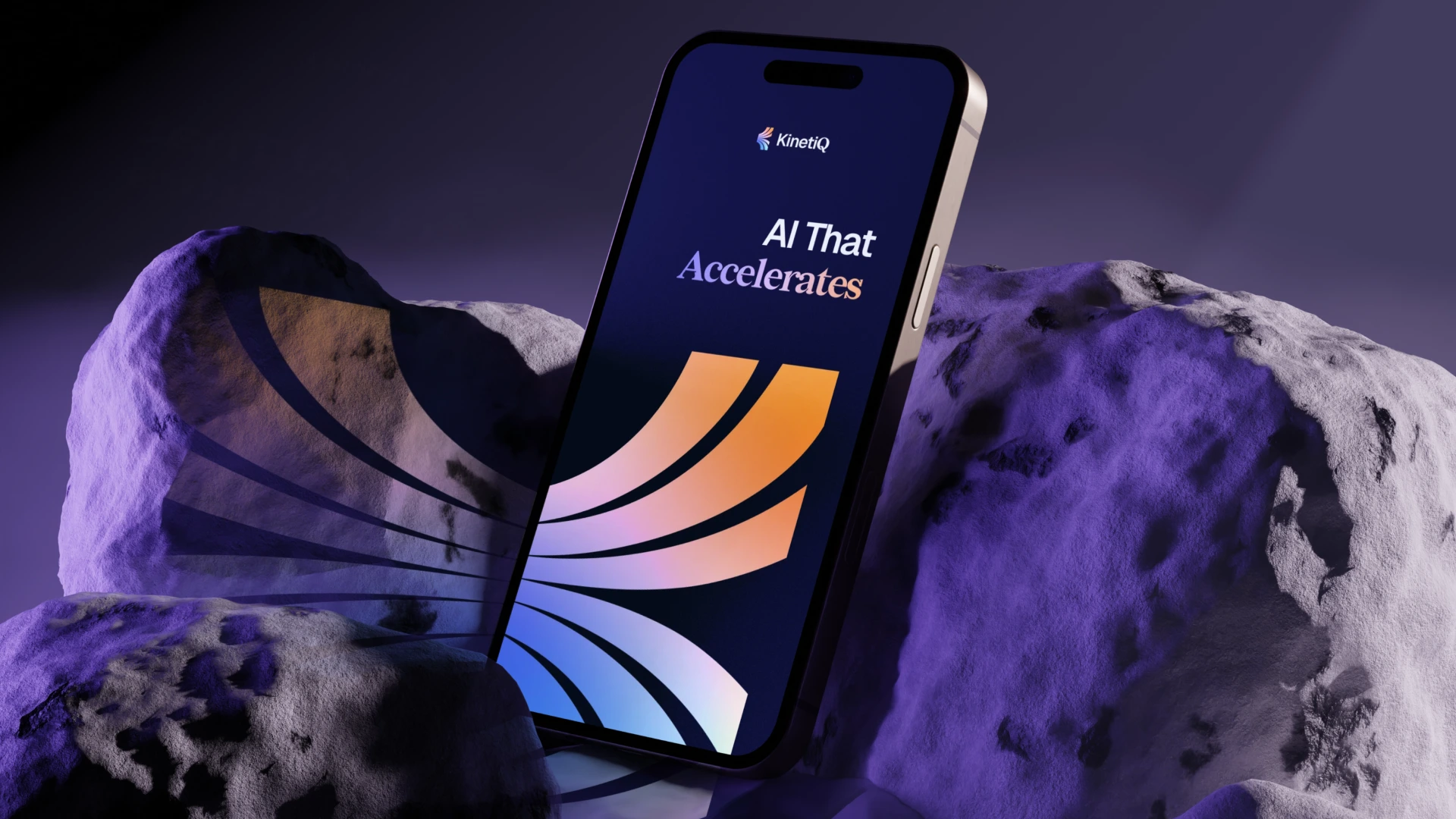
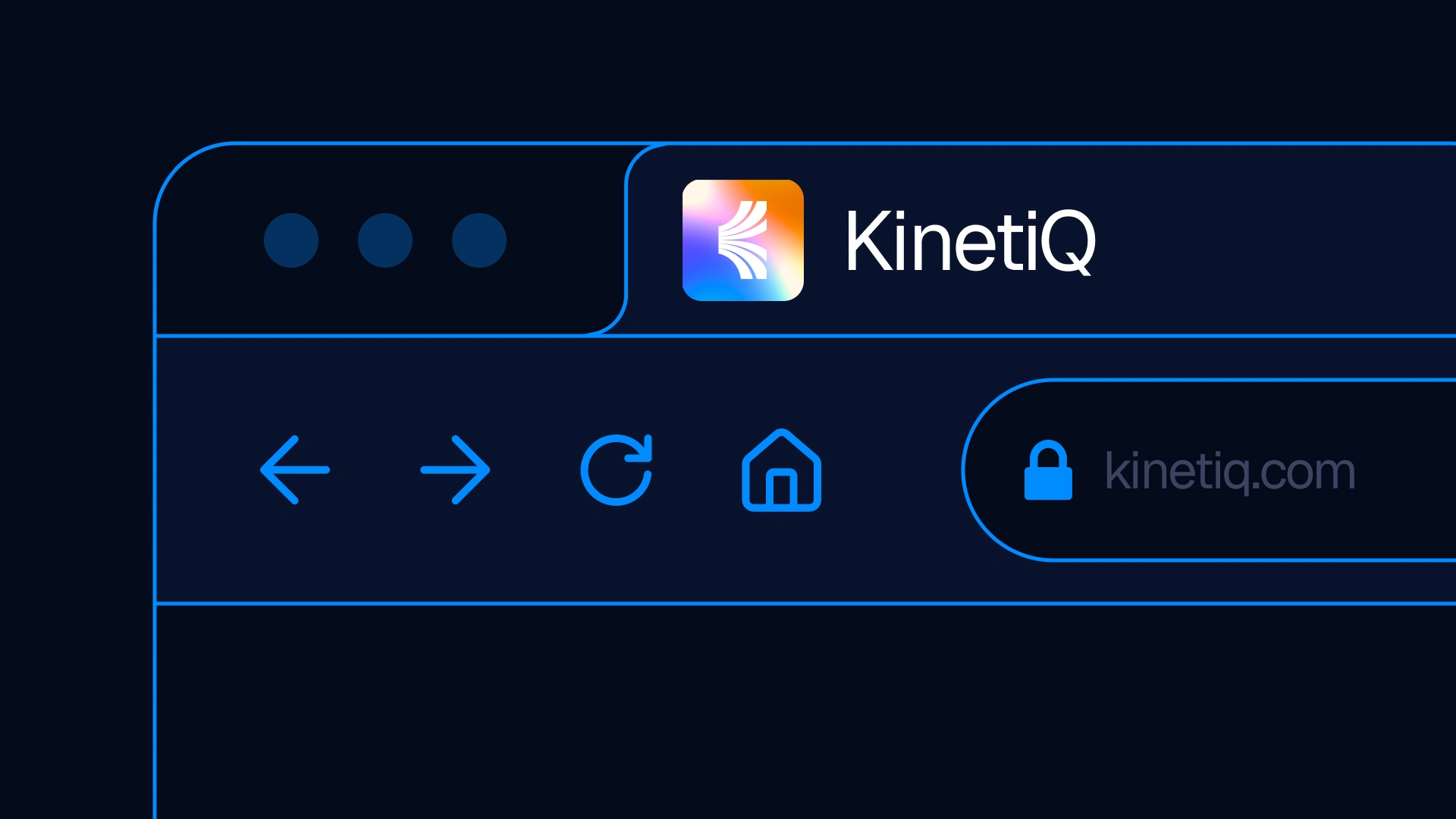
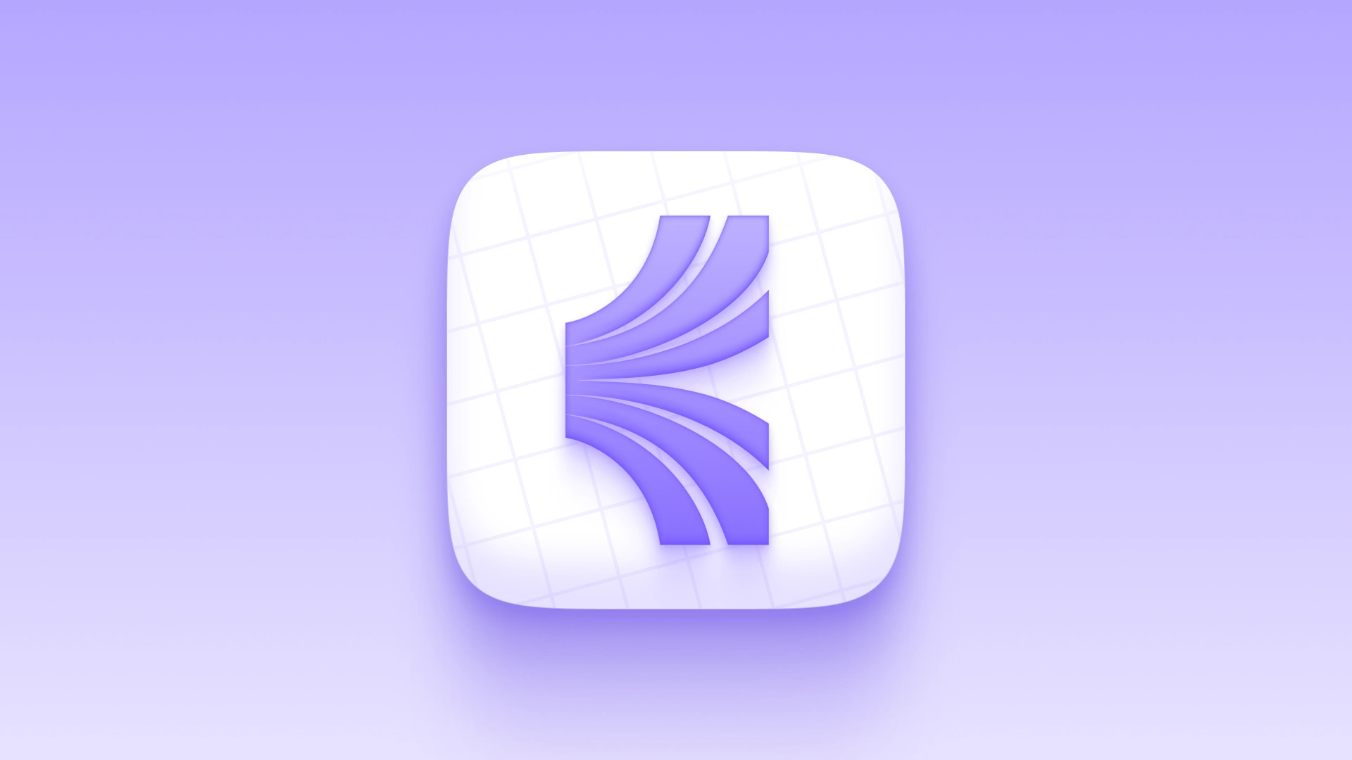
The final symbol represents:
🌟 growth (expanding arcs)
⚡ acceleration (forward-direction flow)
🔆 intelligence (light-inspired geometry)
🚀 futurism (neon gradients)
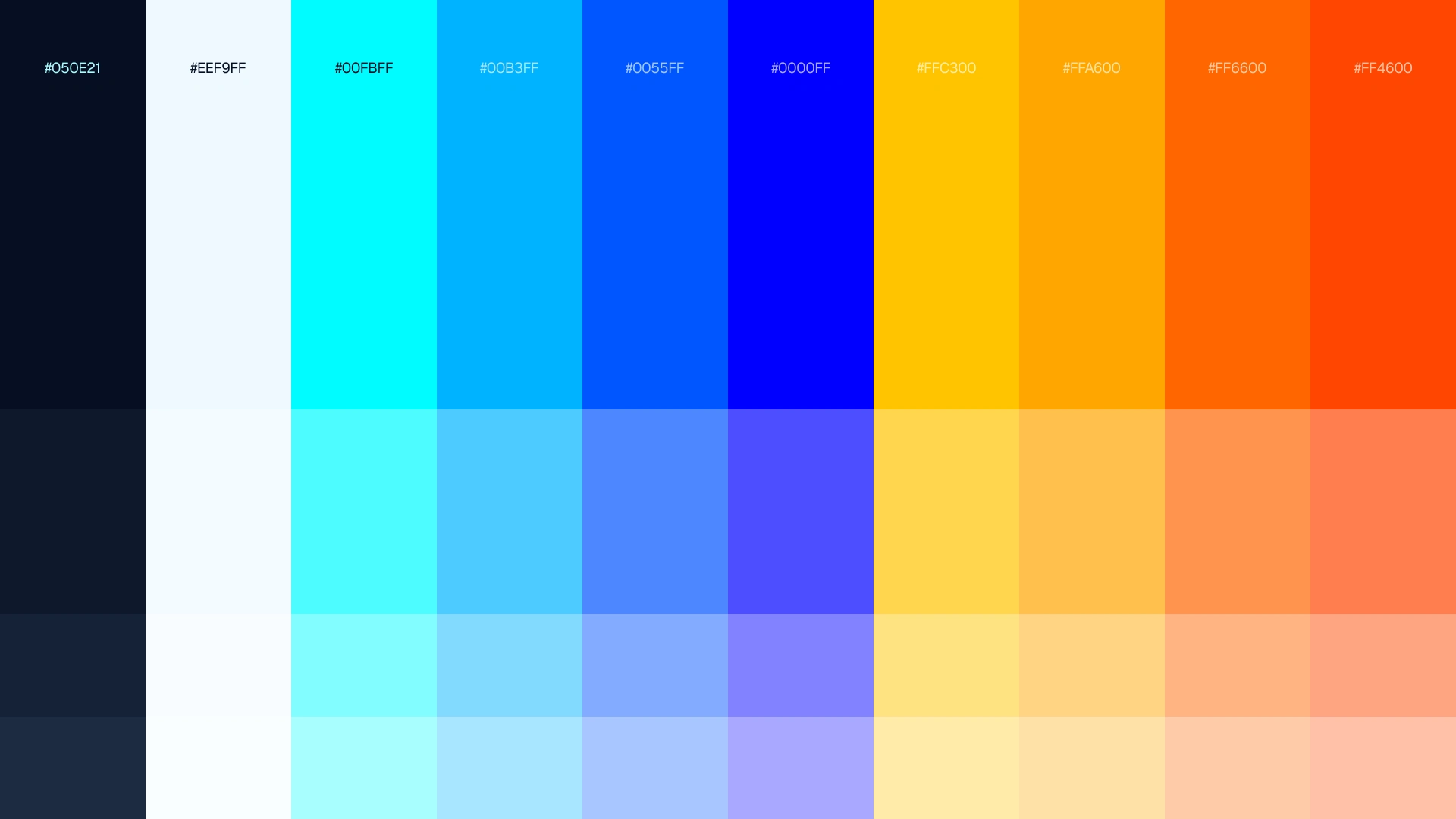
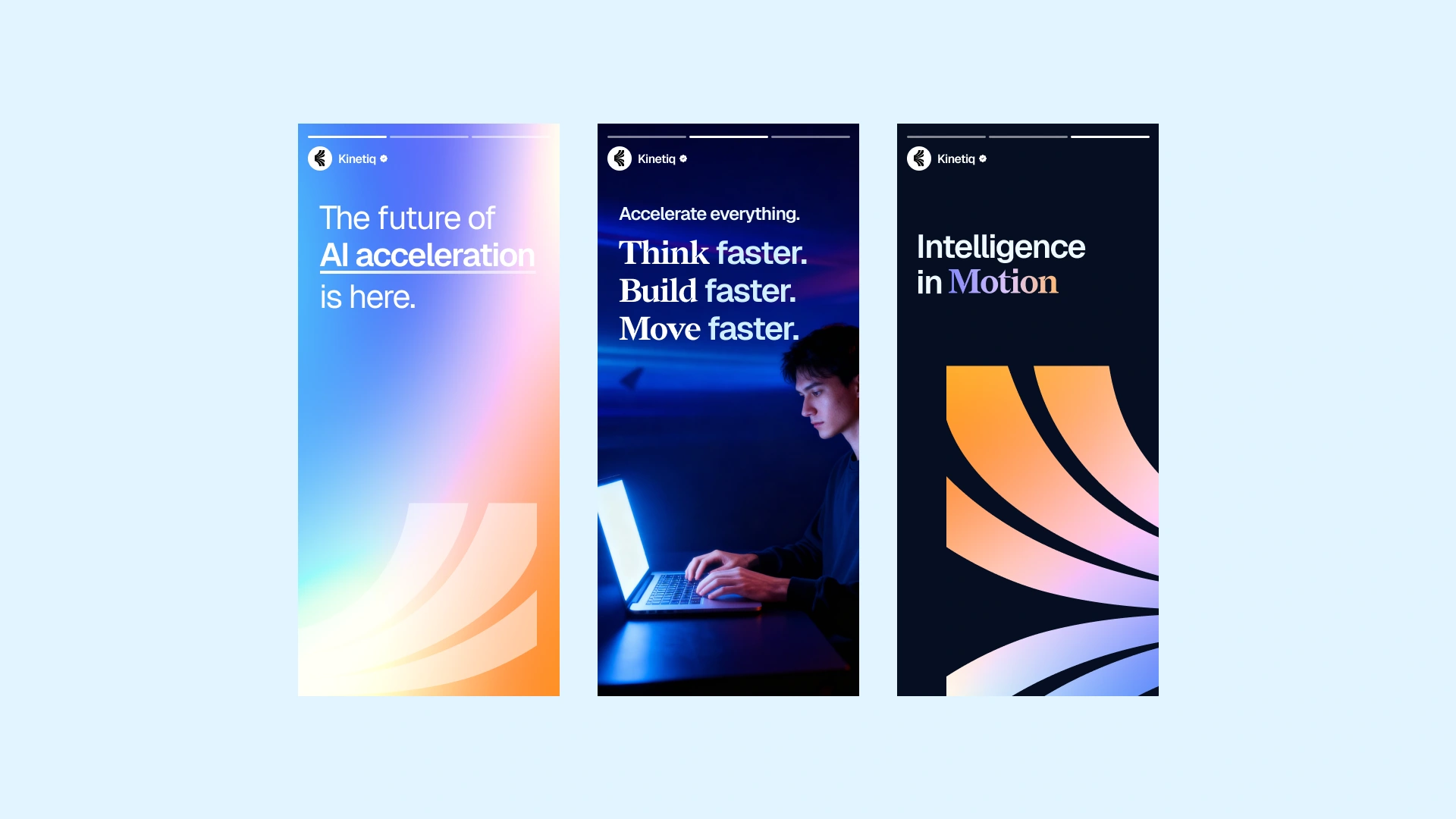
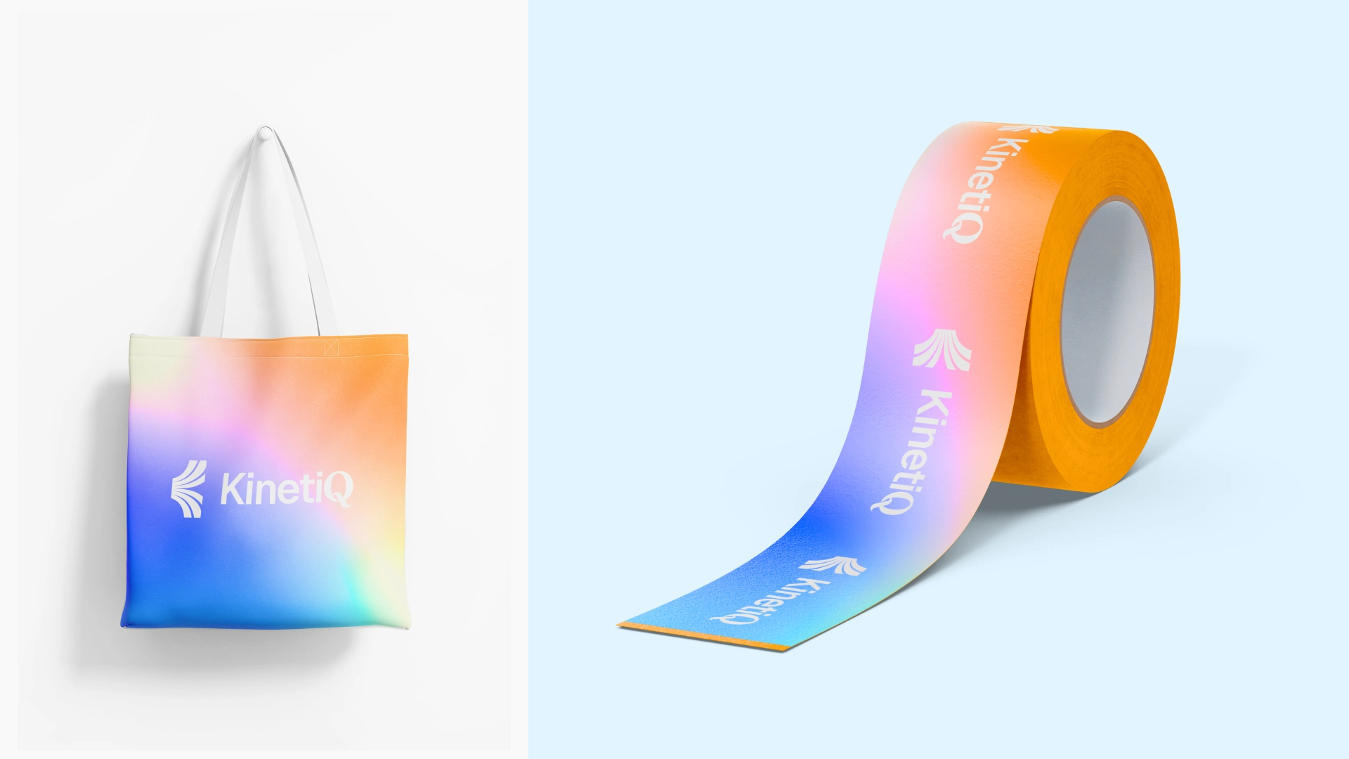
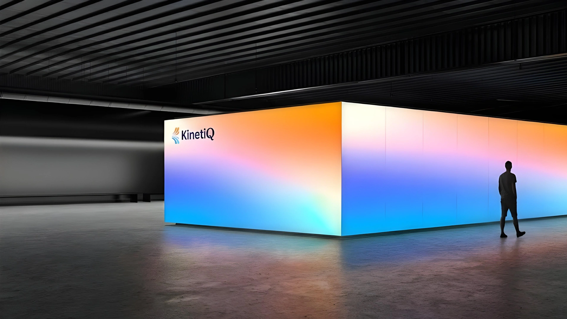
Color Palette
Our palette is bold, vibrant, and perfect for a futuristic tech brand.
Bright cyans, electric blues, vivid oranges, and warm yellows create the “kinetic energy” feeling.
This palette allows the brand to move across moods:
Blue spectrum → technology, trust, intelligence
Orange/yellow spectrum → energy, acceleration, impact
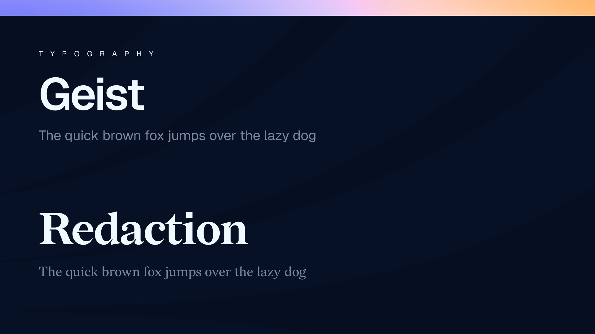
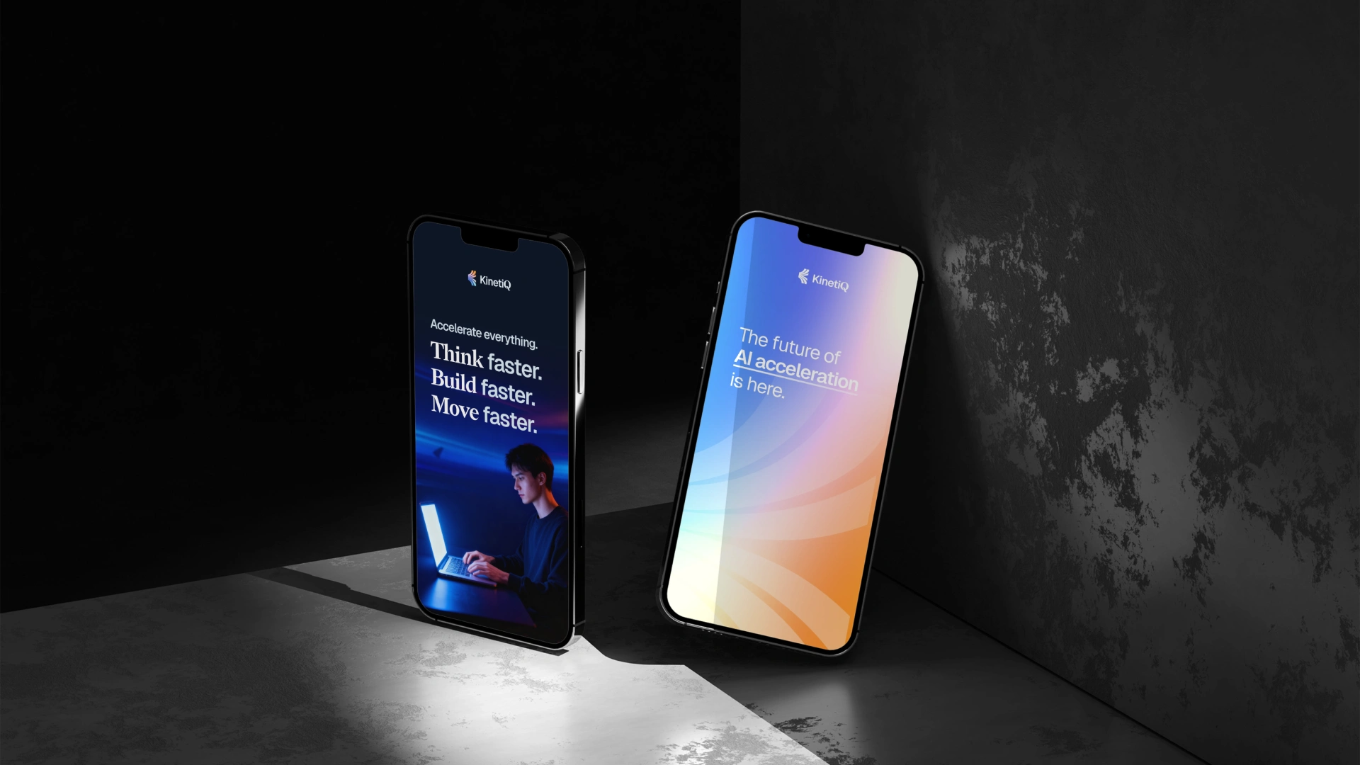
Typography
Geist - Sans Serif (Primary)
Geist is clean, minimal, modern, and very readable.
Perfect for a tech-focused brand that values clarity.
Redaction - Serif (Secondary/Accent)
Redaction adds character and sophistication.
Balanced contrast with Geist creates a premium, editorial feeling.
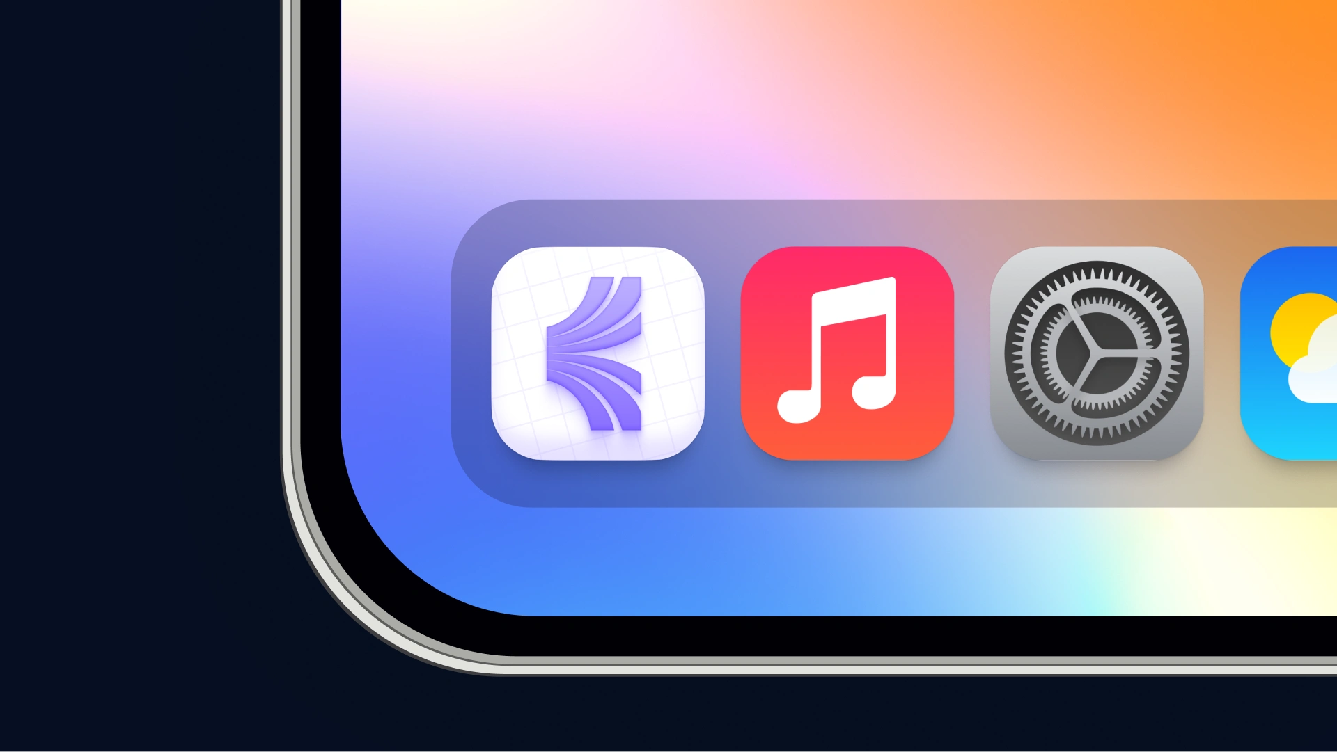
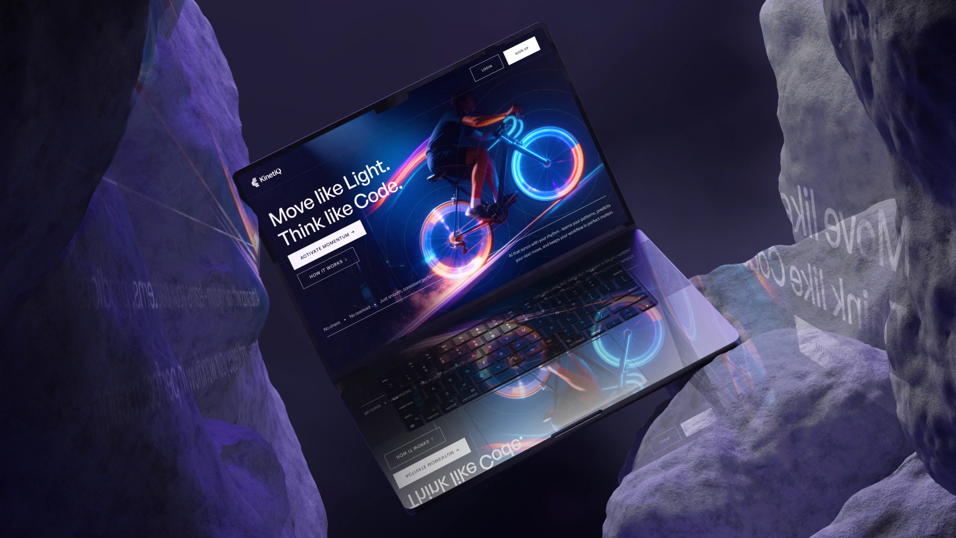
Visual Language - The Motion System
The core of the identity is movement.
The system uses:
✨ arcs and curved forms
✨ gradient transitions
✨ movement-inspired spacing
✨ glowing highlights
✨ depth through layering
These elements express KinetiQ’s personality: always adapting, always accelerating.
Social System
KinetiQ’s social voice is short, confident, and energetic.
Bringing It All Together
The final identity is:
🌈 futuristic
⚡ energetic
💡 intelligent
🎯 balanced
📈 scalable
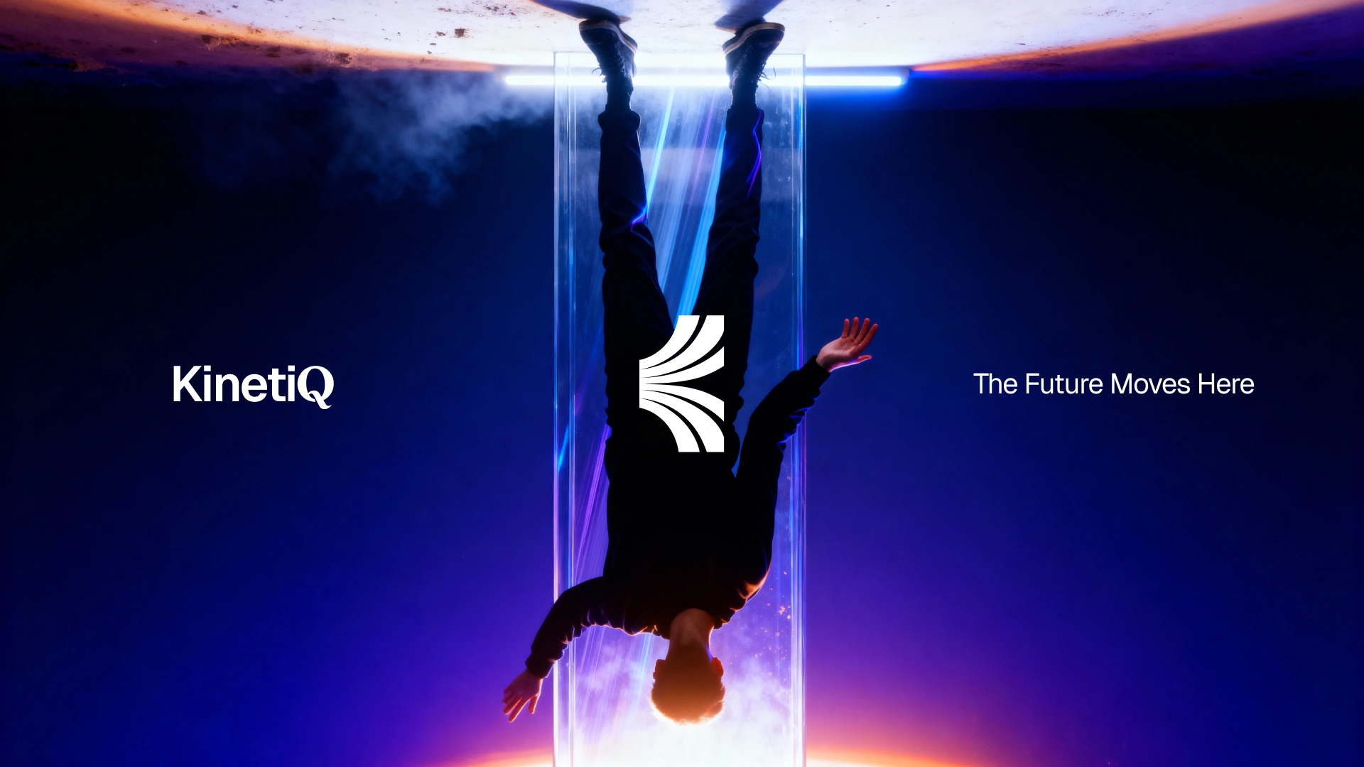
From logo → palette → typography → UI → social → billboards, every part of KinetiQ expresses Intelligence in Motion.
💬 Closing Thoughts
This project was a deep dive into the world of futuristic identity design.
From the first sketch to the last gradient, the goal was to build a brand that feels fast, purposeful, and constantly pushing forward.
Let’s build your SaaS or AI startup brand - from strategy to identity to visuals.
If you’re launching something new, I’d love to help bring it to life.
Like this project
Posted Dec 9, 2025
Developed a brand identity for KinetiQ emphasizing speed and futurism.