Built with Framer
AdaptMX — Framer Website Design & Development
Nico Ramella
Verified
AdaptMX — Framer Website Design & Development
The Brief
AdaptMX operates in a space where credibility is everything. They're selling a complex, technical product, cookieless advertising infrastructure, to agencies and brand teams who evaluate vendors quickly and skeptically. Their existing site was working against them: outdated design, clunky animations, no meaningful SEO structure, and a visual identity that didn't reflect where the company actually stood. For a company valued at $1B, the site was seen as a liability in sales conversations rather than an asset.
They needed something their reps could open in front of a client and let it do the talking.
AdaptMX Framer Design & Development
The Approach
The project started with a discovery call to understand their users, what the sales team needed the site to accomplish, and how different stakeholders would use it day-to-day. They sent a wide range of visual references that pulled in different directions, which was useful: it told me more about the feeling they were after than any single reference could have. From there, I made decisions based on their audience, technical buyers who read carefully and evaluate fast.
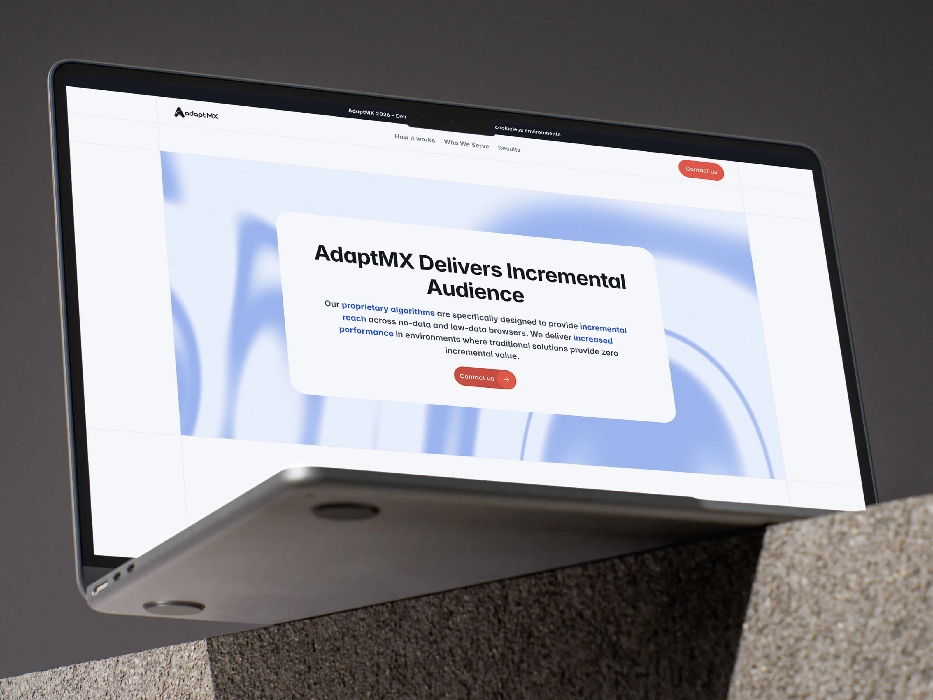
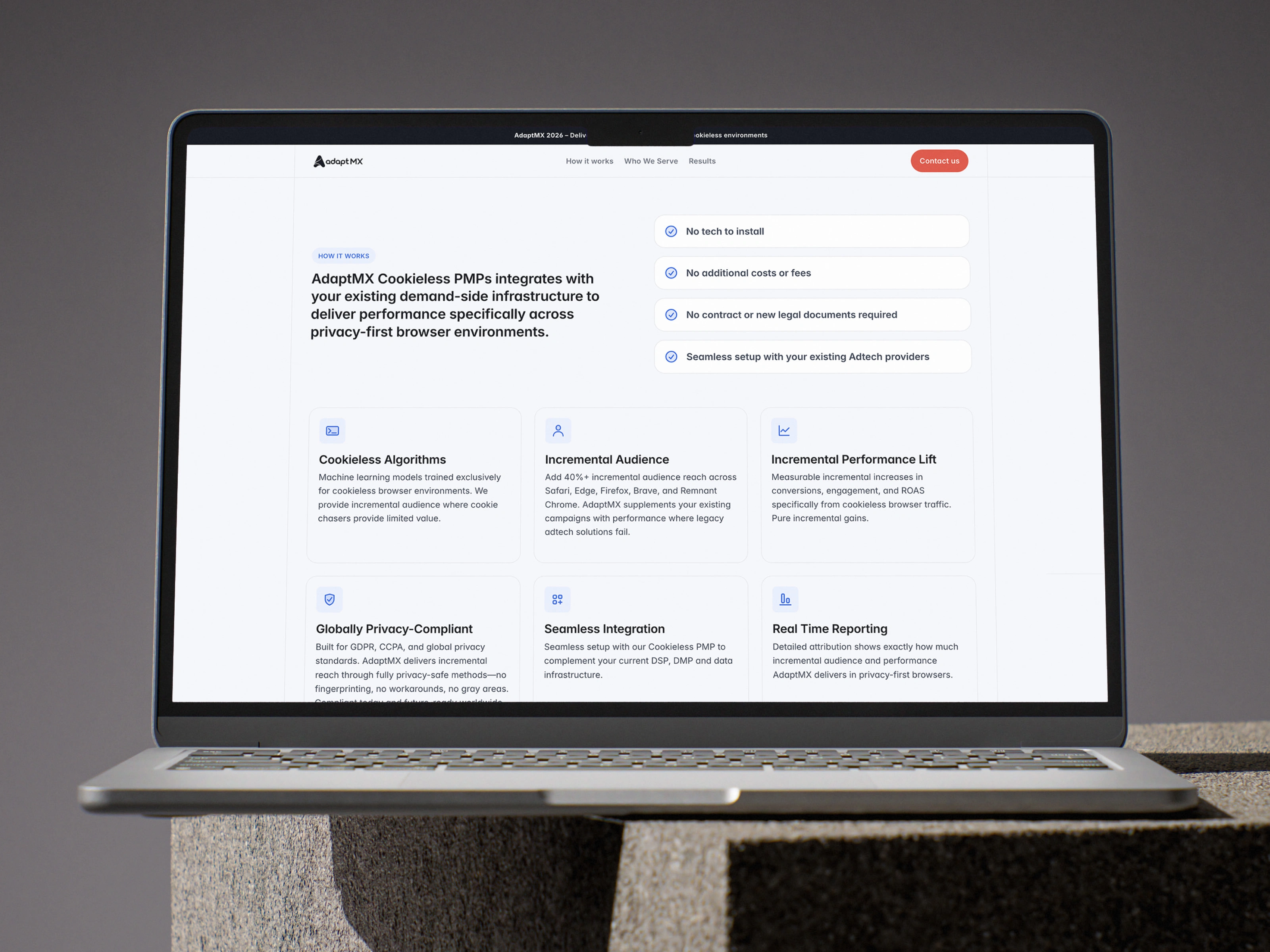
The core challenge was that the site is genuinely text-heavy. AdaptMX's value proposition requires explanation, and there's no shortcutting it. So rather than fighting the content, I designed around it. Sticky scroll behavior keeps section context anchored as users read through dense benefit blocks, so they never lose their place in the narrative. Subtle animations, hover states, and an animated background layer keep the experience feeling alive without distracting from the copy.
AdaptMX Framer Design & Development
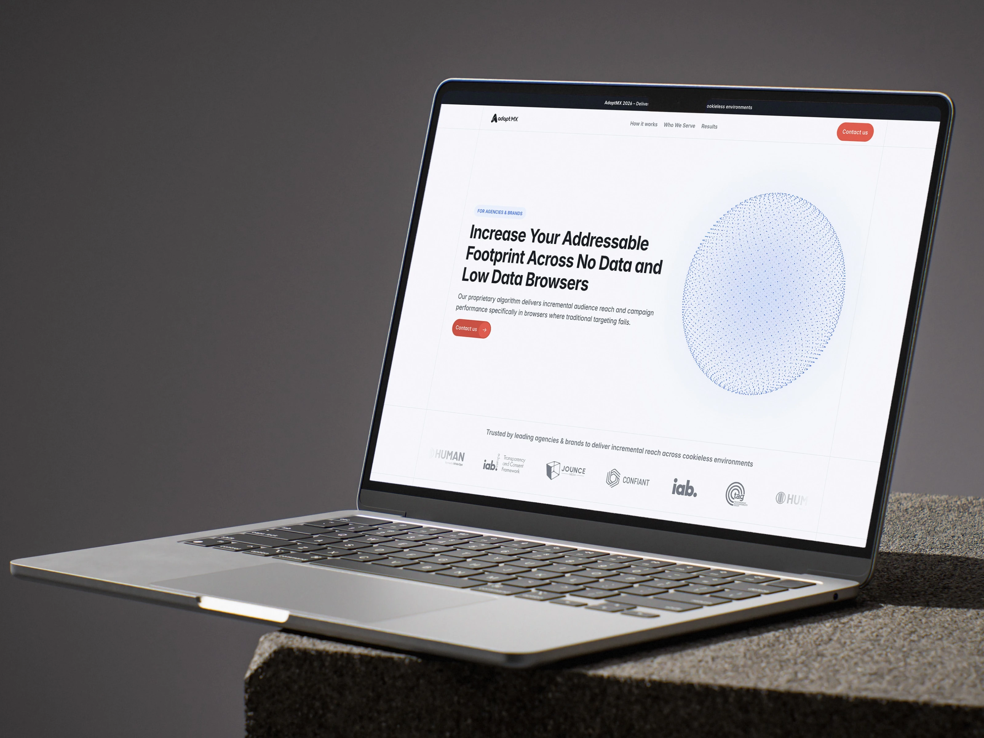
On the brand side, they came in with a logo, red and blue colors. I enhanced both colors, introduced light gray variations to give the layout room to breathe, and added the typeface, shapes, and border system that tie everything together. The particle sphere on the hero, built from a Framer component I adapted, visualizes their core concept without needing a single word of explanation.
The site was built to be fully responsive, with SEO structure properly implemented across the page hierarchy, something the previous site had neglected entirely.
The Result
Delivered in one week. Only one revision round was needed to modify just some copy. The team uses it as a pitch deck in sales conversations, opening it in front of clients rather than using slides. For a product this technical, that kind of trust in the site is the clearest signal that it's doing its job.
AdaptMX Framer Design & Development
Like this project
Posted Feb 21, 2026
Framer website development for a $1B adtech company. Designed for credibility, sales enablement, and cookieless advertising clarity. Delivered in one week.
Likes
2
Views
9
Timeline
Jan 20, 2026 - Mar 27, 2026
Clients
AdaptMX