A Banking/ Fintech App Design
Ismaeel Rabiu
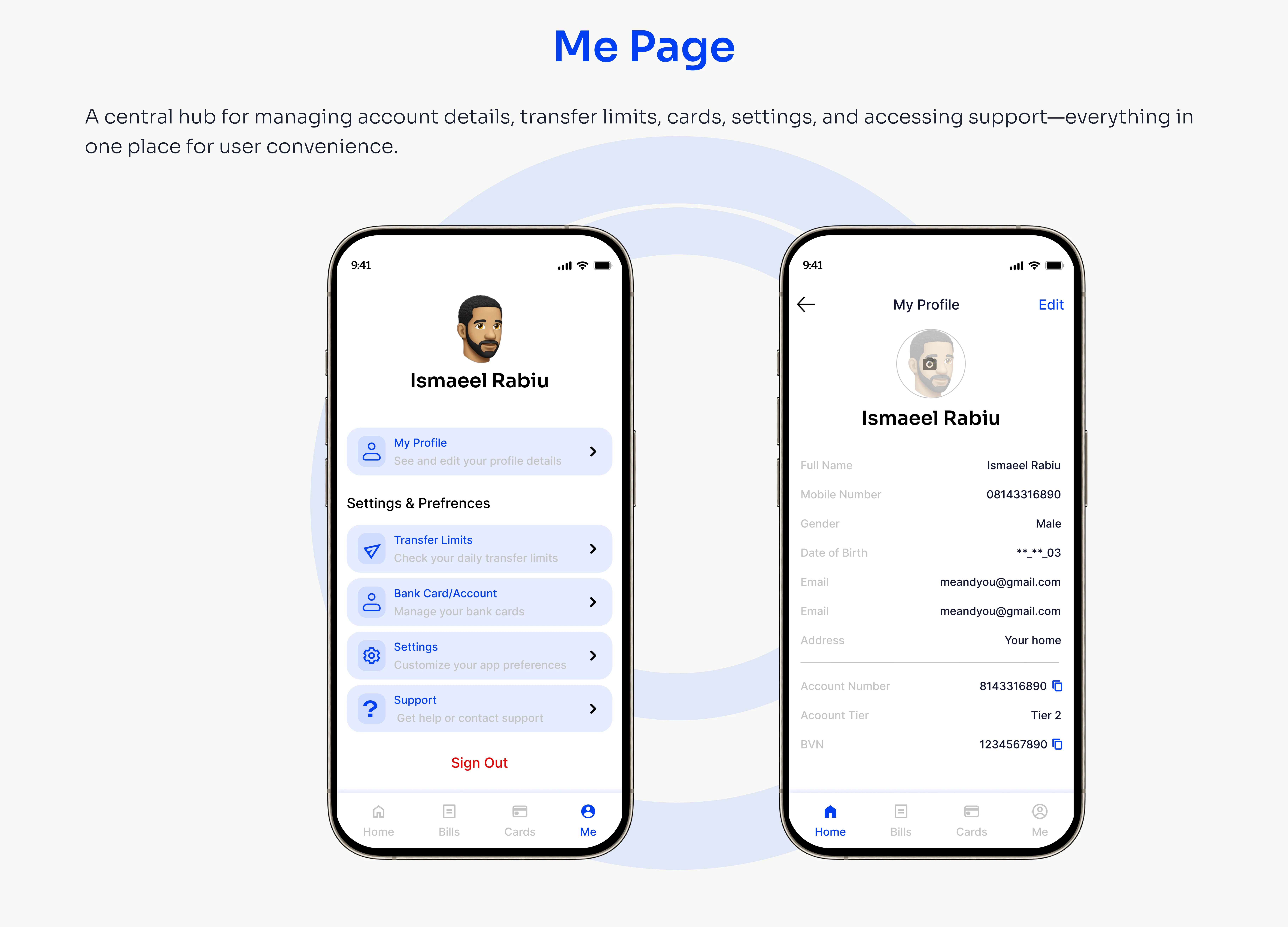
Breeze – Fintech App Design
The goal of Breeze was to tackle a common problem in the fintech space: users often find finance apps complex, intimidating, and overwhelming. Breeze was created as a solution to make money management feel light, simple, and stress-free.
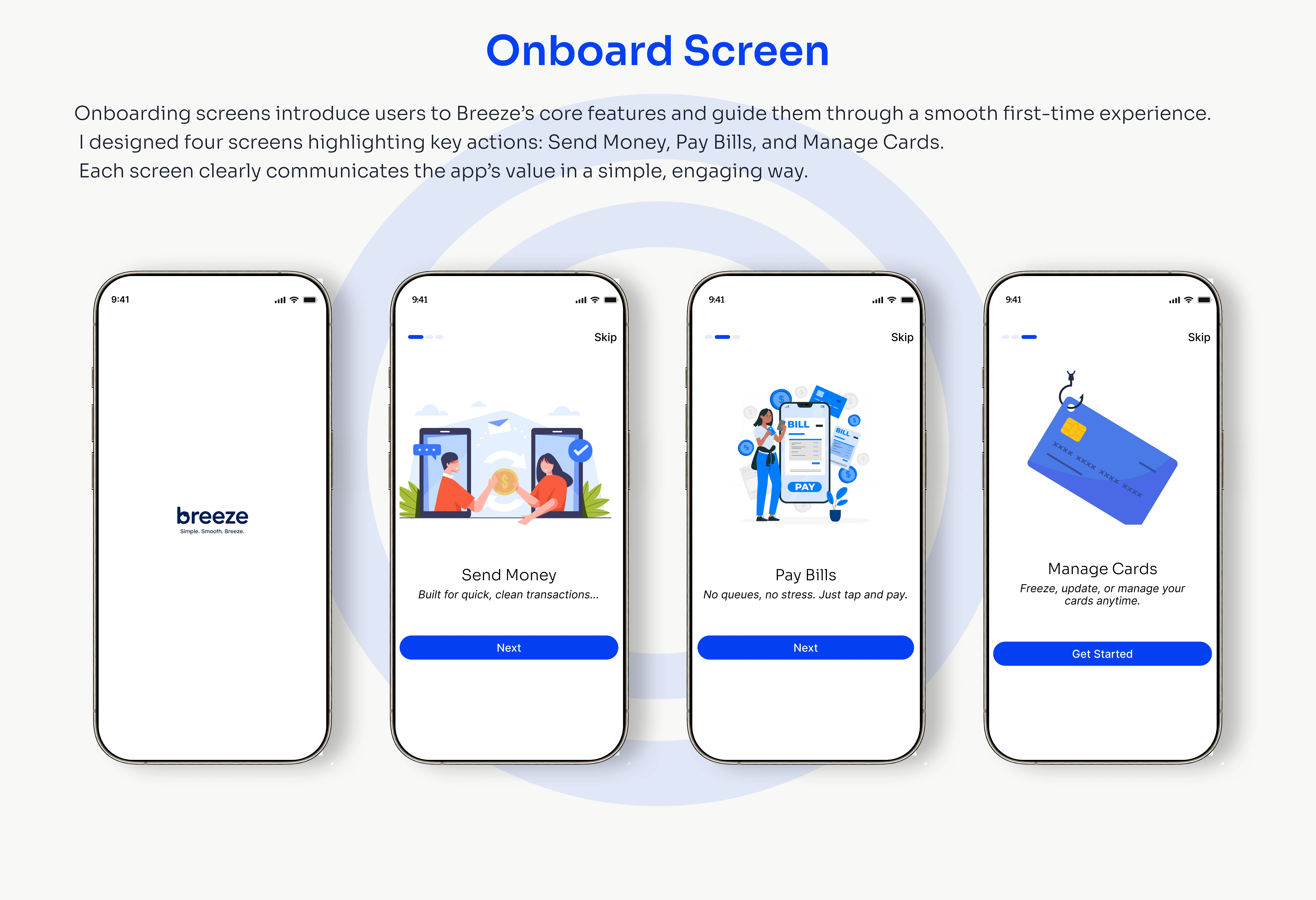
The design process began with research into existing fintech apps to uncover user pain points. Many apps were cluttered, difficult to navigate, and left users feeling uncertain about their decisions. With these insights, I sketched wireframes to map out minimal, clear flows that would guide users step by step. From there, I designed a clean and intuitive interface where clarity and ease of use were the priorities. Prototypes were built and tested with users, and their feedback helped refine every detail to ensure the experience felt as smooth as possible.
At the core of the idea was the name itself—Breeze. The app was designed to work seamlessly in the background, giving users confidence and control without overwhelming them with complexity. Every interaction, from the onboarding process to tracking expenses and managing accounts, was intentionally crafted to feel effortless.
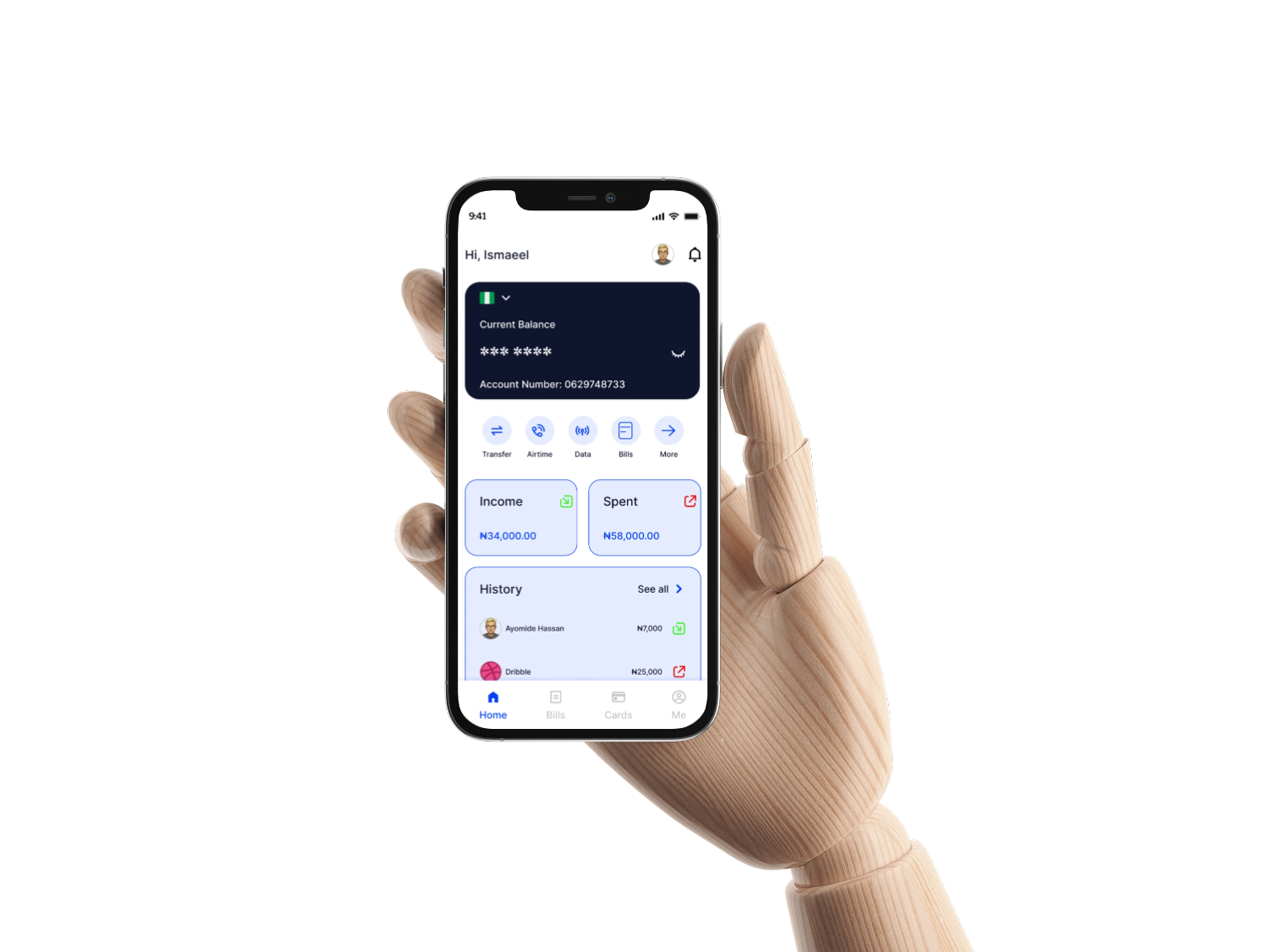
The result was a fintech app that lives up to its promise: a smooth onboarding experience, clear navigation, and a streamlined user journey. Users reported higher engagement, greater satisfaction, and most importantly, they felt more confident in managing their finances. Breeze turned financial management into an approachable, empowering experience—something users could finally feel at ease with.
Like this project
Posted Sep 19, 2025
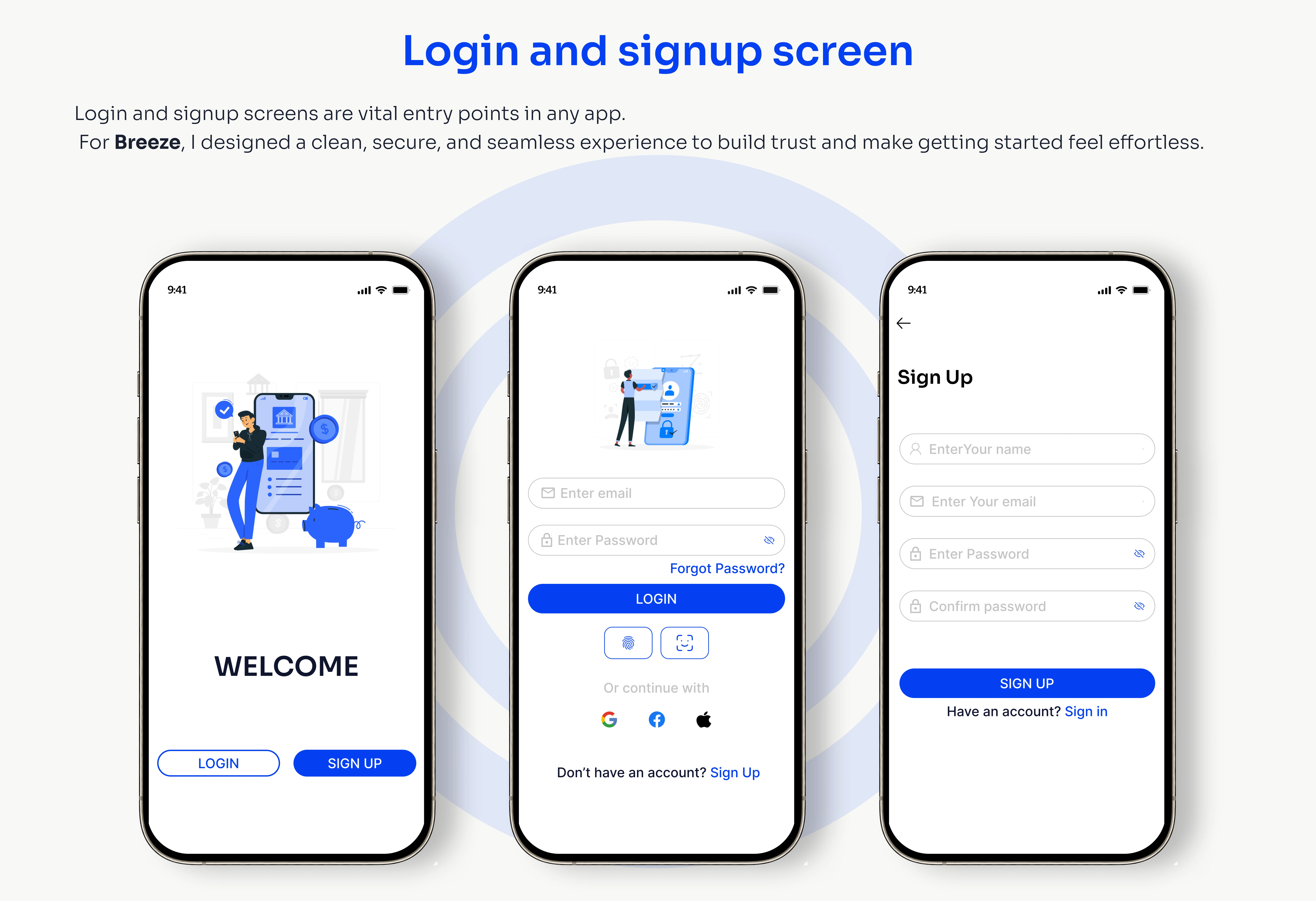
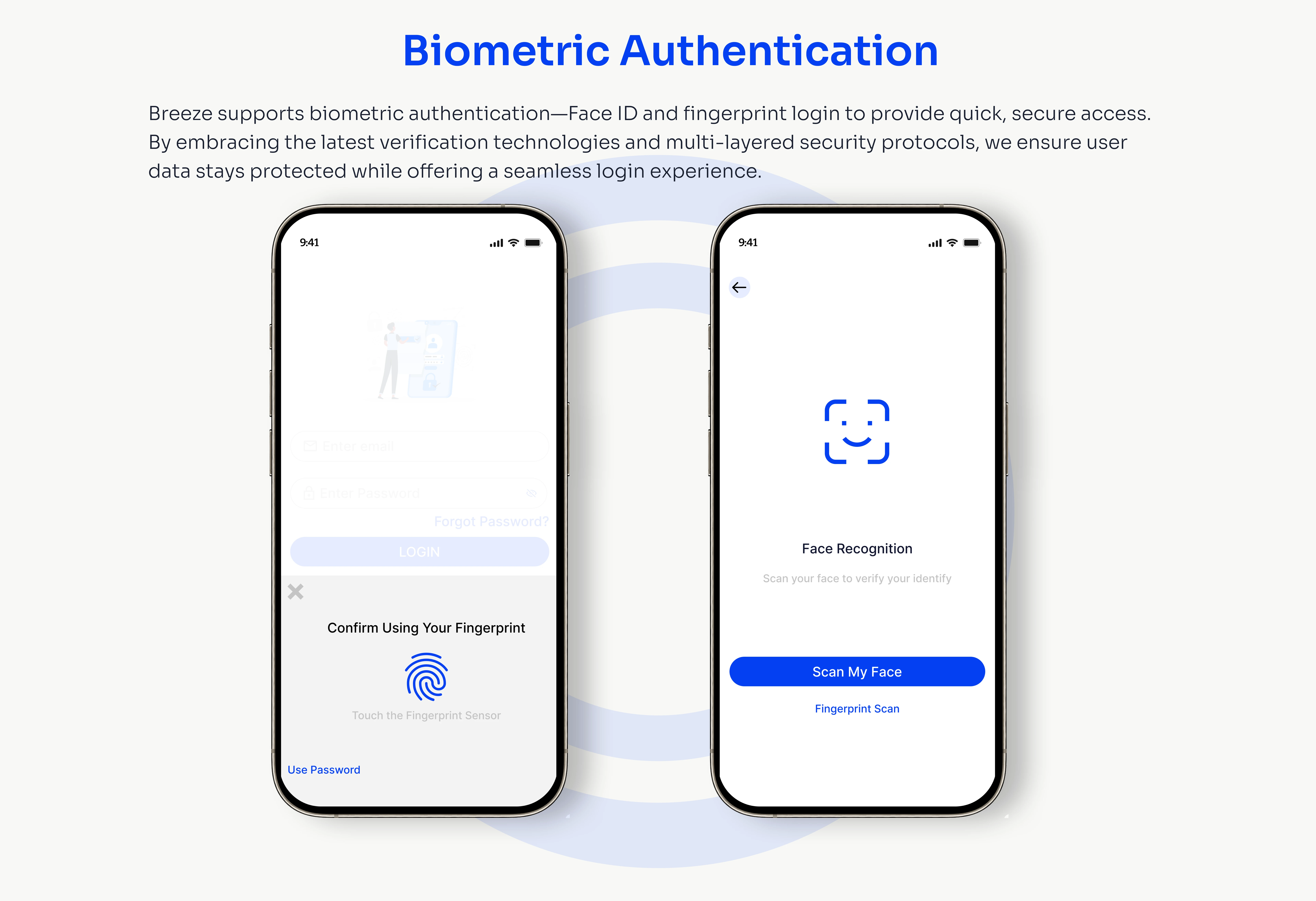
The design emphasizes clarity, accessibility, and trust. With a minimalist layout and navigation, Breeze gives users the confidence to control their finances.