A Bank App Redesign
Ismaeel Rabiu
Kuda Bank App Redesign... Smoother Flows & Cleaner UI
This redesign project was inspired by the need to improve some of the everyday interactions within the Kuda banking app.
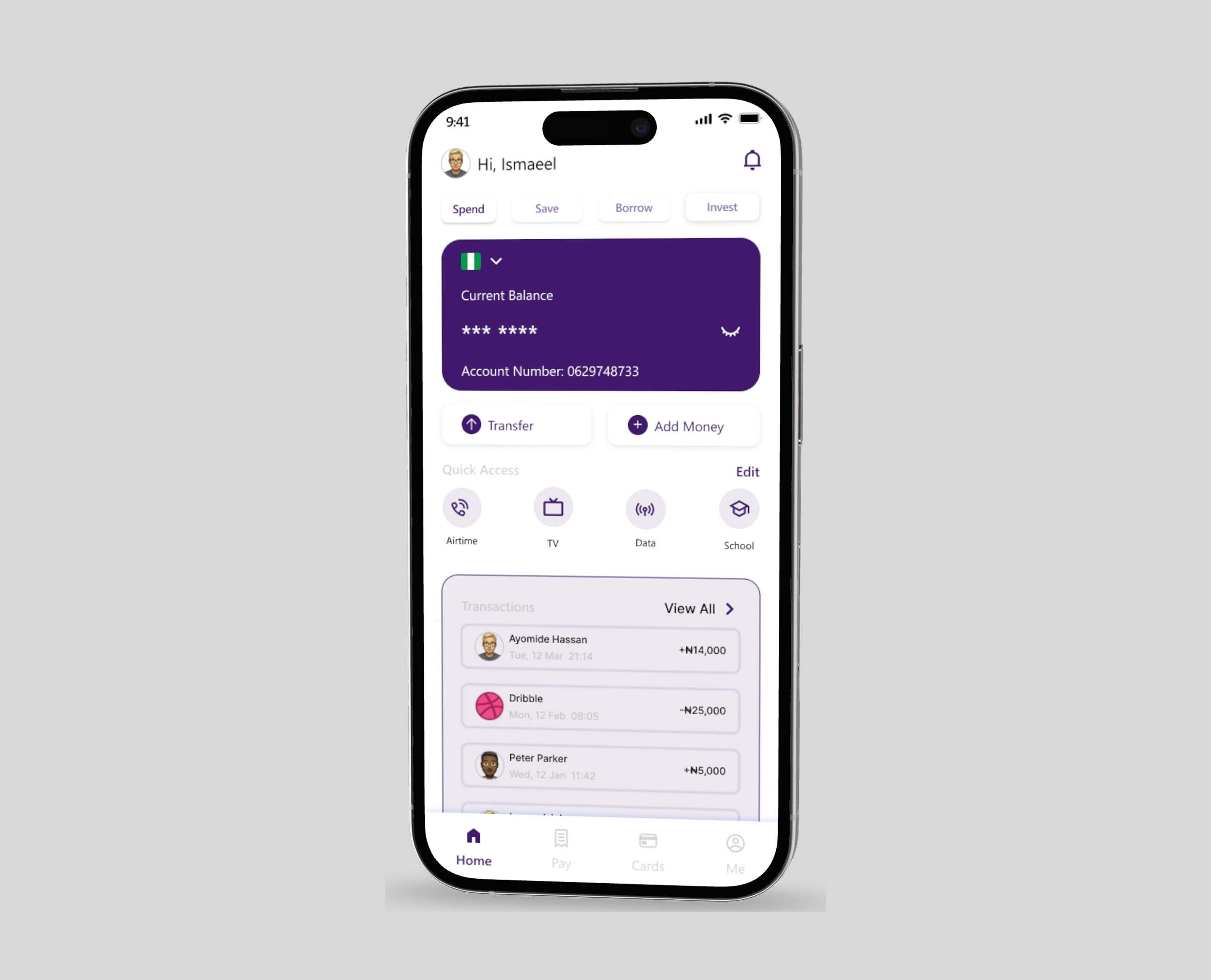
Kuda already provides a strong digital banking experience, I saw opportunities to make certain functions feel smoother, more intuitive, and visually consistent. The focus was on enhancing usability, refining the interface, and creating a cleaner, more polished design.
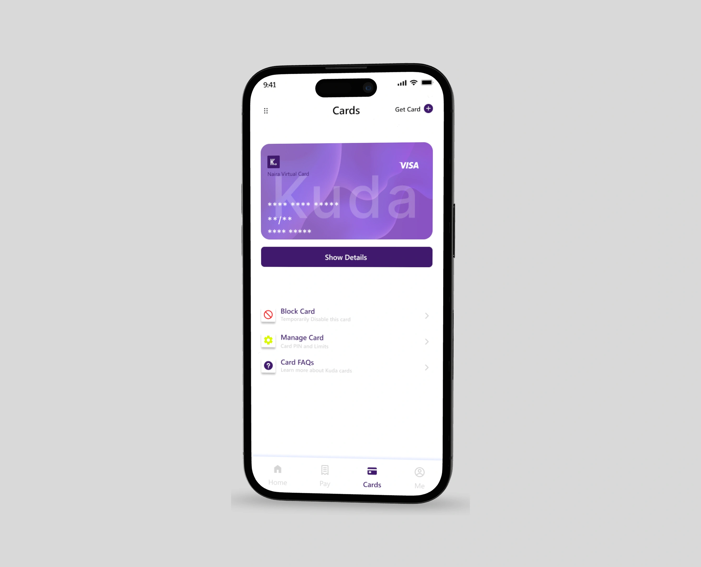
One key area I worked on was the card management flow, particularly the process of revealing card details. In the existing design, this interaction could feel slightly clunky and unintuitive. I reworked it into a more seamless and secure flow—ensuring that users could quickly access their card information without friction, while still maintaining safety and clarity.
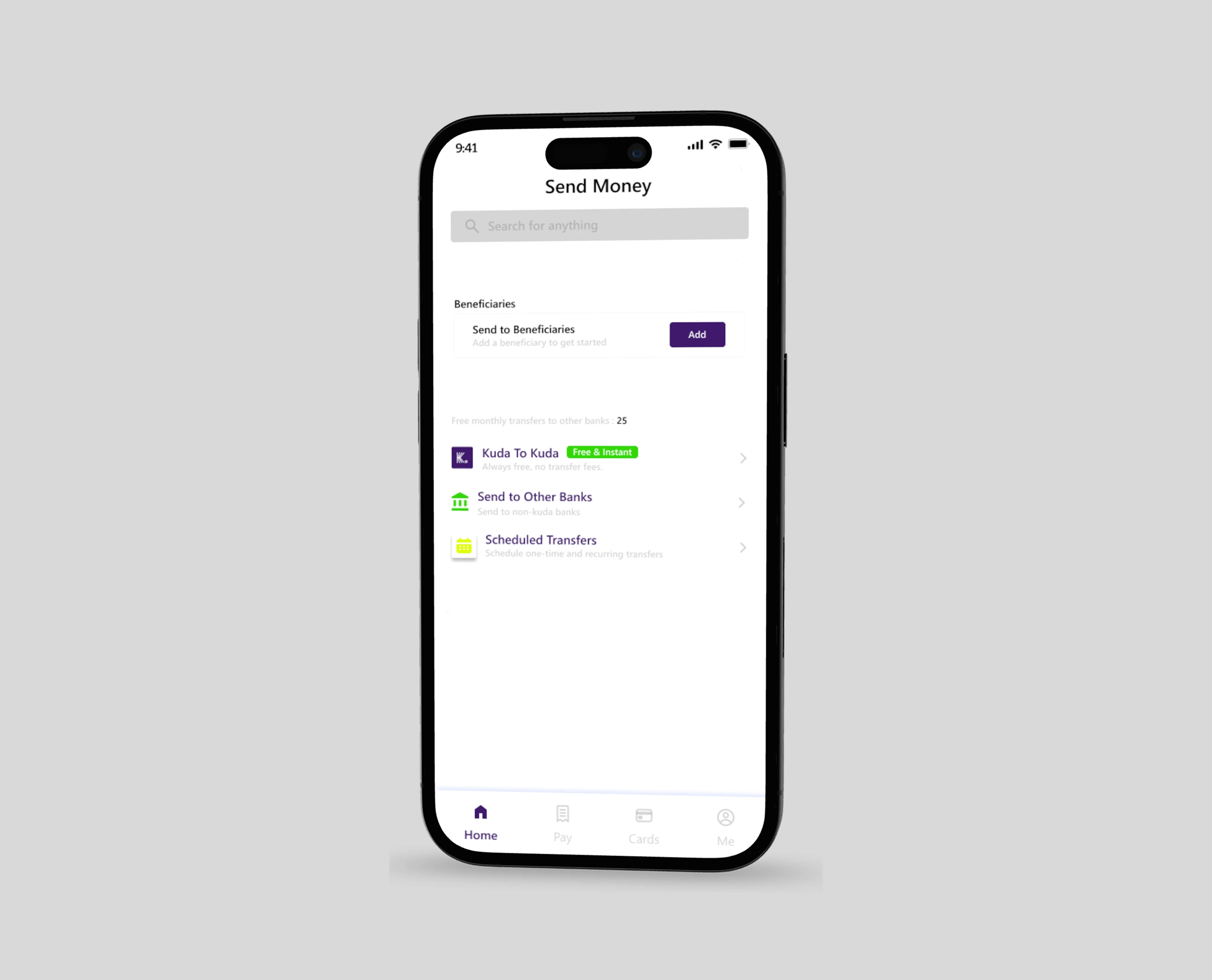
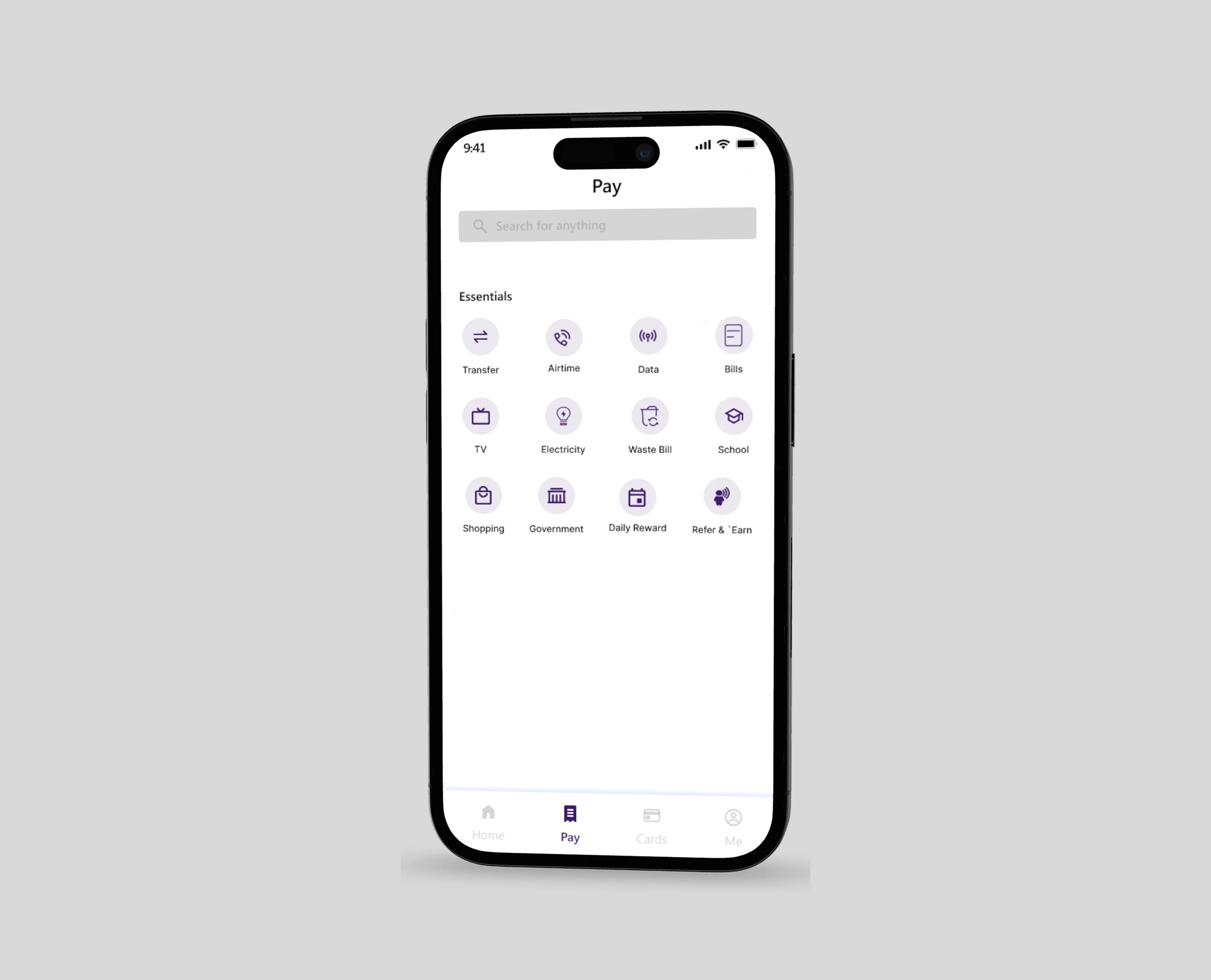
Beyond functionality, I also set out to clean up the UI, removing unnecessary clutter and standardizing components to give the app a more refined look and feel. Colors, spacing, and typography were adjusted to strengthen readability and consistency, while ensuring the app retained its friendly and modern brand identity.
The redesign was not about reinventing Kuda, but about enhancing what already worked smoothing out interactions, refining flows, and making the experience feel more effortless for users. The outcome was a cleaner interface, more intuitive navigation, and a banking app that felt more user-friendly and responsive to everyday needs.
Like this project
Posted Sep 21, 2025
Created a fresh bank app redesign that simplifies payments, card control, and everyday banking, improving usability and customer trust.