Orbit UI/UX: Designing Fintech Screens People Trust

Shoaib Vohra


TL;DR. Orbit is a fintech workspace for founders in Pakistan: team cards, one USD bill repaid in PKR, and AI bookkeeping. I designed every screen, from the information hierarchy to the colour system, then built it with AI. This is the design story; the product story is in my other Orbit case study.
Role: Product designer & PM · Platforms: web, desktop and mobile · Timeline: Sep–Oct 2026
The design problem
Money UIs usually fail in one of two ways: they bury the number you need, or they make risky things look safe. Orbit had both risks: credit in USD, repayment in PKR, and lots of simulated money in a demo. The UI had to be calm, easy to scan and honest.
Key design decisions
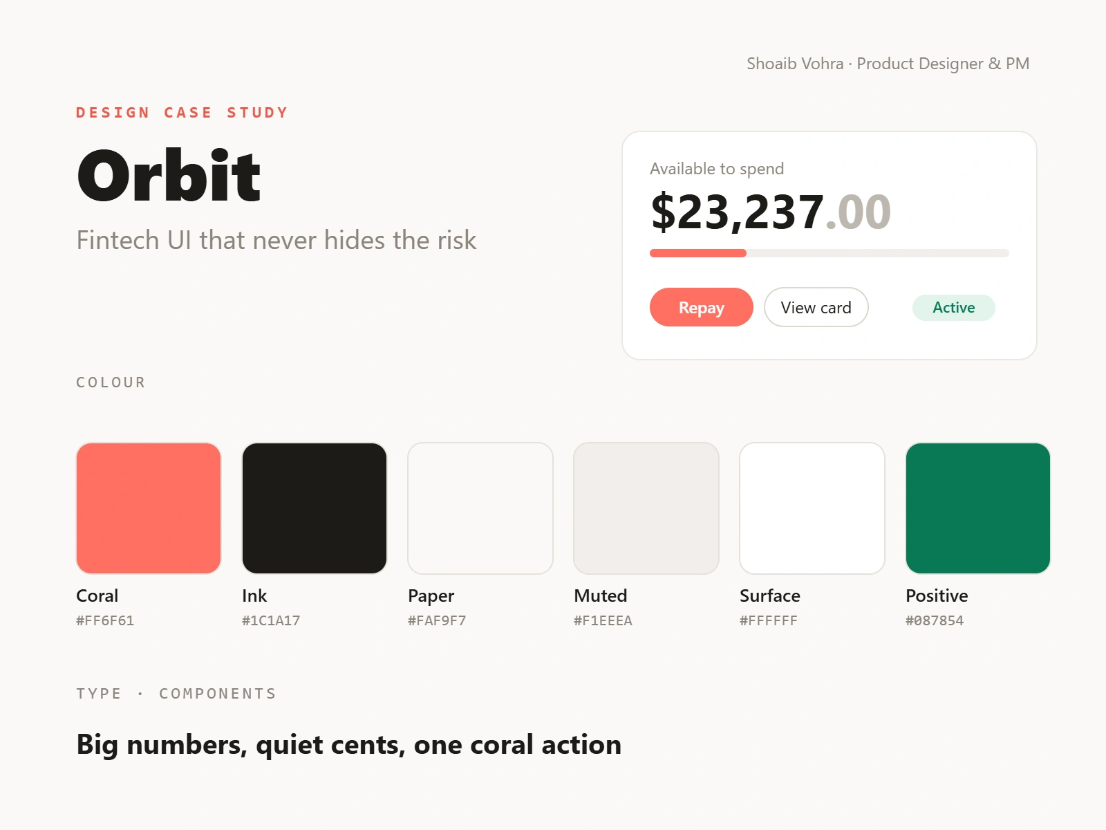
One home screen, three questions. How much can we spend, what is pending, and what do we owe next? Available-to-spend is the biggest thing on the page, a thin coral bar shows how much of the limit is used, and the next payment sits right beside it.
Quiet cents. Whole dollars are near-black and the cents are light grey, so $23,237 reads at a glance while the exact figure is still there.
One accent, used sparingly. Coral (#FF6F61) marks only the action that matters on each screen (Repay, Approve) and the credit-used bar. Status lives in green pills (Active, Approved, Balanced), so colours never compete.
Honesty as a design element. A "Demo" badge sits next to the logo, every simulated balance is labelled, and billing states the currency rule in plain words: "USD · repay in PKR". FX risk is shown, never hidden.
The card feels like an object. A dark, matte virtual card with its controls right next to it: freeze toggle, monthly limit and spend by category.
Two kinds of user, one sidebar. Founder tools (Home, Card, Activity, Billing, Finance) sit apart from admin tools (Accounts, Operations, Treasury lab), so ops complexity never leaks into the founder view.
Same hierarchy on mobile. The phone layout keeps the desktop order: balance, card, next payment.
The screens
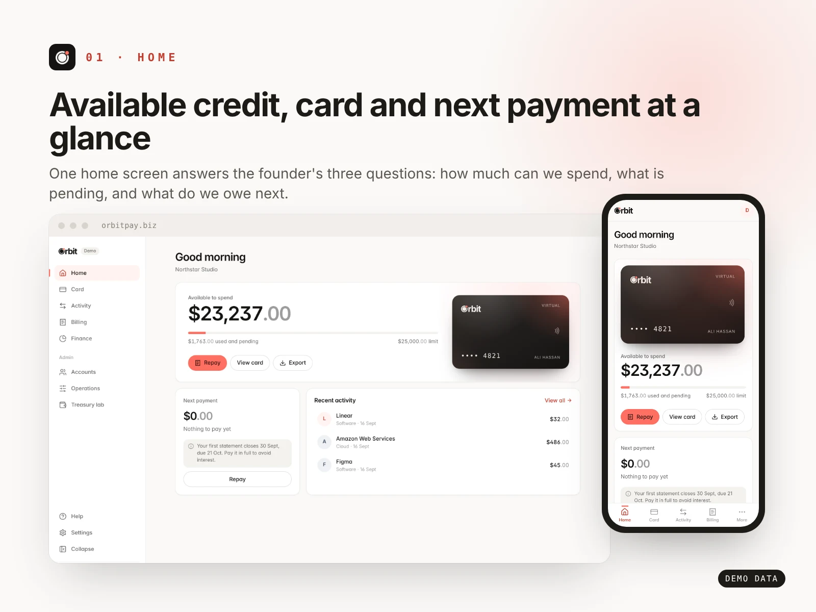
Home: the balance is the hero, and the next payment is one glance away.
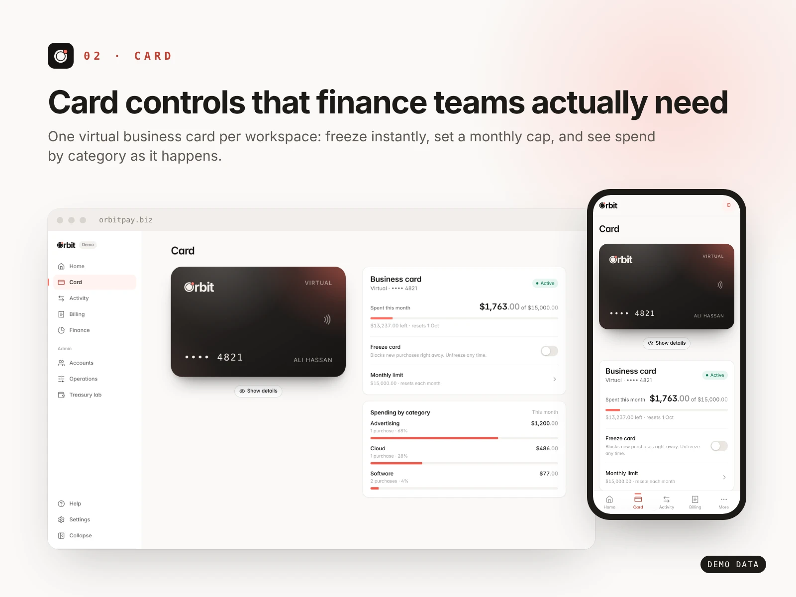
Card: freeze, monthly cap and spend by category, right next to the card.
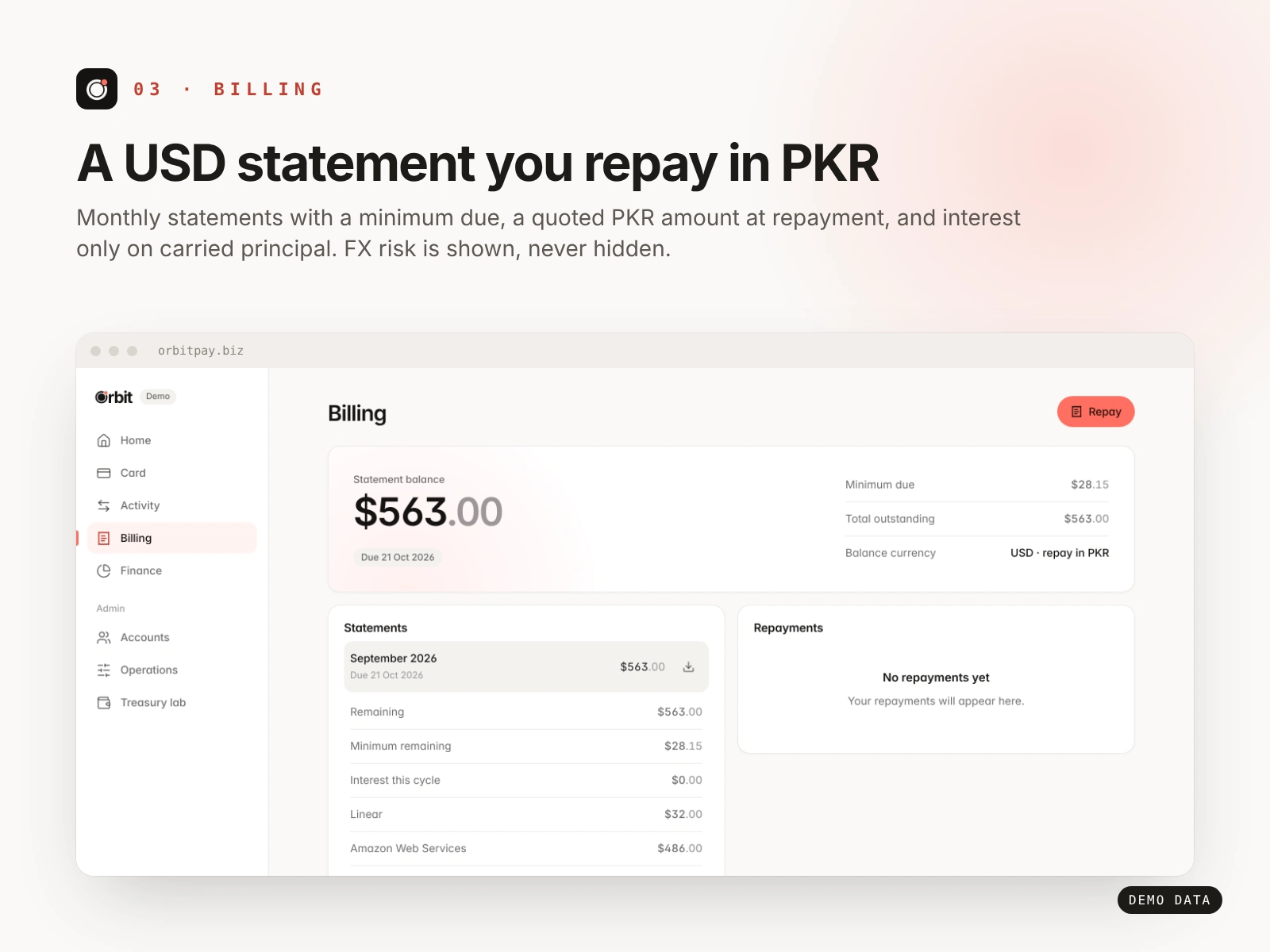
Billing: one USD statement, a quoted PKR amount, and the currency rule in plain words.
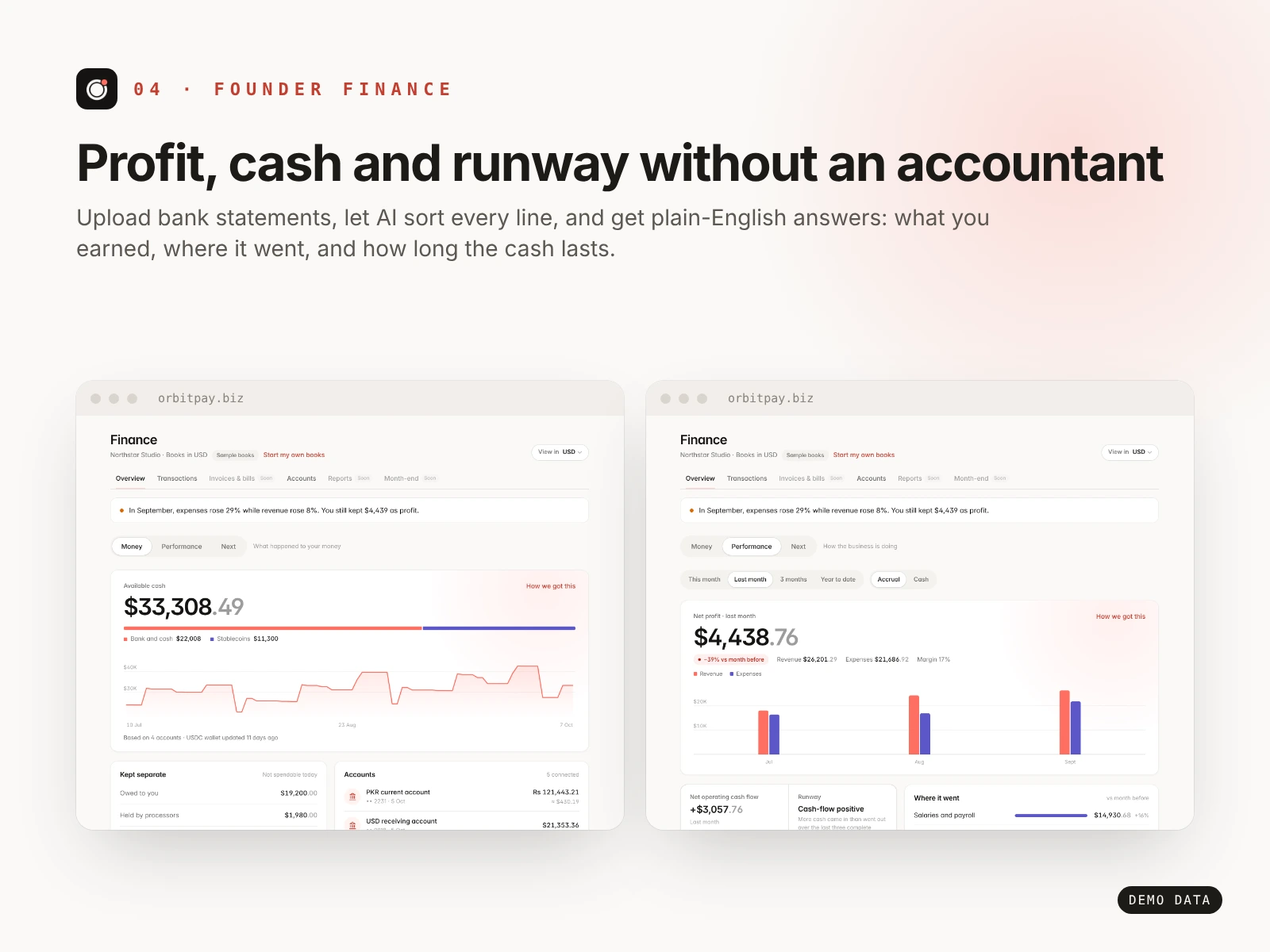
Founder finance: AI-sorted transactions turned into profit, cash and runway.
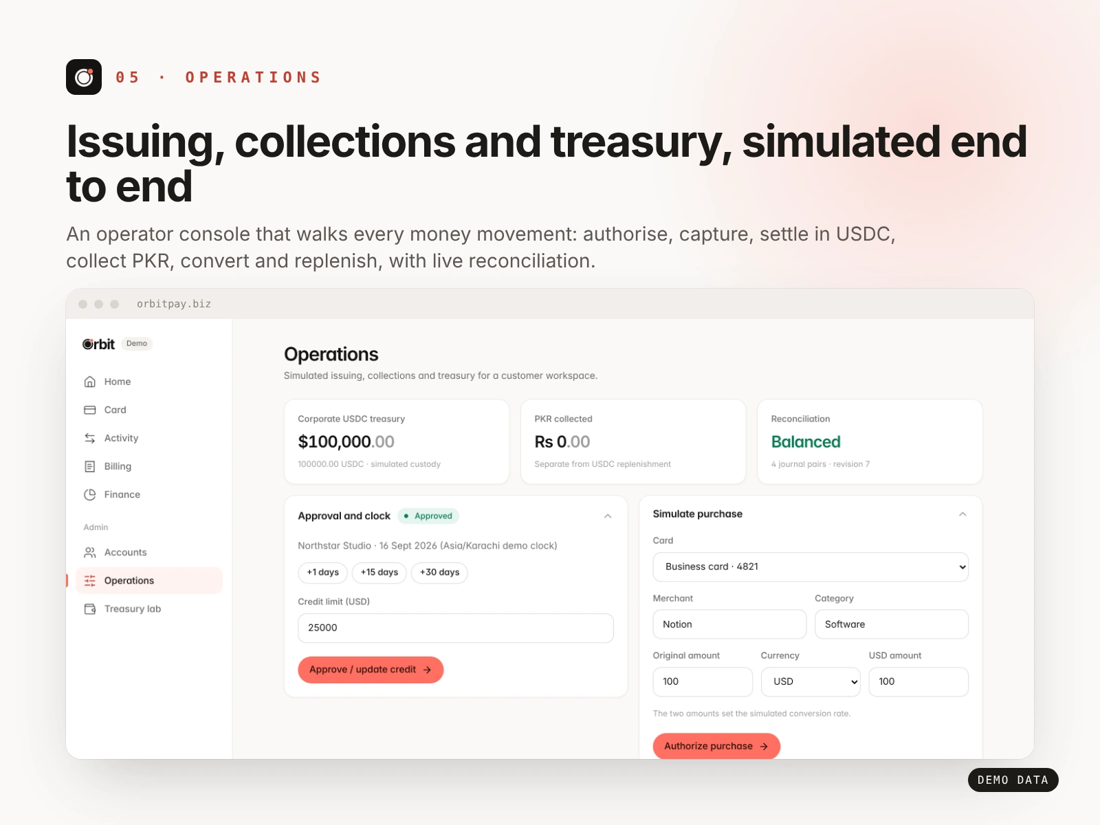
Operations: admin tools kept out of the founder's way, with every simulated step labelled.
Design review: what I'd improve next
Contrast. The light-grey cents and secondary text sit close to the limit. I'd check every text pair against WCAG AA.
Empty states. "No repayments yet" is correct but flat. It should say when the first statement arrives and what to do before then.
Testing. I haven't run usability sessions with founders yet. That comes before any more visual polish.
What this shows
I design for trust and clarity first, then polish. If you need a fintech, SaaS or dashboard UI that people understand on first look, send me a message.
Like this project
Posted Oct 29, 2026
Design case study: hierarchy, colour and honest UI for a fintech app with cards, USD bills repaid in PKR and AI bookkeeping. Web and mobile.
Likes
0
Views
0
Timeline
Sep 1, 2026 - Oct 31, 2026
Clients
Orbit