Gelato Fresh: Playful Artisan Gelato Brand Identity
Mikhail Yakovlev
Gelato Fresh: Playful Artisan Gelato Brand Identity
When I approached the Gelato Fresh project, the objective was clear: create a brand identity that feels joyful, bold, and instantly craveable.
Not luxury.
Not minimalist.
Not sophisticated fine dining.
This brand had to feel like summer on the street.
Bright.
Playful.
Impossible to ignore.
🧠 Project Context
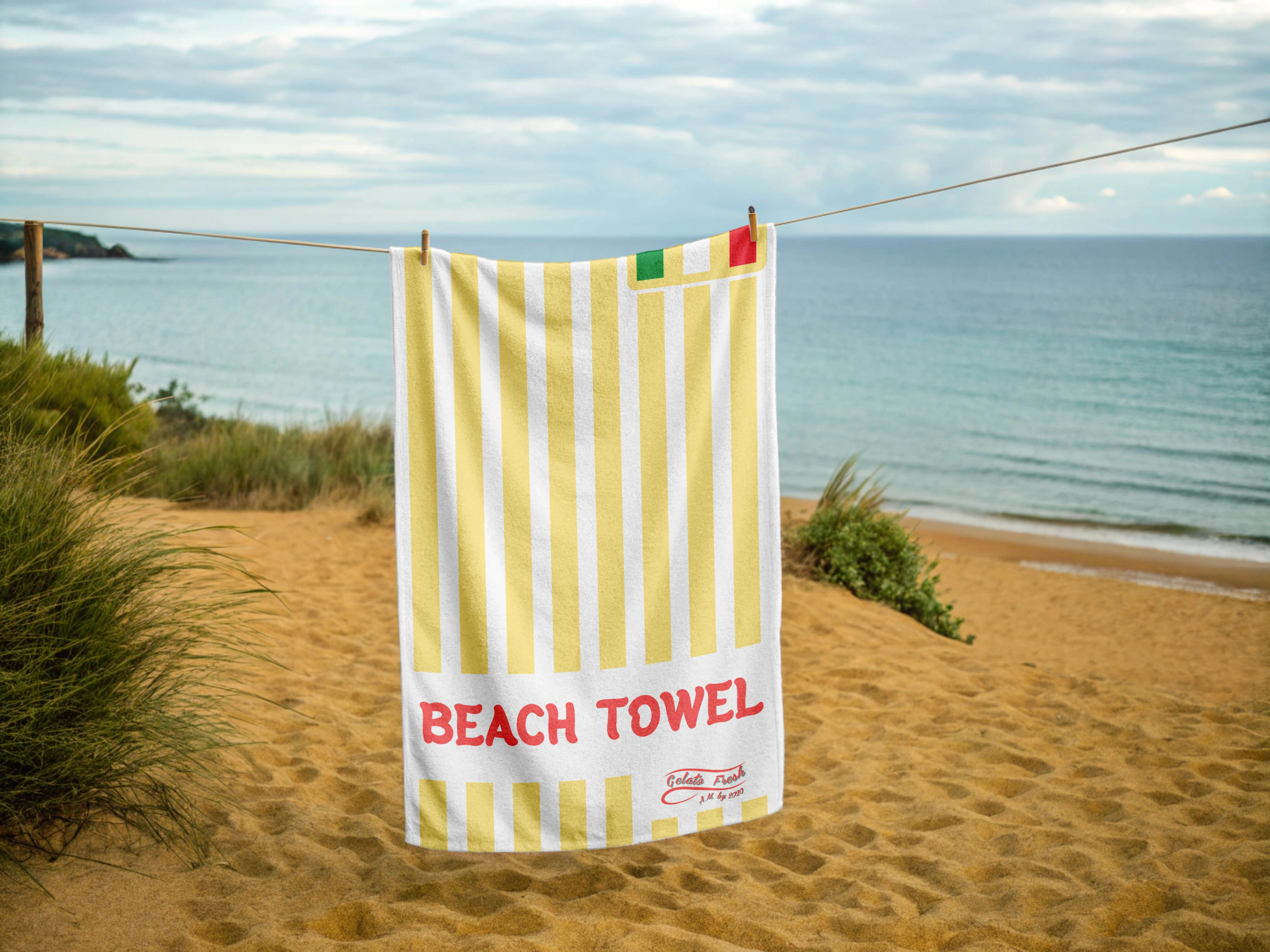
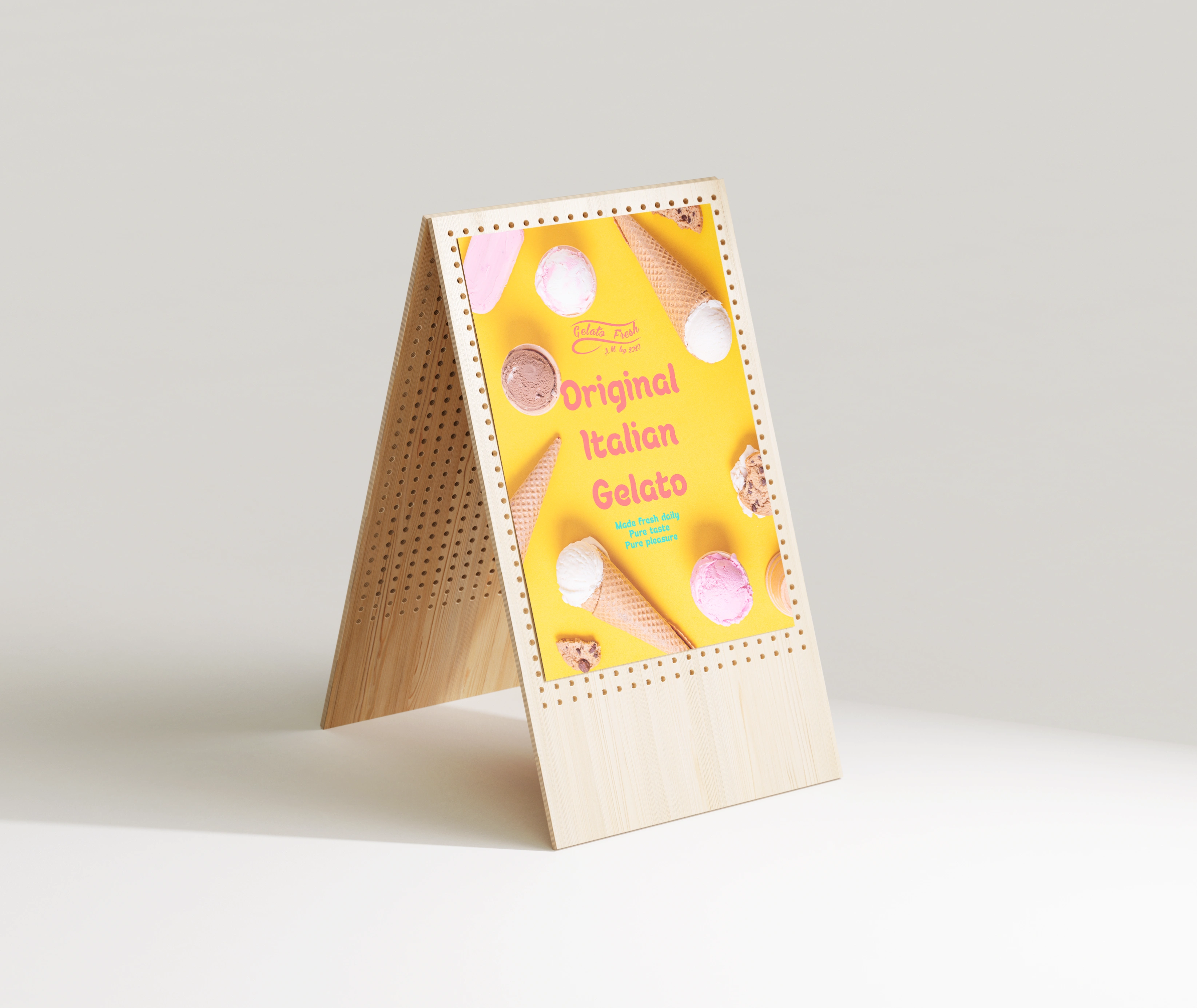
Gelato Fresh is positioned as a street-style artisan gelato brand with strong visual presence across kiosks, packaging, food trucks, and merchandise.
The brand narrative centers around:
🍓 real ingredients
🍦 handmade production
☀ summer energy
🎡 street retail culture
This is not quiet branding.
It is visual flavor.
🔎 Design Strategy
The system was built around three pillars:
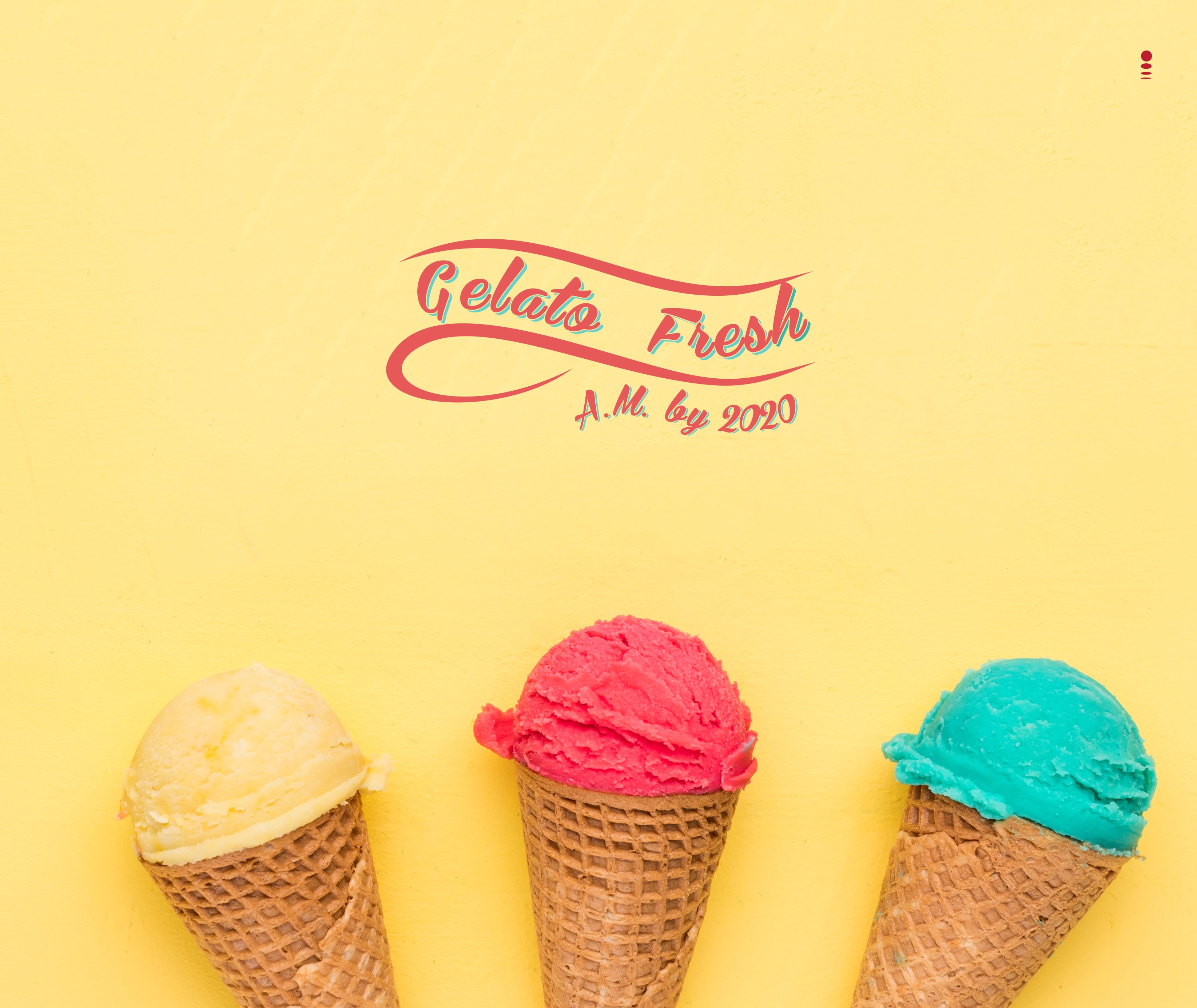
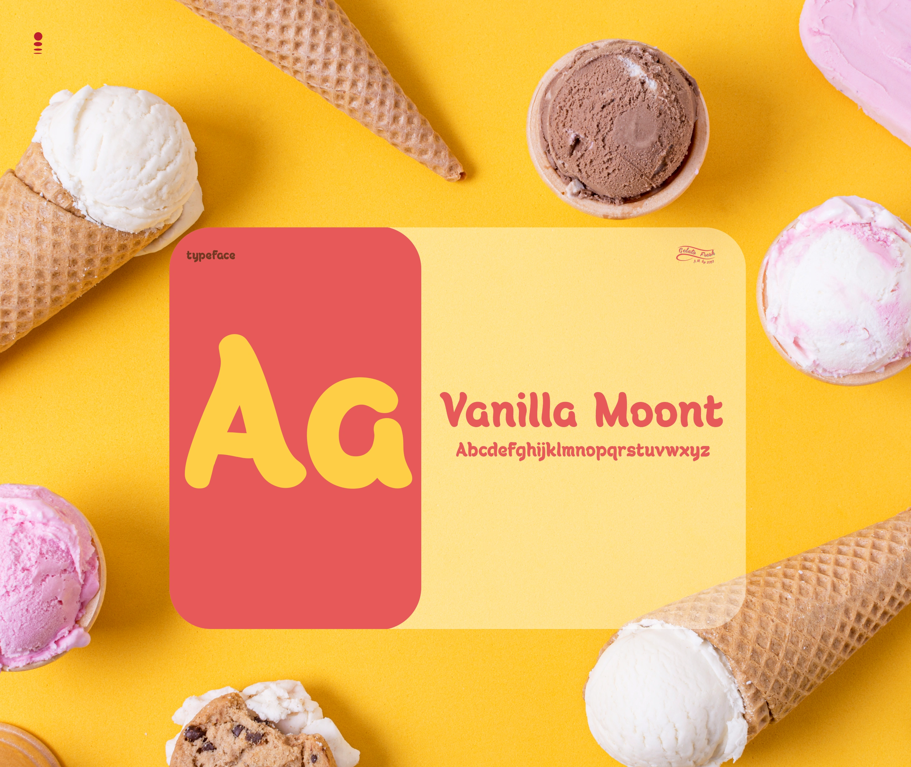
1.Joy as Visual Language
The custom script logo introduces movement and softness, echoing the texture of gelato itself.
The wave underline creates flow.
It feels dynamic and friendly.
Supporting typography like “Vanilla Mount” adds rounded, soft letterforms that mimic scoops.
Nothing sharp.
Everything smooth.
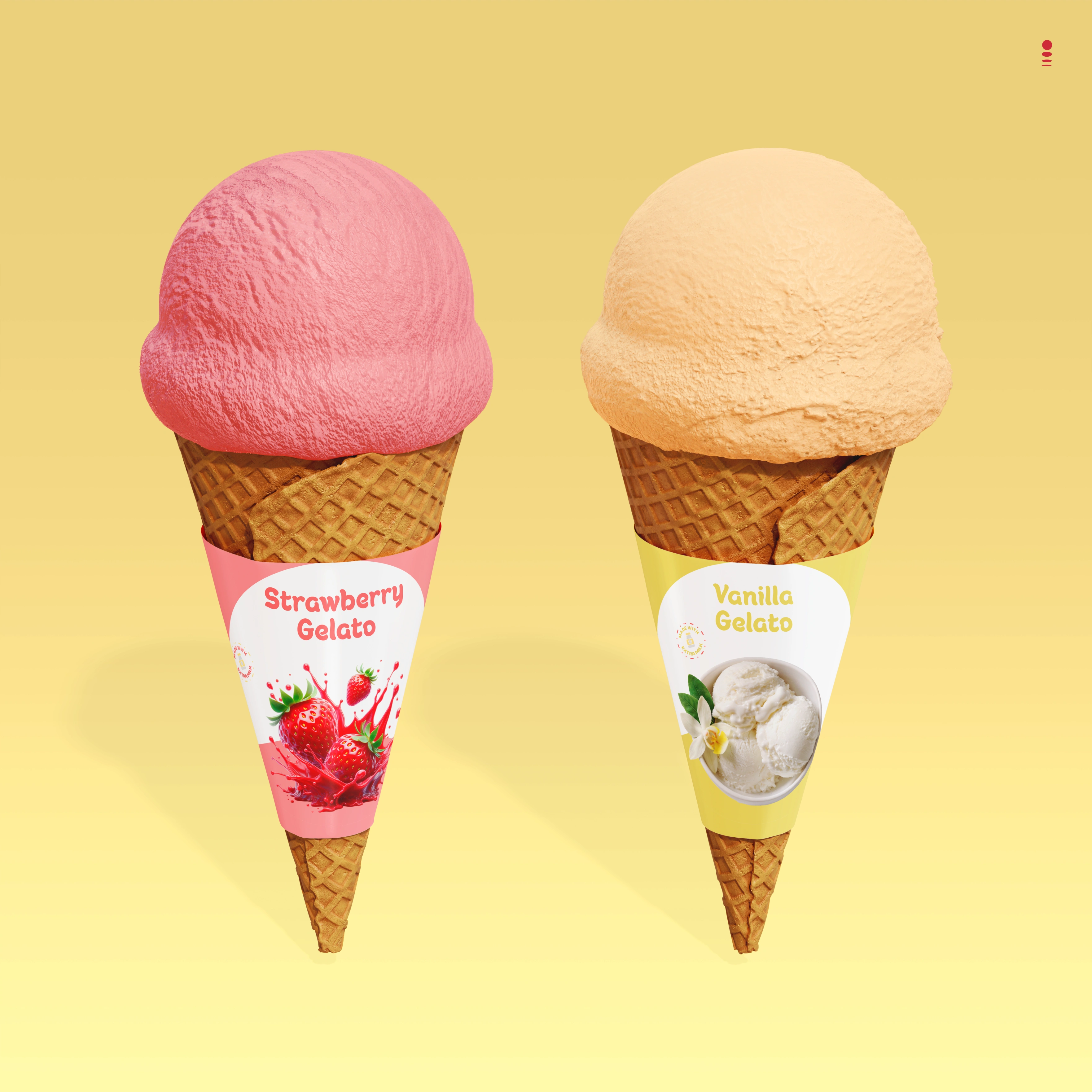
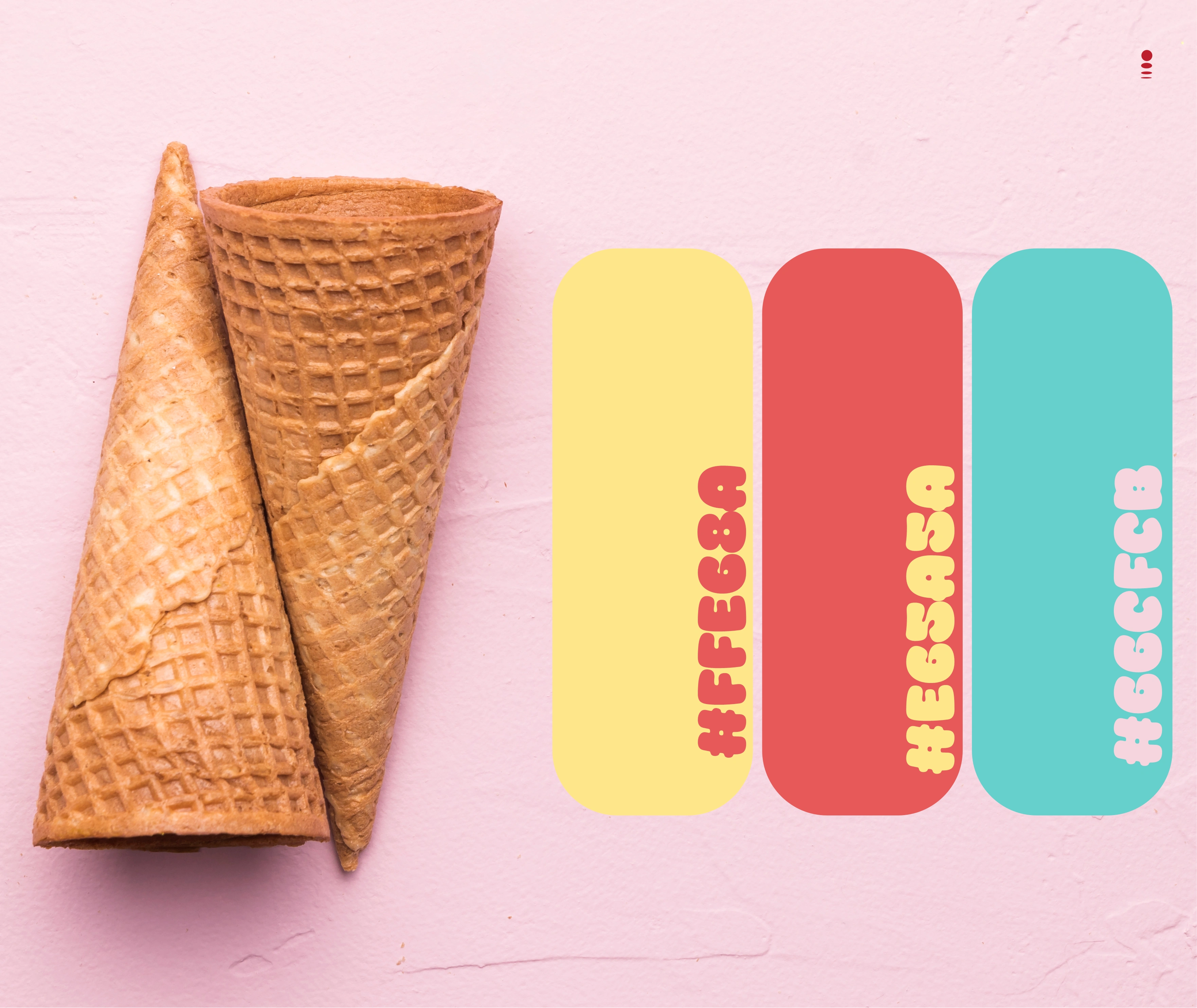
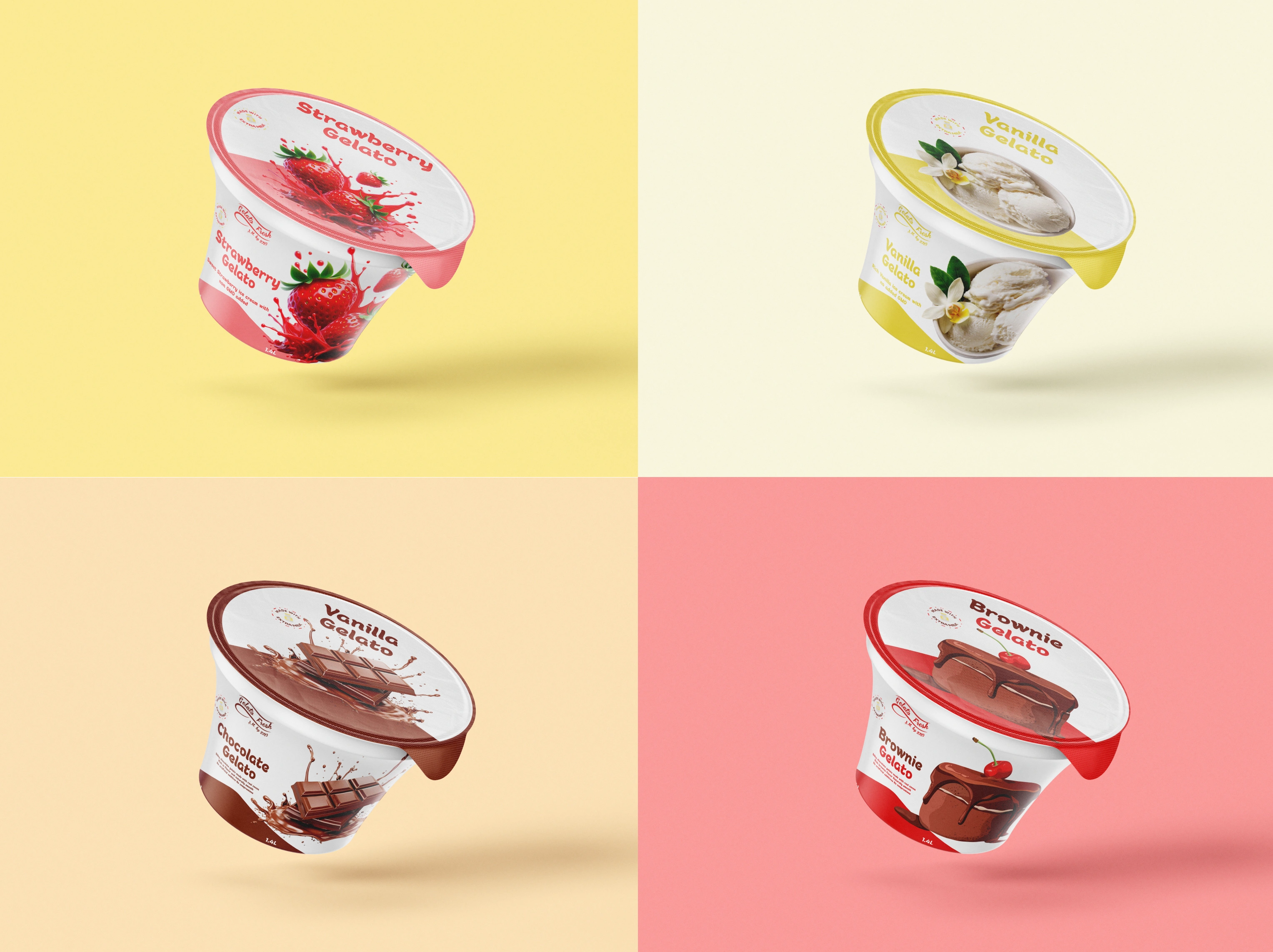
2.Color as Flavor System
The palette is bold and ingredient-driven:
Gelato Yellow — HEX #F6D34E
Strawberry Coral — HEX #E45A58
Mint Turquoise — HEX #57C4C6
Soft Pink — HEX #F6A7B5
Each flavor can own a color.
Each color tells a story.
The system allows instant differentiation across SKUs and signage.
This is retail strategy through color coding.
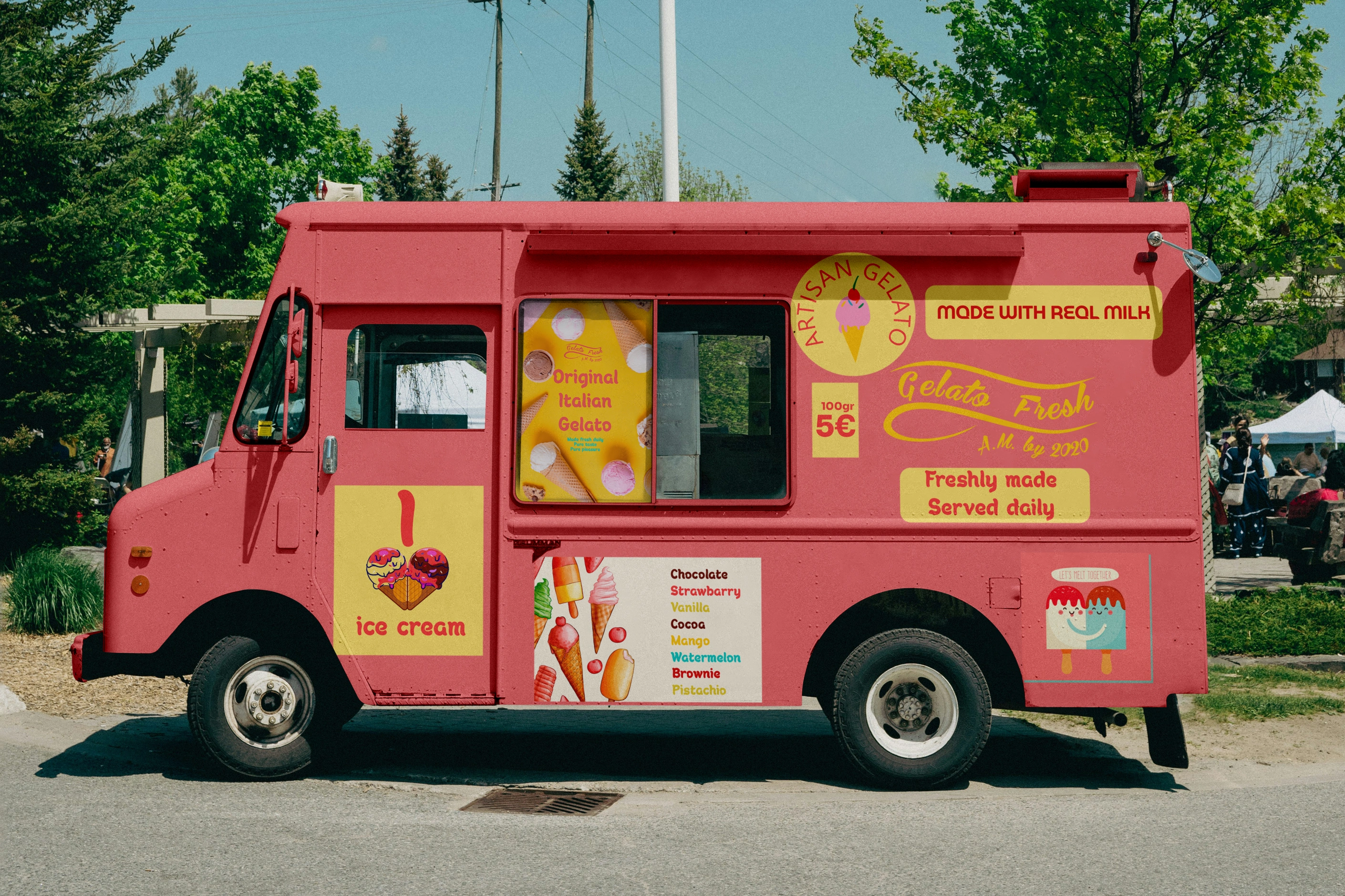
3.Visibility as Growth Strategy
Unlike subtle boutique brands, Gelato Fresh is designed for visibility.
Large typography.
High contrast panels.
Clear flavor hierarchy.
From kiosk to food truck, the brand is readable from distance.
This ensures:
✔ street impact
✔ photo-friendly presence
✔ memorability in crowded environments

🧠 Final Thoughts
With Gelato Fresh, the goal was not heritage.
It was attraction.
Every visual decision reinforces energy, movement, and flavor.
If Forni & Figli was about tradition and fire,
Gelato Fresh is about sunshine and joy.
Different tone.
Same strategic intention.
Like this project
Posted Feb 19, 2026
Designed a bold, playful brand identity for Gelato Fresh, including logo, packaging, kiosk, and food truck visuals built for street visibility and impact.
Likes
15
Views
11
Timeline
Mar 19, 2021 - Sep 1, 2024
Clients
Gelato Fresh